Infographics have exploded over the past few years. It’s a great way to visually and simply explain sometimes complex data to a general audience. My own personal brand of infographics is more on the data visualization side, and thankfully coincides with TrueCar, my employer. I believe that data should be presented in a beautiful and sophisticated way. It should be easy to grok and doesn’t have to be cutesy.
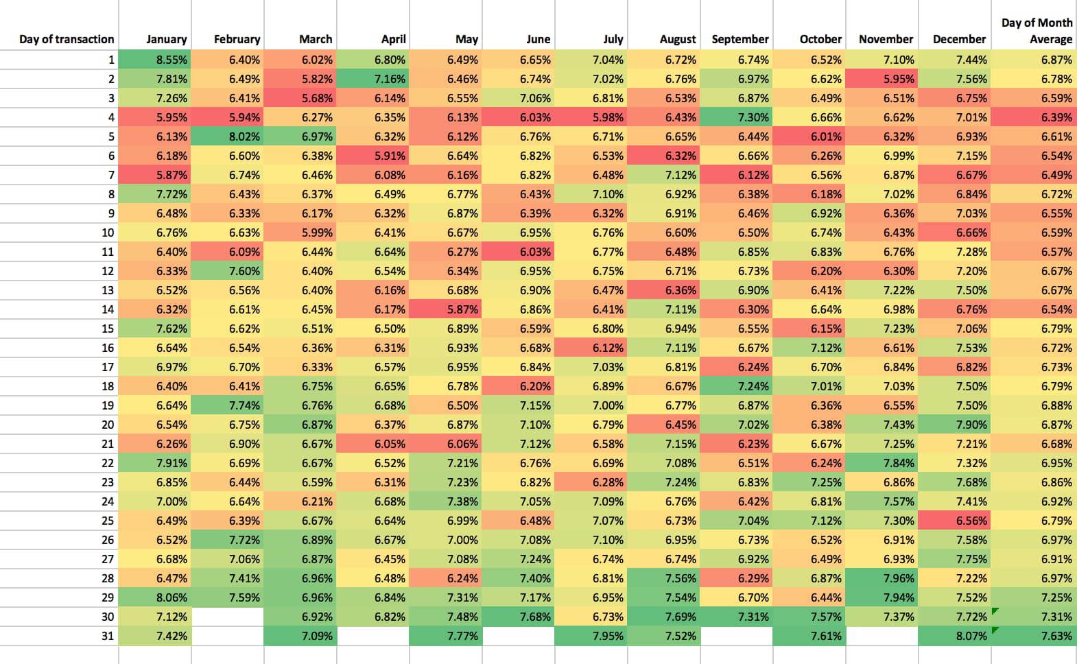
When the latest epic infographic™ project landed on my desk, I started where I always start—I looked at the data. What inspired me was seeing this color-scaled chart of the smartest day of the year to buy. Just by looking at the color I quickly understood the patterns: end of the month, December is the best month, and January 1 is the best day.
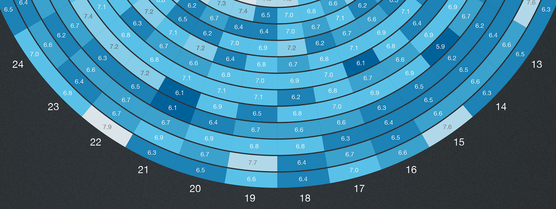
From there I looked for inspiration on cool calendar designs. The notion of color scaling was present in a few examples, and I also really appreciated the circular format in some. Years are cycles, plus a circle is an inherent shape in cars (tires, steering wheel, speedometer, knobs). My search led me to this lovely piece by Martin Oberhaeuser. With much respect to his design, I used it as a jumping-off point to transform the above table from Excel into something hopefully more elegant.
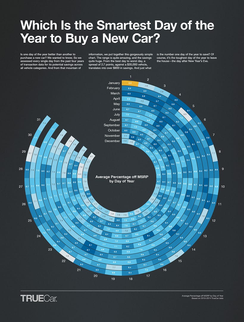
Using TrueCar’s color palette of a couple of blues, I made a color scale—lighter being better, and orange being the best—and inserted the actual percentage value within each cell.
For the chart to show the best month to buy, I combined a calendar and a column graph. And it validates the long-held belief that December is the best month of the year to buy a new car.

The most helpful data I thought we had was the one about the smartest month to buy a particular kind of car. While December remains the best overall month, if you’re looking to buy a subcompact, you should buy in June. Since I had a circular table already I decided to leave this one pretty straightforward.

Last, but not least, is the best day of the week to buy a car. There’s really only seven data points here so presenting the data simply seemed the way to go.

I actually designed the infographic as one long piece first, and then broke it into smaller graphics for social media sharing. As a whole piece I think it works really well. There’s a story that weaves it all together. I hope you enjoy it!
