This post was originally published on Bow & Arrow from PJA (my employer) on February 3, 2011.
The New York Times recently published an article about how apps and web services are enabling consumers to customize how they read their online content. From apps like Flipboard and Pulse to services like Readability and Instapaper, users are increasingly demanding to consume content whenever, wherever and however they want.
When Apple introduced the iPad a year ago, many print publishers saw it as a panacea for their dwindling readership. By creating digital editions, they hoped to recapture some of the eyeballs lost to aggregators and RSS feeds. One of the pioneering publication apps was the WIRED Magazine iPad app. Because of its novelty, its debut issue sold 73,000 digital copies in nine days, almost as much as on newsstands. There is a clear desire from users to read magazines on their tablets.
What that first generation of attempts miss though, is they are trying to replicate 20th century print experience on a 21st century device. The magazine apps feel very one way. But the iPad is an Internet-connected device and users on the Internet demand more interactive experiences. They want to copy and paste passages to put on their blogs. They want to share articles via Facebook and Twitter. Using Adobe's Digital Magazine Solution, Condé Nast is starting to address some of these issues.

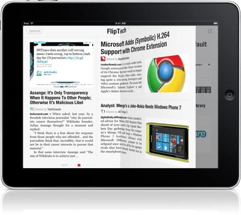
Meanwhile apps such as Flipboard are aggregating content and repackaging it for their users. Flipboard presents news items according to a user's social graph, creating a personalized and highly relevant news stream. Additionally, the app presents this content in a unique way: as a paper magazine. The visual is striking, yet it still holds familiarity with users since it loosely mimics the experience of reading a real-world magazine, with the benefits of interactivity. And so far it has been a hit with users, even earning an App of the Year award from Apple.
Different kinds of content demand different kinds of packages. For example as a designer, I—along with most designers and art directors—flip through magazines such as Communication Arts and Print, and peruse blogs and websites like LovelyPackage.com and SmashingMagazine.com. Seeing something cool usually sparks an idea for whatever we're currently working on.
To get through the hundreds of design-related sites out there, I use RSS feeds to aggregate this content for myself in Google Reader. Unfortunately, because I am so busy, I am not able to keep up with all my feeds. I may manage to check it only every few days. And I dread seeing that “1000+†number next to my unread items.
So last year, when the iPad was introduced, I decided to find a solution as an independent side project. I knew that an app on this large dedicated canvas could be created to serve this need of efficiently consuming visual inspiration. I teamed up with a developer friend and we started work on DesignScene.
We set out to create something that designers would enjoy using and become part of their daily ritual. We had two primary objectives:
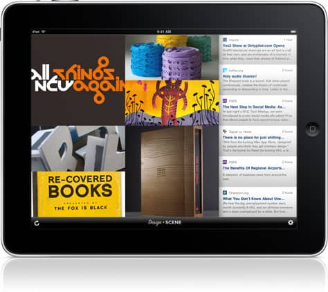
The UI we designed is sparse—a simple grid that takes advantage of the screen real estate afforded by the tablet. Users flick through the various grid cells to see an assortment of images. They can enlarge the images to fill the screen or read the accompanying text from the original source via the built-in web browser. DesignScene surfaces up the latest inspirational images of not only design, but also architecture, photography, art and so on. The content is a curated list of sources and—as a whole—has an editorial point of view to enhance discovery.

It's been two weeks since DesignScene launched. [This was originally posted three weeks ago on the PJA blog.] So far we've had great response from users and media. We built social sharing into the app and we can already see hundreds of discoveries being shared on Twitter. Our users are interacting with content in a way that was not possible just a year ago.