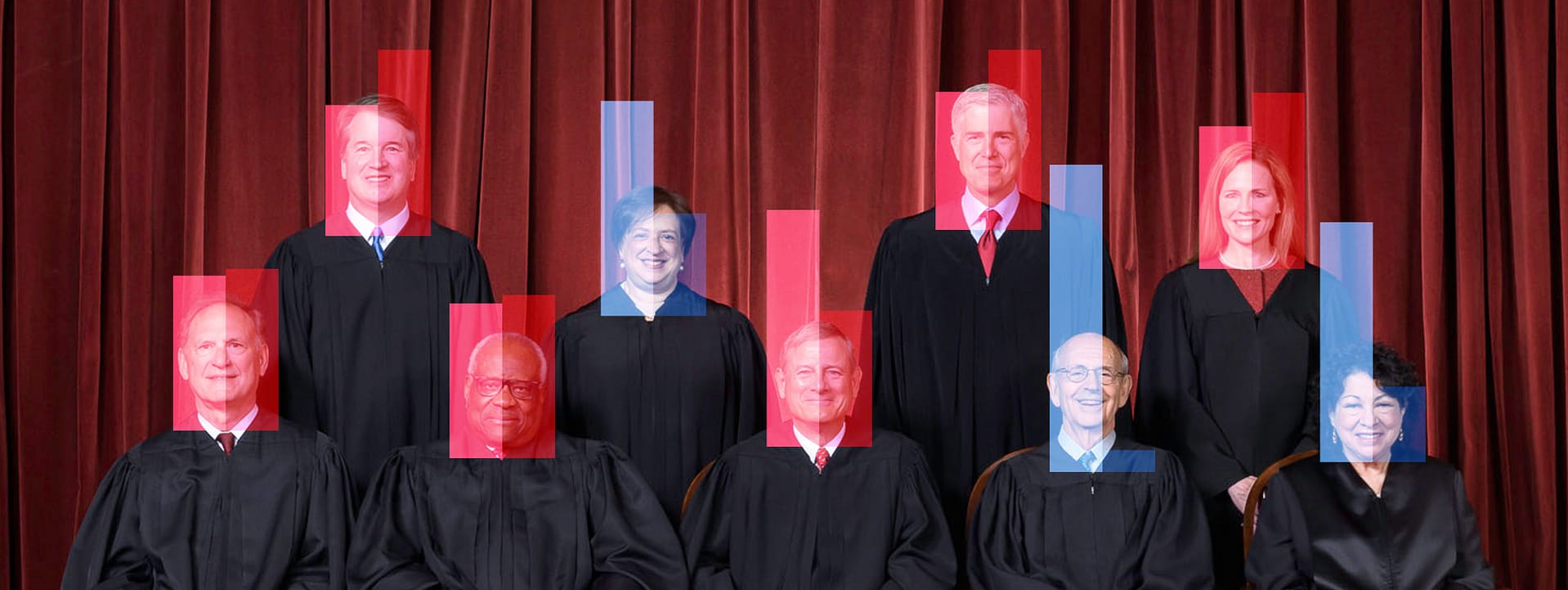
The leaked draft of the majority opinion of Supreme Court justices seeking to overturn Roe v. Wade and Planned Parenthood v. Casey created a political firestorm in Washington, DC, and across the country. But, leak aside, the ruling—should it become final—is shocking. First, it reverses a 49-year precedent about the federal right to abortion. And according to legal experts, the reasoning that author Justice Samuel Alito uses could undo rights such as same-sex marriage, the right to contraception, and interracial marriage.
In a report about the leak, NPR political correspondent Mara Liasson says the leak is ”…going to spark this bigger debate that we’ve been having about whether the United States is turning into a minority rule country. A majority of the justices on the court were appointed by presidents who didn’t get a majority of the popular vote. And in some cases, the conservative justices were confirmed by senators representing a minority of voters.”
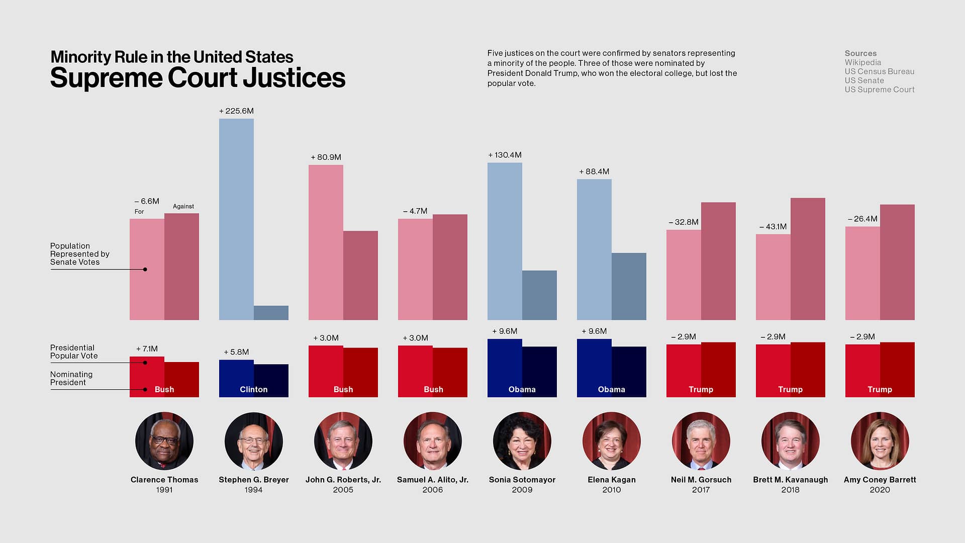
On the surface, I knew she was correct, but I wanted to dive into the numbers and see for myself. Once I did, I wanted to create a visual to show it.
This data visualization is meant to show the cumulative power Republicans have been able to wield as it relates to the seating of Supreme Court justices. I’ve correlated two different but related sets of data into one view: the popular vote counts for every president who nominated a justice to the current court, and the populations represented by the senators who confirmed these justices.
In our representative government, each state gets two senators. Both represent the total residents in their state. And as we know, the populations of all 50 states vary a lot. The senators of Wyoming, the least populous state in the Union, represent 289,000* residents each. In comparison, the senators of California represent 19.6 million* residents each, over 6,780% more! In other words, each resident of Wyoming gets an outsized voice in the US Senate.
I started by gathering all my data from primary sources and placed them into a spreadsheet:
To determine the representative power for each senator’s vote, I multiplied their state’s population by 0.5 for each “Yea.” If a senator did not vote or voted “Present,” 100% of the state’s votes would be determined by the other senator because the state’s residents still needed to be represented.
Then I charted the numbers onto two sets of column graphs for every current justice of the Supreme Court.
In a democracy, citizens need to feel that their voices are being heard, and that their votes matter. But it is disheartening when the candidate you voted for doesn’t win, even when they received a majority of the votes. And when there is an issue such as abortion rights that 70% of the country supports, and yet a minority of people can block that issue, it further proves to many that our democracy is broken and no longer works for the people.
* US Census Bureau population estimate as of July 2021
--
It was pointed out to me that George W. Bush won the popular vote in 2004, which preceded his nominations of Roberts and Alito the the Supreme Court. Indeed he did. It was my oversight because Bush did lose the popular vote to Al Gore in 2000 by 543,895, and that fact just stuck. But in Bush’s re-election bid, he beat John Kerry by three million votes. By the way, Mara Liasson makes the same mistake in the quote above. I have since corrected and updated my graphic. Apologies.