
At TrueCar, data is our lifeblood and visualizing that data in a compelling way is important. Finding that compelling way takes time. We've produced a number of infographics recently. Some have been more involved than others, but all as a way to find our voice in telling a story through data.


This project was initiated because Fiat is going to spin off Ferrari as a separate company. They've owned the brand for over 40 years. So we wondered how long other exotic makes have been owned? The CorpComm team—my internal client—was thinking a simple chart showing the years of ownership. It could have probably been designed easily and in a few hours. But I saw potential in telling a richer story and producing a cooler artifact while still getting the point across. I didn't quite know what form the final graphic would take. It warranted some research, inspiration, and exploration.

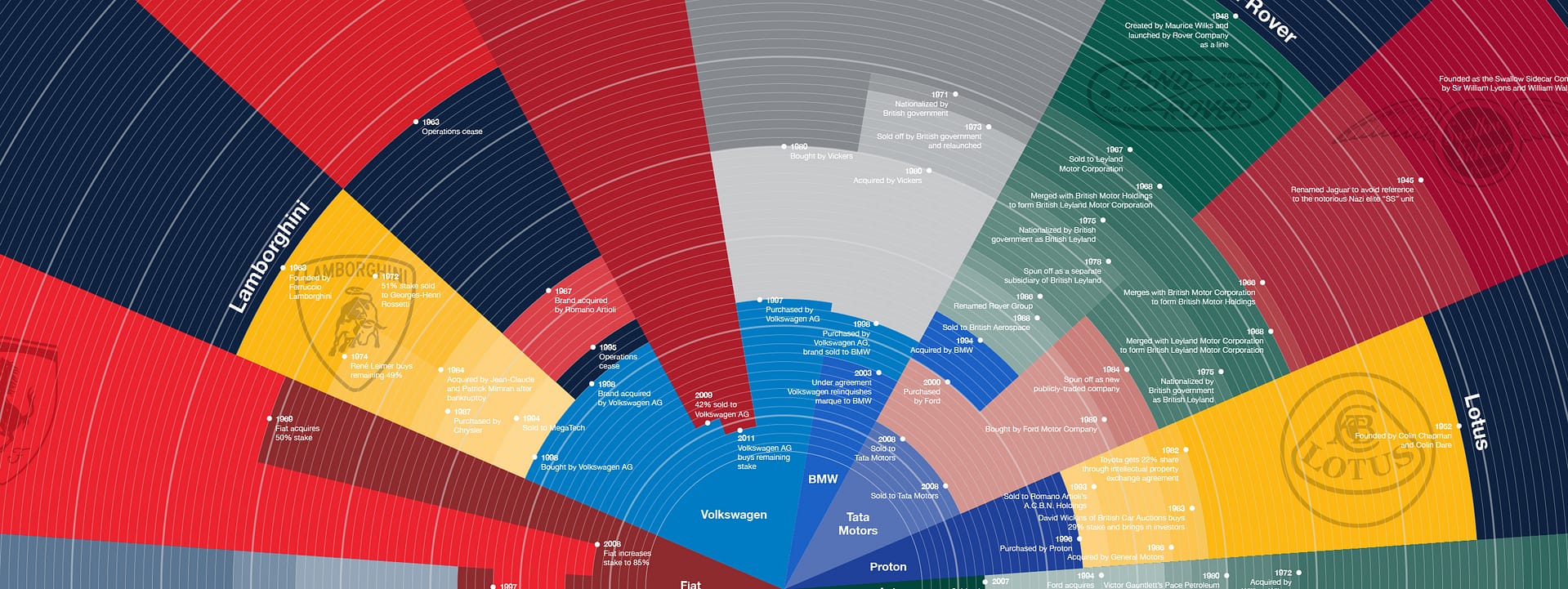
While the team did provide me with some data, I decided to look into the histories of all these makes. Just to get a feel for the material. I ended up spending a full day in the bowels of Wikipedia and other exotic car enthusiast sites tracking down each time a brand changed hands or changed names. What I found was a sometimes—in the case of many of the British brands—fascinating spaghetti of bankruptcies, auctions, nationalizations, and spin-offs. This added much more depth to the pure numbers that I was given, and a timeline form started to wander into my head.
We all know what a great infographic looks like. Stepping back for a moment, I'm using infographic to mean an image that shows a dataset. That data could be numbers, a decision flowchart, or lists, etc. And the visual could be a simple chart, an illustrative poster, or something more complex. Ultimately a great infographic tells the story of the data in a beautiful way.
I recalled seeing an infographic about the history of automobile companies a few years ago. It’s called “The Genealogy of Automobile Companies” and was expertly designed by Larry Gormley. He presents the information about the explosion of auto startups in the early 20th century and how over time it all starts to consolidate. It’s a classic.
My dataset is different because it’s only about foreign exotic makes, but it tells a similar story of consolidation. Additionally the story is also about the changing of owners. I didn’t want to repeat the same form and really needed to show the information in a style consistent with TrueCar’s high-tech brand.
I've always admired the infographics from the New York Times. Their graphics team has done a tremendous job of using a variety of techniques to bring life to the data. They have no visual style per se, yet their signature is clarity.
I also flipped through the massive tome called Information Graphics by Sandra Rendgen. While ultimately I didn't find the perfect form in the book for my data, it certainly opened my eyes to the possibilities.
I began to explore different formats. I knew my dataset and knew that my goal was to show the winding paths that each of these car makes took to get where they are today. Like abandoned orphans bouncing from foster home to foster home, many of these brands’ lineages tell stories of rich men, fast cars, and terribly stupid financial decisions. What form could tell that story?


When I thought more about the data, it occurred to me that this was really about ancestry—about who begot whom. So I looked into examples of family trees and genealogy fans.

The data and the resulting infographic didn’t turn out to be a very screen-friendly. Instead it is a data-intensive multi-layered intricate 24″ x 36″ printed poster meant to be looked at up close.


Time is indicated by the radial lines, from 1906—when Rolls-Royce started—through 2014. Each slice of the semi-circle indicates a brand. The outside starting color is their brand color with a watermark of their original logo. Each change in color within each slice indicates change of ownership or name. As you can see with Maserati and Ferrari, Bentley and Rolls-Royce, and Land Rover and Jaguar, sometimes owners are shared. Ultimately—with the sole exception of Aston Martin—all marques lead to larger corporate parents like Volkswagen AG today who own a multitude of these makes under one entity.
In the end, I don’t think the final solution would have come about had I not gone through the process and spent time getting immersed in the data, looking for design inspiration, and exploring the possibilities. It’s the industry-tested universal design process. But spending a full day getting lost in the history of all these car makes helped me synthesize the data into something bigger. And then spending time to look at hundreds of other infographics helped me break out of any preconceived design notions. The first thought is often wrong and lazy. Finally in sketching, I was able to land on something compelling.
Having spent the last seven years of my career as a creative director, my job is usually more about ensuring my designers are set up to do their best work. Therefore it’s a rare opportunity to design something from start to finish and to obsess over the little details so completely.
I must also mention that having an open-minded client helped a lot too. The CorpComm team at TrueCar gave me a starting point and a long leash.
It was a fun ride and I’m proud of the result.
Download the high-res PNG (4096x2740 3MB)
Download the PDF
The final infographic was worked on over a number of weeks. After finishing the initial design—which was a focused weeklong marathon—I spent a lot of time tweaking the colors for screen and for print. I also had to completely flatten my Adobe Illustrator file to get rid of anti-aliasing artifacts. I originally built the file with a series of masks—one for each slice or marque. But the adjacency of the colors and paths wreaked havoc on the anti-aliasing algorithm and it just looked bad. I knew it would be fine printed, but it also needed to look good on-screen.
