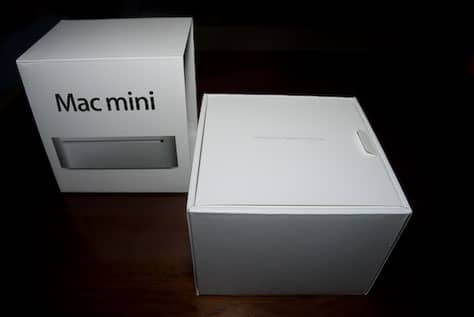
Customer and user experience is not always about the website, the phone call, or person-to-person interaction in a store. It can also come through the form of packaging.
I just bought a Mac mini recently (for a living room media server) and was blown away by the unboxing. Apple has always been really great about their packaging. Having worked at Apple, I've seen the extreme extent of explorations that go into creating the outside of the box (over 500 comps were created for the Power Mac G5 box). (Incidentally, I worked on the second generation iPod package that featured musical artists like Jimi Hendrix.)
What really impressed me about unboxing the Mac mini was not the outside (although nicely designed), but the inside. The package anticipated my every move. How? Let me illustrate.

After removing the slip case, the typical "Designed by Apple in California" copy is printed on the thin box of manuals and DVDs. This box sits flush with the larger box. Nicely protruding from the right side is a tab to pull the manual box out. The tab also acts as a closure for the box. Multipurpose.

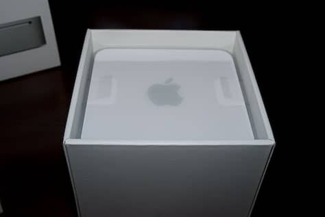
Removing the manuals reveals the Mac mini. What most companies would do in this situation is force you to turn the box upside down and shake the product out. I've done this many times and have found it to be quite maddening.

Instead, Apple thoughtfully supplies two plastic tabs that allow you to lift the mini out of the box. Also very cool.

For the bottom of the box, another cardboard layer hides the power supply and cord. Again, there are pull-tabs here built in to help you lift it out of the box. Did you notice the graphic design pattern here? The tabs are all in the same place and of the same size and shape.
After being so impressed, I thought that surely Apple would fail on the one thing that companies always fail at: tape around the power cable would be impossible to remove. Nope. They read my mind and included a little tab to unwind the tape.
Nice work Apple. You had me at first tab.