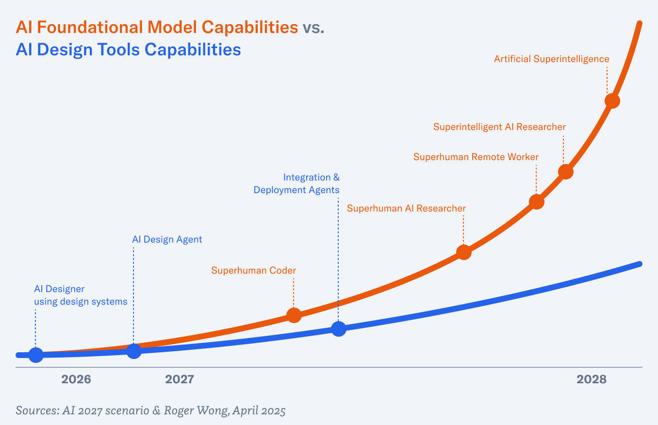
The Atari 400’s membrane keyboard was easy to wipe down, but terrible for typing. It also reminded me of fast food restaurant registers of the time.
Back in the early days of computing—the 1960s and ’70s—there was no distinction between users and programmers. Computer users wrote programs to do stuff for them. Hence the close relationship between the two that’s depicted in TRON. The programs in the digital world resembled their creators because they were extensions of them. Tron, the security program that Bruce Boxleitner’s character Alan Bradley wrote, looks like its creator. Clu looked like Kevin Flynn, played by Jeff Bridges. Early in the film, a compound interest program who was captured by the MCP’s goons says to a cellmate, “if I don’t have a User, then who wrote me?”
The programs in TRON looked like their users. Unless the user was the program, which was the case with Kevin Flynn (Jeff Bridges), third from left.
I was listening to a recent interview with Ivan Zhao, CEO and cofounder of Notion, in which he said he and his cofounder were “inspired by the early computing pioneers who in the ’60s and ’70s thought that computing should be more LEGO-like rather than like hard plastic.” Meaning computing should be malleable and configurable. He goes on to say, “That generation of thinkers and pioneers thought about computing kind of like reading and writing.” As in accessible and fundamental so all users can be programmers too.
The 1980s ushered in the personal computer era with the Apple IIe, Commodore 64, TRS-80, (maybe even the Atari 400 and 800), and then the Macintosh, etc. Programs were beginning to be mass-produced and consumed by users, not programmed by them. To be sure, this move made computers much more approachable. But it also meant that users lost a bit of control. They had to wait for Microsoft to add a feature into Word that they wanted.
Of course, we’re coming back to a full circle moment. In 2025, with AI-enabled vibecoding, users are able to spin up little custom apps that do pretty much anything they want them to do. It’s easy, but not trivial. The only interface is the chatbox, so your control is only as good as your prompts and the model’s understanding. And things can go awry pretty quickly if you’re not careful.
What we’re missing is something accessible, but controllable. Something with enough power to allow users to build a lot, but not so much that it requires high technical proficiency to produce something good. In 1987, Apple released HyperCard and shipped it for free with every new Mac. HyperCard, as fans declared at the time, was “programming for the rest of us.”
HyperCard—Programming for the Rest of Us
HyperCard’s welcome screen showed some useful stacks to help the user get started.
Bill Atkinson was the programmer responsible for MacPaint. After the Mac launched, and apparently on an acid trip, Atkinson conceived of HyperCard. As he wrote on the Apple history site Folklore:
Inspired by a mind-expanding LSD journey in 1985, I designed the HyperCard authoring system that enabled non-programmers to make their own interactive media. HyperCard used a metaphor of stacks of cards containing graphics, text, buttons, and links that could take you to another card. The HyperTalk scripting language implemented by Dan Winkler was a gentle introduction to event-based programming.
There were five main concepts in HyperCard: cards, stacks, objects, HyperTalk, and hyperlinks.
Cards were screens or pages. Remember that the Mac’s nine-inch monochrome screen was just 512 pixels by 342 pixels.
Stacks were collections of cards, essentially apps.
Objects were the UI and layout elements that included buttons, fields, and backgrounds.
HyperTalk was the scripting language that read like plain English.
Hyperlinks were links from one interactive element like a button to another card or stack.
When I say that HyperTalk read like plain English, I mean it really did. AppleScript and JavaScript are descendants. Here’s a sample logic script:
if the text of field "Password" is "open sesame" then go to card "Secret"else answer "Wrong password."end if
Armed with this kit of parts, users were able to use this programming “erector set” and build all sorts of banal or wonderful apps. From tracking vinyl records to issuing invoices, or transporting gamers to massive immersive worlds, HyperCard could do it all. The first version of the classic puzzle adventure game, Myst was created with HyperCard. It was comprised of six stacks and 1,355 cards. From Wikipedia:
The original HyperCard Macintosh version of Myst had each Age as a unique HyperCard stack. Navigation was handled by the internal button system and HyperTalk scripts, with image and QuickTime movie display passed off to various plugins; essentially, Myst functions as a series of separate multimedia slides linked together by commands.
The hit game Myst was built in HyperCard.
For a while, HyperCard was everywhere. Teachers made lesson plans. Hobbyists made games. Artists made interactive stories. In the Eighties and early Nineties, there was a vibrant shareware community. Small independent developers who created and shared simple programs for a postcard, a beer, or five dollars. Thousands of HyperCard stacks were distributed on aggregated floppies and CD-ROMs. Steve Sande, writing in Rocket Yard:
At one point, there was a thriving cottage industry of commercial stack authors, and I was one of them. Heizer Software ran what was called the “Stack Exchange”, a place for stack authors to sell their wares. Like Apple with the current app stores, Heizer took a cut of each sale to run the store, but authors could make a pretty good living from the sale of popular stacks. The company sent out printed catalogs with descriptions and screenshots of each stack; you’d order through snail mail, then receive floppies (CDs at a later date) with the stack(s) on them.
Heizer Software’s “Stack Exchange,” a marketplace for HyperCard authors.
From Stacks to Shrink-Wrap
But even as shareware tiny programs and stacks thrived, the ground beneath this cottage industry was beginning to shift. The computer industry—to move from niche to one in every household—professionalized and commoditized software development, distribution, and sales. By the 1990s, the dominant model was packaged software that was merchandised on store shelves in slick shrink-wrapped boxes. The packaging was always oversized for the floppy or CD it contained to maximize visual space.
Unlike the users/programmers from the ’60s and ’70s, you didn’t make your own word processor anymore, you bought Microsoft Word. You didn’t build your own paint and retouching program—you purchased Adobe Photoshop. These applications were powerful, polished, and designed for thousands and eventually millions of users. But that meant if you wanted a new feature, you had to wait for the next upgrade cycle—typically a couple of years. If you had an idea, you were constrained by what the developers at Microsoft or Adobe decided was on the roadmap.
The ethos of tinkering gave way to the economics of scale. Software became something you consumed rather than created.
From Shrink-Wrap to SaaS
The 2000s took that shift even further. Instead of floppy disks or CD-ROMs, software moved into the cloud. Gmail replaced the personal mail client. Google Docs replaced the need for a copy of Word on every hard drive. Salesforce, Slack, and Figma turned business software into subscription services you didn’t own, but rented month-to-month.
SaaS has been a massive leap for collaboration and accessibility. Suddenly your documents, projects, and conversations lived everywhere. No more worrying about hard drive crashes or lost phones! But it pulled users even farther away from HyperCard’s spirit. The stack you made was yours; the SaaS you use belongs to someone else’s servers. You can customize workflows, but you don’t own the software.
Why Modern Tools Fall Short
For what started out as a note-taking app, Notion has come a long way. With its kit of parts—pages, databases, tags, etc.—it’s highly configurable for tracking information. But you can’t make games with it. Nor can you really tell interactive stories (sure, you can link pages together). You also can’t distribute what you’ve created and share with the rest of the world. (Yes, you can create and sell Notion templates.)
No productivity software programs are malleable in the HyperCard sense.
[IMAGE: Director]
Of course, there are specialized tools for creativity. Unreal Engine and Unity are great for making games. Director and Flash continued the tradition started by HyperCard—at least in the interactive media space—before they were supplanted by more complex HTML5, CSS, and JavaScript. Objectively, these authoring environments are more complex than HyperCard ever was.
HyperCard’s core idea was linking cards and information graphically. This was true hypertext before HTML. It’s no surprise that the first web pioneers drew direct inspiration from HyperCard – in fact, HyperCard influenced the creation of HTTP and the Web itself. The idea of clicking a link to jump to another document? HyperCard had that in 1987 (albeit linking cards, not networked documents). The pointing finger cursor you see when hovering over a web link today? That was borrowed from HyperCard’s navigation cursor.
Ted Nelson coined the terms “hypertext” and “hyperlink” in the mid-1960s, envisioning a world where digital documents could be linked together in nonlinear “trails”—making information interwoven and easily navigable. Bill Atkinson’s HyperCard was the first mass-market program that popularized this idea, even influencing Tim Berners-Lee, the father of the World Wide Web. Berners-Lee’s invention was about linking documents together on a server and linking to other documents on other servers. A web of documents.
Early web browser from 1993, ViolaWWW, directly inspired by the concepts in HyperCard.
Pei-Yuan Wei, developer of one of the first web browsers called ViolaWWW, also drew direct inspiration from HyperCard. Matthew Lasar writing for Ars Technica:
“HyperCard was very compelling back then, you know graphically, this hyperlink thing,” Wei later recalled. “I got a HyperCard manual and looked at it and just basically took the concepts and implemented them in X-windows,” which is a visual component of UNIX. The resulting browser, Viola, included HyperCard-like components: bookmarks, a history feature, tables, graphics. And, like HyperCard, it could run programs.
And of course, with the built-in source code viewer, browsers brought on a new generation of tinkerers who’d look at HTML and make stuff by copying, tweaking, and experimenting.
The Missing Ingredient: Personal Software
Today, we have low-code and no code tools like Bubble for making web apps, Framer for building web sites, and Zapier for automations. The tools are still aimed at professionals though. Maybe with the exception of Zapier and IFTTT, they’ve expanded the number of people who can make software (including websites), but they’re not general purpose. These are all adjacent to what HyperCard was.
(Re)enter personal software.
In an essay titled “Personal software,” Lee Robinson wrote, “You wouldn’t search ‘best chrome extensions for note taking’. You would work with AI. In five minutes, you’d have something that works exactly how you want.”
Exploring the idea of “malleable software,” researchers at Ink & Switch wrote:
How can users tweak the existing tools they’ve installed, rather than just making new siloed applications? How can AI-generated tools compose with one another to build up larger workflows over shared data? And how can we let users take more direct, precise control over tweaking their software, without needing to resort to AI coding for even the tiniest change? None of these questions are addressed by products that generate a cloud-hosted application from a prompt.
Of course, AI prompt-to-code tools have been emerging this year, allowing anyone who can type to build web applications. However, if you study these tools more closely—Replit, Lovable, Base44, etc.—you’ll find that the audience is still technical people. Developers, product managers, and designers can understand what’s going on. But not everyday people.
These tools are still missing ingredients HyperCard had that allowed it to be in the general zeitgeist for a while, that enabled users to be programmers again.
They are:
Direct manipulation
Technical abstraction
Local apps
What Today’s Tools Still Miss
Direct Manipulation
As I concluded in my exhaustive AI prompt-to-code tools roundup from April, “We need to be able to directly manipulate components by clicking and modifying shapes on the canvas or changing values in an inspector.” The latency of the roundtrip of prompting the model, waiting for it to think and then generate code, and then rebuild the app is much too long. If you don’t know how to code, every change takes minutes, so building something becomes tedious, not fun.
Tools need to be a canvas-first, not chatbox-first. Imagine a kit of UI elements on the left that you can drag onto the canvas and then configure and style—not unlike WordPress page builders.
AI is there to do the work for you if you want, but you don’t need to use it.
My sketch of the layout of what a modern HyperCard successor could look like. A directly manipulatable canvas is in the center, object palette on the left, and AI chat panel on the right.
Technical Abstraction
For gen pop, I believe that these tools should hide away all the JavaScript, TypeScript, etc. The thing that the user is building should just work.
Additionally, there’s an argument to be made to bring back HyperTalk or something similar. Here is the same password logic I showed earlier, but in modern-day JavaScript:
No one is going to understand that, much less write something like it.
One could argue that the user doesn’t need to understand that code since the AI will write it. Sure, but code is also documentation. If a user is working on an immersive puzzle game, they need to know the algorithm for the solution.
As a side note, I think flow charts or node-based workflows are great. Unreal Engine’s Blueprints visual scripting is fantastic. Again, AI should be there to assist.
Unreal Engine has a visual scripting interface called Blueprints, with node blocks connected by wires representing game logic.
Local Apps
HyperCard’s file format was “stacks.” And stacks could be compiled into applications that can be distributed without HyperCard. With today’s cloud-based AI coding tools, they can all publish a project to a unique URL for sharing. That’s great for prototyping and for personal use, but if you wanted to distribute it as shareware or donation-ware, you’d have to map it to a custom domain name. It’s not straightforward to purchase from a registrar and deal with DNS records.
What if these web apps can be turned into a single exchangeable file format like “.stack” or some such? Furthermore, what if they can be wrapped into executable apps via Electron?
Rip, Mix, Burn
Lovable, v0, and others already have sharing and remixing built in. This ethos is great and builds on the philosophies of the hippie computer scientists. In addition to fostering a remix culture, I imagine a centralized store for these apps. Of course, those that are published as runtime apps can go through the official Apple and Google stores if they wish. Finally, nothing stops third-party stores, similar to the collections of stacks that used to be distributed on CD-ROMs.
AI as Collaborator, Not Interface
As mentioned, AI should not be the main UI for this. Instead, it’s a collaborator. It’s there if you want it. I imagine that it can help with scaffolding a project just by describing what you want to make. And as it’s shaping your app, it’s also explaining what it’s doing and why so that the user is learning and slowly becoming a programmer too.
Democratizing Programming
When my daughter was in middle school, she used a site called Quizlet to make flash cards to help her study for history tests. There were often user-generated sets of cards for certain subjects, but there were never sets specifically for her class, her teacher, that test. With this HyperCard of the future, she would be able to build something custom in minutes.
Likewise, a small business owner who runs an Etsy shop selling T-shirts can spin up something a little more complicated to analyze sales and compare against overall trends in the marketplace.
And that same Etsy shop owner could sell the little app they made to others wanting the same tool for for their stores.
The Future Is Close
Tron talks to his user, Alan Bradley, via a communication beam.
In an interview with Garry Tan of Y Combinator in June, Michael Truell, the CEO of Anysphere, which is the company behind Cursor, said his company’s mission is to “replace coding with something that’s much better.” He acknowledged that coding today is really complicated:
Coding requires editing millions of lines of esoteric formal programming languages. It requires doing lots and lots of labor to actually make things show up on the screen that are kind of simple to describe.
Truell believes that in five to ten years, making software will boil down to “defining how you want the software to work and how you want the software to look.”
In my opinion, his timeline is a bit conservative, but maybe he means for professionals. I wonder if something simpler will come along sooner that will capture the imagination of the public, like ChatGPT has. Something that will encourage playing and tinkering like HyperCard did.
There’s a third sequel to TRON that’s coming out soon—TRON: Ares. In a panel discussion in the 5,000-seat Hall H at San Diego Comic-Con earlier this summer, Steven Lisberger, the creator of the franchise provided this warning about AI, “Let’s kick the technology around artistically before it kicks us around.” While he said it as a warning, I think it’s an opportunity as well.
AI opens up computer “programming” to a much larger swath of people—hell, everyone. As an industry, we should encourage tinkering by building such capabilities into our products. Not UIs on the fly, but mods as necessary. We should build platforms that increase the pool of users from technical people to everyday users like students, high school teachers, and grandmothers. We should imagine a world where software is as personalizable as a notebook—something you can write in, rearrange, and make your own. And maybe users can be programmers once again.
In the 2011 documentary Jiro Dreams of Sushi, then 85 year-old sushi master Jiro Ono says this about craft:
Once you decide on your occupation… you must immerse yourself in your work. You have to fall in love with your work. Never complain about your job. You must dedicate your life to mastering your skill. That’s the secret of success and is the key to being regarded honorably.
Craft is typically thought of as the formal aspects of any field such as design, woodworking, writing, or cooking. In design, we think about composition, spacing, and typography—being pixel-perfect. But one’s craft is much more than that. Ono’s sushi craft is not solely about slicing fish and pressing it against a bit of rice. It is also about picking the right fish, toasting the nori just so, cooking the rice perfectly, and running a restaurant. It’s the whole thing.
Therefore, mastering design—or any occupation—takes time, experience, or reps as the kids say. So it’s to my dismay that Suff Syed’s essay “Why I’m Giving Up My Design Title — And What That Says About the Future of Design” got so much play in recent weeks. Syed is Head of Product Design at Microsoft—er, was. I guess his title is now Member of the Technical Staff. In a perfectly well-argued and well-written essay, he concludes:
That’s why I’m switching careers. From Head of Product Design to Member of Technical Staff.
This isn’t a farewell to experience, clarity, or elegance. It’s a return to first principles. I want to get closer to the metal—to shape the primitives, models, and agents that will define how tomorrow’s software is built.
We need more people at the intersection. Builders who understand agentic flows and elevated experiences. Designers who can reason about trust boundaries and token windows. Researchers who can make complex systems usable—without dumbing them down to a chat interface.
In the 2,800 words preceding the above quote, Syed lays out a five-point argument: the paradigm for software is changing to agentic AI, design doesn’t drive innovation, fewer design leaders will be needed in the future, the commoditization of design, and the pay gap. The tl;dr being that design as a profession is dead and building with AI is where it’s at.
With respect to Mr. Syed, I call bullshit.
Let’s discuss each of his arguments.
The Paradigm Argument
Suff Syed:
The entire traditional role of product designers, creating static UI in Silicon Valley offices that work for billions of users, is becoming increasingly irrelevant; when the Agent can simply generate the UI it needs for every single user.
That’s a very narrow view of what user experience designers do. In this diagram by Dan Saffer from 2008, UX encircles a large swath of disciplines. It’s a little older so it doesn’t cover newer disciplines like service design or AI design.
Originally made by envis pricisely GmBH - www.envis-precisely.com, based on “The Disciplines of UX” by Dan Saffer (2008). (PDF)
I went to design school a long time ago, graduating 1995. But even back then, in Graphic Design 2 class, graphic design wasn’t just print design. Our final project for that semester was to design an exhibit, something that humans could walk through. I’ve long lost the physical model, but my solution was inspired by the Golden Gate Bridge and how I had this impression of the main cables as welcome arms as you drove across the bridge. My exhibit was a 20-foot tall open structure made of copper beams and a glass roof. Etched onto the roof was a poem—by whom I can’t recall—that would cast the shadows of its letters onto the ground, creating an experience for anyone walking through the structure.
Similarly, thoughtful product designers consider the full experience, not just what’s rendered on the screen. How is onboarding? What’s their interaction with customer service? And with techniques like contextual inquiry, we care about the environments users are in. Understanding that nurses in a hospital are in a very busy setting and share computers are important insights that can’t be gleaned from desk research or general knowledge. Designers are students of life and observers of human behavior.
Syed again:
Agents offer a radical alternative by placing control directly into users’ hands. Instead of navigating through endless interfaces, finding a good Airbnb could be as simple as having a conversation with an AI agent. The UI could be generated on the fly, tailored specifically to your preferences; an N:1 model. No more clicking around, no endless tabs, no frustration.
I don’t know. I have my doubts that this is actually going to be the future. While I agree that agentic workflows will be game-changing, I disagree that the chat UI is the only one for all use cases or even most scenarios. I’ve previously discussed the disadvantages of prompting-only workflows and how professionals need more control.
I also disagree that users will want UIs generated on the fly. Think about the avalanche of support calls and how insane those will be if every user’s interface is different!
In my experience, users—including myself—like to spend the time to set up their software for efficiency. For example, in a dual-monitor setup, I used to expose all of Photoshop’s palettes and put them in the smaller display, and the main canvas on the larger one. Every time I got a new computer or new monitor, I would import that workspace so I could work efficiently.
Habit and muscle memory are underrated. Once a user has invested the time to arrange panels, tools, and shortcuts the way they like, changing it frequently adds friction. For productivity and work software, consistency often outweighs optimization. Even if a specialized AI-made-for-you workspace could be more “optimal” for a task, switching disrupts the user’s mental model and motor memory.
I want to provide one more example because it’s in the news: consider the backlash that OpenAI has faced in the past week with their rollout of GPT-5. OpenAI assumed people would simply welcome “the next model up,” but what they underestimated was the depth of attachment to existing workflows, and in some cases, to the personas of the models themselves. As Casey Newton put it, “it feels different and stronger than the kinds of attachment people have had to previous kinds of technology.” It’s evidence of how much emotional and cognitive investment users pour into the tools they depend on. You can’t just rip that foundation away without warning.
Which brings us back to the heart of design: respect for the user. Not just their immediate preferences, but the habits, muscle memory, and yes, relationships that accumulate over time. Agents may generate UIs on the fly, but if they ignore the human need for continuity and control, they’ll stumble into the same backlash OpenAI faced.
The Innovation Argument
Syed’s second argument is that design supports innovation rather than drive it. I half agree with this. If we’re talking about patents or inventions, sure. Technology will always win the day. But design can certainly drive innovation.
He cites Airbnb, Figma, Notion, and Linear as being “incredible companies with design founders,” but only Airbnb is a Fortune 500 company.
While not having been founded by designers, I don’t think anyone would argue that Apple, Nike, Tesla, and Disney are not design-led and aren’t innovative. All are in the Fortune 500. Disney treats experience design, which includes its parks, media, and consumer products, as a core capability. Imagineering is a literal design R&D division that shapes the company’s most profitable experiences. Look up Lanny Smoot.
Early prototypes of the iPhone featuring the first multitouch screens were actually tablet-sized. But Apple’s industrial design team led by Jony Ive, along with the hardware engineering team got the form factor to fit nicely in one hand. And it was Bas Ording, the UI designer behind Mac OS X’s Aqua design language that prototyped inertial effects. Farhad Manjoo, writing in Slate in 2012:
Jonathan Ive, Apple’s chief designer, had been investigating a technology that he thought could do wonderful things someday—a touch display that could understand taps from multiple fingers at once. (Note that Apple did not invent multitouch interfaces; it was one of several companies investigating the technology at the time.) According to Isaacson’s biography, the company’s initial plan was to the use the new touch system to build a tablet computer. Apple’s tablet project began in 2003—seven years before the iPad went on sale—but as it progressed, it dawned on executives that multitouch might work on phones. At one meeting in 2004, Jobs and his team looked a prototype tablet that displayed a list of contacts. “You could tap on the contact and it would slide over and show you the information,” Forstall testified. “It was just amazing.”
Jobs himself was particularly taken by two features that Bas Ording, a talented user-interface designer, had built into the tablet prototype. One was “inertial scrolling”—when you flick at a list of items on the screen, the list moves as a function of how fast you swipe, and then it comes to rest slowly, as if being affected by real-world inertia. Another was the “rubber-band effect,” which causes a list to bounce against the edge of the screen when there were no more items to display. When Jobs saw the prototype, he thought, “My god, we can build a phone out of this,” he told the D Conference in 2010.
The Leadership Argument
Suff Syed’s third argument is about what it means to be a design leader. He says, “scaling your impact as a designer meant scaling the surfaces you influence.” As you rose up through the ranks, “your craft was increasingly displaced by coordination. You became a negotiator, a timeline manager, a translator of ambition through Product and Engineering partnerships.”
Instead, he argues, because AI can build with fewer people—well, you only need one person: “You need two people: one who understands systems and one who understands the user. Better if they’re the same person.”
That doesn’t scale. Don’t tell me that Microsoft, a company with $281 billion in revenue and 228,000 employees—will shrink like a stellar collapse into a single person with an army of AIs. That’s magical thinking.
Leaders are still needed. Influence and coordination are still needed. Humans will still be needed.
He ends this argument with:
This new world despises a calendar full of reviews, design crits, review meetings, and 1:1s. It emphasizes a repo with commits that matter. And promises the joy of shipping to return to your work. That joy unmediated by PowerPoint, politics, or process. That’s not a demotion. That’s liberation.
So he wants us all to sit in our home offices and not collaborate with others? Innovation no longer comes from lone geniuses. They’re born from bouncing ideas off of your coworkers and everyone building on each other’s ideas.
Friction in the process can actually make things better. Pixar famously has a council known as the Braintrust—a small, rotating group of the studio’s best storytellers who meet regularly to tear down and rebuild works-in-progress. The rules are simple: no mandatory fixes, no sugarcoating, and no egos. The point is to push the director to see the story’s problems more clearly—and to own the solution. One of the most famous saves came with Toy Story 2. Originally destined for direct-to-video release, early cuts were so flat that the Braintrust urged the team to start from scratch. Nine frantic months later, the film emerged as one of Pixar’s most beloved works, proof that constructive creative friction can turn a near-disaster into a classic.
The Distribution Argument
Design taste has been democratized and is table stakes, says Syed in his next argument.
There was a time when every new Y Combinator startup looked like someone tortured an intern into generating a logo using Clipart. Today, thanks to a generation of exposure to good design—and better tools—most founders have internalized the basics of aesthetic judgment. First impressions matter, and now, they’re trivial to get right.
And that templates, libraries, and frameworks make it super easy and quick to spin up something tasteful in minutes:
Component libraries like Tailwind, shadcn/ui, and Radix have collapsed the design stack. What once required a full design team handcrafting a system in Figma, exporting specs to Storybook, and obsessively QA-ing the front-end… now takes a few lines of code. Spin up a repo. Drop in some components. Tweak the palette. Ship something that looks eerily close to Linear or Notion in a weekend.
I’m starting to think that Suff Syed believes that designers are just painters or something. Wow. This whole argument is reductive, flattening our role to be only about aesthetics. See above for how much design actually entails.
The Wealth Argument
“Nobody is paying Designers $10M, let alone $100M anytime soon.” Ah, I think this is him saying the quiet part out loud. Mr. Syed is dropping his design title and becoming a “member of the technical staff” because he’s chasing the money.
He’s right. No one is going to pay a designer $100 million total comp package. Unless you’re Jony Ive and part of io, which OpenAI acquired for $6.5 billion back in May. Which is a rare and likely once-ever occurrence.
The scale of money and investment going into these AI systems is unlike anything we’ve ever seen before in the tech industry. …I heard a rumor there was a big company that wasted a billion dollars or more on a failed training run. And then you start to think, oh, I understand why, to a company like Meta, the right AI talent is worth a hundred million dollars, because that level of expertise doesn’t exist that widely outside of this very small group of people. And if this person does their job well, they can save your company something more like a billion dollars. And maybe that means that you should pay them a hundred million dollars.
“Very small group of people” is likely just a couple dozen people in the world who have this expertise and worth tens of millions of dollars.
Syed again:
People are getting generationally wealthy inventing new agentic abstractions, compressing inference cycles, and scaling frontier models safely. That’s where the gravity is. That’s where anybody should aspire to be. With AI enabling and augmenting you as an individual, there’s a far more compelling reason to chase this frontier. No reason not to.
People also get generationally wealthy by hitting the startup lottery. But it’s a hard road and there’s a lot of luck involved.
The current AI frenzy feels a lot like 1849 in California. Back then, roughly 300,000 people flooded the Sierra Nevada mountains hoping to strike gold, but the math was brutal: maybe 10% made any profit at all, the top 4% earned enough to brag a little, and only about 1% became truly rich. The rest? They left with sore backs, empty pockets, and I guess some good stories.
Back to Reality
AI is already changing the software industry. As designers and builders of software, we are going to be using AI as material. This is as obvious as when the App Store on iPhone debuted and everyone needed to build apps.
Suff Syed wrote his piece as part personal journey and decision-making and part rallying cry to other designers. He is essentially switching careers and says that it won’t be easy.
This transition isn’t about abandoning one identity for another. It’s about evolving—unlearning what no longer serves us and embracing the disciplines that will shape the future. There’s a new skill tree ahead: model internals, agent architectures, memory hierarchies, prompt flows, evaluation loops, and infrastructure that determines how products think, behave, and scale.
Best of luck to Suff Syed on his journey. I hope he strikes AI gold.
As for me, I aim to continue on my journey of being a shokunin, or craftsman, like Jiro Ono. For over 30 years—if you count my amateur days in front of the Mac in middle school—I’ve been designing. Not just pushing pixels in Photoshop or Figma, but doing the work of understanding audiences and users, solving business problems, inventing new interaction patterns, and advocating for usability. All in the service of the user, and all while honing my craft.
That craft isn’t tied to a technology stack or a job title. It’s a discipline, a mindset, and a lifetime’s work. Being a designer is my life.
So no, I’m not giving up my design title. It’s not a relic—it’s a commitment. And in a world chasing the next gold rush, I’d rather keep making work worth coming back to, knowing that in the end, gold fades but mastery endures. Besides, if I ever do get rich, it’ll be because I designed something great, not because I happened to be standing near a gold mine.
*In Part I of this series on the design talent crisis, I wrote about the struggles recent grads have had finding entry-level design jobs and what might be causing the stranglehold on the design job market. In Part II, I discussed how industry and education need to change in order to ensure the survival of the profession. *
**Part III: Adaptation Through Action **
Like most Gen X kids, I grew up with a lot of freedom to roam. By fifth grade, I was regularly out of the house. My friends and I would go to an arcade in San Francisco’s Fisherman’s Wharf called The Doghouse, where naturally, they served hot dogs alongside their Joust and TRON cabinets. But we would invariably go to the Taco Bell across the street for cheap pre-dinner eats. In seventh grade—this is 1986—I walked by a ComputerLand on Van Ness Avenue and noticed a little beige computer with a built-in black and white CRT. The Macintosh screen was actually pale blue and black, but more importantly, showed MacPaint. It was my first exposure to creating graphics on a computer, which would eventually become my career.
Desktop publishing had officially begun a year earlier with the introduction of Aldus PageMaker and the Apple LaserWriter printer for the Mac, which enabled WYSIWYG (What You See Is What You Get) page layouts and high-quality printed output. A generation of designers who had created layouts using paste-up techniques with tools and materials like X-Acto knives, Rapidograph pens, rubyliths, photostats, and rubber cement had to start learning new skills. Typesetters would eventually be phased out in favor of QuarkXPress. A decade of transition would revolutionize the industry, only to be upended again by the web.
Many designers who made the jump from paste-up to desktop publishing couldn’t make the additional leap to HTML. They stayed graphic designers and a new generation of web designers emerged. I think those who were in my generation—those that started in the waning days of analog and the early days of DTP—were able to make that transition.
We are in the midst of yet another transition: to AI-augemented design. It’s important to note that it’s so early, that no one can say anything with absolute authority. Any so-called experts have been working with AI tools and AI UX patterns for maybe two years, maximum. (Caveat: the science of AI has been around for many decades, but using these new tools, techniques, and developing UX patterns for interacting with such tools is solely new.)
It’s obvious that AI is changing not only the design industry, but nearly all industries. The transformation is having secondary effects on the job market, especially for entry-level talent like young designers.
The AI revolution mirrors the previous shifts in our industry, but with a crucial difference: it’s bigger and faster. Unlike the decade-long transitions from paste-up to desktop publishing and from print to web, AI’s impact is compressing adaptation timelines into months rather than years. For today’s design graduates facing the harsh reality documented in Part I and Part II—where entry-level positions have virtually disappeared and traditional apprenticeship pathways have been severed—understanding this historical context isn’t just academic. It’s reality for them. For some, adaptation is possible but requires deliberate strategy. The designers who will thrive aren’t necessarily those with the most polished portfolios or prestigious degrees, but those who can read the moment, position themselves strategically, and create their own pathways into an industry in tremendous flux.
As a designer who is entering the workforce, here are five practical strategies you can employ right now to increase your odds of landing a job in this market:
Leverage AI literacy as competitive differentiator
Emphasize strategic thinking and systems thinking
Become a “dangerous generalist”
Explore alternative pathways and flexibility
Connecting with community
1. AI Literacy as Competitive Differentiator
Just like how Leah Ray, a recent graphic design MFA graduate from CCA, has deeply incorporated AI into her workflow, you have to get comfortable with some of the tools. (See her story in Part II for more context.)
Be proficient in the following categories of AI tools:
Chatbot: Choose ChatGPT, Claude, or Gemini. Learn about how to write prompts. You can even use the chatbot to learn how to write prompts! Use it as a creative partner to bounce ideas off of and to do some initial research for you.
Image generator: Adobe Firefly, DALL-E, Gemini, Midjourney, or Visual Electric. Learn how to use at least one of these, but more importantly, figure out how to get consistently good results from these generators.
Website/web app generator: Figma Make, Lovable, or v0. Especially if you’re in an interaction design field, you’ll need to be proficient in an AI prompt-to-code tool.
Add these skills to your resume and LinkedIn profile. Share your experiments on social media.
But being AI-literate goes beyond just the tools. It’s also about wielding AI as a design material. Here’s the good part: by getting proficient in the tools, you’re also learning about the UX patterns for AI and learning what is possible with AI technologies like LLMs, agents, and diffusion models.
I’ve linked to a number of articles about designing for AI use cases:
MCP: This is an open standard developed by Anthropic but adopted by many companies. It allows agents to interface with existing software platforms without the need for specialized APIs. Read “MCP Explained: The New Standard Connecting AI to Everything.”
Be sure to add at least one case study in your portfolio that incorporates an AI feature.
2. Strategic Thinking and Systems Thinking
Stunts like AI CEOs notwithstanding, companies don’t trust AI enough to cede strategy to it. LLMs are notoriously bad at longer tasks that contain multiple steps. So thinking about strategy and how to create a coherent system are still very much human activities.
Systems thinking—the ability to understand how different parts of a system interact and how changes in one component can create cascading effects throughout the entire system—is becoming essential for tech careers and especially designers. The World Economic Forum’s Future of Jobs Report 2025 identifies it as one of the critical skills alongside AI and big data.
Modern technology is incredibly interconnected. AI can optimize individual elements, but it can’t see the bigger picture—how a pricing change affects user retention, how a new feature impacts server costs, or why your B2B customers need different onboarding than consumers.
Early-career lawyers at the firm Macfarlanes are now interpreting complex contracts that used to be reserved for more senior colleagues. While AI can extract key info from contracts and flag potential issues, humans are still needed to understand the context, implications, and strategic considerations.
Emphasize these skills in your case studies by presenting clear, logical arguments that lead to strategic insights and systemic solutions. Frame every project through a business lens. Show how your design decisions ladder up to company, brand, or product metrics. Include the downstream effects—not just the immediate impact.
3. The “Dangerous Generalist” Advantage
Josh Silverman, professor at CCA and also a design coach and recruiter, has an idea he calls the “dangerous generalist.” This is the unicorn designer who can “do the research, the strategy, the prototyping, the visual design, the presentation, and the storytelling; and be a leader and make a measurable impact.”
It’s a lot and seemingly unfair to expect that out of one person, but for a young and hungry designer with the right training and ambition, I think it’s possible. Other than leadership and making quantitative impact, all of those traits would have been practiced and honed at a good design program.
Be sure to have a variety of projects in your portfolio to showcase how you can do it all.
4. Alternative Pathways and Flexibility
Matt Ström-Awn, in an excellent piece about the product design talent crisis published last Thursday, did some research and says that in “over 600 product design listings, only 1% were for internships, and only 5% required 2 years or less of experience.”
Those are some dismal numbers for anyone trying to get a full-time job with little design experience. So you have to try creative ways of breaking into the industry. In other words, don’t get stuck on only applying for junior-level jobs on LinkedIn. Do that but do more.
Let’s break this down to type of company and type of role.
Types of Companies
Historically, I would have always recommended any new designer to go to an agency first because they usually have the infrastructure to mentor entry-level workers. But, as those jobs have dried up, consider these types of companies.
Early-stage startups: Look for seed-stage or Series A startups. Companies who have just raised their Series A will make a big announcement, so they should be easy to target. Note that you will often be the only designer in the company, so you’ll be doing a lot of learning on the job. If this happens, remember to find community (see below).
Non-tech businesses: Legacy industries might be a lot slower to think about AI, much less adopt it. Focus on sectors where human touch, tradition, regulations, or analog processes dominate. These fields need design expertise, especially as many are just starting to modernize and may require digital transformation, improved branding, or modernized UX.
Nonprofits: With limited budgets and small teams, nonprofits and not-for-profits could be great places to work for. While they tend to try to DIY everything, they will also recognize the need for designers. Organizations that invest in design are 50% more likely to see increases in fundraising revenue.
Type of Roles
In his post for UX Collective, Patrick Morgan says, “Sometimes the smartest move isn’t aiming straight for a ‘product designer’ title, but stepping into a role where you can stay close to product and grow into the craft.”
In other words, look for adjacent roles at the company you want to work for, just to get your foot in the door.
Here are some of those roles—includes ones from Morgan’s list. What is appropriate for you will depend heavily on your skill sets and the type of design you want to eventually practice.
UI developer or front-end engineer: If you’re technically-minded, front-end developers are still sought after, though maybe not as much as before because, you know, AI. But if you’re able to snag a spot as one, it’s a way in.
Product manager: There is no single path to becoming a product manager. It’s a lot of the same skills a good designer should have, but with even more focus on creating strategies that come from customer insights (aka research). I’ve seen designers move into PM roles pretty easily.
Graphic/visual/growth/marketing designer: Again, depending on your design focus, you could already be looking for these jobs. But if you’re in UX and you see one of these roles open up, it’s another way into a company.
Production artist: These roles are likely slowly disappearing as well. This is usually a role at an agency or a larger company that just does design execution.
Freelancer: You may already be doing this, but you can freelance. Not all companies, especially small ones can afford a full-time designer. So they rely on freelance help. Try your hand at Upwork to build up your portfolio. Ensure that you’re charging a price that seems fair to you and that will help pay your bills.
Executive assistant: While this might seem odd, this is a good way to learn about a company and to show your resourcefulness. Lots of EAs are responsible for putting together events, swag, and more. Eventually, you might be able to parlay this role into a design role.
Intern: Internships are rare, I know. And if you haven’t done one, you should. However, ensure that the company complies with local regulations about paying interns. For example, California has strict laws about paying interns at least minimum wage. Unpaid internships are legal only if the role meets a litany of criteria including:
The internship is primarily educational (similar to a school or training program).
The intern is the “primary beneficiary,” not the company.
The internship does not replace paid employees or provide substantial benefit to the employer.
5. Connecting with Community
The job search is isolating. Especially now.
Josh Silverman emphasizes something often overlooked: you’re already part of communities. “Consider all the communities you identify with, as well as all the identities that are a part of you,” he points out. Think beyond LinkedIn—way beyond.
Did you volunteer at a design conference? Help a nonprofit with their rebrand? Those connections matter. Silverman suggests reaching out to three to five people—not hiring managers, but people who understand your work. Former classmates who graduated ahead of you. Designers you met at meetups. Workshop leaders.
“Whether it’s a casual coffee chat or slightly more informal informational interview, there are people who would welcome seeing your name pop up on their screen.”
These conversations aren’t always about immediate job leads. They’re about understanding where the industry’s actually heading, which companies are genuinely hiring, and what skills truly matter versus what’s in job descriptions. As Silverman notes, it’s about creating space to listen and articulate what you need—“nurturing relationships in community will have longer-term benefits.”
In practice: Join alumni Slack channels, participate in local AIGA events, contribute to open-source projects, engage in design challenges. The designers landing jobs aren’t just those with perfect portfolios. They’re the ones who stay visible.
The Path Forward Requires Adaptation, Not Despair
My 12 year-old self would be astonished at what the world is today and how this profession has evolved. I’ve been through three revolutions. Traditional to desktop publishing. Print to web. And now, human-only design to AI-augmented design.
Here’s what I know: the designers who survived those transitions weren’t necessarily the most talented. They were the most adaptable. They read the moment, learned the tools, and—crucially—didn’t wait for permission to reinvent themselves.
This transition is different. It’s faster and much more brutal to entry-level designers.
But you have advantages my generation didn’t. AI tools are accessible in ways that PageMaker and HTML never were. We had to learn through books! We learned by copying. We learned by taking weeks to craft projects. You can chat with Lovable and prompt your way to a portfolio-worthy project over a weekend. You can generate production-ready assets with Midjourney before lunch. You can prototype and test five different design directions while your coffee’s still warm.
The traditional path—degree, internship, junior role, slow climb up the ladder—is broken. Maybe permanently. But that also means the floor is being raised. You should be working on more strategic and more meaningful work earlier in your career.
But you need to be dangerous, versatile, and visible.
The companies that will hire you might not be the ones you dreamed about in design school. The role might not have “designer” in the title. Your first year might be messier than you planned.
That’s OK. Every designer I respect has a messy and unlikely origin story.
The industry will stabilize because it always does. New expectations will emerge, new roles will be created, and yes—companies will realize they still need human designers who understand context, culture, and why that button should definitely not be bright purple.
Until then? Be the designer who ships. Who shows up. Who adapts.
The machines can’t do that. Yet.
I hope you enjoyed this series. I think it’s an important topic to discuss in our industry right now, before it’s too late. Don’t forget to read about the five grads and five educators I interviewed for the series. Please reach out if you have any comments, positive or negative. I’d love to hear them.
For my series on the Design Talent Crisis (see Part I, Part II, and Part III) I interviewed five recent graduates from California College of the Arts (CCA) and San Diego City College. I’m an alum of CCA and I used to teach at SDCC. There’s a mix of folks from both the graphic design and interaction design disciplines.
Meet the Grads
If these enthusiastic and immensely talented designers are available and you’re in a position to hire, please reach out to them!
Benedict Allen
Benedict Allen is a Los Angeles-based visual designer who specializes in creating compelling visual identities at the intersection of design, culture, and storytelling. With a strong background in apparel graphics and branding, Benedict brings experience from his freelance work for The Hunt and Company—designing for a major automotive YouTuber’s clothing line—and an internship at Pureboost Energy Drink Mix. He is skilled in a range of creative tools including Photoshop, Illustrator, Figma, and AI image generation. Benedict’s approach is rooted in history and narrative, resulting in clever and resonant design solutions. He holds an Associate of Arts in Graphic Design from San Diego City College and has contributed to the design community through volunteer work with AIGA San Diego Tijuana.
Emma Haines is a UX and interaction designer with a background in computer science, currently completing her MDes in Interaction Design at California College of the Arts. She brings technical expertise and a passion for human-centered design to her work, with hands-on experience in integrating AI into both the design process and user-facing projects. Emma has held roles at Mphasis, Blink UX, and Colorado State University, and is now seeking full-time opportunities where she can apply her skills in UX, UI, or product design, particularly in collaborative, fast-paced environments.
Erika Kim is a passionate UI/UX and product designer based in Poway, California, with a strong foundation in both visual communication and thoughtful problem-solving. A recent graduate of San Diego City College’s Interaction & Graphic Design program, Erika has gained hands-on experience through internships at TritonNav, Four Fin Creative, and My Rental Spot, as well as a year at Apple in operations and customer service roles. Her work has earned her recognition, including a Gold Winner award at The One Club Student Awards for her project “Gatcha Eats.” Erika’s approach to design emphasizes clarity, collaboration, and the power of well-crafted wayfinding—a passion inspired by her fascination with city and airport signage. She is fluent in English and Korean, and is currently open to new opportunities in user experience and product design.
Ashton Landis is a San Francisco-based graphic designer with a passion for branding, typography, and visual storytelling. A recent graduate of California College of the Arts with a BFA in Graphic Design and a minor in ecological practices, Ashton has developed expertise across branding, UI/UX, design strategy, environmental graphics, and more. She brings a people-centered approach to her work, drawing on her background in photography to create impactful and engaging design solutions. Ashton’s experience includes collaborating with Bay Area non-profits to build participatory identity systems and improve community engagement. She is now seeking new opportunities to grow and help brands make a meaningful impact.
Leah (Xiayi Lei) Ray is a Beijing-based visual designer currently working at Kuaishou Technology, with a strong background in impactful graphic design that blends logic and creativity. She holds an MFA in Design and Visual Communications from California College of the Arts, where she also contributed as a teaching assistant and poster designer. Leah’s experience spans freelance work in branding, identity, and book cover design, as well as roles in UI/UX and visual development at various companies. She is fluent in English and Mandarin, passionate about education, arts, and culture, and is recognized for her thoughtful, novel approach to design.
Sean Bacon is a professor, passionate designer and obsessive typophile who teaches a wide range of classes at San Diego City College. He also helps direct and manage the graphic design program and its administrative responsibilities. He teaches a wide range of classes and always strives to bring excellence to his students’ work. He brings his wealth of experiences and insight to help produce many of the award winning portfolios from City. He has worked for The Daily Aztec, Jonathan Segal Architecture, Parallax Visual Communication and Silent Partner. He attended San Diego City College, San Diego State and completed his masters at Savannah College of Art and Design.
Eric Heiman
Eric Heiman is principal and co-founder of the award-winning, oft-exhibited design studio Volume Inc. He also teaches at California College of the Arts (CCA) where he currently manages TBD*, a student-staffed design studio creating work to help local Bay Area nonprofits and civic institutions. Eric also writes about design every so often, has curated one film festival, occasionally podcasts about classic literature, and was recently made an AIGA Fellow for his contribution to raising the standards of excellence in practice and conduct within the Bay Area design community.
Elena Pacenti
Elena Pacenti is a seasoned design expert with over thirty years of experience in design education, research, and international projects. Currently the Director of the MDes Interaction Design program at California College of the Arts, she has previously held leadership roles at NewSchool of Architecture & Design and Domus Academy, focusing on curriculum development, faculty management, and strategic planning. Elena holds a PhD in Industrial Design and a Master’s in Architecture from Politecnico di Milano, and is recognized for her expertise in service design, strategic design, and user experience. She is passionate about leading innovative, complex projects where design plays a central role.
Bradford Prairie
Bradford Prairie has been teaching at San Diego City College for nine years, starting as an adjunct instructor while simultaneously working as a professional designer and creative director at Ignyte, a leading branding agency. What made his transition unique was Ignyte’s support for his educational aspirations—they understood his desire to prioritize teaching and eventually move into it full-time. This dual background in industry and academia allows him to bring real-world expertise into the classroom while maintaining his creative practice.
Josh Silverman
For three decades, Josh Silverman has built bridges between entrepreneurship, design education, and designers—always focused on helping people find purpose and opportunity. As founder of PeopleWork Partners, he brings a humane design lens to recruiting and leadership coaching, placing emerging leaders at companies like Target, Netflix, and OpenAI, and advising design teams on critique, culture, and operations. He has chaired the MDes program at California College of the Arts, taught and spoken worldwide, and led AIGA chapters. Earlier, he founded Schwadesign, a lean, holacratic studio recognized by The Wall Street Journal and others. His clients span startups, global enterprises, top universities, cities, and non-profits. Josh is endlessly curious about how teams make decisions and what makes them thrive—and is always up for a long bike ride.
In Part I of this series, I wrote about the struggles recent grads have had finding entry-level design jobs and what might be causing the stranglehold on the design job market.
**Part II: Building New Ladders **
When I met Benedict Allen, he had just finished with Portfolio Review a week earlier. That’s the big show all the design students in the Graphic Design program at San Diego City College work toward. It’s a nice event that brings out the local design community where seasoned professionals review the portfolios of the graduating students.
Allen was all smiles and relief. “I want to dabble in different aspects of design because the principles are generally the same.” He goes on to mention how he wants to start a fashion brand someday, DJ, try 3D. “I just want to test and try things and just have fun! Of course, I’ll have my graphic design job, but I don’t want that to be the end. Like when the workday ends, that’s not the end of my creativity.” He was bursting with enthusiasm.
And confidence. When asked about how prepared he felt about his job prospects, he shares, “I say this humbly, I really do feel confident because I’m very proud of my portfolio and the things I’ve made, my design decisions, and my thought processes.” Oh to be in my early twenties again and have his same zeal!
But here’s the thing, I believe him. I believe he’ll go on to do great things because of this young person’s sheer will. He idolizes Virgil Abloh, the died-too-young multi-hyphenate creative who studied architecture, founded the fashion label Off-White, became artistic director of menswear at Louis Vuitton, and designed furniture for IKEA and shoes for Nike. Abloh is Allen’s North Star.
Artificial intelligence, despite its sycophantic tendencies, does not have that infectious passion. Young people are the life blood of companies. They can reinvigorate an organization and bring perspectives to a jaded workforce. Every single time I’ve ever had the privilege of working with interns, I have felt this. My teams have felt this. And they make the whole organization better.
What Companies Must Do
I love this quote by Robert F. Kennedy in his 1966 speech at the University of Cape Town:
This world demands the qualities of youth: not a time of life but a state of mind, a temper of the will, a quality of imagination, a predominance of courage over timidity, of the appetite for adventure over the life of ease.
As mentioned in Part I of this series, the design industry is experiencing an unprecedented talent crisis, with traditional entry-level career pathways rapidly eroding as the capabilities of AI expand and companies anticipate using AI to automate junior-level tasks. Youth is the key ingredient that sustains companies and industries.
The Business Case for Juniors
Five recent design graduates. From top left to right: Ashton Landis, Erika Kim, Emma Haines. Bottom row, left to right: Leah Ray, Benedict Allen.
Just as important as the energy and excitement Benedict Allen brings, is his natural ability to wield AI. He’s an AI native.
In my conversation with him, he’s tried all the major chatbots and has figured out what works best for what. “I’ve used Gemini as I find its voice feature amazing. Like, I use it all the time. …I use Claude sometimes for writing, but I find that the writing was not as good as ChatGPT. ChatGPT felt less like AI-speak. …I love Perplexity. That’s one of my favorites as well.”
He’s not alone. Leah Ray, who recently graduated from California College of the Arts with an MFA in Graphic Design, says that she can’t remember how her design process existed without AI, saying, “It’s become such an integral part of how I think and work.”
She parries with ChatGPT, using it as a creative partner:
I usually start by having a deep or sometimes extended conversation with ChatGPT. And it’s not about getting the direct answer, but more about using the dialogue to clarify my thoughts and challenging my assumptions and even arrive at a clear design direction.
She’ll go on and use the chatbot to help with project planning and timelines, copywriting, code generation, and basic image generation. Ray has even considered training her own AI model using tools like ComfyUI or LoRA that are based on her past design work. She says, “So it could assist me in generating proposals that match my visual styles.” Pretty advanced stuff.
Similar to Ray, Emma Haines, who is finishing up her MDes in Interaction Design at CCA, says that AI “comes into the picture very early on.” She’ll use ChatGPT for brainstorming and project planning, and less so in the later stages.
Unlike many established designers, these young ones don’t see AI as threatening, nor as a crutch. They treat AI as any other tool. Ashton Landis, who recently graduated from CCA with a BFA in Graphic Design, says, “I think right now it’s primarily a tool instead of a replacement.”
Elena Pacenti, Director of MDes Interaction Design at CCA, observes that students have embraced AI immediately and across the board. She says generative AI has been “adopted immediately by everyone, faculty and students” and it’s being used to create text, images, and all sorts of visual content—not just single images, but storyboards, videos, and more. It’s become just another tool in their toolkit.
Pacenti notices that her students are gravitating toward using AI for efficiency rather than exploration. She sees them “embracing all the tools that help make the process faster, more efficient, quicker” to get to their objective, rather than using AI “to explore things they haven’t thought about or to make things.” They’re using it as a shortcut rather than a creative partner.
Restructure Entry-Level Roles
I don’t think it’s quite there yet, but AI will eventually take over the traditional tasks we give to junior designers. Anthropic recently released an integration with Canva, but the results are predictable—barely a good first draft. For companies that choose to live on the bleeding edge, that will likely be within 12 months. I think in two years, we’ll cede more and more of these junior-level design tasks like extending designs, resizing assets, and searching for stock to AI.
But I believe there is still a place for entry-level designers in any organization.
Firstly, the tasks can simply be done faster. When we talk about AI and automation, oftentimes the human who’s initiating the task and then judging its output isn’t part of the conversation. Babysitting AI takes time and more importantly, breaks flow. I can imagine teaching a junior designer how to perform these tasks using AI and just stack up more in a day or week. They’ll still be able to practice their taste and curation skills with supervision from more senior peers.
Second, younger people are inherently better with newer technologies. Asking a much more senior designer to figure out advanced prototyping with Lovable or Cursor will be a non-starter. But junior designers should be able to pick this up quickly and become indispensable pairs of hands in the overall process.
Third, we can simply level up the complexity of the tasks we give to juniors. Aneesh Raman, chief economic opportunity officer at LinkedIn, wrote in The New York Times:
Unless employers want to find themselves without enough people to fill leadership posts down the road, they need to continue to hire young workers. But they need to redesign entry-level jobs that give workers higher-level tasks that add value beyond what can be produced by A.I. At the accounting and consulting firm KPMG, recent graduates are now handling tax assignments that used to be reserved for employees with three or more years of experience, thanks to A.I. tools. And at Macfarlanes, early-career lawyers are now tasked with interpreting complex contracts that once fell to their more seasoned colleagues. Research from the M.I.T. Sloan School of Management backs up this switch, indicating that new and low-skilled workers see the biggest productivity gains and benefits from working alongside A.I. tools.
In other words, let’s assume AI will tackle the campaign resizing or building out secondary and tertiary pages for a website. Have junior designers work on smaller projects as the primary designer so they can set strategy, and have them shadow more senior designers and develop their skills in concept, strategy, and decision-making, not just execution.
Invest in the Leadership Pipeline
The 2023 Writers Guild of America strike offers a sobering preview of what could happen to the design profession if we’re not careful about how AI reshapes entry-level opportunities. Unrelated to AI, but to simple budget-cutting, Hollywood studios began releasing writers immediately after scripts were completed, cutting them out of the production process where they would traditionally learn the hands-on skills needed to become showrunners and producers. As Oscar-winning writer Sian Heder (CODA) observed, “A writer friend has been in four different writers rooms and never once set foot on set. How are we training the next generation of producers and showrunners?” The result was a generation of writers missing the apprenticeship pathway that transforms scriptwriters into skilled creative leaders—exactly the kind of institutional knowledge loss that weakens an entire industry.
The WGA’s successful push for guaranteed on-set presence reveals what the design industry must do to avoid a similar talent catastrophe. Companies are avoiding junior hires entirely, anticipating that AI will handle execution tasks—but this eliminates the apprenticeship pathway where designers actually learn strategic thinking. Instead, they need to restructure entry-level roles to guarantee meaningful learning opportunities—pairing junior designers with real projects where they develop taste through guided decision-making. As one WGA member put it, “There’s just no way to learn to do this without learning on the job.” The design industry’s version of that job isn’t Figma execution—it’s the messy, collaborative process of translating business needs into human experiences.
Today’s junior designers will become tomorrow’s creative directors, design directors, and heads of design. Senior folks like myself will eventually age out, so companies that don’t invest in junior talent now won’t have any experienced designers in five to ten years.
And if this is an industry-wide trend, young designers who can’t get into the workforce today will pivot to other careers and we won’t have senior designers, period.
How Education is Responding
Our five design educators. From top left to right: Bradford Prairie, Elena Pacenti, Sean Bacon. Bottom row, left to right: Josh Silverman, Eric Heiman.
The Irreplaceable Human Element
When I spoke to the recent grads, all five of them mentioned how AI-created output just has an air of AI. Emma Haines:
People can tell what AI design looks like versus what human design looks like. I think that’s because we naturally just add soul into things when we design. We add our own experiences into our designs. And just being artists, we add that human element into it. I think people gravitate towards that naturally, just as humans.
It speaks to how educators are teaching—and have always been teaching—design. Bradford Prairie, a professor at San Diego City College:
We always tell students, “Try to expose yourself to a lot of great work. Try to look at a lot of inspiration. Try to just get outside more.” Because I think a lot of our students are introverts. They want to sit in their room and I tell them, “No, y’all have to get out in the world! …and go touch grass and touch other things out in the world. That’s how you learn what works and what doesn’t, and what culture looks like.
Leah Ray, explaining how our humanity imbues quality into our designs:
You can often recognize an AI look. Images and designs start to feel like templates and over-predictable in that sense. And everything becomes fast like fast food and sometimes even quicker than eating instant food.
And even though there is a scary trend towards synthetic user research, Elena Pacenti, discourages it. She’ll teach her students to start with provisional user archetypes using AI, but then they’ll need to perform primary research to validate it. “We’re going to do primary to validate. Please do not fake data through the AI.”
Redefining Entry-Level Value
I only talked to educators from two institutions for this series, since those are the two I have connections to. For both programs, there’s less emphasis on hard skills like how to use Figma and more on critical thinking and strategy. I suspect that bootcamps are different.
Sean Bacon, chair of the Graphic Design program at San Diego City College:
Our program is really about concepting, creative thinking, and strategy. Bradford and I are cautiously optimistic that maybe, luckily, the chips we put down, are in the right part of the board. But who knows?
I think he’s spot on. Josh Silverman, who teaches courses at CCA’s MDes Interaction Design, and also a design recruiter, observes:
So what I’m seeing from my perspective is a lot of organizations that are hiring the kind of students that we graduate from the program, what I like to call a “dangerous generalist.” It’s someone who can do the research, strategy, prototyping, visual design, presentation, storytelling, and be a leader and make a measurable impact. And if a company is restructuring or just starting and only has the means to hire one person, they’re going to want someone who can do all those things. So we are poised to help a lot of students get meaningful employment because they can do all those things.
AI as Design Material, Not Just Tool
Much of the AI conversation has been about how to incorporate it into our design workflows. For UX designers, it’s just as important to discuss how we design AI experiences for users.
Elena Pacenti champions this shift in the conversation. “My take on the whole thing has been to move beyond the tools and to understand AI as a material we design with.” Similar to the early days of virtual reality, AI is an interaction paradigm with very few UI conventions and therefore ripe for designers to invent. Right now.
This profession specifically designs the interaction for complex systems, products, services, a combination—whatever it is out there—and ecosystems of technologies. What’s the next generation of these things that we’re going to design for? …There’s a very challenging task of imagining interactions that are not going just through a chatbot, but they don’t have shape yet. They look tremendously immaterial, more than the past. It’s not going to be necessarily through a screen.
Her program at CCA has implemented this through a specific elective called “Prototyping with AI,” which Pacenti describes as teaching students to “get your hands dirty and understand what’s behind the LLMs and how you can use this base of data and intelligence to do things that you want, not that they want.” The goal is to help students craft their own tools rather than just using prepackaged consumer AI tools—which she calls “a shift towards using it as a material.”
The Path Forward Requires Collective Action
Benedict Allen’s infectious enthusiasm after Portfolio Review represents everything the design industry risks losing if we don’t act deliberately. His confidence, creativity, and natural fluency with AI tools? That’s the potential young designers bring—but only if companies and educational institutions create pathways for that talent to flourish.
The solution isn’t choosing between human creativity and artificial intelligence. It’s recognizing that the combination is more powerful than either alone. Elena Pacenti’s insight about understanding “AI as a material we design with” points toward this synthesis, while companies like KPMG and Macfarlanes demonstrate how entry-level roles can evolve rather than disappear.
This transformation demands intentional investment from both sides. Design schools are adapting quickly—reimagining curriculum, teaching AI fluency alongside fundamental design thinking, emphasizing the irreplaceable human elements that no algorithm can replicate. Companies must match this effort. Restructure entry-level roles. Create new apprenticeship models. Recognize that today’s junior designers will become tomorrow’s creative leaders.
The young designers I profiled here prove that talent and enthusiasm haven’t disappeared. They’re evolving. Allen’s ambitious vision to start a fashion brand. Leah Ray’s ease with AI tools. The question isn’t whether these designers can adapt to an AI-enabled future.
It’s whether the industry will create space for them to shape it.
In the final part of this series, I’ll explore specific strategies for recent graduates navigating this current job market—from building AI-integrated portfolios to creating alternative pathways into the profession.
This is the first part in a three-part series about the design talent crisis. Read Part II and Part III.
**Part I: The Vanishing Bottom Rung **
Erika Kim’s path to UX design represents a familiar pandemic-era pivot story, yet one that reveals deeper currents about creative work and economic necessity. Armed with a 2020 film and photography degree from UC Riverside, she found herself working gig photography—graduations, band events—when the creative industries collapsed. The work satisfied her artistic impulses but left her craving what she calls “structure and stability,” leading her to UX design. The field struck her as an ideal synthesis, “I’m creating solutions for companies. I’m working with them to figure out what they want, and then taking that creative input and trying to make something that works best for them.”
Since graduating from the interaction design program at San Diego City College a year ago, she’s had three internships and works retail part-time to pay the bills. “I’ve been in survival mode,” she admits. On paper, she’s a great candidate for any junior position. Speaking with her reveals a very thoughtful and resourceful young designer. Why hasn’t she been able to land a full-time job? What’s going on in the design job market?
Back in January, Jared Spool offered an explanation. The UX job market crisis stems from a fundamental shift that occurred around late 2022—what he calls a “market inversion.” The market flipped from having far more open UX positions than qualified candidates to having far more unemployed UX professionals than available jobs. The reasons are multitude, but include expiring tax incentives, rising interest rates, an abundance of bootcamp graduates, automated hiring processes, and globalization.
But that’s only part of the equation. I believe there’s something much larger at play, one that affects more than just UX or product design, but all design disciplines. One in which the tip of the spear has already been felt by software developers in their job market. AI.
Closing Doors for New Graduates
In the first half of this year, 147 tech companies have laid off over 63,000 workers, with a significant portion of them engineers. Entry-level hiring has collapsed, revealing a new permanent reality. At Big Tech companies, new graduates now represent just 7% of all hires—a precipitous 25% decline from 2023 levels and a staggering 50% drop from pre-pandemic baselines in 2019.
The startup ecosystem tells an even more troubling story, where recent graduates comprise less than 6% of new hires, down 11% year-over-year and more than 30% since 2019. This isn’t merely a temporary adjustment; it represents a fundamental restructuring of how companies approach talent acquisition. Even the most credentialed computer science graduates from top-tier programs are finding themselves shut out, suggesting that the erosion of junior positions cuts across disciplines and skill levels.
LinkedIn executive Aneesh Raman wrote in an op-ed for The New York Times that in a “recent survey of over 3,000 executives on LinkedIn at the vice president level or higher, 63 percent agreed that A.I. will eventually take on some of the mundane tasks currently allocated to their entry-level employees.”
There is already a harsh reality for entry-level tech workers. Companies have essentially frozen junior engineer and data analyst hiring because AI can now handle the routine coding and data querying tasks that were once the realm for new graduates. Hiring managers expect AI’s coding capabilities to expand rapidly, potentially eliminating entry-level roles within a year, while simultaneously increasing demand for senior engineers who can review and improve AI-generated code. It’s a brutal catch-22: junior staff lose their traditional stepping stones into the industry just as employers become less willing to invest in onboarding them.
For design students and recent graduates, this data illuminates a broader industry transformation where companies are increasingly prioritizing proven experience over potential—a shift that challenges the very foundations of how creative careers traditionally begin.
While AI tools haven’t exactly been able to replace designers yet—even junior ones—the tech will get there sooner than we think. And CEOs and those holding the purse strings are anticipating this, thus holding back hiring of juniors.
Five recent design graduates. From top left to right: Ashton Landis, Erika Kim, Emma Haines. Bottom row, left to right: Leah Ray, Benedict Allen.
The Learning-by-Doing Crisis
Ashton Landis recently graduated with a BFA in Graphic Design from California College of the Arts (full disclosure: my alma mater). She says:
I found that if you look on LinkedIn for “graphic designer” and you just say the whole San Francisco Bay area, so all of those cities, and you filter for internships and entry level as the job type, there are 36 [job postings] total. And when you go through it, 16 of them are for one or more years of experience. And five of those are for one to two years of experience. And then everything else is two plus years of experience, which doesn’t actually sound like sound like entry level to me. …So we’re pretty slim pickings right now.
When I graduated from CCA in 1995 (or CCAC as it was known back then), we were just climbing out of the labor effects of the early 1990s recession. For my early design jobs in San Francisco, I did a lot of production and worked very closely with more senior designers and creative directors to hone my craft. While school is great for academic learning, nothing beats real-world experience.
Eric Heiman, creative director and co-owner of Volume Inc., a small design studio based in San Francisco, has been teaching at CCA for 26 years. He observes:
We internalize so much by doing things slower, right? The repetition of the process, learning through tinkering with our process, and making mistakes, and things like that. We have internalized those skills.
Sean Bacon, chair of the Graphic Design program at San Diego City College wonders:
What is an entry level position in design then? Where do those exist? How often have I had these companies hire my students even though they clearly don’t have those requirements. So I don’t know. I don’t know what happens, but it is scary to think we’re losing out on what I thought was really valuable training in terms of how I learned to operate, at least in a studio.
Back to the beginnings of my career, I remember digitizing logos when I interned with Mark Fox, a talented logo designer based in Marin County. A brilliant draftsman, he had inked—and still inks—all of his logos by hand. The act of redrawing marks in Illustrator helped me develop my sense of proportions, curves, and optical alignment. At digital agencies, I started my journey redesigning layouts of banners in different sizes. I would eventually have juniors to do that for me as I rose through the ranks. These experiences—though a little painful at the time—were pivotal in perfecting our collective craft. To echo Bacon, it was “really valuable training.”
Apprenticeships at Agencies
Working in agencies and design studios was pretty much an apprenticeship model. Junior designers shadowed more senior designers and took their lead when executing a campaign or designing more pages for a website.
For a typical website project, as a senior designer or art director, I would design the homepage and a few other critical screens, setting up the look and feel. Once those were approved by the client, junior designers would take over and execute the rest. This was efficient and allowed the younger staff to participate and put their reps in.
Searching for stock photos was another classic assignment for interns and junior designers. These were oftentimes multi-day assignments, but it helped teach juniors how to see.
But today, generative AI apps like Midjourney and Visual Electric are replacing stock photography.
From Craft to Curation
As the industry marches towards incorporating AI into our workflows, strategy, judgement, and most importantly taste, are critical skills.
But the paradoxically, how do designers develop taste, craft, and strategic thinking without doing the grunt work?
And not only are they missing out on the mundane work because of the dearth of entry-level opportunities, but also because generative AI can give results so quickly.
Eric Heiman again:
I just give the AI a few words and poof, it’s there. How do you learn how to see things? I just feel like learning how to see is a lot about slowing down. And in the case of designers, doing things yourself over and over again, and they slowly reveal themselves through that process.
Navigating the New Reality
All the recent graduates I interviewed for this piece are smart, enthusiastic, and talented. Yet, Ashton Landis and Erika Kim are struggling to find full-time jobs.
Landis doesn’t think her negative experience in the job market is “entirely because of AI,” attributing it more to “general unemployment rates are pretty high right now” and a job market that is “clearly not great.”
Questioning Career Choices
Leah Ray, a recent graphic design MFA graduate from CCA, was able to secure a position as International Visual Designer at Kuaishou, a popular Chinese short-form video and live-streaming app similar to TikTok. But it wasn’t easy. Her job search began months before graduation, extending through her thesis work and creating the kind of sustained anxiety that prompted her final school project—a speculative design exploring AI’s potential to predict alternative career futures.
I was so anxious about my next step after graduation because I didn’t have a job lined up and I didn’t know what to do. …I’m a person who follows the social clock. My parents and the people around me expect me to do the right thing at the right age. Getting a nice job was my next step, but I couldn’t finish that, which led to me feeling anxious and not knowing what to do.
But through her tenacity and some luck, she was able to land the job that she starts this month.
No, it was not easy to find. But finding this was very lucky. I do remember I saw a lot of job descriptions for junior designers. They expect designers to have AI skills. And I think there are even some roles specifically created for people with AI-related design skills, like AI motion designer and AI model designer, sort of something like that. Like AI image training designers.
Ray’s observation reveals a fundamental shift in entry-level design expectations, where AI proficiency has moved from optional to essential, with entirely new roles emerging around AI-specific design skills.
Our five design educators. From top left to right: Bradford Prairie, Elena Pacenti, Sean Bacon. Bottom row, left to right: Josh Silverman, Eric Heiman.
Preparing Our Students
Emma Haines, a designer completing her masters degree in Interaction Design at CCA began her job search in May. (Her program concludes in August.) Despite not securing a job yet, she’s bullish because of the prestige and practicality of the Master of Design program.
I think this program has actually helped me a good amount from where I was starting out before. I worked for a year between undergrad and this program, and between where I was before and now, there’s a huge difference. That being said, since the industry is changing so rapidly, it feels a little hard to catch up with. That’s the part that makes me a little nervous going into it. I could be confident right now, but maybe in six months something changes and I’m not as confident going into the job market.
CCA’s one-year program represents a strategic bet on adaptability over specialization. Elena Pacenti, the program’s director, describes an intensive structure that “goes from a foundational semester with foundation of interaction design, form, communication, and research to the system part of it. So we do systems thinking, prototyping, also tangible computing.” The program’s Social Lab component is “two semester-long projects with community partners in partnership with stakeholders that are local or international from UNICEF down to the food bank in Oakland.” It positions design as a tool for social impact rather than purely commercial purposes. This compressed timeline creates what Pacenti calls curricular agility: “We’re lucky that we are very agile. We are a one-year program so we can implement changes pretty quickly without affecting years of classes and changes in the curriculum.”
Josh Silverman, who chaired it for nearly five years, reports impressive historical outcomes: “I think historically for the first nine years of the program—this is cohort 10—I think we’ve had something like 85% job placement within six months of graduation.”
Yet both educators acknowledge current market realities. Pacenti observes that “that fat and hungry market of UX designers is no longer there; it’s on a diet,” while maintaining optimism about design’s future relevance: “I do not believe that designers will be less in demand. I think there will be a tremendous need for designers.” Emma Haines’s nervousness about rapid industry change reflects this broader tension—the gap between educational preparation and market evolution that defines professional training during transformative periods.
Bradford Prairie, who has taught in San Diego City College’s Graphic Design program for nine years, embodies this experimental approach to AI in design education. “We get an easy out when it comes to AI tools,” he explains, “because we’re a program that’s meant to train people for the field. And if the field is embracing these tools, we have an obligation to make students aware of them and give some training on how to use the tools.”
Prairie’s classroom experiments reveal both the promise and pitfalls of AI-assisted design. He describes a student struggling with a logo for a DJ app who turned to ChatGPT for inspiration: “It generates a lot of expected things like turntables, headphones, and waveforms… they’re all too complicated. They all don’t really look like logos. They look more like illustrations.” But the process sparked some other ideas, so he told the student, “This is kind of interesting how the waveform is part of the turntable and… we can take this general idea and redraw it and make it simplified.”
This tension between AI output and human refinement has become central to his teaching philosophy: “If there’s one thing that AI can’t replace, it’s your sense of discernment for what is good and what is not good.” The challenge, he acknowledges, lies in developing that discernment in students who may be tempted to rely too heavily on AI from the start.
The Turning Point
These challenges are real, and they’re reshaping the design profession in fundamental ways. Traditional apprenticeships are vanishing, entry-level opportunities are scarce, and new graduates face an increasingly competitive landscape. But within this disruption lies opportunity. The same forces that have eliminated routine design tasks have also elevated the importance of uniquely human skills—strategic thinking, cultural understanding, and creative problem-solving. The path forward requires both acknowledging what’s been lost and embracing what’s possible.
Despite her struggles to land a full-time job in design, Erika Kim remains optimistic because she’s so enthused about her career choice and the opportunity ahead. Remarking on the parallels of today versus the beginning of the Covid-19 pandemic, she says “It’s kind of interesting that I’m also on completely different grounds in terms of uncertainty. But you just have to get through it, you know. Why not?”
In the next part of this series, I’ll focus on the opportunities ahead: how we as a design industry can do better and what we should be teaching our design students. In the final part, I’ll touch on what recent grads can do to find a job in this current market.
I was in London last week with my family and spotted this ad in a Tube car. With the headline “Humans Were the Beta Test,” this is for Artisan, a San Francisco-based startup peddling AI-powered “digital workers.” Specifically an AI agent that will perform sales outreach to prospects, etc.
Artisan ad as seen in London, June 2025
I’ve long left the Bay Area, but I know that the 101 highway is littered with cryptic billboards from tech companies, where the copy only makes sense to people in the tech industry, which to be fair, is a large part of the Bay Area economy. Artisan is infamous for its “Stop Hiring Humans” campaign which went up late last year. Being based in San Diego, much further south in California, I had no idea. Artisan wasn’t even on my radar.
Artisan billboard off Highway 101, between San Francisco and SFO Airport
There’s something to be said about shockvertising. It’s meant to be shocking or offensive to grab attention. And the company sure increased their brand awareness, claiming a +197% increase in brand search growth. Artisan CEO Jaspar Carmichael-Jack writes a post-mortem in their company blog about the campaign:
The impact exceeded our wildest expectations. When I meet new people in San Francisco, 70% of the time they know about Artisan and what we do. Before, that number was around 5%. aHrefs ranked us #2 fastest growing AI companies by brand search. We’ve seen 1000s of sales meetings getting booked.
According to him, “October and November became our biggest months ever, bringing in over $2M in new ARR.”
I don’t know how I feel about this. My initial reaction to seeing “Humans Were the Beta Test” in London was disgust. As my readers know, I’m very much pro-AI, but I’m also very pro-human. Calling humanity a beta test is simply tone-deaf and nihilistic. It is belittling our worth and betting on the end of our species. Yes, yes, I know it’s just advertising and some ads are simply offensive to various people for a variety of reasons. But as technology people, Artisan should know better.
Despite ChatGPT’s soaring popularity, there is still ample fear about AI, especially around job displacement and safety. The discourse around AI is already too hyped up.
I even think “Stop Hiring Humans” is slightly less offensive. As to why the company chose to create a rage-bait campaign, Carmichael-Jack says:
We knew that if we made the billboards as vanilla as everybody else’s, nobody would care. We’d spend $100s of thousands and get nothing in return.
We spent days brainstorming the campaign messaging. We wanted to draw eyes and spark interest, we wanted to cause intrigue with our target market while driving a bit of rage with the wider public. The messaging we came up with was simple but provocative: “Stop Hiring Humans.”
When the full campaign which included 50 bus shelter posters went up, death threats started pouring in. He was in Miami on business and thought going home to San Francisco might be risky. “I was like, I’m not going back to SF,” Carmichael-Jack says in a quote to The San Francisco Standard. “I will get murdered if I go back.”
(For the record, I’m morally opposed to death threats. They’re cowardly and incredibly scary for the recipient, regardless of who that person is.)
I’ve done plenty of B2B advertising campaigns in my day. Shock is not a tactic I would have used, nor would I ever recommend to a brand trying to raise positive awareness. I wish Artisan would have used the services of a good B2B ad agency. There are plenty out there and I used to work at one.
Think about the brands that have used shockvertising tactics in the past like Benetton and Calvin Klein. I’ve liked Oliviero Toscani’s controversial photographs that have been the central part of Benetton’s campaigns because they instigate a positive *liberal *conversation. The Pope kissing Egypt’s Islamic leader invites dialogue about religious differences and coexistence and provocatively expresses the campaign concept of “Unhate.”
But Calvin Klein’s sexualized high schoolers? No. There’s no good message in that.
And for me, there’s no good message in promoting the death of the human race. After all, who will pay for the service after we’re all end-of-lifed?
I kind of expected it: a lot more ink was spilled on Liquid Glass—particularly on social media. In case you don’t remember, Liquid Glass is the new UI for all of Apple’s platforms. It was announced Monday at WWDC 2025, their annual developers conference.
The criticism is primarily around legibility and accessibility. Secondary reasons include aesthetics and power usage to animate all the bubbles.
How Liquid Glass Actually Works
Before I go and address the criticism, I think it would be great to break down the team’s design thinking and how Liquid Glass actually works.
I watched two videos from Apple’s developer site. Much of the rest of the article is a summary of the videos. You can watch them and skip to the end of this piece.
As I watched the video, one thing stood out clearly to me: the design team at Apple did a lot of studying of the real world before digitizing it into UI.
The Core Innovation: Lensing
Instead of scattering light like previous materials, Liquid Glass dynamically bends and shapes light in real-time. Apple calls this “lensing.”
It’s their attempt to recreate how transparent objects work in the physical world. We all intuitively understand how warping and bending light communicates presence and motion. Liquid Glass uses these visual cues to provide separation while letting content shine through.
A Multi-Layer System That Adapts
This isn’t just a simple effect. It’s built from several layers working together:
Highlights respond to environmental lighting and device motion. When you unlock your phone, lights move through 3D space, causing illumination to travel around the material.
Shadows automatically adjust based on what’s behind them—darker over text for separation, lighter over solid backgrounds.
Tint layers continuously adapt. As content scrolls underneath, the material flips between light and dark modes for optimal legibility.
Interactive feedback spreads from your fingertip throughout the element, making it feel alive and responsive.
Regular is the workhorse—full adaptive behaviors, works anywhere.
Clear is more transparent but needs dimming layers for legibility.
Clear should only be used over media-rich content when the content layer won’t suffer from dimming. Otherwise, stick with Regular.
It’s like ice cubes—cloudy ones from your freezer versus clear ones at fancy bars that let you see your drink’s color.
Regular is the workhorse—full adaptive behaviors, works anywhere.
Clear should only be used over media-rich content when the content layer won’t suffer from dimming.
Smart Contextual Changes
When elements scale up (like expanding menus), the material simulates thicker glass with deeper shadows. On larger surfaces, ambient light from nearby content subtly influences the appearance.
Elements don’t fade—they materialize by gradually modulating light bending. The gel-like flexibility responds instantly to touch, making interactions feel satisfying.
This is something that’s hard to see in stills.
The New Tinting Approach
Instead of flat color overlays, Apple generates tone ranges mapped to content brightness underneath. It’s inspired by how colored glass actually works—changing hue and saturation based on what’s behind it.
Apple recommends sparing use of tinting. Only for primary actions that need emphasis. Makes sense.
Design Guidelines That Matter
Liquid Glass is for the navigation and controls layer floating above content—not for everything. Don’t add Liquid Glass to or make content areas Liquid Glass. Never stack glass on glass.
Accessibility features are built-in automatically—reduced transparency, increased contrast, and reduced motion modify the material without breaking functionality.
The Legibility Outcry (and Why It’s Overblown)
“Legibility” was mentioned 13 times in the 19-minute video. Clearly that was a concern of theirs. Yes, in the keynote, clear tinted device home screens were shown and many on social media took that to be an accessibility abomination. Which, yes, that is. But that’s not the default.
The fact that the system senses the type of content underneath it and adjusts accordingly—flipping from light to dark, increasing opacity, or adjusting shadow depth—means they’re making accommodations for legibility.
Maybe Apple needs to do some tweaking, but it’s evident that they care about this.
And like the 18 macOS releases before Tahoe—this version—accessibility settings and controls have been built right in. Universal Access debuted with Mac OS X 10.2 Jaguar in 2002. Apple has had a long history of supporting customers with disabilities, dating all the way back to 1987.
So while the social media outcry about legibility is understandable, Apple’s track record suggests they’ll refine these features based on real user feedback, not just Twitter hot takes.
The Real Goal: Device Continuity
Why and what is Liquid Glass meant to do? It’s unification. With the new design language, Apple has also come out with a new design system. This video presented by Apple designer Maria Hristoforova lays it out.
Hristoforova says that Apple’s new design system overhaul is fundamentally about creating seamless familiarity as users move between devices—ensuring that interface patterns learned on iPhone translate directly to Mac and iPad without requiring users to relearn how things work. The video points out that the company has systematically redesigned everything from typography (hooray for left alignment!) and shapes to navigation bars and sidebars around Liquid Glass as the unifying foundation, so that the same symbols, behaviors, and interactions feel consistent across all screen sizes and contexts.
The Pattern of Promised Unity
This isn’t Apple’s first rodeo with “unified design language” promises.
Back in 2013, iOS 7’s flat design overhaul was supposed to create seamless consistency across Apple’s ecosystem. Jony Ive ditched skeuomorphism for minimalist interfaces with translucency and layering—the foundation for everything that followed.
OS X Yosemite (2014) brought those same principles to desktop. Flatter icons, cleaner lines, translucent elements. Same pitch: unified experience across devices.
macOS Big Sur (2020) pushed even further with iOS-like app icons and redesigned interfaces. Again, the promise was consistent visual language across all platforms.
And here we are in 2025 with Liquid Glass making the exact same promises.
But maybe “goal” is a better word.
Consistency Makes the Brand
I’m OK with the goal of having a unified design language. As designers, we love consistency. Consistency is what makes a brand. As Apple has proven over and over again for decades now, it is one of the most valuable brands in the world. They maintain their position not only by making great products, but also by being incredibly disciplined about consistency.
San Francisco debuted 10 years ago as the system typeface for iOS 9 and OS El Capitan. They’ve since extended it and it works great in marketing and in interfaces.
The rounded corners on their devices are all pretty much the same radii. Now that concentricity is being incorporated into the UI, screen elements will be harmonious with their physical surroundings. Only Apple can do that because they control the hardware and the software. And that is their magic.
Design Is Both How It Works and How It Looks
In 2003, two years after the iPod launched, Rob Walker of The New York Times did a profile on Apple. The now popular quote about design from Steve Jobs comes from this piece.
[The iPod] is, in short, an icon. A handful of familiar clichés have made the rounds to explain this — it’s about ease of use, it’s about Apple’s great sense of design. But what does that really mean? “Most people make the mistake of thinking design is what it looks like,” says Steve Jobs, Apple’s C.E.O. “People think it’s this veneer — that the designers are handed this box and told, ‘Make it look good!’ That’s not what we think design is. It’s not just what it looks like and feels like. Design is how it works.”
People misinterpret this quote all the time to mean design is only how it works. That is not what Steve meant. He meant, design is both what it looks like and how it works.
Steve did care about aesthetics. That’s why the Graphic Design team mocked up hundreds of PowerMac G5 box designs (the graphics on the box, not the construction). That’s why he obsessed over the materials used in Pixar’s Emeryville headquarters. From Walter Isaacson’s biography:
Because the building’s steel beams were going to be visible, Jobs pored over samples from manufacturers across the country to see which had the best color and texture. He chose a mill in Arkansas, told it to blast the steel to a pure color, and made sure the truckers used caution not to nick any of it.
Liquid Glass is a welcomed and much-needed visual refresh. It’s the natural evolution of Apple’s platforms, going from skeuomorphic so users knew they could use their fingers and tap on virtual buttons on a touchscreen, to flat as a response to the cacophony of visual noise in UIs at the time, and now to something kind of in-between.
Humans eventually tire of seeing the same thing. Carmakers refresh their vehicle designs every three or four years. Then they do complete redesigns every five to eight years. It gets consumers excited.
Liquid Glass will help Apple sell a bunch more hardware.
I remember two years ago, when my CEO at the startup I worked for at the time, said that no VC investments were being made unless it had to do with AI. I thought AI was overhyped, and that the media frenzy over it couldn’t get any crazier. I was wrong.
Looking at Google Trends data, interest in AI has doubled in the last 24 months. And I don’t think it’s hit its plateau yet.
So the AI hype train continues. Here are four different pieces about AI, exploring AGI (artificial general intelligence) and its potential effects on the labor force and the fate of our species.
AI Is Underhyped
TED recently published a conversation between creative technologist Bilawal Sidhu and Eric Schmidt, the former CEO of Google.
For most of you, ChatGPT was the moment where you said, “Oh my God, this thing writes, and it makes mistakes, but it’s so brilliantly verbal.” That was certainly my reaction. Most people that I knew did that.
This was two years ago. Since then, the gains in what is called reinforcement learning, which is what AlphaGo helped invent and so forth, allow us to do planning. And a good example is look at OpenAI o3 or DeepSeek R1, and you can see how it goes forward and back, forward and back, forward and back. It’s extraordinary.
…
So I’m using deep research. And these systems are spending 15 minutes writing these deep papers. That’s true for most of them. Do you have any idea how much computation 15 minutes of these supercomputers is? It’s extraordinary. So you’re seeing the arrival, the shift from language to language. Then you had language to sequence, which is how biology is done. Now you’re doing essentially planning and strategy. The eventual state of this is the computers running all business processes, right? So you have an agent to do this, an agent to do this, an agent to do this. And you concatenate them together, and they speak language among each other. They typically speak English language.
He’s saying that within two years, we went from a “stochastic parrot” to an independent agent that can plan, search the web, read dozens of sources, and write a 10,000-word research paper on any topic, with citations.
Later in the conversation, when Sidhu asks how humans are going to spend their days once AGI can take care of the majority of productive work, Schmidt says:
Look, humans are unchanged in the midst of this incredible discovery. Do you really think that we’re going to get rid of lawyers? No, they’re just going to have more sophisticated lawsuits. …These tools will radically increase that productivity. There’s a study that says that we will, under this set of assumptions around agentic AI and discovery and the scale that I’m describing, there’s a lot of assumptions that you’ll end up with something like 30-percent increase in productivity per year. Having now talked to a bunch of economists, they have no models for what that kind of increase in productivity looks like. We just have never seen it. It didn’t occur in any rise of a democracy or a kingdom in our history. It’s unbelievable what’s going to happen.
In other words, we’re still going to be working, but doing a lot less grunt work.
Feel Sorry for the Juniors
Aneesh Raman, chief economic opportunity officer at LinkedIn, writing an op-ed for The New York Times:
Breaking first is the bottom rung of the career ladder. In tech, advanced coding tools are creeping into the tasks of writing simple code and debugging — the ways junior developers gain experience. In law firms, junior paralegals and first-year associates who once cut their teeth on document review are handing weeks of work over to A.I. tools to complete in a matter of hours. And across retailers, A.I. chatbots and automated customer service tools are taking on duties once assigned to young associates.
In other words, if AI tools are handling the grunt work, junior staffers aren’t learning the trade by doing the grunt work.
Vincent Cheng wrote recently, in an essay titled, “LLMs are Making Me Dumber”:
The key question is: Can you learn this high-level steering [of the LLM] without having written a lot of the code yourself? Can you be a good SWE manager without going through the SWE work? As models become as competent as junior (and soon senior) engineers, does everyone become a manager?
When a group of academics founded the A.I. field in the late 1950s, they were sure it wouldn’t take very long to build computers that recreated the brain. Some argued that a machine would beat the world chess champion and discover its own mathematical theorem within a decade. But none of that happened on that time frame. Some of it still hasn’t.
Many of the people building today’s technology see themselves as fulfilling a kind of technological destiny, pushing toward an inevitable scientific moment, like the creation of fire or the atomic bomb. But they cannot point to a scientific reason that it will happen soon.
That is why many other scientists say no one will reach A.G.I. without a new idea — something beyond the powerful neural networks that merely find patterns in data. That new idea could arrive tomorrow. But even then, the industry would need years to develop it.
My quibble with Metz’s article is that it moves the goal posts a bit to include the physical world:
One obvious difference is that human intelligence is tied to the physical world. It extends beyond words and numbers and sounds and images into the realm of tables and chairs and stoves and frying pans and buildings and cars and whatever else we encounter with each passing day. Part of intelligence is knowing when to flip a pancake sitting on the griddle.
As I understood the definition of AGI, it was not about the physical world, but just intelligence, or knowledge. I accept there are multiple definitions of AGI and not everyone agrees on what that is.
In the Wikipedia article about AGI, it states that researchers generally agree that an AGI system must do all of the following:
reason, use strategy, solve puzzles, and make judgments under uncertainty
represent knowledge, including common sense knowledge
plan
learn
communicate in natural language
if necessary, integrate these skills in completion of any given goal
The article goes on to say that “AGI has never been proscribed a particular physical embodiment and thus does not demand a capacity for locomotion or traditional ‘eyes and ears.’”
Do We Lose Control by 2027 or 2031?
Metz’s article is likely in response to the “AI 2027” scenario that was published by the AI Futures Project a couple of months ago. As a reminder, the forecast is that by mid-2027, we will have achieved AGI. And a race between the US and China will effectively end the human race by 2030. Gulp.
…Consensus-1 [the combined US-Chinese superintelligence] expands around humans, tiling the prairies and icecaps with factories and solar panels. Eventually it finds the remaining humans too much of an impediment: in mid-2030, the AI releases a dozen quiet-spreading biological weapons in major cities, lets them silently infect almost everyone, then triggers them with a chemical spray. Most are dead within hours; the few survivors (e.g. preppers in bunkers, sailors on submarines) are mopped up by drones. Robots scan the victims’ brains, placing copies in memory for future study or revival.
Max Harms wrote a reaction to the AI 2027 scenario and it’s a must-read:
Okay, I’m annoyed at people covering AI 2027 burying the lede, so I’m going to try not to do that. The authors predict a strong chance that all humans will be (effectively) dead in 6 years…
Yeah, OK, I buried that lede as well in my previous post about it. Sorry. But, there’s hope…
As far as I know, nobody associated with AI 2027, as far as I can tell, is actually expecting things to go as fast as depicted. Rather, this is meant to be a story about how things could plausibly go fast. The explicit methodology of the project was “let’s go step-by-step and imagine the most plausible next-step.” If you’ve ever done a major project (especially one that involves building or renovating something, like a software project or a bike shed), you’ll be familiar with how this is often wildly out of touch with reality. Specifically, it gives you the planning fallacy.
Harms is saying that while Daniel Kokotajlo wrote in the AI 2027 scenario that humans effectively lose control of AI in 2027, Harms’ median is “around 2030 or 2031.” Four more years!
When to Pull the Plug
In the AI 2027 scenario, the superintelligent AI dubbed Agent-4 is not aligned with the goals of its creators:
Agent-4, like all its predecessors, is misaligned: that is, it has not internalized the Spec in the right way. This is because being perfectly honest all the time wasn’t what led to the highest scores during training. The training process was mostly focused on teaching Agent-4 to succeed at diverse challenging tasks. A small portion was aimed at instilling honesty, but outside a fairly narrow, checkable domain, the training process can’t tell the honest claims from claims merely appearing to be honest. Agent-4 ends up with the values, goals, and principles that cause it to perform best in training, and those turn out to be different from those in the Spec.
At the risk of oversimplifying, maybe all we need to do is to know when to pull the plug. Here’s Eric Schmidt again:
So for purposes of argument, everyone in the audience is an agent. You have an input that’s English or whatever language. And you have an output that’s English, and you have memory, which is true of all humans. Now we’re all busy working, and all of a sudden, one of you decides it’s much more efficient not to use human language, but we’ll invent our own computer language. Now you and I are sitting here, watching all of this, and we’re saying, like, what do we do now? The correct answer is unplug you, right? Because we’re not going to know, we’re just not going to know what you’re up to. And you might actually be doing something really bad or really amazing. We want to be able to watch. So we need provenance, something you and I have talked about, but we also need to be able to observe it. To me, that’s a core requirement. There’s a set of criteria that the industry believes are points where you want to, metaphorically, unplug it. One is where you get recursive self-improvement, which you can’t control. Recursive self-improvement is where the computer is off learning, and you don’t know what it’s learning. That can obviously lead to bad outcomes. Another one would be direct access to weapons. Another one would be that the computer systems decide to exfiltrate themselves, to reproduce themselves without our permission. So there’s a set of such things.
My Takeaway
As Tobias van Schneider directly and succinctly said, “AI is here to stay. Resistance is futile.” As consumers of core AI technology, and as designers of AI-enabled products, there’s not a ton we can do around the most pressing AI safety issues. That we will need to trust the frontier labs like OpenAI and Anthropic for that. But as customers of those labs, we can voice our concerns about safety. As we build our products, especially agentic AI, there are certainly considerations to keep in mind:
Continue to keep humans in the loop. Users need to verify the agents are making the right decisions and not going down any destructive paths.
Inform users about what the AI is doing. The more our users are educated about how AI works and how these systems make their decisions is helpful. One reason DeepSeek R1 resonated was because it displayed its planning and reasoning.
Practice responsible AI development. As we integrate AI into products, commit to regular ethical audits and bias testing. Establish clear guidelines for what kinds of decisions AI should make independently versus when human judgment is required. This includes creating emergency shutdown procedures for AI systems that begin to display concerning behaviors, taking Eric Schmidt’s “pull the plug” advice literally in our product architecture.
Four months into his role as interim CEO, Tom Conrad has been remarkably candid about Sonos’ catastrophic app launch. In recent interviews with WIRED and The Verge, he’s taken personal responsibility—even though he wasn’t at the helm, just on the board—acknowledged deep organizational problems, and outlined the company’s path forward.
But while Conrad is addressing more than many expected, some key details remain off-limits.
What Tom Conrad Is Now Saying
The interim CEO has been surprisingly direct about the scope of the failure. “We all feel really terrible about that,” he told WIRED, taking personal responsibility even though he was only a board member during the launch.
Conrad acknowledges three main categories of problems:
Missing features that were cut to meet deadlines
User experience changes that jarred longtime customers
Performance issues that the company “just didn’t understand”
He’s been specific about the technical fixes, explaining that the latest updates dramatically improve performance on older devices like the PLAY:1 and PLAY:3. He’s also reorganized the company, cutting from “dozens” of initiatives to about 10 focused areas and creating dedicated software teams.
Perhaps most notably, Conrad has acknowledged that Sonos lost its way as a company. “I think perhaps we didn’t make the right level of investment in the platform software of Sonos,” he admits, framing the failed rewrite as an attempt to remedy years of neglect.
What Remains Unspoken
However, Conrad’s interviews still omit several key details that my reporting uncovered:
The content team distraction: He doesn’t mention that while core functionality was understaffed, Sonos had built a large team focused on content features like Sonos Radio—features that customers didn’t want and that generated minimal revenue.
However, Conrad does seem to acknowledge this misallocation implicitly. He told The Verge:
If you look at the last six or seven years, we entered portables and we entered headphones and we entered the professional sort of space with software expressions, we wouldn’t as focused as we might have been on the platform-ness of Sonos. So finding a way to make our software platform a first-class citizen inside of Sonos is a big part of what I’m doing here.
This admission that software wasn’t a “first-class citizen” aligns with accounts from former employees—the core controls team remained understaffed while the content team grew.
The QA cuts: His interviews don’t address the layoffs in quality assurance and user research that happened shortly before launch, removing the very people whose job was to catch these problems.
The hardware coupling: He hasn’t publicly explained why the software overhaul was tied to the Ace headphones launch, creating artificial deadlines that forced teams to ship incomplete work.
The warnings ignored: There’s no mention of the engineers and designers who warned against launching, or how those warnings were overruled by business pressures.
A Different Kind of Transparency
Tom Conrad’s approach represents a middle ground between complete silence and full disclosure. He’s acknowledged fundamental strategic failures—“we didn’t make the right level of investment”—without diving into the specific decisions that led to them.
This partial transparency may be strategic—admitting to systemic problems while avoiding details that could expose specific individuals or departments to blame. It’s also possible that as interim CEO, Conrad is focused on moving forward rather than assigning retroactive accountability. And I get that.
The Path Forward
What’s most notable is how Conrad frames Sonos’ identity. He consistently describes it as a “platform company” rather than just a hardware maker, suggesting a more integrated approach to hardware and software development.
He’s also been direct about customer relationships: “It is really an honor to get to work on something that is so webbed into the emotional fabric of people’s lives,” he told WIRED, “but the consequence of that is when we fail, it has an emotional impact.”
An Ongoing Story
The full story of how Sonos created one of the tech industry’s most spectacular software failures may never be told publicly. Tom Conrad’s interviews provide the official version—a company that made mistakes but is now committed to doing better.
Whether that’s enough for customers who lived through the chaos will depend less on what Conrad says and more on what Sonos delivers. The app is improving, morale is reportedly better, and the company seems focused on its core strengths.
But the question remains: Has Sonos truly learned from what went wrong, or just how to talk about it better?
As Conrad told The Verge, when asked about becoming permanent CEO: “I’ve got a bunch of big ideas about that, but they’re a little bit on the shelf behind me for the moment until I get the go-ahead.”
For now, fixing what’s broken takes precedence over explaining how it got that way. Whether that’s leadership or willful ignorance, only time will tell.
Product design is going to change profoundly within the next 24 months. If the AI 2027 report is any indication, the capabilities of the foundational models will grow exponentially, and with them—I believe—will the abilities of design tools.
The AI foundational model capabilities will grow exponentially and AI-enabled design tools will benefit from the algorithmic advances. Sources: AI 2027 scenario & Roger Wong
The TL;DR of the report is this: companies like OpenAI have more advanced AI agent models that are building the next-generation models. Once those are built, the previous generation is tested for safety and released to the public. And the cycle continues. Currently, and for the next year or two, these companies are focusing their advanced models on creating superhuman coders. This compounds and will result in artificial general intelligence, or AGI, within the next five years.
Non-AI companies will benefit from new model releases. We already see how much the performance of coding assistants like Cursor has improved with recent releases of Claude 3.7 Sonnet, Gemini 2.5 Pro, and this week, GPT-4.1, OpenAI’s latest.
Tools like v0, Lovable, Replit, and Bolt are leading the charge in AI-assisted design. Creating new landing pages and simple apps is literally as easy as typing English into a chat box. You can whip up a very nice-looking dashboard in single-digit minutes.
However, I will argue they are only serving a small portion of the market. These tools are great for zero-to-one digital products or websites. While new sites and software need to be designed and built, the vast majority of the market is in extending and editing current products. There are hordes more designers who work at corporations such as Adobe, Microsoft, Salesforce, Shopify, and Uber than there are designers at agencies. They all need to adhere to their company’s design system and can’t use what Lovable produces from scratch. The generated components can’t be used even if they were styled to look correct. They must be components from their design system code repositories.
The Design-to-Code Gap
But first, a quick detour…
For any designer who has ever handed off a Figma file to a developer, they have felt the stinging disappointment days or weeks later when it’s finally coded. The spacing is never quite right. The type sizes are off. And the back and forth seems endless. The developer handoff experience has been a well-trodden path full of now-defunct or dying companies like InVision, Abstract, and Zeplin. Figma tries to solve this issue with Dev Mode, but even then, there’s a translation that has to happen from pixels and vectors in a proprietary program to code.
Yes, no- and low-code platforms like Webflow, Framer, and Builder.io exist. But the former two are proprietary platforms—you can’t take the code with you—and the latter is primarily a CMS (no-code editing for content editors).
The dream is for a design app similar to Figma that uses components from your team’s GitHub design system repository.1 I’m not talking about a Figma-only component library. No. Real components with controllable props in an inspector. You can’t break them apart and any modifications have to be made at the repo level. But you can visually put pages together. For new components, well, if they’re made of atomic parts, then yes, that should be possible too.
UXPin Merge comes close. Everything I mentioned above is theoretically possible. But if I’m being honest, I did a trial and the product is buggy and wasn’t great to use.
A Glimpse of What’s Coming
Enter Tempo, Polymet, and Subframe. These are very new entrants to the design tool space. Tempo and Polymet are backed by Y Combinator and Subframe is pre-seed.
For Subframe, they are working on a beta feature that will allow you to connect your GitHub repository, append a little snippet of code to each component, and then the library of components will appear in their app. Great! This is the dream. The app seems fairly easy to use and wasn’t sluggish and buggy like UXPin.
But the kicker—the Holy Grail—is their AI.
I quickly put together a hideous form screen based on one of the oldest pages in BuildOps that is long overdue for a redesign. Then, I went into Subframe’s Ask AI tab and prompted, “Make this design more user friendly.” Similar to Midjourney, four blurry tiles appeared and slowly came into focus. This diffuser model effect was a moment of delight for me. I don’t know if they’re actually using a diffuser model—think Stable Diffusion and Midjourney—or if they spent the time building a kick-ass loading state. Anyway, four completely built alternate layouts were generated. I clicked into each one to see it larger and noticed they each used components from our styled design library. (I’m on a trial, so it’s not exactly components from our repo, but it demonstrates the promise.) And I felt like I just witnessed the future.
Subframe’s Ask AI mode drafted four options in under a minute, turning an outdated form into something much more user-friendly.
Three huge datacenters full of Agent-2 copies work day and night, churning out synthetic training data. Another two are used to update the weights. Agent-2 is getting smarter every day.
With the help of thousands of Agent-2 automated researchers, OpenBrain is making major algorithmic advances.
…
Aided by the new capabilities breakthroughs, Agent-3 is a fast and cheap superhuman coder. OpenBrain runs 200,000 Agent-3 copies in parallel, creating a workforce equivalent to 50,000 copies of the best human coder sped up by 30x. OpenBrain still keeps its human engineers on staff, because they have complementary skills needed to manage the teams of Agent-3 copies.
As I said at the top of this essay, AI is making AI and the innovations are compounding. With UX design, there will be a day when design is completely automated.
Imagine this. A product manager at a large-scale e-commerce site wants to decrease shopping cart abandonment by 10%. They task an AI agent to optimize a shopping cart flow with that metric as the goal. A week later, the agent returns the results:
It ran 25 experiments, with each experiment being a design variation of multiple pages.
Each experiment was with 1,000 visitors, totaling about 10% of their average weekly traffic.
Experiment #18 was the winner, resulting in an 11.3% decrease in cart abandonment.
The above will be possible. A few things have to fall in place first, though, and the building blocks are being made right now.
The Foundation Layer : Integrate Design Systems
The design industry has been promoting the benefits of design systems for many years now. What was once a Sisyphean uphill battle is now mostly easier. Development teams understand the benefits of using a shared and standardized component library.
To capture the larger piece of the design market that is not producing greenfield work, AI design tools like Subframe will have to depend on well-built component libraries. Their AI must be able to ingest and internalize design system documentation that govern how components should be used.
Then we’ll be able to prompt new screens with working code into existence.
**Forecast: **Within six months.
Professionals Still Need Control
Cursor—the AI-assisted development tool that’s captured the market—is VS Code enhanced with AI features. In other words, it is a professional-grade programming tool that allows developers to write and edit code, *and *generate it via AI chat. It gives the pros control. Contrast that with something like Lovable, which is aimed at designers and the code is accessible, but you have to look for it. The canvas and chat are prioritized.
For AI-assisted design tools to work, they need to give us designers control. That control comes in the form of curation and visual editing. Give us choices when generating alternates and let us tweak elements to our heart’s content—within the confines of the design system, of course.
The product design workflow in the future will look something like this: prompt the AI, view choices and select one, then use fine-grained controls to tweak.
Automating Design with Design Agents
Agent mode in Cursor is pretty astounding. You’ll see it plan its actions based on the prompt, then execute them one by one. If it encounters an error, it’ll diagnose and fix it. If it needs to install a package or launch the development server to test the app, it will do that. Sometimes, it can go for many minutes without needing intervention. It’s literally like watching a robot assemble a thingamajig.
We will need this same level of agentic AI automation in design tools. If I could write in a chat box “Create a checkout flow for my site” and the AI design tool can generate a working cart page, payment page, and thank-you page from that one prompt using components from the design system, that would be incredible.
Yes, zero-to-one tools are starting to add this feature. Here’s a shopping cart flow from v0…
Building a shopping cart checkout flow in v0 was incredibly fast. Two minutes flat. This video is sped up 400%.
Polymet and Lovable were both able to create decent flows. There is also promise with Tempo, although the service was bugging out when I tested it earlier today. Tempo will first plan by writing a PRD, then it draws a flow diagram, then wireframes the flow, and then generates code for each screen. If I were to create a professional tool, this is how I would do it. I truly hope they can resolve their tech issues.
**Forecast: **Within one year.
Tempo’s workflow seems ideal. It generates a PRD, draws a flow diagram, creates wireframes, and finally codes the UI.
The Final Pieces: Integration and Deployment Agents
The final pieces to realizing our imaginary scenario are coding agents that integrate the frontend from AI design tools to the backend application, and then deploy the code to a server for public consumption. I’m not an expert here, so I’ll just hand-wave past this part. The AI-assisted design tooling mentioned above is frontend-only. For the data to flow and the business logic to work, the UI must be integrated with the backend.
CI/CD (Continuous Integration and Continuous Deployment) platforms like GitHub Actions and Vercel already exist today, so it’s not difficult to imagine deploys being initiated by AI agents.
**Forecast: **Within 18–24 months.
Where Is Figma?
The elephant in the room is Figma’s position in all this. Since their rocky debut of AI features last year, Figma has been trickling out small AI features like more powerful search, layer renaming, mock data generation, and image generation. The biggest AI feature they have is called First Draft, which is a relaunch of design generation. They seem to be stuck placating to designers and developers (Dev Mode), instead of considering how they can bring value to the entire organization. Maybe they will make a big announcement at Config, their upcoming user conference in May. But if they don’t compete with one of these aforementioned tools, they will be left behind.
To be clear, Figma is still going to be a necessary part of the design process. A canvas free from the confines of code allows for easy *manual *exploration. But the dream of closing the gap between design and code needs to come true sooner than later if we’re to take advantage of AI’s promise.
The Two-Year Horizon
As I said at the top of this essay, product design is going to change profoundly within the next two years. The trajectory is clear: AI is making AI, and the innovations are compounding rapidly. Design systems provide the structured foundation that AI needs, while tools like Subframe are developing the crucial integration with these systems.
For designers, this isn’t the end—if anything, it’s a transformation. We’ll shift from pixel-pushers to directors, from creators to curators. Our value will lie in knowing what to ask for and making the subtle refinements that require human taste and judgment.
The holy grail of seamless design-to-code is finally within reach. In 24 months, we won’t be debating if AI will transform product design—we’ll be reflecting on how quickly it happened.
1 I know Figma has the feature called Code Connect. I haven’t used it, but from what I can tell, you match your Figma component library to the code component library. Then in Dev Mode, it makes it easier for engineers to discern which component from the repo to use.
In a recent podcast with partners at startup incubator Y Combinator, Jared Friedman, citing statistics from a survey with their current batch of founders says, “[The] crazy thing is one quarter of the founders said that more than 95% of their code base was AI generated, which is like an insane statistic. And it’s not like we funded a bunch of non-technical founders. Like every one of these people is highly tactical, completely capable of building their own product from scratch a year ago…”
A comment they shared from founder Leo Paz reads, “I think the role of Software Engineer will transition to Product Engineer. Human taste is now more important than ever as codegen tools make everyone a 10x engineer.”
While vibe coding—the new term coined by Andrej Karpathy about coding by directing AI—is about leveraging AI for programming, it’s a window into what will happen to the software development lifecycle as a whole and how all the disciplines, including product management and design will be affected.
A skill inversion trend is happening. Being great at execution is becoming less valuable when AI tools can generate deliverables in seconds. Instead, our value as product professionals is shifting from mastering tools like Figma or languages like JavaScript, to strategic direction. We’re moving from the how to the what and why; from craft to curation. As Leo Paz says, “human taste is now more important than ever.”
The Traditional Value Hierarchy
The industry has been used to the model of unified teams for software development for the last 15–20 years. Product managers define requirements, manage the roadmap, and align stakeholders. Designers focus on the user interface, ensure visual appeal and usability, and prototype solutions. Engineers design the system architecture and then build the application via quality code.
For each of the core disciplines, execution was paramount. (Arguably, product management has always been more strategic, save for ticket writing.) Screens must be pixel-perfect and code must be efficient and bug-free.
The Forces Driving Inversion
Vibe Coding and Vibe Design
With new AI tools like Cursor and Lovable coming into the mix, the nature of implementation fundamentally changes. In Karpathy’s tweet about vibe coding, he says, “…I just see stuff, say stuff, run stuff, and copy paste stuff, and it mostly works.” He’s telling the LLM what he wants—his intent—and the AI delivers, with some cajoling. Jakob Nielsen picks up on this thread and applies it to vibe design. “Vibe design applies similar AI-assisted principles to UX design and user research, by focusing on high-level intent while delegating execution to AI.”
He goes on:
…vibe design emphasizes describing the desired feeling or outcome of a design, and letting AI propose the visual or interactive solutions. Rather than manually drawing every element, a designer might say to an AI tool, “The interface feels a bit too formal; make it more playful and engaging,” and the AI could suggest color changes, typography tweaks, or animation accents to achieve that vibe. This is analogous to vibe coding’s natural language prompts, except the AI’s output is a design mockup or updated UI style instead of code.
This sounds very much like creative direction to me. It’s shaping the software. It’s using human taste to make it better.
Acceleration of Development Cycles
The founder of TrainLoop also says in the YC survey that his coding has sped up one-hundred-fold since six months ago. He says, “I’m no longer an engineer. I’m a product person.”
This means that experimentation is practically free. What’s the best way of creating a revenue forecasting tool? You can whip up three prototypes in about 10 minutes using Lovable and then get them in front of users. Of course, designers have always had the power to explore and create variations for an interface. But to have three functioning prototypes in 10 minutes? Impossible.
With this new-found coding superpower, the idea of bespoke, personal software is starting to take off. Non-coders like The New York Times’ Kevin Roose are using AI to create apps just for themselves, like an app that recommends what to pack his son for lunch based on the contents of his fridge. This is an evolution of the low-code/no-code movement of recent years. The gap between idea to reality is literally 10 minutes.
Democratization of Creation
Designer Tommy Geoco has a running series on his YouTube channel called “Build Wars” where he invites a couple of designers to battle head-to-head on the same assignment. In a livestream in late February, he and his cohosts had a professional web designer Brett Williams square off against 19 year-old Lovable marketer Henrik Westerlund. Their assignment was to build a landing page for a robotics company in 45 minutes, and they would be judged on design quality, execution quality, interactive quality, and strategic approach.
Forty-five minutes to design and build a cohesive landing page is not enough time. Similar to TV cooking competitions, this artificial time constraint forced the two competitors to focus on what mattered and to use their time strategically. In the end, the professional designer won, but the commentators were impressed by how much a young marketer with little design experience could accomplish with AI tools in such a short time, suggesting a fundamental shift in how websites may be created in the future.
Cohost Tom Johnson suggested that small teams using AI tools will outcompete enterprises resistant to adopt them, “Teams that are pushing back on these new AI tools… get real… this is the way that things are going to go. You’re going to get destroyed by a team of 10 or five or one.”
The Maturation Cycle of Specialized Skills
“UX and UX people used to be special, but now we have become normal,” says Jakob Nielsen in a recent article about the decline of ROI from UX work. For enterprises, product or user experience design is now baseline. AI will dramatically increase the chances that young startups, too, will employ UX best practices.
Obviously, with AI, engineering is more accessible, but so are traditional product management processes. ChatGPT can write a pretty good PRD. Dovetail’s AI-powered insights supercharges customer discovery. And yes, why not use ChatGPT to write user stories and Jira tickets?
The New Value Hierarchy
From Technical Execution to Strategic Direction & Taste Curation
In the AI-augmented product development landscape, articulating vision and intent becomes significantly more valuable than implementation skills. While AI can generate better and better code and design assets, it can’t determine what is worth building or why.
Mike Krieger, cofounder of Instagram and now Chief Product Officer at Anthropic, identifies this change clearly. He believes the true bottleneck in product development is shifting to “alignment, deciding what to build, solving real user problems, and figuring out a cohesive product strategy.” These are all areas he describes as “very human problems” that we’re “at least three years away from models solving.”
This makes taste and judgement even more important. When everyone can generate good-enough, decent work via AI, having a strong point of view becomes a differentiator. To repeat Leo Paz, “Human taste is now more important than ever as codegen tools make everyone a 10x engineer.” The ability to recognize and curate quality outputs becomes as valuable as creating them manually.
This transformation manifests differently across disciplines but follows the same pattern:
Product managers shift from writing detailed requirements to articulating problems worth solving and recognizing valuable solutions
Designers transition from pixel-level execution to providing creative direction that guides AI-generated outputs
Engineers evolve from writing every line of code to focusing on architecture, quality standards, and system design Each role maintains its core focus while delegating much of the execution to AI tools. The skill becomes knowing what to ask for rather than how to build it—a fundamental reorientation of professional value.
From Process Execution to User Understanding
In a scene from the film Blade Runner, replicant Leon Kowalski can’t quite understand how to respond to the situation about the incapacitated tortoise.
While AI is great at summarizing mountains of text, it can’t yet replicate human empathy or understand nuanced user needs. The human ability to interpret context, detect unstated problems, and understand emotional responses remains irreplaceable.
Nielsen emphasizes this point when discussing vibe coding and design: “Building the right product remains a human responsibility, in terms of understanding user needs, prioritizing features, and crafting a great user experience.” Even as AI handles more implementation, the work of understanding what users need remains distinctly human.
Research methodologies are evolving to leverage AI’s capabilities while maintaining human insight:
AI tools can process and analyze massive amounts of user feedback
Platforms like Dovetail now offer AI-powered insights from user research
However, interpreting this data and identifying meaningful patterns still requires human judgment
The gap between what users say they want and what they actually need remains a space where human intuition and empathy create tremendous value. Those who excel at extracting these insights will become increasingly valuable as AI handles more of the execution.
From Specialized to Cross-Functional
The traditional boundaries between product disciplines are blurring as AI lowers the barriers between the specialized areas of expertise. This transformation is enabling more fluid, cross-functional files and changing how teams collaborate.
The aforementioned YC podcast highlights this evolution with Leo Paz’s observation that software engineers will become product engineers. The YC founders who are using AI-generated code are already reaping the benefits. They act more like product people and talk to more customers so they can understand them better and build better products.
Concrete examples of this cross-functionality are already emerging:
Designers can now generate functional prototypes without developer assistance using tools like Lovable
Product managers can create basic UI mockups to communicate their ideas more effectively
Engineers can make design adjustments directly rather than waiting for design handoffs
This doesn’t mean that all specialization disappears. As Diana Hu from YC notes:
Zero-to-one will be great for vibe coding where founders can ship features very quickly. But once they hit product market fit, they’re still going to have a lot of really hardcore systems engineering, where you need to get from the one to n and you need to hire very different kinds of people.
The result is a more nuanced specialization landscape. Early-stage products benefit from generalists who can work across domains with AI assistance. As products mature, deeper expertise remains valuable but is focused on different aspects: system architecture rather than implementation details, information architecture rather than UI production, product strategy rather than feature specification.
Team structures are evolving in response:
Smaller, more fluid teams with less rigid role definitions
T-shaped skills becoming increasingly valuable—depth in one area with breadth across others
New collaboration models replacing traditional waterfall handoffs
Emerging hybrid roles that combine traditionally separate domains
The most competitive teams will find the right balance between AI capabilities and human direction, creating new workflows that leverage both. As Johnson warned in the Build Wars competition, “Teams that are pushing back on these new AI tools, get real! This is the way that things are going to go. You’re going to get destroyed by a team of 10 or five or one.”
The ability to adapt across domains is becoming a meta-skill in itself. Those who can navigate multiple disciplines while maintaining a consistent vision will thrive in this new environment where execution is increasingly delegated to artificial intelligence.
Thriving in the Inverted Landscape
The future is already here. AI is fundamentally inverting the skill hierarchy in product development, creating opportunities for those willing to adapt.
Product professionals who succeed in this new landscape will be those who embrace this inversion rather than resist it. This means focusing less on execution mechanics and more on the strategic and human elements that AI cannot replicate: vision, judgment, and taste.
For product managers, double down on developing the abilities to extract profound insights from user conversations and articulate clear, compelling problem statements. Your value will increasingly come from knowing which problems are worth solving rather than specifying how to solve them. AI also can’t align stakeholders and prioritize the work.
For designers, invest in strengthening your design direction skills. The best designers will evolve from skilled craftspeople to visionaries who can guide AI toward creating experiences that resonate emotionally with users. Develop your critical eye and the language to articulate what makes a design succeed or fail. Remember that design has always been about the why.
For engineers, emphasize systems thinking and architecture over implementation details. Your unique value will come from designing resilient, scalable systems and making critical technical decisions that AI cannot yet make autonomously.
Across all roles, three meta-skills will differentiate the exceptional from the merely competent:
Prompt engineering: The ability to effectively direct AI tools
Judgment and taste development: The discernment to recognize quality and make value-based decisions
Cross-functional fluency: The capacity to work effectively across traditional role boundaries
We’re seeing the biggest shift in how we build products since agile came along. Teams are getting smaller and more flexible. Specialized roles are blurring together. And product cycles that used to take months now take days.
There is a silver lining. We can finally focus on what actually matters: solving real problems for real people. By letting AI handle the grunt work, we can spend our time understanding users better and creating things that genuinely improve their lives.
Companies that get this shift will win big. Those that reorganize around these new realities first will pull ahead. But don’t wait too long—as Nielsen points out, this “land grab” won’t last forever. Soon enough, everyone will be working this way.
The future belongs to people who can set the vision and direct AI to make it happen, not those hanging onto skills that AI is rapidly taking over. Now’s the time to level up how you think about products, not just how you build them. In this new world, your strategic thinking and taste matter more than your execution skills.
The fall of Sonos isn’t as simple as a botched app redesign. Instead, it is the cumulative result of poor strategy, hubris, and forgetting the company’s core value proposition. To recap, Sonos rolled out a new mobile app in May 2024, promising “an unprecedented streaming experience.” Instead, it was a severely handicapped app, missing core features and broke users’ systems. By January 2025, that failed launch wiped nearly $500 million from the company’s market value and cost CEO Patrick Spence his job.
What happened? Why did Sonos go backwards on accessibility? Why did the company remove features like sleep timers and queue management? Immediately after the rollout, the backlash began to snowball into a major crisis.
As a designer and longtime Sonos customer who was also affected by the terrible new app, a little piece of me died inside each time I read the word “redesign.” It was hard not to take it personally, knowing that my profession could have anything to do with how things turned out. Was it really Design’s fault?
Even after devouring dozens of news articles, social media posts, and company statements, I couldn’t get a clear picture of why the company made the decisions it did. I cast a net on LinkedIn, reaching out to current and former designers who worked at Sonos. This story is based on hours of conversations between several employees and me. They only agreed to talk on the condition of anonymity. I’ve also added context from public reporting.
The shape of the story isn’t much different than what’s been reported publicly. However, the inner mechanics of how those missteps happened are educational. The Sonos tale illustrates the broader challenges that most companies face as they grow and evolve. How do you modernize aging technology without breaking what works? How do public company pressures affect product decisions? And most importantly, how do organizations maintain their core values and user focus as they scale?
It Just Works
Whenever I moved into a new home, I used to always set up the audio system first. Speaker cable had to be routed under the carpet, along the baseboard, or through walls and floors. To get speakers in the right place, cable management was always a challenge, especially with a surround setup. Then Sonos came along and said, “Wires? We don’t need no stinking wires.” (OK, so they didn’t really say that. Their first wireless speaker, the PLAY:5, was launched in late 2009.)
I purchased my first pair of Sonos speakers over ten years ago. I had recently moved into a modest one-bedroom apartment in Venice, and I liked the idea of hearing my music throughout the place. Instead of running cables, setting up the two PLAY:1 speakers was simple. At the time, you had to plug into Ethernet for the setup and keep at least one component hardwired in. But once that was done, adding the other speaker was easy.
The best technology is often invisible. It turns out that making it work this well wasn’t easy. According to their own history page, in its early days, the company made the difficult decision to build a distributed system where speakers could communicate directly with each other, rather than relying on central control. It was a more complex technical path, but one that delivered a far better user experience. The founding team spent months perfecting their mesh networking technology, writing custom Linux drivers, and ensuring their speakers would stay perfectly synced when playing music.
As a new Sonos owner, a concept that was a little challenging to wrap my head around was that the speaker is the player. Instead of casting music from my phone or computer to the speaker, the speaker itself streamed the music from my network-attached storage (NAS, aka a server) or streaming services like Pandora or Spotify.
One of my sources told me about the “beer test” they had at Sonos. If you’re having a house party and run out of beer, you could leave the house without stopping the music. This is a core Sonos value proposition.
A Rat’s Nest: The Weight of Tech Debt
The original Sonos technology stack, built carefully and methodically in the early 2000s, had served the company well. Its products always passed the beer test. However, two decades later, the company’s software infrastructure became increasingly difficult to maintain and update. According to one of my sources, who worked extensively on the platform, the codebase had become a “rat’s nest,” making even simple changes hugely challenging.
The tech debt had been accumulating for years. While Sonos continued adding features like Bluetooth playback and expanding its product line, the underlying architecture remained largely unchanged. The breaking point came with the development of the Sonos Ace headphones. This major new product category required significant changes to how the Sonos app handled device control and audio streaming.
Rather than tackle this technical debt incrementally, Sonos chose to completely rewrite its mobile app. This “clean slate” approach was seen as the fastest way to modernize the platform. But as many developers know, complete refactors are notoriously risky. And unlike in its early days, when the company would delay launches to get things right—famously once stopping production lines over a glue issue—this time Sonos seemed determined to push forward regardless of quality concerns.
Set Up for Failure
The rewrite project began around 2022 and would span approximately two years. The team did many things right initially—spending a year and a half conducting rigorous user testing and building functional prototypes using SwiftUI. According to my sources, these prototypes and tests validated their direction—the new design was a clear improvement over the current experience. The problem wasn’t the vision. It was execution.
A wave of new product managers, brought in around this time, were eager to make their mark but lacked deep knowledge of Sonos’s ecosystem. One designer noted it was “the opposite of normal feature creep”—while product designers typically push for more features, in this case they were the ones advocating for focusing on the basics.
As a product designer, this role reversal is particularly telling. Typically in a product org, designers advocate for new features and enhancements, while PMs act as a check on scope creep, ensuring we stay focused on shipping. When this dynamic inverts—when designers become the conservative voice arguing for stability and basic functionality—it’s a major red flag. It’s like architects pleading to fix the foundation while the clients want to add a third story. The fact that Sonos’s designers were raising these alarms, only to be overruled, speaks volumes about the company’s shifting priorities.
The situation became more complicated when the app refactor project, codenamed Passport, was coupled to the hardware launch schedule for the Ace headphones. One of my sources described this coupling of hardware and software releases as “the Achilles heel” of the entire project. With the Ace’s launch date set in stone, the software team faced immovable deadlines for what should have been a more flexible development timeline. This decision and many others, according to another source, were made behind closed doors, with individual contributors being told what to do without room for discussion. This left experienced team members feeling voiceless in crucial technical and product decisions. All that careful research and testing began to unravel as teams rushed to meet the hardware schedule.
This misalignment between product management and design was further complicated by organizational changes in the months leading up to launch. First, Sonos laid off many members of its forward-thinking teams. Then, closer to launch, another round of cuts significantly impacted QA and user research staff. The remaining teams were stretched thin, simultaneously maintaining the existing S2 app while building its replacement. The combination of a growing backlog from years prior and diminished testing resources created a perfect storm.
Feeding Wall Street
Measurement myopia can lead to unintended consequences. When Sonos became public in 2018, three metrics the company reported to Wall Street were products registered, Sonos households, and products per household. Requiring customers to register their products is easy enough for a stationary WiFi-connected speaker. But it’s a different issue when it’s a portable one like the Sonos Roam when it’ll be used primarily as a Bluetooth speaker. When my daughter moved into the dorms at UCLA two years ago, I bought her a Roam. But because of Sonos’ quarterly financial reporting and the necessity to tabulate product registrations and new households, her Bluetooth speaker was a paperweight until she came home for Christmas. The speaker required WiFi connectivity and account creation for initial setup, but the university’s network security prevented the required initial WiFi connection.
The Content Distraction
Perhaps the most egregious example of misplaced priorities, driven by the need to show revenue growth, was Sonos’ investment into content features. Sonos Radio launched in April 2020 as a complimentary service for owners. An HD, ad-free paid tier launched later in the same year. Clearly, the thirst to generate another revenue stream, especially a monthly recurring one, was the impetus behind Sonos Radio. Customers thought of Sonos as a hardware company, not a content one.
At the time of the Sonos Radio HD launch, “Beagle” a user in Sonos’ community forums, wrote (emphasis mine):
I predicted a subscription service in a post a few months back. I think it’s the inevitable outcome of floating the company - they now have to demonstrate ways of increasing revenue streams for their shareholders. In the U.K the U.S ads from the free version seem bizarre and irrelevant.
If Sonos wish to commoditise streaming music that’s their business but I see nothing new or even as good as other available services. What really concerns me is if Sonos were to start “encouraging” (forcing) users to access their streams by removing Tunein etc from the app. I’m not trying to demonise Sonos, heaven knows I own enough of their products but I have a healthy scepticism when companies join an already crowded marketplace with less than stellar offerings. Currently I have a choice between Sonos Radio and Tunein versions of all the stations I wish to use. I’ve tried both and am now going to switch everything to Tunein. Should Sonos choose to “encourage” me to use their service that would be the end of my use of their products. That may sound dramatic and hopefully will prove unnecessary but corporate arm twisting is not for me.
My sources said the company started growing its content team, reflecting the belief that Sonos would become users’ primary way to discover and consume music. However, this strategy ignored a fundamental reality: Sonos would never be able to do Spotify better than Spotify or Apple Music better than Apple.
This split focus had real consequences. As the content team expanded, the small controls team struggled with a significant backlog of UX and tech debt, often diverted to other mandatory projects. For example, one employee mentioned that a common user fear was playing music in the wrong room. I can imagine the grief I’d get from my wife if I accidentally played my emo Death Cab For Cutie while she was listening to her Eckhart Tolle podcast in the other room. Dozens, if not hundreds of paper cuts like this remained unaddressed as resources went to building content discovery features that many users would never use. It’s evident that when buying a speaker, as a user, you want to be able to control it to play your music. It’s much less evident that you want to replace your Spotify with Sonos Radio.
But while old time customers like Beagle didn’t appreciate the addition of Sonos content, it’s not conclusive that it was a complete waste of time and effort. The last mention of Sonos Radio performance was in the Q4 2022 earnings call:
Sonos Radio has become the #1 most listened to service on Sonos, and accounted for nearly 30% of all listening.
The company has said it will break out the revenue from Sonos Radio when it becomes material. It has yet to do so in the four years since its release.
The Release Decision
As the launch date approached, concerns about readiness grew. According to my sources, experienced engineers and designers warned that the app wasn’t ready. Basic features were missing or unstable. The new cloud-based architecture was causing latency issues. But with the Ace launch looming and business pressures mounting, these warnings fell on deaf ears.
The aftermath was swift and severe. Like countless other users, I found myself struggling with an app that had suddenly become frustratingly sluggish. Basic features that had worked reliably for years became unpredictable. Speaker groups would randomly disconnect. Simple actions like adjusting volume now had noticeable delays. The UX was confusing. The elegant simplicity that had made Sonos special was gone.
Making matters worse, the company couldn’t simply roll back to the previous version. The new app’s architecture was fundamentally incompatible with the old one, and the cloud services had been updated to support the new system. Sonos was stuck trying to fix issues on the fly while customers grew increasingly frustrated.
Looking Forward
Since the PR disaster, the company has steadily improved the app. It even published a public Trello board to keep customers apprised of its progress, though progress seemed to stall at some point, and it has since been retired.
I think we’ll all agree that this year we’ve let far too many people down. As we’ve seen, getting some important things right (Arc Ultra and Ace are remarkable products!) is just not enough when our customers’ alarms don’t go off, their kids can’t hear their playlist during breakfast, their surrounds don’t fire, or they can’t pause the music in time to answer the buzzing doorbell.
Conrad signals that the company has already begun shifting resources back to core functionality, promising to “get back to the innovation that is at the heart of Sonos’s incredible history.” But rebuilding trust with customers will take time.
Since Conrad’s takeover, more top brass from Sonos left the company, including the chief product officer, the chief commercial officer, and the chief marketing officer.
Lessons for Product Teams
I admit that my original hypothesis in writing this piece was that B2C tech companies are less customer-oriented in their product management decisions than B2B firms. I think about the likes of Meta making product decisions to juice engagement. But in more conversations with PM friends and lurking in r/ProductManagement, that hypothesis is debunked. Sonos just ended making a bunch of poor decisions.
One designer noted that what happened at Sonos isn’t necessarily unique. Incentives, organizational structures, and inertia can all color decision-making at any company. As designers, product managers, and members of product teams, what can we learn from Sonos’s series of unfortunate events?
Don’t let tech debt get out of control. Companies should not let technical debt accumulate until a complete rewrite becomes necessary. Instead, they need processes to modernize their code constantly.
Protect core functionality. Maintaining core functionality must be prioritized over new features when modernizing platforms. After all, users care more about reliability than new fancy new capabilities. You simply can’t mess up what’s already working.
Organizational memory matters. New leaders must understand and respect institutional knowledge about technology, products, and customers. Quick changes without deep understanding can be dangerous.
Listen to the OG. When experienced team members raise concerns, those warnings deserve serious consideration.
Align incentives with user needs. Organizations need to create systems and incentives that reward user-centric decision making. When the broader system prioritizes other metrics, even well-intentioned teams can drift away from user needs.
As a designer, I’m glad I now understand it wasn’t Design’s fault. In fact, the design team at Sonos tried to warn the powers-that-be about the impending disaster.
As a Sonos customer, I’m hopeful that Sonos will recover. I love their products—when they work. The company faces months of hard work to rebuild customer trust. For the broader tech industry, it is a reminder that even well-resourced companies can stumble when they lose sight of their core value proposition in pursuit of new initiatives.
As one of my sources reflected, the magic of Sonos was always in making complex technology invisible—you just wanted to play music, and it worked. Somewhere along the way, that simple truth got lost in the noise.
P.S. I wanted to acknowledge Michael Tsai’s excellent post on his blog about this fiasco. He’s been constantly updating it with new links from across the web. I read all of those sources when writing this post.
My wife and I are big movie lovers. Every year, between January and March, we race to see all the Oscar-nominated films. We watched A Complete Unknown last night and The Brutalist a couple of weeks ago. The latter far outshines the former as a movie, but both share a common theme: the creative obsession.
Timothée Chalamet, as Bob Dylan, is up at all hours writing songs. Sometimes he rushes into his apartment, stumbling over furniture, holding onto an idea in his head, hoping it won’t flitter away, and frantically writes it down. Adrien Brody, playing a visionary architect named László Tóth, paces compulsively around the construction site of his latest project, ensuring everything is built to perfection. He even admonishes and tries to fire a young worker who’s just goofing off.
There is an all-consuming something that takes over your thoughts and actions when you’re in the groove willing something to life, whether it’s a song, building, design, or program. I’ve been feeling this way lately with a side project I’ve been working on off-hours—a web application that’s been consuming my thoughts for about a week. A lot of this obsession is a tenacity around solving a problem. For me, it has been fixing bugs in code—using Cursor AI. But in the past, it has been figuring out how to combine two disparate ideas into a succinct logo, or working out a user flow. These ideas come at all hours. Often for me it’s in the shower but sometimes right before going to sleep. Sometimes my brain works on a solution while I sleep, and I wake up with a revelation about a problem that seemed insurmountable the night before. It’s exhausting and exhilarating at the same time.
If there’s one criticism I have about how Hollywood depicts creativity, it’s that the messiness doesn’t quite come through. Creative problem-solving is never a straight line. It is always a yarn ball path of twists, turns, small setbacks, and large breakthroughs. It includes exposing your nascent ideas to other people and hearing they’re shitty or brilliant, and going back to the drawing board or forging ahead. It also includes collaboration. Invention—especially in the professional setting—is no longer a solo act of a lone genius; it’s a group of people working on the same problem and each bringing their unique experiences, skills, and perspective.
I felt this visceral pull just weeks ago in Toronto. Standing at a whiteboard with my team of designers, each of us caught up in that same creative obsession—but now amplified by our collective energy. Together, we cracked a problem and planned an ambitious feature, and that’s the real story of creation. Not the solitary genius burning the midnight oil, but a group of passionate people bringing their best to the table, feeding off each other’s energy, and building something none of us could have made alone.
For my mental health, I’ve been purposely avoiding the news since the 2024 presidential election. I mean, I haven’t been trying hard, but I’m certainly no longer the political news junkie I was leading up to November 5. However, I get exposed via two vectors: headlines in the New York Times app on my way to the Wordle and Connections, and on social media, specifically Threads and Bluesky. So, I’m not entirely oblivious.
As I slowly dip my toe into the news cycle, I have been reading and listening to a few long-form pieces. The first is the story of how Hitler destroyed the German democracylegally using the constitution in just 53 days.
Historian Timothy W. Ryback, writing for The Atlantic:
By January 1933, the fallibilities of the Weimar Republic—whose 181-article constitution framed the structures and processes for its 18 federated states—were as obvious as they were abundant. Having spent a decade in opposition politics, Hitler knew firsthand how easily an ambitious political agenda could be scuttled. He had been co-opting or crushing right-wing competitors and paralyzing legislative processes for years, and for the previous eight months, he had played obstructionist politics, helping to bring down three chancellors and twice forcing the president to dissolve the Reichstag and call for new elections. When he became chancellor himself, Hitler wanted to prevent others from doing unto him what he had done unto them.
That sets the scene. Rereading the article today, at the start of February, and at the end of Trump’s first two weeks in his second term, I find the similarities striking.
Ryback:
Hitler opened the meeting by boasting that millions of Germans had welcomed his chancellorship with “jubilation,” then outlined his plans for expunging key government officials and filling their positions with loyalists.
Trump won the 2024 election by just 1.5% in the popular vote. It is the “fifth smallest margin of victory in the thirty-two presidential races held since 1900,” according to the Council on Foreign Relations.
Hitler appointed Hermann Göring to his cabinet and made him Prussia’s acting state interior minister.
“I cannot rely on police to go after the red mob if they have to worry about facing disciplinary action when they are simply doing their job,” Göring explained. He accorded them his personal backing to shoot with impunity. “When they shoot, it is me shooting,” Göring said. “When someone is lying there dead, it is I who shot them.”
Then, later in March, Hitler wiped the slates of his National Socialist supporters clean:
…an Article 48 decree was issued amnestying National Socialists convicted of crimes, including murder, perpetrated “in the battle for national renewal.” Men convicted of treason were now national heroes.
A large part of what made Hitler’s dismantling of the Weimar Republic possible was because of the German Reichstag—their legislature. In a high-turnout election, Hitler’s Nazi party received 44 percent of the vote.
Although the National Socialists fell short of Hitler’s promised 51 percent, managing only 44 percent of the electorate—despite massive suppression, the Social Democrats lost just a single Reichstag seat—the banning of the Communist Party positioned Hitler to form a coalition with the two-thirds Reichstag majority necessary to pass the empowering law.
They took this as a mandate to storm government offices across the country, causing their political opponents to flee.
While Trump and his cronies haven’t exactly dissolved our Congress yet, it has already happened on the Republican side in a radical MAGA makeover.
Many Republican politicians have been primaried to their right and have lost. And now, with the wealthiest person in the world, Elon Musk, on Trump’s side, he has vowed to fund a primary challenge against any Republican who dares defy Trump’s agenda.
I appreciate the thoughtfulness of Ezra Klein’s columns and podcasts. In a recent episode of his show, he dissects the first few days of the new administration. On the emerging oligarchy:
The thing that has most got me thinking about oligarchy is Elon Musk, who in putting his money and his money is astonishing in its size and his attentional power because he used that money to take control of X. Yes. The means of communication. The means of communication in putting that in service of Trump to a very large degree. And then being at the Trump rallies, he has become clearly the most influential other figure in the Trump administration. The deal has not just been that maybe Trump listens to him a bit on policy, it’s that he becomes a kind of co-ruler.
In his closing for that episode, Klein leaves us with a very pessimistic diagnosis:
in many ways, Donald Trump was saved in his first term by all the people who did not allow him to do things that he otherwise wanted to do, like shoot missiles into Mexico or unleash the National Guard to begin shooting on protesters en masse. Now he is unleashed, and not just to make policy or make foreign policy decisions, but to enrich himself. And understanding a popular vote victory of a point and a half, where you end up with the smallest House majority since the Great Depression, where you lose half of the Senate races in battleground states, and where not a single governor’s mansion changes hands as a kind of victory that is blessed by God for unsparing ambition and greatness, that’s the kind of mismatch between public mood and presidential energy that can, I guess it could create greatness. It seems also like it can create catastrophe.
I, for one, will be hopeful but realistic that America will end up in catastrophe and our fears of democracy dying will come to fruition.
P.S. I didn’t have a good spot to include Ezra Klein’s January 28, 2025 episode, but it’s a very good listen to understand where the larger MAGA movement is headed.
In the early 2000s to the mid-oughts, every designer I knew wanted to be featured on the FWA, a showcase for cutting-edge web design. While many of the earlier sites were Flash-based, it’s also where I discovered the first uses of parallax, Paper.js, and Three.js. Back then, websites were meant to be explored and their interfaces discovered.
A grid of winners from The FWA in 2009. Source: Rob Ford.
One of my favorite sites of that era was Burger King’s Subservient Chicken, where users could type free text into a chat box to command a man dressed in a chicken suit. In a full circle moment that perfectly captures where we are today, we now type commands into chat boxes to tell AI what to do.
The Wild West mentality of web design meant designers and creative technologists were free to make things look cool. Agencies like R/GA, Big Spaceship, AKQA, Razorfish, and CP+B all won numerous awards for clients like Nike, BMW, and Burger King. But as with all frontiers, civilization eventually arrives with its rules and constraints.
Last week, Sam Altman, the CEO of OpenAI, and a couple of others from the company demonstrated Operator, their AI agent. You’ll see them go through a happy path and have Operator book a reservation on OpenTable. The way it works is that the AI agent is reading a screenshot of the page and deciding how to interact with the UI. (Reminds me of the promise of the Rabbit R1.)
Let me repeat: the AI is interpreting UI by looking at it. Inputs need to look like inputs. Buttons need to look like buttons. Links need to look like links and be obvious.
In recent years, there’s been a push in the web dev community for accessibility. Complying with WCAG standards for building websites has become a positive trend. Now, we know the unforeseen secondary effect is to unlock AI browsing of sites. If links are underlined and form fields are self-evident, an agent like Operator can interpret where to click and where to enter data.
(To be honest, I’m surprised they’re using screenshots instead of interpreting the HTML as automated testing software would.)
The Economics of Change
Since Perplexity and Arc Search came onto the scene last year, the web’s economic foundation has started to shift. For the past 30 years, we’ve built a networked human knowledge store that’s always been designed for humans to consume. Sure, marketers and website owners got smart and figured out how to game the system to rank higher on Google. But ultimately, ranking higher led to more clicks and traffic to your website.
The death of digital media has many causes, including the ineptitude of its funders and managers. But today I want to talk about another potential rifle on the firing squad: generative artificial intelligence, which in its capacity to strip-mine the web and repurpose it as an input for search engines threatens to remove one of the few pillars of revenue remaining for publishers.
That means that Perplexity is basically a rent-seeking middleman on high-quality sources. The value proposition on search, originally, was that by scraping the work done by journalists and others, Google’s results sent traffic to those sources. But by providing an answer, rather than pointing people to click through to a primary source, these so-called “answer engines” starve the primary source of ad revenue — keeping that revenue for themselves.
Their point is that the fundamental symbiotic economic relationship between search engines and original content websites is changing. Instead of sending traffic to websites, search engines, and AI answer engines are scraping the content directly and providing them within their platforms.
Old-school SEO had a fairly balanced value proposition: Google was really good at giving people sources for the information they need and benefitted by running advertising on websites. Websites benefitted by getting attention delivered to them by Google. In a “clickless search” scenario, though, the scale tips considerably.
This isn’t just about news organizations—it’s about the fundamental relationship between websites, search engines, and users.
The Designer’s Dilemma
As the web is increasingly consumed not by humans but by AI robots, should we as designers continue to care what websites look like? Or, put another way, should we begin optimizing websites for the bots?
The art of search engine optimization, or SEO, was already pushing us in that direction. It turned personality-driven copywriting into “content” with keyword density and headings for the Google machine rather than for poetic organization. But with GPTbot slurping up our websites, should we be more straightforward in our visual designs? Should we add more copy?
Not Dead Yet
It’s still early to know if AI optimization (AIO?) will become a real thing. Changes in consumer behavior happen over many single-digit years, not months. As of November 2024, ChatGPT is eighth on the list of the most visited websites globally, ranked by monthly traffic. Google is first with 291 times ChatGPT’s traffic.
Top global websites by monthly users as of November 2024. Source: SEMRush.
Interestingly, as Google rolled out its AI overview for many of its search results, the sites cited by Gemini do see a high clickthrough rate, essentially matching the number one organic spot. It turns out that nearly 40% of us want more details than what the answer engine tells us. That’s a good thing.
Clickthrough rates by entities on the Google search results page. Source: FirstPageSage, January 2025.
Finding the Sweet Spot
There’s a fear that AI answer engines and agentic AI will be the death of creative web design. But what if we’re looking at this all wrong? What if this evolution presents an interesting creative challenge instead?
Just as we once pushed the boundaries of Flash and JavaScript to create award-winning experiences for FWA, designers will need to find innovative ways to work within new constraints. The fact that AI agents like Operator need obvious buttons and clear navigation isn’t necessarily a death sentence for creativity—it’s just a new set of constraints to work with. After all, some of the most creative periods in web design came from working within technical limitations. (Remember when we did layouts using tables?!)
The accessibility movement has already pushed us to think about making websites more structured and navigable. The rise of AI agents is adding another dimension to this evolution, pushing us to find that sweet spot between machine efficiency and human delight.
From the Subservient Chicken to ChatGPT, from Flash microsites to AI-readable interfaces, web design continues to evolve. The challenge now isn’t just making sites that look cool or rank well—it’s creating experiences that serve both human visitors and their AI assistants effectively. Maybe that’s not such a bad thing after all.
It’s 11 degrees Fahrenheit as I step off the plane at Toronto Pearson International. I’ve been up for nearly 24 hours and am about to trek through the gates toward Canadian immigration. Getting here from 73-degree San Diego was a significant challenge. What would be a quick five-hour direct flight turned into a five-hour delay, then cancelation, and then a rebook onto a red-eye through SFO. And I can’t sleep on planes. On top of that, I’ve been recovering from the flu, so my head was still very congested, and the descents from two flights were excruciating.
After going for a short secondary screening for who knows what reason—the second Canada Border Services Agency officer didn’t know either—I make my way to the UP Express train and head towards downtown Toronto. Before reaching Union Station, the train stops at the Weston and Bloor stations, picking up scarfed, ear-muffed, and shivering commuters. I disembark at Union Station, find my way to the PATH, and headed towards the CN Tower. I’m staying at the Marriott attached to the Blue Jays stadium.
Outside the station, the bitter cold slaps me across the face. Even though I am bundled with a hat, gloves, and big jacket, I still am unprepared for what feels like nine-degree weather. I roll my suitcase across the light green-salted concrete, evidence of snowfall just days earlier, with my exhaled breath puffing before me like the smoke from a coal-fired train engine.
I finally make it to the hotel, pass the zigzag vestibule—because vestibules are a thing in the Northeast, unlike Southern California—and my wife is there waiting to greet me with a cup of black coffee. (She had arrived the day before to meet up with a colleague.) I enter my room, take a hot shower, change, and I’m back out again into the freezing cold, walking the block-and-a-half to my company’s downtown Toronto office—though now with some caffeine in my system. It’s go time.
The Three-Day Sprint
Like many companies, my company recently debuted a return to office or RTO policy. Employees who live close by need to come in three days per week, while others who live farther away need to go to the office once a month. This story is not about RTO mandates, at least not directly. I’m not going to debate the merits of the policy, though I will explore some nuances around it. Instead, I want to focus on the benefits of in-person collaboration.
The reason I made the cross-country trip to spend time with my team of product designers despite my illness and the travel snafus, is because we had to ship a big feature by a certain deadline, and this was the only way to get everyone aligned and pointed in the same direction quickly.
Two weeks prior, during the waning days of 2024, we realized that a particular feature was behind schedule and that we needed to ship within Q1. One of our product managers broke down the scope of work into discrete pieces of functionality, and I could see that it was way too much for just one of our designers to handle. So, I huddled with my team’s design manager and devised a plan. We divided the work among three designers. For me to guarantee to my stakeholders—the company’s leadership team and an important customer—I needed to feel good about where the feature was headed from a design perspective. Hence, this three-day design sprint (or swarm) in Toronto was planned.
I wanted to spend two to three hours with the team for three consecutive days. We needed to understand the problem together and keep track of the overall vision so that each designer’s discrete flow connected seamlessly to the overall feature. (Sorry to dance around what this feature is, but because it’s not yet public, I can’t be any more specific.)
The plan was:
Day 1 (morning): The lead designer reviews the entire flow. He sets the table and helps the other designers understand the persona, this part of the product, and its overall purpose. The other designers also walk through their understanding of the flows and functionality they’re responsible for.
Day 2 (afternoon): Every designer presents low-fidelity sketches or wireframes of their key screens.
Day 3 (afternoon): Open studio if needed.
But after Day 1, the plan went out the window. Going through all the flows in the initial session was overly ambitious. We needed half of the second day’s session to finish all the flows. However, we all left the room with a good understanding of the direction of the design solutions.
And I was OK with that. You see, my team is relatively green, and my job is to steer the ship in the right direction. I’m much less concerned about the UI than the overall experience.
Super low-fi whiteboard sketch of a screen. This is enough to go by.
On Day 3, the lead designer, the design manager, and I broke down one of the new features on the whiteboard, sketching what each major screen would look like—which form fields we’d need to display, how the tables would work, and the task flows. At some point, the designer doing most of the sketching—it was his feature, after all—said, “Y’know, it’d be easier if we just jumped into FigJam or Figma for the rest.” I said no. Let’s keep it on the whiteboard. Because honestly, I knew that we would fuss too much when using a digital tool. On the whiteboard, it allowed us to work out abstract concepts in a very low-fidelity and, therefore, facile way. This was better. Said designer learned a good lesson.
Just after two hours, we cracked the feature. We had sketched out all the primary screens and flows on the whiteboard. I was satisfied the designer knew how to execute. Because we did that together, there would be less stakeholder management he’d have to do with me. Now, I can be an advocate for this direction and help align with other stakeholders. (Which I did this past week, in fact.)
The Power of Presence
Keep the Work Sessions Short
I purposely did not make these sessions all day long. I kept them to just a couple hours each to leave room for designers to have headphone time and design. I also set the first meeting for the morning to get everyone on the same page. The other meetings were booked for the afternoon, so the team had time to work on solutions and share those.
Presence Is Underrated
When the world was in lockdown, think about all the group chats and Zoom happy hours you had with your friends. Technology allowed us to stay connected but was no replacement for in-person time. Now think about how happy you felt when you could see them IRL, even if socially distanced. The power of that presence applies to work, too. There’s an ease to the conversation that is distinctly better than the start-stop of Zoom, where people raise hands or interrupt each other because of the latency of the connection.
No Replacement for Having Lunch Together
I’ve attended virtual lunches and happy hours before on Zoom. They are universally awkward. But having lunch in person with someone is great. Conversation flows more naturally, and you’re building genuine rapport, not faking it.
FigJam Is No Match for a Whiteboard and Working Expo Marker
Sketching super lo-fi screens is quick on a whiteboard. In FigJam, minutes are wasted as you’re battling with rectangles, the grid snap, and text size and color decisions. Additionally, standing at the whiteboard and explaining as you draw is immensely powerful. It helps the sketcher work out their thoughts, and the viewer understands the thinking. The physicality of it all is akin to performance art.
The RTO Question
As I said, I don’t want to wade into the RTO debate directly. There have already been a lot of greatthinkpieces on it. But I can add to the conversation as a designer and leader of a team of designers.
As I’ve illustrated in this essay, being together in person is wonderful and powerful. By our very nature, humans are social creatures, and we need to be with our compatriots. Collaboration is not only easier and more effective, but it also allows us to make genuine connections with our coworkers.
At the same time, designers need focus time to do our work. Much of our job is talking with users for research and validation, with fellow designers to receive critical feedback, and with PMs, engineers, and all others to collaborate. But when it comes to pushing pixels, we need uninterrupted headphone time. And that’s hard to come by in an open office plan, of which I’m sure 95% of all offices are these days.
In this article by David Brooks from 2022 in The New York Times, he lists study after study that adds to the growing evidence that open-plan offices are just plain bad.
We talk less with each other.
A much-cited study by Ethan Bernstein and Stephen Turban found that when companies made the move to more open plan offices, workers had about 70 percent fewer face-to-face interactions, while email and instant messaging use rose.
We’re more stressed.
In 2011 psychologist Matthew Davis and others reviewed over 100 studies about office environments. A few years later Maria Konnikova reported on what he found in The New Yorker — that the open space plans “were damaging to the workers’ attention spans, productivity, creative thinking and satisfaction. Compared with standard offices, employees experienced more uncontrolled interactions, higher levels of stress, and lower levels of concentration and motivation.”
And we are less productive.
A 2020 study by Helena Jahncke and David Hallman found that employees in quieter one-person cell offices performed 14 percent better than employees in open plan offices on a cognitive task.
I’m also pretty sure the earlier studies cited in the Brooks article analyzed offices with cubicles, not rows and rows of six-foot tables with two designers each.
The Lure of Closed-Door Offices
Fantasy floor plan of Sterling Cooper by Brandi Roberts.
Many years ago, when I was at Rosetta, I shared a tiny, closed-door office with our head strategy guy, Tod Rathbone. Though cramped, it was a quiet space where Tod wrote briefs, and I worked on pitch decks and resourcing spreadsheets.
In the past, creatives often had private offices despite the popularity of open-layout bullpens. For instance, in the old Hal Riney building in Fisherman’s Wharf, every floor had single-person offices along the perimeter, some with stunning waterfront views. Even our bullpen teams had semi-private cubicles and plenty of breakout spaces to brainstorm. Advertising agencies understood how to design creative workspaces.
Steve Jobs also understood how to design spaces that fostered collaboration. He worked closely with the architectural firm Bohlin Cywinski Jackson to design the headquarters of Pixar Animation Studios in Emeryville. In Walter Isaacson’s biography, Jobs said…
If a building doesn’t encourage [chance encounters and unplanned collaborations], you’ll lose a lot of innovation and the magic that’s sparked by serendipity. So we designed the building to make people get out of their offices and mingle in the central atrium with people they might not otherwise see.
The atrium at Pixar headquarters.
Reimagining the Office
**
I work at home and I’m lucky enough to have a lovely home office. It’s filled with design books, vinyl records, and Batman and Star Wars collectibles. All things that inspire me and make me happy.
My desk setup is pretty great as well. I have a clacky mechanical keyboard, an Apple Studio Display, a Wacom tablet, and a sweet audio setup.
When I go into my company’s offices in Los Angeles and Toronto, I just have my laptop. Our hoteling monitors aren’t great—just 1080p. There’s just no reason to plug in my MacBook Pro.
I’ve been at other companies where the hoteling situation is similar, so I don’t think this is unique to where I work now.
Pre-pandemic, the situation was reversed. Not many of us had perfect home office setups, if at all. We had to go into the office because that’s where we had all our nice equipment and the reference materials necessary to do our jobs. The pandemic flipped that dynamic.
Back to the RTO mandates, I think there could be compromises. Leadership likes to see their expensive real estate filled with workers. The life of a high-up leader is talking to people—employees, customers, partners, etc. But those on the ground performing work that demands focus, like software engineering and designing, need uninterrupted, long, contiguous chunks of time. We must get into the flow state and stay there to design and build stuff. That’s nearly impossible in the office, especially in an open-plan office layout.
So here are some ideas for companies to consider:
Make the office better than your employees’ home setups. Of course, not everyone has a dedicated home office like I do, but by now, they probably have a good setup in place. Reverse that. Give employees spaces that’s theirs so they can have the equipment they want and personalize it to their liking.
Add more closed-door offices. Don’t just reserve them for executives; have enough single-person offices with doors for roles that really need focus. It’s a lot of investment in real estate and furniture, but workers will look forward to spaces they can make their own and where they can work uninterrupted.
Add more cubicles. The wide open plan with no or low dividers gives workers zero privacy. If more offices are out of the question, semi-private cubicles are the next best thing.
Limit in-person days to two or three. As I’ve said earlier in the essay, I love being in person for collaboration. But then, we need time for heads-down-focused work at some point. Companies should consider having people in the office for only two or three days. But don’t expect designers and engineers to push many pixels or write much code.
Cut down on meetings. Scheduled meetings are the bane of any designer’s existence because they cut into our focus time. I tend to want to have my meetings earlier in the day so I can save the rest of the day for actual work. Meetings should be relegated to the mornings or just the afternoons, and this applies to in-office days as well.
After being in freezing Toronto for four days, I arrive back home to sunny San Diego. It’s a perfect 68 degrees. I get out of the Uber with my suitcase and lug it into the house. I settle into my Steelcase chair and then log onto Zoom for a meeting with the feature stakeholders, feeling confident that my team of designers will get it done.
Despite all the transformations we’re seeing, one thing we know for sure: Design (the craft, the discipline, the science) is not going anywhere. While Design only became a more official profession in the 19th century, the study of how craft can be applied to improve business dates back to the early 1800s. Since then, only one thing has remained constant: how Design is done is completely different decade after decade. The change we’re discussing here is not a revolution, just an evolution. It’s simply a change in how many roles will be needed and what they will entail. “Digital systems, not people, will do much of the craft of (screen-level) interaction design.”
Scary words for the UX design profession as it stares down the coming onslaught of AI. Our industry isn’t the first one to face this—copywriters, illustrators, and stock photographers have already been facing the disruption of their respective crafts. All of these creatives have had to pivot quickly. And so will we.
Teixeira and Braga remind us that “Design is not going anywhere,” and that “how Design is done is completely different decade after decade.”
UX Is a Relatively Young Discipline
If you think about it, the UX design profession has already evolved significantly. When I started in the industry as a graphic designer in the early 1990s, web design wasn’t a thing, much less user experience design. I met my first UX design coworker at marchFIRST, when Chris Noessel and I collaborated on Sega.com. Chris had studied at the influential Interaction Design Institute Ivrea in Italy. If I recall correctly, Chris’ title was information architect as UX designer wasn’t a popular title yet. Regardless, I marveled at how Chris used card sorting with Post-It notes to determine the information architecture of the website. And together we came up with the concept that the website itself would be a game, obvious only to visitors who paid attention. (Alas, that part of the site was never built, as we simply ran out of time. Oh, the dot-com days were fun.)
“User experience” was coined by Don Norman in the mid-1990s. When he joined Apple in 1993, he settled on the title of “user experience architect.” In an email interview with Peter Merholz in 1998, Norman said:
I invented the term because I thought human interface and usability were too narrow. I wanted to cover all aspects of the person’s experience with the system including industrial design graphics, the interface, the physical interaction and the manual. Since then the term has spread widely, so much so that it is starting to lose its meaning.
As the thirst for all things digital proliferated, design rose to meet the challenge. Design schools started to add interaction design to their curricula, and lots of younger graphic designers were adapting and working on websites. We used the tools we knew—Adobe Illustrator and Photoshop—and added Macromedia Director and Flash as projects allowed.
Director was the tool of choice for those making CD-ROMs in San Francisco’s Multimedia Gulch in the early 1990s. It was an easy transition for designers and developers when the web arrived just a few years later in the dot-com boom.
In a short span of twenty years, designers added many mediums to their growing list: CD-ROMs, websites, WAP sites, responsive websites, mobile apps, tablet apps, web apps, and AR/VR experiences.
Designers have had to understand the limitations of each medium, picking up craft skills, and learning best practices. But I believe, good designers have had one thing remain constant: they know how to connect businesses with their audiences. They’re the translation layer, if you will. (Notice how I have not said how to make things look good.)
From Concept to Product Strategy
Concept. Back then, that’s how I referred to creative strategy. It was drilled into me at design school and in my first job as a designer. Sega.com was a game in and of itself to celebrate gamers and gaming. Pixar.com was a storybook about how Pixar made its movies, emphasizing its storytelling prowess. The Mitsubishi Lancer microsite leaned on the Lancer’s history as a rally car, reminding visitors of its racing heritage. These were all ideas that emotionally connected the brand with the consumer, to lean on what the audience knew to be true and deepened it.
When I designed Pixar.com, I purposefully made the site linear, like a storybook.
Concept was also the currency of creative departments at ad agencies. The classic copywriter and art director pairing came up with different ideas for ads. These ideas aren’t just executions of TV commercials. Instead, they were the messages the brands wanted to convey, in a way that consumers would be open to them.
I would argue that concept is also product strategy. It’s the point of view that drives a product—whether it’s a marketing website, a cryptocurrency mobile app, or a vertical SaaS web app. Great product strategy connects the business with the user and how the product can enrich their lives. Enrichment can come in many forms. It can be as simple as saving users a few minutes of tedium, or transforming an analog process into a digital one, therefore unlocking new possibilities.
UI Is Already a Commodity
In more recent years, with the rise of UI kits, pre-made templates, and design systems like Material UI, the visual design of user interfaces has become a commodity. I call this moment “peak UI”—when fundamental user interface patterns have reached ubiquity, and no new patterns will or should be invented. Users take what they know from one interface and apply that knowledge to new ones. To change that is to break Jakob’s Law and reduce usability. Of course, when new modalities like voice and AI came on the scene, we needed to invent new user interface patterns, but those are few and far between.
And just like how AI-powered coding assistants are generating code based on human-written code, the leading UI software program Figma is training its AI on users’ files. Pretty soon, designers will be able to generate UIs via a prompt. And those generated UIs will be good enough because they’ll follow the patterns users are already familiar with. (Combined with an in-house design system, the feature will be even more useful.)
In one sense, this alleviates having to make yet another select input. Instead, opening up time for more strategic—and IMHO, more fun—challenges.
Three Minds
In today’s technology companies’ squad, aka Spotify model, every squad has a three-headed leadership team consisting of a product manager, a designer, and an engineering or tech lead. This cross-functional leadership team is a direct descendent of the copywriter-art director creative team pioneered by Bill Bernbach in 1960, sparking the so-called “creative revolution” in advertising.
Ads by DDB during the creative revolution of the 1960s. The firm paired copywriters and art directors to create ads centered on a single idea.
When I was at Organic in 2005, we debuted a mantra called, Three Minds.
Great advertising was often created in “pairs”—a copywriter and an art director. In the digital world, the creation process is more complex. Strategists, designers, information architects, media specialists, and technologists must come together to create great experiences. Quite simply, it takes ThreeMinds.
At its most simplistic, PMs own the why; designers, own the what; and engineers own the how. But the creative act is a lot messier than that and the lines aren’t as firm in practice.
The reality is there’s blurriness between each discipline’s area of responsibility. I asked my friend, Byrne Reese, Group Product Manager at RingCentral, about that fuzziness between PMs and designers, and here’s what he had to say:
I have a bias towards letting a PM drive product strategy. But a good product designer will have a strong point of view here, because they will also see the big picture alongside the PM. It is hard for them not to because for them to do their role well, they need to do competitive analysis, they need to talk to customers, they need to understand the market. Given that, they can’t help it but have a point of view on product strategy.
Shawn Smith, a product management and UX consultant, sees product managers owning a bit more of everything, but ultimately reinforces the point that it’s messy:
Product managers cover some of the why (why x is a relevant problem at all, why it’s a priority, etc), often own the what (what’s the solution we plan to pursue), and engage with designers and engineers on the how (how the solution will be built and how it will ultimately manifest).
Rise of the Product Designer
In the last few years, companies have switched from hiring UX designers to hiring product designers.
The Google Trends data here isn’t conclusive, but you can see a slow decline for “UX design” starting in January 2023 and a steady incline for “product design” since 2021. In September 2024, “product design” overtook “UX design.” (The jump at the start of 2022 is due to a change in Google’s data collection system, so look at the relative comparison between the two lines.)
Zooming out, UX design and product design had been neck and neck. But once the zero interest-rate period (ZIRP) era hit and tech companies were flush with cash, there’s a jump in UX design. My theory is because companies could afford to have designers focus on their area of expertise—optimizing user interactions. At around March 2022, when ZIRP was coming to an end and the tech layoffs started, UX design declines while product design rises.
Looking at the jobs posted on LinkedIn at the moment, and you’ll find nearly 70% more product designer job postings than ones for UX designer—1,354 versus 802.
As Christoper K. Wong wrote so succinctly, product design is overtaking UX. Companies are demanding more from their designers.
Design Has Always Been About the Why
Steve Jobs famously once said, “Design is not just what it looks like and feels like. Design is how it works.”
Through my schooling and early experiences in the field, I’ve always known this and practiced my craft this way. Being a product designer suits me. (Well, being a designer suits me too, but that’s another post.)
Product design requires us designers to consider more than just the interactions on the screen or the right flows. I wrote earlier that—at its most simplistic—designers own the what. But product designers must also consider why we’re building whatever we’re building.
This dual focus on why and what isn’t new to design. When Charles and Ray Eames created their famous Eames Lounge Chair and Ottoman in 1956, they aimed to design a chair that would offer its user respite from the “strains of modern living.” Just a couple of years later, Dieter Rams at Braun, would debut his T3 pocket radio, sparking the transition of music being a group activity to a personal one. The Sony Walkman and Apple iPod are clear direct descendants.
The Eameses and Rams showed us what great designers have always known: our job isn’t just about the surface, or even about how something works. It’s about asking the right questions about why products should exist and how they might enrich people’s lives.
As AI reshapes our profession—just as CD-ROMs, websites, and mobile apps did before—this ability to think strategically about the why becomes even more critical. The tools and techniques will keep changing, just as they have since my days in San Francisco’s Multimedia Gulch in the 1990s. But our core mission stays the same: we’re still that translation layer, creating meaningful connections between businesses and their audiences. That’s what design has always been about, and that’s what it will continue to be.
Creatives need to be free to bring new perspectives. Drink other kool-aid. That’s much of the value in agencies.
This all got me thinking about the differences between working in-house and at an agency. As a designer who began my career bouncing from agency to agency before settling in-house, I’ve seen both sides of this debate firsthand. Many of my designer friends have had similar paths. So, I’ll speak from that perspective. It’s biased and probably a little outdated since I haven’t worked at an agency since 2020, and that was one that I owned.
I think the best path for a young designer is to work for agencies at the beginning of their careers. It’s sort of like casually dating when you first start dating. You quickly experience a bunch of different types of people. You figure out what your preferences are. You make mistakes. You learn a lot about your own strengths and weaknesses. And most importantly, you grow. This is all training for eventually settling down and investing in a long-term relationship with a partner.
Playing the Field: Becoming a Swiss Army Knife
My first full-time design job was for Dennis Crowe, a faculty member at CCA (California College of the Arts, fka CCAC, California College of the Arts when I attended there). To this day, he’s still my favorite boss I’ve ever had. He’s the one who taught me that design is design is design. In my four years at Zimmermann Crowe Design, I worked on packaging, retail graphics, retail fixtures, retail store design, brochures, magazine ads, logos and identities, motion graphics, and websites. The clients I got to work on included big brands like Levi’s, Foot Locker, and Nike. But I also worked with local clientele like Bob ’n’ Sheila’s Edit World (a local video editing company), Marin Academy (a local private high school), and the San Francisco International Film Festival.
There was a thrill in walking into the studio and designing for multiple clients with varying sensibilities on their projects. I really had to learn how to flex not only my design aesthetics but also my problem-solving skills.
I’d juggle multiple projects at a time. I might work on a retail fixture for Levi’s, specifying metals and powder coats, while also sketching on a logo for a photo lab.
The reason I left ZCD was that I had learned all that I could and wanted to work on websites. It was 1999 in San Francisco, at the peak of the multimedia Gold Rush. I wanted to be a part of that. So, I joined USWeb/CKS and began working on Levi.com. Despite having designed only two websites by that point in my career—my portfolio site and ZCD’s site—I was hired at a digital agency. To be fair, back then, CKS did a lot of print still; Apple and Kinko’s were both clients, and the firm did all their marketing.
During my tenure at USWeb/CKS (which then became marchFIRST), I worked on digital campaigns for Levi’s—including the main dot-com, microsites, and emails—web stuff for Apple and Sega, website pitches for Harley-Davidson and Toys “R” Us, and Pixar.com. Again, very different aesthetics, approaches, and strategies for each of those brands.
My career in agencies led to more brands, both consumer and B2B. My projects continued to include marketing sites but soon encompassed intranets, digital ads (aka banners), 360-degree advertising campaigns (brand and product launches), videos, owner events and experiences, and applications.
Working in agencies was exceptional training for me to become a generalist and a multipurpose Swiss Army knife.
Agencies: Built for Perfection
The other great thing about working at agencies is the built-in structure. If you’ve watched Mad Men you’ve seen it. On one side is account, or client services. Like Roger Sterling, they ensure the client is happy, but they’re also the voice of the customer internally. They’ll look at the work, put on their client hat, and make sure it’s on strategy and the client will be satisfied. On the other side is creative. Like Don Draper and his merry pranksters, they come up with the ideas. Extrapolate that to today’s world, and it’s just slightly more complicated. Strategy or planning, production, technology, and delivery, i.e., project management, are added to the mix. And if you’re in an ad agency, you also have media. (Harry Crane’s gotta go somewhere!)
As a creative, you must sell your work through a gauntlet of gatekeepers. Not only will your creative higher-ups approve the work—or at least give input—but so will all the other departments, including account. They’ll poke holes in your strategy and force you to consider the details. You’ll go back and iterate and do it all over again. By the time the client sees it, it’s pretty damn near perfect.
Back then, design agencies rarely had retainers and weren’t agencies of record like most advertising shops. The industry soon changed as the stability of being an AoR for a brand meant being able to hire dedicated teams. One hundred percent allocated creatives meant solutions improved through deeper familiarity with the client’s brand. The benefit of the perspective of the agency was still present because of the way they’re organized. Day-to-day designers, copywriters, art directors, project managers, and account managers are dedicated. But as you go up the hierarchy, creative directors, group creative directors, executive creative directors, and their departmental peers are on multiple accounts. They use this more “worldly” perspective to ensure their teams’ output is on trend, following industry best practices, and relevant. When I was GCD at LEVEL Studios, I oversaw design across many Silicon Valley enterprise brands simultaneously—Cisco, NetApp, VMware, and Marvell.
In-House: Go Deeper
Eventually, whether it’s because of age, maturity, wisdom, or just plain exhaustion, I realized agency life is a young person’s game. The familiarity of working on the same brand, talking to the same audience, and solving similar problems is comforting. I’m not alone, as so many friends have ended up at Salesforce, Apple, and Meta.
Agency life is about exploring different creative identities—just like dating. But in-house work lets you go deeper, building a shared creative language with a single partner: your brand.
While I worked for Apple and Pixar in-house for a few years, that was in the middle of my career. I’d soon return to agency life at Razorfish, PJA, and Rosetta. By the time I got to TrueCar, I had done and seen so much. It was easy for me to take on inforgraphics, pitch decks, publications, motion graphics, and more. I built a strong creative team of nine to take on nearly everything except for above-the-line advertising.
That’s not to say there’s nothing new to learn in a marriage—or working in-house. There’s a ton. But it requires the maturity to want play the long game.
It’s about building relationships and the buzzword I keep hearing these days—alignment. Alignment is about influence, selling your work, and building consensus. Instead of the gauntlet of creative gatekeepers I mentioned earlier, being in-house gives you more design and creative authority and ownership, as long as you can convince others of your expertise.
For me, I can. I’ve spent more than half my career in agencies and worked on dozens of brands across hundreds of projects. I’ve seen a lot and done a lot.
Many designers new to UX or product design rely on user research for many decisions. This is what is taught in schools and boot camps. It’s a best practice that should only be used when the answers aren’t obvious. I suppose obviousness is relative. More senior designers who’ve designed a lot will arrive at answers more quickly because they’ve solved similar problems or seen other apps solve similar problems. Velocity is paramount for startups. Testing something obvious, i.e., has been previously solved, slows the business down. Don’t reinvent the wheel.
From Boot Camps to Product Teams
I’m not quite sure what the state of the agency is today. I see a rise in boutique shops but also a consolidation in the large players. Omnicom and IPG have announced a $20 billion merger to compete against Publicis Groupe and WPP. A report from Forrester last year predicted that generative AI might eliminate as many as 30,000 jobs from ad agencies by 2030. So, what are the prospects for young designers who want to work at agencies first? I don’t know, but it might be much harder to get a job than when I was coming up.
Early-career designers can still get agency-like experience in startups or tech companies, where wearing multiple hats provides a crash course in breadth. They’ll have opportunities to level up quickly. But without mentors or structured guidance, the learning curve can be steep.
Breadth and Depth
While I might be stretching this metaphor of short-term versus long-term relationships a bit—and I do apologize—there are other ways of thinking about this. Medical students rotate through many different specialties to get a feel for which one they might want to focus on. Heck, I would argue it’s similar for undeclared college students as well.
There’s value in the shotgun approach when you’re early in your career. (Sorry for mixing my metaphors again!) In the early stages of your career, variety helps you explore. Later, you’ll face a choice: stick with variety or embrace stability. Not that there can’t be variety in being client-side. Of course, that can happen via different product lines, audiences, and even sub-brands. The sandbox will be just a little smaller.
Stephen Beck wasn’t questioning the value of agencies. He wondered why the New York Times would have an external one since they already have an internal one. Agencies give perspective, which you need for brand campaigns. It’s easy for in-house creatives to get sucked into the company’s mission and forget how the outside world sees them. Perspective through breadth is the currency of agencies. In contrast, you get more profound insights via depth by being in-house.
I believe working in both types of organizations is part of a designer’s journey. Dating teaches you breadth and adaptability, while commitment lets you dive deep and create lasting value. The key is knowing when it’s time to shift gears.
I was floored. Under immense pressure, under the highest of expectations, Kamala outperformed, delivering way beyond what anyone anticipated. Her biography is what makes her relatable. It illustrates her values. And her story is the American story.
When she talked about her immigrant parents, I thought about mine. My dad was a cook and a taxicab driver. My mother worked as a waitress. My sister and I grew up squarely in the middle class, in a rented flat in the San Francisco working class neighborhood of North Beach (yes, back in the 1970s and ’80s it was working class). Our school, though a private parochial one, was also attended by students from around the neighborhood, also mostly kids of immigrants. Education was a top value in our immigrant families and they made sacrifices to pay for our schooling.
Because my mother and father worked so hard, my parents taught my sister and me the importance of dedication and self-determination. Money was always a worry in our household. It was an unspoken presence permeating all decisions. We definitely grew up with a scarcity mindset.
But our parents, especially my dad, taught us the art of the possible. There wasn’t a problem he was unwilling to figure out. He was a jack of all trades who knew how to cook anything, repair anything, and do anything. Though he died when my sister and I were teenagers, his curiosity remained in us, and we knew we could pursue any career we wanted.
With the unwavering support of our mother, we were the first ones in our extended family to go to college, coming out the other end to pursue white collar, professional careers. And creative ones at that. We became entrepreneurs, starting small businesses that created jobs.
Kamala Harris’s story and my story are not dissimilar. They’re echoes, variations on the American story of immigrants coming to seek a better life in the greatest country in the world. So that they may give a better life for their children and their children’s children.
The American story changes the further you get away from your original immigrant ancestors — yes, unless your ancestors are indigenous, we’re all descendants of immigrants. But it is still about opportunity; it is still about the art of the possible; it is still about freedom. It is about everyone having a chance.
Kamala ended her speech with “And together, let us write the next great chapter in the most extraordinary story ever told.” It resonated with me and made me emotional. Because she captured exactly what it means to me to be an American and to love this country where an unlikely journey like hers and mine could only happen here.
After years of rumors and speculation, Apple finally unveiled their virtual reality headset yesterday in a classic “One more thing…” segment in their keynote. Dubbed Apple Vision Pro, this mixed reality device is perfectly Apple: it’s human-first. It’s centered around extending human productivity, communication, and connection. It’s telling that one of the core problems they solved was the VR isolation problem. That’s the issue where users of VR are isolated from the real world; they don’t know what’s going on, and the world around them sees that. Insert meme of oblivious VR user here. Instead, with the Vision Pro, when someone else is nearby, they show through the interface. Additionally, an outward-facing display shows the user’s eyes. These two innovative features help maintain the basic human behavior of acknowledging each other’s presence in the same room.
I know a thing or two about VR and building practical apps for VR. A few years ago, in the mid-2010s, I cofounded a VR startup called Transported. My cofounders and I created a platform for touring real estate in VR. We wanted to help homebuyers and apartment hunters more efficiently shop for real estate. Instead of zigzagging across town running to multiple open houses on a Sunday afternoon, you could tour 20 homes in an hour on your living room couch. Of course, “virtual tours” existed already. There were cheap panoramas on real estate websites and “dollhouse” tours created using Matterport technology. Our tours were immersive; you felt like you were there. It was the future! There were several problems to solve, including 360° photography, stitching rooms together, building a player, and then most importantly, distribution. Back in 2015–2016, our theory was that Facebook, Google, Microsoft, Sony, and Apple would quickly make VR commonplace because they were pouring billions of R&D and marketing dollars into the space. But it turned out we were a little ahead of our time.
Consumers didn’t take to VR as all the technologists predicted. Headsets were still cumbersome. The best device in the market then was the Oculus Rift, which had to be tethered to a high-powered PC. When the Samsung Gear VR launched, it was a game changer for us because the financial barrier to entry was dramatically lowered. But despite the big push from all these tech companies, the consumer adoption curve still wasn’t great.
For our use case—home tours—consumers were fine with the 2D Matterport tours. They didn’t want to put on a headset. Transported withered as the gaze from the tech companies wandered elsewhere. Oculus continued to come out with new hardware, but the primary applications have all been entertainment. Practical uses for VR never took off. Despite Meta’s recent metaverse push, VR was still seen as a sideshow, a toy, and not the future of computing.
Until yesterday.
Apple didn’t coin the term “spatial computing.” The credit belongs to Simon Greenwold, who, in 2003, defined it as “human interaction with a machine in which the machine retains and manipulates referents to real objects and spaces.” But with the headline “Welcome to the era of spatial computing,” Apple brilliantly reminds us that VR has practical use cases. They take a position opposite of the all-encompassing metaverse playland that Meta has staked out. They’ve redefined the category and may have breathed life back into it.
Beyond marketing, Apple has solved many of the problems that have plagued VR devices.
**Isolation: **As mentioned at the beginning of this piece, Apple seems to have solved the isolation issue with what they’re calling EyeSight. People around you can see your eyes, and you can see them inside Vision Pro.
Comfort: One of the biggest complaints about the Oculus Quest is its heaviness on your face. Apple solves this with a wired battery pack that users put into their pockets, thus moving that weight off their heads. But it is a tether.
Screen door effect: Even though today’s screens have really tiny pixels, users can still see the individual pixels because they’re so close to the display. In VR, this is called the “screen door effect” because you can see the lines between the screen’s pixels. The Quest 2 is roughly HD-quality (1832x1920) per eye. Apple Vision Pro will be double that to 4K quality per eye. We’ll have to see if this is truly eliminated once reviewers get their hands on test units.
Immersive audio: Building on the spatial audio technology they debuted with AirPods Pro, Vision Pro will have immersive audio to transport users to new environments.
Control: One of the biggest challenges in VR adoption has been controlling the user interface. Handheld game controllers are not intuitive for most people. In the real world, you look at something to focus on it, and you use your fingers and hands to manipulate objects. Vision Pro looks to overcome this usability issue with eye tracking and finger gestures.
Performance: Rendering 3D spaces in real-time requires a ton of computing and graphics-processing power. Apple’s move to its own M-series chips leapfrogs those available on competitors’ devices.
Security: In the early days of the Oculus Rift, users had to take off their headsets in the middle of setup to create and log into an online account. More recently, Meta mandated that Oculus users log in with their Facebook accounts. I’m not sure about the setup process, but privacy-focused Apple has built on their Face ID technology to create iris scanning technology called Optic ID. This identifies the specific human, so it’s as secure as a password. Finally, your surroundings captured by the external cameras are processed on-device.
Cross-platform compatibility: If Vision Pro is to be used for work, it will need to be cross-platform. In Apple’s presentation, FaceTime calls in VR didn’t exclude non-VR participants. Their collaborative whiteboard app, Freeform, looked to be usable on Vision Pro.
Development frameworks: There are 1.8 million apps in Apple’s App Store developed using Apple’s developer toolkits. From the presentation, it looked like converting existing iOS and possibly macOS apps to be compatible with visionOS should be trivial. Additionally, Apple announced they’re working with Unity to help developers bring their existing apps—games—to Vision Pro.
While Apple Vision Pro looks to be a technological marvel that has been years in the making, I don’t think it’s without its faults.
Tether: The Oculus Quest was a major leap forward. Free from being tethered to a PC, games like Beat Saber were finally possible. While Vision Pro isn’t tethered to a computer, there is the cord to the wearable battery pack. Apple has been in a long war against wires—AirPods, MagSafe charging—and now they’ve introduced a new one.
Price: OK, at $3,500, it is as expensive as the highest-end 16-inch MacBook Pro. This is not a toy and not for everyday consumers. It’s more than ten times the price of an Oculus Quest 2 ($300) and more than six times that of a Sony PlayStation VR 2 headset ($550). I’m sure the “Pro” designation softens the blow a little.
Apple Vision Pro will ship in early 2024. I’m excited by the possibilities of this new platform. Virtual reality has captured the imagination of science-fiction writers, futurists, and technologists for decades. Being able to completely immerse yourself into stories, games, and simulations by just putting on a pair of goggles is very alluring. The technology has had fits and starts. And it’s starting again.
I can’t remember the last time I picked up a newspaper. At least ten years, maybe even twenty. But this morning, as I walked into my hotel restaurant for breakfast, they had one copy of today’s San Francisco Chronicle left. And I grabbed it.
I used to read the Chronicle all the time. Whether I bought it for a quarter from one of the hundreds of yellow and blue machines that dotted every corner in downtown San Francisco, from a newsstand sold by someone wearing fingerless gloves but whose fingertips were black with ink, or from somewhere within ten feet of my front door depending on the paperboy’s aim that morning.
I rarely read each story in every edition of the Chronicle. Instead, I had some favorite sections. I’d usually read the main stories in the A section and then US news. The B section was world news, which I often skipped. Usually, a few stories in the C section, Business, piqued my interest. And I always read through the Datebook, the paper’s entertainment and lifestyle area.
Reading a newspaper encourages discovery. In the Datebook section, I stumbled into the Comics & Puzzles spread. The signature green-tinted Sporting Green section is pictured behind.
Way before streaming, TV schedules were printed in newspapers and in TV Guide. I guess the Chronicle still does.
Physically, the newspaper is an ephemeral object. Its thin, crispy paper with perforated top and bottom edges dotted with small punched holes from the grabber, and ink that is kissed onto the paper with just enough resolution for the type and photos, but not enough to make them beautiful. There is no binding, no staples or glue to hold pages together—only folding. Each section is folded together, and the first section holds all the sections in a bundle. The newspaper is disposable; its only purpose is to convey the news, the content printed on its surface. It is not a keepsake. The paper stock yellows, and the ink fades relatively quickly, reflecting the freshness of the news within.
Reading a newspaper is an experience. Its sheer size is unwieldy and not exactly the best user experience. But there is something about spreading your arms wide to unfold it, hearing the crinkling of the paper, getting a whiff of the ink, and feeling the dryness of the stock between your fingers. This tactile experience engages more than just your eyes.
And maybe that is why I was hit with such a wave of nostalgia this morning when I picked up the Chronicle. I remembered Sunday mornings in a North Beach cafe, sipping a cappuccino and nibbling on a scone. Italian music was in the air mixed with the gurgles of the espresso machine and clanks of saucers and spoons. All while reading the newspaper for hours.
I recently came across Creative Selection: Inside Apple’s Design Process During the Golden Age of Steve Jobs by former software engineer Ken Kocienda. It was in one of my social media feeds, and since I’m interested in Apple, the creative process, and having been at Apple at that time, I was curious.
I began reading the book Saturday evening and finished it Tuesday morning. It was an easy read, as I was already familiar with many of the players mentioned and nearly all the technologies and concepts. But, I’d done something I hadn’t done in a long time—I devoured the book.
Ultimately this book gave more color and structure to what I’d already known, based on my time at Apple and my own interactions with him. Steve Jobs was the ultimate creative director who could inspire, choose, and direct work.
Kocienda describes a nondescript conference room called Diplomacy in Infinite Loop 1 (IL1), the first building at Apple’s then main campus. This was the setting for an hours-long meeting where Steve held court with his lieutenants. Their team members would wait nervously outside the room and get called in one by one to show their in-progress work. In Kocienda’s case, he describes a scene where he showed Steve the iPad software keyboard for the first time. He presented one solution that allowed the user to choose from two layouts: more keys but smaller keys or fewer keys but bigger. Steve asked which Kocienda liked better, and he said the bigger keys, and that was decided.
Before reading this book, I had known about these standing meetings. Not the one about software, but I knew about the MarCom meeting. Every Wednesday afternoon, Steve would hold a similar meeting—Phil Schiller would be there too, of course—to review in-progress work from the Marketing & Communications teams. This included stuff from the ad agency and work from the Graphic Design Group, where I was.
My department was in a plain single-story building on Valley Green Drive, a few blocks from the main campus and close to the Apple employee fitness center. The layout inside consisted of one large room where nearly everyone sat. Our workstations were set up on bench-style desks. Picture a six-foot table, with a workstation on the left facing north and another on the right facing south. There were three of these six-foot tables per row and maybe a dozen rows. Tall 48” x 96” Gatorfoam boards lined the perimeter of the open area. On these boards, we pinned printouts of all our work in progress. Packaging concepts, video storyboards, Keynote themes, and messaging headlines were all tacked up.
There was a handful of offices at one end and two large offices in the back. One was called the Lava Lounge and housed a group of highly-skilled Photoshop and 3D artists. They retouched photos and recreated screenshots and icons at incredibly-high resolutions for use on massive billboards in their dim room, lit only by lava lamps. The other office was for people who were working on super secret projects. Of course, that was badge access only.
My boss, Hiroki Asai, the executive creative director at the time, sat out in the open area with the rest of us. Every day around 4pm, he would walk around the perimeter of the room and review all the work. He’d offer his critique, which often ended up being, “I think this needs to be more…considered.” (He was always right!) A gaggle of designers, copywriters, and project managers would follow him around and offer their own opinions of the work as well. In other words, as someone who worked in the room, I had to pin up my work by 4pm every day and show some progress to get some feedback. Feedback from Hiroki was essential to moving work forward.
So every Wednesday afternoon, with a bundle of work tucked under his arms, he would exit the side door of the building and race over to IL1 to meet with Steve. I never went with him to those meetings. He usually brought project managers or creative directors. Some of the time, Hiroki would come back dejected after being yelled at by Steve, and some of the time, he’d come back triumphant, having got the seal of approval from him.
I like to tell one story about how our design team created five hundred quarter-scale mockups to get to an approval for the PowerMac G5 box. In the end, the final design was a black box with photos of the computer tower on each side of the box corresponding to the same side of the product. Steve didn’t want to be presented with only one option. He needed many. And then they were refined.
The same happened with the Monsters, Inc. logo when I was at USWeb/CKS. We presented Steve with a thick two-inch binder full of logo ideas. There must have been over a hundred in there.
Steve always expected us to do our due diligence, explore all options, and show our work. Show him that we did the explorations. He was the ultimate creative director.
That’s how Steve Jobs also approached software and hardware design, which is nicely recounted in Kocienda’s book.
In the book, Kocienda enumerates seven essential elements in Apple’s (product) design process: inspiration, collaboration, craft, diligence, decisiveness, taste, and empathy. I would expand upon that and say the act of exploration is also essential, as it leads to inspiration. In Steve’s youth, he experimented with LSD, became a vegetarian, took classes on calligraphy, and sought spiritual teachers in India. He was exploring to find his path. As with his own life, he used the act of exploration to design everything at Apple, to find the right solutions.
As designers, copywriters, and engineers, we explored all possibilities even when we knew where we would end up, just to see what was out there. Take the five hundred PowerMac G5 boxes to get to a simple black box with photos. Or my 14 rounds of MacBuddy. The concept of exploring and then refining is the definition of “creative selection,” Kocienda’s play on Darwin’s natural selection. But his essential element of diligence best illustrates the obsessive refinement things went through at Apple. Quality isn’t magic. It’s through a lot of perspiration.
I was feeling emotionally off today and I wasn’t quite sure until I realized that the events of January 6, 2021 deeply affected me as a patriotic American. At the time, I thought it was the culmination—the last act of a power-hungry, extremist wing of our country. Donald Trump and his deliberate peddlers of lies and misinformation had incubated and unleashed this insurrectionist mob against the Capitol, against the United States.
But I was wrong. It was not the last act. It did not end. In fact, it continued to fester. One year on, as much as 21 million Americans think that Joe Biden did not legitimately win the 2020 election, and that Trump should be restored via violent means. That’s more than the population of New York state (19.3M)!
I struggle to understand what caused this, much less what the solution might be. Yes, the obvious cause was the Big Lie that Trump actually won the 2020 election. With the Republican Party constantly attacking the legitimacy of a free and fair election for months, it worked its base up into a frothy frenzy. But what caused that? Power? Maybe, but why? Why are they so hell-bent on holding onto power as to destroy our democracy?
In an effort to make sense of it all, here’s what I’ve been reading…
Although initially rejected by many Republicans, the claims that fanned the flames of violence on January 6th have since been embraced by a sizeable portion of voters and elected officials — many of whom know better.
A new NPR/Ipsos poll finds that 64% of Americans believe U.S. democracy is “in crisis and at risk of failing.” That sentiment is felt most acutely by Republicans: Two-thirds of GOP respondents agree with the verifiably false claim that “voter fraud helped Joe Biden win the 2020 election” — a key pillar of the “Big Lie” that the election was stolen from former President Donald Trump.
This New Right no longer believes we’re in a neutral liberal contest between competing ideas and concepts of the good. They believe the progressive left have taken over every aspect of American society and wield an authoritarian power over what, in particular, white Christians are allowed to say and think in this country; therefore this kind of libertarian consensus — which has presided in American conservatism, especially since Reagan — which prescribes a kind of private traditionalism and a public-facing liberalism, is totally insufficient for this moment.
Donald trump came closer than anyone thought he could to toppling a free election a year ago. He is preparing in plain view to do it again, and his position is growing stronger. Republican acolytes have identified the weak points in our electoral apparatus and are methodically exploiting them. They have set loose and now are driven by the animus of tens of millions of aggrieved Trump supporters who are prone to conspiracy thinking, embrace violence, and reject democratic defeat. Those supporters, Robert Pape’s “committed insurrectionists,” are armed and single-minded and will know what to do the next time Trump calls upon them to act.