
The art of storytelling and persuasion: A tactical designer’s guide
How designers can use storytelling to gain buy-in, inspire action, and grow influence.
If there’s one criticism I have about how Hollywood depicts creativity, it’s that the messiness doesn’t quite come through. Creative problem-solving is never a straight line. It is always a yarn ball path of twists, turns, small setbacks, and large breakthroughs. It includes exposing your nascent ideas to other people and hearing they’re shitty or brilliant, and going back to the drawing board or forging ahead. It also includes collaboration. Invention—especially in the professional setting—is no longer a solo act of a lone genius; it’s a group of people working on the same problem and each bringing their unique experiences, skills, and perspective.
I felt this visceral pull just weeks ago in Toronto. Standing at a whiteboard with my team of designers, each of us caught up in that same creative obsession—but now amplified by our collective energy. Together, we cracked a problem and planned an ambitious feature, and that’s the real story of creation. Not the solitary genius burning the midnight oil, but a group of passionate people bringing their best to the table, feeding off each other’s energy, and building something none of us could have made alone.
James Poniewozik, writing for The New York Times:
Whether they work in sand or spores, heavy-handed metaphor is the true material of choice for all these opening titles. The series are different in genres and tone. But all of them seem to have collectively decided that the best way to convey the sense of epic event TV is with an overture of shape-shifting, literal-minded screen-saver art.
His point is that a recent trend in “prestige TV” main titles is to use particle effects. Particle effects—if you don’t know—are simulations in 3D software that produce, well, particles that can be affected by gravity, wind, and each other—essentially physics. Particles can be styled to look like snow, rain, smoke, fireworks, flower petals, water (yes, water is just particles; see this excellent video from Corridor Digital), or even Mordor’s orc hoards. This functionality has been in After Effects for decades in 2D but has been making its way into 3D packages like Cinema 4D and Blender. There’s a very popular program now called Houdini, which does particle systems and other simulations really well. My theory is that because particle effects are simpler to produce and workstations with GPUs are cheaper and easier to come by, these effects are simply more within reach. They certainly look expensive.
Anyhow, I love it when mainstream media covers design. It brings a necessary visibility to our profession, especially in the age of generative AI. The article is worth checking out (gift article) because Poniewozik embeds a bunch of videos within it.
This is also an excuse to plug one of my favorite TV main title sequences of all time, True Blood by Digital Kitchen. It’s visceral, hypnotic, and utterly unstoppable. I watched it every time.
In an interview with Watch the Titles! in 2009, Rama Allen, lead designer and concept co-creator of the sequence:
After dipping ourselves in Southern Gothic, from Powers Boothe in Southern Comfort to digesting a pile of Harry Crews novels, one of the biggest ideas we latched onto was “the whore in the house of prayer.” This delicate balance of the sacred and profane co-existing creates powerful imagery. Editorially, we collided the seething behind-the-curtains sexuality of the South into the fist-pounding spirituality of Pentecostal healings to viscerally expose the conflicts we saw in the narrative of the show. Holy rollers flirt with perversion while godless creatures seek redemption.
Another all-time favorite of mine is, of course, Mad Men by Imaginary Forces. Looking at this sequence again after having finished the series, it’s impressive how well it captures Don Draper’s story in just over 30 seconds.
In an interview with Art of the Title in 2011, creative directors Steve Fuller and Mark Gardner point out the duality of the 1950s and ’60 eras’ characters—projecting respectability while giving in to their vices. This contrast became a key influence on the sequence’s design, reflecting the tension between their polished exteriors and hidden complexities.
Steve Fuller:
Yeah, one thing that Matthew [Weiner] said kept echoing in my head. He said, “This is an era of guys wanting to be the head of the PTA but also drink, smoke, and get laid as much as possible.” That was the kind of dual life these guys were leading and that’s what was interesting.
The best titles give the viewer a sense of the story and its world while being visually interesting and holding the audience for up to a minute while the name cards roll.
I was floored. Under immense pressure, under the highest of expectations, Kamala outperformed, delivering way beyond what anyone anticipated. Her biography is what makes her relatable. It illustrates her values. And her story is the American story.
When she talked about her immigrant parents, I thought about mine. My dad was a cook and a taxicab driver. My mother worked as a waitress. My sister and I grew up squarely in the middle class, in a rented flat in the San Francisco working class neighborhood of North Beach (yes, back in the 1970s and ’80s it was working class). Our school, though a private parochial one, was also attended by students from around the neighborhood, also mostly kids of immigrants. Education was a top value in our immigrant families and they made sacrifices to pay for our schooling.
Because my mother and father worked so hard, my parents taught my sister and me the importance of dedication and self-determination. Money was always a worry in our household. It was an unspoken presence permeating all decisions. We definitely grew up with a scarcity mindset.
But our parents, especially my dad, taught us the art of the possible. There wasn’t a problem he was unwilling to figure out. He was a jack of all trades who knew how to cook anything, repair anything, and do anything. Though he died when my sister and I were teenagers, his curiosity remained in us, and we knew we could pursue any career we wanted.
With the unwavering support of our mother, we were the first ones in our extended family to go to college, coming out the other end to pursue white collar, professional careers. And creative ones at that. We became entrepreneurs, starting small businesses that created jobs.
Kamala Harris’s story and my story are not dissimilar. They’re echoes, variations on the American story of immigrants coming to seek a better life in the greatest country in the world. So that they may give a better life for their children and their children’s children.
The American story changes the further you get away from your original immigrant ancestors — yes, unless your ancestors are indigenous, we’re all descendants of immigrants. But it is still about opportunity; it is still about the art of the possible; it is still about freedom. It is about everyone having a chance.
Kamala ended her speech with “And together, let us write the next great chapter in the most extraordinary story ever told.” It resonated with me and made me emotional. Because she captured exactly what it means to me to be an American and to love this country where an unlikely journey like hers and mine could only happen here.
Imagine a smoky wood-paneled conference room. Five men in smart suits sit around a table with a slide projector in the middle. Atop the machine is a finned plastic container that looks like a donut or a bundt cake. A sixth man is standing and begins a pitch.
Technology is a glittering lure, but there’s the rare occasion when the public can be engaged on the level beyond flash, if they have a sentimental bond with the product.
My first job, I was in-house at a fur company with this old pro copywriter—Greek named Teddy. And Teddy told me the most important idea in advertising is “new.” Creates an itch. You simply put your product in there as a kind of calamine lotion.
But he also talked about a deeper bond with the product. Nostalgia. It’s delicate, but potent.
Courtesy of Lions Gate Entertainment, Inc.
Of course, I’m describing an iconic scene from the TV show Mad Men, in which Don Draper, creative director of Sterling Cooper, a mid-level advertising agency on the rise, vying for Kodak’s business.
Draper weaves a story about technology, newness, and nostalgia. As he clicks through a slideshow of his family on the screen, he channels the desire—no—need of everyone, i.e., consumers, to be loved and how the power of memories can take us there.
Teddy told me that in Greek “nostalgia” literally means “the pain from an old wound.” It’s a twinge in your heart, far more powerful than memory alone. This device isn’t a spaceship. It’s a time machine. It goes backwards, forwards. It takes us to a place where we ache to go again.
It’s not called the Wheel. It’s called the Carousel. It lets us travel the way a child travels. Round and around and back home again, to a place where we know we are loved.
This isn’t brand strategy. However, it is an excellent illustration of how using insights about an audience and the uniqueness of your brand can create a powerful emotional connection. You see, one of Don Draper’s gifts is his instinct about people. He can immediately get deep into a single person’s heart and manipulate them, and he can also apply that skill to audiences. It’s about understanding what makes them tick, what they care about, and then combining their desires with whatever is unique about the brand. (Ironically, in the show, he knows himself the least.)
What is brand strategy? It is identifying the intersection of these two circles of the Venn diagram and finding the emotional truth therein.
In Alina Wheeler’s seminal book on brand identity called Designing Brand Identity, she emphasizes that:
Effective brand strategy provides a central, unifying idea around which all behavior, actions, and communications are aligned. It works across all products and services, and is effective over time. The best brand strategies are so differentiated and powerful that they deflect the competition. They are easy to talk about, whether you are the CEO or an employee.
Wheeler goes on to say that brand strategy is deeply rooted in the company’s vision, which is aligned with its leadership and employees, and encapsulates a deep understanding of the customer’s perceptions and needs.
A brand strategy enhances the connection with ideal customers by clearly defining the brand’s value proposition and ensuring the messaging resonates with their needs, preferences, and desires. It streamlines marketing by creating a cohesive narrative across all channels, making it easier to communicate the benefits and unique selling points of products. Furthermore, a solid brand strategy amplifies brand awareness, setting a foundation for consistent and memorable brand experiences, which fosters recognition and loyalty among the target audience.
There are five essential elements of brand strategy:
All good brands must exist for some reason beyond just the financial aspect. No consumer will have any affinity with a brand that’s only out to make money. Instead, the brand needs to have a higher purpose—a reason for being that is greater than themselves. Simon Sinek’s Start with Why is a great primer on why brand purpose is necessary.
A brand’s purpose is then distilled into a succinct statement that acts as the brand’s mission. It is the unifying internal rallying cry for employees so they can share a common purpose.
Target’s brand is very consistent with its white and red color palette.
Keeping the message and design consistent is critical to making a brand stand out. This means always sharing the same core message and look, which helps people recognize and trust the brand. It’s like they’re getting a note from a familiar friend. This builds a strong, trustworthy brand image that people can easily remember, connect with, and love.
Nike celebrates the athlete in all of us.
Creating an emotional connection and weaving compelling storytelling into the fabric of a brand goes beyond mere transactions; it invites the audience into a narrative that resonates on a personal level. Through stories, a brand can illustrate its values, mission, and the impact it aims to have in the world, making its purpose relatable and its vision inspiring. This narrative approach fosters a deeper bond with the audience, turning passive consumers into passionate advocates. Engaging storytelling not only captivates but also enriches the brand experience, ensuring that every interaction is meaningful and memorable.
By integrating authentic stories into the brand strategy, companies can give light to the human element of their brand, making it more accessible and emotionally appealing to their audience.
Understanding the competitive landscape and strategically positioning the brand within it is crucial. It involves recognizing where your brand stands in relation to competitors and identifying what makes your brand unique through techniques like SWOT analyses and competitive audits. This awareness enables a brand to differentiate itself, highlighting its unique value propositions that appeal to the target audience. By carefully analyzing competitors and the market, a brand can craft a positioning strategy that emphasizes its strengths, addresses consumer needs more effectively, and carves out a distinct space in the consumer’s mind, setting the stage for sustainable growth and loyalty.
The character Harry Crane reacting to Don Draper’s Carousel pitch.
Brand strategy is much more than just a pretty logo or shiny new website. It’s about creating a meaningful connection with a brand’s audience, as demonstrated by Don Draper’s memorable pitch in Mad Men. The key lies in storytelling and emotional resonance, moving beyond the novelty to forge a genuine bond with customers.
Alina Wheeler’s work further highlights the importance of a unified narrative that aligns with the company’s mission and resonates with both employees and customers. A successful brand strategy differentiates the brand from competitors, not just through its products or services, but through the story it tells and the values it embodies.
To navigate the complexities of brand development effectively, creating a narrative that speaks directly to the audience’s needs and desires is essential. Building a brand is about more than just standing out in the market; it’s about creating a lasting relationship with customers by reflecting their values and aspirations.
Apple’s Think Different campaign celebrated iconoclasts and invited those consumers into their tent.
Not all clients know they need this. Effective brand strategy is key to all successful brands like Nike, Apple, Patagonia, and Nordstrom. It’s the foundation upon which all lasting brands are built. These companies don’t just sell products; they sell stories, experiences, and values that resonate deeply with their customers. These brands stand out not only because of their innovative offerings but also because of their ability to connect with consumers on an emotional level, embedding their products into the lifestyles and identities of their audience. This deep connection is the result of a carefully crafted brand strategy that articulates a clear vision, mission, and set of values that align with those of their target market.
Moreover, an effective brand strategy acts as a guiding star for all of a company’s marketing efforts, ensuring consistency across all touchpoints. It helps businesses understand their unique position in the market, differentiate themselves from competitors, and communicate their message in a compelling and memorable way. By investing in a solid brand strategy, companies can build a robust and cohesive brand identity that attracts and retains loyal customers, driving long-term success and growth. In a world where consumers are bombarded with choices, a well-executed brand strategy is not just a secret power—it’s an essential one.
I can’t remember the last time I picked up a newspaper. At least ten years, maybe even twenty. But this morning, as I walked into my hotel restaurant for breakfast, they had one copy of today’s San Francisco Chronicle left. And I grabbed it.
I used to read the Chronicle all the time. Whether I bought it for a quarter from one of the hundreds of yellow and blue machines that dotted every corner in downtown San Francisco, from a newsstand sold by someone wearing fingerless gloves but whose fingertips were black with ink, or from somewhere within ten feet of my front door depending on the paperboy’s aim that morning.
I rarely read each story in every edition of the Chronicle. Instead, I had some favorite sections. I’d usually read the main stories in the A section and then US news. The B section was world news, which I often skipped. Usually, a few stories in the C section, Business, piqued my interest. And I always read through the Datebook, the paper’s entertainment and lifestyle area.
Reading a newspaper encourages discovery. In the Datebook section, I stumbled into the Comics & Puzzles spread. The signature green-tinted Sporting Green section is pictured behind.
Way before streaming, TV schedules were printed in newspapers and in TV Guide. I guess the Chronicle still does.
Physically, the newspaper is an ephemeral object. Its thin, crispy paper with perforated top and bottom edges dotted with small punched holes from the grabber, and ink that is kissed onto the paper with just enough resolution for the type and photos, but not enough to make them beautiful. There is no binding, no staples or glue to hold pages together—only folding. Each section is folded together, and the first section holds all the sections in a bundle. The newspaper is disposable; its only purpose is to convey the news, the content printed on its surface. It is not a keepsake. The paper stock yellows, and the ink fades relatively quickly, reflecting the freshness of the news within.
Reading a newspaper is an experience. Its sheer size is unwieldy and not exactly the best user experience. But there is something about spreading your arms wide to unfold it, hearing the crinkling of the paper, getting a whiff of the ink, and feeling the dryness of the stock between your fingers. This tactile experience engages more than just your eyes.
And maybe that is why I was hit with such a wave of nostalgia this morning when I picked up the Chronicle. I remembered Sunday mornings in a North Beach cafe, sipping a cappuccino and nibbling on a scone. Italian music was in the air mixed with the gurgles of the espresso machine and clanks of saucers and spoons. All while reading the newspaper for hours.
Obviously, Covid-19 wreaked havoc on the world and countless lives this past year. We all know someone who caught the virus or died from it, or we were infected ourselves. We tried to do our part by staying home to limit our exposure to other people. We stayed away from our loved ones to protect them and to slow the spread. To keep ourselves occupied, many of us took up baking, cooking, knitting, or exercising. I started on what would become a yearlong path of learning about whatever interested me.
Video site YouTube saw an explosion in traffic from people bored in lockdown. I was one of them. At first, I was simply trying to learn how to optimize my work-from-home setup. Channels such as Podcastage and Curtis Judd taught me about microphones, and I upgraded my audio setup.
Then the YouTube recommendation engine took over, and I started to encounter other channels that were audio-adjacent: photography, videography, video editing, filmmaking, visual effects, and 3D animation. From these channels, I rediscovered my love for all those things. (I’m no stranger to these mediums and crafts, but the further along in my career I got, the less I did these things day to day.) Here’s a list of those channels:
By May or so, I really wanted to make something that I could share. I decided to take my obsessive reading of the news and of design articles and turn it into a newsletter called designspun. Each week I linked to notable design-related articles while trying to put some context around them. Maybe there was something bigger in the zeitgeist., or I could connect something happening in business or tech news to design. It was fun, a lot of hard work, and lasted about fifteen issues until I no longer had time for it. I appreciated being able to do it though, as it allowed me to flex my writing muscle a little.
My experience with 3D software began with Adobe Dimensions (which has recently been reincarnated as something completely different), FormZ, and Electric Image in the 1990s. I eventually learned Cinema 4D at some point but only ever had the need for 3D every once in a while.
But with the run-up to the 2020 election, I picked up C4D again to make some pro-Biden art. After working on marketing campaigns and digital product design for so many years, I had forgotten how joyful it was to play in 3D space. So I decided to relearn C4D again (along with Maxon’s GPU renderer Redshift, and most recently, a particle system called X-Particles), just to be able to make some art.
It culminated this weekend with this piece, which I call “Gold #1.”
I also put it up on OpenSea as an NFT to experiment with what might happen.
My year of following my curiosity continues. While I still very much enjoy sitting back and watching a great TV series or movie, I would very much rather learn something. Who knows what will be next.
Sometimes it takes a small push to get the creative obsessions going. Like the majority of the country, I’ve been appalled at Donald Trump’s presidency. From his administration’s cruel policies to just how awful of a man Trump has shown himself, I have been gritting my teeth for four years, waiting for him to lose his re-election bid. I was profoundly concerned about democracy in the United States and how it was being actively undermined by Trump and his band of far-right Republicans.
When Trump ran against Hillary Clinton in 2016, I made a poster and website called “Inside Trump’s Brain.” I knew back then how terrible of a president he would be, but had hoped he’d grow into the office. Boy, was I wrong.
So when Joe Biden won the Democratic nomination, I needed to do all I could to get him elected and make Trump a one-term president.
I donated. I talked to the few I knew who supported Trump. I joined Biden’s texting team. But then my friend Christopher Simmons put out a call to his network for artwork to show support for the Biden & Harris ticket. What began as a one-off for me turned into a series driven by not only the cause, but by a need to just make. I became obsessed with 3D typography and loops. The format on Instagram is about creating bite-sized animations that can catch people’s attention and make them pause their scroll for a few seconds.
Here are the pieces in the order in which they were posted. But do note that the “United We Stand” image came first. It was a collaboration with my very talented sister, Gloria. She provided the paintbrush textures and some color consulting.
We communicate in stories. Storytelling has been around as long as our species has existed. From paintings on cave walls in Lascaux, to hieroglyphics in ancient Egypt, to radio dramas like “War of the Worlds” that cause city-wide panic, to the fantastical Game of Thrones television series on HBO, stories impart culture, history, information, and ideas. Stories are primal so we are receptive to them, and we remember them.
Today when we think of storytelling, we think of our modern day’s Golden Age of Television or the Marvel Cinematic Universe (“MCU”) movies. Comic-Con in San Diego is the Mecca of pop culture storytelling, and this year brought an estimated 135,000 fans from over 80 countries. Attendees packed over 2,000 panels and screenings and lined up for more than 250 autograph events from their favorite actors, writers, and artists. Fans lined up for hours, often overnight, for a chance to get into the infamous 6,500-seat Hall H where they were able to get a glimpse of their favorite star talking about their latest film or TV project. Many came to the con dressed as their favorite characters, often constructing their own elaborate costumes. That is fandom, otherwise known as brand loyalty.
What lessons for design and branding can we learn from Comic-Con and its pilgrimage of rabid fans? Storytelling has power, and design is storytelling.
In this article we’ll take the primary elements of storytelling and apply them to design, namely branding, marketing, and product design:
Stories have to exist in a self-contained universe, one that follows its own defined rules. Sometimes that world is familiar, reflecting our reality, and other times the environment is foreign, futuristic, or magical.
In Star Trek, transporter technology allows the teleportation of a person or thing from one place to another.
Internal logic is essential to building a believable world. In other words, it’s about defining the rules and consistently following them. For instance in the Star Trek universe, transporter technology exists—being able to teleport a person or thing from one place to another—but there are rules around its use. It has a limited range, i.e. you can’t beam a person from one end of the galaxy to the other; it cannot be used to or from warp-moving vehicles; and there are certain materials the technology cannot penetrate. And while there are faster-than-light-traveling vehicles in the show and aliens with extra capabilities, humans remain human and don’t have any extraordinary abilities.
I believe that branding, specifically brand identity is the world a brand builds for its customers to live in.
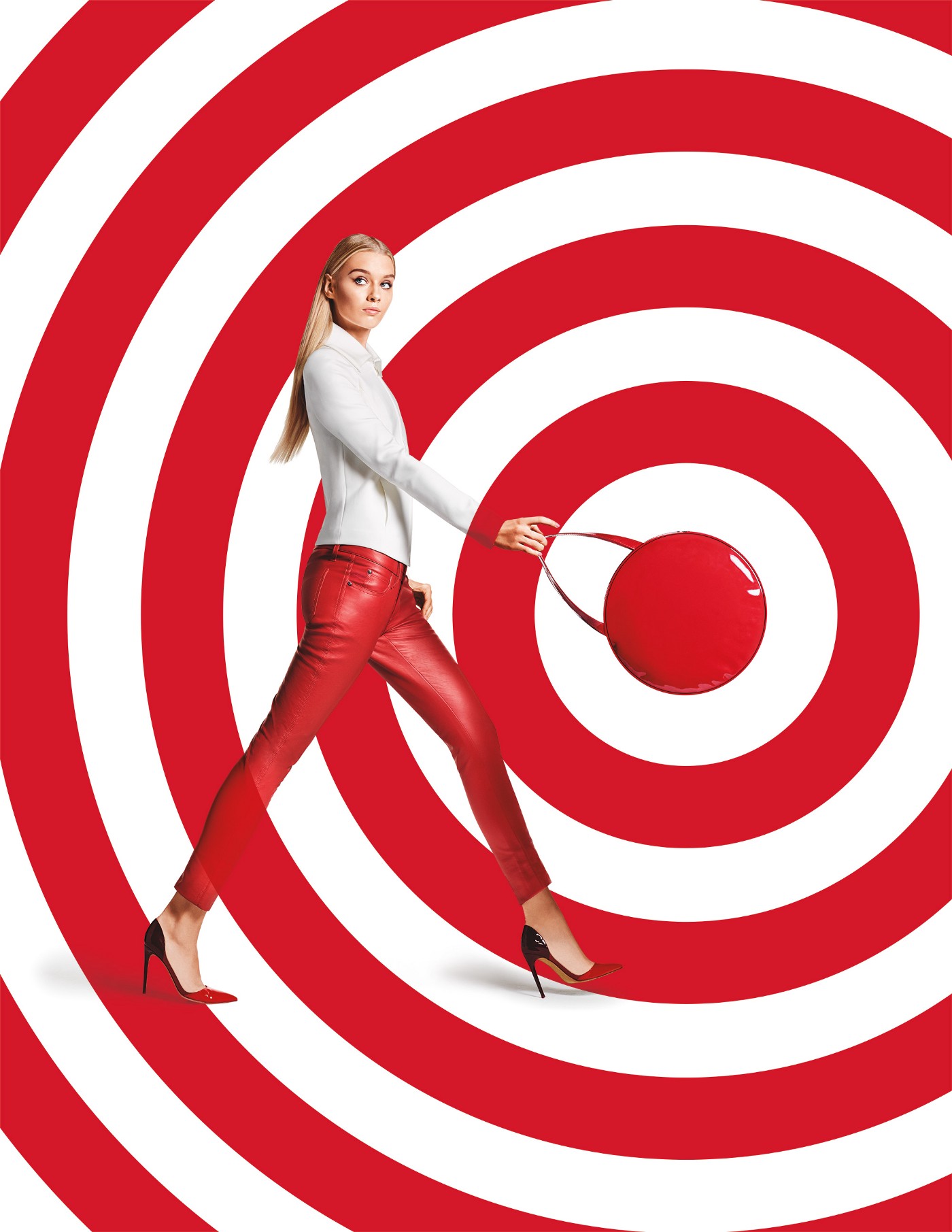
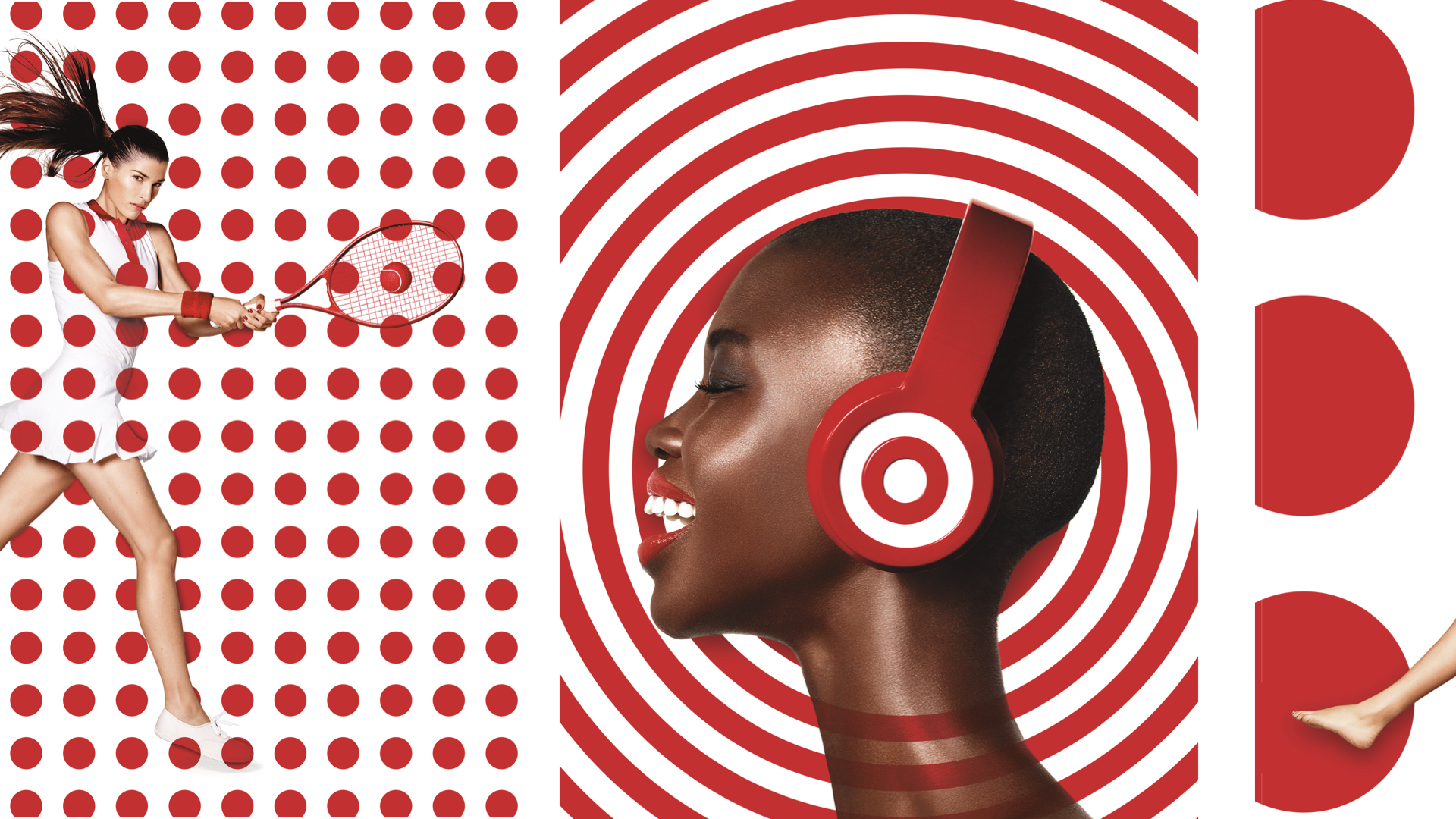
Target’s advertising lives in a world of red, white, and Helvetica.
Target has built a world of red, white, and Helvetica. Its customers know that world and trust it. But if Target decided to suddenly throw in blue, straying from the rules they’ve consistently followed, its customers would scratch their heads.
When creating your own brand, your customers need to see consistency. They need to feel they are in the right place when they interact with your brand. Use brand identity guidelines to document your brand world’s internal logic. Every touchpoint a customer sees should have the same colors, typography, and art direction.
Our world has been established, so now we need characters to be in our story. All stories have a protagonist, the main character. Many stories pair that character up with a guide or mentor. For our purposes we’ll call them the hero and the guide.
Donald Miller in his book Building a StoryBrand: Clarify Your Message So Customers Will Listen, says that the hero is not the brand! Instead, the hero should be the customer, and the brand should be the guide. This makes sense when you stop to think about it: customers seek out new brands to buy from because they have a problem to solve. And by playing the part of the guide, brands have the opportunity to be the mentor, the facilitator.
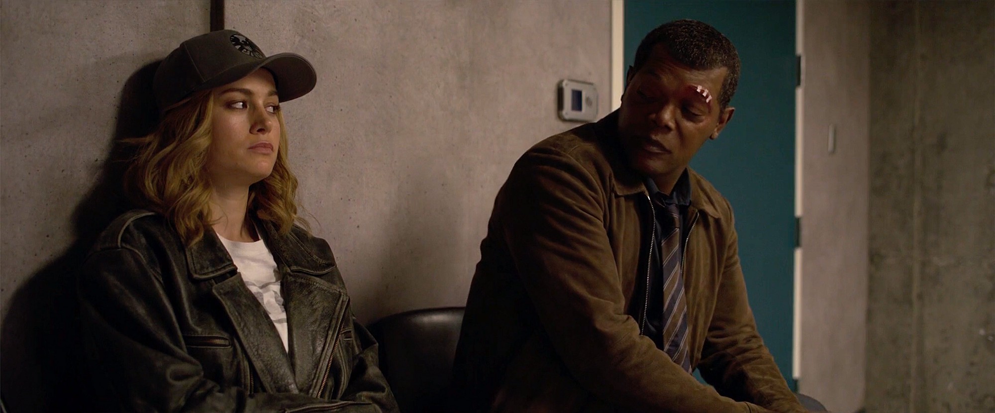
Captain Marvel has Nick Fury to show her around S.H.I.E.L.D. and Earth in the 1990s.
Luke Skywalker is mentored by Obi-Wan Kenobi who introduces him to the ways of the Force.
In fiction we all want to be the hero, not someone who is the helper to the hero. We want to be Captain Marvel who has Nick Fury to show her around Earth in the 1990s, or Luke Skywalker who is mentored by Obi-Wan Kenobi who introduces him to the ways of the Force. The guides are characters the heroes trust and look up to.
Nike’s ad campaigns celebrate the athlete within each of us.
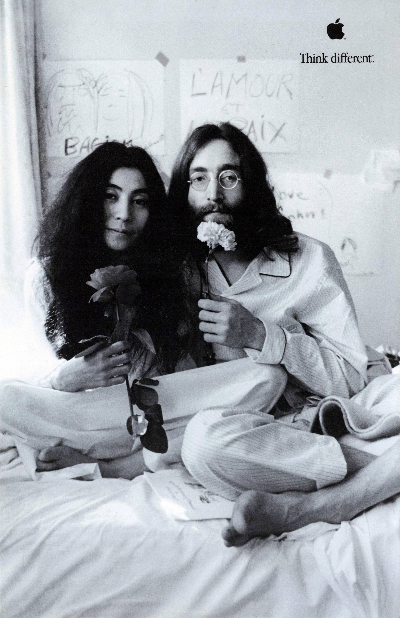
Apple’s “Think Different” campaign wasn’t about how they had the best computers, but about celebrating geniuses like John Lennon and Yoko Ono.
All stories have a plot, something that happens. Sometimes those plots are thin, simple, or dense and convoluted. But the best, most popular stories can be distilled to a very simple formula. Miller in his book outlines this structure as follows:
StoryBrand Framework by Donald Miller.
Let’s apply it to one of my favorite movies, Star Wars:
StoryBrand framework applied to Star Wars
While Miller’s StoryBrand framework is geared towards marketing and messaging, I believe we can extend it to user experience and product design as well. Remember that the hero is the customer or the user. And our product is the plot through which our hero can solve their problem.
For fun, let’s apply this framework to Dropbox:
For the user to trust Dropbox with her files, Dropbox’s brand identity needs to be consistent from its advertising and marketing, to its landing page and website, and finally to its application. Remember their world needs to stay internally logical by using the same color, fonts, imagery, and even brand voice.
In 2008 Marvel began their incredibly ambitious MCU movies with Iron Man. But from that very first movie, they started to build their world. They introduced us to new characters with subsequent films and wielded familiar story beats while bringing something new. Ultimately over the course of 23 interconnected movies, they created millions of fans worldwide who collectively spent more than $22 billion at the box office.
We’ve already mentioned Nike, Apple, Target, and Dropbox, but what about a newer brand that’s doing this right? Slack.
From day one Slack built personality into the design of their product. Their quirky plaid pattern and colors in their hashtag logo made its way to the product, allowing users to customize their own workspaces with themes. Their UX copy is charming, personable. In other words, Slack’s brand from the colors to the fonts to the brand voice is infused from their marketing website all the way into their product. And this attention to design as story has helped drive Slack to over ten million daily active users, and propelled the company’s valuation to $20 billion when they IPO’d.
Design as storytelling is an incredibly powerful tool to build a brand, create a better product, and promote fanaticism. As young startups enter an increasingly crowded marketplace, they need to differentiate through memorable and consistent branding. And they can by incorporating storytelling in their design.
The Apple Mac turned 30 years old today. I got my first Mac in 1985 actually after weeks if not months of convincing my father to spend his hard-earned money on it. Every weekend and after many school days, I’d take the bus over to Computerland on Van Ness in San Francisco and just play with the Mac on display for hours at a time.
Embarrassingly this is one of my first MacPaint paintings. Bear in mind that I was 12 years old at the time.
Watching the premiere of Mad Men season six, I loved that Peggy Olson blasted her creative team for bringing her three variations on the same idea. These are words to remember.
Those are three different versions of the same idea.
If you can’t tell the difference between which part’s the idea and which part’s the execution of the idea, you’re of no use to me.
…Well I’m sorry to point it out, but you’re walking over the same ground. When you bring me something like this, it looks like cowardice.
I have been a Mac user since 1985, when I was in the seventh grade. For months I lusted after the Mac on display at Computerland on Van Ness Avenue in San Francisco. I’d go there after school just to play with MacPaint. It simply captured my imagination. Finally, after many weeks of begging, I got my dad to buy me a 512K Mac. Thus began my love affair with Apple.
Imagine how lucky I felt when I actually began working on the brand and on Pixar in 2001-2002. It was such a privilege to be so close to the magic and to Steve Jobs himself.
The Steve Jobs I knew was human. Not a god. Not someone who could distort reality. Just a man.
But he was sharp and always focused with his opinions and observations. He demanded perfection. Always.
I was a lowly pixel pusher when I worked directly with him. In addition to Pixar.com, I also designed some pitch slides for him. His feedback was always direct and always right. Yes it was surreal to have him call me on the phone and for me to load slides on his Mac.
Near the end of my tenure at Pixar, I wanted to do more. I was hoping to build a little design department there. But Steve didn’t think I was ready, and he told me so—directly. Even though I was crushed at the time, it was probably one of the best pushes I ever got to do better, to stay hungry, and to stay foolish.
Thank you, Steve. You changed me—and more importantly, the world—for the better.
With everyone sharing their sweet Steve moments, I have to share mine.
I was working at Apple in the motion graphics group within the Graphic Design department. I was assigned to work on the intro animation for the Mac OS X 10.3 Panther setup assistant. We went through the normal design process with our stakeholders (people in charge of “MacBuddy”) and got to an animation that was essentially swarms of dots that formed each of the different translations of “Welcome” on the screen. And then we showed this nearly-final animation to someone higher at the top—forgive me, I’ve forgotten who this was—and he killed it because the dots looked too much like sperm. OK, they kinda did. (Think about swirling points of light but with motion trails. We tried increasing the motion blur, but it was no use.)
It was back to the drawing board and I presented more ideas. Eventually, Steve got involved and started looking at the animations. Each week my boss would show Steve a new revision of it, and each time we got a little closer. Then on Round 14, the week my boss was on vacation, I had to go present it to Steve Jobs.
He was eager to see this new revision. No pleasantries. No introductions (actually he knew me from Pixar). Just got right down to business. But he did say this to me, “Wow. We spend more time on MacBuddy than Microsoft does on all of its UI.” And then he chuckled.
The presentation was quick and he only had a couple of pretty minor notes. I think I had one more revision and it was finally done.
What my time at Apple and working with Steve taught me was this: Keep going until it’s right. Don’t settle.
Thank you, Steve.
“1000+” should be a familiar number for Google Reader users. My RSS feeds have been neglected in past months. Emails from AdAge.com, Creativity-Online, and links from friends go unread and unclicked. I’ve just been running 100 miles per hour at work. This is not to slam my current employer (because I truly like working here), but more of an observation.
If we creatives are always so busy with projects, and never take the time to look up, take off our headphones and find inspiration, our work will suffer. Our work will stagnate. Our work will suck.
So this is a reminder to myself (and to other creatives) to take a bit of time each day to remain inspired. Surf the web. Watch TV. See a movie in a theater. Listen to new music. Read a magazine or a book. Go to a bookstore. Go to a museum. Go hiking.
Eric Baker spends 30 minutes every day scouring the web for inspirational images. He shares them regularly on Design Observer.
And I’ve started to try to gather images and links that delight me in a couple of Tumblr blogs (ELT and ___ is awesome.)
This is also a reminder to managers of creatives: you must let them play. You have to structure your organization and processes to allow creative folks time to recharge and get inspired. Google’s 20% time is a great example of how structuring some R&D/inspiration time can yield results. The Scotch Tape and Post-it Notes were invented by engineers at 3M during their 15% time. Or taken to the extreme, Stefan Sagmeister closes his studio every seven years for a yearlong sabbatical to get inspired again.
Now how can I get someone to pay me for a sabbatical?
In the age of digital and social media, and in the age of realtime marketing, what matters more? The big idea or the smaller idea and execution?
Many digital agencies have been experimenting with new ways of working to try to get at those ideas and executions that a traditional agency couldn’t dream of. I was working at Organic when we rolled out the “Three Minds” initiative, meaning that for every brainstorm, we needed to have at least three people from three disciplines in the room. This is similar to what Big Spaceship has been trying to do by throwing together teams of creatives, strategists, technologists and production.
Digital agencies think that this is a point of differentiation. They think that online, social and viral are so complex that they need all this brainpower to figure it out. What ends up happening when you put a technologist and/or producer into a room with creatives? Executions. It’s a natural and inevitable thing. And I believe it’s a distraction from getting to a better and bigger idea.
I believe that when you add in people whose jobs are to make things (technologists build, producers produce, etc.) too early in the creative process, before the idea is baked, you shortchange the idea. The idea becomes smaller and less compelling.
Creative teams go there all the time too. Too often do I hear an art director or copywriter say “OK, so the idea is a game within a banner.” No. That’s not the idea. That’s an execution. What’s the idea?
People may argue that the mass audience doesn’t care about the idea; all people will remember is the commercial, billboard or Facebook app (no one remembers banners). I disagree. People remember the campaign which was essentially that story dreamt up one late night in a conference room by a creative partnership.
In the traditional advertising agency model, the two-person copywriter and art director partnership is designed to tell stories. The idea isn’t a TV spot, a print ad or a billboard. The idea isn’t a banner, a microsite or a Facebook app. The idea is a story. It’s a story with a hook, that draws people in, makes them feel something and act on that. And as humans, we love stories.
I believe that for digital agencies to compete with the traditional ones, they need to be better at developing compelling ideas. A big traditional shop can always farm out a digital execution, but digital agencies can’t farm out the idea generation.
The design blog that connects the dots others miss. Written by Roger Wong.
If you’re new here, check out what others are reading in the Popular feed.