Skip to content

52 posts tagged with “apple”

Last September I wrote about why we still need a HyperCard for the AI era—a tool that’s accessible but controllable, that lets everyday people build and share software without needing to be developers. John Allsopp sees the demand side of that equation already arriving.

Writing on LinkedIn, he starts with his 13-year-old daughter sending him a link to Aippy, a platform where people create, share, and remix apps like TikTok videos. It already has thousands of apps on it:

Millions of people who have never written a line of code are starting to build applications — not scripts or simple automations, but genuine applications with interfaces and logic and persistence.

The shift Allsopp describes isn’t just about who’s building. It’s about how software spreads:

This pattern — creation, casual sharing, organic spread — looks a lot more like how content moves on TikTok or Instagram than how apps move through the App Store. Software becomes something you make and share, and remix. Not something you publish and sell. It surfaces through social connections and social discovery, not through store listings and search rankings.

And the platforms we have aren’t built for it. Allsopp points out that the appliance model Apple introduced in 2007 made sense for an audience that was intimidated by technology. That audience grew up:

The platforms designed to protect users from complexity are now protecting users from their own creativity and that of their peers.

This is the world I was writing about in “Why We Still Need a HyperCard for the AI Era.” I argued for tools with direct manipulation, technical abstraction, and local distribution—ingredients HyperCard had that current AI coding tools still miss. Allsopp is describing the audience those tools need to serve. The gap between the two is where the opportunity sits.

Article: Here Comes Everybody (Again) — John Allsopp / 27th January, 2026

Here Comes Everybody (Again)

Clay Shirky’s Here Comes Everybody (2008) was about the democratisation of coordination…what happens when everybody builds. Shirky’s vision of a world where “people are given the tools to do things together, without needing traditional organizational structures” didn’t pan out quite as optimisticall

linkedin.com iconlinkedin.com

Daniel Kennett dug out his old Mac Pro to revisit Aperture, the photo app Apple discontinued in 2015:

It’s hard to overstate quite how revolutionary and smooth this flow is until you had it for multiple years before having it taken away. Nothing on the market—even over a decade later—is this good at meeting you where you are and not interrupting your flow.

Kennett’s observation: Aperture came to you. Most software makes you go to it. You could edit a photo right on the map view, or while laying out a book page. No separate editing mode. Press H for the adjustments HUD, make your changes, done.

The cruel twist was Apple suggesting Photos as a replacement. Ten years later, photographers are still grumbling about it in comment sections.

Aperture screenshot: map of Le Sauze-du-Lac with pins; left Library sidebar; right Adjustments panel; filmstrip thumbnails.

Daniel Kennett - A Lament For Aperture, The App We'll Never Get Over Losing

I’m an old Mac-head at heart, and I’ve been using Macs since the mid 1990s (the first Mac I used was an LC II with System 7.1 installed on it). I don’t tend to _genuinely_ think that the computing experience was better in the olden days — sure, there’s a thing to be said about the simplicity of older software, but most of my fondness for those days is nostalgia.

ikennd.ac iconikennd.ac

There’s a design principle I return to often: if everything is emphasized, nothing is. Bold every word in a paragraph and you’ve just made regular text harder to read. Highlight every line in a document and you’ve defeated the purpose of highlighting.

Nikita Prokopov applies this to Apple’s macOS Tahoe, which adds icons to nearly every menu item:

Perhaps counter-intuitively, adding an icon to everything is exactly the wrong thing to do. To stand out, things need to be different. But if everything has an icon, nothing stands out.

The whole article is a detailed teardown of the icon choices—inconsistent metaphors, icons reused for unrelated actions, details too small to parse at 12×12 effective pixels. But the core problem isn’t execution. It’s the premise.

Prokopov again:

It’s delusional to think that there’s a good icon for every action if you think hard enough. There isn’t. It’s a lost battle from the start.

What makes this such a burn is that Apple knew better. Prokopov pulls from the 1992 Macintosh Human Interface Guidelines, which warned that poorly used icons become “unpleasant, distracting, illegible, messy, cluttered, confusing, frustrating.” Thirty-two years later, Apple built exactly that.

This applies beyond icons. Any time you’re tempted to apply something universally—color, motion, badges, labels—ask whether you’re helping users find what matters or just adding visual noise. Emphasis only works through contrast.

Yellow banner with scattered black UI icons, retro Mac window at left, text: It's hard to justify Tahoe icons — tonsky.me

It’s hard to justify Tahoe icons

Looking at the first principles of icon design—and how Apple failed to apply all of them in macOS Tahoe

tonsky.me icontonsky.me

When I worked at LEVEL Studios (which became Rosetta) in the early 2010s, we had a whole group dedicated to icon design. It was small but incredibly talented and led by Jon Delman, a master of this craft. And yes, Jon and team designed icons for Apple.

Those glory days are long gone and the icons coming out of Cupertino these days are pedestrian, to put it gently. The best observation about Apple’s icon decline comes from Héliographe, via John Gruber:

If you put the Apple icons in reverse it looks like the portfolio of someone getting really really good at icon design.

Row of seven pen-and-paper app icons showing design evolution from orange stylized pen to ink bottle with fountain pen.

Posted by @heliographe.studio on Threads

Seven Pages icons from newest to oldest, each one more artistically interesting than the last. The original is exquisite. The current one is a squircle with a pen on it.

This is even more cringe-inducing when you keep in mind something Gruber recalls from a product briefing with Jony Ive years ago:

Apple didn’t change things just for the sake of changing them. That Apple was insistent on only changing things if the change made things better. And that this was difficult, at times, because the urge to do something that looks new and different is strong, especially in tech.

Apple’s hardware team still operates this way. An M5 MacBook Pro looks like an M1 MacBook Pro. An Apple Watch Series 11 is hard to distinguish from a Series 0. These designs don’t change because they’re excellent.

The software team lost that discipline somewhere. Gruber again:

I know a lot of talented UI designers and a lot of insightful UI critics. All of them agree that MacOS’s UI has gotten drastically worse over the last 10 years, in ways that seem so obviously worse that it boggles the mind how it happened.

The icons are just the most visible symptom. The confidence to not change something—to trust that the current design is still the best design—requires knowing the difference between familiarity and complacency. Somewhere along the way, Apple’s software designers stopped being able to tell.

Centered pale gray circle with a dark five-pointed star against a muted blue-gray background

Thoughts and Observations Regarding Apple Creator Studio

Starting with a few words on the new app icons.

daringfireball.net icondaringfireball.net

On Corporate Maneuvers Punditry

Mark Gurman, writing for Bloomberg:

Meta Platforms Inc. has poached Apple Inc.’s most prominent design executive in a major coup that underscores a push by the social networking giant into AI-equipped consumer devices.

The company is hiring Alan Dye, who has served as the head of Apple’s user interface design team since 2015, according to people with knowledge of the matter. Apple is replacing Dye with longtime designer Stephen Lemay, according to the people, who asked not to be identified because the personnel changes haven’t been announced.

I don’t regularly cover personnel moves here, but Alan Dye jumping over to Meta has been a big deal in the Apple news ecosystem. John Gruber, in a piece titled “Bad Dye Job” on his Daring Fireball blog, wrote a scathing takedown of Dye, excoriating his tenure at Apple and flogging him for going over to Meta, which is arguably Apple’s arch nemesis.

Putting Alan Dye in charge of user interface design was the one big mistake Jony Ive made as Apple’s Chief Design Officer. Dye had no background in user interface design — he came from a brand and print advertising background. Before joining Apple, he was design director for the fashion brand Kate Spade, and before that worked on branding for the ad agency Ogilvy. His promotion to lead Apple’s software interface design team under Ive happened in 2015, when Apple was launching Apple Watch, their closest foray into the world of fashion. It might have made some sense to bring someone from the fashion/brand world to lead software design for Apple Watch, but it sure didn’t seem to make sense for the rest of Apple’s platforms. And the decade of Dye’s HI leadership has proven it.

I usually appreciate Gruber’s writing and take on things. He’s unafraid to tell it like it is and to be incredibly direct. Which makes people love him and fear him. But in paragraph after paragraph, Gruber just lays in on Dye.

It’s rather extraordinary in today’s hyper-partisan world that there’s nearly universal agreement amongst actual practitioners of user-interface design that Alan Dye is a fraud who led the company deeply astray. It was a big problem inside the company too. I’m aware of dozens of designers who’ve left Apple, out of frustration over the company’s direction, to work at places like LoveFrom, OpenAI, and their secretive joint venture io. I’m not sure there are any interaction designers at io who aren’t ex-Apple, and if there are, it’s only a handful. From the stories I’m aware of, the theme is identical: these are designers driven to do great work, and under Alan Dye, “doing great work” was no longer the guiding principle at Apple. If reaching the most users is your goal, go work on design at Google, or Microsoft, or Meta. (Design, of course, isn’t even a thing at Amazon.) Designers choose to work at Apple to do the best work in the industry. That has stopped being true under Alan Dye. The most talented designers I know are the harshest critics of Dye’s body of work, and the direction in which it’s been heading.

Designers can be great at more than one thing and they can evolve. Being in design leadership does not mean that you need to be the best practitioner of all the disciplines, but you do need to have the taste, sensibilities, and judgement of a good designer, no matter how you started. I’m a case in point. I studied traditional graphic design in art school. But I’ve been in digital design for most of my career now, and product design for the last 10 years.

Has UI over at Apple been worse over the last 10 years? Maybe. I will need to analyze things a lot more carefully. But I vividly remember having debates with my fellow designers about Mac OS X UI choices like the pinstriping, brushed metal, and many, many inconsistencies when I was working in the Graphic Design Group in 2004. UI design has never been perfect in Cupertino.

Alan Dye isn’t a CEO and wasn’t even at the same exposure level as Jony Ive when he was still at Apple. I don’t know Dye, though we’re certainly in the same design circles—we have 20 shared connections on LinkedIn. But as far as I’m concerned, he’s a civilian because he kept a low profile, like all Apple employees.

The parasocial relationships we have with tech executives is weird. I guess it’s one thing if they have a large online presence like Instagram’s Adam Mosseri or 37signals’ David Heinemeier Hansson (aka DHH), but Alan Dye made only a couple appearances in Apple keynotes and talked about Liquid Glass. In other words, why is Gruber writing 2,500 words in this particular post, and it’s just one of five posts covering this story!

Anyway, I’m not a big fan of Meta, but maybe Dye can bring some ethics to the design team over there. Who knows. Regardless, I am wishing him well rather than taking him down.

Hard to believe that the very first fully computer animated feature film came out 30 years ago. To say that Toy Story was groundbreaking would be an understatement. If you look at the animated feature landscape today, 100% is computer-generated.

In this re-found interview with Steve Jobs exactly a year after the movie premiered in theaters, Jobs talks about a few things, notably how different Silicon Valley and Hollywood were—and still are.

From the Steve Jobs Archive:

In this footage, Steve reveals the long game behind Pixar’s seeming overnight success. With striking clarity, he explains how its business model gives artists and engineers a stake in their creations, and he reflects on what Disney’s hard-won wisdom taught him about focus and discipline. He also talks about the challenge of leading a team so talented that it inverts the usual hierarchy, the incentives that inspire people to stay with the company, and the deeper purpose that unites them all: to tell stories that last and put something of enduring value into the culture.  

Play

And Jobs in his own words:

Well, in this blending of a Hollywood  culture and a Silicon Valley culture, one of the things that we encountered was  that the Hollywood culture and the Silicon Valley culture each used different models of  employee retention. Hollywood uses the stick, which is the contract, and Silicon Valley  uses the carrot, which is the stock option. And we examined both of those in really pretty  great detail, both economically, but also psychologically and culture wise, what kind of  culture do you end up with. And while there’s a lot of reasons to want to lock down your  employees for the duration of a film because, if somebody leaves, you’re at risk, those  same dangers exist in Silicon Valley. During an engineering project, you don’t want to lose people, and yet, they managed to evolve another system than contracts. And we preferred the Silicon Valley model in this case, which basically gives people stock in the company so that we all have the same goal, which is to create shareholder value. But also, it makes us constantly worry about making Pixar the greatest company we can  so that nobody would ever want to leave. 

Large serif headline "Pixar: The Early Days" on white background, small dotted tree logo at bottom-left.

Pixar: The Early Days

A never-before-seen 1996 interview

stevejobsarchive.com iconstevejobsarchive.com

Mnemonics—short audio branding—is one of those trends that come and go. The one for Intel was pretty well-known for a long time and spurred the creation of similar sonic identities (e.g., T-Mobile, Netflix). Apple announced in mid-October that they were dropping the “Plus” from their streaming service to be known simply as “Apple TV.” The news spurred a bunch of punditry around probable confusion with the Apple TV app and Apple TV hardware device.

Yesterday, Apple shared the new identity work that drops the ”+” from the streaming service name and logo. It’s in the form of the opening logo and mnemonic that will appear in front of shows.

Here is a longer version that’ll appear before films.

In an interview, Finneas O’Connell (who goes by his stage name Finneas), brother of pop star Billie Eilish and her main collaborator, spilled the beans on how he came up with it. Chris Willman, writing for Variety:

Speaking via Zoom from his home studio, Finneas points to the piano behind him as a starting point for a fleeting piece of music whose instrumentation isn’t easy to pin down before it’s gone in one ear and out the other at the start of a viewing experience. “I have my upright piano back here, so I sat and started there. I’m always more able to make something quickly on a real instrument than I am with software. I played a chord that felt kind of hopeful and kind of optimistic, but had gravity to it and hopefully had a little bit of an enigmatic, mysterious quality. And so I had this chord thing happening and then I started building the sounds around it. I had these pieces of zinc and I was hitting them and then reversing the audio, and I was playing real piano and then reversing that, and playing these bass synthesizers and then pitching those up and gliding them down.”

Beyond the cool sound, I love how the logo sting seems to be inspired by early TV logo idents like this one for NBC from 1967.

Update November 6, 2025 3:00 PM PT:

Ad Age reports that the logo sting was filmed in-camera! Writing in the industry mag, Tim Nudd says the branding was done by Apple’s longtime agency TBWA\Media Arts Lab and production company Optical Arts, and that its “lush visuals are meant to capture the platform’s cinematic ambitions and remind viewers that Apple TV is where prestige storytelling lives.”

The report includes a link to a 33-second behind-the-scenes video:

Smiling man with shoulder-length red hair and beard in a black suit next to a black panel with iridescent Apple TV logo

Finneas on Creating a New Mnemonic Intro for Apple Originals — His Shortest Music Ever, but Possibly Soon to Be the Most Ubiquitous (EXCLUSIVE)

Finneas talks the assignment to do his shortest piece of music ever — the few seconds of sound that will precede every Apple TV program from now on.

variety.com iconvariety.com

Did you know that Apple made Office before Microsoft made Office? It was called AppleWorks and launched in 1984 for the Apple II. They’d make it for the Mac in 1991 and called it ClarisWorks because Apple spun off a software subsidiary for who knows what reason.

Howard Oakley recently wrote a brief history of AppleWorks and shared some nice visuals. Though I wished he included an image from that original Apple II text-based AppleWorks as well.

AppleWorks screenshot: Certificate of Achievement for Marcia Marks, ornate black border, yellow seal, color palette panel

A brief history of AppleWorks

It took 7 years for it to become available for the Mac, changed names and hands twice, but somehow survived until 2007.

eclecticlight.co iconeclecticlight.co

Nielsen Norman Group weighs in on iOS 26 Liquid Glass. Predictably, they don’t like it. Raluca Budiu:

With iOS 26, Apple seems to be leaning harder into visual design and decorative UI effects — but at what cost to usability? At first glance, the system looks fluid and modern. But try to use it, and soon those shimmering surfaces and animated controls start to get in the way.

I get it. Flat—or mostly flat—and static UI conforms to the heuristics. But honestly, it can get boring and homogenous quickly. Put the NNg microscope on any video game UI and it’ll be torn to shreds, despite gamers learning to adapt quickly.

I’ve had iOS 26 on my phone for just a couple of weeks. I continue to be delighted by the animations and effects. So far, nothing has hindered the usability for me. We’ll see what happens as more and more apps get translated.

Liquid Glass Is Cracked, and Usability Suffers in iOS 26

Liquid Glass Is Cracked, and Usability Suffers in iOS 26

iOS 26’s visual language obscures content instead of letting it take the spotlight. New (but not always better) design patterns replace established conventions.

nngroup.com iconnngroup.com

As much as I defended the preview, and as much as Apple wants to make Liquid Glass a thing, the new UI is continuing to draw criticism. Dan Moren for Six Colors:

“Glass” is the overall look of these updates, and it’s everywhere. Transparent, frosted, distorting. In some places it looks quite cool, such as in the edge distortion when you’re swiping up on the lock screen. But elsewhere, it seems to me that glass may not be quite the right material for the job. The Glass House might be architecturally impressive, but it’s not particularly practical.

It’s also a definite philosophical choice, and one that’s going to engender some criticism—much of it well-deserved. Apple has argued that it’s about getting controls out of the way, but is that really what’s happening here? It’s hard to argue that having a transparent button sitting right on top of your email is helping that email be more prominent. To take this argument to its logical conclusion, why is the keyboard not fully transparent glass over our content?

I’ve yet to upgrade myself. I will say that everyone dislikes change. Lest we forget that the now-ubiquitous flat design introduced by iOS 7 was also criticized.

preview-1758732622764.png

iOS 26 Review: Through a glass, liquidly

iOS 26! It feels like just last year we were here discussing iOS 18. How time flies. After a year that saw the debut of Apple Intelligence and the subsequent controversy over the features that it d…

sixcolors.com iconsixcolors.com

Ah, this brings back memories! I spent so much time in MacPaint working with these patterns when I was young. Paul Smith faithfully recreates them:

I was working on something and thought it would be fun to use one of the classic Mac black-and-white patterns in the project. I’m talking about the original 8×8-pixel ones that were in the original Control Panel for setting the desktop background and in MacPaint as fill patterns.

I figured there’d must be clean, pixel-perfect GIFs or PNGs of them somewhere on the web. And perhaps there are, but after poking around a bit, I ran out of energy for that, but by then had a head of steam for extracting the patterns en masse from the original source, somehow. Then I could produce whatever format I needed for them.

preview-1757693571067.png

Classic 8×8-pixel B&W Mac patterns

TL;DR: I made a website for the original classic Mac patterns I was working on something and thought it would be fun to use one of the classic Mac black-and-white patterns in the project. I'm talking about the original 8×8-pixel ones that were in the...

pauladamsmith.com iconpauladamsmith.com
Still from a video shown at Apple Keynote 2025. Split screen of AirPods Pro connection indicator on left, close-up of earbuds in charging case on right.

Notes About the September 2025 Apple Event

Today’s Apple keynote opened with a classic quote from Steve Jobs.

Steve Jobs quote at Apple Keynote 2025 – Black keynote slide with white text: “Design is not just what it looks like and feels like. Design is how it works.” – Steve Jobs.

Then a video played, focused on the fundamental geometric shapes that can be found in Apple’s products: circles in the HomePod, iPhone shutter button, iPhone camera, MagSafe charging ring, Digital Crown on Apple Watch; rounded squares in the charging block, Home scene button, Mac mini, keycaps, Finder icon, FaceID; to the lozenges found in the AirPods case, MagSafe port, Liquid Glass carousel control, and the Action button on Apple Watch Ultra.

It’s no secret that I am a big fan of Severance, the Apple TV+ show that has 21 Emmy nominations this year. I made a fan project earlier in the year that generates Outie facts for your Innie.

After launching a teaser campaign back in April, Atomic Keyboard is finally taking pre-orders for their Severance-inspired keyboard just for Macrodata Refinement department users. The show based the MDR terminals on the Data General Dasher D2 terminal from 1977. So this new keyboard includes three layouts:

  1. “Innie” which is show-accurate, meaning no Escape, no Option, and no Control keys, and includes the trackball
  2. “Outie,” a 60% layout that includes modern modifier keys and the trackball
  3. “Dasher” which replicates the DG terminal layout

It’s not cheap. The final retail price will be $899, but they’re offering a pre-Kickstarter price of $599.

preview-1752862402377.png

MDR Dasher Keyboard | For Work That's Mysterious & Important

Standard equipment for Macrodata Refinement: CNC-milled body, integrated trackball, modular design. Please enjoy each keystroke equally.

mdrkeyboard.com iconmdrkeyboard.com

John Calhoun joined Apple 30 years ago as a programmer to work on the Color Picker.

Having never written anything in assembly, you can imagine how overjoyed I was. It’s not actually a very accurate analogy, but imagine someone handing you a book in Chinese and asking you to translate it into English (I’m assuming here that you don’t know Chinese of course). Okay, it wasn’t that hard, but maybe you get a sense that this was quite a hurdle that I would have to overcome.

Calhoun was given an old piece of code and tasked with updating it. Instead, he translated it into a programming language he knew—C—and then decided to add to the feature. He explains:

I disliked HSL as a color space, I preferred HSV (Hue, Saturation, Value) because when I did artwork I was more comfortable thinking about color in those terms. So writing an HSV color picker was on my short list.

When I had my own color picker working I think I found that it was kind of fun. Perhaps for that reason, I struck out again and wrote another color picker. The World Wide Web (www) was a rather new thing that seemed to be catching on, so I naturally thought that an HTML color picker made sense. So I tackled that one as well. It was more or less the RGB color picker but the values were in hexadecimal and a combined RGB string value like “#FFCC33” was made easy to copy for the web designer.

So an engineer decided, all on his own, that he’d add a couple extra features. Including the fun crayon picker:

On a roll, I decided to also knock out a “crayon picker”. At this point, to be clear, the color picker was working and I felt I understood it well enough. As I say, I was kind of just having some fun now.

Screenshot of a classic Mac OS color picker showing the “Crayon Picker” tab. A green color named “Watercress” is selected, replacing the original orange color. Options include CMYK, HLS, and HSV pickers on the left.

And Calhoun makes this point:

It was frankly a thing I liked about working for Apple in those days. The engineers were the one’s driving the ship. As I said, I wrote an HSV picker because it was, I thought, a more intuitive color space for artists. I wrote the HTML color picker because of the advent of the web. And I wrote the crayon picker because it seemed to me to be the kind of thing Apple was all about: HSL, RGB — these were kind of nerdy color spaces — a box of crayons is how the rest of us picked colors.

Making software—especially web software—has matured since then, with product managers and designers now collaborating closely with engineers. But with AI coding assistants, the idea of an individual contributor making solo decisions and shipping code might become de rigueur again.

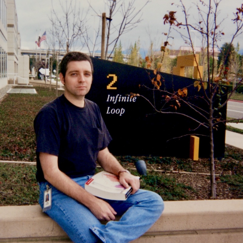
Man sitting outside 2 Infinite Loop, Apple’s former headquarters in Cupertino, holding a book with an ID badge clipped to his jeans.

Almost Fired

I was hired on at Apple in October of 1995. This was what I refer to as Apple’s circling the drain period. Maybe you remember all the doomsaying — speculation that Apple was going to be shuttering soon. It’s a little odd perhaps then that they were hiring at all but apparently Apple reasoned that they nonetheless needed another “graphics engineer” to work on the technology known as QuickdrawGX. I was then a thirty-one year old programmer who lived in Kansas and wrote games for the Macintosh — surely, Apple thought, I would be a good fit for the position.

engineersneedart.com iconengineersneedart.com

Let’s continue down Mac memory lane with this fun post from Basic Apple Guy:

With macOS 26, Apple has announced a dramatically new look to their UI: Liquid Glass. Solid material icon elements give way to softer, shinier, glassier icons. The rounded rectangle became slightly more rounded, and Apple eliminated the ability for icon elements to extend beyond the icon rectangle (as seen in the current icons for GarageBand, Photo Booth, Dictionary, etc.).

With this release being one of the most dramatic visual overhauls of macOS’s design, I wanted to begin a collection chronicling the evolution of the system icons over the years. I’ve been rolling these out on social media over the past week and will continue to add to and update this collection slowly over the summer. Enjoy!

preview-1752036853593.png

macOS Icon History

Documenting the evolution of macOS system icons over the past several decades.

basicappleguy.com iconbasicappleguy.com

This is an amazing article and website by Marcin Wichary, the man behind the excellent Shift Happens book.

…I had a realization that the totemic 1984 Mac control panel, designed by Susan Kare, is still to this day perhaps the only settings screen ever brought up in casual conversation.

I kept wondering about that screen, and about what happened since then. Turns out, the Mac settings have lived a far more fascinating life than I imagined, have been redesigned many times, and can tell us a lot about the early history and the troubled upbringing of this interesting machine.

Indeed, Wichary goes through multiple versions of Mac operating systems and performs digital paleontology, uncovering long lost Settings minutiae. It’s also a great lesson in UI along the way. Be sure to click in the Mac screens.

preview-1752030135022.png

Frame of preference

A story of early Mac settings told by 10 emulators.

aresluna.org iconaresluna.org

It’s been said that desktop publishing democratized graphic design. For those of you too young to know what the term means, it means the technology that enabled graphic design to go digital. It was an ecosystem, really: the Mac, PostScript, LaserWriter, and PageMaker. But before all that, designers depended on typesetters to set type.

David Langton writing for UX Collective:

A lot was lost when the Macintosh wiped out the traditional typesetting industry. From the art of typography to the craft of typesetting, many essential elements were lost. Typesetters were part of a tradition that stretched back more than 500 years to Gutenberg’s printing press. They understood the basics of type: kerning (spacing between the letters), leading (the space between lines of text), and line breaks (how to avoid widows — those solo words abandoned at the end of a paragraph). They knew about readability (like how to avoid setting type that was too wide to read). There were classic yet limited fonts, with standards for size and leading that assured that everyone working within common ranges maintained a threshold for quality. Yet it was in the craft or business side of typesetting that these services were most under appreciated. Typesetters provided overnight service. They worked overnight, so graphic designers did not have to. We would finish our days specifying the type, and the typesetters would keystroke the manuscripts, proofread, stylize the type, and set up columns following our instructions.

Designers would then pick up the galleys from the typesetters in the morning. The black type was photographically printed on white photo paper. You’d have to cut them up and paste them onto boards, assembling your layout.

Because this was such a physical process, we had to slow down. Langton says:

But since the Macintosh became an in-house tool, the process was reversed. Now, designers design first, then think about it. This shift in process has contributed to a trivialization of the role of graphic designer because anyone can noodle around with the Mac’s sophisticated type tools and make layouts. The design process has been trivialized while the thinking, the evaluation, and the strategic part of the process are often abandoned.

One small thing I’ll point out is that desktop publishing wasn’t popularized until 1985.

  • PostScript was released by Adobe in 1984.
  • The LaserWriter printer was released by Apple in 1985.
  • PageMaker was released by Aldus—later bought by Adobe—in 1985.
preview-1750050186871.jpeg

What the 1984 Macintosh revolution teaches designers about the 2025 AI revolution

Upheaval and disruption are nothing new for graphic designers.

uxdesign.cc iconuxdesign.cc

Vincent Nguyen writing for Yanko Design, interviewing Alan Dye, VP of Human Interface Design at Apple:

This technical challenge reveals the core problem Apple set out to solve: creating a digital material that maintains form-changing capabilities while preserving transparency. Traditional UI elements either block content or disappear entirely, but Apple developed a material that can exist in multiple states without compromising visibility of underlying content. Dye’s emphasis on “celebrating user content” exposes Apple’s hierarchy philosophy, where the interface serves content instead of competing with it. When you tap to magnify text, the interface doesn’t resize but stretches and flows like liquid responding to pressure, ensuring your photos, videos, and web content remain the focus while navigation elements adapt around them.

Since the Jony Ive days, Apple’s hardware has always been about celebrating the content. Bezels got smaller. Screens got bigger and brighter. Even the flat design brought on by iOS 7 and eventually adopted by the whole ecosystem was a way to strip away the noise and focus on the content.

Dye’s explanation of the “glass layer versus application layer” architecture provides insight into how Apple technically implements this philosophy. The company has created a distinct separation between functional controls (the glass layer) and user content (the application layer), allowing each to behave according to different rules while maintaining visual cohesion. This architectural decision enables the morphing behavior Dye described, where controls can adapt and change while content remains stable and prominent.

The Apple platform UI today sort of does that, but Liquid Glass seems to take it even further.

Nguyen about his experience using the Music app on Mac:

The difference from current iOS becomes apparent in specific scenarios. In the current Music app, scrolling through your library feels like moving through flat, static layers. With Liquid Glass, scrolling creates a sense of depth. You can see your album artwork subtly shifting beneath the translucent controls, creating spatial awareness of where interface elements sit in relation to your content. The tab bar doesn’t just scroll with you; it creates gentle optical distortions that make the underlying content feel physically present beneath the glass surface.

preview-1749793045679.jpg

Apple’s Liquid Glass Hands-On: Why Every Interface Element Now Behaves Like Physical Material

Liquid Glass represents more than an aesthetic update or surface-level polish. It functions as a complex behavioral system, precisely engineered to dictate how interface layers react to user input. In practical terms, this means Apple devices now interact with interface surfaces not as static, interchangeable panes, but as dynamic, adaptive materials that fluidly flex and

yankodesign.com iconyankodesign.com

The Steve Jobs archive sharing a little behind-the-scenes of Jobs’s famous Stanford commencement speech:

The talk generated no small measure of anxiety for Steve. He had attended Reed College for only a few months before dropping out; now he would be speaking to graduates of one of the world’s top research universities, a place that meant a great deal to him. An intensely private man, Steve was not in the habit of talking about his personal journey—but he knew the occasion required it.

Steve Jobs has always had an aura of invincibility around him—a creative genius who could convince those around him and the world of anything he wanted using his “reality distortion field.” But he was also human.

I’m sure you’ve seen it before. But whether you’re 22 years old or 50, his advice still resonates. I love the clarity in this scaled-up version.

Play
preview-1749791832757.jpg

Stay Hungry, Stay Foolish

Marking the 20th anniversary of Steve Jobs’ 2005 Stanford commencement speech with a digitally enhanced version of the video as well as a behind-the-scenes look at how it came to be: from firsthand accounts from people who were connected to the commencement to Steve’s personal drafts.

stevejobsarchive.com iconstevejobsarchive.com
Collection of iOS interface elements showcasing Liquid Glass design system including keyboards, menus, buttons, toggles, and dialogs with translucent materials on dark background.

Breaking Down Apple’s Liquid Glass: The Tech, The Hype, and The Reality

I kind of expected it: a lot more ink was spilled on Liquid Glass—particularly on social media. In case you don’t remember, Liquid Glass is the new UI for all of Apple’s platforms. It was announced Monday at WWDC 2025, their annual developers conference.

The criticism is primarily around legibility and accessibility. Secondary reasons include aesthetics and power usage to animate all the bubbles.

I have relayed here before the story that I’ve been using Macs since 1985. It wasn’t the hardware that drew me in—it was MacPaint. I was always an artistic kid so being able to paint on a digital canvas seemed thrilling to me. And of course it was back then.

Behind MacPaint, was a man named Bill Atkinson. Atkinson died last Thursday, June 5 of pancreatic cancer. In a short remembrance, John Gruber said:

I say this with no hyperbole: Bill Atkinson may well have been the best computer programmer who ever lived. Without question, he’s on the short list. What a man, what a mind, what gifts to the world he left us.

I‘m happy that Figma also remembered Atkinson and that they are standing on his shoulders.

Every day at Figma, we wrestle with the same challenges Atkinson faced: How do you make powerful tools feel effortless? How do you hide complexity behind intuitive interactions? His fingerprints are on every pixel we push, every selection we make, every moment of creative flow our users experience.

preview-1749532457343.jpg

Bill Atkinson’s 10 Rules for Making Interfaces More Human

We commemorate the Apple pioneer whose QuickDraw and HyperCard programs made the Macintosh intuitive enough for nearly anyone to use.

figma.com iconfigma.com
Abstract gradient design with flowing liquid glass elements in blue and pink colors against a gray background, showcasing Apple's new Liquid Glass design language.

Quick Notes About WWDC 2025

Apple’s annual developer conference kicked off today with a keynote that announced:

  • Unified Version 26 across all Apple platforms (iOS, iPadOS, macOS, watchOS, tvOS, visionOS)
  • “Liquid Glass” design system. A complete UI and UX overhaul, the first major redesign since iOS 7
  • Apple Intelligence. Continued small improvements, though not the deep integration promised a year ago
  • Full windowing system on iPadOS. Windows comes to iPad! Finally.

Of course, those are the very high-level highlights.

Sebastiaan de With, former designer at Apple and currently co-founder and designer at Lux (makers of Halide, Kino, Spectre, and Orion) imagined what the next era in iOS design might be. (WWDC, Apple’s developer conference is next week. This is typically when they unveil the new operating systems that will launch in the fall. Rumors are flying as usual.)

But he starts with a history lesson:

Smart people study history to understand the future. If we were to categorize the epochs of iOS design, we could roughly separate them into the Shaded Age, the Adaptive Age, and the New Age.

The Shaded Age, or skeuomorphic age, took inspiration from the Dashboard feature of Mac OS X Tiger. And then the Flat Age brought on by the introduction of iOS 7.

de With’s concept mocks for the New Age are fantastic. Based on the physicality of visionOS, with specular highlights and reactive reflections, it’s luscious and reminds me of the first time I ever laid eyes on Aqua—the glossy, candy-like look of the original Mac OS X. Steve Jobs said at its introduction, “…one of the design goals was when you saw it you wanted to lick it.”

Close-up of a glass-rendered user interface

Sebastiaan de With: “Philosophically, if I was Apple, I’d describe this as finally having an interface that matches the beautiful material properties of its devices. All the surfaces of your devices have glass screens. This brings an interface of a matching material, giving the user a feeling of the glass itself coming alive.

preview-1749013108308.jpg

Physicality: the new age of UI

There’s a lot of rumors of a big impending UI redesign from Apple. Let’s imagine what’s (or what could be) next for the design of iPhones, Macs and iPads.

lux.camera iconlux.camera

OpenAI is acquiring a hardware company called “io” that Jony Ive cofounded just a year ago:

Two years ago, Jony Ive and the creative collective LoveFrom, quietly began collaborating with Sam Altman and the team at OpenAI.

It became clear that our ambitions to develop, engineer and manufacture a new family of products demanded an entirely new company. And so, one year ago, Jony founded io with Scott Cannon, Evans Hankey and Tang Tan.

We gathered together the best hardware and software engineers, the best technologists, physicists, scientists, researchers and experts in product development and manufacturing. Many of us have worked closely for decades.

The io team, focused on developing products that inspire, empower and enable, will now merge with OpenAI to work more intimately with the research, engineering and product teams in San Francisco.

It has been an open rumor that Sam Altman and Ive has been working together on some hardware. I had assumed they formalized their partnership already, but I guess not.

Play

There are some bold statements that Ive and Altman make in the launch video, teasing a revolutionary new device that will enable quicker, better access to ChatGPT. Something that is a lot less friction than how Altman explains in the video:

If I wanted to ask ChatGPT something right now about something we had talked about earlier, think about what would happen. I would like reached down. I would get on my laptop, I’d open it up, I’d launch a web browser, I’d start typing, and I’d have to, like, explain that thing. And I would hit enter, and I would wait, and I would get a response. And that is at the limit of what the current tool of a laptop can do. But I think this technology deserves something much better.

There are a couple of other nuggets about what this new device might be from the statements Ive and Altman made to Bloomberg:

…Ive and Altman don’t see the iPhone disappearing anytime soon. “In the same way that the smartphone didn’t make the laptop go away, I don’t think our first thing is going to make the smartphone go away,” Altman said. “It is a totally new kind of thing.”

“We are obviously still in the terminal phase of AI interactions,” said Altman, 40. “We have not yet figured out what the equivalent of the graphical user interface is going to be, but we will.”

While we don’t know what the form factor will be, I’m sure it won’t be a wearable pin—ahem, RIP Humane. Just to put it out there—I predict it will be a voice assistant in an earbud, very much like the AI in the 2013 movie “Her.” Altman has long been obsessed with the movie, going as far as trying to get Scarlett Johansson to be one of the voices for ChatGPT.

EDIT 5/22/2025, 8:58am PT: Added prediction about the form factor.

preview-1747889382686.jpg

Sam and Jony introduce io

Building a family of AI products for everyone.

openai.com iconopenai.com