Skip to content

117 posts tagged with “design”

Our profession is changing rapidly. I’ve been covering that here for nearly a year now. Lots of posts come across my desk that say similar things. Tom Scott repeats a lot of what’s been said, but I’ll pull out a couple nuggets that caught my eye.

He declares that “Hands-on is the new default.” Quoting Vitor Amaral, a designer at Intercom:

Being craft-focused means staying hands-on, regardless of specialty or seniority. This won’t be a niche role, it will be an expectation for everyone, from individual contributors to VPs. The value lies in deeply understanding how things actually work, and that comes from direct involvement in the work.

As AI speeds up execution, the craft itself will become easier, but what will matter most is the critical judgment to craft the right thing, move fast, and push the boundaries of quality.

For those looking for work, Scott says, “You NEED to change how you find a job.” Quoting Felix Haas, investor and designer at Lovable:

Start building a real product and get a feeling for it what it means pushing something out in the market

Learn to use AI to prototype interactively → even at a basic level

Get comfortable with AI tools early → they’ll be your co-designer / sparring partner

Focus on solving real problems, not just making things look good (Which was a problem for very long in the design space)

Scott also says that “Design roles are merging,” and Ridd from Dive Club illustrates the point:

We are seeing a collapse of design’s monopoly on ideation where designers no longer “own” the early idea stage. PMs, engineers, and others are now prototyping directly with new tools.

If designers move too slow, others will fill the gap. The line between PM, engineer, and designer is thinner than ever. Anyone tool-savvy can spin up prototypes — which raises the bar for designers.

Impact comes from working prototypes, not just facilitation. Leading brainstorms or “owning process” isn’t enough. Real influence comes from putting tangible prototypes in front of the team and aligning everyone around them.

Design is still best positioned — but not guaranteed

Designers could lead this shift, but only if they step up. Ownership of ideation is earned, not assumed.

The future of product design

The future of product design

The future belongs to AI-native designers

verifiedinsider.substack.com iconverifiedinsider.substack.com

DOC is a publication from Fabricio Teixeira and Caio Braga that I’ve linked to before. Their latest reflection is on interfaces.

A good user interface is a good conversation.

Interfaces thrive on clarity, responsiveness, and mutual understanding. In a productive dialogue, each party clearly articulates their intentions and receives timely, understandable responses. Just as a good conversationalist anticipates the next question or need, a good interface guides you smoothly through your task. At their core, interfaces translate intent into action. They’re a bridge between what’s in your head and what the product can do.

Reflection is the best word I’ve found to describe these pieces. They’re hype-free, urging us to take a step back, and—at least for me—a reminder about our why.

In the end, interfaces are also a space for self-expression.

The ideal of “no interface” promises ultimate efficiency and direct access—but what do we lose in that pursuit? Perhaps the interface is not just a barrier to be minimized, but a space for human expression. It’s a canvas; a place to imbue a product with personality, visual expression, and a unique form of art.

When we strip that away, or make everything look the same, we lose something important. We trade the unique and the delightful for the purely functional. We sacrifice a vital part of what makes technology human: the thoughtful, and sometimes imperfect, ways we present ourselves to the world.

A pixelated hand

DOC • Interface

On connection, multi-modality, and self-expression.

doc.cc icondoc.cc

America by Design, Again

President Trump signed an executive order creating America by Design, a national initiative to improve the usability and design of federal services, both digital and physical. The order establishes a National Design Studio inside the White House and appoints Airbnb co-founder and RISD graduate Joe Gebbia as the first Chief Design Officer. The studio’s mandate: cut duplicative design costs, standardize experiences to build trust, and raise the quality of government services. Gebbia said he aims to make the U.S. “the most beautiful, and usable, country in the digital world.”

Ironically, this follows the gutting of the US Digital Service, left like a caterpillar consumed from within by parasitic wasp larvae, when it was turned into DOGE. And as part of the cutting of thousands from the federal workforce, 18F, the pioneering digital services agency that started in 2014, was eliminated.

Ethan Marcotte, the designer who literally wrote the book on responsive design and worked at 18F, had some thoughts. He points out the announcement web page weighs in at over three megabytes. Very heavy for a government page and slow for those in the country unserved by broadband—about 26 million. On top of that, the page is full of typos and is an accessibility nightmare.

In other words, we’re left with a web page announcing a new era of design for the United States government, but it’s tremendously costly to download, and inaccessible to many. What I want to suggest is that neither of these things are accidents: they read to me as signals of intent; of how this administration intends to practice design.

The National Design Studio has a mission to turn government services into as easy as buying from the Apple Store. Marcotte’s insight is that designing for government—at scale for nearly 350 million people—is very different than designing in the private sector. Coordination among agencies can take years.

Despite what this new “studio” would suggest, designing better government services didn’t involve smearing an animated flag and a few nice fonts across a website. It involved months, if not years, of work: establishing a regular cadence of user research and stakeholder interviews; building partnerships across different teams or agencies; working to understand the often vast complexity of the policy and technical problems involved; and much, much more. Judging by their mission statement, this “studio” confuses surface-level aesthetics with the real, substantive work of design.

Here’s the kicker:

There’s a long, brutal history of design under fascism, and specifically in the way aesthetics are used to define a single national identity. Dwell had a good feature on this in June…

The executive order also brought on some saltiness from Christopher Butler, lays out the irony, or the waste.

The hubris of this appointment becomes clearer when viewed alongside the recent dismantling of 18F, the federal government’s existing design services office. Less than a year ago, Trump and Elon Musk’s DOGE initiative completely eviscerated this team, which was modeled after the UK’s Government Digital Service and comprised hundreds of design practitioners with deep expertise in government systems. Many of us likely knew someone at 18F. We knew how much value they offered the country. The people in charge didn’t understand what they did and didn’t care.

In other words, we were already doing what Gebbia claims he’ll accomplish in three years. The 18F team had years of experience navigating federal bureaucracy, understanding regulatory constraints, and working within existing governmental structures—precisely the institutional knowledge required for meaningful reform.

Butler knew Joe Gebbia, the appointed Chief Design Officer, in college and calls out his track record in government, or lack thereof.

Full disclosure: I attended college with Joe Gebbia and quickly formed negative impressions of his character that subsequent events have only reinforced.

While personal history colors perspective, the substantive concerns about this appointment stand independently: the mismatch between promised expertise and demonstrated capabilities, the destruction of existing institutional knowledge, the unrealistic timeline claims, and the predictable potential for conflicts of interest.

Government design reform is important work that requires deep expertise, institutional knowledge, and genuine commitment to public service. It deserves leaders with proven track records in complex systems design, not entrepreneurs whose primary experience involves circumventing existing regulations for private gain.

If anything this yet another illustration of this administration’s incompetence.

I have always wanted to read 6,200 words about color! Sorry, that’s a lie. But I did skim it and really admired the very pretty illustrations. Dan Hollick is a saint for writing and illustrating this chapter in his living book called Making Software, a reference manual for designers and programmers that make digital products. From his newsletter:

I started writing this chapter just trying to explain what a color space is. But it turns out, you can’t really do that without explaining a lot of other stuff at the same time.

Part of the issue is color is really complicated and full of confusing terms that need a maths degree to understand. Gamuts, color models, perceptual uniformity, gamma etc. I don’t have a maths degree but I do have something better: I’m really stubborn.

And here are the opening sentences of the chapter on color:

Color is an unreasonably complex topic. Just when you think you’ve got it figured out, it reveals a whole new layer of complexity that you didn’t know existed.

This is partly because it doesn’t really exist. Sure, there are different wavelengths of light that our eyes perceive as color, but that doesn’t mean that color is actually a property of that light - it’s a phenomenon of our perception.

Digital color is about trying to map this complex interplay of light and perception into a format that computers can understand and screens can display. And it’s a miracle that any of it works at all.

I’m just waiting for him to put up a Stripe link so I can throw money at him.

preview-1756359522301.jpg

Making Software: What is a color space?

In which we answer every question you've ever had about digital color, and some you haven't.

makingsoftware.com iconmakingsoftware.com

This post from Carly Ayres breaks down a beef between Michael Roberson (developer of an AI-enabled moodboard tool) and Elizabeth Goodspeed (writer and designer, oft-linked on this blog) and explores ragebait, putting in the reps as a junior, and designers as influencers.

Tweet by Michael Roberson defending Moodboard AI against criticism, saying if faster design research threatens your job, “you’re ngmi.” Screenshot shows a Sweetgreen brand audit board with colors, fonts, and imagery.

Tweet from Michael Roberson

The tweet earned 30,000 views, but only about 20 likes. “That ratio was pretty jarring,” [Roberson] said. Still, the strategy felt legible. “When I post things like, ‘if you don’t do X, you’re not going to make it,’ obviously, I don’t think that. These tools aren’t really capable of replacing designers just yet. It’s really easy to get views baiting and fear-mongering.”

Much like the provocative Artisan campaign, I think this is a net negative for the brand. Pretty sure I won’t be trying out Moodboard AI anytime soon, ngl.

But stepping back from the internet beef, Ayres argues that it’s a philosophical difference about the role friction in the creative process.

Michael’s experience mirrors that of many young designers: brand audits felt like busywork during his Landor internship. “That process was super boring,” he told me. “I wasn’t learning much by copy-pasting things into a deck.” His tool promises to cut through that inefficiency, letting teams reach visual consensus faster and spend more time on execution.

Young Michael, the process is the point! Without doing this boring stuff, by automating it with AI, how are you going to learn? This is but one facet of the whole discussion around expertise, wisdom, and the design talent crisis.

Goodspeed agrees with me:

Elizabeth sees it differently. “What’s interesting to me,” Elizabeth noted, “is how many people are now entering this space without a personal understanding of how the process of designing something actually works.” For her, that grunt work was formative. “The friction is the process,” she explained. “That’s how you form your point of view. You can’t just slap seven images on a board. You’re forced to think: What’s relevant? How do I organize this and communicate it clearly?”

Ultimately, the saddest point that Ayres makes—and noted by my friend Eric Heiman—is this:

When you’re young, online, and trying to get a project off the ground, caring about distribution is the difference between a hobby and a company. But there’s a cost. The more you perform expertise, the less you develop it. The more you optimize for engagement, the more you risk flattening what gave the work meaning in the first place. In a world where being known matters more than knowing, the incentives point toward performance over practice. And we all become performers in someone else’s growth strategy.

…Because when distribution matters more than craft, you don’t become a designer by designing. You become a designer by being known as one. That’s the game now.

preview-1755813084079.png

Mooooooooooooooood

Is design discourse the new growth hack?

open.substack.com iconopen.substack.com
Surreal black-and-white artwork of a glowing spiral galaxy dripping paint-like streaks over a city skyline at night.

Why I’m Keeping My Design Title

In the 2011 documentary Jiro Dreams of Sushi, then 85 year-old sushi master Jiro Ono says this about craft:

Once you decide on your occupation… you must immerse yourself in your work. You have to fall in love with your work. Never complain about your job. You must dedicate your life to mastering your skill. That’s the secret of success and is the key to being regarded honorably.

Craft is typically thought of as the formal aspects of any field such as design, woodworking, writing, or cooking. In design, we think about composition, spacing, and typography—being pixel-perfect. But one’s craft is much more than that. Ono’s sushi craft is not solely about slicing fish and pressing it against a bit of rice. It is also about picking the right fish, toasting the nori just so, cooking the rice perfectly, and running a restaurant. It’s the whole thing.

Therefore, mastering design—or any occupation—takes time, experience, or reps as the kids say. So it’s to my dismay that Suff Syed’s essay “Why I’m Giving Up My Design Title — And What That Says About the Future of Design” got so much play in recent weeks. Syed is Head of Product Design at Microsoft—er, was. I guess his title is now Member of the Technical Staff. In a perfectly well-argued and well-written essay, he concludes:

That’s why I’m switching careers. From Head of Product Design to Member of Technical Staff.

This isn’t a farewell to experience, clarity, or elegance. It’s a return to first principles. I want to get closer to the metal—to shape the primitives, models, and agents that will define how tomorrow’s software is built.

We need more people at the intersection. Builders who understand agentic flows and elevated experiences. Designers who can reason about trust boundaries and token windows. Researchers who can make complex systems usable—without dumbing them down to a chat interface.

In the 2,800 words preceding the above quote, Syed lays out a five-point argument: the paradigm for software is changing to agentic AI, design doesn’t drive innovation, fewer design leaders will be needed in the future, the commoditization of design, and the pay gap. The tl;dr being that design as a profession is dead and building with AI is where it’s at. 

With respect to Mr. Syed, I call bullshit. 

Let’s discuss each of his arguments.

The Paradigm Argument

Suff Syed:

The entire traditional role of product designers, creating static UI in Silicon Valley offices that work for billions of users, is becoming increasingly irrelevant; when the Agent can simply generate the UI it needs for every single user.

That’s a very narrow view of what user experience designers do. In this diagram by Dan Saffer from 2008, UX encircles a large swath of disciplines. It’s a little older so it doesn’t cover newer disciplines like service design or AI design.

Diagram titled The Disciplines of UX showing overlapping circles of fields like Industrial Design, Human Factors, Communication Design, and Architecture. The central green overlap highlights Interaction Design, surrounded by related areas such as usability engineering, information architecture, motion design, application design, and human-computer interaction.

Originally made by envis pricisely GmBH - www.envis-precisely.com, based on “The Disciplines of UX” by Dan Saffer (2008). (PDF)

I went to design school a long time ago, graduating 1995. But even back then, in Graphic Design 2 class, graphic design wasn’t just print design. Our final project for that semester was to design an exhibit, something that humans could walk through. I’ve long lost the physical model, but my solution was inspired by the Golden Gate Bridge and how I had this impression of the main cables as welcome arms as you drove across the bridge. My exhibit was a 20-foot tall open structure made of copper beams and a glass roof. Etched onto the roof was a poem—by whom I can’t recall—that would cast the shadows of its letters onto the ground, creating an experience for anyone walking through the structure.

Similarly, thoughtful product designers consider the full experience, not just what’s rendered on the screen. How is onboarding? What’s their interaction with customer service? And with techniques like contextual inquiry, we care about the environments users are in. Understanding that nurses in a hospital are in a very busy setting and share computers are important insights that can’t be gleaned from desk research or general knowledge. Designers are students of life and observers of human behavior.

Syed again:

Agents offer a radical alternative by placing control directly into users’ hands. Instead of navigating through endless interfaces, finding a good Airbnb could be as simple as having a conversation with an AI agent. The UI could be generated on the fly, tailored specifically to your preferences; an N:1 model. No more clicking around, no endless tabs, no frustration.

I don’t know. I have my doubts that this is actually going to be the future. While I agree that agentic workflows will be game-changing, I disagree that the chat UI is the only one for all use cases or even most scenarios. I’ve previously discussed the disadvantages of prompting-only workflows and how professionals need more control. 

I also disagree that users will want UIs generated on the fly. Think about the avalanche of support calls and how insane those will be if every user’s interface is different!

In my experience, users—including myself—like to spend the time to set up their software for efficiency. For example, in a dual-monitor setup, I used to expose all of Photoshop’s palettes and put them in the smaller display, and the main canvas on the larger one. Every time I got a new computer or new monitor, I would import that workspace so I could work efficiently. 

Habit and muscle memory are underrated. Once a user has invested the time to arrange panels, tools, and shortcuts the way they like, changing it frequently adds friction. For productivity and work software, consistency often outweighs optimization. Even if a specialized AI-made-for-you workspace could be more “optimal” for a task, switching disrupts the user’s mental model and motor memory.

I want to provide one more example because it’s in the news: consider the backlash that OpenAI has faced in the past week with their rollout of GPT-5. OpenAI assumed people would simply welcome “the next model up,” but what they underestimated was the depth of attachment to existing workflows, and in some cases, to the personas of the models themselves. As Casey Newton put it, “it feels different and stronger than the kinds of attachment people have had to previous kinds of technology.” It’s evidence of how much emotional and cognitive investment users pour into the tools they depend on. You can’t just rip that foundation away without warning. 

Which brings us back to the heart of design: respect for the user. Not just their immediate preferences, but the habits, muscle memory, and yes, relationships that accumulate over time. Agents may generate UIs on the fly, but if they ignore the human need for continuity and control, they’ll stumble into the same backlash OpenAI faced.

The Innovation Argument

Syed’s second argument is that design supports innovation rather than drive it. I half agree with this. If we’re talking about patents or inventions, sure. Technology will always win the day. But design can certainly drive innovation.

He cites Airbnb, Figma, Notion, and Linear as being “incredible companies with design founders,” but only Airbnb is a Fortune 500 company. 

While not having been founded by designers, I don’t think anyone would argue that Apple, Nike, Tesla, and Disney are not design-led and aren’t innovative. All are in the Fortune 500. Disney treats experience design, which includes its parks, media, and consumer products, as a core capability. Imagineering is a literal design R&D division that shapes the company’s most profitable experiences. Look up Lanny Smoot.

Early prototypes of the iPhone featuring the first multitouch screens were actually tablet-sized. But Apple’s industrial design team led by Jony Ive, along with the hardware engineering team got the form factor to fit nicely in one hand. And it was Bas Ording, the UI designer behind Mac OS X’s Aqua design language that prototyped inertial effects. Farhad Manjoo, writing in Slate in 2012:

Jonathan Ive, Apple’s chief designer, had been investigating a technology that he thought could do wonderful things someday—a touch display that could understand taps from multiple fingers at once. (Note that Apple did not invent multitouch interfaces; it was one of several companies investigating the technology at the time.) According to Isaacson’s biography, the company’s initial plan was to the use the new touch system to build a tablet computer. Apple’s tablet project began in 2003—seven years before the iPad went on sale—but as it progressed, it dawned on executives that multitouch might work on phones. At one meeting in 2004, Jobs and his team looked a prototype tablet that displayed a list of contacts. “You could tap on the contact and it would slide over and show you the information,” Forstall testified. “It was just amazing.”

Jobs himself was particularly taken by two features that Bas Ording, a talented user-interface designer, had built into the tablet prototype. One was “inertial scrolling”—when you flick at a list of items on the screen, the list moves as a function of how fast you swipe, and then it comes to rest slowly, as if being affected by real-world inertia. Another was the “rubber-band effect,” which causes a list to bounce against the edge of the screen when there were no more items to display. When Jobs saw the prototype, he thought, “My god, we can build a phone out of this,” he told the D Conference in 2010.

The Leadership Argument

Suff Syed’s third argument is about what it means to be a design leader. He says, “scaling your impact as a designer meant scaling the surfaces you influence.” As you rose up through the ranks, “your craft was increasingly displaced by coordination. You became a negotiator, a timeline manager, a translator of ambition through Product and Engineering partnerships.”

Instead, he argues, because AI can build with fewer people—well, you only need one person: “You need two people: one who understands systems and one who understands the user. Better if they’re the same person.”

That doesn’t scale. Don’t tell me that Microsoft, a company with $281 billion in revenue and 228,000 employees—will shrink like a stellar collapse into a single person with an army of AIs. That’s magical thinking.

Leaders are still needed. Influence and coordination are still needed. Humans will still be needed.

He ends this argument with:

This new world despises a calendar full of reviews, design crits, review meetings, and 1:1s. It emphasizes a repo with commits that matter. And promises the joy of shipping to return to your work. That joy unmediated by PowerPoint, politics, or process. That’s not a demotion. That’s liberation.

So he wants us all to sit in our home offices and not collaborate with others? Innovation no longer comes from lone geniuses. They’re born from bouncing ideas off of your coworkers and everyone building on each other’s ideas.

Friction in the process can actually make things better. Pixar famously has a council known as the Braintrust—a small, rotating group of the studio’s best storytellers who meet regularly to tear down and rebuild works-in-progress. The rules are simple: no mandatory fixes, no sugarcoating, and no egos. The point is to push the director to see the story’s problems more clearly—and to own the solution. One of the most famous saves came with Toy Story 2. Originally destined for direct-to-video release, early cuts were so flat that the Braintrust urged the team to start from scratch. Nine frantic months later, the film emerged as one of Pixar’s most beloved works, proof that constructive creative friction can turn a near-disaster into a classic.

The Distribution Argument

Design taste has been democratized and is table stakes, says Syed in his next argument.

There was a time when every new Y Combinator startup looked like someone tortured an intern into generating a logo using Clipart. Today, thanks to a generation of exposure to good design—and better tools—most founders have internalized the basics of aesthetic judgment. First impressions matter, and now, they’re trivial to get right.

And that templates, libraries, and frameworks make it super easy and quick to spin up something tasteful in minutes:

Component libraries like Tailwind, shadcn/ui, and Radix have collapsed the design stack. What once required a full design team handcrafting a system in Figma, exporting specs to Storybook, and obsessively QA-ing the front-end… now takes a few lines of code. Spin up a repo. Drop in some components. Tweak the palette. Ship something that looks eerily close to Linear or Notion in a weekend.

I’m starting to think that Suff Syed believes that designers are just painters or something. Wow. This whole argument is reductive, flattening our role to be only about aesthetics. See above for how much design actually entails.

The Wealth Argument

“Nobody is paying Designers $10M, let alone $100M anytime soon.” Ah, I think this is him saying the quiet part out loud. Mr. Syed is dropping his design title and becoming a “member of the technical staff” because he’s chasing the money.

He’s right. No one is going to pay a designer $100 million total comp package. Unless you’re Jony Ive and part of io, which OpenAI acquired for $6.5 billion back in May. Which is a rare and likely once-ever occurrence.

In a recent episode of Hard Fork, The New Times tech columnist Kevin Roose said:

The scale of money and investment going into these AI systems is unlike anything we’ve ever seen before in the tech industry. …I heard a rumor there was a big company that wasted a billion dollars or more on a failed training run. And then you start to think, oh, I understand why, to a company like Meta, the right AI talent is worth a hundred million dollars, because that level of expertise doesn’t exist that widely outside of this very small group of people. And if this person does their job well, they can save your company something more like a billion dollars. And maybe that means that you should pay them a hundred million dollars.

“Very small group of people” is likely just a couple dozen people in the world who have this expertise and worth tens of millions of dollars.

Syed again:

People are getting generationally wealthy inventing new agentic abstractions, compressing inference cycles, and scaling frontier models safely. That’s where the gravity is. That’s where anybody should aspire to be. With AI enabling and augmenting you as an individual, there’s a far more compelling reason to chase this frontier. No reason not to.

People also get generationally wealthy by hitting the startup lottery. But it’s a hard road and there’s a lot of luck involved.

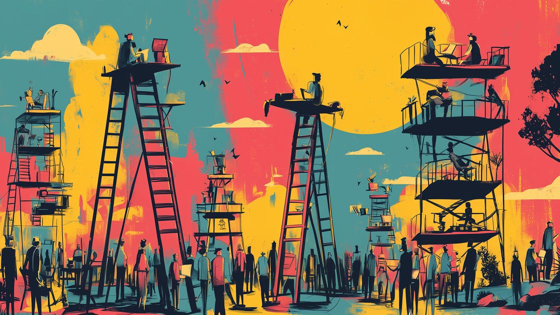
The current AI frenzy feels a lot like 1849 in California. Back then, roughly 300,000 people flooded the Sierra Nevada mountains hoping to strike gold, but the math was brutal: maybe 10% made any profit at all, the top 4% earned enough to brag a little, and only about 1% became truly rich. The rest? They left with sore backs, empty pockets, and I guess some good stories. 

Back to Reality

AI is already changing the software industry. As designers and builders of software, we are going to be using AI as material. This is as obvious as when the App Store on iPhone debuted and everyone needed to build apps.

Suff Syed wrote his piece as part personal journey and decision-making and part rallying cry to other designers. He is essentially switching careers and says that it won’t be easy.

This transition isn’t about abandoning one identity for another. It’s about evolving—unlearning what no longer serves us and embracing the disciplines that will shape the future. There’s a new skill tree ahead: model internals, agent architectures, memory hierarchies, prompt flows, evaluation loops, and infrastructure that determines how products think, behave, and scale.

Best of luck to Suff Syed on his journey. I hope he strikes AI gold. 

As for me, I aim to continue on my journey of being a shokunin, or craftsman, like Jiro Ono. For over 30 years—if you count my amateur days in front of the Mac in middle school—I’ve been designing. Not just pushing pixels in Photoshop or Figma, but doing the work of understanding audiences and users, solving business problems, inventing new interaction patterns, and advocating for usability. All in the service of the user, and all while honing my craft.

That craft isn’t tied to a technology stack or a job title. It’s a discipline, a mindset, and a lifetime’s work. Being a designer is my life. 

So no, I’m not giving up my design title. It’s not a relic—it’s a commitment. And in a world chasing the next gold rush, I’d rather keep making work worth coming back to, knowing that in the end, gold fades but mastery endures. Besides, if I ever do get rich, it’ll be because I designed something great, not because I happened to be standing near a gold mine.

Cap Watkins, Head of Product Design at Lattice, was catching up with a former top-performing designer who was afraid other designers were mad at her for getting all the “cool” projects.

What made those projects glamorous and desirable was her and how she approached the work. There’s that old nugget about making your own luck and that is something she excelled at. She had a unique ability to take really hard or nebulous problems (both design and team-related) and morph them into something amazing that got people excited. Instead of getting discouraged, she’d respond to friction with more energy, more enthusiasm. In so many ways, she was a transformative presence on any team and project.

In other words, this designer cared and made the best of all her assignments.

Make things happen

Top designers aren’t handed “cool” projects—they transform hard, unglamorous work into exciting wins. Stop waiting. Make your work shine. Make things happen.

capwatkins.com iconcapwatkins.com

Christopher K. Wong argues that desirability is a key part of design that helps decide which features users really want:

To give a basic definition, desirability is a strategic part of UX that revolves around a single user question: Have you defined (and solved) the right problem for users?

In other words, before drawing a single box or arrow, have you done your research and discovery to know you’re solving a pain point?

The way the post is written makes it hard to get at a succinct definition, but here’s my take. Desirability is about ensuring a product or feature is truly wanted, needed, and chosen by users—not just visual appeal—making it a core pillar for impactful design decisions and prioritization. And designers should own this.

preview-1754632102491.jpeg

Want to have a strategic design voice at work? Talk about desirability

Desirability isn’t just about visual appeal: it’s one of the most important user factors

dataanddesign.substack.com icondataanddesign.substack.com

Coincidentally, I was considering adding a service designer to my headcount plan when this article came across my feeds. Perfect timing. It’s hard to imagine that service design as a discipline is so young—only since 2012 according to the author.

Joe Foley, writing in Creative Bloq:

As a discipline, service design is still relatively new. A course at the Royal College of Art in London (RCA) only began in 2012 and many people haven’t even heard of the term. But that’s starting to change.

He interviews designer Clive Grinyer, whose new book on service design has just come out. He was co-founder of the design consultancy Tangerine, Director of Design and Innovation for the UK Design Council, and Head of Service Design at the Royal College of Art.

Griner:

Great service design is often invisible as it solves problems and removes barriers, which isn’t necessarily noticed as much as a shiny new product. The example of GDS (Government Digital Service) redesigning every government department from a service design perspective and removing many frustrating and laborious aspects of public life from taxing a car to getting a passport, is one of the best.

The key difference between service design and UX is that it’s end product is not something on a screen:

But service design is not just the experience we have through the glass of a screen or a device: it’s designed from the starting point of the broader objective and may include many other channels and touchpoints. I think it was Colin Burns who said a product is just a portal to a service.

In other words, if you open the aperture of what user experience means, and take on the challenge of designing real-world processes, flows, and interaction—that is service design.

preview-1753921779925.jpg

Service design isn't just a hot buzzword, it affects everything in your life

Brands need to catch up fast.

creativebloq.com iconcreativebloq.com
Human chain of designers supporting each other to reach laptops and design tools floating above them, illustrating collaborative mentorship and knowledge transfer in the design industry.

Why Young Designers Are the Antidote to AI Automation

In Part I of this series, I wrote about the struggles recent grads have had finding entry-level design jobs and what might be causing the stranglehold on the design job market.

**Part II: Building New Ladders **

When I met Benedict Allen, he had just finished with Portfolio Review a week earlier. That’s the big show all the design students in the Graphic Design program at San Diego City College work toward. It’s a nice event that brings out the local design community where seasoned professionals review the portfolios of the graduating students.

Allen was all smiles and relief. “I want to dabble in different aspects of design because the principles are generally the same.” He goes on to mention how he wants to start a fashion brand someday, DJ, try 3D. “I just want to test and try things and just have fun! Of course, I’ll have my graphic design job, but I don’t want that to be the end. Like when the workday ends, that’s not the end of my creativity.” He was bursting with enthusiasm.

And confidence. When asked about how prepared he felt about his job prospects, he shares, “I say this humbly, I really do feel confident because I’m very proud of my portfolio and the things I’ve made, my design decisions, and my thought processes.” Oh to be in my early twenties again and have his same zeal!

But here’s the thing, I believe him. I believe he’ll go on to do great things because of this young person’s sheer will. He idolizes Virgil Abloh, the died-too-young multi-hyphenate creative who studied architecture, founded the fashion label Off-White, became artistic director of menswear at Louis Vuitton, and designed furniture for IKEA and shoes for Nike. Abloh is Allen’s North Star. 

Artificial intelligence, despite its sycophantic tendencies, does not have that infectious passion. Young people are the life blood of companies. They can reinvigorate an organization and bring perspectives to a jaded workforce. Every single time I’ve ever had the privilege of working with interns, I have felt this. My teams have felt this. And they make the whole organization better.

What Companies Must Do

I love this quote by Robert F. Kennedy in his 1966 speech at the University of Cape Town:

This world demands the qualities of youth: not a time of life but a state of mind, a temper of the will, a quality of imagination, a predominance of courage over timidity, of the appetite for adventure over the life of ease.

As mentioned in Part I of this series, the design industry is experiencing an unprecedented talent crisis, with traditional entry-level career pathways rapidly eroding as the capabilities of AI expand and companies anticipate using AI to automate junior-level tasks. Youth is the key ingredient that sustains companies and industries.

The Business Case for Juniors

Portraits of five recent design graduates. From top left to right: Ashton Landis, wearing a black sleeveless top with long blonde hair against a dark background; Erika Kim, outdoors in front of a mountain at sunset, smiling in a fleece-collared jacket; Emma Haines, smiling and looking over her shoulder in a light blazer, outdoors; Bottom row, left to right: Leah Ray, in a black-and-white portrait wearing a black turtleneck, looking ahead, Benedict Allen, smiling in a black jacket with layered necklaces against a light background

Five recent design graduates. From top left to right: Ashton Landis, Erika Kim, Emma Haines. Bottom row, left to right: Leah Ray, Benedict Allen.

Just as important as the energy and excitement Benedict Allen brings, is his natural ability to wield AI. He’s an AI native.

In my conversation with him, he’s tried all the major chatbots and has figured out what works best for what. “I’ve used Gemini as I find its voice feature amazing. Like, I use it all the time. …I use Claude sometimes for writing, but I find that the writing was not as good as ChatGPT. ChatGPT felt less like AI-speak. …I love Perplexity. That’s one of my favorites as well.”

He’s not alone. Leah Ray, who recently graduated from California College of the Arts with an MFA in Graphic Design, says that she can’t remember how her design process existed without AI, saying, “It’s become such an integral part of how I think and work.”

She parries with ChatGPT, using it as a creative partner:

I usually start by having a deep or sometimes extended conversation with ChatGPT. And it’s not about getting the direct answer, but more about using the dialogue to clarify my thoughts and challenging my assumptions and even arrive at a clear design direction.

She’ll go on and use the chatbot to help with project planning and timelines, copywriting, code generation, and basic image generation. Ray has even considered training her own AI model using tools like ComfyUI or LoRA that are based on her past design work. She says, “So it could assist me in generating proposals that match my visual styles.” Pretty advanced stuff.

Similar to Ray, Emma Haines, who is finishing up her MDes in Interaction Design at CCA, says that AI “comes into the picture very early on.” She’ll use ChatGPT for brainstorming and project planning, and less so in the later stages.

Unlike many established designers, these young ones don’t see AI as threatening, nor as a crutch. They treat AI as any other tool. Ashton Landis, who recently graduated from CCA with a BFA in Graphic Design, says, “I think right now it’s primarily a tool instead of a replacement.”

Elena Pacenti, Director of MDes Interaction Design at CCA, observes that students have embraced AI immediately and across the board. She says generative AI has been “adopted immediately by everyone, faculty and students” and it’s being used to create text, images, and all sorts of visual content—not just single images, but storyboards, videos, and more. It’s become just another tool in their toolkit.

Pacenti notices that her students are gravitating toward using AI for efficiency rather than exploration. She sees them “embracing all the tools that help make the process faster, more efficient, quicker” to get to their objective, rather than using AI “to explore things they haven’t thought about or to make things.” They’re using it as a shortcut rather than a creative partner. 

Restructure Entry-Level Roles

I don’t think it’s quite there yet, but AI will eventually take over the traditional tasks we give to junior designers. Anthropic recently released an integration with Canva, but the results are predictable—barely a good first draft. For companies that choose to live on the bleeding edge, that will likely be within 12 months. I think in two years, we’ll cede more and more of these junior-level design tasks like extending designs, resizing assets, and searching for stock to AI.

But I believe there is still a place for entry-level designers in any organization. 

Firstly, the tasks can simply be done faster. When we talk about AI and automation, oftentimes the human who’s initiating the task and then judging its output isn’t part of the conversation. Babysitting AI takes time and more importantly, breaks flow. I can imagine teaching a junior designer how to perform these tasks using AI and just stack up more in a day or week. They’ll still be able to practice their taste and curation skills with supervision from more senior peers.

Second, younger people are inherently better with newer technologies. Asking a much more senior designer to figure out advanced prototyping with Lovable or Cursor will be a non-starter. But junior designers should be able to pick this up quickly and become indispensable pairs of hands in the overall process.

Third, we can simply level up the complexity of the tasks we give to juniors. Aneesh Raman, chief economic opportunity officer at LinkedIn, wrote in The New York Times:

Unless employers want to find themselves without enough people to fill leadership posts down the road, they need to continue to hire young workers. But they need to redesign entry-level jobs that give workers higher-level tasks that add value beyond what can be produced by A.I. At the accounting and consulting firm KPMG, recent graduates are now handling tax assignments that used to be reserved for employees with three or more years of experience, thanks to A.I. tools. And at Macfarlanes, early-career lawyers are now tasked with interpreting complex contracts that once fell to their more seasoned colleagues. Research from the M.I.T. Sloan School of Management backs up this switch, indicating that new and low-skilled workers see the biggest productivity gains and benefits from working alongside A.I. tools.

In other words, let’s assume AI will tackle the campaign resizing or building out secondary and tertiary pages for a website. Have junior designers work on smaller projects as the primary designer so they can set strategy, and have them shadow more senior designers and develop their skills in concept, strategy, and decision-making, not just execution.

Invest in the Leadership Pipeline

The 2023 Writers Guild of America strike offers a sobering preview of what could happen to the design profession if we’re not careful about how AI reshapes entry-level opportunities. Unrelated to AI, but to simple budget-cutting, Hollywood studios began releasing writers immediately after scripts were completed, cutting them out of the production process where they would traditionally learn the hands-on skills needed to become showrunners and producers. As Oscar-winning writer Sian Heder (CODA) observed, “A writer friend has been in four different writers rooms and never once set foot on set. How are we training the next generation of producers and showrunners?” The result was a generation of writers missing the apprenticeship pathway that transforms scriptwriters into skilled creative leaders—exactly the kind of institutional knowledge loss that weakens an entire industry.

The WGA’s successful push for guaranteed on-set presence reveals what the design industry must do to avoid a similar talent catastrophe. Companies are avoiding junior hires entirely, anticipating that AI will handle execution tasks—but this eliminates the apprenticeship pathway where designers actually learn strategic thinking. Instead, they need to restructure entry-level roles to guarantee meaningful learning opportunities—pairing junior designers with real projects where they develop taste through guided decision-making. As one WGA member put it, “There’s just no way to learn to do this without learning on the job.” The design industry’s version of that job isn’t Figma execution—it’s the messy, collaborative process of translating business needs into human experiences. 

Today’s junior designers will become tomorrow’s creative directors, design directors, and heads of design. Senior folks like myself will eventually age out, so companies that don’t invest in junior talent now won’t have any experienced designers in five to ten years. 

And if this is an industry-wide trend, young designers who can’t get into the workforce today will pivot to other careers and we won’t have senior designers, period.

How Education is Responding

Portraits of five design educators. From top left to right: Bradford Prairie, smiling in a jacket and button-down against a soft purple background; Elena Pacenti, seated indoors, wearing a black top with long light brown hair; Sean Bacon, smiling in a light button-down against a white background; Bottom row, left to right: Josh Silverman, smiling in a striped shirt against a dark background; Eric Heiman, in profile wearing a flat cap and glasses, black and white photo

Our five design educators. From top left to right: Bradford Prairie, Elena Pacenti, Sean Bacon. Bottom row, left to right: Josh Silverman, Eric Heiman.

The Irreplaceable Human Element

When I spoke to the recent grads, all five of them mentioned how AI-created output just has an air of AI. Emma Haines:

People can tell what AI design looks like versus what human design looks like. I think that’s because we naturally just add soul into things when we design. We add our own experiences into our designs. And just being artists, we add that human element into it. I think people gravitate towards that naturally, just as humans.

It speaks to how educators are teaching—and have always been teaching—design. Bradford Prairie, a professor at San Diego City College:

We always tell students, “Try to expose yourself to a lot of great work. Try to look at a lot of inspiration. Try to just get outside more.” Because I think a lot of our students are introverts. They want to sit in their room and I tell them, “No, y’all have to get out in the world! …and go touch grass and touch other things out in the world. That’s how you learn what works and what doesn’t, and what culture looks like.

Leah Ray, explaining how our humanity imbues quality into our designs:

You can often recognize an AI look. Images and designs start to feel like templates and over-predictable in that sense. And everything becomes fast like fast food and sometimes even quicker than eating instant food.

And even though there is a scary trend towards synthetic user research, Elena Pacenti, discourages it. She’ll teach her students to start with provisional user archetypes using AI, but then they’ll need to perform primary research to validate it. “We’re going to do primary to validate. Please do not fake data through the AI.”

Redefining Entry-Level Value

I only talked to educators from two institutions for this series, since those are the two I have connections to. For both programs, there’s less emphasis on hard skills like how to use Figma and more on critical thinking and strategy. I suspect that bootcamps are different.

Sean Bacon, chair of the Graphic Design program at San Diego City College:

Our program is really about concepting, creative thinking, and strategy. Bradford and I are cautiously optimistic that maybe, luckily, the chips we put down, are in the right part of the board. But who knows?

I think he’s spot on. Josh Silverman, who teaches courses at CCA’s MDes Interaction Design, and also a design recruiter, observes: 

So what I’m seeing from my perspective is a lot of organizations that are hiring the kind of students that we graduate from the program, what I like to call a “dangerous generalist.” It’s someone who can do the research, strategy, prototyping, visual design, presentation, storytelling, and be a leader and make a measurable impact. And if a company is restructuring or just starting and only has the means to hire one person, they’re going to want someone who can do all those things. So we are poised to help a lot of students get meaningful employment because they can do all those things.

AI as Design Material, Not Just Tool

Much of the AI conversation has been about how to incorporate it into our design workflows. For UX designers, it’s just as important to discuss how we design AI experiences for users.

Elena Pacenti champions this shift in the conversation. “My take on the whole thing has been to move beyond the tools and to understand AI as a material we design with.” Similar to the early days of virtual reality, AI is an interaction paradigm with very few UI conventions and therefore ripe for designers to invent. Right now.

This profession specifically designs the interaction for complex systems, products, services, a combination—whatever it is out there—and ecosystems of technologies. What’s the next generation of these things that we’re going to design for? …There’s a very challenging task of imagining interactions that are not going just through a chatbot, but they don’t have shape yet. They look tremendously immaterial, more than the past. It’s not going to be necessarily through a screen.

Her program at CCA has implemented this through a specific elective called “Prototyping with AI,” which Pacenti describes as teaching students to “get your hands dirty and understand what’s behind the LLMs and how you can use this base of data and intelligence to do things that you want, not that they want.” The goal is to help students craft their own tools rather than just using prepackaged consumer AI tools—which she calls “a shift towards using it as a material.”

The Path Forward Requires Collective Action

Benedict Allen’s infectious enthusiasm after Portfolio Review represents everything the design industry risks losing if we don’t act deliberately. His confidence, creativity, and natural fluency with AI tools? That’s the potential young designers bring—but only if companies and educational institutions create pathways for that talent to flourish.

The solution isn’t choosing between human creativity and artificial intelligence. It’s recognizing that the combination is more powerful than either alone. Elena Pacenti’s insight about understanding “AI as a material we design with” points toward this synthesis, while companies like KPMG and Macfarlanes demonstrate how entry-level roles can evolve rather than disappear.

This transformation demands intentional investment from both sides. Design schools are adapting quickly—reimagining curriculum, teaching AI fluency alongside fundamental design thinking, emphasizing the irreplaceable human elements that no algorithm can replicate. Companies must match this effort. Restructure entry-level roles. Create new apprenticeship models. Recognize that today’s junior designers will become tomorrow’s creative leaders.

The young designers I profiled here prove that talent and enthusiasm haven’t disappeared. They’re evolving. Allen’s ambitious vision to start a fashion brand. Leah Ray’s ease with AI tools. The question isn’t whether these designers can adapt to an AI-enabled future.

It’s whether the industry will create space for them to shape it.


In the final part of this series, I’ll explore specific strategies for recent graduates navigating this current job market—from building AI-integrated portfolios to creating alternative pathways into the profession.

Illustration of people working on laptops atop tall ladders and multi-level platforms, symbolizing hierarchy and competition, set against a bold, abstract sunset background.

The Design Industry Created Its Own Talent Crisis. AI Just Made It Worse.

This is the first part in a three-part series about the design talent crisis. Read Part II and Part III.

**Part I: The Vanishing Bottom Rung **

Erika Kim’s path to UX design represents a familiar pandemic-era pivot story, yet one that reveals deeper currents about creative work and economic necessity. Armed with a 2020 film and photography degree from UC Riverside, she found herself working gig photography—graduations, band events—when the creative industries collapsed. The work satisfied her artistic impulses but left her craving what she calls “structure and stability,” leading her to UX design. The field struck her as an ideal synthesis, “I’m creating solutions for companies. I’m working with them to figure out what they want, and then taking that creative input and trying to make something that works best for them.”

Since graduating from the interaction design program at San Diego City College a year ago, she’s had three internships and works retail part-time to pay the bills. “I’ve been in survival mode,” she admits. On paper, she’s a great candidate for any junior position. Speaking with her reveals a very thoughtful and resourceful young designer. Why hasn’t she been able to land a full-time job? What’s going on in the design job market? 

Back in January, Jared Spool offered an explanation. The UX job market crisis stems from a fundamental shift that occurred around late 2022—what he calls a “market inversion.” The market flipped from having far more open UX positions than qualified candidates to having far more unemployed UX professionals than available jobs. The reasons are multitude, but include expiring tax incentives, rising interest rates, an abundance of bootcamp graduates, automated hiring processes, and globalization.

But that’s only part of the equation. I believe there’s something much larger at play, one that affects more than just UX or product design, but all design disciplines. One in which the tip of the spear has already been felt by software developers in their job market. AI.

Closing Doors for New Graduates

In the first half of this year, 147 tech companies have laid off over 63,000 workers, with a significant portion of them engineers. Entry-level hiring has collapsed, revealing a new permanent reality. At Big Tech companies, new graduates now represent just 7% of all hires—a precipitous 25% decline from 2023 levels and a staggering 50% drop from pre-pandemic baselines in 2019.

The startup ecosystem tells an even more troubling story, where recent graduates comprise less than 6% of new hires, down 11% year-over-year and more than 30% since 2019. This isn’t merely a temporary adjustment; it represents a fundamental restructuring of how companies approach talent acquisition. Even the most credentialed computer science graduates from top-tier programs are finding themselves shut out, suggesting that the erosion of junior positions cuts across disciplines and skill levels.  

LinkedIn executive Aneesh Raman wrote in an op-ed for The New York Times that in a “recent survey of over 3,000 executives on LinkedIn at the vice president level or higher, 63 percent agreed that A.I. will eventually take on some of the mundane tasks currently allocated to their entry-level employees.”

There is already a harsh reality for entry-level tech workers. Companies have essentially frozen junior engineer and data analyst hiring because AI can now handle the routine coding and data querying tasks that were once the realm for new graduates. Hiring managers expect AI’s coding capabilities to expand rapidly, potentially eliminating entry-level roles within a year, while simultaneously increasing demand for senior engineers who can review and improve AI-generated code. It’s a brutal catch-22: junior staff lose their traditional stepping stones into the industry just as employers become less willing to invest in onboarding them. 

For design students and recent graduates, this data illuminates a broader industry transformation where companies are increasingly prioritizing proven experience over potential—a shift that challenges the very foundations of how creative careers traditionally begin.

While AI tools haven’t exactly been able to replace designers yet—even junior ones—the tech will get there sooner than we think. And CEOs and those holding the purse strings are anticipating this, thus holding back hiring of juniors.

Portraits of five recent design graduates. From top left to right: Ashton Landis, wearing a black sleeveless top with long blonde hair against a dark background; Erika Kim, outdoors in front of a mountain at sunset, smiling in a fleece-collared jacket; Emma Haines, smiling and looking over her shoulder in a light blazer, outdoors; Bottom row, left to right: Leah Ray, in a black-and-white portrait wearing a black turtleneck, looking ahead, Benedict Allen, smiling in a black jacket with layered necklaces against a light background

Five recent design graduates. From top left to right: Ashton Landis, Erika Kim, Emma Haines. Bottom row, left to right: Leah Ray, Benedict Allen.

The Learning-by-Doing Crisis

Ashton Landis recently graduated with a BFA in Graphic Design from California College of the Arts (full disclosure: my alma mater). She says:

I found that if you look on LinkedIn for “graphic designer” and you just say the whole San Francisco Bay area, so all of those cities, and you filter for internships and entry level as the job type, there are 36 [job postings] total. And when you go through it, 16 of them are for one or more years of experience. And five of those are for one to two years of experience. And then everything else is two plus years of experience, which doesn’t actually sound like sound like entry level to me. …So we’re pretty slim pickings right now.

When I graduated from CCA in 1995 (or CCAC as it was known back then), we were just climbing out of the labor effects of the early 1990s recession. For my early design jobs in San Francisco, I did a lot of production and worked very closely with more senior designers and creative directors to hone my craft. While school is great for academic learning, nothing beats real-world experience.

Eric Heiman, creative director and co-owner of Volume Inc., a small design studio based in San Francisco, has been teaching at CCA for 26 years. He observes:

We internalize so much by doing things slower, right? The repetition of the process, learning through tinkering with our process, and making mistakes, and things like that. We have internalized those skills.

Sean Bacon, chair of the Graphic Design program at San Diego City College wonders:

What is an entry level position in design then? Where do those exist? How often have I had these companies hire my students even though they clearly don’t have those requirements. So I don’t know. I don’t know what happens, but it is scary to think we’re losing out on what I thought was really valuable training in terms of how I learned to operate, at least in a studio.

Back to the beginnings of my career, I remember digitizing logos when I interned with Mark Fox, a talented logo designer based in Marin County. A brilliant draftsman, he had inked—and still inks—all of his logos by hand. The act of redrawing marks in Illustrator helped me develop my sense of proportions, curves, and optical alignment. At digital agencies, I started my journey redesigning layouts of banners in different sizes. I would eventually have juniors to do that for me as I rose through the ranks. These experiences—though a little painful at the time—were pivotal in perfecting our collective craft. To echo Bacon, it was “really valuable training.”

Apprenticeships at Agencies

Working in agencies and design studios was pretty much an apprenticeship model. Junior designers shadowed more senior designers and took their lead when executing a campaign or designing more pages for a website.

For a typical website project, as a senior designer or art director, I would design the homepage and a few other critical screens, setting up the look and feel. Once those were approved by the client, junior designers would take over and execute the rest. This was efficient and allowed the younger staff to participate and put their reps in.

Searching for stock photos was another classic assignment for interns and junior designers. These were oftentimes multi-day assignments, but it helped teach juniors how to see. 

But today, generative AI apps like Midjourney and Visual Electric are replacing stock photography. 

From Craft to Curation

As the industry marches towards incorporating AI into our workflows, strategy, judgement, and most importantly taste, are critical skills.

But the paradoxically, how do designers develop taste, craft, and strategic thinking without doing the grunt work?

And not only are they missing out on the mundane work because of the dearth of entry-level opportunities, but also because generative AI can give results so quickly.

Eric Heiman again:

I just give the AI a few words and poof, it’s there. How do you learn how to see things? I just feel like learning how to see is a lot about slowing down. And in the case of designers, doing things yourself over and over again, and they slowly reveal themselves through that process.

All the recent graduates I interviewed for this piece are smart, enthusiastic, and talented. Yet, Ashton Landis and Erika Kim are struggling to find full-time jobs. 

Landis doesn’t think her negative experience in the job market is “entirely because of AI,” attributing it more to “general unemployment rates are pretty high right now” and a job market that is “clearly not great.”

Questioning Career Choices

Leah Ray, a recent graphic design MFA graduate from CCA, was able to secure a position as International Visual Designer at Kuaishou, a popular Chinese short-form video and live-streaming app similar to TikTok. But it wasn’t easy. Her job search began months before graduation, extending through her thesis work and creating the kind of sustained anxiety that prompted her final school project—a speculative design exploring AI’s potential to predict alternative career futures.

I was so anxious about my next step after graduation because I didn’t have a job lined up and I didn’t know what to do. …I’m a person who follows the social clock. My parents and the people around me expect me to do the right thing at the right age. Getting a nice job was my next step, but I couldn’t finish that, which led to me feeling anxious and not knowing what to do.

But through her tenacity and some luck, she was able to land the job that she starts this month. 

No, it was not easy to find. But finding this was very lucky. I do remember I saw a lot of job descriptions for junior designers. They expect designers to have AI skills. And I think there are even some roles specifically created for people with AI-related design skills, like AI motion designer and AI model designer, sort of something like that. Like AI image training designers.

Ray’s observation reveals a fundamental shift in entry-level design expectations, where AI proficiency has moved from optional to essential, with entirely new roles emerging around AI-specific design skills.

Portraits of five design educators. From top left to right: Bradford Prairie, smiling in a jacket and button-down against a soft purple background; Elena Pacenti, seated indoors, wearing a black top with long light brown hair; Sean Bacon, smiling in a light button-down against a white background; Bottom row, left to right: Josh Silverman, smiling in a striped shirt against a dark background; Eric Heiman, in profile wearing a flat cap and glasses, black and white photo

Our five design educators. From top left to right: Bradford Prairie, Elena Pacenti, Sean Bacon. Bottom row, left to right: Josh Silverman, Eric Heiman.

Preparing Our Students

Emma Haines, a designer completing her masters degree in Interaction Design at CCA began her job search in May. (Her program concludes in August.) Despite not securing a job yet, she’s bullish because of the prestige and practicality of the Master of Design program.

I think this program has actually helped me a good amount from where I was starting out before. I worked for a year between undergrad and this program, and between where I was before and now, there’s a huge difference. That being said, since the industry is changing so rapidly, it feels a little hard to catch up with. That’s the part that makes me a little nervous going into it. I could be confident right now, but maybe in six months something changes and I’m not as confident going into the job market.

CCA’s one-year program represents a strategic bet on adaptability over specialization. Elena Pacenti, the program’s director, describes an intensive structure that “goes from a foundational semester with foundation of interaction design, form, communication, and research to the system part of it. So we do systems thinking, prototyping, also tangible computing.” The program’s Social Lab component is “two semester-long projects with community partners in partnership with stakeholders that are local or international from UNICEF down to the food bank in Oakland.” It positions design as a tool for social impact rather than purely commercial purposes. This compressed timeline creates what Pacenti calls curricular agility: “We’re lucky that we are very agile. We are a one-year program so we can implement changes pretty quickly without affecting years of classes and changes in the curriculum.”

Josh Silverman, who chaired it for nearly five years, reports impressive historical outcomes: “I think historically for the first nine years of the program—this is cohort 10—I think we’ve had something like 85% job placement within six months of graduation.”

Yet both educators acknowledge current market realities. Pacenti observes that “that fat and hungry market of UX designers is no longer there; it’s on a diet,” while maintaining optimism about design’s future relevance: “I do not believe that designers will be less in demand. I think there will be a tremendous need for designers.” Emma Haines’s nervousness about rapid industry change reflects this broader tension—the gap between educational preparation and market evolution that defines professional training during transformative periods.

Bradford Prairie, who has taught in San Diego City College’s Graphic Design program for nine years, embodies this experimental approach to AI in design education. “We get an easy out when it comes to AI tools,” he explains, “because we’re a program that’s meant to train people for the field. And if the field is embracing these tools, we have an obligation to make students aware of them and give some training on how to use the tools.”

Prairie’s classroom experiments reveal both the promise and pitfalls of AI-assisted design. He describes a student struggling with a logo for a DJ app who turned to ChatGPT for inspiration: “It generates a lot of expected things like turntables, headphones, and waveforms… they’re all too complicated. They all don’t really look like logos. They look more like illustrations.” But the process sparked some other ideas, so he told the student, “This is kind of interesting how the waveform is part of the turntable and… we can take this general idea and redraw it and make it simplified.”

This tension between AI output and human refinement has become central to his teaching philosophy: “If there’s one thing that AI can’t replace, it’s your sense of discernment for what is good and what is not good.” The challenge, he acknowledges, lies in developing that discernment in students who may be tempted to rely too heavily on AI from the start.

The Turning Point

These challenges are real, and they’re reshaping the design profession in fundamental ways. Traditional apprenticeships are vanishing, entry-level opportunities are scarce, and new graduates face an increasingly competitive landscape. But within this disruption lies opportunity. The same forces that have eliminated routine design tasks have also elevated the importance of uniquely human skills—strategic thinking, cultural understanding, and creative problem-solving. The path forward requires both acknowledging what’s been lost and embracing what’s possible.

Despite her struggles to land a full-time job in design, Erika Kim remains optimistic because she’s so enthused about her career choice and the opportunity ahead. Remarking on the parallels of today versus the beginning of the Covid-19 pandemic, she says “It’s kind of interesting that I’m also on completely different grounds in terms of uncertainty. But you just have to get through it, you know. Why not?”


In the next part of this series, I’ll focus on the opportunities ahead: how we as a design industry can do better and what we should be teaching our design students. In the final part, I’ll touch on what recent grads can do to find a job in this current market.

Stephanie Tyler, in a great essay about remembering what we do as designers:

In an age where AI can generate anything, the question is no longer ‘can it be made?’ but ‘is it worth making?’ The frontier isn’t volume—it’s discernment. And in that shift, taste has become a survival skill.

And this is my favorite passage, because this is how I think about this blog and my newsletter.

There will always be creators. But the ones who stand out in this era are also curators. People who filter their worldview so cleanly that you want to see through their eyes. People who make you feel sharper just by paying attention to what they pay attention to.

Curation is care. It says: I thought about this. I chose it. I didn’t just repost it. I didn’t just regurgitate the trending take. I took the time to decide what was worth passing on.

That’s rare now. And because it’s rare, it’s valuable.

We think of curation as a luxury. But it’s actually maintenance. It’s how you care for your mind. Your attention. Your boundaries.

This blog represents my current worldview, what I’m interested in and exploring. What I’m thinking about now.

preview-1752706649473.png

Taste Is the New Intelligence

Why curation, discernment, and restraint matter more than ever

wildbarethoughts.com iconwildbarethoughts.com

Ted Goas, writing in UX Collective:

I predict the early parts of projects, getting from nothing to something, will become shared across roles. For designers looking to branch out, code is a natural next step. I see a future where we’re fixing small bugs ourselves instead of begging an engineer, implementing that animation that didn’t make the sprint but you know would absolutely slap, and even building simple features when engineering resources are tight.

Our new reality is that anyone can make a rough draft.

But that doesn’t mean those drafts are good. That’s where our training and taste come in.

I think Goas is right and it echoes the AI natives post by Elena Verna. I wrote a little more extensively in my newsletter over the weekend.

preview-1752467928143.jpg

Designers: We’ll all be design engineers in a year

And that’s a good thing.

uxdesign.cc iconuxdesign.cc

In a dual profile, Ben Blumenrose spotlights Phil Vander Broek—whose startup Dopt was acquired last year by Airtable—and Filip Skrzesinski—who is currently working on Subframe—in the Designer Founders newsletter.

One of the lessons Vander Broek learned was to not interview customers just to validate an idea. Interview them to get the idea first. In other words, discover the pain points:

They ran 60+ interviews in three waves. The first 20 conversations with product and growth leaders surfaced a shared pain point: driving user adoption was painfully hard, and existing tools felt bolted on. The next 20 calls helped shape a potential solution through mockups and prototypes—one engineer was so interested he volunteered for weekly co-design sessions. A final batch of 20 calls confirmed their ideal customer was engineers, not PMs.

As for Skrzesinski, he’s learning that being a startup founder isn’t about building the product—it’s about building a business:

But here’s Filip’s counterintuitive advice: “Don’t start a company because you love designing products. Do it in spite of that.”

“You won’t be designing in the traditional sense—you’ll be designing the company’s DNA,” he explains. “It’s the invisible work: how you organize, how you think, how you make decisions. How it feels to work there, to use what you’re making, to believe in it.”

preview-1751333180140.jpeg

Designer founders on pain-hunting, seeking competitive markets, and why now is the time to build

Phil Vander Broek of Dopt and Filip Skrzesinski of Subframe share hard-earned lessons on getting honest about customer signals, moving faster, and the shift from designing products to companies.

designerfounders.substack.com icondesignerfounders.substack.com
Collection of iOS interface elements showcasing Liquid Glass design system including keyboards, menus, buttons, toggles, and dialogs with translucent materials on dark background.

Breaking Down Apple’s Liquid Glass: The Tech, The Hype, and The Reality

I kind of expected it: a lot more ink was spilled on Liquid Glass—particularly on social media. In case you don’t remember, Liquid Glass is the new UI for all of Apple’s platforms. It was announced Monday at WWDC 2025, their annual developers conference.

The criticism is primarily around legibility and accessibility. Secondary reasons include aesthetics and power usage to animate all the bubbles.

How Liquid Glass Actually Works

Before I go and address the criticism, I think it would be great to break down the team’s design thinking and how Liquid Glass actually works. 

I watched two videos from Apple’s developer site. Much of the rest of the article is a summary of the videos. You can watch them and skip to the end of this piece.

First off is this video that explains Liquid Glass in detail.

As I watched the video, one thing stood out clearly to me: the design team at Apple did a lot of studying of the real world before digitizing it into UI.

The Core Innovation: Lensing

Instead of scattering light like previous materials, Liquid Glass dynamically bends and shapes light in real-time. Apple calls this “lensing.”

It’s their attempt to recreate how transparent objects work in the physical world. We all intuitively understand how warping and bending light communicates presence and motion. Liquid Glass uses these visual cues to provide separation while letting content shine through.

A Multi-Layer System That Adapts

Liquid Glass toolbar with pink tinted buttons (bookmark, refresh, more) floating over geometric green background, showing tinting capabilities.

This isn’t just a simple effect. It’s built from several layers working together:

  • Highlights respond to environmental lighting and device motion. When you unlock your phone, lights move through 3D space, causing illumination to travel around the material.
  • Shadows automatically adjust based on what’s behind them—darker over text for separation, lighter over solid backgrounds.
  • Tint layers continuously adapt. As content scrolls underneath, the material flips between light and dark modes for optimal legibility.
  • Interactive feedback spreads from your fingertip throughout the element, making it feel alive and responsive.

All of this happens automatically when developers apply Liquid Glass.

Two Variants (Frosted and Clear)

Liquid Glass has the same two types of material.

  • Regular is the workhorse—full adaptive behaviors, works anywhere.
  • Clear is more transparent but needs dimming layers for legibility.

Clear should only be used over media-rich content when the content layer won’t suffer from dimming. Otherwise, stick with Regular.

It’s like ice cubes—cloudy ones from your freezer versus clear ones at fancy bars that let you see your drink’s color.

Four examples of regular Liquid Glass elements: audio controls, deletion dialog, text selection menu, and red toolbar, demonstrating various applications.

Regular is the workhorse—full adaptive behaviors, works anywhere.

Video player interface with Liquid Glass controls (pause, skip buttons) overlaying blue ocean scene with sea creature.

Clear should only be used over media-rich content when the content layer won’t suffer from dimming.

Smart Contextual Changes

When elements scale up (like expanding menus), the material simulates thicker glass with deeper shadows. On larger surfaces, ambient light from nearby content subtly influences the appearance.

Elements don’t fade—they materialize by gradually modulating light bending. The gel-like flexibility responds instantly to touch, making interactions feel satisfying.

This is something that’s hard to see in stills.

The New Tinting Approach

Red "Add" button with music note icon using Liquid Glass material over black and white checkered pattern background.

Instead of flat color overlays, Apple generates tone ranges mapped to content brightness underneath. It’s inspired by how colored glass actually works—changing hue and saturation based on what’s behind it.

Apple recommends sparing use of tinting. Only for primary actions that need emphasis. Makes sense.

Design Guidelines That Matter

Liquid Glass is for the navigation and controls layer floating above content—not for everything. Don’t add Liquid Glass to or make content areas Liquid Glass. Never stack glass on glass.

Liquid Glass button with a black border and overlapping windows icon floating over blurred green plant background, showing off its accessibility mode.

Accessibility features are built-in automatically—reduced transparency, increased contrast, and reduced motion modify the material without breaking functionality.

The Legibility Outcry (and Why It’s Overblown)

Apple devices (MacBook, iPad, iPhone, Apple Watch) displaying new Liquid Glass interface with translucent elements over blue gradient wallpapers.

“Legibility” was mentioned 13 times in the 19-minute video. Clearly that was a concern of theirs. Yes, in the keynote, clear tinted device home screens were shown and many on social media took that to be an accessibility abomination. Which, yes, that is. But that’s not the default. 

The fact that the system senses the type of content underneath it and adjusts accordingly—flipping from light to dark, increasing opacity, or adjusting shadow depth—means they’re making accommodations for legibility.

Maybe Apple needs to do some tweaking, but it’s evident that they care about this.

And like the 18 macOS releases before Tahoe—this version—accessibility settings and controls have been built right in. Universal Access debuted with Mac OS X 10.2 Jaguar in 2002. Apple has had a long history of supporting customers with disabilities, dating all the way back to 1987.

So while the social media outcry about legibility is understandable, Apple’s track record suggests they’ll refine these features based on real user feedback, not just Twitter hot takes.

The Real Goal: Device Continuity

Why and what is Liquid Glass meant to do? It’s unification. With the new design language, Apple has also come out with a new design system. This video presented by Apple designer Maria Hristoforova lays it out.

Hristoforova says that Apple’s new design system overhaul is fundamentally about creating seamless familiarity as users move between devices—ensuring that interface patterns learned on iPhone translate directly to Mac and iPad without requiring users to relearn how things work. The video points out that the company has systematically redesigned everything from typography (hooray for left alignment!) and shapes to navigation bars and sidebars around Liquid Glass as the unifying foundation, so that the same symbols, behaviors, and interactions feel consistent across all screen sizes and contexts. 

The Pattern of Promised Unity

This isn’t Apple’s first rodeo with “unified design language” promises.

Back in 2013, iOS 7’s flat design overhaul was supposed to create seamless consistency across Apple’s ecosystem. Jony Ive ditched skeuomorphism for minimalist interfaces with translucency and layering—the foundation for everything that followed.

OS X Yosemite (2014) brought those same principles to desktop. Flatter icons, cleaner lines, translucent elements. Same pitch: unified experience across devices.

macOS Big Sur (2020) pushed even further with iOS-like app icons and redesigned interfaces. Again, the promise was consistent visual language across all platforms.

And here we are in 2025 with Liquid Glass making the exact same promises. 

But maybe “goal” is a better word.

Consistency Makes the Brand

I’m OK with the goal of having a unified design language. As designers, we love consistency. Consistency is what makes a brand. As Apple has proven over and over again for decades now, it is one of the most valuable brands in the world. They maintain their position not only by making great products, but also by being incredibly disciplined about consistency.

San Francisco debuted 10 years ago as the system typeface for iOS 9 and OS El Capitan. They’ve since extended it and it works great in marketing and in interfaces.

iPhone Settings screen showing Liquid Glass grouped table cells with red outline highlighting the concentric shape design.

The rounded corners on their devices are all pretty much the same radii. Now that concentricity is being incorporated into the UI, screen elements will be harmonious with their physical surroundings. Only Apple can do that because they control the hardware and the software. And that is their magic.

Design Is Both How It Works and How It Looks

In 2003, two years after the iPod launched, Rob Walker of The New York Times did a profile on Apple. The now popular quote about design from Steve Jobs comes from this piece.

[The iPod] is, in short, an icon. A handful of familiar clichés have made the rounds to explain this — it’s about ease of use, it’s about Apple’s great sense of design. But what does that really mean? “Most people make the mistake of thinking design is what it looks like,” says Steve Jobs, Apple’s C.E.O. “People think it’s this veneer — that the designers are handed this box and told, ‘Make it look good!’ That’s not what we think design is. It’s not just what it looks like and feels like. Design is how it works.”

People misinterpret this quote all the time to mean design is only how it works. That is not what Steve meant. He meant, design is both what it looks like and how it works.

Steve did care about aesthetics. That’s why the Graphic Design team mocked up hundreds of PowerMac G5 box designs (the graphics on the box, not the construction). That’s why he obsessed over the materials used in Pixar’s Emeryville headquarters. From Walter Isaacson’s biography:

Because the building’s steel beams were going to be visible, Jobs pored over samples from manufacturers across the country to see which had the best color and texture. He chose a mill in Arkansas, told it to blast the steel to a pure color, and made sure the truckers used caution not to nick any of it.

Liquid Glass is a welcomed and much-needed visual refresh. It’s the natural evolution of Apple’s platforms, going from skeuomorphic so users knew they could use their fingers and tap on virtual buttons on a touchscreen, to flat as a response to the cacophony of visual noise in UIs at the time, and now to something kind of in-between.

Humans eventually tire of seeing the same thing. Carmakers refresh their vehicle designs every three or four years. Then they do complete redesigns every five to eight years. It gets consumers excited. 

Liquid Glass will help Apple sell a bunch more hardware.

Related to my earlier post today about Arc’s novelty tax, here’s an essay by DOC, a tribute to consistency.

Leveraging known, established UX patterns and sticking to them prevent users from having to learn net-new interactions and build net-new mental models every time they engage with a new product.

But, as Josh Miller wrote in the aforementioned post, “New interfaces start from familiar ones.” DOC’s essay uses jazz as a metaphor:

Consistency is about making room for differentiation. Think about a jazz session: the band starts from a known scale, rhythm. One musician breaks through, improvising on top of that pattern for a few minutes before joining the band again. The band, the audience, everyone knows what is happening, when it starts and when it ends, because the foundation of it all is a consistent melody.

Geometric pattern of stacked rectangular blocks forming a diagonal structure against a dark sky. Artwork by Maya Lin.

Consistency

On compounding patterns and the art of divergence.

doc.cc icondoc.cc

A lot of chatter in the larger design and development community has been either “AI is the coolest” or “AI is shite and I want nothing to do with it.”

Tobias van Schneider puts it plainly:

AI is here to stay.

Resistance is futile. Doesn’t matter how we feel about it. AI has arrived, and it’s going to transform every industry, period. The ship has sailed, and we’re all along for the ride whether we like it or not. Not using AI in the future is the equivalent to not using the internet. You can get away with it, but it’s not going to be easy for you.

He goes on to argue that craftspeople have been affected the most, not only by AI, but by the proliferation of stock and templates:

The warning signs have been flashing for years. We’ve witnessed the democratization of design through templates, stock assets, and simplified tools that turned specialized knowledge into commodity. Remember when knowing Photoshop guaranteed employment? Those days disappeared years ago. AI isn’t starting this fire, it’s just pouring gasoline on it. The technical specialist without artistic vision is rapidly becoming as relevant as a telephone operator in the age of smartphones. It’s simply not needed anymore.

But he’s not all doom and gloom.

If the client could theoretically do everything themselves with AI, then why hire a designer?

Excellent question. I believe there are three reasons to continue hiring a designer:

  1. Clients lag behind. It’ll takes a few years before they fully catch up and stop hiring creatives for certain tasks, at which point creatives have caught up on what makes them worthy (beyond just production output).

  2. Clients famously don’t know what they want. That’s the primary reason to hire a designer with a vision. Even with AI at their fingertips, they wouldn’t know what instructions to give because they don’t understand the process.

  3. Smart clients focus on their strengths and outsource the rest. If I run a company I could handle my own bookkeeping, but I’ll hire someone. Same with creative services. AI won’t change that fundamental business logic. Just because I can, doesn’t mean I should.

And finally, he echoes the same sentiment that I’ve been saying (not that I’m the originator of this thought—just great minds think alike!):

What differentiates great designers then?

The Final Filter: taste & good judgment

Everyone in design circles loves to pontificate about taste, but it’s always the people with portfolios that look like a Vegas casino who have the most to say. Taste is the emperor’s new clothes of the creative industry, claimed by all, possessed by few, recognized only by those who already have it.

In other words, as designers, we need to lean into our curation skills.

preview-1746372802939.jpg

The future of the designer

Let's not bullshit ourselves. Our creative industry is in the midst of a massive transformation. MidJourney, ChatGPT, Claude and dozens of other tools have already fundamentally altered how ideation, design and creation happens.

vanschneider.com iconvanschneider.com
A cut-up Sonos speaker against a backdrop of cassette tapes

When the Music Stopped: Inside the Sonos App Disaster

The fall of Sonos isn’t as simple as a botched app redesign. Instead, it is the cumulative result of poor strategy, hubris, and forgetting the company’s core value proposition. To recap, Sonos rolled out a new mobile app in May 2024, promising “an unprecedented streaming experience.” Instead, it was a severely handicapped app, missing core features and broke users’ systems. By January 2025, that failed launch wiped nearly $500 million from the company’s market value and cost CEO Patrick Spence his job.

What happened? Why did Sonos go backwards on accessibility? Why did the company remove features like sleep timers and queue management? Immediately after the rollout, the backlash began to snowball into a major crisis.

A collage of torn newspaper-style headlines from Bloomberg, Wired, and The Verge, all criticizing the new Sonos app. Bloomberg’s headline states, “The Volume of Sonos Complaints Is Deafening,” mentioning customer frustration and stock decline. Wired’s headline reads, “Many People Do Not Like the New Sonos App.” The Verge’s article, titled “The new Sonos app is missing a lot of features, and people aren’t happy,” highlights missing features despite increased speed and customization.

As a designer and longtime Sonos customer who was also affected by the terrible new app, a little piece of me died inside each time I read the word “redesign.” It was hard not to take it personally, knowing that my profession could have anything to do with how things turned out. Was it really Design’s fault?

Even after devouring dozens of news articles, social media posts, and company statements, I couldn’t get a clear picture of why the company made the decisions it did. I cast a net on LinkedIn, reaching out to current and former designers who worked at Sonos. This story is based on hours of conversations between several employees and me. They only agreed to talk on the condition of anonymity. I’ve also added context from public reporting.

The shape of the story isn’t much different than what’s been reported publicly. However, the inner mechanics of how those missteps happened are educational. The Sonos tale illustrates the broader challenges that most companies face as they grow and evolve. How do you modernize aging technology without breaking what works? How do public company pressures affect product decisions? And most importantly, how do organizations maintain their core values and user focus as they scale?

It Just Works

Whenever I moved into a new home, I used to always set up the audio system first. Speaker cable had to be routed under the carpet, along the baseboard, or through walls and floors. To get speakers in the right place, cable management was always a challenge, especially with a surround setup. Then Sonos came along and said, “Wires? We don’t need no stinking wires.” (OK, so they didn’t really say that. Their first wireless speaker, the PLAY:5, was launched in late 2009.)

I purchased my first pair of Sonos speakers over ten years ago. I had recently moved into a modest one-bedroom apartment in Venice, and I liked the idea of hearing my music throughout the place. Instead of running cables, setting up the two PLAY:1 speakers was simple. At the time, you had to plug into Ethernet for the setup and keep at least one component hardwired in. But once that was done, adding the other speaker was easy.

The best technology is often invisible. It turns out that making it work this well wasn’t easy. According to their own history page, in its early days, the company made the difficult decision to build a distributed system where speakers could communicate directly with each other, rather than relying on central control. It was a more complex technical path, but one that delivered a far better user experience. The founding team spent months perfecting their mesh networking technology, writing custom Linux drivers, and ensuring their speakers would stay perfectly synced when playing music.

A network architecture diagram for a Sonos audio system, showing Zone Players, speakers, a home network, and various audio sources like a computer, MP3 store, CD player, and internet connectivity. The diagram includes wired and wireless connections, a WiFi handheld controller, and a legend explaining connection types. Handwritten notes describe the Zone Player’s ability to play, fetch, and store MP3 files for playback across multiple zones. Some elements, such as source converters, are crossed out.

As a new Sonos owner, a concept that was a little challenging to wrap my head around was that the speaker is the player. Instead of casting music from my phone or computer to the speaker, the speaker itself streamed the music from my network-attached storage (NAS, aka a server) or streaming services like Pandora or Spotify.

One of my sources told me about the “beer test” they had at Sonos. If you’re having a house party and run out of beer, you could leave the house without stopping the music. This is a core Sonos value proposition.

A Rat’s Nest: The Weight of Tech Debt

The original Sonos technology stack, built carefully and methodically in the early 2000s, had served the company well. Its products always passed the beer test. However, two decades later, the company’s software infrastructure became increasingly difficult to maintain and update. According to one of my sources, who worked extensively on the platform, the codebase had become a “rat’s nest,” making even simple changes hugely challenging.

The tech debt had been accumulating for years. While Sonos continued adding features like Bluetooth playback and expanding its product line, the underlying architecture remained largely unchanged. The breaking point came with the development of the Sonos Ace headphones. This major new product category required significant changes to how the Sonos app handled device control and audio streaming.

Rather than tackle this technical debt incrementally, Sonos chose to completely rewrite its mobile app. This “clean slate” approach was seen as the fastest way to modernize the platform. But as many developers know, complete refactors are notoriously risky. And unlike in its early days, when the company would delay launches to get things right—famously once stopping production lines over a glue issue—this time Sonos seemed determined to push forward regardless of quality concerns.

Set Up for Failure

The rewrite project began around 2022 and would span approximately two years. The team did many things right initially—spending a year and a half conducting rigorous user testing and building functional prototypes using SwiftUI. According to my sources, these prototypes and tests validated their direction—the new design was a clear improvement over the current experience. The problem wasn’t the vision. It was execution.

A wave of new product managers, brought in around this time, were eager to make their mark but lacked deep knowledge of Sonos’s ecosystem. One designer noted it was “the opposite of normal feature creep”—while product designers typically push for more features, in this case they were the ones advocating for focusing on the basics.

As a product designer, this role reversal is particularly telling. Typically in a product org, designers advocate for new features and enhancements, while PMs act as a check on scope creep, ensuring we stay focused on shipping. When this dynamic inverts—when designers become the conservative voice arguing for stability and basic functionality—it’s a major red flag. It’s like architects pleading to fix the foundation while the clients want to add a third story. The fact that Sonos’s designers were raising these alarms, only to be overruled, speaks volumes about the company’s shifting priorities.

The situation became more complicated when the app refactor project, codenamed Passport, was coupled to the hardware launch schedule for the Ace headphones. One of my sources described this coupling of hardware and software releases as “the Achilles heel” of the entire project. With the Ace’s launch date set in stone, the software team faced immovable deadlines for what should have been a more flexible development timeline. This decision and many others, according to another source, were made behind closed doors, with individual contributors being told what to do without room for discussion. This left experienced team members feeling voiceless in crucial technical and product decisions. All that careful research and testing began to unravel as teams rushed to meet the hardware schedule.

This misalignment between product management and design was further complicated by organizational changes in the months leading up to launch. First, Sonos laid off many members of its forward-thinking teams. Then, closer to launch, another round of cuts significantly impacted QA and user research staff. The remaining teams were stretched thin, simultaneously maintaining the existing S2 app while building its replacement. The combination of a growing backlog from years prior and diminished testing resources created a perfect storm.

Feeding Wall Street

A data-driven slide showing Sonos’ customer base growth and revenue opportunities. It highlights increasing product registrations, growth in multi-product households, and a potential >$6 billion revenue opportunity by converting single-product households to multi-product ones.

Measurement myopia can lead to unintended consequences. When Sonos became public in 2018, three metrics the company reported to Wall Street were products registered, Sonos households, and products per household. Requiring customers to register their products is easy enough for a stationary WiFi-connected speaker. But it’s a different issue when it’s a portable one like the Sonos Roam when it’ll be used primarily as a Bluetooth speaker. When my daughter moved into the dorms at UCLA two years ago, I bought her a Roam. But because of Sonos’ quarterly financial reporting and the necessity to tabulate product registrations and new households, her Bluetooth speaker was a paperweight until she came home for Christmas. The speaker required WiFi connectivity and account creation for initial setup, but the university’s network security prevented the required initial WiFi connection.

The Content Distraction

A promotional image for Sonos Radio, featuring bold white text over a red, semi-transparent square with a bubbly texture. The background shows a tattooed woman wearing a translucent green top, holding a patterned ceramic mug. Below the main text, a caption reads “Now Playing – Indie Gold”, with a play button icon beneath it. The Sonos logo is positioned vertically on the right side.

Perhaps the most egregious example of misplaced priorities, driven by the need to show revenue growth, was Sonos’ investment into content features. Sonos Radio launched in April 2020 as a complimentary service for owners. An HD, ad-free paid tier launched later in the same year. Clearly, the thirst to generate another revenue stream, especially a monthly recurring one, was the impetus behind Sonos Radio. Customers thought of Sonos as a hardware company, not a content one.

At the time of the Sonos Radio HD launch, “Beagle” a user in Sonos’ community forums, wrote (emphasis mine):

I predicted a subscription service in a post a few months back. I think it’s the inevitable outcome of floating the company - they now have to demonstrate ways of increasing revenue streams for their shareholders. In the U.K the U.S ads from the free version seem bizarre and irrelevant.

If Sonos wish to commoditise streaming music that’s their business but I see nothing new or even as good as other available services. What really concerns me is if Sonos were to start “encouraging” (forcing) users to access their streams by removing Tunein etc from the app. I’m not trying to demonise Sonos, heaven knows I own enough of their products but I have a healthy scepticism when companies join an already crowded marketplace with less than stellar offerings. Currently I have a choice between Sonos Radio and Tunein versions of all the stations I wish to use. I’ve tried both and am now going to switch everything to Tunein. Should Sonos choose to “encourage” me to use their service that would be the end of my use of their products. That may sound dramatic and hopefully will prove unnecessary but corporate arm twisting is not for me.

My sources said the company started growing its content team, reflecting the belief that Sonos would become users’ primary way to discover and consume music. However, this strategy ignored a fundamental reality: Sonos would never be able to do Spotify better than Spotify or Apple Music better than Apple.

This split focus had real consequences. As the content team expanded, the small controls team struggled with a significant backlog of UX and tech debt, often diverted to other mandatory projects. For example, one employee mentioned that a common user fear was playing music in the wrong room. I can imagine the grief I’d get from my wife if I accidentally played my emo Death Cab For Cutie while she was listening to her Eckhart Tolle podcast in the other room. Dozens, if not hundreds of paper cuts like this remained unaddressed as resources went to building content discovery features that many users would never use. It’s evident that when buying a speaker, as a user, you want to be able to control it to play your music. It’s much less evident that you want to replace your Spotify with Sonos Radio.

But while old time customers like Beagle didn’t appreciate the addition of Sonos content, it’s not conclusive that it was a complete waste of time and effort. The last mention of Sonos Radio performance was in the Q4 2022 earnings call:

Sonos Radio has become the #1 most listened to service on Sonos, and accounted for nearly 30% of all listening.

The company has said it will break out the revenue from Sonos Radio when it becomes material. It has yet to do so in the four years since its release.

The Release Decision

Four screenshots of the Sonos app interface on a mobile device, displaying music playback, browsing, and system controls. The first screen shows the home screen with recently played albums, music services, and a playback bar. The second screen presents a search interface with Apple Music and Spotify options. The third screen displays the now-playing view with album art and playback controls. The fourth screen shows multi-room speaker controls with volume levels and playback status for different rooms.

As the launch date approached, concerns about readiness grew. According to my sources, experienced engineers and designers warned that the app wasn’t ready. Basic features were missing or unstable. The new cloud-based architecture was causing latency issues. But with the Ace launch looming and business pressures mounting, these warnings fell on deaf ears.

The aftermath was swift and severe. Like countless other users, I found myself struggling with an app that had suddenly become frustratingly sluggish. Basic features that had worked reliably for years became unpredictable. Speaker groups would randomly disconnect. Simple actions like adjusting volume now had noticeable delays. The UX was confusing. The elegant simplicity that had made Sonos special was gone.

Making matters worse, the company couldn’t simply roll back to the previous version. The new app’s architecture was fundamentally incompatible with the old one, and the cloud services had been updated to support the new system. Sonos was stuck trying to fix issues on the fly while customers grew increasingly frustrated.

Looking Forward

Since the PR disaster, the company has steadily improved the app. It even published a public Trello board to keep customers apprised of its progress, though progress seemed to stall at some point, and it has since been retired.

A Trello board titled “Sonos App Improvement & Bug Tracker” displaying various columns with updates on issues, roadmap items, upcoming features, recent fixes, and implemented solutions. Categories include system issues, volume responsiveness, music library performance, and accessibility improvements for the Sonos app.

Tom Conrad, cofounder of Pandora and a director on Sonos’s board, became the company’s interim CEO after Patrick Spence was discharged. Conrad addressed these issues head-on in his first letter to employees:

I think we’ll all agree that this year we’ve let far too many people down. As we’ve seen, getting some important things right (Arc Ultra and Ace are remarkable products!) is just not enough when our customers’ alarms don’t go off, their kids can’t hear their playlist during breakfast, their surrounds don’t fire, or they can’t pause the music in time to answer the buzzing doorbell.

Conrad signals that the company has already begun shifting resources back to core functionality, promising to “get back to the innovation that is at the heart of Sonos’s incredible history.” But rebuilding trust with customers will take time.

Since Conrad’s takeover, more top brass from Sonos left the company, including the chief product officer, the chief commercial officer, and the chief marketing officer.

Lessons for Product Teams

I admit that my original hypothesis in writing this piece was that B2C tech companies are less customer-oriented in their product management decisions than B2B firms. I think about the likes of Meta making product decisions to juice engagement. But in more conversations with PM friends and lurking in r/ProductManagement, that hypothesis is debunked. Sonos just ended making a bunch of poor decisions.

One designer noted that what happened at Sonos isn’t necessarily unique. Incentives, organizational structures, and inertia can all color decision-making at any company. As designers, product managers, and members of product teams, what can we learn from Sonos’s series of unfortunate events?

  1. Don’t let tech debt get out of control. Companies should not let technical debt accumulate until a complete rewrite becomes necessary. Instead, they need processes to modernize their code constantly.
  2. Protect core functionality. Maintaining core functionality must be prioritized over new features when modernizing platforms. After all, users care more about reliability than new fancy new capabilities. You simply can’t mess up what’s already working.
  3. Organizational memory matters. New leaders must understand and respect institutional knowledge about technology, products, and customers. Quick changes without deep understanding can be dangerous.
  4. Listen to the OG. When experienced team members raise concerns, those warnings deserve serious consideration.
  5. Align incentives with user needs. Organizations need to create systems and incentives that reward user-centric decision making. When the broader system prioritizes other metrics, even well-intentioned teams can drift away from user needs.

As a designer, I’m glad I now understand it wasn’t Design’s fault. In fact, the design team at Sonos tried to warn the powers-that-be about the impending disaster.

As a Sonos customer, I’m hopeful that Sonos will recover. I love their products—when they work. The company faces months of hard work to rebuild customer trust. For the broader tech industry, it is a reminder that even well-resourced companies can stumble when they lose sight of their core value proposition in pursuit of new initiatives.

As one of my sources reflected, the magic of Sonos was always in making complex technology invisible—you just wanted to play music, and it worked. Somewhere along the way, that simple truth got lost in the noise.


P.S. I wanted to acknowledge Michael Tsai’s excellent post on his blog about this fiasco. He’s been constantly updating it with new links from across the web. I read all of those sources when writing this post.

Page 1 of 5