9 posts tagged with “illustration

I love this wonderfully written piece by Julie Zhou exploring the Ghiblification of everything. On how we feel about a month later:

The second watching never commands the same awe as the first. The 20th bite doesn’t dance on the tongue as exquisitely. And the 200th anime portrait certainly no longer impresses the way it once did.

The sad truth is that oversaturation strangles quality. Nothing too easy can truly be tasteful.

She goes on to make a point that Studio Ghibli’s quality is beyond style—it’s of narrative and imagination.

AI-generated images in the “Ghibli style” may borrow its surface features but they don’t capture the soul of what makes Studio Ghibli exceptional in quality. They lack the narrative depth, the handcrafted devotion, and the cultural resonance.

Like a celebrity impersonator, the ChatGPT images borrow from the cache of the original. But sadly, hollowly, it’s not the same. What made the original shimmer is lost in translation.

And rather than going down the AI-is-enshitification conversation, Zhou pivots a little, focusing on the technological quality and the benefits it brings.

…ChatGPT could offer a flavor of magic that Studio Ghibli could never achieve, the magic of personalization.


The quality of Ghibli-fication is the quality of the new image model itself, one that could produce so convincing an on-the-fly facsimile of a photograph in a particular style that it created a "moment" in public consciousness. ChatGPT 4o beat out a number of other image foundational models for this prize.
preview-1745686415978.png

The AI Quality Coup

What exactly is "great" work now?

Earth 3 Streamline Icon: https://streamlinehq.comopen.substack.com

You might not know his name—I sure didn’t—but you’ll surely recognize his illustration style that came to embody the style du jour of the 1960s and ’70s. Robert E. McGinnis has died at the age of 99. The New York Times has an obituary:

Robert E. McGinnis, an illustrator whose lusty, photorealistic artwork of curvaceous women adorned more than 1,200 pulp paperbacks, as well as classic movie posters for “Breakfast at Tiffany’s,” featuring Audrey Hepburn with a cigarette holder, and James Bond adventures including “Thunderball,” died on March 10 at his home in Greenwich, Conn. He was 99.


Mr. McGinnis’s female figures from the 1960s and ’70s flaunted a bold sexuality, often in a state of semi undress, whether on the covers of detective novels by John D. MacDonald or on posters for movies like “Barbarella” (1968), with a bikini-clad Jane Fonda, or Bond films starring Sean Connery and Roger Moore.
Illustrated movie poster for the James Bond film "The Man with the Golden Gun," featuring Roger Moore as Bond, surrounded by action scenes, women in bikinis, explosions, and a large golden gun in the foreground.
preview-1745266961383.jpg

Robert E. McGinnis, Whose Lusty Illustrations Defined an Era, Dies at 99

(Gift Article) In the 1960s and ’70s, his leggy femmes fatales beckoned from paperback covers and posters for movies like “Breakfast at Tiffany’s” and “Thunderball.”

Earth 3 Streamline Icon: https://streamlinehq.comnytimes.com

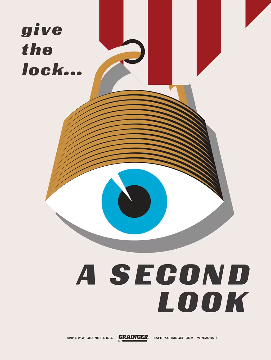
Retro Safety

I was visiting a customer of ours in Denver this week. They're an HVAC contractor and we were camped out in one of their conference rooms where they teach their service technicians. On the walls, among posters of air conditioning diagrams were a couple of safety posters. At first glance they look like they're from the 1950s and ’60s, but upon closer inspection, they're from 2016! The only credit I can find on the internet is the copywriter, John Wrend.

Sadly, the original microsite where Grainger had these posters is gone, but I managed to track down the full set.

Illustration of a padlock shaped like a human eye with text that reads “give the lock… A SECOND LOOK,” promoting safety awareness from Grainger.

Such a gorgeous visual essay from Amelia Wattenberger. Beyond being wonderful to look at, the content is just as thought-provoking. Her experiment towards the middle of the piece is interesting. In our world of flat design and design systems, Amelia is truly innovating.

People made of yarn working on room-sized computers

Our interfaces have lost their senses

With increasing amounts of AI chatbots, we're losing even more: texture, color, shape. Instead of interactive controls, we have a text input. Want to edit an image? Type a command. Adjust a setting? Type into a text box. Learn something? Read another block of text.

Earth 3 Streamline Icon: https://streamlinehq.comwattenberger.com
Poster of Putin as a false idol with the word FALSE

Putin: False

Update: A 18” x 24” screen-printed version of this poster is now available at my Etsy shop. It’s four colors: red, blue, black, and gold; and printed on thick 100 lb French Paper Co. cover stock. Proceeds will be donated to help Ukraine.

“…I want a man like Putin
One like Putin, full of strength
One like Putin, who won’t be a drunk
One like Putin, who wouldn’t hurt me
One like Putin, who won’t run away!”

— Lyrics from a popular Russian pop song, “One Like Putin,” from 2010.

3D red text “VOTE” with aviator sunglasses above it

Art for Biden

Sometimes it takes a small push to get the creative obsessions going. Like the majority of the country, I’ve been appalled at Donald Trump’s presidency. From his administration’s cruel policies to just how awful of a man Trump has shown himself, I have been gritting my teeth for four years, waiting for him to lose his re-election bid. I was profoundly concerned about democracy in the United States and how it was being actively undermined by Trump and his band of far-right Republicans.

When Trump ran against Hillary Clinton in 2016, I made a poster and website called “Inside Trump’s Brain.” I knew back then how terrible of a president he would be, but had hoped he’d grow into the office. Boy, was I wrong.

So when Joe Biden won the Democratic nomination, I needed to do all I could to get him elected and make Trump a one-term president.

I donated. I talked to the few I knew who supported Trump. I joined Biden’s texting team. But then my friend Christopher Simmons put out a call to his network for artwork to show support for the Biden & Harris ticket. What began as a one-off for me turned into a series driven by not only the cause, but by a need to just make. I became obsessed with 3D typography and loops. The format on Instagram is about creating bite-sized animations that can catch people’s attention and make them pause their scroll for a few seconds.

Graphic of a T shaped like a swastika

Agitprop in Times of Uncertainty

This was originally published as an item in Issue 005 of the designspun email newsletter.

Great art can be born out of great unrest. Anti-government, anti-evil propaganda harnesses the frustration and despair people feel in times of crisis. Mark Fox and Angie Wang (aka Design Is Play) are following up their award-winning “Trump 24K Gold-Plated” poster with a new series of anti-Trump agitprop. The pair have launched a Kickstarter campaign to help fund three posters, “Trump: Lord of the Lies” and a diptych called “White Lies Matter.”

From their Kickstarter page:

We designed Trump: Lord of the Lies to create a succinct mnemonic for Donald Trump’s corruption. Likewise, the White Lies Matter diptych crystallizes Donald Trump’s history of rhetorical flirtations with white supremacists. And after he is voted out of office, this work will add to the body of evidence that many Americans can still tell the difference between what is true, and what is false.
Cover of the 2009 FEED report featuring a pencil sketch of a man looking at a tattooed thigh, with mixed media elements.

Designing FEED 2009

FEED 2009 has now been released and I feel privileged to have been a part of this one. If you haven’t already checked it out, please do so. The report and findings are very compelling and eye-opening. [Download PDF]

I wanted to share a little bit about the process we went through in designing the new report.

When my friend and colleague Garrick Schmitt first approached me, he already had an editorial direction in mind. He realized the data was so profound that the usual packaging of articles around the report would actually take away from it. So he wanted a smaller format with less content. He referenced books by Marty Neumeier: simple layout, large type, lots of infographics. The theme for the book came down to “customer engagement.” The data shows that when brands engage with customers in an experience of some kind (like an event, contest, etc.), ninety-six percent (96%) of their customers are more likely to consider, buy from or recommend that brand. Ninety-six percent. You never see a number like that in a survey. (To get that number, add up the sometimes/usually/always percentages for the consider, purchase and recommend results.)

So the answer was obvious in my mind. The design had to be simple (and elegant) but it really had to have an organic touch; it’s about the customer after all. I started thinking about Darwin’s journal and his observations and drawings of animals. I toyed with having the whole book typeset in a font I could make from Garrick’s handwriting, accompanied by scientific drawings of consumers. As soon as I thought about looking at illustrators who had a realistic style, someone immediately came to mind. Earlier in the summer I worked with a freelance copywriter named David Fullarton who was also a talented illustrator/artist. His work combines collage with portraiture and witty copy. His style would be the foil to the business-speak and myriad bar graphs and pie charts. He was perfect.