Skip to content

7 posts in Visuals of the Day

3 min read
Close-up of bicentennial logo storyboard frames featuring red, white, and blue geometric patterns and star designs in rounded rectangles.

America at 200

When I was younger, I had a sheet of US Bicentennial stamps and I always loved the red, white, and blue star. Little did I know then that I would become a graphic designer.

Sheet of US postage stamps featuring the bicentennial star logo, each stamp showing "AMERICAN REVOLUTION BICENTENNIAL 1776-1976" with 8-cent denomination.

The symbol, designed by Bruce Blackburn at Chermayeff & Geismar is a multilayered stylized five-pointed star. It folds like bunting. Its rounded corners evoke both a flower and a pinwheel at the same time. And finally, the negative space reveals a classic, pointed star.

Official American Revolution Bicentennial logo - red and blue interlocking star design with "AMERICAN REVOLUTION BICENTENNIAL 1776-1976" text in circular border.

A few years ago, Standards Manual reproduced the guidelines and I managed to grab a copy. Here’s a spread featuring storyboards for a motion graphics spot. I love it.

Open guidebook showing American Revolution Bicentennial logo storyboard frames and a Certificate of Official Recognition template from 1776-1976.

In Blackburn’s foreword to the reproduction, he wrote:

My deliberations led to the following conclusions: to begin with, of all the revolutionary “American” symbols I considered as possible elements in a solution, the only one that passed the historical reference test and, at the same time, could be utilized in a contemporary or “modern” way was the five-pointed star from the Betsy Ross flag. But the star is an aggressive and militaristic form, and the event needed something friendlier, more accessible. Why not wrap the star in stripes of red, white and blue “bunting”, rounding the sharp edges of the star and producing a second star surrounding the original? The two stars also refer to the two American centuries being celebrated.

Also little-known fact—Blackburn’s version was not the winner of the competition. Richard Baird, writing for his great Logo Histories newsletter two years ago, tells the story:

The symbol designed by Bruce Blackburn while working at Chermayeff & Geismar Associates is well-known and celebrated as a fine achievement in marque-making. The symbol would go on to be used on the side of the NASA Vehicle Assembly Building, on the Viking Mars lander and used across stamps, patches and all kinds of promotional materials, which accounts for its widespread recognition in the US. However, few know that Blackburn’s design was not the winning entry, that honour went to Lance Wyman.

Honestly, I don’t like Wyman’s version as much. Maybe it’s because I’m so familiar with the Blackburn symbol. The 7 and 6 are too abstracted to be visible, even to a trained designer like me.

Happy 249th birthday, America.

Oh, and Chermayeff & Geismar & Haviv is working on the 250th anniversary branding for next year.

Talking Heads Release a Video for “Psycho Killer”

The Talking Heads have released a new music video for an old song. Directed by Mike Mills—who is not only a filmmaker but also a graphic designer—and starring Saoirse Ronan, the video for the band’s first hit, “Psycho Killer” is a wonderful study on the pressures, anxieties, and joys of being a young person in today’s world. It was made to celebrate the band’s 50th anniversary.

Play

Watch on YouTube

On Instagram, the band said, “This video makes the song better- We LOVE what this video is NOT - it’s not literal, creepy, bloody, physically violent or obvious.”

Me too.

The System Has Been Updated

I’ve been seeing this new ad from Coinbase these past few days and love it. Made by independent agency Isle of Any, this spot has on-point animation, a banging track, and a great concept that plays with the Blue Screen of Death.

Play

I found this one article about it from Little Black Book:

“Crypto is fundamentally updating the financial system,” says Toby Treyer-Evans, co-founder of Isle of Any, speaking with LBB. “So, to us it felt like an interesting place to start for the campaign, both as a film idea and as a way to play with the viewer and send a message. When you see it on TV, in the context of other advertising, it’s deliberately arresting… and blue being Coinbase’s brand colour is just one of those lovely coming togethers.”

Remember the Nineties?

In the 1980s and ’90s, Emigre was a prolific powerhouse. The company started out as a magazine in the mid-1980s, but quickly became a type foundry as the Mac enabled desktop publishing. As a young designer in San Francisco who started out in the ’90s, Zuzana Licko and Rudy VanderLans were local heroes (they were based across the Bay in Berkeley). From 1990–1999 they churned out 37 typefaces for a total of 157 fonts. And in that decade, they expanded their influence by getting into music, artists book publishing, and apparel. More than any other design brand, they celebrated art and artists.

Here is a page from a just-released booklet (with a free downloadable PDF) showcasing their fonts from the Nineties.

Two-page yellow spread featuring bold black typography samples. Left page shows “NINE INCH NAILS” in Platelet Heavy, “majorly” in Venus Dioxide Outlined, both dated 1993. Right page shows “Reality Bites” in Venus Dioxide, a black abstract shape below labeled Fellaparts, also from 1993.

Retro Safety

I was visiting a customer of ours in Denver this week. They’re an HVAC contractor and we were camped out in one of their conference rooms where they teach their service technicians. On the walls, among posters of air conditioning diagrams were a couple of safety posters. At first glance they look like they’re from the 1950s and ’60s, but upon closer inspection, they’re from 2016! The only credit I can find on the internet is the copywriter, John Wrend.

Sadly, the original microsite where Grainger had these posters is gone, but I managed to track down the full set.

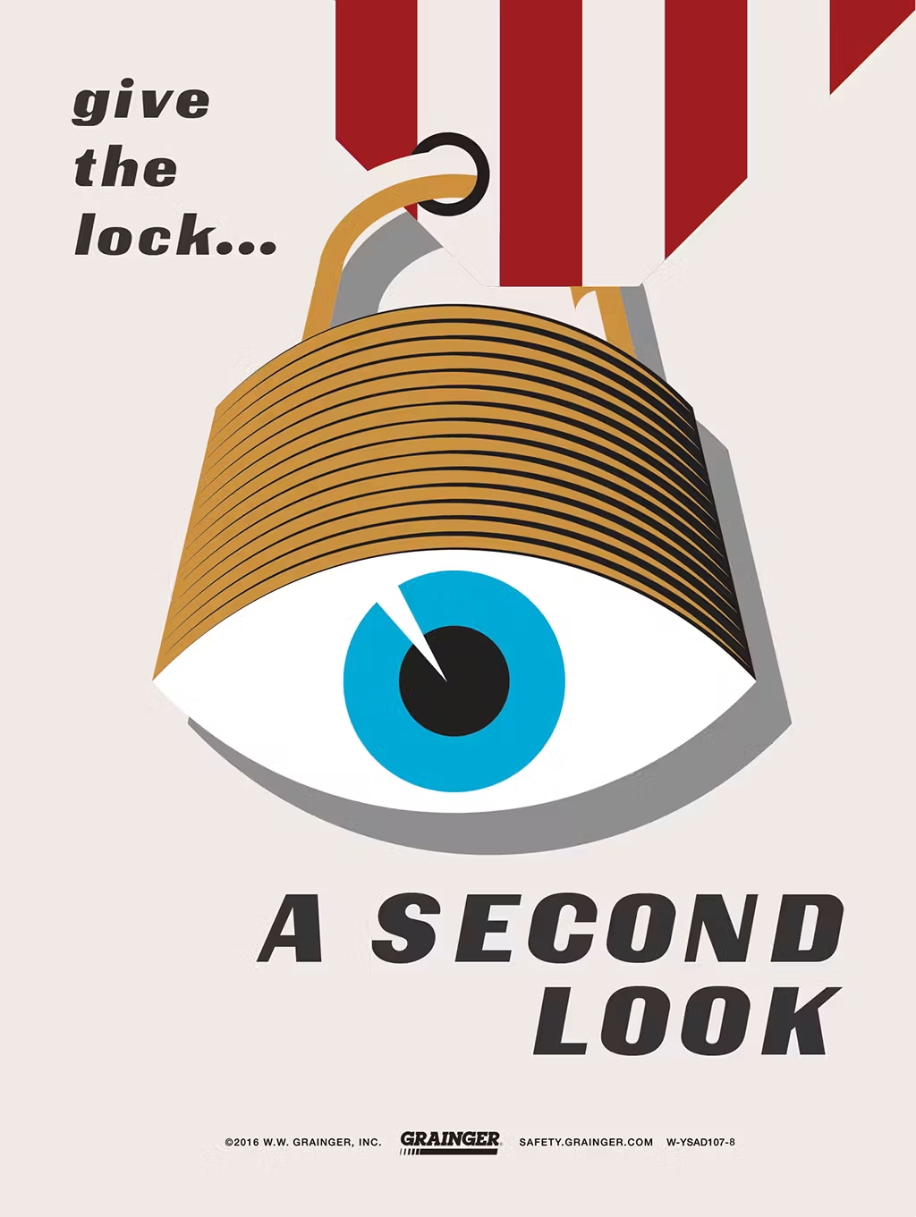
Illustration of a padlock shaped like a human eye with text that reads “give the lock… A SECOND LOOK,” promoting safety awareness from Grainger.

Illustration of an injured construction worker emerging from unstable scaffolding, with text reading “Make sure it’s SECURE” and “Scaffolding safety starts with you!” promoting workplace safety from Grainger.

Silhouette of a hard hat filled with workers using ladders, accompanied by the text “KEEP LADDER SAFETY TOP OF MIND,” promoting safe ladder practices from Grainger.

Cartoon-style illustration of a person getting their arm caught in a machine with the guard removed, alongside the text “DON’T LET YOUR MACHINE GUARD DOWN,” promoting machine safety from Grainger.

Worker in full arc flash protective gear stands in front of a red-orange explosion graphic, with bold text reading “Arc flashes kill” and a warning to stay prepared, promoting electrical safety from Grainger.

Illustration of a shocked electrical outlet with a zigzagging yellow wire above it and the text “Using the wrong wires can be SHOCKING,” promoting electrical wiring safety from Grainger.

Painterly illustration of a confident construction worker wearing a full-body safety harness with the text “Don it Properly!” promoting proper fall protection from Grainger.

Cartoon-style illustration of a distracted forklift driver on a phone causing falling boxes and a spilled drink, with the text “FOCUSED DRIVERS ARE SAFE DRIVERS,” promoting powered truck safety from Grainger.

Stylized illustration of a person wearing a yellow respirator mask with the text “WEAR YOUR RESPIRATOR! AND BREATHE EASY,” promoting respiratory safety from Grainger.

Retro-style poster featuring a surprised man’s face with the text “IGNORE HAZARDS, INVITE HAZCOM” above various hazardous chemical containers, promoting hazard communication safety from Grainger.