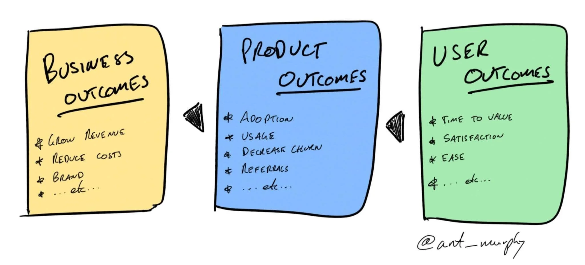
Lola Famulegun, writing for Nielsen Norman Group, separates the UX metrics that describe design performance from the business metrics executives use to judge an investment:
Upstream metrics tell you how the design performed. Examples include task success rates, error rates, SUS scores.
Downstream metrics capture what changed in the business as a result. Examples include support contact volume, conversion rates, and churn.
Downstream metrics tell you what the work was worth. You don’t need to abandon the metrics you already collect, but you do need to build a bridge from them to the ones leadership tracks. The table below maps common upstream metrics to the business priorities they most directly connect to, with a suggested framing for each.
Famulegun also points out that the translation depends on access to data outside the UX team. I recall that my team had to fight with my company’s revenue operations team to get access to Salesforce data so we could make prioritization decisions with ARR as an input.
Famulegun:
The data you need already exists inside your organization. Partner with finance, product analytics, customer support, or marketing to understand what they track and to get access to before-and-after data for flows you’ve redesigned. Even directional data is persuasive when it’s honest: “Contacts about [feature] dropped 30% in the quarter following the navigation change.”
A practical note: this translation only works if you have access to downstream data. If your team isn’t currently connected to product analytics, customer support, or finance reporting, that’s the first conversation to have.
The goal isn’t to overstate what UX delivers. It’s to surface the connection that already exists between the work your team does and the numbers the business is tracking.