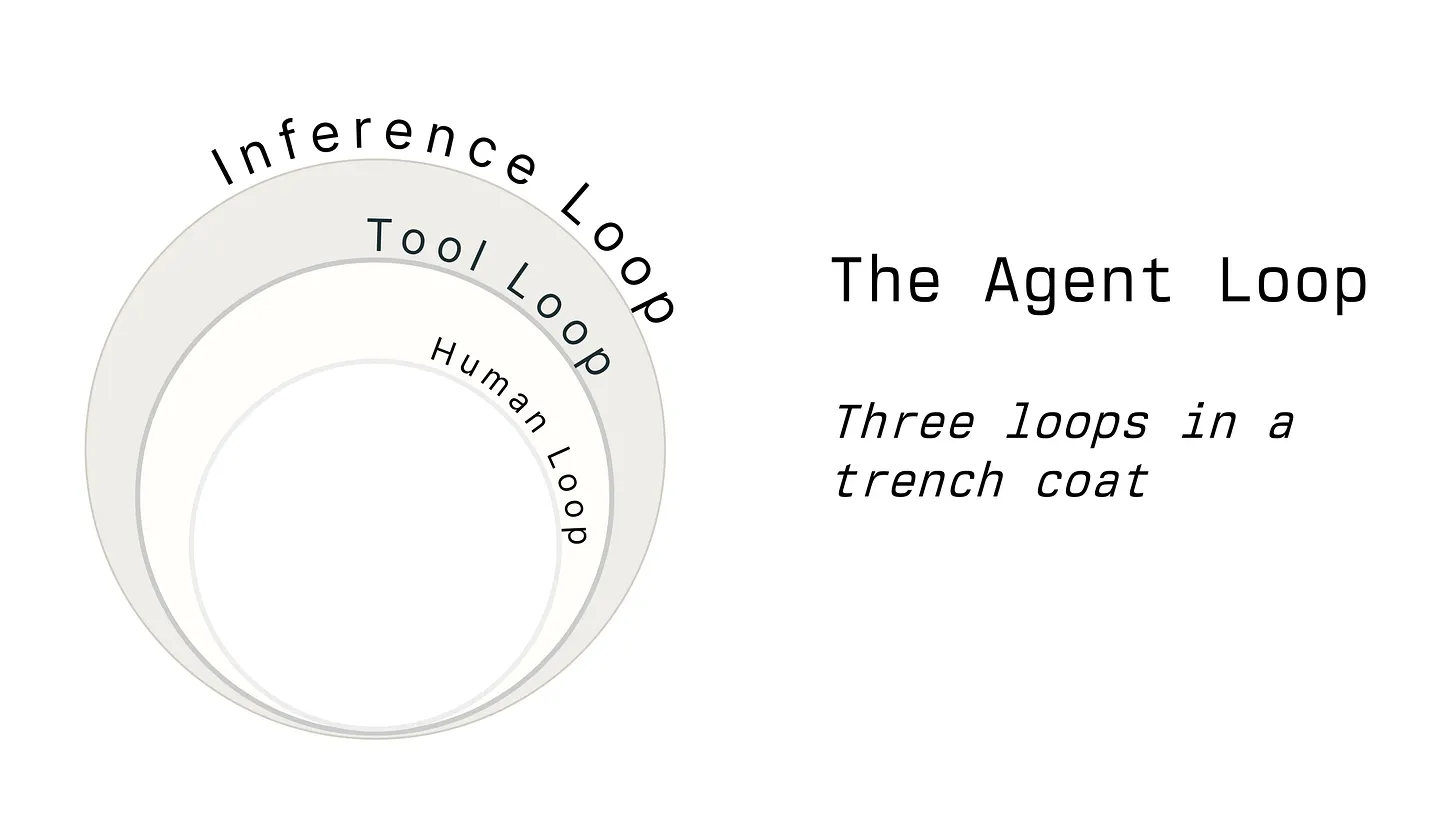
Skip to content
9 min read
Worn white robots with glowing pink eyes, one central robot displaying a pink-tinted icon for ChatGPT Atlas, in a dark alley with pink neon circle

OpenAI’s ChatGPT Atlas Browser Needs Work

Like many people, I tried OpenAI’s ChatGPT Atlas browser last week. I immediately made it my daily driver, seeing if I could make the best of it. Tl;dr: it’s still early days and I don’t believe it’s quite ready for primetime. But let’s back up a bit.

The Era of the AI Browser Is Here

Back in July, I reviewed both Comet from Perplexity and Dia from The Browser Company. It was a glimpse of the future that I wanted. I concluded:

The AI-powered ideas in both Dia and Comet are a step change. But the basics also have to be there, and in my opinion, should be better than what Chrome offers. The interface innovations that made Arc special shouldn’t be sacrificed for AI features. Arc is/was the perfect foundation. Integrate an AI assistant that can be personalized to care about the same things you do so its summaries are relevant. The assistant can be agentic and perform tasks for you in the background while you focus on more important things. In other words, put Arc, Dia, and Comet in a blender and that could be the perfect browser of the future.

There were also open rumors that OpenAI was working on a browser of their own, so the launch of Atlas was inevitable.

I will say that A-ha’s 1985 hit “Take On Me” and its accompanying video was incredibly influential on me as a kid. Listening to the struggles the band endured and the constant tuning of the song they did is very inspiring. In an episode of Song Exploder, Hrishikesh Hirway interviews Paul Waaktaar-Savoy, who originally wrote the bones of the song as a teenager, about the creative journey the band took to realize the version we know and love.

Hirway:

Okay, so you have spent the whole budget and then this version of the song comes out in 1984, and it flops. How were you able to convince anybody to give you another chance? Or maybe even more so, I’m curious, for your own sake: How were you able to feel like that wasn’t the end of the road for the song? Like, it had its chance, it didn’t happen, and that was that.

Waaktaar-Savoy:

Yeah, that’s the good thing about being young. You don’t feel, (chuckles) you know, you just sort of, brush it off your shoulders, you know. We were a hundred percent confident. We were like, there’s not a doubt in our minds.

…it took some time, you know, it was very touch and go. ‘Cause the, you know, they’ve spent this much money on the half-finished album. Are they gonna pour more money into it and risk losing more money? So, from Norway? Hey, no one comes from Norway and makes it. And so it was a risk for people.

Having gone to England from their native Norway, A-ha released two versions of the song in the UK before it became a hit in the US. With the help of the music video, of course.

A new record exec at the US arm of Warner Bros. took a liking to the band and the album, as Waaktaar-Savoy recalls:

And there was a new guy on the company, Jeff Ayeroff. He fell in love with the, the album and the song. And he had been keeping this one particular idea sort of in the back of his head. There was this art film called Commuter, with animation. So, he was the one who put together that with Steve Barron, who was the director.

And they made the video. And the song slowly climbed the charts to become a number one hit.

Play
Episode 301: A-ha

Episode 301: A-ha

Explore the making of “Take On Me” by A-ha on Song Exploder. Listen as band member Paul Waaktaar-Savoy shares the origins, evolution, and creative process behind their iconic hit. This episode delves into the band’s journey, the song’s chart-topping success, and the inspiration behind the legendary music video. Find full episode audio, streaming links, a transcript, and behind-the-scenes stories from A-ha, the most successful Norwegian pop group of all time. Discover music history and artist insights only on Song Exploder’s in-depth podcast series.

songexploder.net iconsongexploder.net

Circling back to Monday’s item on how caring is good design, Felix Haas has a subtly different take: build kindness into your products.

Kindness in design isn’t about adding smiley faces or writing cheerful copy. It’s deeper than tone. It’s about intent embedded in every interaction.

Kindness shows up in the patience of an empty state that doesn’t rush you. In the warmth of micro-interactions that acknowledge your actions without demanding attention. In error messages that guide rather than scold. In defaults that assume good intent rather than user incompetence.

These moments seem subtle, even trivial, in isolation. But they accumulate. They shape how we feel about a product over weeks and months. They turn interfaces into relationships. They build trust.

Kind Products Win

Kind Products Win

Why do so many products feel soulless?

designplusai.com icondesignplusai.com

As a follow-up to our previous item on Claude Code, here’s an article by Nick Babich who gives us three ways product designers can use Claude to code.

Remember that Anthropic’s Claude has been the leading LLM for coding for a while now.

Claude For Code: How to use Claude to Streamline Product Design Process

Claude For Code: How to use Claude to Streamline Product Design Process

Anthropic Claude is a primary competitor of OpenAI’s ChatGPT. Just like ChatGPT this is versatile tool that can be use used in many…

uxplanet.org iconuxplanet.org

With Cursor and Lovable as the darlings of AI coding tools, don’t sleep on Claude Code. Personally, I’ve been splitting my time between Claude Code and Cursor. While Claude Code’s primary persona is coders and tinkerers, it can be used for so much more.

Lenny Rachitsky calls it “the most underrated AI tool for non-technical people.”

The key is to forget that it’s called Claude Code and instead think of it as Claude Local or Claude Agent. It’s essentially a super-intelligent AI running locally, able to do stuff directly on your computer—from organizing your files and folders to enhancing image quality, brainstorming domain names, summarizing customer calls, creating Linear tickets, and, as you’ll see below, so much more.

Since it’s running locally, it can handle huge files, run much longer than the cloud-based Claude/ChatGPT/Gemini chatbots, and it’s fast and versatile. Claude Code is basically Claude with even more powers.

Rachitsky shares 50 of his “favorite and most creative ways non-technical people are using Claude Code in their work and life.”

Everyone should be using Claude Code more

Everyone should be using Claude Code more

How to get started, and 50 ways non-technical people are using Claude Code in their work and life

lennysnewsletter.com iconlennysnewsletter.com

Remote work really exploded when the Covid-19 pandemic hit. Everyone had to adjust to working from home, relying on Zoom and Slack and other collaborative tools much more. But beyond tooling, there’s also process. Matt Mullenweg, CEO of Automattic, has famously been a proponent of distributed work for a while.

Paolo Belcastro peels back the curtain to share how the 1,500 or so global employees of Automattic stay connected via two core principles:

There are two ideas that define our communication culture:

Radical Transparency: we default to openness, with every conversation accessible to everyone in the company. Asynchronous by Design: we don’t expect everyone to be “on” at the same time.

Everything is written down:

Our internal platform, P2, started life as a WordPress theme (it was called Prologue, later updated to version 2 and eventually shortened to P2) that lets people post directly on the front end of a site—fast, simple, and visible to everyone. Over time it evolved into a network of thousands of P2s for teams, projects, and watercooler chats (couch surfing, classified ads, house renovations, babies, pets, music, or games, we kind of have it all).

Every post, every comment, every decision ever made in the history of Automattic is preserved there.

As you can imagine, it soon becomes a volume problem. There’s too much stuff.

No one can read everything.

That’s why onboarding is designed to help people adapt:

  • Each newcomer is paired with a mentor from a different team, to give them a cross-company perspective.
  • They receive a curated list of “milestone posts” that map the history of Automattic, along with role-specific threads relevant to their work.
  • The Field Guide offers principles, templates, and advice about how to handle communication.

Somehow, they make it work.

Using chaos to communicate order

Using chaos to communicate order

How we communicate at Automattic

ttl.blog iconttl.blog

Building on Matthew Ström-Awn’s argument that true quality emerges from decentralized, ground-level ownership, Sean Goedecke writes an essay exploring how software companies navigate the tension between formalized control and the informal, often invisible work that actually drives product excellence.

But first, what does legibility even mean?

What does legibility mean to a tech company, in practice? It means:

  • The head of a department knows, to the engineer, all the projects the department is currently working on
  • That head also knows (or can request) a comprehensive list of all the projects the department has shipped in the last quarter
  • That head has the ability to plan work at least one quarter ahead (ideally longer)
  • That head can, in an emergency, direct the entire resources of the department at immediate work

Note that “shipping high quality software” or “making customers happy” or even “making money” is not on this list. Those are all things tech companies want to do, but they’re not legibility.

Goedecke argues that while leaders prize formal processes and legibility to facilitate predictability and coordination, these systems often overlook the messier, less measurable activities that drive true product quality and user satisfaction.

All organizations - tech companies, social clubs, governments - have both a legible and an illegible side. The legible side is important, past a certain size. It lets the organization do things that would otherwise be impossible: long-term planning, coordination with other very large organizations, and so on. But the illegible side is just as important. It allows for high-efficiency work, offers a release valve for processes that don’t fit the current circumstances, and fills the natural human desire for gossip and soft consensus.

Seeing like a software company

The big idea of James C. Scott’s Seeing Like A State can be expressed in three points: Modern organizations exert control by maximising “legibility”: by…

seangoedecke.com iconseangoedecke.com

Matt Ström-Awn makes the argument that companies can achieve sustainable excellence by empowering everyone at each level to take ownership of quality, rather than relying solely on top-down mandates or standardized procedures.

But more and more I’ve come to believe that quality isn’t a slogan, a program, or a scorecard. It’s a promise kept at the edge by the people doing the work. And, ideally, quality is fundamental to the product itself, where users can judge it without our permission. That’s the shift we need: away from heroics at the center, toward systems that make quality inevitable.

The stakes are high. Centralized quality — slogans, KPIs, executive decrees — can produce positive results, but it’s brittle. Decentralized quality — continuous feedback, distributed ownership, emergent standards — builds resilience. In this essay, I’d like to make the case that the future belongs to those who can decentralize their mindset and approach to quality.

Ström-Awn offers multiple case studies, contrasting centralized systems with decentralized ones, using Ford, Amazon, Apple, Toyota, Netflix, 3M, Morning Star, W.L. Gore, Valve, Barnes & Noble, and Microsoft under Satya Nadella as examples.

These stories share a common thread: organizations that trusted their frontline workers to identify and solve quality problems. But decentralized quality has its own vulnerabilities. Valve’s radical structure has been criticized for creating informal power hierarchies and making it difficult to coordinate large projects. Some ex-employees describe a “high school clique” atmosphere where popular workers accumulate influence while others struggle. Without traditional management oversight, initiatives can moulder, or veer in directions that don’t serve broader company goals.

Still, these examples show a different path for achieving quality, where excellence is defined in the course of building a product. Unlike centralized approaches relying on visionary (but fallible) leaders, decentralized systems are resilient to individual failures, adaptable to change, and empowering to builders. The andon cord, the rolling desk, and the local bookstore manager each represent a small bet on human judgment over institutional control. Those bets look like they’re paying off.

Decentralizing quality

Decentralizing quality

Why moving judgment to the edges wins in the long run

matthewstrom.com iconmatthewstrom.com

Slow and steady wins the race, so they say. And in Waymo’s case, that’s true. Unlike the stereotypical Silicon Valley of “Move fast and break things,” Waymo has been very deliberate and intentional in developing its self-driving tech. In other words, they’re really trying to account for the unintended consequences.

Writing for The Atlantic, Saahil Desai:

Compared with its robotaxi competitors, “Waymo has moved the slowest and the most deliberately,” [Bryant Walker Smith] said—which may be a lesson for the world’s AI developers. The company was founded in 2009 as a secretive project inside of Google; a year later, it had logged 1,000 miles of autonomous rides in a tricked-out Prius. Close to a decade later, in 2018, Waymo officially launched its robotaxi service. Even now, when Waymos are inching their way into the mainstream, the company has been hypercautious. The company is limited to specific zones within the five cities it operates in (San Francisco, Phoenix, Los Angeles, Austin, and Atlanta). And only Waymo employees and “a growing number of guests” can ride them on the highway, Chris Bonelli, a Waymo spokesperson, told me. Although the company successfully completed rides on the highway years ago, higher speeds bring more risk for people and self-driving cars alike. What might look like a few grainy pixels to Waymo’s cameras one moment could be roadkill to swerve around the very next.

Move Fast and Break Nothing

Move Fast and Break Nothing

Waymo’s robotaxis are probably safer than ChatGPT.

theatlantic.com icontheatlantic.com

As UX designers, we try to anticipate the edge cases—what might a user do and how can we ensure they don’t hit any blockers. But beyond the confines of the products we build, we must also remember to anticipate the unintended consequences. How might this product or feature affect the user emotionally? Are we creating bad habits? Are we fomenting rage in pursuit of engagement?

Martin Tomitsch and Steve Baty write in DOC, suggesting some frameworks to anticipate the unpredictable:

Chaos theory describes the observation that even tiny perturbations like the flutter of a butterfly can lead to dramatic, non-linear effects elsewhere over time. Seemingly small changes or decisions that we make as designers can have significant and often unforeseen consequences.

As designers, we can’t directly control the chain of reactions that will follow an action. Reactions are difficult to predict, as they occur depending on factors beyond our direct control.

But by using tools like systems maps, the impact ripple canvas, and iceberg visuals, we can take potential reactions out of the unpredictable pile and shift them into the foreseeable pile.

The UX butterfly effect

The UX butterfly effect

Understanding unintended consequences in design and how to plan for them.

doc.cc icondoc.cc

OK, so there’s workslop, but there’s also general AI slop. With OpenAI’s recent launch of the Sora app, there going to be more and more AI-generated image and video content making the rounds. I do believe that there’s a place for using AI to generate imagery. It can be done well (see Christian Haas’s “AI Jobs”). Or not.

Casey Newton, writing in his Platformer newsletter:

In Sora we find the entire debate over AI-generated media in miniature. On one hand, the content now widely derided as “slop” continually receives brickbats on social media, in blog posts and in YouTube comments. And on the other, some AI-generated material is generating millions of views — presumably not all from people who are hate-watching it.

As the content on the internet is increasingly AI-generated, platforms will need to balance how much of it they let in, lest the overall quality drops.

As Sarah Perez noted at TechCrunch, Pinterest has come under fire from its user base all year for a perceived decline in quality of the service as the percentage of slop there increases. Many people use the service to find real objects they can buy and use; the more that those objects are replaced with AI fantasies, the worse Pinterest becomes for them.

Like most platforms, Pinterest sees little value in banning slop altogether. After all, some people enjoy looking at fantastical AI creations. At the same time, its success depends in some part on creators believing that there is value in populating the site with authentic photos and videos. The more that Pinterest’s various surfaces are dominated by slop, the less motivated traditional creators may be to post there.

How platforms are handling the slop backlash

How platforms are handling the slop backlash

AI-generated media is generating millions of views. But some companies are beginning to rein it in

platformer.news iconplatformer.news

Sticking with the workslop or outsourcing our main work to AI, Douglas Rushkoff writes in Fast Company:

By using the AI to do the big stuff—by outsourcing our primary competencies to the machines instead of giving them the boring busywork—we deskill ourselves and deprive everyone of the opportunity for AI-enhanced outputs. Too many of us are using AI as the primary architect for a project, rather than the general contractor who supports the architect’s human vision.

People forget that it’s the process of doing something that helps us synthesize and form the connections necessary for innovation.

As the researcher behind MIT’s study “This is Your Brain on ChatGPT” explained at a recent ANDUS event, when people turn to an AI for a solution before working on a problem themselves, the number of connections formed in their brains decreases. But when they turn to the AI after working on the problem for a while, they end up with more neural connections than if they worked entirely alone.

That’s because the value of the AI is not its ability to create product for us, but to engage with us in our process. Working and iterating with an AI—doing what we could call generative thinking—is actually a break from Industrial Age thinking. We focus less on outputs than on cycles. Less on the volume of short-term results (assembly line), and more on the quality and complexity of thought and innovation.

The value of the AI is not its ability to create product for us, but to engage with us in our process

The value of the AI is not its ability to create product for us, but to engage with us in our process

AI doesn’t have to replace our competencies or even our employees.

fastcompany.com iconfastcompany.com

Speaking of workslop, here’s an article from NN/g on how to avoid falling into over-reliance on AI in our design field. They call it the “7 Deadly AI Sins for UX Professionals.”

  1. Outsourced Thinking
  2. Wasted Time
  3. Lost Details
  4. Isolated Ideation
  5. Naïve Trust
  6. Bland Taste
  7. Defensive Outlook

As Tanner Kohler writes:

It’s not about avoiding AI. It’s about maintaining your own growth and the quality of your work as you use AI. AI will constantly be changing. Never let yourself slip into repeatedly committing the sins that weaken you and your UX skills.

7 Deadly AI Sins for UX Professionals

7 Deadly AI Sins for UX Professionals

Succumbing to AI temptations weakens your UX skills. Strive for the AI virtues to keep yourself strong as you use AI in your work.

nngroup.com iconnngroup.com

Definitely use AI at work if you can. You’d be guilty of professional negligence if you don’t. But, you must not blindly take output from ChatGPT, Claude, or Gemini and use it as-is. You have to check it, verify that it’s free from hallucinations, and applicable to the task at hand. Otherwise, you’ll generate “workslop.”

Kate Niederhoffer, Gabriella Rosen Kellerman, et. al., in Harvard Business Review, report on a study by Stanford Social Media Lab and BetterUp Labs. They write, “Employees are using AI tools to create low-effort, passable looking work that ends up creating more work for their coworkers.”

Here’s how this happens. As AI tools become more accessible, workers are increasingly able to quickly produce polished output: well-formatted slides, long, structured reports, seemingly articulate summaries of academic papers by non-experts, and usable code. But while some employees are using this ability to polish good work, others use it to create content that is actually unhelpful, incomplete, or missing crucial context about the project at hand. The insidious effect of workslop is that it shifts the burden of the work downstream, requiring the receiver to interpret, correct, or redo the work. In other words, it transfers the effort from creator to receiver.

Don’t be like this. Use it to do better work, not to turn in mediocre work.

Workslop may feel effortless to create but exacts a toll on the organization. What a sender perceives as a loophole becomes a hole the recipient needs to dig out of. Leaders will do best to model thoughtful AI use that has purpose and intention. Set clear guardrails for your teams around norms and acceptable use. Frame AI as a collaborative tool, not a shortcut. Embody a pilot mindset, with high agency and optimism, using AI to accelerate specific outcomes with specific usage. And uphold the same standards of excellence for work done by bionic human-AI duos as by humans alone.

AI-Generated “Workslop” Is Destroying Productivity

AI-Generated “Workslop” Is Destroying Productivity

Despite a surge in generative AI use across workplaces, most companies are seeing little measurable ROI. One possible reason is because AI tools are being used to produce “workslop”—content that appears polished but lacks real substance, offloading cognitive labor onto coworkers. Research from BetterUp Labs and Stanford found that 41% of workers have encountered such AI-generated output, costing nearly two hours of rework per instance and creating downstream productivity, trust, and collaboration issues. Leaders need to consider how they may be encouraging indiscriminate organizational mandates and offering too little guidance on quality standards. To counteract workslop, leaders should model purposeful AI use, establish clear norms, and encourage a “pilot mindset” that combines high agency with optimism—promoting AI as a collaborative tool, not a shortcut.

hbr.org iconhbr.org

The web is a magical place. It started out as a way to link documents like research papers across the internet, but has evolved into the representation of the internet and the place where we get information and get things done. Writer Will Leitch on Medium:

It is difficult to describe, to a younger person or, really, anyone who wasn’t there, what the emergence of the Internet — this thing that had not been there your entire life, that you had no idea existed, that was suddenly just everywhere — meant to someone who wanted to write. When I graduated college in 1997, the expectation for me, and most wanna-be writers, was that we had two options: Start on the bottom rung of a print publication and toil away for years, hoping that enough people with jobs above you would retire or die in time for you to get a real byline by the time you were 40, or write a brilliant novel or memoir that turned you into Dave Eggers or Elizabeth Wurtzel. That was pretty much it! Then, suddenly, from the sky, there was this place where you could:

  • Write whatever you wanted.
  • Write as long as you wanted.
  • Have your work available to read by anyone, anywhere on the entire freaking planet.

This was — and still is — magical.

The core argument of what Leitch write is that while the business and traffic models that fueled web publishing are collapsing—due to changing priorities of platforms like Google and the dominance of video on social media (i.e., TikTok and Reels), the essential, original magic of publishing on the web isn’t dead.

But that does not mean that Web publishing — that writing on the Internet, the pure pleasure of putting something out in the world and having it be yours, of discovering other people who are doing the same thing — itself is somehow dead, or any less magical than it was in the first place. Because it is magical. It still is. It always was.

It’s the (Theoretical) End of Web Publishing (and I Feel Fine)

It’s the (Theoretical) End of Web Publishing (and I Feel Fine)

Let’s remember why we started publishing on the Web in the first place.

williamfleitch.medium.com iconwilliamfleitch.medium.com

Noah Davis writing in Web Designer Depot, says aloud what I’d thought—but never wrote down—before AI, templates started to kill creativity in web design.

If you’re wondering why the web feels dead, lifeless, or like you’re stuck in a scrolling Groundhog Day of “hero image, tagline, three icons, CTA,” it’s not because AI hallucinated its way into the design department.

It’s because we templatified creativity into submission!

We used to design websites like we were crafting digital homes—custom woodwork, strange hallways, surprise color choices, even weird sound effects if you dared. Each one had quirks. A personality. A soul.

When I was coming up as a designer in the late 1990s and early 2000s, one of my favorite projects was designing Pixar.com. The animation studio’s soul—and by extension the soul I’d imbue into the website—was story. The way this manifest was a linear approach to the site, similar to a slideshow, to tell the story of each of their films.

And as the web design industry grew, and everyone needed and wanted a website, from Fortune 500s to the local barber shop, access to well-designed websites was made possible via templates.

Let’s be real: clients aren’t asking for design anymore. They’re asking for “a site like this.” You know the one. It looks clean. It has animations. It scrolls smoothly. It’s “modern.” Which, in 2025, is just a euphemism for “I want what everyone else has so I don’t have to think.”

Templates didn’t just streamline web development. They rewired what people expect a website to be.

Why hire a designer when you can drop your brand colors into a no-code template, plug in some Lottie files, and call it a day? The end result isn’t bad. It’s worse than bad. It’s forgettable.

Davis ends his rant with a call to action: “If you want design to live, stop feeding the template machine. Build weird stuff. Ugly stuff. Confusing stuff. Human stuff.”

AI Didn’t Kill Web Design —Templates Did It First

AI Didn’t Kill Web Design —Templates Did It First

The web isn’t dying because of AI—it’s drowning in a sea of templates. Platforms like Squarespace, Wix, and Shopify have made building a site easier than ever—but at the cost of creativity, originality, and soul. If every website looks the same, does design even matter anymore?

webdesignerdepot.com iconwebdesignerdepot.com

Designer Ben Holliday writes a wonderful deep dive into how caring is good design. In it, he references the conversation that Jony Ive had with Patrick Collison a few months ago. (It’s worth watching in its entirety if you haven’t already.)

Watching the interview back, I was struck by how he spoke about applying care to design, describing how:

“…everyone has the ability to sense the care in designed things because we can all recognise carelessness.”

Talking about the history of industrial design at Apple, Ive speaks about the care that went into the design of every product. That included the care that went into packaging – specifically things that might seem as inconsequential as how a cable was wrapped and then unpackaged. In reality, the type of small interactions that millions of people experienced when unboxing the latest iPhone. These are details that people wouldn’t see as such, but Ive and team believed that they would sense care when they had been carefully considered and designed.

This approach has always been a part of Jony Ive’s design philosophy, or the principles applied by his creative teams at Apple. I looked back and found an earlier 2015 interview and notes I’d made where he says how he believes that the majority of our manufactured environment is characterised by carelessness. But then, how, at Apple, they wanted people to sense care in their products.

The attention to detail and the focus and attention we can all bring to design is care. It’s important.

Holliday’s career has been focused in government, public sector, and non-profit environments. In other words, he thinks a lot about how design can impact people’s lives at massive scale.

In the past few months, I’ve been drawn to the word ‘careless’ when thinking about the challenges faced by our public services and society. This is especially the case with the framing around the impact of technology in our lives, and increasingly the big bets being made around AI to drive efficiency and productivity.

The word careless can be defined as the failure to give sufficient attention to avoiding harm or errors. Put simply, carelessness can be described as ‘negligence’.

Later, he cites Facebook/Meta’s carelessness when they “used data to target young people when at their most vulnerable,” specifically, body confidence.

Design is care (and sensing carelessness)

Design is care (and sensing carelessness)

Why design is care, and how the experiences we shape and deliver will be defined by how people sense that care in the future.

benholliday.com iconbenholliday.com

Auto-Tagging the Post Archive

Since I finished migrating my site from Next.js/Payload CMS to Astro, I’ve been wanting to redo the tag taxonomy for my posts. They’d gotten out of hand over time, and the tag tumbleweed grew to more than 80 tags. What the hell was I thinking when I had both “product design” and “product designer”?

Anyway, I tried a few programmatic ways to determine the best taxonomy, but ultimately manually culled it down to 29 tags. Then, I really didn’t want to have to manually go back and re-tag more than 350 posts. So I turned to AI. It took two attempts. The first one that Cursor planned for me used ML to discern the tags, but that failed spectacularly because it was using frequency of words, not semantic meaning.

So I ultimately tried an LLM approach and that worked. I spec’d it out and had Claude Code write it for me. Then after another hour or so of experimenting and seeing if the resulting tags worked, I let it run concurrently in four terminal windows to process all the posts from the past 20 years. Et voila!

I spot-checked at least half of all the posts manually and made some adjustments. But I’m pretty happy with the results.

See the new tags on the Search page or just click around and explore.

Designer Davide Mascioli created a book and online archive of over 450 space exploration-related logos from around the world.

It’s a wonderful archive—pretty exhaustive—and includes a smattering of logos from science fiction (though less exhaustive there, since there are so many sci-fi properties).

Here are some of my favorites (graphically)…

NASA 1975 “Worm” logo page with bold typographic mark on light blue background and logotype samples.

South African National Space Agency 2010 page with swirling logo on mint background and mission control display.

Australian Space Agency 2018 page with abstract black circles on pink background and a rocket launch photo.

Firefly Aerospace 2017 page with stylized firefly logo on yellow background and rocket assembly image.

Zero 2 Infinity 2009 page with circular “011∞” logo on yellow background and high-altitude balloon pod photo.

Space Exploration Logo Archive

Space Exploration Logo Archive

S.E.L.A. is an archive of logos related to the world of Space Exploration. The collection spans more than 80 years of works and includes the most iconic and noteworthy logos distributed in seven chapters, starting with the best known up to the raw & rare ones.

spaceexplorationlogoarchive.webflow.io iconspaceexplorationlogoarchive.webflow.io

I will admit that I’d not heard of this website until I came across this article. Playing around with Perfectly Imperfect myself, I find it to be the strange web Brutalist manifestation of MySpace for the Gen Z generation.

Sudi Jama, writing for It’s Nice That:

Talking about the design for Perfectly Imperfect’s social site pi.fyi, on the other hand, Tyler says: “The design calls back to an era where algorithms didn’t dominate your day-to-day experience on the internet.” Tyler rejects the homogenisation of web design and decided to swerve Perfectly Imperfect into a lane of its own, inspired by the early internet aesthetics of “solid but saturated colours, lack of texture, MS Paint-style airbrushing, and a singular broadcast-style aesthetic”, Brent David Freaney tells us. Brent’s studio Special Offer collaborated with Tyler to bring the best parts of early internet’s visuality, whilst still creating something that belongs in 2025. Some fun facts: Pi.fyi’s colour system was modelled from 1990s McDonald’s brand and style guidelines, and the spray paint logo was inspired by an old Teenage Fanclub band t-shirt Tyler got on eBay.

The platform thrives in the chaos, all born from its visible human touch. “A lot of the core pages that users spend time on (the home page, profiles, etc) are designed to look more like a magazine than a social site.” The visuals are deliberately flat, featuring few animations, in order to let the design cut through. The mixture of a home page presented as acting front page, with editorial content, user posts, profiles adorned in large image paired with bold bordered text, and written content pouring from the right side of the screen. Tyler says: “It’s this approach that’s led us to calling Perfectly Imperfect a ‘social magazine’.” Tyler is inspired by the likes of Index Mag, MySpace, and i-D, among others – all boundary-pushing platforms which hold a cultural authority.

Perfectly Imperfect is the ‘social magazine’ (and nerd’s paradise) remodelling the online sphere

Perfectly Imperfect is the ‘social magazine’ (and nerd’s paradise) remodelling the online sphere

Split between a platform to profile figures from Charli XCX to Francis Ford Coppola, and a social network that refuses to serve the algorithm overlords, this magazine is breaking necks.

itsnicethat.com iconitsnicethat.com

Writing for UX Collective, Filipe Nzongo argues that designers should embrace behavior as a fundamental design material—not just to drive metrics or addiction, but to intentionally create products that empower people and foster meaningful, lasting change in their lives.

Behavior should be treated as a design material, just as technology once became our material. If we use behavior thoughtfully, we can create better products. More than that, I believe there is a broader and more meaningful opportunity before us: to design for behavior. Not to make people addicted to products, but to help them grow as human beings, better parents, citizens, students, and professionals. Because if behavior is our medium, then design is our tool for empowerment.

Behavior is our medium

Behavior is our medium

The focus should remain on human

uxdesign.cc iconuxdesign.cc

A former colleague of mine, designer Evan Sornstein wrote a wonderful piece on LinkedIn applying Buddhist principles to design.

Buddhism begins with the recognition that life is marked by impermanence, suffering, and non-self. These aren’t abstract doctrines — they are observations about how the world actually works. Over centuries, these ideas contributed to Japanese aesthetics: wabi-sabi (imperfection), ma (meaningful emptiness), yo no bi (beauty in usefulness), the humility of the shokunin, and the care of omotenashi. What emerges is not a set of rules, but an extraordinary perspective: beauty is inseparable from impermanence; usefulness is inseparable from dignity; care is inseparable from design. In an age when our digital products too often prioritize stickiness and metrics over humanity, these ideas offer a different path. They remind us that design is not about control or cleverness — it’s about connection, trust, and care.

The following eight principles aren’t new “methods” or “laws,” but reflections of this lineage, reframed for product design — though they apply to nearly any creative practice. They are invitations to design with the same attention, humility, and compassion that Buddhism and Japanese aesthetics have carried for centuries.

Designing Emptiness

Designing Emptiness

What Buddhism and Japanese aesthetics teach us about space, meaning, and care in UX It’s been about two years since I first realized I wanted to write this. Looking back, I’ve been on a quiet path for nearly a decade — unknowingly becoming a Buddhist.

linkedin.com iconlinkedin.com

I think these guidelines from Vercel are great. It’s a one-pager and very clearly written for both humans and AI. It reminds me of the old school MailChimp brand voice guidelines and Apple’s Human Interface Guidelines which have become reference standards.

Web Interface Guidelines

Web Interface Guidelines

Guidelines for building great interfaces on the web. Covers interactions, animations, layout, content, forms, performance & design.

vercel.com iconvercel.com

For as long as I can remember, I’d always loved magazines. Print magazines aren’t as trendy these days, but back in the day, I probably had at least a dozen magazine subscriptions. My favorites—naturally—were always the ones with great editorial design, art direction, and photography. Classics like Wired, Interview, Harper’s Bazaar, and Rolling Stone. And, of course, Colors.

The New York Times Magazine lists the top 25 magazine covers of all time. Their list includes classics like George Lois’s cover for Esquire posing Muhammad Ali as Saint Sebastian, the black on black post-9/11 cover for The New Yorker by Art Spiegelman and Françoise Mouly, and Annie Leibovitz’s photo of a clothed Yoko Ono and nude John Lennon for Rolling Stone.

The 25 Most Influential Magazine Covers of All Time

The 25 Most Influential Magazine Covers of All Time

(Gift Article) Four editors, a creative director and a visual artist met to debate and discuss the best of print media — and its enduring legacy.

nytimes.com iconnytimes.com

There’s a famous quote that Henry Ford allegedly said:

If I had asked people what they wanted, they would have said faster horses.

Anton Sten argues that a lot of people use this quote to justify not doing any user (or market) research:

This quote gets thrown around constantly—usually by someone who wants to justify ignoring user research entirely. The logic goes: users don’t know what they want, so why bother asking them?

I think he’s right. The question to ask users isn’t “What should we build?” but “What are your biggest pain points?”

Good research uncovers problems. It reveals pain points. It helps you understand what people are actually struggling with in their daily lives. What they’re working around. What they’ve given up on entirely.

Users aren’t supposed to design your product. That’s your job. But they’re the only ones who can tell you what’s actually broken in their world.

When you focus on understanding problems instead of collecting feature requests, you stop getting “faster horses” and start hearing real needs.

Henry Ford’s horse problem wasn’t about imagination

The famous “faster horses” quote isn’t wrong because users can’t imagine solutions—it’s wrong because it defends lazy research.

antonsten.com iconantonsten.com