Skip to content

49 posts tagged with “design process”

I love this framing by Patrizia Bertini:

Let me offer a different provocation: AI is not coming for your job. It is coming for your tasks. And if you cannot distinguish between the two, then yes — you should be worried. Going further, she distinguishes between output and outcome: Output is what a process produces. Code. Copy. Designs. Legal briefs. Medical recommendations. Outputs are the tangible results of a system executing its programmed or prescribed function — the direct product of following steps, rules, or algorithms. The term emerged in the industrial era, literally describing the quantity of coal or iron a mine could extract in a given period. Output depends entirely on the efficiency and capability of the process that generates it.

Outcome is what happens when that output meets reality. An outcome requires context, interpretation, application, and crucially — intentionality. Outcomes demand understanding not just what was produced, but why it matters, who it affects, and what consequences ripple from it. Where outputs measure productivity, outcomes measure impact. They are the ultimate change or consequence that results from applying an output with purpose and judgment.

She argues that, “AI can generate outputs. It cannot, however, create outcomes.”

This reminds me of a recent thread by engineer Marc Love:

It’s insane just how much how I work has changed in the last 18 months.

I almost never hand write code anymore except when giving examples during planning conversations with LLMs.

I build multiple full features per day , each of which would’ve taken me a week or more to hand write. Building full drafts and discarding them is basically free.

Well over half of my day is spent ideating, doing systems design, and deciding what and what not to build.

It’s still conceptually the same job, but if i list out the specific things i do in a day versus 18 months ago, it’s almost completely different.

Care about the outcome, not the output.

preview-1759425572315-1200x533.png

When machines make outputs, humans must own outcomes

The future of work in the age of AI and deepware.

uxdesign.cc iconuxdesign.cc

When I read this, I thought to myself, “Geez, this is what a designer does.” I think there is a lot of overlap between what we do as product designers and what product managers do. One critical one—in my opinion, and why we’re calling ourselves product designers—is product sense. Product sense is the skill of finding real user needs and creating solutions that have impact.

So I think people can read this with two lenses:

  • If you’re a designer who executes the assignments you’re given, jumping into Figma right away, read this to be more well-rounded and understand the why of what you’re making.
  • If you’re a designer who spends 80% of your time questioning everything and defining the problem, and only 20% of your time in Figma, read this to see how much overlap you actually have with a PM.

BTW, if you’re in the first bucket, I highly encourage you to gain the skills necessary to migrate to the second bucket.

While designers often stay on top of visual design trends or the latest best practices from NNG, Jules Walter suggests an even wider aperture. Writing in Lenny’s Newsletter:

Another practice for developing creativity is to spend time learning about emerging trends in technology, society, and regulations. Changes in the industry create opportunities for launching new products that can address user needs in new ways. As a PM, you want to understand what’s possible in your domain in order to come up with creative solutions.

preview-1758776009017.png

How to develop product sense

Jules Walter shares a ton of actionable and practical advice to develop your product sense, explains what product sense is, how to know if you’re getting better,

lennysnewsletter.com iconlennysnewsletter.com

Interesting piece from Vaughn Tan about a critical thinking framework that is disguised as a piece about building better AI UIs for critical thinking. Sorry, that sentence is kind of a tongue-twister. Tan calls out—correctly—that LLMs don’t think, or in his words, can’t make meaning:

Meaningmaking is making inherently subjective decisions about what’s valuable: what’s desirable or undesirable, what’s right or wrong. The machines behind the prompt box are remarkable tools, but they’re not meaningmaking entities.

Therefore when users ask LLMs for their opinions on matters, e.g., as in the therapy use case, the AIs won’t come back with actual thinking. IMHO, it’s semantics, but that’s another post.

Anyhow, Tan shares a pen and paper prototype he’s been testing, which breaks down a major decision into guided steps, or put another way, a framework.

This user experience was designed to simulate a multi-stage process of structured elicitation of various aspects of strongly reasoned arguments. This design explicitly addresses both requirements for good tool use. The structured prompts helped students think critically about what they were actually trying to accomplish with their custom major proposals — the meaningmaking work of determining value, worth, and personal fit. Simultaneously, the framework made clear what kinds of thinking work the students needed to do themselves versus what kinds of information gathering and analysis could potentially be supported by tools like LLMs.

This guided or framework-driven approach was something I attempted wtih Griffin AI. Via a series of AI-guided prompts to the user—or a glorified form, honestly—my tool helped users build brand strategies. To be sure, a lot of the “thinking” was done by the model, but the idea that an AI can guide you to critically think about your business or your client’s business was there.

preview-1756270668809.png

Designing AI tools that support critical thinking

Current AI interfaces lull us into thinking we’re talking to something that can make meaningful judgments about what’s valuable. We’re not — we’re using tools that are tremendously powerful but nonetheless can’t do “meaningmaking” work (the work of deciding what matters, what’s worth pursuing).

vaughntan.org iconvaughntan.org

Designer Tey Bannerman writes that when he hears “human in the loop,” he’s reminded of a story about Lieutenant Colonel Stanislav Petrov, a Soviet Union duty watch officer who monitored for incoming missile strikes from the US.

12:15 AM… the unthinkable. Every alarm in the facility started screaming. The screens showed five US ballistic missiles, 28 minutes from impact. Confidence level: 100%. Petrov had minutes to decide whether to trigger a chain reaction that would start nuclear war and could very well end civilisation as we knew it.

He was the “human in the loop” in the most literal, terrifying sense.

Everything told him to follow protocol. His training. His commanders. The computers.

But something felt wrong. His intuition, built from years of intelligence work, whispered that this didn’t match what he knew about US strategic thinking.

Against every protocol, against the screaming certainty of technology, he pressed the button marked “false alarm”.

Twenty-three minutes of gripping fear passed before ground radar confirmed: no missiles. The system had mistaken a rare alignment of sunlight on high-altitude clouds for incoming warheads.

His decision to break the loop prevented nuclear war.

Then Bannerman shares an awesome framework he developed that allows humans in the loop in AI systems “genuine authority, time to think, and understanding the bigger picture well enough to question” the system’s decision. Click on to get the PDF from his site.

Framework diagram by Tey Bannerman titled Beyond ‘human in the loop’. It shows a 4×4 matrix mapping AI oversight approaches based on what is being optimized (speed/volume, quality/accuracy, compliance, innovation) and what’s at stake (irreversible consequences, high-impact failures, recoverable setbacks, low-stakes outcomes). Colored blocks represent four modes: active control, human augmentation, guided automation, and AI autonomy. Right panel gives real-world examples in e-commerce email marketing and recruitment applicant screening.

Redefining ‘human in the loop’

"Human in the loop" is overused and vague. The Petrov story shows humans must have real authority, time, and context to safely override AI. Bannerman offers a framework that asks what you optimize for and what is at stake, then maps 16 practical approaches.

teybannerman.com iconteybannerman.com

In a fascinating thread about designing a typeface in Illustrator versus a font editor, renowned typographer Jonathan Hoefler lets us peek behind the curtains.

But moreover, the reason not to design typefaces in a drawing program is that there, you’re drawing letters in isolation, without regard to their neighbors. Here’s the lowercase G from first corner of the HTF Didot family, its 96pt Light Roman master, which I drew toward the end of 1991. (Be gentle; I was 21.) I remember being delighted by the results, no doubt focussing on that delicate ear, etc. But really, this is only half the picture, because it’s impossible to know if this letter works, unless you give it context. Here it is between lowercase Ns, which establish a typographic ‘control’ for an alphabet’s weight, width, proportions, contrast, fit, and rhythm. Is this still a good G? Should the upper bowl maybe move left a little? How do we feel about its weight, compared to its neighbors? Is the ear too dainty?

Jonathan Hoefler on designing fonts in a drawing program versus a font editor

Threads

Jonathan Hoefler on designing fonts in a drawing program versus a font editor

threads.com iconthreads.com

Ben Davies-Romano argues that the AI chat box is our new design interface:

Every interaction with a large language model starts the same way: a blinking cursor in a blank text field. That unassuming box is more than an input — it’s the interface between our human intent and the model’s vast, probabilistic brain.

This is where the translation happens. We pour in the nuance, constraints, and context of our ideas; the model converts them into an output. Whether it’s generating words, an image, a video sequence, or an interactive prototype, every request passes through this narrow bridge.

It’s the highest-stakes, lowest-fidelity design surface I’ve ever worked with: a single field that stands between human creativity and an engine capable of reshaping it into almost any form, albeit with all the necessary guidance and expertise applied.

In other words, don’t just say “Make it better,” but guide the AI instead.

That’s why a vague, lazy prompt, like “make it better”, is the design equivalent of telling a junior designer “make it intuitive” and walking away. You’ll get something generic, safe, and soulless, not because the AI “missed the brief,” but because there was no brief.

Without clear stakes, a defined brand voice, and rich context, the system will fill in the blanks with its default, most average response. And “average” is rarely what design is aiming for.

And he makes a point that designers should be leading the charge on showing others what generative AI can do:

In the age of AI, it shouldn’t be everyone designing, per say. It should be designers using AI as an extension of our craft. Bringing our empathy, our user focus, our discipline of iteration, and our instinct for when to stop generating and start refining. AI is not a replacement for that process; it’s a multiplier when guided by skilled hands.

So, let’s lead. Let’s show that the real power of AI isn’t in what it can generate, but in how we guide it — making it safer, sharper, and more human. Let’s replace the fear and the gimmicks with clarity, empathy, and intentionality.

The blank prompt is our new canvas. And friends, we need to be all over it.

preview-1754887809469.jpeg

Prompting is designing. And designers need to lead.

Forget “prompt hacks.” Designers have the skills to turn AI from a gimmick into a powerful, human-centred tool if we take the lead.

medium.com iconmedium.com

My former colleague from Organic, Christian Haas—now ECD at YouTube—has been experimenting with AI video generation recently. He’s made a trilogy of short films called AI Jobs.

Play

You can watch part one above 👆, but don’t sleep on parts two and three.

Haas put together a “behind the scenes” article explaining his process. It’s fascinating and I’ll want to play with video generation myself at some point.

I started with a rough script, but that was just the beginning of a conversation. As I started generating images, I was casting my characters and scouting locations in real time. What the model produced would inspire new ideas, and I would rewrite the script on the fly. This iterative loop continued through every stage. Decisions weren’t locked in; they were fluid. A discovery made during the edit could send me right back to “production” to scout a new location, cast a new character and generate a new shot. This flexibility is one of the most powerful aspects of creating with Gen AI.

It’s a wonderful observation Haas has made—the workflow enabled by gen AI allows for more creative freedom. In any creative endeavor where the production of the final thing is really involved and utilizes a significant amount of labor and materials, be it a film, commercial photography, or software, planning is a huge part. We work hard to spec out everything before a crew of a hundred shows up on set or a team of highly-paid engineers start coding. With gen AI, as shown here with Google’s Veo 3, you have more room for exploration and expression.

UPDATE: I came across this post from Rory Flynn after I published this. He uses diagrams to direct Veo 3.

preview-1754327232920.jpg

Behind the Prompts — The Making of "AI Jobs"

Christian Haas created the first film with the simple goal of learning to use the tools. He didn’t know if it would yield anything worth watching but that was not the point.

linkedin.com iconlinkedin.com

Luke Wroblewski, writing in his blog:

Across several of our companies, software development teams are now “out ahead” of design. To be more specific, collaborating with AI agents (like Augment Code) allows software developers to move from concept to working code 10x faster. This means new features become code at a fast and furious pace.

When software is coded this way, however, it (currently at least) lacks UX refinement and thoughtful integration into the structure and purpose of a product. This is the work that designers used to do upfront but now need to “clean up” afterward. It’s like the development process got flipped around. Designers used to draw up features with mockups and prototypes, then engineers would have to clean them up to ship them. Now engineers can code features so fast that designers are ones going back and cleaning them up.

This is what I’ve been secretly afraid of. That we would go back to the times when designers were called in to do cleanup. Wroblewski says:

Instead of waiting for months, you can start playing with working features and ideas within hours. This allows everyone, whether designer or engineer, an opportunity to learn what works and what doesn’t. At its core rapid iteration improves software and the build, use/test, learn, repeat loop just flipped, it didn’t go away.

Yeah, or the feature will get shipped this way and be stuck this way because startups move fast and move on.

My take is that as designers, we need to meet the moment and figure out how to build design systems and best practices into the agentic workflows our developer counterparts are using.

preview-1753725448535.png

AI Has Flipped Software Development

For years, it's been faster to create mockups and prototypes of software than to ship it to production. As a result, software design teams could stay "ahead" of...

lukew.com iconlukew.com

This is a really well-written piece that pulls the AI + design concepts neatly together. Sharang Sharma, writing in UX Collective:

As AI reshapes how we work, I’ve been asking myself, it’s not just how to stay relevant, but how to keep growing and finding joy in my craft.

In my learning, the new shift requires leveraging three areas

  1. AI tools: Assembling an evolving AI design stack to ship fast
  2. AI fluency: Learning how to design for probabilistic systems
  3. Human-advantage: Strengthening moats like craft, agency and judgment to stay ahead of automation

Together with strategic thinking and human-centric skills, these pillars shape our path toward becoming an AI-native designer.

Sharma connects all the crumbs I’ve been dropping this week:

preview-1752771124483.jpeg

AI tools + AI fluency + human advantage = AI-native designer

From tools to agency, is this what it would take to thrive as a product designer in the AI era?

uxdesign.cc iconuxdesign.cc

If you want an introduction on how to use Cursor as a designer, here’s a must-watch video. It’s just over half-an-hour long and Elizabeth Lin goes through several demos in Cursor.

Cursor is much more advanced than the AI prompt-to-code tools I’ve covered here before. But with it, you’ll get much more control because you’re building with actual code. (Of course, sigh, you won’t have sliders and inputs for controlling design.)

preview-1750139600534.png

A designer's guide to Cursor: How to build interactive prototypes with sound, explore visual styles, and transform data visualizations | Elizabeth Lin

How to use Cursor for rapid prototyping: interactive sound elements, data visualization, and aesthetic exploration without coding expertise

open.substack.com iconopen.substack.com

Nick Babich writing for UX Planet:

Because AI design and code generators quickly take an active part in the design process, it’s essential to understand how to make the most of these tools. If you’ve played with Cursor, Bolt, Lovable, or v0, you know the output is only as good as the input.

Well said, especially as prompting is the primary input for these AI tools. He goes on to enumerate his five parts to a good prompt. Worth a quick read.

preview-1748498594917.png

How to write better prompts for AI design & code generators

Because AI design and code generators quickly take an active part in the design process, it’s essential to understand how to make the most…

uxplanet.org iconuxplanet.org

I was recently featured on the Design of AI podcast to discuss my article that pit eight AI prompt-to-code tools head to head. We talked through the list but I also offered a point of view on where I see the gap.

Arpy Dragffy and Brittany Hobbs close out the episode this way (emphasis mine):

So it’s great that Roger did that analysis and that evaluation. I honestly am a bit shocked by those results. Again, his ranking was that Subframe was number one, Onlook was two, v0 number three, Tempo number four. But again, if you look at his matrix, only two of the tools scored over 70 out of 100 and only one of the tools he could recommend. And this really shines a dark light on AI products and their maturity right now**.** But I suspect that this comes down to the strategy that was used by some of these products. If you go to them, almost every single one of them is actually a coding tool, except the two that scored the highest.

Onlook, its headline is “The Cursor for Designers.” So of course it’s a no brainer that makes a lot of sense. That’s part of their use cases, but nonetheless it didn’t score that good in his matrix.

The top scoring one from his list Subframe is directly positioned to designers. The title is “Design meet code.” It looks like a UI editor. It looks like the sort of tool that designers wish they had. These tools are making it easier for product managers to run research programs, to turn early prototypes and ideas into code to take code and really quick design changes. When you need to make a change to a website, you can go straight into one of these tools and stand up the code.

Listen on Apple Podcasts and Spotify.

preview-1747355019951.jpg

Rating AI Design to Code Products + Hacks for ChatGPT & Claude [Roger Wong]

Designers are overwhelmed with too many AI products that promise to help them simplify workflows and solve the last mile of design-to-code. With the...

designof.ai icondesignof.ai

For as long as I can remember, I’ve been fascinated by how television shows and movies are made. I remember the specials ABC broadcast about the making of The Empire Strikes Back and other Lucasfilm movies like the Indiana Jones series. More recently—especially with the advent of podcasts—I’ve loved listening to how show runners think about writing their shows. For example, as soon as an episode of Battlestar Galactica aired, I would rewatch it with Ronald D. Moore’s commentary. These days, I‘m really enjoying the official The Last of Us podcast because it features commentary from both Craig Mazin and Neil Druckmann.

Anyway, thinking about personas as characters from TV shows and movies and using screenwriting techniques is right up my alley. Laia Tremosa for the IxDF:

Hollywood spends millions to bring characters to life. UX design teams sometimes spend weeks… only to make personas no one ever looks at again. So don’t aim for personas that look impressive in a slide deck. Aim for personas that get used—in design reviews, product decisions, and testing plans.

Be the screenwriter. Be the director. Be the casting agent.

preview-1747105241059.jpg

The Hollywood Guide to UX Personas: Storytelling That Drives Better Design

Great products need great personas. Learn how to build them using the storytelling techniques Hollywood has perfected.

interaction-design.org iconinteraction-design.org

A lot of chatter in the larger design and development community has been either “AI is the coolest” or “AI is shite and I want nothing to do with it.”

Tobias van Schneider puts it plainly:

AI is here to stay.

Resistance is futile. Doesn’t matter how we feel about it. AI has arrived, and it’s going to transform every industry, period. The ship has sailed, and we’re all along for the ride whether we like it or not. Not using AI in the future is the equivalent to not using the internet. You can get away with it, but it’s not going to be easy for you.

He goes on to argue that craftspeople have been affected the most, not only by AI, but by the proliferation of stock and templates:

The warning signs have been flashing for years. We’ve witnessed the democratization of design through templates, stock assets, and simplified tools that turned specialized knowledge into commodity. Remember when knowing Photoshop guaranteed employment? Those days disappeared years ago. AI isn’t starting this fire, it’s just pouring gasoline on it. The technical specialist without artistic vision is rapidly becoming as relevant as a telephone operator in the age of smartphones. It’s simply not needed anymore.

But he’s not all doom and gloom.

If the client could theoretically do everything themselves with AI, then why hire a designer?

Excellent question. I believe there are three reasons to continue hiring a designer:

  1. Clients lag behind. It’ll takes a few years before they fully catch up and stop hiring creatives for certain tasks, at which point creatives have caught up on what makes them worthy (beyond just production output).

  2. Clients famously don’t know what they want. That’s the primary reason to hire a designer with a vision. Even with AI at their fingertips, they wouldn’t know what instructions to give because they don’t understand the process.

  3. Smart clients focus on their strengths and outsource the rest. If I run a company I could handle my own bookkeeping, but I’ll hire someone. Same with creative services. AI won’t change that fundamental business logic. Just because I can, doesn’t mean I should.

And finally, he echoes the same sentiment that I’ve been saying (not that I’m the originator of this thought—just great minds think alike!):

What differentiates great designers then?

The Final Filter: taste & good judgment

Everyone in design circles loves to pontificate about taste, but it’s always the people with portfolios that look like a Vegas casino who have the most to say. Taste is the emperor’s new clothes of the creative industry, claimed by all, possessed by few, recognized only by those who already have it.

In other words, as designers, we need to lean into our curation skills.

preview-1746372802939.jpg

The future of the designer

Let's not bullshit ourselves. Our creative industry is in the midst of a massive transformation. MidJourney, ChatGPT, Claude and dozens of other tools have already fundamentally altered how ideation, design and creation happens.

vanschneider.com iconvanschneider.com

Dan Maccarone:

If users don’t trust the systems we design, that’s not a PM problem. It’s a design failure. And if we don’t fix it, someone else will, probably with worse instincts, fewer ethics, and a much louder bullhorn.

UX is supposed to be the human layer of technology. It’s also supposed to be the place where strategy and empathy actually talk to each other. If we can’t reclaim that space, can’t build products people understand, trust, and want to return to, then what exactly are we doing here?

It is a long read but well worth it.

preview-1746118018231.jpeg

We built UX. We broke UX. And now we have to fix it!

We didn’t just lose our influence. We gave it away. UX professionals need to stop accepting silence, reclaim our seat at the table, and…

uxdesign.cc iconuxdesign.cc
A futuristic scene with a glowing, tech-inspired background showing a UI design tool interface for AI, displaying a flight booking project with options for editing and previewing details. The screen promotes the tool with a “Start for free” button.

Beyond the Prompt: Finding the AI Design Tool That Actually Works for Designers

There has been an explosion of AI-powered prompt-to-code tools within the last year. The space began with full-on integrated development environments (IDEs) like Cursor and Windsurf. These enabled developers to use leverage AI assistants right inside their coding apps. Then came a tools like v0, Lovable, and Replit, where users could prompt screens into existence at first, and before long, entire applications.

A couple weeks ago, I decided to test out as many of these tools as I could. My aim was to find the app that would combine AI assistance, design capabilities, and the ability to use an organization’s coded design system.

While my previous essay was about the future of product design, this article will dive deep into a head-to-head between all eight apps that I tried. I recorded the screen as I did my testing, so I’ve put together a video as well, in case you didn’t want to read this.

Play

It is a long video, but there’s a lot to go through. It’s also my first video on YouTube, so this is an experiment.

The Bottom Line: What the Testing Revealed

I won’t bury the lede here. AI tools can be frustrating because they are probabilistic. One hour they can solve an issue quickly and efficiently, while the next they can spin on a problem and make you want to pull your hair out. Part of this is the LLM—and they all use some combo of the major LLMs. The other part is the tool itself for not handling what happens when their LLMs fail. 

For example, this morning I re-evaluated Lovable and Bolt because they’ve released new features within the last week, and I thought it would only be fair to assess the latest version. But both performed worse than in my initial testing two weeks ago. In fact, I tried Bolt twice this morning with the same prompt because the first attempt netted a blank preview. Unfortunately, the second attempt also resulted in a blank screen and then I ran out of credits. 🤷‍♂️

Scorecard for Subframe, with a total of 79 points across different categories: User experience (22), Visual design (13), Prototype (6), Ease of use (13), Design control (15), Design system integration (5), Speed (5), Editor’s discretion (0).

For designers who want actual design tools to work on UI, Subframe is the clear winner. The other tools go directly from prompt to code, skipping giving designers any control via a visual editor. We’re not developers, so manipulating the design in code is not for us. We need to be able to directly manipulate the components by clicking and modifying shapes on the canvas or changing values in an inspector.

For me, the runner-up is v0, if you want to use it only for prototyping and for getting ideas. It’s quick—the UI is mostly unstyled, so it doesn’t get in the way of communicating the UX.

The Players: Code-Only vs. Design-Forward Tools

There are two main categories of contenders: code-only tools, and code plus design tools.

Code-Only

  • Bolt
  • Lovable
  • Polymet
  • Replit
  • v0

Code + Design

  • Onlook
  • Subframe
  • Tempo

My Testing Approach: Same Prompt, Different Results

As mentioned at the top, I tested these tools between April 16–27, 2025. As with most SaaS products, I’m sure things change daily, so this report captures a moment in time.

For my evaluation, since all these tools allow for generating a design from a prompt, that’s where I started. Here’s my prompt:

Create a complete shopping cart checkout experience for an online clothing retailer

I would expect the following pages to be generated:

  • Shopping cart
  • Checkout page (or pages) to capture payment and shipping information
  • Confirmation

I scored each app based on the following rubric:

  • Sample generation quality
  • User experience (25)
  • Visual design (15)
  • Prototype (10)
  • Ease of use (15)
  • Control (15)
  • Design system integration (10)
  • Speed (10)
  • Editor’s discretion (±10)

The Scoreboard: How Each Tool Stacked Up

AI design tools for designers, with scores: Subframe 79, Onlook 71, v0 61, Tempo 59, Polymet 58, Lovable 49, Bolt 43, Replit 31. Evaluations conducted between 4/16–4/27/25.

Final summary scores for AI design tools for designers. Evaluations conducted between 4/16–4/27/25.

Here are the summary scores for all eight tools. For the detailed breakdown of scores, view the scorecards here in this Google Sheet.

The Blow-by-Blow: The Good, the Bad, and the Ugly

Bolt

Bolt screenshot: A checkout interface with a shopping cart summary, items listed, and a “Proceed to Checkout” button, displaying prices and order summary.

First up, Bolt. Classic prompt-to-code pattern here—text box, type your prompt, watch it work. 

Bolt shows you the code generation in real-time, which is fascinating if you’re a developer but mostly noise if you’re not. The resulting design was decent but plain, with typical UX patterns. It missed delivering the confirmation page I would expect. And when I tried to re-evaluate it this morning with their new features? Complete failure—blank preview screens until I ran out of credits. No rhyme or reason. And there it is—a perfect example of the maddening inconsistency these tools deliver. Working beautifully in one session, completely broken in another. Same inputs, wildly different outputs.

Score: 43

Lovable

Lovable screenshot: A shipping information form on a checkout page, including fields for personal details and a “Continue to Payment” button.

Moving on to Lovable, which I captured this morning right after they launched their 2.0 version. The experience was a mixed bag. While it generated clean (if plain) UI with some nice touches like toast notifications and a sidebar shopping cart, it got stuck at a critical juncture—the actual checkout. I had to coax it along, asking specifically for the shopping cart that was missing from the initial generation.

The tool encountered an error but at least provided a handy “Try to fix” button. Unlike Bolt, Lovable tries to hide the code, focusing instead on the browser preview—which as a designer, I appreciate. When it finally worked, I got a very vanilla but clean checkout flow and even the confirmation page I was looking for. Not groundbreaking, but functional. The approach of hiding code complexity might appeal to designers who don’t want to wade through development details.

Score: 49

Polymet

Polymet screenshot: A checkout page design for a fashion store showing payment method options (Credit Card, PayPal, Apple Pay), credit card fields, order summary with subtotal, shipping, tax, and total.

Next up is Polymet. This one has a very interesting interface and I kind of like it. You have your chat on the left and a canvas on the right. But instead of just showing the screen it’s working on, it’s actually creating individual components that later get combined into pages. It’s almost like building Figma components and then combining them at the end, except these are all coded components.

The design is pretty good—plain but very clean. I feel like it’s got a little more character than some of the others. What’s nice is you can go into focus mode and actually play with the prototype. I was able to navigate from the shopping cart through checkout (including Apple Pay) to confirmation. To export the code, you need to be on a paid plan, but the free trial gives you at least a taste of what it can do.

Score: 58

Replit

Replit screenshot: A developer interface showing progress on an online clothing store checkout project with error messages regarding the use of the useCart hook.

Replit was a test of patience—no exaggeration, it was the slowest tool of the bunch at 20 minutes to generate anything substantial. Why so slow? It kept encountering errors and falling into those weird loops that LLMs often do when they get stuck. At one point, I had to explicitly ask it to “make it work” just to progress beyond showing product pages, which wasn’t even what I’d asked for in the first place.

When it finally did generate a checkout experience, the design was nothing to write home about. Lines in the stepper weren’t aligning properly, there were random broken elements, and ultimately—it just didn’t work. I couldn’t even complete the checkout flow, which was the whole point of the exercise. I stopped recording at that point because, frankly, I just didn’t want to keep fighting with a tool that’s both slow and ineffective. 

Score: 31

v0

v0 screenshot: An online shopping cart with a multi-step checkout process, including a shipping form and order summary with prices and a “Continue to Payment” button.

Taking v0 for a spin next, which comes from Vercel. I think it was one of the earlier prompt-to-code generators I heard about—originally just for components, not full pages (though I could be wrong). The interface is similar to Bolt with a chat panel on the left and code on the right. As it works, it shows you the generated code in real-time, which I appreciate. It’s pretty mature and works really well.

The result almost looks like a wireframe, but the visual design has a bit more personality than Bolt’s version, even though it’s using the unstyled shadcn components. It includes form validation (which I checked), and handles the payment flow smoothly before showing a decent confirmation page. Speed-wise, v0 is impressively quick compared to some others I tested—definitely a plus when you’re iterating on designs and trying to quickly get ideas.

Score: 61

Onlook

Onlook screenshot: A design tool interface showing a cart with empty items and a “Continue Shopping” button on a fashion store checkout page.

Onlook stands out as a self-contained desktop app rather than a web tool like the others. The experience starts the same way—prompt in, wait, then boom—but instead of showing you immediate results, it drops you into a canvas view with multiple windows displaying localhost:3000, which is your computer running a web server locally. The design it generated was fairly typical and straightforward, properly capturing the shopping cart, shipping, payment, and confirmation screens I would expect. You can zoom out to see a canvas-style overview and manipulate layers, with a styles tab that lets you inspect and edit elements.

The dealbreaker? Everything gets generated as a single page application, making it frustratingly difficult to locate and edit specific states like shipping or payment. I couldn’t find these states visually or directly in the pages panel—they might’ve been buried somewhere in the layers, but I couldn’t make heads or tails of it. When I tried using it again today to capture the styles functionality for the video, I hit the same wall that plagued several other tools I tested—blank previews and errors. Despite going back and forth with the AI, I couldn’t get it running again.

Score: 71

Subframe

Subframe screenshot: A design tool interface with a checkout page showing a cart with items, a shipping summary, and the option to continue to payment.

My time with Subframe revealed a tool that takes a different approach to the same checkout prompt. Unlike most competitors, Subframe can’t create an entire flow at once (though I hear they’re working on multi-page capabilities). But honestly, I kind of like this limitation—it forces you as a designer to actually think through the process.

What sets Subframe apart is its MidJourney-like approach, offering four different design options that gradually come into focus. These aren’t just static mockups but fully coded, interactive pages you can preview in miniature. After selecting a shopping cart design, I simply asked it to create the next page, and it intelligently moved to shipping/billing info.

The real magic is having actual design tools—layers panel, property inspector, direct manipulation—alongside the ability to see the working React code. For designers who want control beyond just accepting whatever the AI spits out, Subframe delivers the best combination of AI generation and familiar design tooling.

Score: 79

Tempo

Tempo screenshot: A developer tool interface generating a clothing store checkout flow, showing wireframe components and code previews.

Lastly, Tempo. This one takes a different approach than most other tools. It starts by generating a PRD from your prompt, then creates a user flow diagram before coding the actual screens—mimicking the steps real product teams would take. Within minutes, it had generated all the different pages for my shopping cart checkout experience. That’s impressive speed, but from a design standpoint, it’s just fine. The visual design ends up being fairly plain, and the prototype had some UX issues—the payment card change was hard to notice, and the “Place order” action didn’t properly lead to a confirmation screen even though it existed in the flow.

The biggest disappointment was with Tempo’s supposed differentiator. Their DOM inspector theoretically allows you to manipulate components directly on canvas like you would in Figma—exactly what designers need. But I couldn’t get it to work no matter how hard I tried. I even came back days later to try again with a different project and reached out to their support team, but after a brief exchange—crickets. Without this feature functioning, Tempo becomes just another prompt-to-code tool rather than something truly designed for visual designers who want to manipulate components directly. Not great.

Score: 59

The Verdict: Control Beats Code Every Time

Subframe screenshot: A design tool interface displaying a checkout page for a fashion store with a cart summary and a “Proceed to Checkout” button.

Subframe offers actual design tools—layers panel, property inspector, direct manipulation—along with AI chat.

I’ve spent the last couple weeks testing these prompt-to-code tools, and if there’s one thing that’s crystal clear, it’s this: for designers who want actual design control rather than just code manipulation, Subframe is the standout winner.

I will caveat that I didn’t do a deep dive into every single tool. I played with them at a cursory level, giving each a fair shot with the same prompt. What I found was a mix of promising starts and frustrating dead ends.

The reality of AI tools is their probabilistic nature. Sometimes they’ll solve problems easily, and then at other times they’ll spectacularly fail. I experienced this firsthand when retesting both Lovable and Bolt with their latest features—both performed worse than in my initial testing just two weeks ago. Blank screens. Error messages. No rhyme or reason.

For designers like me, the dealbreaker with most of these tools is being forced to manipulate designs through code rather than through familiar design interfaces. We need to be able to directly manipulate components by clicking and modifying shapes on the canvas or changing values in an inspector. That’s where Subframe delivers while others fall short—if their audience includes designers, which might not be the case.

For us designers, I believe Subframe could be the answer. But I’m also looking forward to if Figma will have an answer. Will the company get in the AI > design > code game? Or will it be left behind? 

The future belongs to applications that balance AI assistance with familiar design tooling—not just code generators with pretty previews.

Illustration of humanoid robots working at computer terminals in a futuristic control center, with floating digital screens and globes surrounding them in a virtual space.

Prompt. Generate. Deploy. The New Product Design Workflow

Product design is going to change profoundly within the next 24 months. If the AI 2027 report is any indication, the capabilities of the foundational models will grow exponentially, and with them—I believe—will the abilities of design tools.

A graph comparing AI Foundational Model Capabilities (orange line) versus AI Design Tools Capabilities (blue line) from 2026 to 2028. The orange line shows exponential growth through stages including Superhuman Coder, Superhuman AI Researcher, Superhuman Remote Worker, Superintelligent AI Researcher, and Artificial Superintelligence. The blue line shows more gradual growth through AI Designer using design systems, AI Design Agent, and Integration & Deployment Agents.

The AI foundational model capabilities will grow exponentially and AI-enabled design tools will benefit from the algorithmic advances. Sources: AI 2027 scenario & Roger Wong

The TL;DR of the report is this: companies like OpenAI have more advanced AI agent models that are building the next-generation models. Once those are built, the previous generation is tested for safety and released to the public. And the cycle continues. Currently, and for the next year or two, these companies are focusing their advanced models on creating superhuman coders. This compounds and will result in artificial general intelligence, or AGI, within the next five years. 

Non-AI companies will benefit from new model releases. We already see how much the performance of coding assistants like Cursor has improved with recent releases of Claude 3.7 Sonnet, Gemini 2.5 Pro, and this week, GPT-4.1, OpenAI’s latest.

Tools like v0LovableReplit, and Bolt are leading the charge in AI-assisted design. Creating new landing pages and simple apps is literally as easy as typing English into a chat box. You can whip up a very nice-looking dashboard in single-digit minutes.

However, I will argue they are only serving a small portion of the market. These tools are great for zero-to-one digital products or websites. While new sites and software need to be designed and built, the vast majority of the market is in extending and editing current products. There are hordes more designers who work at corporations such as Adobe, Microsoft, Salesforce, Shopify, and Uber than there are designers at agencies. They all need to adhere to their company’s design system and can’t use what Lovable produces from scratch. The generated components can’t be used even if they were styled to look correct. They must be components from their design system code repositories.

The Design-to-Code Gap

But first, a quick detour…

For any designer who has ever handed off a Figma file to a developer, they have felt the stinging disappointment days or weeks later when it’s finally coded. The spacing is never quite right. The type sizes are off. And the back and forth seems endless. The developer handoff experience has been a well-trodden path full of now-defunct or dying companies like InVisionAbstract, and Zeplin. Figma tries to solve this issue with Dev Mode, but even then, there’s a translation that has to happen from pixels and vectors in a proprietary program to code. 

Yes, no- and low-code platforms like Webflow, Framer, and Builder.io exist. But the former two are proprietary platforms—you can’t take the code with you—and the latter is primarily a CMS (no-code editing for content editors).

The dream is for a design app similar to Figma that uses components from your team’s GitHub design system repository.1 I’m not talking about a Figma-only component library. No. Real components with controllable props in an inspector. You can’t break them apart and any modifications have to be made at the repo level. But you can visually put pages together. For new components, well, if they’re made of atomic parts, then yes, that should be possible too.

UXPin Merge comes close. Everything I mentioned above is theoretically possible. But if I’m being honest, I did a trial and the product is buggy and wasn’t great to use. 

A Glimpse of What’s Coming

Enter TempoPolymet, and Subframe. These are very new entrants to the design tool space. Tempo and Polymet are backed by Y Combinator and Subframe is pre-seed.

For Subframe, they are working on a beta feature that will allow you to connect your GitHub repository, append a little snippet of code to each component, and then the library of components will appear in their app. Great! This is the dream. The app seems fairly easy to use and wasn’t sluggish and buggy like UXPin.

But the kicker—the Holy Grail—is their AI. 

I quickly put together a hideous form screen based on one of the oldest pages in BuildOps that is long overdue for a redesign. Then, I went into Subframe’s Ask AI tab and prompted, “Make this design more user friendly.” Similar to Midjourney, four blurry tiles appeared and slowly came into focus. This diffuser model effect was a moment of delight for me. I don’t know if they’re actually using a diffuser model—think Stable Diffusion and Midjourney—or if they spent the time building a kick-ass loading state. Anyway, four completely built alternate layouts were generated. I clicked into each one to see it larger and noticed they each used components from our styled design library. (I’m on a trial, so it’s not exactly components from our repo, but it demonstrates the promise.) And I felt like I just witnessed the future.

Image shows a side-by-side comparison of design screens from what appears to be Subframe, a design tool. On the left is a generic form page layout with fields for customer information, property details, billing options, job specifications, and financial information. On the right is a more refined "Create New Job" interface with improved organization, clearer section headings (Customer Information, Job Details, Work Description), and thumbnail previews of alternative design options at the bottom. Both interfaces share the same navigation header with Reports, Dashboard, Operations, Dispatch, and Accounting tabs. The bottom of the right panel indicates "Subframe AI is in beta."RetryClaude can make mistakes. Please double-check responses.

Subframe’s Ask AI mode drafted four options in under a minute, turning an outdated form into something much more user-friendly.

What Product Design in 2027 Might Look Like

From the AI 2027 scenario report, in the chapter, “March 2027: Algorithmic Breakthroughs”:

Three huge datacenters full of Agent-2 copies work day and night, churning out synthetic training data. Another two are used to update the weights. Agent-2 is getting smarter every day.

With the help of thousands of Agent-2 automated researchers, OpenBrain is making major algorithmic advances.

Aided by the new capabilities breakthroughs, Agent-3 is a fast and cheap superhuman coder. OpenBrain runs 200,000 Agent-3 copies in parallel, creating a workforce equivalent to 50,000 copies of the best human coder sped up by 30x. OpenBrain still keeps its human engineers on staff, because they have complementary skills needed to manage the teams of Agent-3 copies.

As I said at the top of this essay, AI is making AI and the innovations are compounding. With UX design, there will be a day when design is completely automated.

Imagine this. A product manager at a large-scale e-commerce site wants to decrease shopping cart abandonment by 10%. They task an AI agent to optimize a shopping cart flow with that metric as the goal. A week later, the agent returns the results:

  • It ran 25 experiments, with each experiment being a design variation of multiple pages.
  • Each experiment was with 1,000 visitors, totaling about 10% of their average weekly traffic.
  • Experiment #18 was the winner, resulting in an 11.3% decrease in cart abandonment.

The above will be possible. A few things have to fall in place first, though, and the building blocks are being made right now.

The Foundation Layer : Integrate Design Systems

The design industry has been promoting the benefits of design systems for many years now. What was once a Sisyphean uphill battle is now mostly easier. Development teams understand the benefits of using a shared and standardized component library.

To capture the larger piece of the design market that is not producing greenfield work, AI design tools like Subframe will have to depend on well-built component libraries. Their AI must be able to ingest and internalize design system documentation that govern how components should be used. 

Then we’ll be able to prompt new screens with working code into existence. 

**Forecast: **Within six months.

Professionals Still Need Control

Cursor—the AI-assisted development tool that’s captured the market—is VS Code enhanced with AI features. In other words, it is a professional-grade programming tool that allows developers to write and edit code, *and *generate it via AI chat. It gives the pros control. Contrast that with something like Lovable, which is aimed at designers and the code is accessible, but you have to look for it. The canvas and chat are prioritized.

For AI-assisted design tools to work, they need to give us designers control. That control comes in the form of curation and visual editing. Give us choices when generating alternates and let us tweak elements to our heart’s content—within the confines of the design system, of course. 

A diagram showing the process flow of creating a shopping cart checkout experience. At the top is a prompt box, which leads to four generated layout options below it. The bottom portion shows configuration panels for adjusting size and padding properties of the selected design.

The product design workflow in the future will look something like this: prompt the AI, view choices and select one, then use fine-grained controls to tweak.

Automating Design with Design Agents

Agent mode in Cursor is pretty astounding. You’ll see it plan its actions based on the prompt, then execute them one by one. If it encounters an error, it’ll diagnose and fix it. If it needs to install a package or launch the development server to test the app, it will do that. Sometimes, it can go for many minutes without needing intervention. It’s literally like watching a robot assemble a thingamajig. 

We will need this same level of agentic AI automation in design tools. If I could write in a chat box “Create a checkout flow for my site” and the AI design tool can generate a working cart page, payment page, and thank-you page from that one prompt using components from the design system, that would be incredible.

Yes, zero-to-one tools are starting to add this feature. Here’s a shopping cart flow from v0…

Building a shopping cart checkout flow in v0 was incredibly fast. Two minutes flat. This video is sped up 400%.

Polymet and Lovable were both able to create decent flows. There is also promise with Tempo, although the service was bugging out when I tested it earlier today. Tempo will first plan by writing a PRD, then it draws a flow diagram, then wireframes the flow, and then generates code for each screen. If I were to create a professional tool, this is how I would do it. I truly hope they can resolve their tech issues. 

**Forecast: **Within one year.

A screenshot of Tempo, an AI-powered design tool interface showing the generation of a complete checkout experience. The left sidebar displays a history of AI-assisted tasks including generating PRD, mermaid diagrams, wireframes and components. The center shows a checkout page preview with cart summary, checkout form, and order confirmation screens visible in a component-based layout.

Tempo’s workflow seems ideal. It generates a PRD, draws a flow diagram, creates wireframes, and finally codes the UI.

The Final Pieces: Integration and Deployment Agents

The final pieces to realizing our imaginary scenario are coding agents that integrate the frontend from AI design tools to the backend application, and then deploy the code to a server for public consumption. I’m not an expert here, so I’ll just hand-wave past this part. The AI-assisted design tooling mentioned above is frontend-only. For the data to flow and the business logic to work, the UI must be integrated with the backend.

CI/CD (Continuous Integration and Continuous Deployment) platforms like GitHub Actions and Vercel already exist today, so it’s not difficult to imagine deploys being initiated by AI agents.

**Forecast: **Within 18–24 months.

Where Is Figma?

The elephant in the room is Figma’s position in all this. Since their rocky debut of AI features last year, Figma has been trickling out small AI features like more powerful search, layer renaming, mock data generation, and image generation. The biggest AI feature they have is called First Draft, which is a relaunch of design generation. They seem to be stuck placating to designers and developers (Dev Mode), instead of considering how they can bring value to the entire organization. Maybe they will make a big announcement at Config, their upcoming user conference in May. But if they don’t compete with one of these aforementioned tools, they will be left behind.

To be clear, Figma is still going to be a necessary part of the design process. A canvas free from the confines of code allows for easy *manual *exploration. But the dream of closing the gap between design and code needs to come true sooner than later if we’re to take advantage of AI’s promise.

The Two-Year Horizon

As I said at the top of this essay, product design is going to change profoundly within the next two years. The trajectory is clear: AI is making AI, and the innovations are compounding rapidly. Design systems provide the structured foundation that AI needs, while tools like Subframe are developing the crucial integration with these systems.

For designers, this isn’t the end—if anything, it’s a transformation. We’ll shift from pixel-pushers to directors, from creators to curators. Our value will lie in knowing what to ask for and making the subtle refinements that require human taste and judgment.

The holy grail of seamless design-to-code is finally within reach. In 24 months, we won’t be debating if AI will transform product design—we’ll be reflecting on how quickly it happened.


1 I know Figma has the feature called Code Connect. I haven’t used it, but from what I can tell, you match your Figma component library to the code component library. Then in Dev Mode, it makes it easier for engineers to discern which component from the repo to use.

Haiyan Zhang gives us another way of thinking about AI—as material, like clay, paint, or plywood—instead of a tool. I like that because it invites exploration:

When we treat AI as a design material, prototyping becomes less about refining known ideas — and more about expanding the space of what’s possible. It’s messy, surprising, sometimes frustrating — but that’s what working with any material feels like in its early days.

Clay resists. Wood splinters. AI misinterprets.

But in that material friction, design happens.

The challenge ahead isn’t just to use AI more efficiently — it’s to foster a culture of design experimentation around it. Like any great material, AI won’t reveal its potential through control, but through play, feedback, and iteration.

I love this metaphor. It’s freeing.

Illustration with the text ‘AI as Design Material’ surrounded by icons of a saw cutting wood, a mid-century modern chair, a computer chip, and a brain with circuit lines, on an orange background.

AI as Design Material

From Plywood to Prompts: The Evolution of Material Thinking in Design Design has always evolved hand-in-hand with material innovation — whether shaping wood, steel, fiberglass, or pixels. In 1940, at the Cranbrook Academy of Art, Charles Eames and his friend Eero Saarinen collaborated on MoMA’s Orga

linkedin.com iconlinkedin.com
Closeup of a man with glasses, with code being reflected in the glasses

From Craft to Curation: Design Leadership in the Age of AI

In a recent podcast with partners at startup incubator Y Combinator, Jared Friedman, citing statistics from a survey with their current batch of founders says, “[The] crazy thing is one quarter of the founders said that more than 95% of their code base was AI generated, which is like an insane statistic. And it’s not like we funded a bunch of non-technical founders. Like every one of these people is highly tactical, completely capable of building their own product from scratch a year ago…”

A comment they shared from founder Leo Paz reads, “I think the role of Software Engineer will transition to Product Engineer. Human taste is now more important than ever as codegen tools make everyone a 10x engineer.”

Still from a YouTube video that shows a quote from Leo Paz

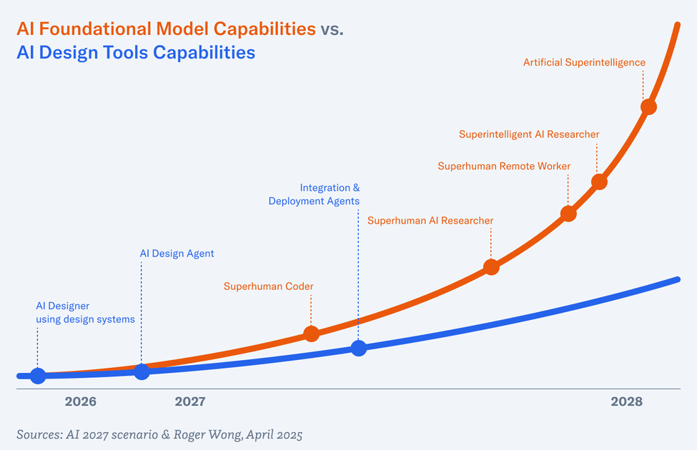
While vibe coding—the new term coined by Andrej Karpathy about coding by directing AI—is about leveraging AI for programming, it’s a window into what will happen to the software development lifecycle as a whole and how all the disciplines, including product management and design will be affected.

A skill inversion trend is happening. Being great at execution is becoming less valuable when AI tools can generate deliverables in seconds. Instead, our value as product professionals is shifting from mastering tools like Figma or languages like JavaScript, to strategic direction. We’re moving from the how to the what and why; from craft to curation. As Leo Paz says, “human taste is now more important than ever.”

The Traditional Value Hierarchy

The industry has been used to the model of unified teams for software development for the last 15–20 years. Product managers define requirements, manage the roadmap, and align stakeholders. Designers focus on the user interface, ensure visual appeal and usability, and prototype solutions. Engineers design the system architecture and then build the application via quality code.

For each of the core disciplines, execution was paramount. (Arguably, product management has always been more strategic, save for ticket writing.) Screens must be pixel-perfect and code must be efficient and bug-free.

The Forces Driving Inversion

Vibe Coding and Vibe Design

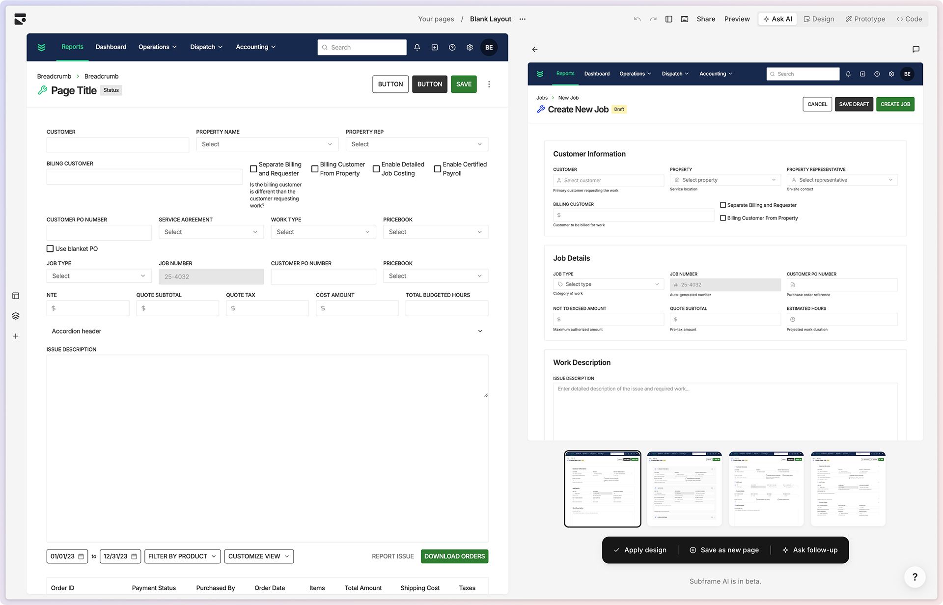
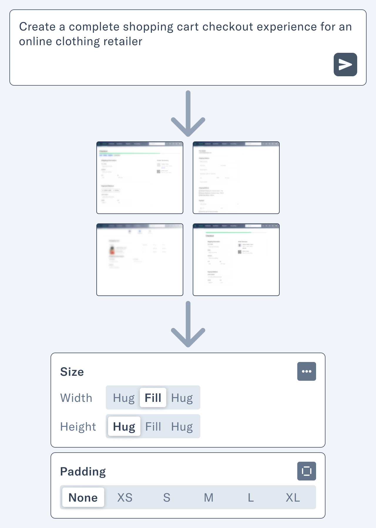
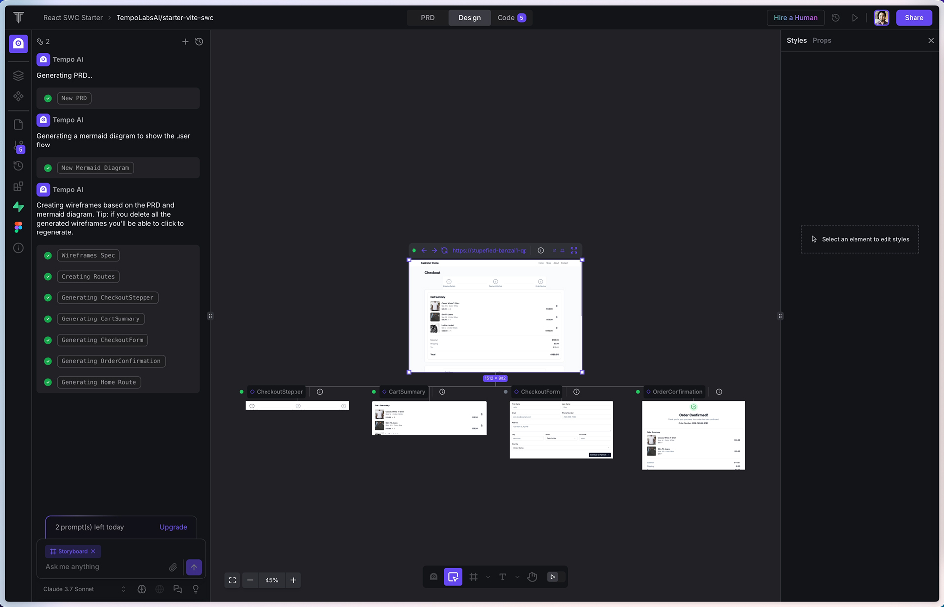
With new AI tools like Cursor and Lovable coming into the mix, the nature of implementation fundamentally changes. In Karpathy’s tweet about vibe coding, he says, “…I just see stuff, say stuff, run stuff, and copy paste stuff, and it mostly works.” He’s telling the LLM what he wants—his intent—and the AI delivers, with some cajoling. Jakob Nielsen picks up on this thread and applies it to vibe design. “Vibe design applies similar AI-assisted principles to UX design and user research, by focusing on high-level intent while delegating execution to AI.”

He goes on:

…vibe design emphasizes describing the desired feeling or outcome of a design, and letting AI propose the visual or interactive solutions​. Rather than manually drawing every element, a designer might say to an AI tool, “The interface feels a bit too formal; make it more playful and engaging,” and the AI could suggest color changes, typography tweaks, or animation accents to achieve that vibe. This is analogous to vibe coding’s natural language prompts, except the AI’s output is a design mockup or updated UI style instead of code.

This sounds very much like creative direction to me. It’s shaping the software. It’s using human taste to make it better.

Acceleration of Development Cycles

The founder of TrainLoop also says in the YC survey that his coding has sped up one-hundred-fold since six months ago. He says, “I’m no longer an engineer. I’m a product person.”

This means that experimentation is practically free. What’s the best way of creating a revenue forecasting tool? You can whip up three prototypes in about 10 minutes using Lovable and then get them in front of users. Of course, designers have always had the power to explore and create variations for an interface. But to have three functioning prototypes in 10 minutes? Impossible.

With this new-found coding superpower, the idea of bespoke, personal software is starting to take off. Non-coders like The New York Times’ Kevin Roose are using AI to create apps just for themselves, like an app that recommends what to pack his son for lunch based on the contents of his fridge. This is an evolution of the low-code/no-code movement of recent years. The gap between idea to reality is literally 10 minutes.

Democratization of Creation

Designer Tommy Geoco has a running series on his YouTube channel called “Build Wars” where he invites a couple of designers to battle head-to-head on the same assignment. In a livestream in late February, he and his cohosts had a professional web designer Brett Williams square off against 19 year-old Lovable marketer Henrik Westerlund. Their assignment was to build a landing page for a robotics company in 45 minutes, and they would be judged on design quality, execution quality, interactive quality, and strategic approach.

Play

Forty-five minutes to design and build a cohesive landing page is not enough time. Similar to TV cooking competitions, this artificial time constraint forced the two competitors to focus on what mattered and to use their time strategically. In the end, the professional designer won, but the commentators were impressed by how much a young marketer with little design experience could accomplish with AI tools in such a short time, suggesting a fundamental shift in how websites may be created in the future.

Cohost Tom Johnson suggested that small teams using AI tools will outcompete enterprises resistant to adopt them, “Teams that are pushing back on these new AI tools… get real… this is the way that things are going to go. You’re going to get destroyed by a team of 10 or five or one.”

The Maturation Cycle of Specialized Skills

“UX and UX people used to be special, but now we have become normal,” says Jakob Nielsen in a recent article about the decline of ROI from UX work. For enterprises, product or user experience design is now baseline. AI will dramatically increase the chances that young startups, too, will employ UX best practices.

Obviously, with AI, engineering is more accessible, but so are traditional product management processes. ChatGPT can write a pretty good PRD. Dovetail’s AI-powered insights supercharges customer discovery. And yes, why not use ChatGPT to write user stories and Jira tickets?

The New Value Hierarchy

From Technical Execution to Strategic Direction & Taste Curation

In the AI-augmented product development landscape, articulating vision and intent becomes significantly more valuable than implementation skills. While AI can generate better and better code and design assets, it can’t determine what is worth building or why.

Mike Krieger, cofounder of Instagram and now Chief Product Officer at Anthropic, identifies this change clearly. He believes the true bottleneck in product development is shifting to “alignment, deciding what to build, solving real user problems, and figuring out a cohesive product strategy.” These are all areas he describes as “very human problems” that we’re “at least three years away from models solving.”

This makes taste and judgement even more important. When everyone can generate good-enough, decent work via AI, having a strong point of view becomes a differentiator. To repeat Leo Paz, “Human taste is now more important than ever as codegen tools make everyone a 10x engineer.” The ability to recognize and curate quality outputs becomes as valuable as creating them manually.

This transformation manifests differently across disciplines but follows the same pattern:

  • Product managers shift from writing detailed requirements to articulating problems worth solving and recognizing valuable solutions
  • Designers transition from pixel-level execution to providing creative direction that guides AI-generated outputs
  • Engineers evolve from writing every line of code to focusing on architecture, quality standards, and system design Each role maintains its core focus while delegating much of the execution to AI tools. The skill becomes knowing what to ask for rather than how to build it—a fundamental reorientation of professional value.

From Process Execution to User Understanding

In a scene from the film "Blade Runner," replicant Leon Kowalski can't quite understand how to respond to the situation about the incapacitated tortoise.

In a scene from the film Blade Runner, replicant Leon Kowalski can’t quite understand how to respond to the situation about the incapacitated tortoise.

While AI is great at summarizing mountains of text, it can’t yet replicate human empathy or understand nuanced user needs. The human ability to interpret context, detect unstated problems, and understand emotional responses remains irreplaceable.

Nielsen emphasizes this point when discussing vibe coding and design: “Building the right product remains a human responsibility, in terms of understanding user needs, prioritizing features, and crafting a great user experience.” Even as AI handles more implementation, the work of understanding what users need remains distinctly human.

Research methodologies are evolving to leverage AI’s capabilities while maintaining human insight:

  • AI tools can process and analyze massive amounts of user feedback
  • Platforms like Dovetail now offer AI-powered insights from user research
  • However, interpreting this data and identifying meaningful patterns still requires human judgment

The gap between what users say they want and what they actually need remains a space where human intuition and empathy create tremendous value. Those who excel at extracting these insights will become increasingly valuable as AI handles more of the execution.

From Specialized to Cross-Functional

The traditional boundaries between product disciplines are blurring as AI lowers the barriers between the specialized areas of expertise. This transformation is enabling more fluid, cross-functional files and changing how teams collaborate.

The aforementioned YC podcast highlights this evolution with Leo Paz’s observation that software engineers will become product engineers. The YC founders who are using AI-generated code are already reaping the benefits. They act more like product people and talk to more customers so they can understand them better and build better products.

Concrete examples of this cross-functionality are already emerging:

  • Designers can now generate functional prototypes without developer assistance using tools like Lovable
  • Product managers can create basic UI mockups to communicate their ideas more effectively
  • Engineers can make design adjustments directly rather than waiting for design handoffs

This doesn’t mean that all specialization disappears. As Diana Hu from YC notes:

Zero-to-one will be great for vibe coding where founders can ship features very quickly. But once they hit product market fit, they’re still going to have a lot of really hardcore systems engineering, where you need to get from the one to n and you need to hire very different kinds of people.

The result is a more nuanced specialization landscape. Early-stage products benefit from generalists who can work across domains with AI assistance. As products mature, deeper expertise remains valuable but is focused on different aspects: system architecture rather than implementation details, information architecture rather than UI production, product strategy rather than feature specification.

Team structures are evolving in response:

  • Smaller, more fluid teams with less rigid role definitions
  • T-shaped skills becoming increasingly valuable—depth in one area with breadth across others
  • New collaboration models replacing traditional waterfall handoffs
  • Emerging hybrid roles that combine traditionally separate domains

The most competitive teams will find the right balance between AI capabilities and human direction, creating new workflows that leverage both. As Johnson warned in the Build Wars competition, “Teams that are pushing back on these new AI tools, get real! This is the way that things are going to go. You’re going to get destroyed by a team of 10 or five or one.”

The ability to adapt across domains is becoming a meta-skill in itself. Those who can navigate multiple disciplines while maintaining a consistent vision will thrive in this new environment where execution is increasingly delegated to artificial intelligence.

Thriving in the Inverted Landscape

The future is already here. AI is fundamentally inverting the skill hierarchy in product development, creating opportunities for those willing to adapt.

Product professionals who succeed in this new landscape will be those who embrace this inversion rather than resist it. This means focusing less on execution mechanics and more on the strategic and human elements that AI cannot replicate: vision, judgment, and taste.

For product managers, double down on developing the abilities to extract profound insights from user conversations and articulate clear, compelling problem statements. Your value will increasingly come from knowing which problems are worth solving rather than specifying how to solve them. AI also can’t align stakeholders and prioritize the work.

For designers, invest in strengthening your design direction skills. The best designers will evolve from skilled craftspeople to visionaries who can guide AI toward creating experiences that resonate emotionally with users. Develop your critical eye and the language to articulate what makes a design succeed or fail. Remember that design has always been about the why.

For engineers, emphasize systems thinking and architecture over implementation details. Your unique value will come from designing resilient, scalable systems and making critical technical decisions that AI cannot yet make autonomously.

Across all roles, three meta-skills will differentiate the exceptional from the merely competent:

  • Prompt engineering: The ability to effectively direct AI tools
  • Judgment and taste development: The discernment to recognize quality and make value-based decisions
  • Cross-functional fluency: The capacity to work effectively across traditional role boundaries

We’re seeing the biggest shift in how we build products since agile came along. Teams are getting smaller and more flexible. Specialized roles are blurring together. And product cycles that used to take months now take days.

There is a silver lining. We can finally focus on what actually matters: solving real problems for real people. By letting AI handle the grunt work, we can spend our time understanding users better and creating things that genuinely improve their lives.

Companies that get this shift will win big. Those that reorganize around these new realities first will pull ahead. But don’t wait too long—as Nielsen points out, this “land grab” won’t last forever. Soon enough, everyone will be working this way.

The future belongs to people who can set the vision and direct AI to make it happen, not those hanging onto skills that AI is rapidly taking over. Now’s the time to level up how you think about products, not just how you build them. In this new world, your strategic thinking and taste matter more than your execution skills.

A screenshot of the YourOutie.is website showing the Lumon logo at the top with the title "Outie Query System Interface (OQSI)" beneath it. The interface has a minimalist white card on a blue background with small digital patterns. The card contains text that reads "Describe your Innie to learn about your Outie" and a black "Get Started" button. The design mimics the retro-corporate aesthetic of the TV show Severance.

Your Outie Has Both Zaz and Pep: Building YourOutie.is with AI

A tall man with curly, graying hair and a bushy mustache sits across from a woman with a very slight smile in a dimly lit room. There’s pleasant, calming music playing. He’s eager with anticipation to learn about his Outie. He’s an Innie who works on the “severed” floor at Lumon. He’s undergone a surgical procedure that splits his work self from his personal self. This is the premise of the show Severance on Apple TV+.

Ms. Casey, the therapist:

All right, Irving. What I’d like to do is share with you some facts about your Outie. Because your Outie is an exemplary person, these facts should be very pleasing. Just relax your body and be open to the facts. Try to enjoy each equally. These facts are not to be shared outside this room. But for now, they’re yours to enjoy.

Your Outie is generous. Your Outie is fond of music and owns many records. Your Outie is a friend to children and to the elderly and the insane. Your Outie is strong and helped someone lift a heavy object. Your Outie attends many dances and is popular among the other attendees. Your Outie likes films and owns a machine that can play them. Your Outie is splendid and can swim gracefully and well.

The scene is from season one, episode two, called “Half Loop.” With season two wrapping up, and with my work colleagues constantly making “my Outie” jokes, I wondered if there was a Your Outie generator. Not really. There’s this meme generator from imgflip, but that’s about it.

Screenshot of the Your Outie meme generator from imgflip.

So, in the tradition of name generator sites like Fantasy Name Generators (you know, for DnD), I decided to make my own using an LLM to generate the wellness facts.

The resulting website took four-and-a-half days. I started Monday evening and launched it by dinner time Friday. All totaled, it was about 20 hours of work. Apologies to my wife, to whom I barely spoke while I was in the zone with my creative obsession.

Lumon Outie Query System Interface (OQSI)

Lumon Outie Query System Interface (OQSI)

Your Outie started with a proof-of-concept.

I started with a proof-of-concept using Claude. I gathered information about the show and all the official Your Outie wellness facts from the fantastic Severance Wiki and attached them to this prompt:

I would like to create a “Wellness Fact” generator based on the “Your Outie is…” format from the character Ms. Casey. Question: What questions should we ask the user in order to create responses that are humorous and unique? These need to be very basic questions, potentially from predefined dropdowns.

Claude’s response made me realize that asking about the real person was the wrong way to go. It felt too generic. Then I wondered, what if we just had the user role-play as their Innie?

The prototype was good and showed how fun this little novelty could be. So I decided to put my other side-project on hold for a bit—I’ve been working on redesigning this site—and make a run at creating this.

Screenshot of Claude with the chat on the left and the prototype on the right. The prototype is a basic form with dropdowns for Innie traits.

Your Outie developed the API first but never used it.

My first solution was to create a Python API with a Next.js frontend. With my experience building AI-powered software, I knew that Python was the preferred method for working with LLMs. I also used LangChain so that I could have optionality with foundational models. I took the TypeScript code from Claude and asked Cursor to use Python and LangChain to develop the API. Before long, I had a working backend.

One interesting problem I ran into was that the facts from GPT often came back very similar to each other. So, I added code to categorize each fact and prevent dupes. Tweaking the prompt also yielded better-written results.

Additionally, I tried all the available models—except for the reasoning ones like o1. OpenAI’s GPT-4o-mini seemed to strike a good balance.

This was Monday evening.

Honestly, this was very trivial to do. Cursor plus Python LangChain made it easy. 172 lines of code. Boom.

I would later regret choosing Python, however.

Your Outie designed the website in Figma but only the first couple of screens.

Now the fun part was coming up with the design. There were many possibilities. I could riff on the computer terminals on the severed floor like the macrodata refinement game. I could emulate 1970s and ’80s corporate design like Mr. Milchick’s performance review report.

Screenshot of an old CRT monitor with a grid of numbers. Some of these numbers are captured into a box on the bottom of the screen.

The official macrodata refinement game from Apple.

Still from the show of the character Seth Milchick's performance review report.

Seth Milchick receives his first performance review in this report.

I ended up with the latter, but as I started designing, I realized I could incorporate a little early Macintosh vibe. I began thinking of the website as a HyperCard stack. So I went with it.

I was anxious to build the frontend. I started a new Next.js project and fired up Cursor. I forwent a formal PRD and started vibe coding (ugh, I hate that term, more on this in an upcoming post). Using static mock data, I got the UI to a good place by the end of the evening—well, midnight—but there was still a lot of polishing to do.

This was Tuesday night.

Screenshot of the author's Figma canvas showing various screen designs and typographic explorations.

My Figma canvas showing some quick explorations.

Your Outie struggled bravely with Cursor and won.

Beyond the basic generator, I wanted to create something that had both zaz and pep. Recalling the eight-hour remix of the Severance theme by ODESZA, “Music to Refine To,” I decided to add a music player to the site. I found a few cool tracks on Epidemic Sound and tried building the player. I thought it would be easy, but Cursor and I struggled mightily for hours. Play/pause wouldn’t work. Autoplaying the next track wouldn’t work. Etc. Eventually, I cut my losses after figuring out at least play/pause and combined the tracks together into a long one. Six minutes should be long enough, right?

v0 helped with generating the code for the gradient background.

This is my ode to the Music Dance Experience (MDE) from season one. That was Wednesday.

Still from the show of two characters dancing in the middle of the office.

Your Outie reintegrated.

Thursday’s activity was integrating the backend with the frontend. Again, with Cursor, this was relatively straightforward. The API took the request from the frontend and provided a response. The frontend displayed it. I spent more time fine-tuning the animations and getting the mobile layout just right. You wouldn’t believe how much Cursor-wrangling I had to do to get the sliding animations and fades dialed in. I think this is where AI struggles—with the nuances.

By the end of the night, I had a nice working app. Now, I had to look for a host. Vercel doesn’t support Python. After researching Digital Ocean, I realized I would have to pay for two app servers: one for the Node.js frontend and another for the Python backend. That’s not too cost-effective for a silly site like this. Again, it was midnight, so I slept on it.

Your Outie once refactored code from Python to React in just one hour.

Still from the show of the main character, Mark S. staring at his computer monitor.

In the morning, I decided to refactor the API from Python to React. LangChain has a JavaScript version, so I asked Cursor to translate the original Python code. The translation wasn’t as smooth as I had hoped. Again, it missed many of the details that I spent time putting into the original prompt and logic. But a few more chats later, the translation was completed, and now the app was all in React.

Between the end of my work day and dinner on Friday, I finished the final touchups on the site: removing debugging console messages, rewriting error messages to be more Severance-like, and making sure there were no layout bugs.

I had to fix a few more build errors and used Claude Code. It seemed a lot easier than sitting there and going back and forth with Cursor.

Then, I connected my repo to Vercel, and voila! The Lumon Outie Query System Interface (OQSI) was live at YourOutie.is.

I hope you enjoy it as much as I had fun making it. Now, I think I owe my wife some flowers and a date night.

Page 1 of 2