Personal Software | Lee Robinson
In the future, everyone can cook.
I was sitting on a barstool next to my wife in a packed restaurant in Little Italy. We were the lone Kansas City Chiefs supporters in a nest full of hipster Philadelphia Eagles fans. After Jon Batiste finished his fantastic rendition of the national anthem, and the teams took the field for kickoff, I noticed something. The scorebug—the broadcast industry’s term for the lower-third or chyron graphic at the bottom of the screen—was different, and in a good way.

I posted about it seven minutes into the first quarter, saying I appreciated “the minimalistic lower-thirds for this Super Bowl broadcast.” It was indeed refreshing, a break from the over-the-top 3D-animated sparkling. I thought the graphics were clear and utilitarian while being exquisitely-designed. They weren’t distracting from the action. As with any good interface design, this new scorebug kept the focus on the players and the game, not itself. I also thought they were a long-delayed response to Apple’s Friday Night Baseball scorebug.

Anyhow, as a man of good taste, John Gruber also noticed the excellence of the new graphics. Some of his followers, however, did not.
It looks as if they just let an intern knock something up in PowerPoint and didn’t bother having someone check it first. Awful. 👎
The scorebug is absolutely horrible! I really hope they don’t adopt this for the 2025 season, or I will riot. Horrible design and very distracting especially the score, this looks like something out of Fortnite.
Gruber has a wonderful and in-depth write-up about FOX Sports’ new NFL scorebug. Not only does it include a good design critique, but also a history lesson about the scorebug, which surprisingly, didn’t debut until 1994.
Until 1994, the networks would show the score and time remaining when they cut to a commercial break, and then show it again when they came back from commercials.
I had totally forgotten about that.
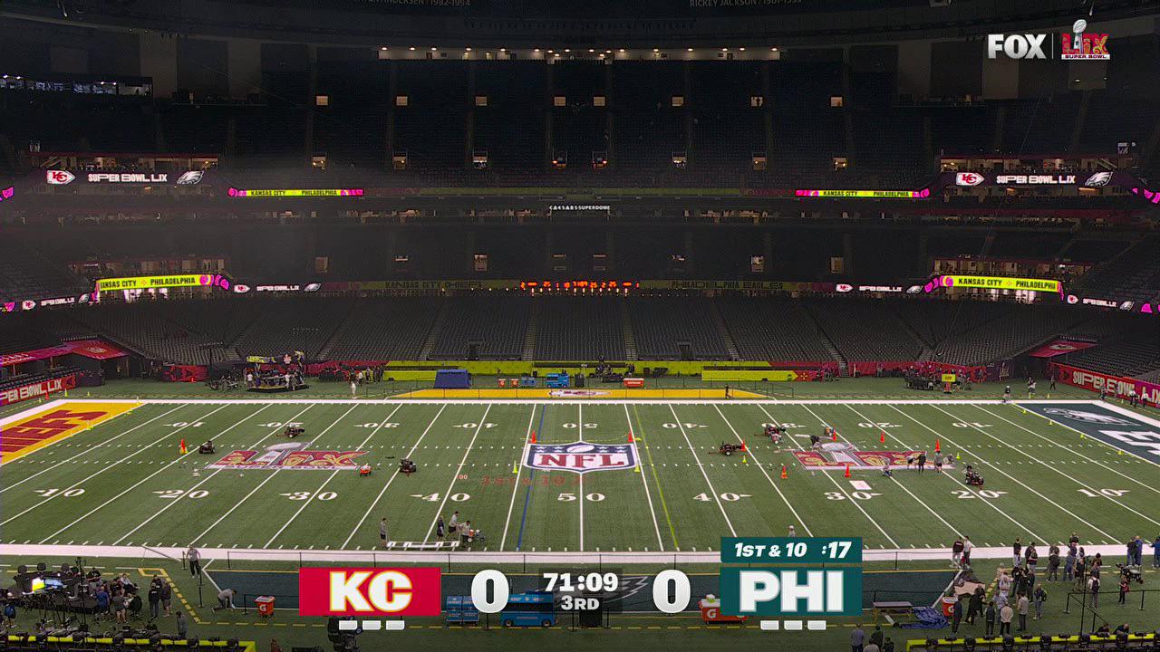
Better look at the new scorebug displayed during a pre-game broadcast test.

In the early 2000s to the mid-oughts, every designer I knew wanted to be featured on the FWA, a showcase for cutting-edge web design. While many of the earlier sites were Flash-based, it’s also where I discovered the first uses of parallax, Paper.js, and Three.js. Back then, websites were meant to be explored and their interfaces discovered.

A grid of winners from The FWA in 2009. Source: Rob Ford.
One of my favorite sites of that era was Burger King’s Subservient Chicken, where users could type free text into a chat box to command a man dressed in a chicken suit. In a full circle moment that perfectly captures where we are today, we now type commands into chat boxes to tell AI what to do.

The Wild West mentality of web design meant designers and creative technologists were free to make things look cool. Agencies like R/GA, Big Spaceship, AKQA, Razorfish, and CP+B all won numerous awards for clients like Nike, BMW, and Burger King. But as with all frontiers, civilization eventually arrives with its rules and constraints.
Last week, Sam Altman, the CEO of OpenAI, and a couple of others from the company demonstrated Operator, their AI agent. You’ll see them go through a happy path and have Operator book a reservation on OpenTable. The way it works is that the AI agent is reading a screenshot of the page and deciding how to interact with the UI. (Reminds me of the promise of the Rabbit R1.)
Let me repeat: the AI is interpreting UI by looking at it. Inputs need to look like inputs. Buttons need to look like buttons. Links need to look like links and be obvious.
In recent years, there’s been a push in the web dev community for accessibility. Complying with WCAG standards for building websites has become a positive trend. Now, we know the unforeseen secondary effect is to unlock AI browsing of sites. If links are underlined and form fields are self-evident, an agent like Operator can interpret where to click and where to enter data.
(To be honest, I’m surprised they’re using screenshots instead of interpreting the HTML as automated testing software would.)
Since Perplexity and Arc Search came onto the scene last year, the web’s economic foundation has started to shift. For the past 30 years, we’ve built a networked human knowledge store that’s always been designed for humans to consume. Sure, marketers and website owners got smart and figured out how to game the system to rank higher on Google. But ultimately, ranking higher led to more clicks and traffic to your website.
But the digerati are worried. Casey Newton of Platformer, writing about web journalism (emphasis mine):
The death of digital media has many causes, including the ineptitude of its funders and managers. But today I want to talk about another potential rifle on the firing squad: generative artificial intelligence, which in its capacity to strip-mine the web and repurpose it as an input for search engines threatens to remove one of the few pillars of revenue remaining for publishers.
Elizabeth Lopatto, writing for The Verge points out:
That means that Perplexity is basically a rent-seeking middleman on high-quality sources. The value proposition on search, originally, was that by scraping the work done by journalists and others, Google’s results sent traffic to those sources. But by providing an answer, rather than pointing people to click through to a primary source, these so-called “answer engines” starve the primary source of ad revenue — keeping that revenue for themselves.
Their point is that the fundamental symbiotic economic relationship between search engines and original content websites is changing. Instead of sending traffic to websites, search engines, and AI answer engines are scraping the content directly and providing them within their platforms.
Christopher Butler captures this broader shift in his essay “Who is the internet for?”:
Old-school SEO had a fairly balanced value proposition: Google was really good at giving people sources for the information they need and benefitted by running advertising on websites. Websites benefitted by getting attention delivered to them by Google. In a “clickless search” scenario, though, the scale tips considerably.
This isn’t just about news organizations—it’s about the fundamental relationship between websites, search engines, and users.
As the web is increasingly consumed not by humans but by AI robots, should we as designers continue to care what websites look like? Or, put another way, should we begin optimizing websites for the bots?
The art of search engine optimization, or SEO, was already pushing us in that direction. It turned personality-driven copywriting into “content” with keyword density and headings for the Google machine rather than for poetic organization. But with GPTbot slurping up our websites, should we be more straightforward in our visual designs? Should we add more copy?
It’s still early to know if AI optimization (AIO?) will become a real thing. Changes in consumer behavior happen over many single-digit years, not months. As of November 2024, ChatGPT is eighth on the list of the most visited websites globally, ranked by monthly traffic. Google is first with 291 times ChatGPT’s traffic.

Top global websites by monthly users as of November 2024. Source: SEMRush.
Interestingly, as Google rolled out its AI overview for many of its search results, the sites cited by Gemini do see a high clickthrough rate, essentially matching the number one organic spot. It turns out that nearly 40% of us want more details than what the answer engine tells us. That’s a good thing.

Clickthrough rates by entities on the Google search results page. Source: FirstPageSage, January 2025.
There’s a fear that AI answer engines and agentic AI will be the death of creative web design. But what if we’re looking at this all wrong? What if this evolution presents an interesting creative challenge instead?
Just as we once pushed the boundaries of Flash and JavaScript to create award-winning experiences for FWA, designers will need to find innovative ways to work within new constraints. The fact that AI agents like Operator need obvious buttons and clear navigation isn’t necessarily a death sentence for creativity—it’s just a new set of constraints to work with. After all, some of the most creative periods in web design came from working within technical limitations. (Remember when we did layouts using tables?!)
The accessibility movement has already pushed us to think about making websites more structured and navigable. The rise of AI agents is adding another dimension to this evolution, pushing us to find that sweet spot between machine efficiency and human delight.
From the Subservient Chicken to ChatGPT, from Flash microsites to AI-readable interfaces, web design continues to evolve. The challenge now isn’t just making sites that look cool or rank well—it’s creating experiences that serve both human visitors and their AI assistants effectively. Maybe that’s not such a bad thing after all.
I love this essay from Baldur Bjarnason, maybe because his stream of consciousness style is so similar to my own. He compares the rapidly changing economics of web and software development to the film, TV, and publishing industries.
Before we get to web dev, let’s look at the film industry, as disrupted by streaming.
Like, Crazy Rich Asians made a ton of money in 2018. Old Hollywood would have churned out at least two sequels by now and it would have inspired at least a couple of imitator films. But if they ever do a sequel it’s now going to be at least seven or even eight years after the fact. That means that, in terms of the cultural zeitgeist, they are effectively starting from scratch and the movie is unlikely to succeed.
He’s not wrong.
Every Predator movie after the first has underperformed, yet they keep making more of them. Completed movies are shelved for tax credits. Entire shows are disappeared [from] streamers and not made available anywhere to save money on residuals, which does not make any sense because the economics of Blu-Ray are still quite good even with lower overall sales and distribution than DVD. If you have a completed series or movie, with existing 4K masters, then you’re unlikely to lose money on a Blu-Ray.
I’ll quibble with him here. Shows and movies disappear from streamers because there’s a finite pot of money from subscriber revenue. So removing content will save them money. Blu-Ray is more sustainable because it’s an additional purchase.
OK, let’s get back to web dev.
He points out that similar to the film and other creative industries, developers fill their spare time with passion projects. But their day jobs are with tech companies and essentially subsidize their side projects.
And now, both the creative industries proper and tech companies have decided that, no, they probably don’t need that many of the “grunts” on the ground doing the actual work. They can use “AI” at a much lower cost because the output of the “AI” is not that much worse than the incredibly shitty degraded products they’ve been destroying their industries with over the past decade or so.
Bjarnason ends with seven suggestions for those in the industry. I’ll just quote one:
Don’t get tied to a single platform for distribution or promotion. Every use of a silo should push those interested to a venue you control such as a newsletter or website.
In other words, whatever you do, own your audience. Don’t farm that out to a platform like X/Twitter, Threads, or TikTok.
Of course, there are a lot of parallels to be drawn between what’s happening in the development and software engineering industries to what’s happening in design.

Web dev at the end of the world, from Hveragerði, Iceland
James Poniewozik, writing for The New York Times:
Whether they work in sand or spores, heavy-handed metaphor is the true material of choice for all these opening titles. The series are different in genres and tone. But all of them seem to have collectively decided that the best way to convey the sense of epic event TV is with an overture of shape-shifting, literal-minded screen-saver art.
His point is that a recent trend in “prestige TV” main titles is to use particle effects. Particle effects—if you don’t know—are simulations in 3D software that produce, well, particles that can be affected by gravity, wind, and each other—essentially physics. Particles can be styled to look like snow, rain, smoke, fireworks, flower petals, water (yes, water is just particles; see this excellent video from Corridor Digital), or even Mordor’s orc hoards. This functionality has been in After Effects for decades in 2D but has been making its way into 3D packages like Cinema 4D and Blender. There’s a very popular program now called Houdini, which does particle systems and other simulations really well. My theory is that because particle effects are simpler to produce and workstations with GPUs are cheaper and easier to come by, these effects are simply more within reach. They certainly look expensive.
Anyhow, I love it when mainstream media covers design. It brings a necessary visibility to our profession, especially in the age of generative AI. The article is worth checking out (gift article) because Poniewozik embeds a bunch of videos within it.
This is also an excuse to plug one of my favorite TV main title sequences of all time, True Blood by Digital Kitchen. It’s visceral, hypnotic, and utterly unstoppable. I watched it every time.
In an interview with Watch the Titles! in 2009, Rama Allen, lead designer and concept co-creator of the sequence:
After dipping ourselves in Southern Gothic, from Powers Boothe in Southern Comfort to digesting a pile of Harry Crews novels, one of the biggest ideas we latched onto was “the whore in the house of prayer.” This delicate balance of the sacred and profane co-existing creates powerful imagery. Editorially, we collided the seething behind-the-curtains sexuality of the South into the fist-pounding spirituality of Pentecostal healings to viscerally expose the conflicts we saw in the narrative of the show. Holy rollers flirt with perversion while godless creatures seek redemption.
Another all-time favorite of mine is, of course, Mad Men by Imaginary Forces. Looking at this sequence again after having finished the series, it’s impressive how well it captures Don Draper’s story in just over 30 seconds.
In an interview with Art of the Title in 2011, creative directors Steve Fuller and Mark Gardner point out the duality of the 1950s and ’60 eras’ characters—projecting respectability while giving in to their vices. This contrast became a key influence on the sequence’s design, reflecting the tension between their polished exteriors and hidden complexities.
Steve Fuller:
Yeah, one thing that Matthew [Weiner] said kept echoing in my head. He said, “This is an era of guys wanting to be the head of the PTA but also drink, smoke, and get laid as much as possible.” That was the kind of dual life these guys were leading and that’s what was interesting.
The best titles give the viewer a sense of the story and its world while being visually interesting and holding the audience for up to a minute while the name cards roll.
I’ve had Matthew Butterick’s Practical Typography website/ebook bookmarked since I discovered it over ten years ago. It’s making the rounds again, and I think it’s a good reminder that we are all “professional writers” as he describes:
When we think of “professional writers” we probably think of novelists, screenwriters, or journalists. But the programmer, the scientist, the lawyer—and you, if your work depends on presenting written ideas—all deserve to be called professional writers.
But as professional writers, we do more than write. We edit, we format, we print, we generate PDFs, we make web pages. More than ever, we’re responsible for delivering the written word to our readers. So we’re not just writers—we’re publishers.
Typography is the visual component of the written word. Thus, being a publisher of the written word necessarily means being a typographer.
He’s right. As much of our work is in producing documents and content, we are publishers. Here are a few of my favorite pages:
This book reminds me of a couple of seminal books from the early 1990s: The Mac Is Not a Typewriter by Robin Williams and Stop Stealing Sheep by Erik Spiekermann and E. M. Ginger. The former is how I learned all the basics, back when I was designing my high school’s newspaper. The latter is more comprehensive, going deeper into how type works conceptually. These three are all essential resources for any designer.

Typography is the visual component of the written word. Thus, being a publisher of the written word necessarily means being a typographer.
The design blog that connects the dots others miss. Written by Roger Wong.
If you’re new here, check out what others are reading in the Popular feed.