I can’t remember the last time I picked up a newspaper. At least ten years, maybe even twenty. But this morning, as I walked into my hotel restaurant for breakfast, they had one copy of today’s San Francisco Chronicle left. And I grabbed it.
I used to read the Chronicle all the time. Whether I bought it for a quarter from one of the hundreds of yellow and blue machines that dotted every corner in downtown San Francisco, from a newsstand sold by someone wearing fingerless gloves but whose fingertips were black with ink, or from somewhere within ten feet of my front door depending on the paperboy’s aim that morning.
I rarely read each story in every edition of the Chronicle. Instead, I had some favorite sections. I’d usually read the main stories in the A section and then US news. The B section was world news, which I often skipped. Usually, a few stories in the C section, Business, piqued my interest. And I always read through the Datebook, the paper’s entertainment and lifestyle area.

Reading a newspaper encourages discovery. In the Datebook section, I stumbled into the Comics & Puzzles spread. The signature green-tinted Sporting Green section is pictured behind.

Way before streaming, TV schedules were printed in newspapers and in TV Guide. I guess the Chronicle still does.
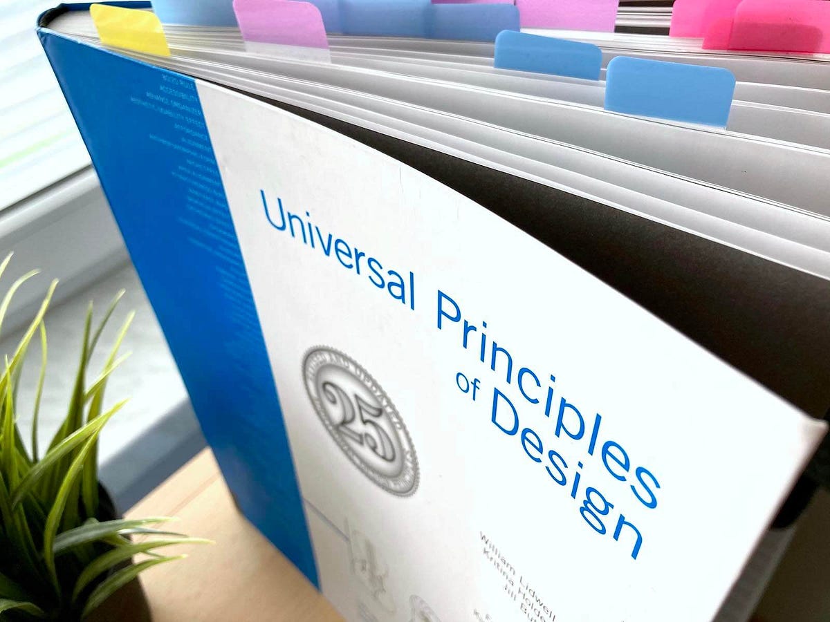
Physically, the newspaper is an ephemeral object. Its thin, crispy paper with perforated top and bottom edges dotted with small punched holes from the grabber, and ink that is kissed onto the paper with just enough resolution for the type and photos, but not enough to make them beautiful. There is no binding, no staples or glue to hold pages together—only folding. Each section is folded together, and the first section holds all the sections in a bundle. The newspaper is disposable; its only purpose is to convey the news, the content printed on its surface. It is not a keepsake. The paper stock yellows, and the ink fades relatively quickly, reflecting the freshness of the news within.
Reading a newspaper is an experience. Its sheer size is unwieldy and not exactly the best user experience. But there is something about spreading your arms wide to unfold it, hearing the crinkling of the paper, getting a whiff of the ink, and feeling the dryness of the stock between your fingers. This tactile experience engages more than just your eyes.
And maybe that is why I was hit with such a wave of nostalgia this morning when I picked up the Chronicle. I remembered Sunday mornings in a North Beach cafe, sipping a cappuccino and nibbling on a scone. Italian music was in the air mixed with the gurgles of the espresso machine and clanks of saucers and spoons. All while reading the newspaper for hours.