Skip to content

118 posts tagged with “design”

2 min read
Where are the Black Designers

Representation Is Powerful

This was originally published as an item in Issue 004 of the designspun email newsletter.

When I went to design school in the 1990s, of course, graphic design history was part of the curriculum. I didn’t realize it at the time, but everyone we studied—and therefore worshipped—was a white male. For minorities, representation is so powerful. And as the conversation in our country about race righteously heats up and expands from police brutality to systemic racism, it’s time to look at our own industry and ask ourselves about diversity and representation.

Toronto-based creative director Glenford Laughton compiled a great list of 13 African-American graphic designers we should all know. It includes greats like Georg Olden, who was the first African American to design a postage stamp, and Archie Boston, the designer-provocateur who started and chaired the design program at Cal State Long Beach.

According to the AIGA’s 2019 Design Census, just 3% of designers are black. African Americans make up about 14% of our population. Last year, product designer Wes O’Haire from Dropbox created Blacks Who Design. It’s a directory of black creatives on Twitter, giving them a platform to be seen and found, while simultaneously inspiring young people by showing them successful designers who have their same skin color. Representation is powerful.

Hoping to start a dialogue about changing the design industry, Where are the Black Designers is holding a virtual conversation on June 27, 2020.

Aggie Topkins writes in Eye on Design, “Graphic design, by focusing on its own version of monarchs and dynasties, maintains an outdated approach to history that further entrenches it as a hierarchical society.” In other words, maybe it’s time to teach design students about the societal and social changes happening, rather than the individual geniuses who channeled those influences into some work.

Screenshot of Facebook's hate speech banner

We Make the World We Want to Live In

This was originally published as an item in Issue 003 of the designspun email newsletter.

It is no secret that Twitter has enabled and emboldened Donald Trump by not restricting any of his tweets, even if they violated their terms of service. But earlier this week, they put misinformation warnings on two of his tweets about mail-in ballots. This angered the President but also got the ball rolling. Snapchat shortly followed by saying it will no longer promote Trump’s account. Against the backdrop of growing protests against the murder of George Floyd by police, some tech companies finally started to grow a conscience. But will Silicon Valley change? Mary-Hunter McDonnell, corporate activism researcher from the Wharton School of Business says, “Giving money to organizations that are out on the front lines is more helpful, but it’s also to some extent passing the buck. People are tired of that.”

As designers, we have some power over the projects we work on, and the products we create. Mike Monterio wrote in February, “At some point, you will have to explain to your children that you work, or once worked, at Facebook.”

While at Facebook, Lisa Sy designed ways to flag hate speech on the platform—using Trump’s account in the mockups. In 2016. Four years later, Facebook has not implemented such a system and continues to leave up dangerous posts from Trump, including the highly-charged “when the looting starts, the shooting starts” post.

Tobias van Schneider wrote in 2016,

The role as a designer, or even as an engineer has become more influential and powerful than ever. The work we do makes an impact and naturally brings up the discussion around ethics, responsibility and accountability.

Many of us will work on pieces that are seen by hundreds, maybe thousands. A few of us, having larger clients, or working at a tech company, might work on something used by millions, if not billions of people. We hold great responsibility.

We produce work for audiences, users. Humans who are on the other end of that screen, poster, or ad. Mike Monterio again:

You don’t work for the people who sign your checks. You work for the people who use the products of your labor. If I were to put my hope in one thing, it’s that you understand the importance of this. Your job is to look out for the people your work is affecting. That is a responsibility we cannot defer.

Photo of the Hall H stage at Comic-Con

What Comic-Con Teaches Us about Design and Branding

We communicate in stories. Storytelling has been around as long as our species has existed. From paintings on cave walls in Lascaux, to hieroglyphics in ancient Egypt, to radio dramas like “War of the Worlds” that cause city-wide panic, to the fantastical Game of Thrones television series on HBO, stories impart culture, history, information, and ideas. Stories are primal so we are receptive to them, and we remember them.

Today when we think of storytelling, we think of our modern day’s Golden Age of Television or the Marvel Cinematic Universe (“MCU”) movies. Comic-Con in San Diego is the Mecca of pop culture storytelling, and this year brought an estimated 135,000 fans from over 80 countries. Attendees packed over 2,000 panels and screenings and lined up for more than 250 autograph events from their favorite actors, writers, and artists. Fans lined up for hours, often overnight, for a chance to get into the infamous 6,500-seat Hall H where they were able to get a glimpse of their favorite star talking about their latest film or TV project. Many came to the con dressed as their favorite characters, often constructing their own elaborate costumes. That is fandom, otherwise known as brand loyalty.

What lessons for design and branding can we learn from Comic-Con and its pilgrimage of rabid fans? Storytelling has power, and design is storytelling.

In this article we’ll take the primary elements of storytelling and apply them to design, namely branding, marketing, and product design:

  1. Worldbuilding: Where does the story take place?
  2. Main characters: Who are the people we’ll care about?
  3. The plot: What will happen in the story?​

PANTONE Colors and Worldbuilding

Stories have to exist in a self-contained universe, one that follows its own defined rules. Sometimes that world is familiar, reflecting our reality, and other times the environment is foreign, futuristic, or magical.

A crew of officers onboard the starship Enterprise are in the middle of teleporting

In Star Trek, transporter technology allows the teleportation of a person or thing from one place to another.

Internal logic is essential to building a believable world. In other words, it’s about defining the rules and consistently following them. For instance in the Star Trek universe, transporter technology exists—being able to teleport a person or thing from one place to another—but there are rules around its use. It has a limited range, i.e. you can’t beam a person from one end of the galaxy to the other; it cannot be used to or from warp-moving vehicles; and there are certain materials the technology cannot penetrate. And while there are faster-than-light-traveling vehicles in the show and aliens with extra capabilities, humans remain human and don’t have any extraordinary abilities.

I believe that branding, specifically brand identity is the world a brand builds for its customers to live in.

Advertisement showing a woman walking and carrying a handbag. She is against a red and white bullseye.

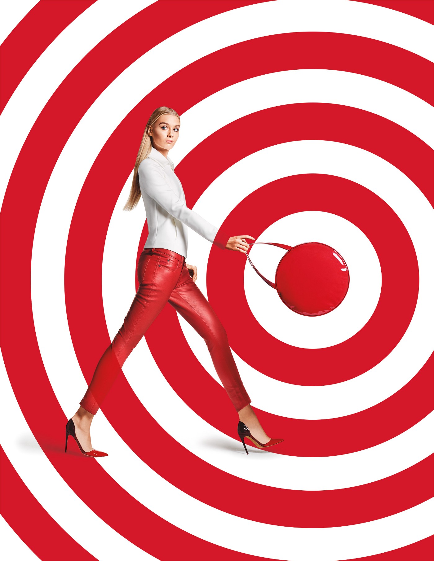
Target’s advertising lives in a world of red, white, and Helvetica.

Target has built a world of red, white, and Helvetica. Its customers know that world and trust it. But if Target decided to suddenly throw in blue, straying from the rules they’ve consistently followed, its customers would scratch their heads.

When creating your own brand, your customers need to see consistency. They need to feel they are in the right place when they interact with your brand. Use brand identity guidelines to document your brand world’s internal logic. Every touchpoint a customer sees should have the same colors, typography, and art direction.

The Hero and the Guide

Our world has been established, so now we need characters to be in our story. All stories have a protagonist, the main character. Many stories pair that character up with a guide or mentor. For our purposes we’ll call them the hero and the guide.

Donald Miller in his book Building a StoryBrand: Clarify Your Message So Customers Will Listen, says that the hero is not the brand! Instead, the hero should be the customer, and the brand should be the guide. This makes sense when you stop to think about it: customers seek out new brands to buy from because they have a problem to solve. And by playing the part of the guide, brands have the opportunity to be the mentor, the facilitator.

A woman (Captain Marvel) and a man (Nick Fury) sit and have a discussion

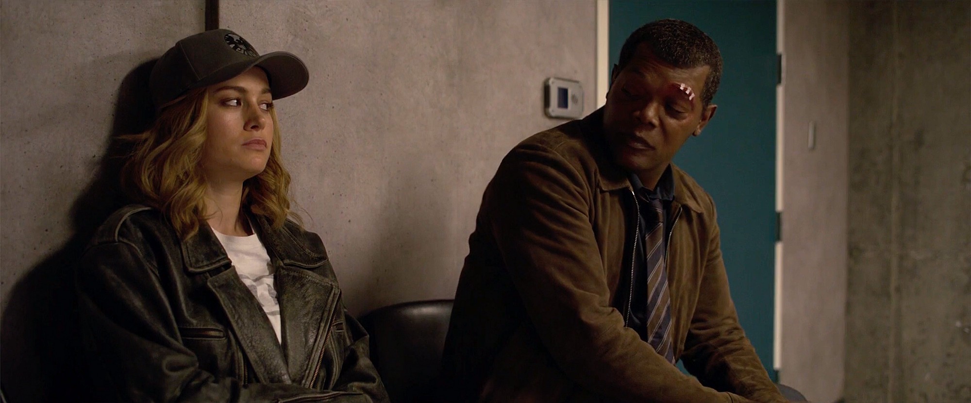
Captain Marvel has Nick Fury to show her around S.H.I.E.L.D. and Earth in the 1990s.

A young man (Luke Skywalker) and an older man (Obi Wan Kenobi) are sitting and having a discussion

Luke Skywalker is mentored by Obi-Wan Kenobi who introduces him to the ways of the Force.

In fiction we all want to be the hero, not someone who is the helper to the hero. We want to be Captain Marvel who has Nick Fury to show her around Earth in the 1990s, or Luke Skywalker who is mentored by Obi-Wan Kenobi who introduces him to the ways of the Force. The guides are characters the heroes trust and look up to.

A star tennis player is about to hit a ball

Nike’s ad campaigns celebrate the athlete within each of us.

A man and a woman in their pajamas are sitting in bed holding up flowers as a gesture of peace

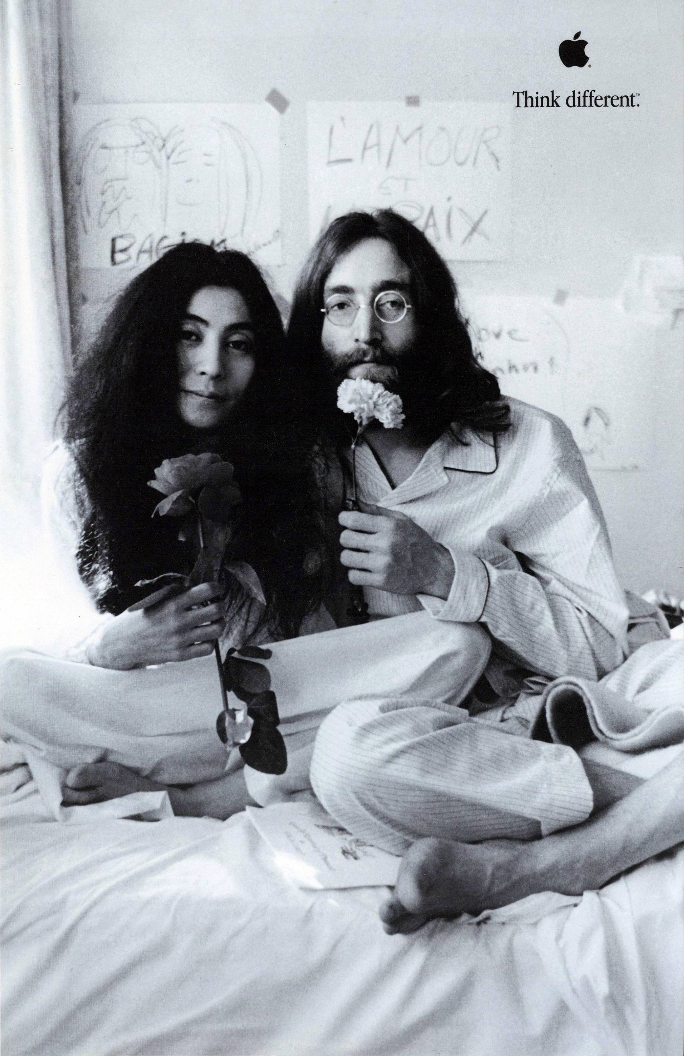
Apple’s “Think Different” campaign wasn’t about how they had the best computers, but about celebrating geniuses like John Lennon and Yoko Ono.

Plotting User Experience Design

All stories have a plot, something that happens. Sometimes those plots are thin, simple, or dense and convoluted. But the best, most popular stories can be distilled to a very simple formula. Miller in his book outlines this structure as follows:

  1. A character
  2. Has a problem
  3. And meets a guide
  4. Who gives them a plan
  5. And calls them to action
  6. They avoid failure
  7. And end in a success

A visual storytelling framework showing a character with a problem who meets a guide, receives a plan, takes action, and either achieves success or avoids failure.

StoryBrand Framework by Donald Miller.

Let’s apply it to one of my favorite movies, Star Wars:

  1. Luke Skywalker
  2. Wants to defeat the evil Galactic Empire
  3. Meets Obi-Wan Kenobi, former Jedi Knight
  4. Who teaches Luke to trust the Force
  5. Luke helps deliver the Death Star plans hidden in R2-D2 to the Rebels
  6. Without the plans the Rebels would be obliterated by the starbase
  7. With Luke trusting in the Force, he’s able to destroy the Death Star, thus saving the Rebels

The StoryBrand framework mapped to Star Wars, with Luke as the character, Obi-Wan as the guide, the plan being “trust the Force,” and outcomes tied to the Rebellion’s success or defeat.

StoryBrand framework applied to Star Wars

While Miller’s StoryBrand framework is geared towards marketing and messaging, I believe we can extend it to user experience and product design as well. Remember that the hero is the customer or the user. And our product is the plot through which our hero can solve their problem.

For fun, let’s apply this framework to Dropbox:

  1. An information worker
  2. Has multiple devices and often can’t access her files when she needs to
  3. Meets Dropbox
  4. Whose product can sync and store all her files in the cloud
  5. Encourages her to sign up and install their product
  6. So she can stop forgetting to email herself files to/from work
  7. And access her files instantly from any device anywhere, impressing her bosses

For the user to trust Dropbox with her files, Dropbox’s brand identity needs to be consistent from its advertising and marketing, to its landing page and website, and finally to its application. Remember their world needs to stay internally logical by using the same color, fonts, imagery, and even brand voice.

Using Design as Storytelling to Create Fans

Collage of Marvel Studios movie posters from the Infinity Saga (2008–2019), featuring films from Iron Man to Avengers: Endgame, arranged in chronological release order with a central “Infinity Saga” title card.

In 2008 Marvel began their incredibly ambitious MCU movies with Iron Man. But from that very first movie, they started to build their world. They introduced us to new characters with subsequent films and wielded familiar story beats while bringing something new. Ultimately over the course of 23 interconnected movies, they created millions of fans worldwide who collectively spent more than $22 billion at the box office.

We’ve already mentioned Nike, Apple, Target, and Dropbox, but what about a newer brand that’s doing this right? Slack.

Welcome screen to a communications app

From day one Slack built personality into the design of their product. Their quirky plaid pattern and colors in their hashtag logo made its way to the product, allowing users to customize their own workspaces with themes. Their UX copy is charming, personable. In other words, Slack’s brand from the colors to the fonts to the brand voice is infused from their marketing website all the way into their product. And this attention to design as story has helped drive Slack to over ten million daily active users, and propelled the company’s valuation to $20 billion when they IPO’d.

Design as storytelling is an incredibly powerful tool to build a brand, create a better product, and promote fanaticism. As young startups enter an increasingly crowded marketplace, they need to differentiate through memorable and consistent branding. And they can by incorporating storytelling in their design.

Smartest Time to Buy Infographic

Smart Data Needs Smart Design

Infographics have exploded over the past few years. It’s a great way to visually and simply explain sometimes complex data to a general audience. My own personal brand of infographics is more on the data visualization side, and thankfully coincides with TrueCar, my employer. I believe that data should be presented in a beautiful and sophisticated way. It should be easy to grok and doesn’t have to be cutesy.

When the latest epic infographic™ project landed on my desk, I started where I always start—I looked at the data. What inspired me was seeing this color-scaled chart of the smartest day of the year to buy. Just by looking at the color I quickly understood the patterns: end of the month, December is the best month, and January 1 is the best day.

Color-coded spreadsheet showing percentage values by day of the month across all twelve months, labeled “Day of transaction” on the left and “Day of Month Average” on the right. Cells are heatmapped from red (lower values) to green (higher values), visualizing performance trends or rates by calendar date.

Best Day Excel

From there I looked for inspiration on cool calendar designs. The notion of color scaling was present in a few examples, and I also really appreciated the circular format in some. Years are cycles, plus a circle is an inherent shape in cars (tires, steering wheel, speedometer, knobs). My search led me to this lovely piece by Martin Oberhaeuser. With much respect to his design, I used it as a jumping-off point to transform the above table from Excel into something hopefully more elegant.

Radial infographic by TrueCar showing the average percentage off MSRP for each day of the year, based on 2010–2014 data. Each ring represents a month, with darker blue indicating better car discounts. January 1st is marked as the best day to buy a new car, with the highest average discount.

Using TrueCar’s color palette of a couple of blues, I made a color scale—lighter being better, and orange being the best—and inserted the actual percentage value within each cell.

For the chart to show the best month to buy, I combined a calendar and a column graph. And it validates the long-held belief that December is the best month of the year to buy a new car.

Bar chart comparing average percentage savings off MSRP by month. December is the best month to buy a car with 7.72% average savings, followed by September and October (both at 7.63%). January has the lowest average savings at 6.80%.

The most helpful data I thought we had was the one about the smartest month to buy a particular kind of car. While December remains the best overall month, if you’re looking to buy a subcompact, you should buy in June. Since I had a circular table already I decided to leave this one pretty straightforward.

Matrix showing average discount percentages by month for different vehicle categories. December is best for large cars, premium cars, and midsize utilities, while May is best for small utility vehicles and subcompact cars. The data reveals variation by vehicle type and seasonal sales strategies.

Last, but not least, is the best day of the week to buy a car. There’s really only seven data points here so presenting the data simply seemed the way to go.

Bar chart showing average savings off MSRP by day of the week. Wednesday offers the highest average discount at 7.40%, followed by Monday (7.36%) and Friday (7.33%). Saturday and Sunday have the lowest savings, with Saturday at 6.98%.

I actually designed the infographic as one long piece first, and then broke it into smaller graphics for social media sharing. As a whole piece I think it works really well. There’s a story that weaves it all together. I hope you enjoy it!

Comprehensive infographic from TrueCar analyzing the best time to buy a car by day, week, month, and vehicle segment. Includes a circular heatmap of daily savings, bar charts for best months and weekdays, and a matrix showing savings by vehicle type across months. December and Wednesday are highlighted as offering the highest discounts.

Exotic car marques timeline

Designing a Data-First Infographic

A radial timeline infographic showing the ownership history of exotic car brands like Ferrari, Bugatti, Porsche, Land Rover, and others. The diagram uses colored segments for each brand and maps mergers, acquisitions, and transitions from the early 1900s to the 2010s.

At TrueCar, data is our lifeblood and visualizing that data in a compelling way is important. Finding that compelling way takes time. We’ve produced a number of infographics recently. Some have been more involved than others, but all as a way to find our voice in telling a story through data.

Timeline chart showing the growth of TrueCar’s certified dealer network from April 2006 to September 2014, growing from launch to 9,000 dealers. Key milestones are marked at each 1,000-dealer increment.

Heatmap-style chart showing monthly incentive spending (in % and dollars) from January 2009 to October 2014. Circle size and color represent spending levels, with the highest occurring in March 2009 (11.24%).

Grid of pie charts visualizing 2014 forecasted U.S. auto sales by segment—cars, pickups, utility & vans, and premium—for major OEMs like Ford, GM, Toyota, and Volkswagen. Each chart shows revenue by vehicle type in billions.

The Assignment

This project was initiated because Fiat is going to spin off Ferrari as a separate company. They’ve owned the brand for over 40 years. So we wondered how long other exotic makes have been owned? The CorpComm team—my internal client—was thinking a simple chart showing the years of ownership. It could have probably been designed easily and in a few hours. But I saw potential in telling a richer story and producing a cooler artifact while still getting the point across. I didn’t quite know what form the final graphic would take. It warranted some research, inspiration, and exploration.

Stacked horizontal bar chart comparing performance or ratings across six luxury car brands (Porsche, Jaguar, Rolls Royce, Bentley, Lotus, Ferrari). Bars are color-coded by categories labeled “Current” through “-6,” though the chart is missing a title.

Research

While the team did provide me with some data, I decided to look into the histories of all these makes. Just to get a feel for the material. I ended up spending a full day in the bowels of Wikipedia and other exotic car enthusiast sites tracking down each time a brand changed hands or changed names. What I found was a sometimes—in the case of many of the British brands—fascinating spaghetti of bankruptcies, auctions, nationalizations, and spin-offs. This added much more depth to the pure numbers that I was given, and a timeline form started to wander into my head.

Inspiration

I recalled seeing an infographic about the history of automobile companies a few years ago. It’s called “The Genealogy of Automobile Companies” and was expertly designed by Larry Gormley. He presents the information about the explosion of auto startups in the early 20th century and how over time it all starts to consolidate. It’s a classic.

My dataset is different because it’s only about foreign exotic makes, but it tells a similar story of consolidation. Additionally the story is also about the changing of owners. I didn’t want to repeat the same form and really needed to show the information in a style consistent with TrueCar’s high-tech brand.

I’ve always admired the infographics from the New York Times. Their graphics team has done a tremendous job of using a variety of techniques to bring life to the data. They have no visual style per se, yet their signature is clarity.

I also flipped through the massive tome called Information Graphics by Sandra Rendgen. While ultimately I didn’t find the perfect form in the book for my data, it certainly opened my eyes to the possibilities.

Exploration

I began to explore different formats. I knew my dataset and knew that my goal was to show the winding paths that each of these car makes took to get where they are today. Like abandoned orphans bouncing from foster home to foster home, many of these brands’ lineages tell stories of rich men, fast cars, and terribly stupid financial decisions. What form could tell that story?

A sketch of a simplified vertical timeline showing the movement of car brands between parent companies from 1906 to 2014. The right side lists parent brands like Fiat, Aston Martin, and Volkswagen.

Left sketch shows a radial segment labeled “Rolls” with a branching ownership path ending at VW and BMW. Right sketch shows a horizontal flow where each row represents a corporate entity, with curved lines connecting ownership transitions.

A sketch showing two visual ideas: a 3D-style stepped timeline at the top and a curved path-based diagram underneath that maps brand transitions over time.

Three visual ideas: a circular loop diagram, a starburst layout with converging lines, and a labeled radial chart illustrating the flow of brand ownership over time through a central hub of holding companies.

Black line diagram on a white background showing brand ownership transitions from 1910 to 2010 for marques like Ferrari, Maserati, Bugatti, Lotus, and Jaguar. Lines connect across parent companies including Fiat, Proton, VW, BMW, Ford, and Tata Motors.

When I thought more about the data, it occurred to me that this was really about ancestry—about who begot whom. So I looked into examples of family trees and genealogy fans.

Side-by-side image of two radial genealogy charts. The left chart is a colorful, fan-shaped ancestral tree labeled “GENEALOGY,” showing paternal ancestors in blues and greens and maternal ancestors in reds and yellows. The right chart is a black-and-white diagram titled “Ancestors, Children and Grandchildren of Darius Mead,” showing family lineage in a semicircular format with names and birth dates.

Solution

The data and the resulting infographic didn’t turn out to be a very screen-friendly. Instead it is a data-intensive multi-layered intricate 24″ x 36″ printed poster meant to be looked at up close.

Zoomed-in radial timeline showing Land Rover and Jaguar brand ownership changes, including mergers, spin-offs, and government nationalization from the 1940s to 2000s. Uses colored bands to represent corporate affiliations.

Radial chart segment showing historical ownership and acquisitions of Lotus, Proton, and Aston Martin, from the 1970s to the 2010s. Key milestones include Ford, GM, Toyota, and Tata Motors.

Time is indicated by the radial lines, from 1906—when Rolls-Royce started—through 2014. Each slice of the semi-circle indicates a brand. The outside starting color is their brand color with a watermark of their original logo. Each change in color within each slice indicates change of ownership or name. As you can see with Maserati and Ferrari, Bentley and Rolls-Royce, and Land Rover and Jaguar, sometimes owners are shared. Ultimately—with the sole exception of Aston Martin—all marques lead to larger corporate parents like Volkswagen AG today who own a multitude of these makes under one entity.

A radial timeline infographic showing the ownership history of exotic car brands like Ferrari, Bugatti, Porsche, Land Rover, and others. The diagram uses colored segments for each brand and maps mergers, acquisitions, and transitions from the early 1900s to the 2010s.

In the end, I don’t think the final solution would have come about had I not gone through the process and spent time getting immersed in the data, looking for design inspiration, and exploring the possibilities. It’s the industry-tested universal design process. But spending a full day getting lost in the history of all these car makes helped me synthesize the data into something bigger. And then spending time to look at hundreds of other infographics helped me break out of any preconceived design notions. The first thought is often wrong and lazy. Finally in sketching, I was able to land on something compelling.

Having spent the last seven years of my career as a creative director, my job is usually more about ensuring my designers are set up to do their best work. Therefore it’s a rare opportunity to design something from start to finish and to obsess over the little details so completely.

I must also mention that having an open-minded client helped a lot too. The CorpComm team at TrueCar gave me a starting point and a long leash.

It was a fun ride and I’m proud of the result.

Download the high-res PNG (4096x2740 3.3MB)

Download the PDF

A Short Note about Craft

The final infographic was worked on over a number of weeks. After finishing the initial design—which was a focused weeklong marathon—I spent a lot of time tweaking the colors for screen and for print. I also had to completely flatten my Adobe Illustrator file to get rid of anti-aliasing artifacts. I originally built the file with a series of masks—one for each slice or marque. But the adjacency of the colors and paths wreaked havoc on the anti-aliasing algorithm and it just looked bad. I knew it would be fine printed, but it also needed to look good on-screen.

Side-by-side visualization comparing “Before” and “After” versions of a brand history graphic for Land Rover. Both versions show key ownership and corporate changes from 1948 to 2008, using colored sectors and curved text paths.

DesignScene 2.0 Launches

Yesterday Lunar/Theory (my partner David and I) launched version 2.0 of our iPad app DesignScene. Take a look at the trailer:

Play

I’ll write more about it in the coming days. Meanwhile, read this post on our blog about it.

Illustration of a snake in a tablet

Adapt or Die

Yesterday Apple announced its third-generation iPad, simply named “iPad.” Buried in MG Siegler’s excellent take on the press event is this statement:

What’s more likely — 5 years from now, your primary home computing device is a PC? Or 5 years from now, your primary home computing device is a tablet? Just two years ago, this question would have been an absolute joke. Now it’s a joke to think it will take a full five years.

In the post-PC world, tablets are becoming the new normal more and more. In just the two years since the iPad was first introduced, we’ve seen it pervasive on airplanes to entertain children, many executives in Silicon Valley walking around with them instead of lugging laptops, and even the President of the United States receiving his Presidential Daily Briefing via iPad instead of a sheet of paper.

How We Really Use Tablets

Rosetta—the agency for which I work—released a study last month around how we consumers use tablets. Consumption and entertainment are still the primary uses of tablets today, but here are some interesting points to note:

  • 33% of tablet users (who owned one 12+ months) prefer to read/check email on their tablets
  • 38% of them prefer tablets to read e-books, magazines or newspapers
  • 34% of them use their tablets at work
  • 45% on the go

In other words we’re witnessing the trend of users either adding to their repertoire of connected devices or in some cases shifting away from traditional PCs to tablets. As MG Siegler said in the quote above, tablets are poised to become the primary computing device at home.

But I would argue that place is a misleading distinction. Yes, PCs will likely still be a primary computing device at the office, but maybe it’s the wrong way to put it.

Work/Life, Life/Work

PCs today are not stationary. Almost every workplace I’ve come across in recent years outfits its workforce with laptops. Those laptops are often taken home so that work can be done at home. And here’s the thing: as much as we’d like to draw a hard line between work and home, it’s too fuzzy. It’s too gray.

Workers check their personal emails and Facebook while at work, on their work machines. They IM their friends or watch funny cat videos on YouTube in the office. Conversely they check their work email on their personal smartphones and catch up with industry-related reading before bed.

The workforce of today achieves work/life balance by seamlessly blending the two to get things done. Wherever they are.

Responsive Web Design

Out of this notion of users being connected constantly and wanting access to information all the time, wherever they are, the responsive web design movement was born. Essentially it’s a set of techniques to enable a single codebase to deliver multiple layouts for different screen sizes. The redesign of BostonGlobe.com has become the poster child for this modern and forward-looking approach to designing for the web. It’s about letting users access content from whatever devices they have, wherever they are. And with this approach, content creators are also saving money on operating expenditures because they only have one site to maintain, not two or three. No longer should you need to write a different headline for mobile.

The Impending Future Is Here

With all this data staring at them in the face, it amazes me that when it comes to digital marketing, many corporations still have the traditional view of developing for mobile. They are still stuck on starting with the desktop experience and then dumbing it down for smartphones and tablets. The old way of thinking made sense at the time (three, four years ago?): users on the go have different needs, and the screen real estate is too small to do anything significant.

However, as we’ve become used to having the Internet in our pocket and as we’ve found a place for the tablet to live in our lives, that four year-old thinking is sadly out of touch with the impending future.

432 million users use Facebook on a mobile device every month. Facebook partially attributes the 76% increase from 2010 to the release of its iPad app. With Apple selling more iPads in Q4 2011 than PCs sold by any PC manufacturer, and with annual tablet sales projected to be at over 45 million by 2016, tablets are here to stay and will become more and more prevalent.

Additionally 472 million smartphones were sold in 2011, 46% of the U.S. adult population have smartphones, and 69% of smartphone owners use it for business. Last, but not least: 81% of smartphone users browse the Internet. The mobile web and the notion of content anywhere cannot be ignored.

The workforce of tomorrow will read their work emails on their smartphones and tablets. They will do research and consume work-related content on those devices. And they will go beyond consumption and produce work on those devices.

As designers and marketers, to ignore this is ignoring the inevitable.

Welcome animation

Thank You, Steve

With everyone sharing their sweet Steve moments, I have to share mine.

I was working at Apple in the motion graphics group within the Graphic Design department. I was assigned to work on the intro animation for the Mac OS X 10.3 Panther setup assistant. We went through the normal design process with our stakeholders (people in charge of “MacBuddy”) and got to an animation that was essentially swarms of dots that formed each of the different translations of “Welcome” on the screen. And then we showed this nearly-final animation to someone higher at the top—forgive me, I’ve forgotten who this was—and he killed it because the dots looked too much like sperm. OK, they kinda did. (Think about swirling points of light but with motion trails. We tried increasing the motion blur, but it was no use.)

It was back to the drawing board and I presented more ideas. Eventually, Steve got involved and started looking at the animations. Each week my boss would show Steve a new revision of it, and each time we got a little closer. Then on Round 14, the week my boss was on vacation, I had to go present it to Steve Jobs.

He was eager to see this new revision. No pleasantries. No introductions (actually he knew me from Pixar). Just got right down to business. But he did say this to me, “Wow. We spend more time on MacBuddy than Microsoft does on all of its UI.” And then he chuckled.

The presentation was quick and he only had a couple of pretty minor notes. I think I had one more revision and it was finally done.

What my time at Apple and working with Steve taught me was this: Keep going until it’s right. Don’t settle.

Thank you, Steve.

Using the iPad to Reshape Content

This post was originally published on Bow & Arrow from PJA (my employer) on February 3, 2011.

The New York Times recently published an article about how apps and web services are enabling consumers to customize how they read their online content. From apps like Flipboard and Pulse to services like Readability and Instapaper, users are increasingly demanding to consume content whenever, wherever and however they want.

When Apple introduced the iPad a year ago, many print publishers saw it as a panacea for their dwindling readership. By creating digital editions, they hoped to recapture some of the eyeballs lost to aggregators and RSS feeds. One of the pioneering publication apps was the WIRED Magazine iPad app. Because of its novelty, its debut issue sold 73,000 digital copies in nine days, almost as much as on newsstands. There is a clear desire from users to read magazines on their tablets.

What that first generation of attempts miss though, is they are trying to replicate 20th century print experience on a 21st century device. The magazine apps feel very one way. But the iPad is an Internet-connected device and users on the Internet demand more interactive experiences. They want to copy and paste passages to put on their blogs. They want to share articles via Facebook and Twitter. Using Adobe’s Digital Magazine Solution, Condé Nast is starting to address some of these issues.

Tablet displaying the Flipboard app with a tech news layout, featuring articles on Microsoft Chrome extension support, Wikileaks, and Nokia Windows Phone, alongside images of the Chrome logo and a smartphone.

Meanwhile apps such as Flipboard are aggregating content and repackaging it for their users. Flipboard presents news items according to a user’s social graph, creating a personalized and highly relevant news stream. Additionally, the app presents this content in a unique way: as a paper magazine. The visual is striking, yet it still holds familiarity with users since it loosely mimics the experience of reading a real-world magazine, with the benefits of interactivity. And so far it has been a hit with users, even earning an [App of the Year](http://www.businessinsider.com/apple-calls-flipboard-ipad-app-of-the-year-2010-12 “Apple Calls Flipboard “iPad App Of The Year"") award from Apple.

Different kinds of content demand different kinds of packages. For example as a designer, I—along with most designers and art directors—flip through magazines such as Communication Arts and Print, and peruse blogs and websites like LovelyPackage.com and SmashingMagazine.com. Seeing something cool usually sparks an idea for whatever we’re currently working on.

To get through the hundreds of design-related sites out there, I use RSS feeds to aggregate this content for myself in Google Reader. Unfortunately, because I am so busy, I am not able to keep up with all my feeds. I may manage to check it only every few days. And I dread seeing that “1000+†number next to my unread items.

So last year, when the iPad was introduced, I decided to find a solution as an independent side project. I knew that an app on this large dedicated canvas could be created to serve this need of efficiently consuming visual inspiration. I teamed up with a developer friend and we started work on DesignScene.

We set out to create something that designers would enjoy using and become part of their daily ritual. We had two primary objectives:

  • The UI must serve the content and the audience. It has to be beautiful and show off visuals well.
  • The content must be relevant. There’s a glut of design-related websites and blogs on the Internet. Let’s help designers navigate through them.

The UI we designed is sparse—a simple grid that takes advantage of the screen real estate afforded by the tablet. Users flick through the various grid cells to see an assortment of images. They can enlarge the images to fill the screen or read the accompanying text from the original source via the built-in web browser. DesignScene surfaces up the latest inspirational images of not only design, but also architecture, photography, art and so on. The content is a curated list of sources and—as a whole—has an editorial point of view to enhance discovery.

iPad screen displaying the DesignScene app, featuring a grid of colorful design visuals on the left and a list of design-related article headlines on the right. The interface highlights creative content and industry news in a visually engaging layout.

It’s been two weeks since DesignScene launched. [This was originally posted three weeks ago on the PJA blog.] So far we’ve had great response from users and media. We built social sharing into the app and we can already see hundreds of discoveries being shared on Twitter. Our users are interacting with content in a way that was not possible just a year ago.

Introducing DesignScene App for iPad

I’m really proud to announce that DesignScene for iPad has shipped today. From idea to release, it’s been about a year in the making. Here’s a little trailer I made in case you missed it:

Play

I’ll be frank and say that this app was really made for me. Like many designers I spend a lot of my time going from website to website looking at stuff and reading up on trends. I eventually started using RSS feeds but even my feeds got unwieldy. I dreaded opening up Google Reader and seeing “1000+” unread items.

When Apple announced the iPad 12 months ago it struck me that this device was the perfect thing to visually browse through all of my design-related feeds. It didn’t take me too long to sketch and comp up something.

Early mockup of the DesignScene app interface, showing a grid of vibrant visual content on the left—including illustrations, photos, and videos—and a right-hand column with repeated tech news headlines about Ferrari-red robots at Santander Bank from TechCrunch. A refresh timestamp is shown at the bottom.

Of course I am just a designer and had zero Objective-C skills whatsoever. I can do simple HTML, CSS and even PHP, but real programming languages elude me. I knew I had to find a development partner. Problem is that there are tons of people like me with an idea, while developers are in high demand. I asked my network of friends and contacts, posted on Craigslist and BuildItWithMe but didn’t really find anyone. I had a couple of meetings with friends of friends who were iPhone developers but they had their own objectives. Finally I got in touch with an old friend who was working on his first iPhone app.

I presented my idea to David and he liked it. We decided to go to iPad Dev Camp which took place a week after the iPad shipped and just a couple of weeks after David and I initially talked. We built the prototype for DesignScene at the camp (and received an Honorable Mention). We were off to a great start.

The reality of day jobs and personal lives slowed progress down as we got into the spring and summer of 2010. But in the fall as chatter of curated content emerged we kicked ourselves into high gear. David worked on functionality (there’s a lot of backend processing that actually happens so that the app is as fast as it can be) and I worked on reaching out to sources to get official permission.

Fast-forward to today, and DesignScene is now available for purchase on the App Store. We’ve worked incredibly hard on this, sweated all the details (there’s actually a maintenance upgrade that we released hours after 1.0.0 went on sale), and are really proud of what we’ve accomplished. Of course we could not have done this without the immense and loving support from our families. A million thanks to our wives and kids for putting up with our late night hackathons.

We are going to keep working on to improve DesignScene (we have some neat features we’ve been thinking about) but we’re also going to think about other apps. Stay tuned and wish us luck!

iTunes Link to DesignScene app for iPad

David’s side of the story

The Benefits of Having One Agency

There’s been a lot of chatter in recent weeks about how so-called “digital” agencies are or are not ready to be the lead for a campaign. But I think the question is a little off.

Instead the question should be “Why are clients splitting up campaign work based on tactic?”

Despite the maturing of digital agencies such as Razorfish (for whom I work), R/GA and AKQA, today’s clients are still sending digital work to digital agencies and traditional work to traditional agencies. And equally bad is having a third company plan and buy their media (sometimes there’s a traditional media agency and a digital one). Why is this bad?

Flowchart showing a fragmented client-agency relationship. The client’s objective is divided across four agencies—traditional, media, digital, and PR—each generating its own ideas and plans, resulting in overlapping and disjointed tactics handled by various specialists.

OK, the end-zone is down that way 50 yards! Make sure you talk to each other along the way. Now go! [Download PDF]

I’ve seen it time and time again: if you want an integrated marketing campaign, how could you possibly brief all the companies and hope they work together and come back with something good and cohesive? The agencies will pay lip-service and say they’re collaborating, but there’s only so much collaboration that can happen in reality. Each agency is moving fast and really has no time to talk to the others. Plus there is always unspoken political jockeying for protecting the work each agency does have and trying to steal more business from the others. I strongly believe that this model is inefficient (money and time), makes agency people insane, and creates less-than-stellar campaigns.

What should instead happen is the client needs to brief one agency who will create a singular idea and execute on that idea across different tactics and mediums. Therefore the messaging, art direction and strategy for the campaign are cohesive.

Flowchart showing an ideal client-agency relationship. The client sets an objective, which is passed to a single agency that develops an idea and a plan. The plan branches into multiple tactics—like video, print, banners, and events—executed by specialists and a PR agency.

Let the one Agency bring in specialists as needed to serve the idea. [Download PDF]

Agencies should not be labeled “digital,” for digital is only a tactic. I’d say the same with “traditional.” What clients should ask for is strong strategic work that drives results. Let the agency—regardless of its label—decide on who to sub-contract to if necessary.

When we see clients trust their agency and its vision, we witness great work all around:

Oh wait. There isn’t a “digital” agency on that list. But there soon will be.

Further reading:

Please feel free to use the above diagrams which I’m making available through a Creative Commons license.

Cover of the 2009 FEED report featuring a pencil sketch of a man looking at a tattooed thigh, with mixed media elements.

Designing FEED 2009

FEED 2009 has now been released and I feel privileged to have been a part of this one. If you haven’t already checked it out, please do so. The report and findings are very compelling and eye-opening. [Download PDF]

I wanted to share a little bit about the process we went through in designing the new report.

When my friend and colleague Garrick Schmitt first approached me, he already had an editorial direction in mind. He realized the data was so profound that the usual packaging of articles around the report would actually take away from it. So he wanted a smaller format with less content. He referenced books by Marty Neumeier: simple layout, large type, lots of infographics. The theme for the book came down to “customer engagement.” The data shows that when brands engage with customers in an experience of some kind (like an event, contest, etc.), ninety-six percent (96%) of their customers are more likely to consider, buy from or recommend that brand. Ninety-six percent. You never see a number like that in a survey. (To get that number, add up the sometimes/usually/always percentages for the consider, purchase and recommend results.)

So the answer was obvious in my mind. The design had to be simple (and elegant) but it really had to have an organic touch; it’s about the customer after all. I started thinking about Darwin’s journal and his observations and drawings of animals. I toyed with having the whole book typeset in a font I could make from Garrick’s handwriting, accompanied by scientific drawings of consumers. As soon as I thought about looking at illustrators who had a realistic style, someone immediately came to mind. Earlier in the summer I worked with a freelance copywriter named David Fullarton who was also a talented illustrator/artist. His work combines collage with portraiture and witty copy. His style would be the foil to the business-speak and myriad bar graphs and pie charts. He was perfect.

When I briefed David, I gave him a draft of the report and some loose direction. What he came back with was sheer genius. Because of his copy in conjunction with his art, the illustrations became another layer of commentary about the state of our industry and even our hyperconnected society. Yelpers are not only reviewing restaurants, but also doctors and schools. It doesn’t seem far off that they might be reviewing police officers in the future.

Hand-drawn illustration of a policeman with a quote about Yelp reviews and a $250 fine for texting while driving.

Meanwhile, I took another look at the nameplate for FEED. Last year’s design element of the small rectangular bars was inspired by the holes in computer punchcards. This year, I took the idea a little further by incorporating the actual shape of the punchcard and making the name a part of that.

Cover of the 2008 Razorfish Consumer Experience Report titled “FEED” in large bold white letters on a dark background.

Bold orange FEED logo with rounded edges and corner tab, featuring small rectangles reminiscent of vintage computer punch card holes.

Garrick and I also talked a lot about the format of the physical book. He liked the idea of putting it up on Blurb for anyone to order their own copy. The small 7x7 size felt right for the amount of content we had. In addition to Blurb, we have also offset-printed 2,000 copies of the book. For this I chose a natural white cover stock for the interior pages which alludes to Moleskine sketchbooks and fits well with David’s illustration style. And we even made temporary tattoos of the back cover illustration.

Tattoo illustration of a vintage TV with angel wings and banner reading “R.I.P. the 30-second TV spot.”

At Razorfish most of my days are filled with high-level, large-scale strategizing or pushing tiny colored squares around on a screen. It’s always nice to work on a small project and make something that can be felt, picked up and even smelled. I hope you enjoy looking at it as much as I have enjoyed making it.

Large print proof of the FEED report laid out on a prepress inspection table with color calibration tools.

Seven stacked copies of the FEED: The Razorfish Digital Brand Experience Report 2009, with orange spines.

Illustration of a lightbulb with a crown

Do Big Ideas Still Matter? Yes.

In the age of digital and social media, and in the age of realtime marketing, what matters more? The big idea or the smaller idea and execution?

Many digital agencies have been experimenting with new ways of working to try to get at those ideas and executions that a traditional agency couldn’t dream of. I was working at Organic when we rolled out the “Three Minds” initiative, meaning that for every brainstorm, we needed to have at least three people from three disciplines in the room. This is similar to what Big Spaceship has been trying to do by throwing together teams of creatives, strategists, technologists and production.

Digital agencies think that this is a point of differentiation. They think that online, social and viral are so complex that they need all this brainpower to figure it out. What ends up happening when you put a technologist and/or producer into a room with creatives? Executions. It’s a natural and inevitable thing. And I believe it’s a distraction from getting to a better and bigger idea.

I believe that when you add in people whose jobs are to make things (technologists build, producers produce, etc.) too early in the creative process, before the idea is baked, you shortchange the idea. The idea becomes smaller and less compelling.

Creative teams go there all the time too. Too often do I hear an art director or copywriter say “OK, so the idea is a game within a banner.” No. That’s not the idea. That’s an execution. What’s the idea?

People may argue that the mass audience doesn’t care about the idea; all people will remember is the commercial, billboard or Facebook app (no one remembers banners). I disagree. People remember the campaign which was essentially that story dreamt up one late night in a conference room by a creative partnership.

In the traditional advertising agency model, the two-person copywriter and art director partnership is designed to tell stories. The idea isn’t a TV spot, a print ad or a billboard. The idea isn’t a banner, a microsite or a Facebook app. The idea is a story. It’s a story with a hook, that draws people in, makes them feel something and act on that. And as humans, we love stories.

I believe that for digital agencies to compete with the traditional ones, they need to be better at developing compelling ideas. A big traditional shop can always farm out a digital execution, but digital agencies can’t farm out the idea generation.

Concept != Layout

Fellow Razorfisher and social media guru Shiv Singh asks, in the age of social media, do big ideas matter less? Truth be told, I’ve been thinking about how to craft my reaction to this since I first read a similar tweet from Michael Lebowitz, CEO of Big Spaceship about how the old ad agency creative partnerships are being replaced with other roles.

@bigspaceship: where(sic) putting the art director & copywriter together was the structure of the tv age, we put strategy, tech, design and production together

The quick gist is that there’s a shift towards execution versus concept. The art school I went to had a very strong and simple philosophy that it taught its students: concept is king. In crits we were always asked, “Why did you pick that typeface?” or “What is that color supposed to signify?” or “Why did you choose that style of photography?” etc. There had to be a reason for all the elements in our designs and that reason had to be rooted in the concept.

Concept was not about layout. A concept (or idea) was your point of view on the message you’re trying to convey. And the acid test for whether the concept was a true concept was whether or not you could verbally sum it up in just a couple of sentences and have a completely different design to support that concept.

Oftentimes the word “concept” gets thrown around in our industry. It has become a stand-in for almost any creative deliverable. Three designs are not three concepts. A concept, however, can be executed in three different ways.

Next time, a more direct reaction to if big ideas still matter. Hint: They do.

You Had Me at First Tab

Customer and user experience is not always about the website, the phone call, or person-to-person interaction in a store. It can also come through the form of packaging.

I just bought a Mac mini recently (for a living room media server) and was blown away by the unboxing. Apple has always been really great about their packaging. Having worked at Apple, I’ve seen the extreme extent of explorations that go into creating the outside of the box (over 500 comps were created for the Power Mac G5 box). (Incidentally, I worked on the second generation iPod package that featured musical artists like Jimi Hendrix.)

What really impressed me about unboxing the Mac mini was not the outside (although nicely designed), but the inside. The package anticipated my every move. How? Let me illustrate.

Unopened Mac mini box next to an opened inner package revealing the product’s lid.

After removing the slip case, the typical “Designed by Apple in California” copy is printed on the thin box of manuals and DVDs. This box sits flush with the larger box. Nicely protruding from the right side is a tab to pull the manual box out. The tab also acts as a closure for the box. Multipurpose.

Top-down view of the Mac mini inside the box with visible pull tabs and Apple logo.

Removing the manuals reveals the Mac mini. What most companies would do in this situation is force you to turn the box upside down and shake the product out. I’ve done this many times and have found it to be quite maddening.

Hand peeling back a tab to lift the Mac mini from its packaging.

Instead, Apple thoughtfully supplies two plastic tabs that allow you to lift the mini out of the box. Also very cool.

Empty Mac mini box showing cable compartments after the device has been removed.

For the bottom of the box, another cardboard layer hides the power supply and cord. Again, there are pull-tabs here built in to help you lift it out of the box. Did you notice the graphic design pattern here? The tabs are all in the same place and of the same size and shape.

After being so impressed, I thought that surely Apple would fail on the one thing that companies always fail at: tape around the power cable would be impossible to remove. Nope. They read my mind and included a little tab to unwind the tape.

Nice work Apple. You had me at first tab.

Where Is the Craftsmanship?

quotes_main

Quotes Pro

Whenever I look at anything with words on it, I look at the typography. Bring me to a local corner lunch cafe with a menu typed out and printed from Microsoft Word and I will have a field day. I would judge even more harshly at a more expensive restaurant. I can’t help it as I—like most designers, I’m sure—just look at everything with a critical eye.

My biggest typographical pet peeve is the rendering of apostrophes, single and double quotes.

It astounds me when I notice this on any piece, and all I can mutter to myself is “Where is the craftsmanship?!” This was not the case decades ago when copy was sent out to professional typesetters. The very thing that democratized graphic design was the the same thing that lowered the bar on what passes for “professional” graphic design. I’m talking about how the computer and software allowed more people access to the tools necessary to create great looking stuff. No longer did designers need to send out manuscripts to a typesetter who would in turn set the type into galleys for the designer to paste up in the mechanical. This spawned a whole new industry called desktop publishing, but killed the entire profession of typesetter, and along with it some higher standards.

Don’t get me wrong. I’m no luddite. I put myself through college by working at a desktop publishing service bureau. But because I had some great teachers, and because of my sometimes unhealthy attention to detail, I had a lot of respect for typography, thus taking the time to learn all the rules and standards. But I digress.

Primes and Quoation Marks

What passes sometimes today for single and double quotation marks are actually foot and inch marks (or hour and minute marks). Why is that? My theory is that to be efficient in the manufacturing of some of the first practical typewriters, they straightened out the quotation marks so they could be dual purpose—open and close. In fact in Christopher Sholes’ patent for the QWERTY keyboard, only a single straight apostrophe key is shown, presumably the user would strike the key twice for a double quotation mark. And of course, most of this layout made its way into our modern computer keyboards and software.

QWERTY Patent Drawing

Software companies like Microsoft and Adobe have been trying to mitigate this error by employing “smart quotes” technology. The software will analyze whether the quotation mark is at the beginning of the word (and then use the open state) or the end of the word (and use the close state). Most the time this actually works well. But what happens when you need to use an apostrophe in its close state as a contraction replacement in words like ’Til, Rock ’n’ Roll, and mac ’n’ cheese? The software isn’t smart enough to replace it with the proper close state and the designer or brand ends up looking amateurish.

Joe’s Mac ’n Cheese

How to not look like an amateur designer? (OK, maybe amateur could be considered a harsh term to you pros. Maybe bad craft is what I’m really talking about.) Go ahead and turn on the smart quotes feature of your favorite design app, but pay attention and override when necessary.

GlyphDescriptionMacWindows
Open single quoteOPTION-]ALT-0-1-4-5
Close single quote (apostrophe)SHIFT-OPTION-]ALT-0-1-4-6
Open double quoteOPTION-[ALT-0-1-4-7
Close double quoteSHIFT-OPTION-[ALT-0-1-4-8

Sell the Horseshit

Infographic showing a timeline of geometric and design principles from 3000 BC to 2009, highlighting influential concepts such as the golden ratio, Vitruvian Man, and modern logo design, with visual references to mathematical, architectural, and artistic works.

Yesterday the design and advertising community was abuzz over the leaked presentation deck (PDF) for the new Pepsi logo by the Arnell Group. Yes it is absolutely a work of pure horseshit. But, I was reminded of the decks that my colleagues and I create every day and how somebody’s horseshit may be someone else’s chocolate cake.

We all have to sell our work. Ideally the concepts and ideas come from a well-formed strategy, but that doesn’t always happen. Many times the strategy must back into the creative. In other words sometimes you might have a great idea that you’ll need to justify after the fact.

This is even more true if you’re dealing with a purely formal exercise such as redesigning an iconic logo like Pepsi’s. A good design strategy would be to do the due diligence and look at the different historical variations of the logo and then just have at it, coming up with dozens if not hundreds of iterations. But afterwards when you find the new design you subjectively like, you’re going to need to explain in an intelligent, tangible, evidence-based manner detailing how you arrived at that solution—especially if you’re getting paid $1 million for the effort. So that’s when you break out the horses and shovels.

(via Brand New)

Update: Validation that the Arnell strategy deck is all BS from a freelancer:

(the logo design) nothing to do with any of that bullshit on the PDF, that was (I believe) just a way to keep the client entertained (like we, viewers of this PDF were) and make them feel like their money (1.2B) was worth something.

The Soul of the Apple Store: Genius Bar

The New York Times published a story today about the Genius Bars in the Apple Stores, and how they are the “souls of the stores.” Mentioned within the article is the video loop that plays behind the Bar, which I had the pleasure and privilege of designing!

Invariably in their 20’s and 30’s, and predominantly male, Apple’s experts do keep lofty company. Behind each bar is a screen with a rotating display of quotations from half a dozen better-known intellectual luminaries, like Leonardo da Vinci (“The noblest pleasure is the joy of understanding”) and Michelangelo (“If people knew how hard I had to work to gain my mastery, it wouldn’t seem wonderful at all”).

Page 5 of 5