Skip to content

21 posts tagged with “ui design”

Thinking about this morning’s link about web forms, if you abstract why it’s so powerful, you get to the point of human-computer interaction: the computer should do what the user intends, not the buttons they push.

Matt Webb reminds us about the DWIM, or Do What I Mean philosophy in computing that was coined by Warren Teitelman in 1966. Webb quotes computer scientist Larry Masinter:

DWIM is an embodiment of the idea that the user is interacting with an agent who attempts to interpret the user’s request from contextual information. Since we want the user to feel that he is conversing with the system, he should not be stopped and forced to correct himself or give additional information in situations where the correction or information is obvious.

Webb goes on to say:

Squint and you can see ChatGPT as a DWIM UI: it never, never, never says “syntax error.”

Now, arguably it should come back and ask for clarifications more often, and in particular DWIM (and AI) interfaces are more successful the more they have access to the user’s context (current situation, history, environment, etc).

But it’s a starting point. The algo is: design for capturing intent and then DWIM; iterate until that works. AI unlocks that.

preview-1757558679383.png

The destination for AI interfaces is Do What I Mean

Posted on Friday 29 Aug 2025. 840 words, 10 links. By Matt Webb.

interconnected.org iconinterconnected.org

Christopher Butler writes a wonderful essay about the “best interfaces we never built,” exploring the UIs from sci-fi:

Science fiction, by the way, hasn’t just predicted our technological future. We all know the classic examples, particularly those from Star Trek: the communicator and tricorder anticipated the smartphone; the PADD anticipated the tablet; the ship’s computer anticipated Siri, Alexa, Google, and AI voice interfaces; the entire interior anticipated the Jony Ive glass filter on reality. It’s enough to make a case that Trek didn’t anticipate these things so much as those who watched it as young people matured in careers in design and engineering. But science fiction has also been a fertile ground for imagining very different ways for how humans and machines interact.

He goes on to namecheck 2001: A Space Odyssey, Quantum Leap, Inspector Gadget and others. I don’t know Butler personally, but I’d bet $1 he’s Gen X like me.

As UX designers, it’s very easy to get stuck thinking that UI is just pixels rendered on a screen. But in fact, an interface is anything that translates our intentions into outcomes that technology can deliver.

preview-1750007787508.jpg

The Best Interfaces We Never Built

Every piece of technology is an interface. Though the word has come to be a shorthand for what we see and use on a screen, an interface is anything

chrbutler.com iconchrbutler.com

Vincent Nguyen writing for Yanko Design, interviewing Alan Dye, VP of Human Interface Design at Apple:

This technical challenge reveals the core problem Apple set out to solve: creating a digital material that maintains form-changing capabilities while preserving transparency. Traditional UI elements either block content or disappear entirely, but Apple developed a material that can exist in multiple states without compromising visibility of underlying content. Dye’s emphasis on “celebrating user content” exposes Apple’s hierarchy philosophy, where the interface serves content instead of competing with it. When you tap to magnify text, the interface doesn’t resize but stretches and flows like liquid responding to pressure, ensuring your photos, videos, and web content remain the focus while navigation elements adapt around them.

Since the Jony Ive days, Apple’s hardware has always been about celebrating the content. Bezels got smaller. Screens got bigger and brighter. Even the flat design brought on by iOS 7 and eventually adopted by the whole ecosystem was a way to strip away the noise and focus on the content.

Dye’s explanation of the “glass layer versus application layer” architecture provides insight into how Apple technically implements this philosophy. The company has created a distinct separation between functional controls (the glass layer) and user content (the application layer), allowing each to behave according to different rules while maintaining visual cohesion. This architectural decision enables the morphing behavior Dye described, where controls can adapt and change while content remains stable and prominent.

The Apple platform UI today sort of does that, but Liquid Glass seems to take it even further.

Nguyen about his experience using the Music app on Mac:

The difference from current iOS becomes apparent in specific scenarios. In the current Music app, scrolling through your library feels like moving through flat, static layers. With Liquid Glass, scrolling creates a sense of depth. You can see your album artwork subtly shifting beneath the translucent controls, creating spatial awareness of where interface elements sit in relation to your content. The tab bar doesn’t just scroll with you; it creates gentle optical distortions that make the underlying content feel physically present beneath the glass surface.

preview-1749793045679.jpg

Apple’s Liquid Glass Hands-On: Why Every Interface Element Now Behaves Like Physical Material

Liquid Glass represents more than an aesthetic update or surface-level polish. It functions as a complex behavioral system, precisely engineered to dictate how interface layers react to user input. In practical terms, this means Apple devices now interact with interface surfaces not as static, interchangeable panes, but as dynamic, adaptive materials that fluidly flex and

yankodesign.com iconyankodesign.com
Collection of iOS interface elements showcasing Liquid Glass design system including keyboards, menus, buttons, toggles, and dialogs with translucent materials on dark background.

Breaking Down Apple’s Liquid Glass: The Tech, The Hype, and The Reality

I kind of expected it: a lot more ink was spilled on Liquid Glass—particularly on social media. In case you don’t remember, Liquid Glass is the new UI for all of Apple’s platforms. It was announced Monday at WWDC 2025, their annual developers conference.

The criticism is primarily around legibility and accessibility. Secondary reasons include aesthetics and power usage to animate all the bubbles.

How Liquid Glass Actually Works

Before I go and address the criticism, I think it would be great to break down the team’s design thinking and how Liquid Glass actually works. 

I watched two videos from Apple’s developer site. Much of the rest of the article is a summary of the videos. You can watch them and skip to the end of this piece.

First off is this video that explains Liquid Glass in detail.

As I watched the video, one thing stood out clearly to me: the design team at Apple did a lot of studying of the real world before digitizing it into UI.

The Core Innovation: Lensing

Instead of scattering light like previous materials, Liquid Glass dynamically bends and shapes light in real-time. Apple calls this “lensing.”

It’s their attempt to recreate how transparent objects work in the physical world. We all intuitively understand how warping and bending light communicates presence and motion. Liquid Glass uses these visual cues to provide separation while letting content shine through.

A Multi-Layer System That Adapts

Liquid Glass toolbar with pink tinted buttons (bookmark, refresh, more) floating over geometric green background, showing tinting capabilities.

This isn’t just a simple effect. It’s built from several layers working together:

  • Highlights respond to environmental lighting and device motion. When you unlock your phone, lights move through 3D space, causing illumination to travel around the material.
  • Shadows automatically adjust based on what’s behind them—darker over text for separation, lighter over solid backgrounds.
  • Tint layers continuously adapt. As content scrolls underneath, the material flips between light and dark modes for optimal legibility.
  • Interactive feedback spreads from your fingertip throughout the element, making it feel alive and responsive.

All of this happens automatically when developers apply Liquid Glass.

Two Variants (Frosted and Clear)

Liquid Glass has the same two types of material.

  • Regular is the workhorse—full adaptive behaviors, works anywhere.
  • Clear is more transparent but needs dimming layers for legibility.

Clear should only be used over media-rich content when the content layer won’t suffer from dimming. Otherwise, stick with Regular.

It’s like ice cubes—cloudy ones from your freezer versus clear ones at fancy bars that let you see your drink’s color.

Four examples of regular Liquid Glass elements: audio controls, deletion dialog, text selection menu, and red toolbar, demonstrating various applications.

Regular is the workhorse—full adaptive behaviors, works anywhere.

Video player interface with Liquid Glass controls (pause, skip buttons) overlaying blue ocean scene with sea creature.

Clear should only be used over media-rich content when the content layer won’t suffer from dimming.

Smart Contextual Changes

When elements scale up (like expanding menus), the material simulates thicker glass with deeper shadows. On larger surfaces, ambient light from nearby content subtly influences the appearance.

Elements don’t fade—they materialize by gradually modulating light bending. The gel-like flexibility responds instantly to touch, making interactions feel satisfying.

This is something that’s hard to see in stills.

The New Tinting Approach

Red "Add" button with music note icon using Liquid Glass material over black and white checkered pattern background.

Instead of flat color overlays, Apple generates tone ranges mapped to content brightness underneath. It’s inspired by how colored glass actually works—changing hue and saturation based on what’s behind it.

Apple recommends sparing use of tinting. Only for primary actions that need emphasis. Makes sense.

Design Guidelines That Matter

Liquid Glass is for the navigation and controls layer floating above content—not for everything. Don’t add Liquid Glass to or make content areas Liquid Glass. Never stack glass on glass.

Liquid Glass button with a black border and overlapping windows icon floating over blurred green plant background, showing off its accessibility mode.

Accessibility features are built-in automatically—reduced transparency, increased contrast, and reduced motion modify the material without breaking functionality.

The Legibility Outcry (and Why It’s Overblown)

Apple devices (MacBook, iPad, iPhone, Apple Watch) displaying new Liquid Glass interface with translucent elements over blue gradient wallpapers.

“Legibility” was mentioned 13 times in the 19-minute video. Clearly that was a concern of theirs. Yes, in the keynote, clear tinted device home screens were shown and many on social media took that to be an accessibility abomination. Which, yes, that is. But that’s not the default. 

The fact that the system senses the type of content underneath it and adjusts accordingly—flipping from light to dark, increasing opacity, or adjusting shadow depth—means they’re making accommodations for legibility.

Maybe Apple needs to do some tweaking, but it’s evident that they care about this.

And like the 18 macOS releases before Tahoe—this version—accessibility settings and controls have been built right in. Universal Access debuted with Mac OS X 10.2 Jaguar in 2002. Apple has had a long history of supporting customers with disabilities, dating all the way back to 1987.

So while the social media outcry about legibility is understandable, Apple’s track record suggests they’ll refine these features based on real user feedback, not just Twitter hot takes.

The Real Goal: Device Continuity

Why and what is Liquid Glass meant to do? It’s unification. With the new design language, Apple has also come out with a new design system. This video presented by Apple designer Maria Hristoforova lays it out.

Hristoforova says that Apple’s new design system overhaul is fundamentally about creating seamless familiarity as users move between devices—ensuring that interface patterns learned on iPhone translate directly to Mac and iPad without requiring users to relearn how things work. The video points out that the company has systematically redesigned everything from typography (hooray for left alignment!) and shapes to navigation bars and sidebars around Liquid Glass as the unifying foundation, so that the same symbols, behaviors, and interactions feel consistent across all screen sizes and contexts. 

The Pattern of Promised Unity

This isn’t Apple’s first rodeo with “unified design language” promises.

Back in 2013, iOS 7’s flat design overhaul was supposed to create seamless consistency across Apple’s ecosystem. Jony Ive ditched skeuomorphism for minimalist interfaces with translucency and layering—the foundation for everything that followed.

OS X Yosemite (2014) brought those same principles to desktop. Flatter icons, cleaner lines, translucent elements. Same pitch: unified experience across devices.

macOS Big Sur (2020) pushed even further with iOS-like app icons and redesigned interfaces. Again, the promise was consistent visual language across all platforms.

And here we are in 2025 with Liquid Glass making the exact same promises. 

But maybe “goal” is a better word.

Consistency Makes the Brand

I’m OK with the goal of having a unified design language. As designers, we love consistency. Consistency is what makes a brand. As Apple has proven over and over again for decades now, it is one of the most valuable brands in the world. They maintain their position not only by making great products, but also by being incredibly disciplined about consistency.

San Francisco debuted 10 years ago as the system typeface for iOS 9 and OS El Capitan. They’ve since extended it and it works great in marketing and in interfaces.

iPhone Settings screen showing Liquid Glass grouped table cells with red outline highlighting the concentric shape design.

The rounded corners on their devices are all pretty much the same radii. Now that concentricity is being incorporated into the UI, screen elements will be harmonious with their physical surroundings. Only Apple can do that because they control the hardware and the software. And that is their magic.

Design Is Both How It Works and How It Looks

In 2003, two years after the iPod launched, Rob Walker of The New York Times did a profile on Apple. The now popular quote about design from Steve Jobs comes from this piece.

[The iPod] is, in short, an icon. A handful of familiar clichés have made the rounds to explain this — it’s about ease of use, it’s about Apple’s great sense of design. But what does that really mean? “Most people make the mistake of thinking design is what it looks like,” says Steve Jobs, Apple’s C.E.O. “People think it’s this veneer — that the designers are handed this box and told, ‘Make it look good!’ That’s not what we think design is. It’s not just what it looks like and feels like. Design is how it works.”

People misinterpret this quote all the time to mean design is only how it works. That is not what Steve meant. He meant, design is both what it looks like and how it works.

Steve did care about aesthetics. That’s why the Graphic Design team mocked up hundreds of PowerMac G5 box designs (the graphics on the box, not the construction). That’s why he obsessed over the materials used in Pixar’s Emeryville headquarters. From Walter Isaacson’s biography:

Because the building’s steel beams were going to be visible, Jobs pored over samples from manufacturers across the country to see which had the best color and texture. He chose a mill in Arkansas, told it to blast the steel to a pure color, and made sure the truckers used caution not to nick any of it.

Liquid Glass is a welcomed and much-needed visual refresh. It’s the natural evolution of Apple’s platforms, going from skeuomorphic so users knew they could use their fingers and tap on virtual buttons on a touchscreen, to flat as a response to the cacophony of visual noise in UIs at the time, and now to something kind of in-between.

Humans eventually tire of seeing the same thing. Carmakers refresh their vehicle designs every three or four years. Then they do complete redesigns every five to eight years. It gets consumers excited. 

Liquid Glass will help Apple sell a bunch more hardware.

I’ve been very interested in finding tools to close the design-to-code gap. Martina Sartor writing in UX Planet articulates why that is so important:

After fifteen years hopping between design systems, dev stand-ups, and last-minute launch scrambles, I’m convinced design-to-dev QA is still one of the most underestimated bottlenecks in digital product work. We pour weeks into meticulous Figma files, yet the last mile between mock-up and production code keeps tripping us up.

This is an honest autopsy of why QA hurts and how teams can start healing it — today — without buying more software (though new approaches are brewing).

preview-1749534149927.png

Why Design-to-Dev QA Still Stings

(and Practical Ways to Ease the Pain)

uxplanet.org iconuxplanet.org
Abstract gradient design with flowing liquid glass elements in blue and pink colors against a gray background, showcasing Apple's new Liquid Glass design language.

Quick Notes About WWDC 2025

Apple’s annual developer conference kicked off today with a keynote that announced:

  • Unified Version 26 across all Apple platforms (iOS, iPadOS, macOS, watchOS, tvOS, visionOS)
  • “Liquid Glass” design system. A complete UI and UX overhaul, the first major redesign since iOS 7
  • Apple Intelligence. Continued small improvements, though not the deep integration promised a year ago
  • Full windowing system on iPadOS. Windows comes to iPad! Finally.

Of course, those are the very high-level highlights.

For designers, the headline is Liquid Glass. Sebastiaan de With’s predictive post and renderings from last week were very spot-on.

I like it. I think iOS and macOS needed a fresh coat of paint and Liquid Glass delivers.

There’s already been some criticism—naturally, because we’re opinionated designers after all!—with some calling it over the top, a rehash of Windows Vista, or an accessibility nightmare.

Apple Music interface showing the new Liquid Glass design with translucent playback controls and navigation bar overlaying colorful album artwork, featuring "Blest" by Yuno in the player and navigation tabs for Home, New, Radio, Library, and Search.

The new Liquid Glass design language acts like real glass, refracting light and bending the image behind it accordingly.

In case you haven’t seen it, it’s a visual and—albeit less so—experience overhaul for the various flavors of Apple OSes. Imagine a transparent glass layer where controls sit. The layer has all the refractive qualities of glass, bending the light as images pass below it, and its edges catching highlights from a light source. This is all powered by a sophisticated 3D engine, I’m sure. It’s gorgeous.

It’s been 12 years since the last major refresh, with iOS 7 bringing on an era of so-called flat design to the world. At the time, it was a natural extension of Jony Ive’s predilection for minimalism, to strip things to their core. What could be more pure than using only type? It certainly appealed to my sensibilities. But what it brought on was a universe of sameness in UI design. 

Person using an iPad with a transparent glass interface overlay, demonstrating the new Liquid Glass design system with translucent app icons visible through the glass layer.

**

Hand interacting with a translucent glass interface displaying text on what appears to be a tablet or device, showing the new design's transparency effects.

The design team at Apple studied the physical properties of real glass to perfect the material in the new versions of the OSes.

With the release of Liquid Glass, led by Apple’s VP of Design, Alan Dye, I hope we’ll see designers add a little more personality, depth, and texture back into their UIs. No, we don’t need to return to the days of skeuomorphism—kicked off by Mac OS X’s Aqua interface design. I do think there’s been a movement away from flat design recently. Even at the latest Config conference, Figma showed off functionality to add noise and texture into our designs. We’ve been in a flat world for 12 years! Time to add a little spice back in.

Finally, it’s a beta. This is typical of Apple. The implementation will be iterated on and by the time it ships later this year in September, it will have been further refined. 

I do miss a good 4-minute video from Jony Ive talking about the virtues of software material design though…

Sebastiaan de With, former designer at Apple and currently co-founder and designer at Lux (makers of Halide, Kino, Spectre, and Orion) imagined what the next era in iOS design might be. (WWDC, Apple’s developer conference is next week. This is typically when they unveil the new operating systems that will launch in the fall. Rumors are flying as usual.)

But he starts with a history lesson:

Smart people study history to understand the future. If we were to categorize the epochs of iOS design, we could roughly separate them into the Shaded Age, the Adaptive Age, and the New Age.

The Shaded Age, or skeuomorphic age, took inspiration from the Dashboard feature of Mac OS X Tiger. And then the Flat Age brought on by the introduction of iOS 7.

de With’s concept mocks for the New Age are fantastic. Based on the physicality of visionOS, with specular highlights and reactive reflections, it’s luscious and reminds me of the first time I ever laid eyes on Aqua—the glossy, candy-like look of the original Mac OS X. Steve Jobs said at its introduction, “…one of the design goals was when you saw it you wanted to lick it.”

Close-up of a glass-rendered user interface

Sebastiaan de With: “Philosophically, if I was Apple, I’d describe this as finally having an interface that matches the beautiful material properties of its devices. All the surfaces of your devices have glass screens. This brings an interface of a matching material, giving the user a feeling of the glass itself coming alive.

preview-1749013108308.jpg

Physicality: the new age of UI

There’s a lot of rumors of a big impending UI redesign from Apple. Let’s imagine what’s (or what could be) next for the design of iPhones, Macs and iPads.

lux.camera iconlux.camera
Colorful illustration featuring the Figma logo on the left and a whimsical character operating complex, abstract machinery with gears, dials, and mechanical elements in vibrant colors against a yellow background.

Figma Make: Great Ideas, Nowhere to Go

Nearly three weeks after it was introduced at Figma Config 2025, I finally got access to Figma Make. It is in beta and Figma made sure we all know. So I will say upfront that it’s a bit unfair to do an official review. However, many of the tools in my AI prompt-to-code shootout article are also in beta. 

Since this review is fairly visual, I made a video as well that summarizes the points in this article pretty well.

Play

The Promise: One-to-One With Your Design

Figma's Peter Ng presenting on stage with large text reading "0→1 but 1:1 with your designs" against a dark background with purple accent lighting.

Figma’s Peter Ng presenting on stage Make’s promise: “0→1 but 1:1 with your designs.”

“What if you could take an idea not only from zero to one, but also make it one-to-one with your designs?” said Peter Ng, product designer at Figma. Just like all the other AI prompt-to-code tools, Figma Make is supposed to enable users to prompt their way to a working application. 

The Figma spin is that there’s more control over the output. Click an element and have the prompt only apply to that element. Or also click on something in the canvas and change some details like the font family, size, or color. 

The other Figma advantage is to be able to use pasted Figma designs for a more accurate translation to code. That’s the “one-to-one” Ng refers to.

The Reality: Falls Short

I evaluated Figma Make via my standard checkout flow prompt (thus covering the zero-to-one use case), another prompt, and with a pasted design (one-to-one).

Let’s get the standard evaluation out of the way before moving onto a deeper dive.

Figma Make Scorecard

Figma Make scorecard showing a total score of 58 out of 100, with breakdown: User experience 18/25, Visual design 13/15, Prototype 8/10, Ease of use 9/15, Design Control 6/15, Design system integration 0/15, Speed 9/10, and Editor's Discretion -5/10.

I ran the same prompt through it as the other AI tools:

Create a complete shopping cart checkout experience for an online clothing retailer

Figma Make’s score totaled 58, which puts it squarely in the middle of the pack. This was for a variety of reasons.

The quality of the generated output was pretty good. The UI was nice and clean, if a bit unstyled. This is because Make uses Shadcn UI components. Overall, the UX was exactly what I would expect. Perhaps a progress bar would have been a nice touch.

The generation was fast, clocking in at three minutes, which puts it near the top in terms of speed.

And the fine-grained editing sort of worked as promised. However, my manual changes were sometimes overridden if I used the chat.

Where It Actually Shines

Figma Make interface showing a Revenue Forecast Calculator with a $200,000 total revenue input, "Normal" distribution type selected, monthly breakdown table showing values from January ($7,407) to December ($7,407), and an orange bar chart displaying the normal distribution curve across 12 months with peak values in summer months.

The advantage of these prompt-to-code tools is that it’s really easy to prototype—maybe it’s even production-ready?—complex interactions.

To test this, I used a new prompt:

Build a revenue forecast calculator. It should take the input of a total budget from the user and automatically distribute the budget to a full calendar year showing the distribution by month. The user should be able to change the distribution curve from “Even” to “Normal” where “Normal” is a normal distribution curve.

Along with the prompt, I also included a wireframe as a still image. This gave the AI some idea of the structure I was looking for, at least.

The resulting generation was great and the functionality worked as expected. I iterated the design to include a custom input method and that worked too.

The One-to-One Promise Breaks Down

I wanted to see how well Figma Make would work with a well-structured Figma Design file. So I created a homepage for fictional fitness instructor using auto layout frames, structuring the file as I would divs in HTML.

Figma Design interface showing the original "Body by Reese" fitness instructor homepage design with layers panel on left, main canvas displaying the Pilates hero section and content layout, and properties panel on right. This is the reference design that was pasted into Figma Make for testing.

This is the reference design that was pasted into Figma Make for testing. Notice the well-structured layers!

Then I pasted the design into the chatbox and included a simple prompt. The result was…disappointing. The layout was correct but the type and type sizes were all wrong. I input that feedback into the chat and then the right font finally appeared. 

Then I manually updated the font sizes and got the design looking pretty close to my original. There was one problem: an image was the wrong size and not proportionally-scaled. So I asked the AI to fix it.

Figma Make interface showing a fitness instructor homepage with "Body by Reese" branding, featuring a hero image of someone doing Pilates with "Sculpt. Strengthen. Shine." text overlay, navigation menu, and content section with instructor photo and "Book a Class" call-to-action button.

Figma Make’s attempt at translating my Figma design to code.

The AI did not fix it and reverted some of my manual overrides for the fonts. In many ways this is significantly worse than not giving designers fine-grained control in the first place. Overwriting my overrides made me lose trust in the product because I lost work—however minimal it was. It brought me back to the many occasions that Illustrator or Photoshop crashed while saving, thus corrupting the file. Yes, it wasn’t as bad, but it still felt that way.

Dead End by Design

The question of what to do with the results of a Figma Make chat remain. A Figma Make file is its own filetype. You can’t bring it back into Figma Design nor even Figma Sites to make tweaks. You can publish it and it’s hosted on Figma’s infrastructure, just like Sites. You can download the code, but it’s kind of useless.

Code Export Is Capped at the Knees

You can download the React code as a zip file. But the code does not contain the necessary package.json that makes it installable on your local machine nor on a Node.js server. The package file tells the npm installer which dependencies need to be installed for the project to run.

I tried using Cursor to figure out where to move the files around—they have to be in a src directory—and to help me write a package.json but it would have taken too much time to reverse engineer it.

Nowhere to Go

Maybe using Figma Make inside Figma Sites will be a better use case. It’s not yet enabled for me, but that feature is the so-called Code Layers that was mentioned in the Make and Sites deep dive presentation at Config. In practice, it sounds very much like Code Components in Framer.

The Bottom Line

Figma had to debut Make in order to stay competitive. There’s just too much out there nipping at their heels. While a design tool like Figma is necessary to unlock the freeform exploration designers need, it is also the natural next step to be able to make it real from within the tool. The likes of Lovable, v0, and Subframe allow you to start with a design from Figma and turn that design into working code. The thesis for many of those tools is that they’re taking care of the post design-to-developer handoff: get a design, give the AI some context, and we’ll make it real. Figma has occupied the pre-designer-to-developer handoff for a while and they’re finally taking the next step.

However, in its current state, Figma Make is a dead end (see previous section). But it is beta software which should get better before official release. As a preview I think it’s cool, despite its flaws and bugs. But I wouldn’t use it for any actual work.

During this beta period, Figma needs to…

  • Add complete code export so the resulting code is portable, rather than keeping it within its closed system
  • Fix the fiendish bugs around the AI overwriting manual overrides
  • Figure out tighter integration between Make and the other products, especially Design
A futuristic scene with a glowing, tech-inspired background showing a UI design tool interface for AI, displaying a flight booking project with options for editing and previewing details. The screen promotes the tool with a “Start for free” button.

Beyond the Prompt: Finding the AI Design Tool That Actually Works for Designers

There has been an explosion of AI-powered prompt-to-code tools within the last year. The space began with full-on integrated development environments (IDEs) like Cursor and Windsurf. These enabled developers to use leverage AI assistants right inside their coding apps. Then came a tools like v0, Lovable, and Replit, where users could prompt screens into existence at first, and before long, entire applications.

A couple weeks ago, I decided to test out as many of these tools as I could. My aim was to find the app that would combine AI assistance, design capabilities, and the ability to use an organization’s coded design system.

While my previous essay was about the future of product design, this article will dive deep into a head-to-head between all eight apps that I tried. I recorded the screen as I did my testing, so I’ve put together a video as well, in case you didn’t want to read this.

Play

It is a long video, but there’s a lot to go through. It’s also my first video on YouTube, so this is an experiment.

The Bottom Line: What the Testing Revealed

I won’t bury the lede here. AI tools can be frustrating because they are probabilistic. One hour they can solve an issue quickly and efficiently, while the next they can spin on a problem and make you want to pull your hair out. Part of this is the LLM—and they all use some combo of the major LLMs. The other part is the tool itself for not handling what happens when their LLMs fail. 

For example, this morning I re-evaluated Lovable and Bolt because they’ve released new features within the last week, and I thought it would only be fair to assess the latest version. But both performed worse than in my initial testing two weeks ago. In fact, I tried Bolt twice this morning with the same prompt because the first attempt netted a blank preview. Unfortunately, the second attempt also resulted in a blank screen and then I ran out of credits. 🤷‍♂️

Scorecard for Subframe, with a total of 79 points across different categories: User experience (22), Visual design (13), Prototype (6), Ease of use (13), Design control (15), Design system integration (5), Speed (5), Editor’s discretion (0).

For designers who want actual design tools to work on UI, Subframe is the clear winner. The other tools go directly from prompt to code, skipping giving designers any control via a visual editor. We’re not developers, so manipulating the design in code is not for us. We need to be able to directly manipulate the components by clicking and modifying shapes on the canvas or changing values in an inspector.

For me, the runner-up is v0, if you want to use it only for prototyping and for getting ideas. It’s quick—the UI is mostly unstyled, so it doesn’t get in the way of communicating the UX.

The Players: Code-Only vs. Design-Forward Tools

There are two main categories of contenders: code-only tools, and code plus design tools.

Code-Only

  • Bolt
  • Lovable
  • Polymet
  • Replit
  • v0

Code + Design

  • Onlook
  • Subframe
  • Tempo

My Testing Approach: Same Prompt, Different Results

As mentioned at the top, I tested these tools between April 16–27, 2025. As with most SaaS products, I’m sure things change daily, so this report captures a moment in time.

For my evaluation, since all these tools allow for generating a design from a prompt, that’s where I started. Here’s my prompt:

Create a complete shopping cart checkout experience for an online clothing retailer

I would expect the following pages to be generated:

  • Shopping cart
  • Checkout page (or pages) to capture payment and shipping information
  • Confirmation

I scored each app based on the following rubric:

  • Sample generation quality
  • User experience (25)
  • Visual design (15)
  • Prototype (10)
  • Ease of use (15)
  • Control (15)
  • Design system integration (10)
  • Speed (10)
  • Editor’s discretion (±10)

The Scoreboard: How Each Tool Stacked Up

AI design tools for designers, with scores: Subframe 79, Onlook 71, v0 61, Tempo 59, Polymet 58, Lovable 49, Bolt 43, Replit 31. Evaluations conducted between 4/16–4/27/25.

Final summary scores for AI design tools for designers. Evaluations conducted between 4/16–4/27/25.

Here are the summary scores for all eight tools. For the detailed breakdown of scores, view the scorecards here in this Google Sheet.

The Blow-by-Blow: The Good, the Bad, and the Ugly

Bolt

Bolt screenshot: A checkout interface with a shopping cart summary, items listed, and a “Proceed to Checkout” button, displaying prices and order summary.

First up, Bolt. Classic prompt-to-code pattern here—text box, type your prompt, watch it work. 

Bolt shows you the code generation in real-time, which is fascinating if you’re a developer but mostly noise if you’re not. The resulting design was decent but plain, with typical UX patterns. It missed delivering the confirmation page I would expect. And when I tried to re-evaluate it this morning with their new features? Complete failure—blank preview screens until I ran out of credits. No rhyme or reason. And there it is—a perfect example of the maddening inconsistency these tools deliver. Working beautifully in one session, completely broken in another. Same inputs, wildly different outputs.

Score: 43

Lovable

Lovable screenshot: A shipping information form on a checkout page, including fields for personal details and a “Continue to Payment” button.

Moving on to Lovable, which I captured this morning right after they launched their 2.0 version. The experience was a mixed bag. While it generated clean (if plain) UI with some nice touches like toast notifications and a sidebar shopping cart, it got stuck at a critical juncture—the actual checkout. I had to coax it along, asking specifically for the shopping cart that was missing from the initial generation.

The tool encountered an error but at least provided a handy “Try to fix” button. Unlike Bolt, Lovable tries to hide the code, focusing instead on the browser preview—which as a designer, I appreciate. When it finally worked, I got a very vanilla but clean checkout flow and even the confirmation page I was looking for. Not groundbreaking, but functional. The approach of hiding code complexity might appeal to designers who don’t want to wade through development details.

Score: 49

Polymet

Polymet screenshot: A checkout page design for a fashion store showing payment method options (Credit Card, PayPal, Apple Pay), credit card fields, order summary with subtotal, shipping, tax, and total.

Next up is Polymet. This one has a very interesting interface and I kind of like it. You have your chat on the left and a canvas on the right. But instead of just showing the screen it’s working on, it’s actually creating individual components that later get combined into pages. It’s almost like building Figma components and then combining them at the end, except these are all coded components.

The design is pretty good—plain but very clean. I feel like it’s got a little more character than some of the others. What’s nice is you can go into focus mode and actually play with the prototype. I was able to navigate from the shopping cart through checkout (including Apple Pay) to confirmation. To export the code, you need to be on a paid plan, but the free trial gives you at least a taste of what it can do.

Score: 58

Replit

Replit screenshot: A developer interface showing progress on an online clothing store checkout project with error messages regarding the use of the useCart hook.

Replit was a test of patience—no exaggeration, it was the slowest tool of the bunch at 20 minutes to generate anything substantial. Why so slow? It kept encountering errors and falling into those weird loops that LLMs often do when they get stuck. At one point, I had to explicitly ask it to “make it work” just to progress beyond showing product pages, which wasn’t even what I’d asked for in the first place.

When it finally did generate a checkout experience, the design was nothing to write home about. Lines in the stepper weren’t aligning properly, there were random broken elements, and ultimately—it just didn’t work. I couldn’t even complete the checkout flow, which was the whole point of the exercise. I stopped recording at that point because, frankly, I just didn’t want to keep fighting with a tool that’s both slow and ineffective. 

Score: 31

v0

v0 screenshot: An online shopping cart with a multi-step checkout process, including a shipping form and order summary with prices and a “Continue to Payment” button.

Taking v0 for a spin next, which comes from Vercel. I think it was one of the earlier prompt-to-code generators I heard about—originally just for components, not full pages (though I could be wrong). The interface is similar to Bolt with a chat panel on the left and code on the right. As it works, it shows you the generated code in real-time, which I appreciate. It’s pretty mature and works really well.

The result almost looks like a wireframe, but the visual design has a bit more personality than Bolt’s version, even though it’s using the unstyled shadcn components. It includes form validation (which I checked), and handles the payment flow smoothly before showing a decent confirmation page. Speed-wise, v0 is impressively quick compared to some others I tested—definitely a plus when you’re iterating on designs and trying to quickly get ideas.

Score: 61

Onlook

Onlook screenshot: A design tool interface showing a cart with empty items and a “Continue Shopping” button on a fashion store checkout page.

Onlook stands out as a self-contained desktop app rather than a web tool like the others. The experience starts the same way—prompt in, wait, then boom—but instead of showing you immediate results, it drops you into a canvas view with multiple windows displaying localhost:3000, which is your computer running a web server locally. The design it generated was fairly typical and straightforward, properly capturing the shopping cart, shipping, payment, and confirmation screens I would expect. You can zoom out to see a canvas-style overview and manipulate layers, with a styles tab that lets you inspect and edit elements.

The dealbreaker? Everything gets generated as a single page application, making it frustratingly difficult to locate and edit specific states like shipping or payment. I couldn’t find these states visually or directly in the pages panel—they might’ve been buried somewhere in the layers, but I couldn’t make heads or tails of it. When I tried using it again today to capture the styles functionality for the video, I hit the same wall that plagued several other tools I tested—blank previews and errors. Despite going back and forth with the AI, I couldn’t get it running again.

Score: 71

Subframe

Subframe screenshot: A design tool interface with a checkout page showing a cart with items, a shipping summary, and the option to continue to payment.

My time with Subframe revealed a tool that takes a different approach to the same checkout prompt. Unlike most competitors, Subframe can’t create an entire flow at once (though I hear they’re working on multi-page capabilities). But honestly, I kind of like this limitation—it forces you as a designer to actually think through the process.

What sets Subframe apart is its MidJourney-like approach, offering four different design options that gradually come into focus. These aren’t just static mockups but fully coded, interactive pages you can preview in miniature. After selecting a shopping cart design, I simply asked it to create the next page, and it intelligently moved to shipping/billing info.

The real magic is having actual design tools—layers panel, property inspector, direct manipulation—alongside the ability to see the working React code. For designers who want control beyond just accepting whatever the AI spits out, Subframe delivers the best combination of AI generation and familiar design tooling.

Score: 79

Tempo

Tempo screenshot: A developer tool interface generating a clothing store checkout flow, showing wireframe components and code previews.

Lastly, Tempo. This one takes a different approach than most other tools. It starts by generating a PRD from your prompt, then creates a user flow diagram before coding the actual screens—mimicking the steps real product teams would take. Within minutes, it had generated all the different pages for my shopping cart checkout experience. That’s impressive speed, but from a design standpoint, it’s just fine. The visual design ends up being fairly plain, and the prototype had some UX issues—the payment card change was hard to notice, and the “Place order” action didn’t properly lead to a confirmation screen even though it existed in the flow.

The biggest disappointment was with Tempo’s supposed differentiator. Their DOM inspector theoretically allows you to manipulate components directly on canvas like you would in Figma—exactly what designers need. But I couldn’t get it to work no matter how hard I tried. I even came back days later to try again with a different project and reached out to their support team, but after a brief exchange—crickets. Without this feature functioning, Tempo becomes just another prompt-to-code tool rather than something truly designed for visual designers who want to manipulate components directly. Not great.

Score: 59

The Verdict: Control Beats Code Every Time

Subframe screenshot: A design tool interface displaying a checkout page for a fashion store with a cart summary and a “Proceed to Checkout” button.

Subframe offers actual design tools—layers panel, property inspector, direct manipulation—along with AI chat.

I’ve spent the last couple weeks testing these prompt-to-code tools, and if there’s one thing that’s crystal clear, it’s this: for designers who want actual design control rather than just code manipulation, Subframe is the standout winner.

I will caveat that I didn’t do a deep dive into every single tool. I played with them at a cursory level, giving each a fair shot with the same prompt. What I found was a mix of promising starts and frustrating dead ends.

The reality of AI tools is their probabilistic nature. Sometimes they’ll solve problems easily, and then at other times they’ll spectacularly fail. I experienced this firsthand when retesting both Lovable and Bolt with their latest features—both performed worse than in my initial testing just two weeks ago. Blank screens. Error messages. No rhyme or reason.

For designers like me, the dealbreaker with most of these tools is being forced to manipulate designs through code rather than through familiar design interfaces. We need to be able to directly manipulate components by clicking and modifying shapes on the canvas or changing values in an inspector. That’s where Subframe delivers while others fall short—if their audience includes designers, which might not be the case.

For us designers, I believe Subframe could be the answer. But I’m also looking forward to if Figma will have an answer. Will the company get in the AI > design > code game? Or will it be left behind? 

The future belongs to applications that balance AI assistance with familiar design tooling—not just code generators with pretty previews.

The New FOX Sports Scorebug

I was sitting on a barstool next to my wife in a packed restaurant in Little Italy. We were the lone Kansas City Chiefs supporters in a nest full of hipster Philadelphia Eagles fans. After Jon Batiste finished his fantastic rendition of the national anthem, and the teams took the field for kickoff, I noticed something. The scorebug—the broadcast industry’s term for the lower-third or chyron graphic at the bottom of the screen—was different, and in a good way.

A Bluesky post praising the minimalistic Super Bowl lower-thirds, with a photo of a TV showing the Chiefs vs. Eagles game and sleek on-screen graphics.

posted about it seven minutes into the first quarter, saying I appreciated “the minimalistic lower-thirds for this Super Bowl broadcast.” It was indeed refreshing, a break from the over-the-top 3D-animated sparkling. I thought the graphics were clear and utilitarian while being exquisitely-designed. They weren’t distracting from the action. As with any good interface design, this new scorebug kept the focus on the players and the game, not itself. I also thought they were a long-delayed response to Apple’s Friday Night Baseball scorebug.

New York Mets batter Brandon Nimmo at the plate, with a modern, minimalist Apple TV+ scorebug showing game stats.

Anyhow, as a man of good taste, John Gruber also noticed the excellence of the new graphics. Some of his followers, however, did not.

It looks as if they just let an intern knock something up in PowerPoint and didn’t bother having someone check it first. Awful. 👎

The scorebug is absolutely horrible! I really hope they don’t adopt this for the 2025 season, or I will riot. Horrible design and very distracting especially the score, this looks like something out of Fortnite.

Gruber has a wonderful and in-depth write-up about FOX Sports’ new NFL scorebug. Not only does it include a good design critique, but also a history lesson about the scorebug, which surprisingly, didn’t debut until 1994.

Until 1994, the networks would show the score and time remaining when they cut to a commercial break, and then show it again when they came back from commercials.

I had totally forgotten about that.

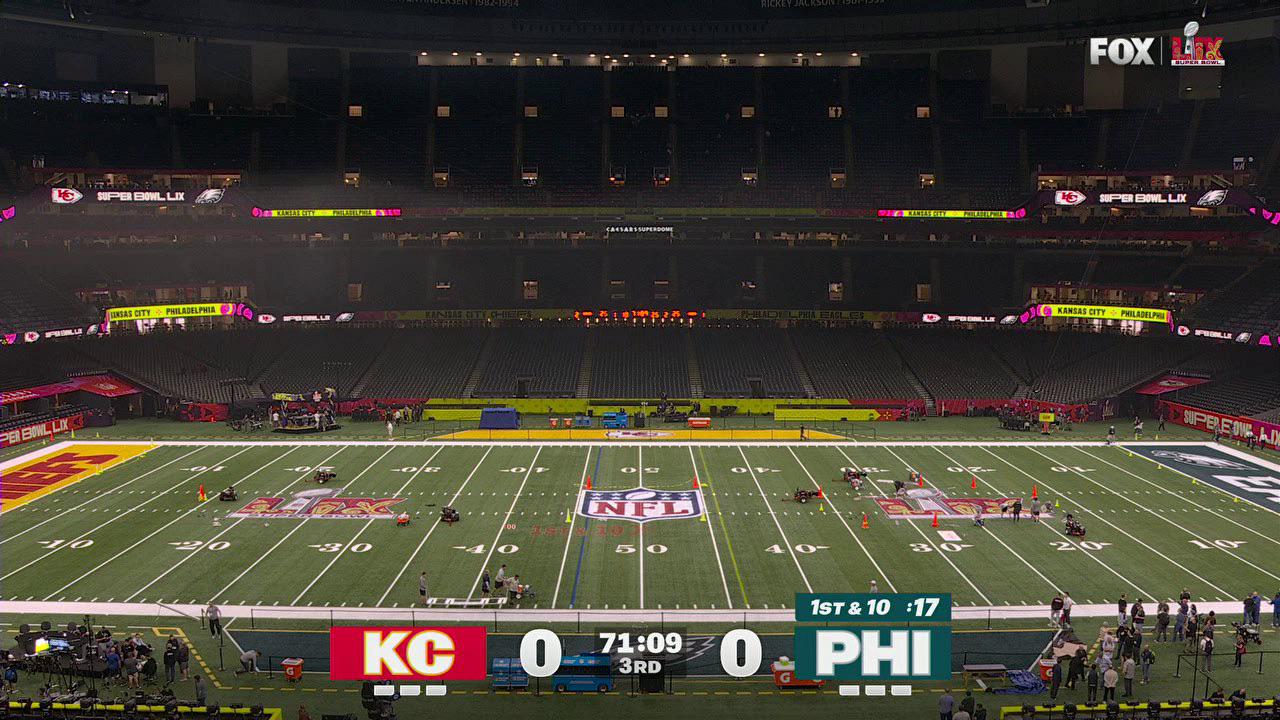
Empty stadium with FOX’s updated Super Bowl LIX scoreboard graphics displayed during a pre-game broadcast test.

Better look at the new scorebug displayed during a pre-game broadcast test.

Apple VR headset on a table

Thoughts on Apple Vision Pro

Apple finally launched its Vision Pro “spatial computing” device in early February. We immediately saw TikTok memes of influencers being ridiculous. I wrote about my hope for the Apple Vision Pro back in June 2023, when it was first announced. When preorders opened for Vision Pro in January, I told myself I wouldn’t buy it. I couldn’t justify the $3,500 price tag. Out of morbid curiosity, I would lurk in the AVP subreddits to live vicariously through those who did take the plunge.

After about a month of reading all the positives from users about the device, I impulsively bought an Apple Vision Pro. I placed my order online at noon and picked it up just two hours later at an Apple Store near me.

Many great articles and YouTube videos have already been produced, so this post won’t be a top-to-bottom review of the Apple Vision Pro. Instead, I’ll try to frame it from my standpoint as someone who has designed user experiences for VR

Welcome to the Era of Spatial Computing

Augmented reality, mixed reality, or spatial computing—as Apple calls it—on a “consumer” device is pretty new. You could argue that Microsoft HoloLens did it first, but that didn’t generate the same cultural currency as AVP has, and the HoloLens line has been relegated to industrial applications. The Meta Quest 3, launched last October, also has a passthrough camera, but they don’t market the feature; it’s still sold as a purely virtual reality headset.

Screenshot of the Apple Vision Pro home screen showing floating app icons in an augmented reality workspace. Visible apps include TV, Music, Mindfulness, Settings, Safari, Photos, Notes, App Store, Freeform, Mail, Messages, Keynote, and Compatible Apps, overlaid on a real-world office environment.

Vision Pro Home Screen in my messy home office.

Putting on Vision Pro for the first time is pretty magical. I saw the world around me—though a slightly muted and grainy version of my reality—and I saw UI floating and pinned to reality. Unlike any other headset I’ve tried, there is no screen door effect. I couldn’t see the pixels. It’s genuinely a retina display just millimeters away from my actual retinas. 

The UI is bright, vibrant, and crisp in the display. After launching a weather app from the home “screen” and positioning it on a wall, it stays exactly where it is in my living room. As I move closer to the app, everything about the app remains super sharp. It’s like diving into a UI. 

The visionOS User Interface

The visionOS UI feels very much like an extension of macOS. There’s a lot of translucency, blurred backgrounds for a frosted glass effect, and rounded corners. The controls for moving, closing, and resizing a window feel very natural. There were times when I wished I could rotate a window on its Y-axis to face me better, but that wasn’t possible. 

Admittedly, I didn’t turn on the accessibility feature. But as is, a significant issue that the UI presents is contrast. As someone with no accessibility issues, it was hard to tell half the time when something was highlighted. I would often have to look at another UI component and then back again to make sure a button was actually highlighted.

When you launch a Vision Pro app, it is placed right in front of you. For example, I would look at the Photos app, then click the Digital Crown (the dial for immersion) to bring up the Home Screen, which is then overlaid on top of the app. The background app does get fainter, and I can tell that the new screen is on top of Photos. Launching the Apple TV app from there would bring up the TV window on top of Photos, and I would run into issues where the handles for the windows are really close together, making it difficult to select the right one with my eyes so I can move it.

Window management, in general, is a mess. First of all, there is none. There’s no minimizing of windows; I would have to move them out of the way. There’s no collecting of windows. For instance, I couldn’t set up a workspace with the apps in the right place, collapse them all, and bring them with me to another room in my house. I would have to close them all, reopen them, and reposition them in the new room.

Working in Apple Vision Pro

I was excited to try the Mac Virtual Display feature, where you can see your Mac’s screen inside Vision Pro. Turning this on is intuitive. A “Connect” button appeared just above my MacBook Pro when I looked at it.

The Mac’s screen blacks out, and a large screen inside Vision Pro appears. I could resize it, move it around, and position it exactly where I wanted it. Everything about this virtual screen was crisp, but I ran into issues.

First, I’m a pretty good typist but cannot touch-type. With the Mac Virtual Display, I need to look down at my keyboard every few seconds. The passthrough camera on the headset is great but not perfect. There is some warping of reality on the edges, and that was just enough to cause a little motion sickness.

Second, when I’m sitting at my desk, I’m used to working with dual monitors. I usually have email or comms software on the smaller laptop screen while I work in Figma, Illustrator, or Photoshop on my larger 5K Apple Studio Display. If I sit at my desk and turn on Mac Virtual Display, I also lose my Studio Display. Only one virtual display shows up in Vision Pro. 

I tried to mitigate the lost space by opening Messages, Spark Email (the iPad version), and Fantastical in Vision Pro and placing those apps around me. But I found switching from my Mac to these other apps cumbersome. I’d have to stop using my mouse and use my fingers instead when I looked at Spark. I found that keyboard focus depended on where my eyes were looking. For example, if I were reading an email in Spark but needed to look at my keyboard to find the “E” key to archive that email, if I pressed the key before my eyes were back in the Spark window, that E would go to whatever app my eyes happened to cross. In other words, my eyes are my cursor, which takes a while to get used to.

Spatial Computing 1.0

It is only the first version of visionOS (currently 1.1). I expect many of these issues, like window management, eye tracking and input confusion, and contrast, to improve in the coming years. 

Native visionOS Apps

In many ways, Apple has been telegraphing what they want to achieve with Vision Pro for years. Apple’s API for augmented reality, ARKit, was released way back in June 2017, a full six years before Vision Pro was unveiled. Some of the early AR apps for Vision Pro are cool tech demos.

Screenshot from Apple Vision Pro using the JigSpace app, showing a detailed 3D augmented reality model of a jet engine overlaid in a modern living room environment.

There’s a jet engine in my living room!

The JigSpace app plunks real-world objects into your living room. I pulled up a working jet engine and was able to peel away the layers to see how it worked. There’s even a Formula 1 race car that you can load into your environment.

The Super Fruit Ninja game was fun. I turned my living room into a fruit-splattered dojo. I could even launch throwing stars from my hands that would get stuck on my walls.

Screenshot from Apple Vision Pro using the Zillow Immerse app, displaying a virtual tour interface overlaid on a dining area. Navigation options such as “Breakfast nook,” “Living room,” and “Kitchen” appear at the bottom, along with a broken 3D floor plan model in the center.

That’s half a floor plan on top of a low-resolution 360° photo.

Some Vision Pro apps were rushed out the door and are just awful. The Zillow Immerse app is one of them. I found the app glitchy and all the immersive house tours very low-quality. The problem is that the environments that ship with Vision Pro are so high-resolution and detailed that anything short of that is jarringly inferior. 

UX Considerations in Vision Pro

Apple Vision Pro can run iPad apps, at least the ones where the developer has enabled the capability. However, I found that many of the touch targets in iPad apps were not sufficient. Apple’s Human Interface Guidelines specify that hit targets should be at least 44x44 pts. But if opened in Vision Pro, that’s not enough. For visionOS, Apple recommends controls’ centers be at least 60 pts apart. 

I would further recommend that controls for visionOS apps should have large targets. In Apple’s own Photos app, in the left sidebar, only the accordion arrow is a control. Looking at and selecting the accordion label like “Spatial” or “Selfies” does not work. I had to look to the right of the label, to the arrow in order to select the item. Not great.

Eye and hand tracking in Vision Pro are excellent, although not perfect. There were many times when I couldn’t get the device to register my pinch gesture or get my eyes to a point in a window to resize it.

Some apps take advantage of additional gestures like pinching with both hands and then pulling them apart to resize something. I do believe that more standard gestures need to be introduced in the future for visionOS.

Steve Jobs famously once said, “God gave us ten styluses. Let’s not invent another.” Apple eventually introduced the Pencil for iPad. I think for many applications and for users to be productive with them, Apple will have to introduce a controller.

IMAX in My Bedroom

The single most compelling use case for Apple Vision Pro right now is consuming video content, specifically movies and TV shows. The built-in speakers, which Apple calls audio pods, sound fantastic. Apple has been doing a lot of work in Spatial Audio over the years and I experienced really great surround sound in the Vision Pro. The three apps that currently stand out for video entertainment are IMAX, Disney Plus, and Apple TV. 

Watching content in the IMAX —only a couple of trailers were free—reminded me of the best IMAX screen I’ve ever been to, which is the one in the Metreon in San Francisco. The screen is floor-to-ceiling high with a curved railing in front of it. On either side is a backlit IMAX logo, and I could choose from a few different positions in the theater!

Screenshot from Apple Vision Pro using the Disney+ app, showing a virtual Star Wars-themed environment with a sunset over Tatooine. A floating screen displays a scene featuring droids BB-8 and R2-D2, blending immersive AR with cinematic playback.

Watching a Star Wars movie on Tatooine.

Disney leverages its IP very well by giving us various sets to watch their content. I could watch Avengers: End Game from Avengers Tower, Monsters, Inc. from the scare floor, or The Empire Strikes Back from Luke’s land speeder on Tatooine. 

With Apple TV, I could watch Masters of the Air in a window in my space or go into an immersive environment. Whether it’s lakeside looking towards Mount Hood, on the surface of the moon, or in a discrete movie theater, the content was the star. My wife goes to sleep before me, and I usually put on my AirPods and watch something on my iPad. With Vision Pro, I could be much more engrossed in the show because the screen is as big as my room.

Still from an Apple Vision Pro commercial showing a person lying on a couch wearing the headset, watching a large virtual screen suspended in the air that displays warplanes flying through clouds. The scene emphasizes immersive home entertainment; caption reads “Apple TV+ subscription required.”

From the Apple commercial “First Timer”

I rewatched Dune from 2021 and was blown away by the audio quality of my AirPods Pro. The movie has incredible sound and uses bass and sub-bass frequencies a lot, so I was surprised at how well the AirPods performed. Of course, I didn’t feel the bass rumble in my chest, but I could certainly hear it in my ears.

Vision Pro Industrial Design

Close-up photo of the Apple Vision Pro headset, showcasing its sleek design with a reflective front visor, external cameras, and adjustable fabric headband resting on a dark surface.

The Vision Pro hardware is gorgeous.

As many others have pointed out, the hardware is incredible. It feels very premium and is a technological marvel. The cool-looking Solo Knit Band works pretty well for me, but everyone’s heads are so different that your mileage may vary. Everyone’s face is also very different, and Apple uses the Face ID scanner on the iPhone to scan your face when you order it. This determines the exact light seal they’ll include with your Vision Pro.

There are 28 different models of light seals. Finding the right light seal to fit my face wasn’t as easy as taking the recommendation from the scan. When I went to pick it up, I opted for a fitting, but the 21W that was suggested didn’t feel comfortable. I tried a couple of other light seal sizes and settled on the most comfortable one. But at home, the device was still very uncomfortable. I couldn’t wear it for more than 10 minutes without feeling a lot of pressure on my cheeks.

The next day, I returned to the Apple Store and tried three or four more light seal and headband combinations. But once dialed in, the headset was comfortable enough for me to watch an hour-long TV show.

I wonder why Apple didn’t try to develop a method that requires less variation. Wouldn’t some memory foam cushioned light seal work?

Apple’s Ambitions

The Apple Vision Pro is an audacious device, and I can tell where they want to go, but they don’t yet have the technology to get there. They want to make AR glasses with crystal-clear, super-sharp graphics that can then be converted to immersive VR with the flick of a dial.

That’s why EyeSight, the screen on the front of the headset, allows people in the surrounding area to see the user’s eyes. The device also has a passthrough camera, allowing the user to see out. Together, these two features allow Vision Pro to act as a clear two-way lens.

But Apple seems to want both AR and VR in the same device. I would argue that it might be physically impossible. Imagine an Apple device more like the HoloLens, where they are truly glasses with imagery projected onto them. That eliminates the smaller-than-their-competitors’ field of vision, or FOV. That would eliminate the ridiculous fitting conundrum as the glasses could float in front of your eyes. And that would probably reduce the device’s weight, which has been discussed at length in many reviews.

And then, for VR, maybe there’s a conversion that could happen with the AR glasses. A dial could turn the glasses from transparent to opaque. Then, the user would snap on a light-blocking attachment (a light seal). I believe that would be a perfectly acceptable tradeoff.

What $3,500 Buys You

In 1985, when I was 12 years old, I badgered my father daily to buy me a Macintosh computer. I had seen it at ComputerLand, a computer shop on Van Ness Avenue. I would go multiple times per week after school just to mess around with the display unit. I was enamored with MacPaint.

Vintage black-and-white print ad announcing the Apple Macintosh, featuring a hand using a computer mouse and a sketch of the Macintosh computer. The headline reads, “We can put you in touch with Macintosh,” promoting its simplicity and ease of use. The ad is from ComputerLand with the tagline “Make friends with the future.”

After I don’t know how many months, my dad relented and bought me a Macintosh 512K. The retail cost of the machine in 1985 was $2,795, equivalent to $8,000 in 2024 dollars. That’s a considerable investment for a working-class immigrant family. But my wise father knew then that computers were the future. And he was right.

With my Mac, I drew illustrations in MacPaint, wrote all my school essays in MacWrite, and made my first program in HyperCard. Eventually, I upgraded to other Macs and got exposed to and honed my skills in Photoshop and Illustrator, which would help my graphic design career. I designed my first application icon when I was a senior in high school.

Of course, computers are much cheaper today. The $999 entry model MacBook Air is able to do what my Mac 512K did and so much more. A kid today armed with a MacBook Air could learn so much!

Which brings us to the price tag of the Apple Vision Pro. It starts at $3,499. For a device where you can’t—at least for now—do much but consume. This was an argument against iPad for the longest time: it is primarily a consumption device. Apple went so far as to create a TV spot showing how a group of students use an iPad to complete a school project. With an iPad, there is a lot of creation that can happen. There are apps for drawing, 3D sculpting, video editing, writing, brainstorming, and more. It is more than a consumption device.

More than a Consumption Device? Not So Fast.

For Vision Pro, today, I’m not so sure. The obvious use case is 3D modeling and animation. Already, someone is figuring out how to visualize 3D models from Blender in AVP space. It’s tied to the instance of Blender running on his Mac, though, isn’t it? 3D modeling and animation software is notoriously complicated. The UI for Cinema 4D, the 3D software that I know best, has so many options and commands and so many keyboard shortcuts and combinations that it would be impossible to replicate in visionOS. Or take simpler apps like Final Cut Pro or Photoshop. Both have iPad apps, but a combination of the keyboard and mouse can make a user so much more productive. Imagine having to look at precisely the right UI element in Vision Pro, then pinch at exactly the right thing in a dense interface like Final Cut Pro. It would be a nightmare.

Screenshot from Apple Vision Pro using the Djay app, showing a realistic virtual DJ setup with turntables and music controls overlaid in a modern living room. A user’s hand interacts with the virtual record player, blending AR and music mixing in real time.

Being creative with djay in Apple Vision Pro

I do think that creative apps will eventually find their way to the platform. One of the launch apps is djay, the DJing app, of course. But it will take some time to figure out.

Beyond that, could a developer use Vision Pro to program in? If we look to the iPadOS ecosystem there are a handful of apps to write code. But there is no way to check your code, at least not natively. Erik Bledsoe from Coder writes, “The biggest hurdle to using an iPad for coding is its lack of a runtime environment for most languages, forcing you to move your files to a server for compiling and testing.” The workaround is to use a cloud-based IDE in the browser like Coder. I imagine that the same limitations will apply to Vision Pro.

The Bottom Line

For $3,500, you could buy a 16-inch MacBook Pro with an M3 Pro chip and an iPhone 15 Pro. Arguably, this would be a much more productive setup. With the Mac, you’d have access to tens of thousands of apps, many for professional applications. With the iPhone, there are nearly five million apps in the App Store.

In other words, I don’t believe buying an Apple Vision Pro today would open a new world up for a teenager. It might be cool and a little inspirational, but it won’t help the creator inside them. It won’t do what the Mac 512K did for me back in 1985.

Vision Pro’s Future

Clearly, the Apple Vision Pro released in 2024 is a first generation product. Just like the first-gen Apple Watch, Apple and its customers will need to feel their collective way and figure out all the right use cases. We can look to the Meta Quest 3 and Microsoft HoloLens 2 to give us a glimpse.

As much as people were marveling at the AR vacuum cleaning game for Vision Pro, AR and VR apps have existed for a while. PianoVision for Meta Quest 3 combines your real piano or keyboard with a Guitar Hero-like game to teach you how to play. The industrial applications for HoloLens make a lot of sense.

Now that Apple is overtly out of the closet in the AR/VR game, developers will show great enthusiasm and investment in the space. At least on Reddit, there’s a lot of excitement from users and developers. We will have to see if the momentum lasts. The key for the developers will be the size of the market. Will there be enough Vision Pro users to sustain a thriving app ecosystem?

As for me, I decided to return my Vision Pro within the 14-day return window. The only real use case for me was the consumption of media, which I couldn’t justify spending $3,500 for a room-sized TV that only I could watch. Sign me up for version 2, though.

Using the iPad to Reshape Content

This post was originally published on Bow & Arrow from PJA (my employer) on February 3, 2011.

The New York Times recently published an article about how apps and web services are enabling consumers to customize how they read their online content. From apps like Flipboard and Pulse to services like Readability and Instapaper, users are increasingly demanding to consume content whenever, wherever and however they want.

When Apple introduced the iPad a year ago, many print publishers saw it as a panacea for their dwindling readership. By creating digital editions, they hoped to recapture some of the eyeballs lost to aggregators and RSS feeds. One of the pioneering publication apps was the WIRED Magazine iPad app. Because of its novelty, its debut issue sold 73,000 digital copies in nine days, almost as much as on newsstands. There is a clear desire from users to read magazines on their tablets.

What that first generation of attempts miss though, is they are trying to replicate 20th century print experience on a 21st century device. The magazine apps feel very one way. But the iPad is an Internet-connected device and users on the Internet demand more interactive experiences. They want to copy and paste passages to put on their blogs. They want to share articles via Facebook and Twitter. Using Adobe’s Digital Magazine Solution, Condé Nast is starting to address some of these issues.

Tablet displaying the Flipboard app with a tech news layout, featuring articles on Microsoft Chrome extension support, Wikileaks, and Nokia Windows Phone, alongside images of the Chrome logo and a smartphone.

Meanwhile apps such as Flipboard are aggregating content and repackaging it for their users. Flipboard presents news items according to a user’s social graph, creating a personalized and highly relevant news stream. Additionally, the app presents this content in a unique way: as a paper magazine. The visual is striking, yet it still holds familiarity with users since it loosely mimics the experience of reading a real-world magazine, with the benefits of interactivity. And so far it has been a hit with users, even earning an [App of the Year](http://www.businessinsider.com/apple-calls-flipboard-ipad-app-of-the-year-2010-12 “Apple Calls Flipboard “iPad App Of The Year"") award from Apple.

Different kinds of content demand different kinds of packages. For example as a designer, I—along with most designers and art directors—flip through magazines such as Communication Arts and Print, and peruse blogs and websites like LovelyPackage.com and SmashingMagazine.com. Seeing something cool usually sparks an idea for whatever we’re currently working on.

To get through the hundreds of design-related sites out there, I use RSS feeds to aggregate this content for myself in Google Reader. Unfortunately, because I am so busy, I am not able to keep up with all my feeds. I may manage to check it only every few days. And I dread seeing that “1000+†number next to my unread items.

So last year, when the iPad was introduced, I decided to find a solution as an independent side project. I knew that an app on this large dedicated canvas could be created to serve this need of efficiently consuming visual inspiration. I teamed up with a developer friend and we started work on DesignScene.

We set out to create something that designers would enjoy using and become part of their daily ritual. We had two primary objectives:

  • The UI must serve the content and the audience. It has to be beautiful and show off visuals well.
  • The content must be relevant. There’s a glut of design-related websites and blogs on the Internet. Let’s help designers navigate through them.

The UI we designed is sparse—a simple grid that takes advantage of the screen real estate afforded by the tablet. Users flick through the various grid cells to see an assortment of images. They can enlarge the images to fill the screen or read the accompanying text from the original source via the built-in web browser. DesignScene surfaces up the latest inspirational images of not only design, but also architecture, photography, art and so on. The content is a curated list of sources and—as a whole—has an editorial point of view to enhance discovery.

iPad screen displaying the DesignScene app, featuring a grid of colorful design visuals on the left and a list of design-related article headlines on the right. The interface highlights creative content and industry news in a visually engaging layout.

It’s been two weeks since DesignScene launched. [This was originally posted three weeks ago on the PJA blog.] So far we’ve had great response from users and media. We built social sharing into the app and we can already see hundreds of discoveries being shared on Twitter. Our users are interacting with content in a way that was not possible just a year ago.