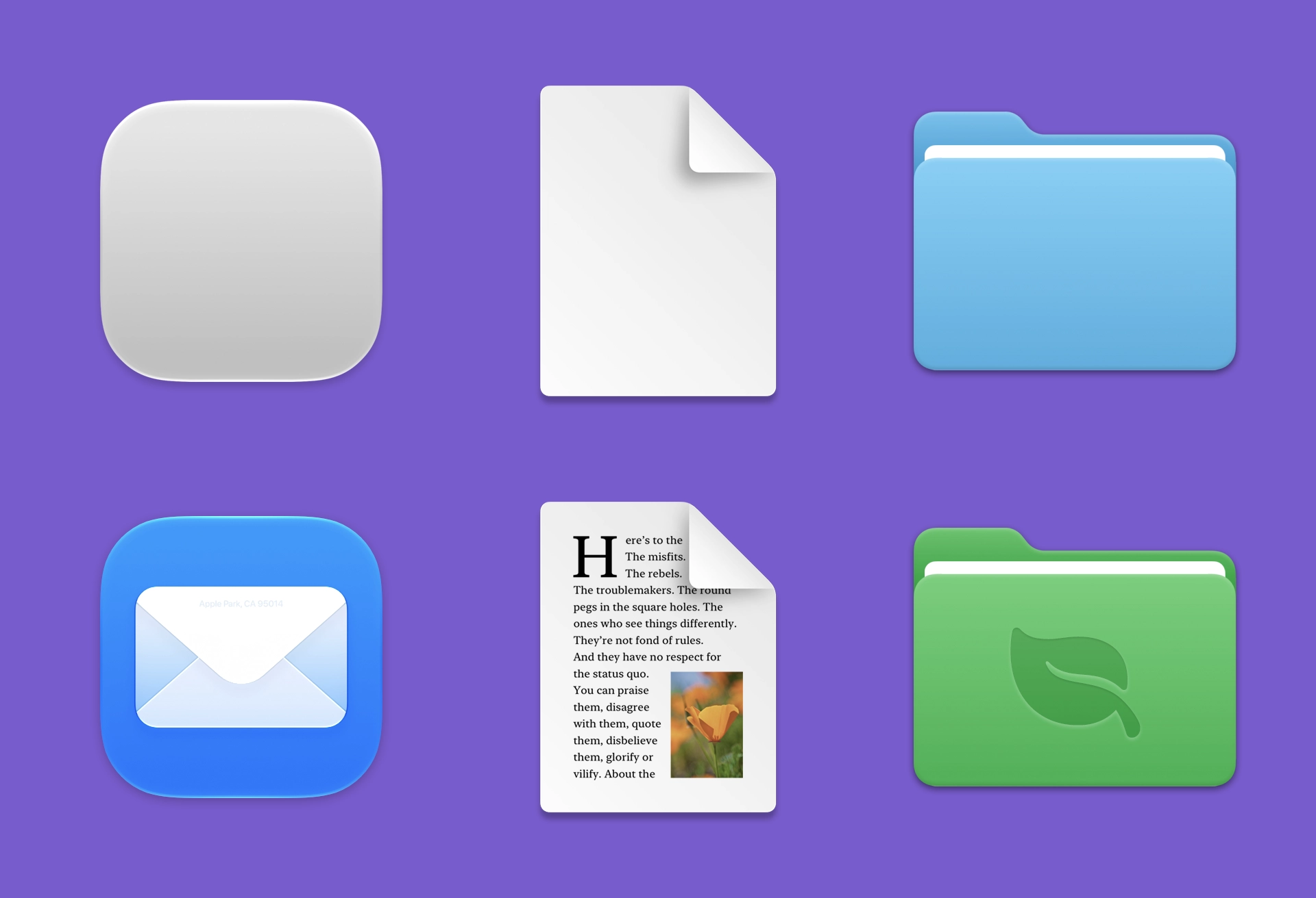
The click-target problem is why I’m fine with macOS’s mandatory squircle. Older icons sometimes made negative space look clickable when it wasn’t. Apple’s uniform shape makes the target predictable—a small accessibility improvement worth the trade, IMHO.
Louie Mantia, writing on the Parakeet blog, explains the icon designer’s tradeoff:
Masking all of these app icons to a squircle, and even applying Liquid Glass effects to them, aims to solve this problem. And this follows the same principle of iOS 7, which is to make it easier for all apps to fit in on the platform, especially apps built by designers and developers who aren’t familiar with how to make an icon that looks great next to first-party icons.
Just so I’m clear about my preference, I would love if Apple provided a way for designers to poke outside that squircle boundary. Some of my favorite app icons did that. But also some of my least-favorite app icons ignored this shape entirely, when it was used for every system icon in the last five years. Whenever those apps showed up in my Dock, it was like a stain on my shirt I couldn’t get out.
Despite the genuine loss associated with the squircle restriction, there’s more than one way to design with it.
Mantia is right that Apple handled some older icons poorly. Designs made specifically for the pre-Tahoe squircle were shrunk and placed inside the new one, punishing designers who had followed the previous rules. But Mantia’s broader point holds. The Dock also has to accommodate neglected utilities, unmodified corporate logos, and apps whose makers never learned the platform’s conventions. The squircle makes more of them look correctly sized next to one another.
Mantia goes beyond visual consistency and describes the shape’s semantic job:
Seventeen years later, now that app icons on macOS do have a uniform rounded-square appearance, they do look better adjacent to each other in the Dock. What’s even better is that over the last 19 years, apps on Apple platforms have distinguished themselves with a very recognizable visual identity.
The shape of apps is a squircle. And it has been proven to work for everyone. Companies can use their logo as an app icon. Designers can create something specifically for the platform. And both of these get to look like an app. Whether people consider the squircle a container or a canvas, this uniform appearance communicates its function: a squircle represents an app, just like how a piece of paper represents a digital document, or a folder represents, well, a folder.