Skip to content

83 posts tagged with “technology industry”

5 min read
Stylized artwork showing three figures in profile - two humans and a metallic robot skull - connected by a red laser line against a purple cosmic background with Earth below.

Beyond Provocative: How One AI Company’s Ad Campaign Betrays Humanity

I was in London last week with my family and spotted this ad in a Tube car. With the headline “Humans Were the Beta Test,” this is for Artisan, a San Francisco-based startup peddling AI-powered “digital workers.” Specifically an AI agent that will perform sales outreach to prospects, etc.

London Underground tube car advertisement showing "Humans Were the Beta Test" with subtitle "The Era of AI Employees Is Here" and Artisan company branding on a purple space-themed background.

Artisan ad as seen in London, June 2025

I’ve long left the Bay Area, but I know that the 101 highway is littered with cryptic billboards from tech companies, where the copy only makes sense to people in the tech industry, which to be fair, is a large part of the Bay Area economy. Artisan is infamous for its “Stop Hiring Humans” campaign which went up late last year. Being based in San Diego, much further south in California, I had no idea. Artisan wasn’t even on my radar.

Highway billboard reading "Stop Hiring Humans, Hire Ava, the AI BDR" with Artisan branding and an AI avatar image on the right side.

Artisan billboard off Highway 101, between San Francisco and SFO Airport

There’s something to be said about shockvertising. It’s meant to be shocking or offensive to grab attention. And the company sure increased their brand awareness, claiming a +197% increase in brand search growth. Artisan CEO Jaspar Carmichael-Jack writes a post-mortem in their company blog about the campaign:

The impact exceeded our wildest expectations. When I meet new people in San Francisco, 70% of the time they know about Artisan and what we do. Before, that number was around 5%. aHrefs ranked us #2 fastest growing AI companies by brand search. We’ve seen 1000s of sales meetings getting booked.

According to him, “October and November became our biggest months ever, bringing in over $2M in new ARR.”

I don’t know how I feel about this. My initial reaction to seeing “Humans Were the Beta Test” in London was disgust. As my readers know, I’m very much pro-AI, but I’m also very pro-human. Calling humanity a beta test is simply tone-deaf and nihilistic. It is belittling our worth and betting on the end of our species. Yes, yes, I know it’s just advertising and some ads are simply offensive to various people for a variety of reasons. But as technology people, Artisan should know better.

Despite ChatGPT’s soaring popularity, there is still ample fear about AI, especially around job displacement and safety. The discourse around AI is already too hyped up.

I even think “Stop Hiring Humans” is slightly less offensive. As to why the company chose to create a rage-bait campaign, Carmichael-Jack says:

We knew that if we made the billboards as vanilla as everybody else’s, nobody would care. We’d spend $100s of thousands and get nothing in return.

We spent days brainstorming the campaign messaging. We wanted to draw eyes and spark interest, we wanted to cause intrigue with our target market while driving a bit of rage with the wider public. The messaging we came up with was simple but provocative: “Stop Hiring Humans.”

Bus stop advertisement displaying "Stop Hiring Humans" with "The Era of AI Employees Is Here" and three human faces, branded by Artisan, on a city street with a passing bus.RetryClaude can make mistakes. Please double-check responses.

When the full campaign which included 50 bus shelter posters went up, death threats started pouring in. He was in Miami on business and thought going home to San Francisco might be risky. “I was like, I’m not going back to SF,” Carmichael-Jack says in a quote to The San Francisco Standard. “I will get murdered if I go back.”

(For the record, I’m morally opposed to death threats. They’re cowardly and incredibly scary for the recipient, regardless of who that person is.)

I’ve done plenty of B2B advertising campaigns in my day. Shock is not a tactic I would have used, nor would I ever recommend to a brand trying to raise positive awareness. I wish Artisan would have used the services of a good B2B ad agency. There are plenty out there and I used to work at one.

Think about the brands that have used shockvertising tactics in the past like Benetton and Calvin Klein. I’ve liked Oliviero Toscani’s controversial photographs that have been the central part of Benetton’s campaigns because they instigate a positive *liberal *conversation. The Pope kissing Egypt’s Islamic leader invites dialogue about religious differences and coexistence and provocatively expresses the campaign concept of “Unhate.”

But Calvin Klein’s sexualized high schoolers? No. There’s no good message in that.

And for me, there’s no good message in promoting the death of the human race. After all, who will pay for the service after we’re all end-of-lifed?

Here we go. Figma has just dropped their S-1, or their registration for an initial public offering (IPO).

A financial metrics slide showing Figma's key performance indicators on a dark green background. The metrics displayed are: $821M LTM revenue, 46% YoY revenue growth, 18% non-GAAP operating margin, 91% gross margin, 132% net dollar retention, 78% of Forbes 2000 companies use Figma, and 76% of customers use 2 or more products.

Rollup of stats from Figma’s S-1.

While a lot of the risk factors are boilerplate—legalese to cover their bases—the one about AI is particularly interesting, “Competitive developments in AI and our inability to effectively respond to such developments could adversely affect our business, operating results, and financial condition.”

Developments in AI are already impacting the software industry significantly, and we expect this impact to be even greater in the future. AI has become more prevalent in the markets in which we operate and may result in significant changes in the demand for our platform, including, but not limited to, reducing the difficulty and cost for competitors to build and launch competitive products, altering how consumers and businesses interact with websites and apps and consume content in ways that may result in a reduction in the overall value of interface design, or by otherwise making aspects of our platform obsolete or decreasing the number of designers, developers, and other collaborators that utilize our platform. Any of these changes could, in turn, lead to a loss of revenue and adversely impact our business, operating results, and financial condition.

There’s a lot of uncertainty they’re highlighting:

  • Could competitors use AI to build competing products?
  • Could AI reduce the need for websites and apps which decreases the need for interfaces?
  • Could companies reduce workforces, thus reducing the number of seats they buy?

These are all questions the greater tech industry is asking.

preview-1751405229235.png

Figma Files Registration Statement for Proposed IPO | Figma Blog

An update on Figma's path to becoming a publicly traded company: our S-1 is now public.

figma.com iconfigma.com

In a dual profile, Ben Blumenrose spotlights Phil Vander Broek—whose startup Dopt was acquired last year by Airtable—and Filip Skrzesinski—who is currently working on Subframe—in the Designer Founders newsletter.

One of the lessons Vander Broek learned was to not interview customers just to validate an idea. Interview them to get the idea first. In other words, discover the pain points:

They ran 60+ interviews in three waves. The first 20 conversations with product and growth leaders surfaced a shared pain point: driving user adoption was painfully hard, and existing tools felt bolted on. The next 20 calls helped shape a potential solution through mockups and prototypes—one engineer was so interested he volunteered for weekly co-design sessions. A final batch of 20 calls confirmed their ideal customer was engineers, not PMs.

As for Skrzesinski, he’s learning that being a startup founder isn’t about building the product—it’s about building a business:

But here’s Filip’s counterintuitive advice: “Don’t start a company because you love designing products. Do it in spite of that.”

“You won’t be designing in the traditional sense—you’ll be designing the company’s DNA,” he explains. “It’s the invisible work: how you organize, how you think, how you make decisions. How it feels to work there, to use what you’re making, to believe in it.”

preview-1751333180140.jpeg

Designer founders on pain-hunting, seeking competitive markets, and why now is the time to build

Phil Vander Broek of Dopt and Filip Skrzesinski of Subframe share hard-earned lessons on getting honest about customer signals, moving faster, and the shift from designing products to companies.

designerfounders.substack.com icondesignerfounders.substack.com

Vincent Nguyen writing for Yanko Design, interviewing Alan Dye, VP of Human Interface Design at Apple:

This technical challenge reveals the core problem Apple set out to solve: creating a digital material that maintains form-changing capabilities while preserving transparency. Traditional UI elements either block content or disappear entirely, but Apple developed a material that can exist in multiple states without compromising visibility of underlying content. Dye’s emphasis on “celebrating user content” exposes Apple’s hierarchy philosophy, where the interface serves content instead of competing with it. When you tap to magnify text, the interface doesn’t resize but stretches and flows like liquid responding to pressure, ensuring your photos, videos, and web content remain the focus while navigation elements adapt around them.

Since the Jony Ive days, Apple’s hardware has always been about celebrating the content. Bezels got smaller. Screens got bigger and brighter. Even the flat design brought on by iOS 7 and eventually adopted by the whole ecosystem was a way to strip away the noise and focus on the content.

Dye’s explanation of the “glass layer versus application layer” architecture provides insight into how Apple technically implements this philosophy. The company has created a distinct separation between functional controls (the glass layer) and user content (the application layer), allowing each to behave according to different rules while maintaining visual cohesion. This architectural decision enables the morphing behavior Dye described, where controls can adapt and change while content remains stable and prominent.

The Apple platform UI today sort of does that, but Liquid Glass seems to take it even further.

Nguyen about his experience using the Music app on Mac:

The difference from current iOS becomes apparent in specific scenarios. In the current Music app, scrolling through your library feels like moving through flat, static layers. With Liquid Glass, scrolling creates a sense of depth. You can see your album artwork subtly shifting beneath the translucent controls, creating spatial awareness of where interface elements sit in relation to your content. The tab bar doesn’t just scroll with you; it creates gentle optical distortions that make the underlying content feel physically present beneath the glass surface.

preview-1749793045679.jpg

Apple’s Liquid Glass Hands-On: Why Every Interface Element Now Behaves Like Physical Material

Liquid Glass represents more than an aesthetic update or surface-level polish. It functions as a complex behavioral system, precisely engineered to dictate how interface layers react to user input. In practical terms, this means Apple devices now interact with interface surfaces not as static, interchangeable panes, but as dynamic, adaptive materials that fluidly flex and

yankodesign.com iconyankodesign.com
Collection of iOS interface elements showcasing Liquid Glass design system including keyboards, menus, buttons, toggles, and dialogs with translucent materials on dark background.

Breaking Down Apple’s Liquid Glass: The Tech, The Hype, and The Reality

I kind of expected it: a lot more ink was spilled on Liquid Glass—particularly on social media. In case you don’t remember, Liquid Glass is the new UI for all of Apple’s platforms. It was announced Monday at WWDC 2025, their annual developers conference.

The criticism is primarily around legibility and accessibility. Secondary reasons include aesthetics and power usage to animate all the bubbles.

How Liquid Glass Actually Works

Before I go and address the criticism, I think it would be great to break down the team’s design thinking and how Liquid Glass actually works. 

I watched two videos from Apple’s developer site. Much of the rest of the article is a summary of the videos. You can watch them and skip to the end of this piece.

First off is this video that explains Liquid Glass in detail.

As I watched the video, one thing stood out clearly to me: the design team at Apple did a lot of studying of the real world before digitizing it into UI.

The Core Innovation: Lensing

Instead of scattering light like previous materials, Liquid Glass dynamically bends and shapes light in real-time. Apple calls this “lensing.”

It’s their attempt to recreate how transparent objects work in the physical world. We all intuitively understand how warping and bending light communicates presence and motion. Liquid Glass uses these visual cues to provide separation while letting content shine through.

A Multi-Layer System That Adapts

Liquid Glass toolbar with pink tinted buttons (bookmark, refresh, more) floating over geometric green background, showing tinting capabilities.

This isn’t just a simple effect. It’s built from several layers working together:

  • Highlights respond to environmental lighting and device motion. When you unlock your phone, lights move through 3D space, causing illumination to travel around the material.
  • Shadows automatically adjust based on what’s behind them—darker over text for separation, lighter over solid backgrounds.
  • Tint layers continuously adapt. As content scrolls underneath, the material flips between light and dark modes for optimal legibility.
  • Interactive feedback spreads from your fingertip throughout the element, making it feel alive and responsive.

All of this happens automatically when developers apply Liquid Glass.

Two Variants (Frosted and Clear)

Liquid Glass has the same two types of material.

  • Regular is the workhorse—full adaptive behaviors, works anywhere.
  • Clear is more transparent but needs dimming layers for legibility.

Clear should only be used over media-rich content when the content layer won’t suffer from dimming. Otherwise, stick with Regular.

It’s like ice cubes—cloudy ones from your freezer versus clear ones at fancy bars that let you see your drink’s color.

Four examples of regular Liquid Glass elements: audio controls, deletion dialog, text selection menu, and red toolbar, demonstrating various applications.

Regular is the workhorse—full adaptive behaviors, works anywhere.

Video player interface with Liquid Glass controls (pause, skip buttons) overlaying blue ocean scene with sea creature.

Clear should only be used over media-rich content when the content layer won’t suffer from dimming.

Smart Contextual Changes

When elements scale up (like expanding menus), the material simulates thicker glass with deeper shadows. On larger surfaces, ambient light from nearby content subtly influences the appearance.

Elements don’t fade—they materialize by gradually modulating light bending. The gel-like flexibility responds instantly to touch, making interactions feel satisfying.

This is something that’s hard to see in stills.

The New Tinting Approach

Red "Add" button with music note icon using Liquid Glass material over black and white checkered pattern background.

Instead of flat color overlays, Apple generates tone ranges mapped to content brightness underneath. It’s inspired by how colored glass actually works—changing hue and saturation based on what’s behind it.

Apple recommends sparing use of tinting. Only for primary actions that need emphasis. Makes sense.

Design Guidelines That Matter

Liquid Glass is for the navigation and controls layer floating above content—not for everything. Don’t add Liquid Glass to or make content areas Liquid Glass. Never stack glass on glass.

Liquid Glass button with a black border and overlapping windows icon floating over blurred green plant background, showing off its accessibility mode.

Accessibility features are built-in automatically—reduced transparency, increased contrast, and reduced motion modify the material without breaking functionality.

The Legibility Outcry (and Why It’s Overblown)

Apple devices (MacBook, iPad, iPhone, Apple Watch) displaying new Liquid Glass interface with translucent elements over blue gradient wallpapers.

“Legibility” was mentioned 13 times in the 19-minute video. Clearly that was a concern of theirs. Yes, in the keynote, clear tinted device home screens were shown and many on social media took that to be an accessibility abomination. Which, yes, that is. But that’s not the default. 

The fact that the system senses the type of content underneath it and adjusts accordingly—flipping from light to dark, increasing opacity, or adjusting shadow depth—means they’re making accommodations for legibility.

Maybe Apple needs to do some tweaking, but it’s evident that they care about this.

And like the 18 macOS releases before Tahoe—this version—accessibility settings and controls have been built right in. Universal Access debuted with Mac OS X 10.2 Jaguar in 2002. Apple has had a long history of supporting customers with disabilities, dating all the way back to 1987.

So while the social media outcry about legibility is understandable, Apple’s track record suggests they’ll refine these features based on real user feedback, not just Twitter hot takes.

The Real Goal: Device Continuity

Why and what is Liquid Glass meant to do? It’s unification. With the new design language, Apple has also come out with a new design system. This video presented by Apple designer Maria Hristoforova lays it out.

Hristoforova says that Apple’s new design system overhaul is fundamentally about creating seamless familiarity as users move between devices—ensuring that interface patterns learned on iPhone translate directly to Mac and iPad without requiring users to relearn how things work. The video points out that the company has systematically redesigned everything from typography (hooray for left alignment!) and shapes to navigation bars and sidebars around Liquid Glass as the unifying foundation, so that the same symbols, behaviors, and interactions feel consistent across all screen sizes and contexts. 

The Pattern of Promised Unity

This isn’t Apple’s first rodeo with “unified design language” promises.

Back in 2013, iOS 7’s flat design overhaul was supposed to create seamless consistency across Apple’s ecosystem. Jony Ive ditched skeuomorphism for minimalist interfaces with translucency and layering—the foundation for everything that followed.

OS X Yosemite (2014) brought those same principles to desktop. Flatter icons, cleaner lines, translucent elements. Same pitch: unified experience across devices.

macOS Big Sur (2020) pushed even further with iOS-like app icons and redesigned interfaces. Again, the promise was consistent visual language across all platforms.

And here we are in 2025 with Liquid Glass making the exact same promises. 

But maybe “goal” is a better word.

Consistency Makes the Brand

I’m OK with the goal of having a unified design language. As designers, we love consistency. Consistency is what makes a brand. As Apple has proven over and over again for decades now, it is one of the most valuable brands in the world. They maintain their position not only by making great products, but also by being incredibly disciplined about consistency.

San Francisco debuted 10 years ago as the system typeface for iOS 9 and OS El Capitan. They’ve since extended it and it works great in marketing and in interfaces.

iPhone Settings screen showing Liquid Glass grouped table cells with red outline highlighting the concentric shape design.

The rounded corners on their devices are all pretty much the same radii. Now that concentricity is being incorporated into the UI, screen elements will be harmonious with their physical surroundings. Only Apple can do that because they control the hardware and the software. And that is their magic.

Design Is Both How It Works and How It Looks

In 2003, two years after the iPod launched, Rob Walker of The New York Times did a profile on Apple. The now popular quote about design from Steve Jobs comes from this piece.

[The iPod] is, in short, an icon. A handful of familiar clichés have made the rounds to explain this — it’s about ease of use, it’s about Apple’s great sense of design. But what does that really mean? “Most people make the mistake of thinking design is what it looks like,” says Steve Jobs, Apple’s C.E.O. “People think it’s this veneer — that the designers are handed this box and told, ‘Make it look good!’ That’s not what we think design is. It’s not just what it looks like and feels like. Design is how it works.”

People misinterpret this quote all the time to mean design is only how it works. That is not what Steve meant. He meant, design is both what it looks like and how it works.

Steve did care about aesthetics. That’s why the Graphic Design team mocked up hundreds of PowerMac G5 box designs (the graphics on the box, not the construction). That’s why he obsessed over the materials used in Pixar’s Emeryville headquarters. From Walter Isaacson’s biography:

Because the building’s steel beams were going to be visible, Jobs pored over samples from manufacturers across the country to see which had the best color and texture. He chose a mill in Arkansas, told it to blast the steel to a pure color, and made sure the truckers used caution not to nick any of it.

Liquid Glass is a welcomed and much-needed visual refresh. It’s the natural evolution of Apple’s platforms, going from skeuomorphic so users knew they could use their fingers and tap on virtual buttons on a touchscreen, to flat as a response to the cacophony of visual noise in UIs at the time, and now to something kind of in-between.

Humans eventually tire of seeing the same thing. Carmakers refresh their vehicle designs every three or four years. Then they do complete redesigns every five to eight years. It gets consumers excited. 

Liquid Glass will help Apple sell a bunch more hardware.

I have relayed here before the story that I’ve been using Macs since 1985. It wasn’t the hardware that drew me in—it was MacPaint. I was always an artistic kid so being able to paint on a digital canvas seemed thrilling to me. And of course it was back then.

Behind MacPaint, was a man named Bill Atkinson. Atkinson died last Thursday, June 5 of pancreatic cancer. In a short remembrance, John Gruber said:

I say this with no hyperbole: Bill Atkinson may well have been the best computer programmer who ever lived. Without question, he’s on the short list. What a man, what a mind, what gifts to the world he left us.

I‘m happy that Figma also remembered Atkinson and that they are standing on his shoulders.

Every day at Figma, we wrestle with the same challenges Atkinson faced: How do you make powerful tools feel effortless? How do you hide complexity behind intuitive interactions? His fingerprints are on every pixel we push, every selection we make, every moment of creative flow our users experience.

preview-1749532457343.jpg

Bill Atkinson’s 10 Rules for Making Interfaces More Human

We commemorate the Apple pioneer whose QuickDraw and HyperCard programs made the Macintosh intuitive enough for nearly anyone to use.

figma.com iconfigma.com
Abstract gradient design with flowing liquid glass elements in blue and pink colors against a gray background, showcasing Apple's new Liquid Glass design language.

Quick Notes About WWDC 2025

Apple’s annual developer conference kicked off today with a keynote that announced:

  • Unified Version 26 across all Apple platforms (iOS, iPadOS, macOS, watchOS, tvOS, visionOS)
  • “Liquid Glass” design system. A complete UI and UX overhaul, the first major redesign since iOS 7
  • Apple Intelligence. Continued small improvements, though not the deep integration promised a year ago
  • Full windowing system on iPadOS. Windows comes to iPad! Finally.

Of course, those are the very high-level highlights.

For designers, the headline is Liquid Glass. Sebastiaan de With’s predictive post and renderings from last week were very spot-on.

I like it. I think iOS and macOS needed a fresh coat of paint and Liquid Glass delivers.

There’s already been some criticism—naturally, because we’re opinionated designers after all!—with some calling it over the top, a rehash of Windows Vista, or an accessibility nightmare.

Apple Music interface showing the new Liquid Glass design with translucent playback controls and navigation bar overlaying colorful album artwork, featuring "Blest" by Yuno in the player and navigation tabs for Home, New, Radio, Library, and Search.

The new Liquid Glass design language acts like real glass, refracting light and bending the image behind it accordingly.

In case you haven’t seen it, it’s a visual and—albeit less so—experience overhaul for the various flavors of Apple OSes. Imagine a transparent glass layer where controls sit. The layer has all the refractive qualities of glass, bending the light as images pass below it, and its edges catching highlights from a light source. This is all powered by a sophisticated 3D engine, I’m sure. It’s gorgeous.

It’s been 12 years since the last major refresh, with iOS 7 bringing on an era of so-called flat design to the world. At the time, it was a natural extension of Jony Ive’s predilection for minimalism, to strip things to their core. What could be more pure than using only type? It certainly appealed to my sensibilities. But what it brought on was a universe of sameness in UI design. 

Person using an iPad with a transparent glass interface overlay, demonstrating the new Liquid Glass design system with translucent app icons visible through the glass layer.

**

Hand interacting with a translucent glass interface displaying text on what appears to be a tablet or device, showing the new design's transparency effects.

The design team at Apple studied the physical properties of real glass to perfect the material in the new versions of the OSes.

With the release of Liquid Glass, led by Apple’s VP of Design, Alan Dye, I hope we’ll see designers add a little more personality, depth, and texture back into their UIs. No, we don’t need to return to the days of skeuomorphism—kicked off by Mac OS X’s Aqua interface design. I do think there’s been a movement away from flat design recently. Even at the latest Config conference, Figma showed off functionality to add noise and texture into our designs. We’ve been in a flat world for 12 years! Time to add a little spice back in.

Finally, it’s a beta. This is typical of Apple. The implementation will be iterated on and by the time it ships later this year in September, it will have been further refined. 

I do miss a good 4-minute video from Jony Ive talking about the virtues of software material design though…

Bell Labs was a famed research lab run by AT&T (aka “Ma Bell” before it was broken up). You can draw a straight line from Bell Labs to Xerox PARC where essential computing technologies like the graphical user interface, the mouse, Ethernet, and more were invented.

Aeroform, writing for 1517 Fund:

The reason why we don’t have Bell Labs is because we’re unwilling to do what it takes to create Bell Labs — giving smart people radical freedom and autonomy.

The freedom to waste time. The freedom to waste resources. And the autonomy to decide how.

preview-1749165348692.png

Why Bell Labs Worked.

Or, how MBA culture killed Bell Labs

1517.substack.com icon1517.substack.com

Nate Jones performed a yeoman’s job of summarizing Mary Meeker’s 340-slide deck on AI trends, the “2025 Technology as Innovation (TAI) Report.” For those of you who don’t know, Mary Meeker is a famed technology analyst and investor known for her insightful reports on tech industry trends. For the longest time, as an analyst at Kleiner Perkins, she published the Internet Trends report. And she was always prescient.

Half of Jones’ post is the summary, while the other half is how the report applies to product teams. The whole thing is worth 27 minutes of your time, especially if you work in software.

preview-1748925250512.jpeg

I Summarized Mary Meeker's Incredible 340 Page 2025 AI Trends Deck—Here's Mary's Take, My Response, and What You Can Learn

Yes, it's really 340 pages, and yes I really compressed it down, called out key takeaways, and shared what you can actually learn about building in the AI space based on 2025 macro trends!

natesnewsletter.substack.com iconnatesnewsletter.substack.com

As a reaction to the OpenAI + io announcement two weeks ago, Christopher Butler imagines a mesh computing device network he calls “personal ambient computing”:

…I keep thinking back to Star Trek, and how the device that probably inspired the least wonder in me as a child is the one that seems most relevant now: the Federation’s wearables. Every officer wore a communicator pin — a kind of Humane Pin light — but they also all wore smaller pins at their collars signifying rank. In hindsight, it seems like those collar pins, which were discs the size of a watch battery, could have formed some kind of wearable, personal mesh network. And that idea got me going…

He describes the device as a standardized disc that can be attached to any enclosure. I love his illustration too:

Diagram of a PAC Mesh Network connecting various devices: Pendant, Clip, Watch, Portable, Desktop, Handset, and Phone in a circular layout.

Christopher Butler: “I imagine a magnetic edge system that allows the disc to snap into various enclosures — wristwatches, handhelds, desktop displays, wearable bands, necklaces, clips, and chargers.”

Essentially, it’s an always-on, always observing personal AI.

preview-1748892632021.png

PAC – Personal Ambient Computing - Christopher Butler

Like most technologists of a certain age, many of my expectations for the future of computing were set by Star Trek production designers. It’s quite

chrbutler.com iconchrbutler.com

Following up on OpenAI’s acquisition of Jony Ive’s hardware startup, io, Mark Wilson, writing for Fast Company:

As Ive told me back in 2023, there have been only three significant modalities in the history of computing. After the original command line, we got the graphical user interface (the desktop, folders, and mouse of Xerox, Mac OS, and Windows), then voice (Alexa, Siri), and, finally, with the iPhone, multitouch (not just the ability to tap a screen, but to gesture and receive haptic feedback). When I brought up some other examples, Ive quickly nodded but dismissed them, acknowledging these as “tributaries” of experimentation. Then he said that to him the promise, and excitement, of building new AI hardware was that it might introduce a new breakthrough modality to interacting with a machine. A fourth modality.

Hmm, it hasn’t taken off yet because AR hasn’t really gained mainstream popularity, but I would argue hand gestures in AR UI to be a fourth modality. But Ive thinks different. Wilson continues:

Ive’s fourth modality, as I gleaned, was about translating AI intuition into human sensation. And it’s the exact sort of technology we need to introduce ubiquitous computing, also called quiet computing and ambient computing. These are terms coined by the late UX researcher Mark Weiser, who in the 1990s began dreaming of a world that broke us free from our desktop computers to usher in devices that were one with our environment. Weiser did much of this work at Xerox PARC, the same R&D lab that developed the mouse and GUI technology that Steve Jobs would eventually adopt for the Macintosh. (I would also be remiss to ignore that ubiquitous computing is the foundation of the sci-fi film Her, one of Altman’s self-stated goalposts.)

Ah, essentially an always-on, always watching AI that is ready to assist. But whatever the form factor this device takes, it will likely depend on a smartphone:

The first io device seems to acknowledge the phone’s inertia. Instead of presenting itself as a smartphone-killer like the Ai Pin or as a fabled “second screen” like the Apple Watch, it’s been positioned as a third, er, um … thing next to your phone and laptop. Yeah, that’s confusing, and perhaps positions the io product as unessential. But it also appears to be a needed strategy: Rather than topple these screened devices, it will attempt to draft off them.

Wilson ends with the idea of a subjective computer, one that has personality and gives you opinions. He explains:

I think AI is shifting us from objective to subjective. When a Fitbit counts your steps and calories burned, that’s an objective interface. When you ask ChatGPT to gauge the tone of a conversation, or whether you should eat better, that’s a subjective interface. It offers perspective, bias, and, to some extent, personality. It’s not just serving facts; it’s offering interpretation.

The entire column is worth a read.

preview-1748580958171.jpg

Can Jony Ive and Sam Altman build the fourth great interface? That's the question behind io

Where Meta, Google, and Apple zig, Ive and Altman are choosing to zag. Can they pull it off?

fastcompany.com iconfastcompany.com

Josh Miller, writing in The Browser Company’s substack:

After a couple of years of building and shipping Arc, we started running into something we called the “novelty tax” problem. A lot of people loved Arc — if you’re here you might just be one of them — and we’d benefitted from consistent, organic growth since basically Day One. But for most people, Arc was simply too different, with too many new things to learn, for too little reward.

“Novelty tax” is another way of saying using non-standard patterns that users just didn’t get. I love Arc. It’s my daily driver. But, Miller is right that it does have a steep learning curve. So there is a natural ceiling to their market.

Miller’s conclusion is where things get really interesting:

Let me be even more clear: traditional browsers, as we know them, will die. Much in the same way that search engines and IDEs are being reimagined [by AI-first products like Perplexity and Cursor]. That doesn’t mean we’ll stop searching or coding. It just means the environments we do it in will look very different, in a way that makes traditional browsers, search engines, and IDEs feel like candles — however thoughtfully crafted. We’re getting out of the candle business. You should too.

“You should too.”

And finally, to bring it back to the novelty tax:

**New interfaces start from familiar ones. **In this new world, two opposing forces are simultaneously true. How we all use computers is changing much faster (due to AI) than most people acknowledge. Yet at the same time, we’re much farther from completely abandoning our old ways than AI insiders give credit for. Cursor proved this thesis in the coding space: the breakthrough AI app of the past year was an (old) IDE — designed to be AI-native. OpenAI confirmed this theory when they bought Windsurf (another AI IDE), despite having Codex working quietly in the background. We believe AI browsers are next.

Sad to see Arc’s slow death, but excited to try Dia soon.

preview-1748494472613.png

Letter to Arc members 2025

On Arc, its future, and the arrival of AI browsers — a moment to answer the largest questions you've asked us this past year.

browsercompany.substack.com iconbrowsercompany.substack.com

OpenAI is acquiring a hardware company called “io” that Jony Ive cofounded just a year ago:

Two years ago, Jony Ive and the creative collective LoveFrom, quietly began collaborating with Sam Altman and the team at OpenAI.

It became clear that our ambitions to develop, engineer and manufacture a new family of products demanded an entirely new company. And so, one year ago, Jony founded io with Scott Cannon, Evans Hankey and Tang Tan.

We gathered together the best hardware and software engineers, the best technologists, physicists, scientists, researchers and experts in product development and manufacturing. Many of us have worked closely for decades.

The io team, focused on developing products that inspire, empower and enable, will now merge with OpenAI to work more intimately with the research, engineering and product teams in San Francisco.

It has been an open rumor that Sam Altman and Ive has been working together on some hardware. I had assumed they formalized their partnership already, but I guess not.

Play

There are some bold statements that Ive and Altman make in the launch video, teasing a revolutionary new device that will enable quicker, better access to ChatGPT. Something that is a lot less friction than how Altman explains in the video:

If I wanted to ask ChatGPT something right now about something we had talked about earlier, think about what would happen. I would like reached down. I would get on my laptop, I’d open it up, I’d launch a web browser, I’d start typing, and I’d have to, like, explain that thing. And I would hit enter, and I would wait, and I would get a response. And that is at the limit of what the current tool of a laptop can do. But I think this technology deserves something much better.

There are a couple of other nuggets about what this new device might be from the statements Ive and Altman made to Bloomberg:

…Ive and Altman don’t see the iPhone disappearing anytime soon. “In the same way that the smartphone didn’t make the laptop go away, I don’t think our first thing is going to make the smartphone go away,” Altman said. “It is a totally new kind of thing.”

“We are obviously still in the terminal phase of AI interactions,” said Altman, 40. “We have not yet figured out what the equivalent of the graphical user interface is going to be, but we will.”

While we don’t know what the form factor will be, I’m sure it won’t be a wearable pin—ahem, RIP Humane. Just to put it out there—I predict it will be a voice assistant in an earbud, very much like the AI in the 2013 movie “Her.” Altman has long been obsessed with the movie, going as far as trying to get Scarlett Johansson to be one of the voices for ChatGPT.

EDIT 5/22/2025, 8:58am PT: Added prediction about the form factor.

preview-1747889382686.jpg

Sam and Jony introduce io

Building a family of AI products for everyone.

openai.com iconopenai.com
Stylized digital artwork of two humanoid figures with robotic and circuit-like faces, set against a vivid red and blue background.

The AI Hype Train Has No Brakes

I remember two years ago, when my CEO at the startup I worked for at the time, said that no VC investments were being made unless it had to do with AI. I thought AI was overhyped, and that the media frenzy over it couldn’t get any crazier. I was wrong.

Looking at Google Trends data, interest in AI has doubled in the last 24 months. And I don’t think it’s hit its plateau yet.

Line chart showing Google Trends interest in “AI” from May 2020 to May 2025, rising sharply in early 2023 and peaking near 100 in early 2025.

So the AI hype train continues. Here are four different pieces about AI, exploring AGI (artificial general intelligence) and its potential effects on the labor force and the fate of our species.

AI Is Underhyped

TED recently published a conversation between creative technologist Bilawal Sidhu and Eric Schmidt, the former CEO of Google. 

Play

Schmidt says:

For most of you, ChatGPT was the moment where you said, “Oh my God, this thing writes, and it makes mistakes, but it’s so brilliantly verbal.” That was certainly my reaction. Most people that I knew did that.

This was two years ago. Since then, the gains in what is called reinforcement learning, which is what AlphaGo helped invent and so forth, allow us to do planning. And a good example is look at OpenAI o3 or DeepSeek R1, and you can see how it goes forward and back, forward and back, forward and back. It’s extraordinary.

So I’m using deep research. And these systems are spending 15 minutes writing these deep papers. That’s true for most of them. Do you have any idea how much computation 15 minutes of these supercomputers is? It’s extraordinary. So you’re seeing the arrival, the shift from language to language. Then you had language to sequence, which is how biology is done. Now you’re doing essentially planning and strategy. The eventual state of this is the computers running all business processes, right? So you have an agent to do this, an agent to do this, an agent to do this. And you concatenate them together, and they speak language among each other. They typically speak English language.

He’s saying that within two years, we went from a “stochastic parrot” to an independent agent that can plan, search the web, read dozens of sources, and write a 10,000-word research paper on any topic, with citations.

Later in the conversation, when Sidhu asks how humans are going to spend their days once AGI can take care of the majority of productive work, Schmidt says: 

Look, humans are unchanged in the midst of this incredible discovery. Do you really think that we’re going to get rid of lawyers? No, they’re just going to have more sophisticated lawsuits. …These tools will radically increase that productivity. There’s a study that says that we will, under this set of assumptions around agentic AI and discovery and the scale that I’m describing, there’s a lot of assumptions that you’ll end up with something like 30-percent increase in productivity per year. Having now talked to a bunch of economists, they have no models for what that kind of increase in productivity looks like. We just have never seen it. It didn’t occur in any rise of a democracy or a kingdom in our history. It’s unbelievable what’s going to happen.

In other words, we’re still going to be working, but doing a lot less grunt work. 

Feel Sorry for the Juniors

Aneesh Raman, chief economic opportunity officer at LinkedIn, writing an op-ed for The New York Times:

Breaking first is the bottom rung of the career ladder. In tech, advanced coding tools are creeping into the tasks of writing simple code and debugging — the ways junior developers gain experience. In law firms, junior paralegals and first-year associates who once cut their teeth on document review are handing weeks of work over to A.I. tools to complete in a matter of hours. And across retailers, A.I. chatbots and automated customer service tools are taking on duties once assigned to young associates.

In other words, if AI tools are handling the grunt work, junior staffers aren’t learning the trade by doing the grunt work.

Vincent Cheng wrote recently, in an essay titled, “LLMs are Making Me Dumber”:

The key question is: Can you learn this high-level steering [of the LLM] without having written a lot of the code yourself? Can you be a good SWE manager without going through the SWE work? As models become as competent as junior (and soon senior) engineers, does everyone become a manager?

But It Might Be a While

Cade Metz, also for the Times:

When a group of academics founded the A.I. field in the late 1950s, they were sure it wouldn’t take very long to build computers that recreated the brain. Some argued that a machine would beat the world chess champion and discover its own mathematical theorem within a decade. But none of that happened on that time frame. Some of it still hasn’t.

Many of the people building today’s technology see themselves as fulfilling a kind of technological destiny, pushing toward an inevitable scientific moment, like the creation of fire or the atomic bomb. But they cannot point to a scientific reason that it will happen soon.

That is why many other scientists say no one will reach A.G.I. without a new idea — something beyond the powerful neural networks that merely find patterns in data. That new idea could arrive tomorrow. But even then, the industry would need years to develop it.

My quibble with Metz’s article is that it moves the goal posts a bit to include the physical world:

One obvious difference is that human intelligence is tied to the physical world. It extends beyond words and numbers and sounds and images into the realm of tables and chairs and stoves and frying pans and buildings and cars and whatever else we encounter with each passing day. Part of intelligence is knowing when to flip a pancake sitting on the griddle.

As I understood the definition of AGI, it was not about the physical world, but just intelligence, or knowledge. I accept there are multiple definitions of AGI and not everyone agrees on what that is.

In the Wikipedia article about AGI, it states that researchers generally agree that an AGI system must do all of the following:

  • reason, use strategy, solve puzzles, and make judgments under uncertainty
  • represent knowledge, including common sense knowledge
  • plan
  • learn
  • communicate in natural language
  • if necessary, integrate these skills in completion of any given goal

The article goes on to say that “AGI has never been proscribed a particular physical embodiment and thus does not demand a capacity for locomotion or traditional ‘eyes and ears.’”

Do We Lose Control by 2027 or 2031?

Metz’s article is likely in response to the “AI 2027” scenario that was published by the AI Futures Project a couple of months ago. As a reminder, the forecast is that by mid-2027, we will have achieved AGI. And a race between the US and China will effectively end the human race by 2030. Gulp.

…Consensus-1 [the combined US-Chinese superintelligence] expands around humans, tiling the prairies and icecaps with factories and solar panels. Eventually it finds the remaining humans too much of an impediment: in mid-2030, the AI releases a dozen quiet-spreading biological weapons in major cities, lets them silently infect almost everyone, then triggers them with a chemical spray. Most are dead within hours; the few survivors (e.g. preppers in bunkers, sailors on submarines) are mopped up by drones. Robots scan the victims’ brains, placing copies in memory for future study or revival.

Max Harms wrote a reaction to the AI 2027 scenario and it’s a must-read:

Okay, I’m annoyed at people covering AI 2027 burying the lede, so I’m going to try not to do that. The authors predict a strong chance that all humans will be (effectively) dead in 6 years…

Yeah, OK, I buried that lede as well in my previous post about it. Sorry. But, there’s hope…

As far as I know, nobody associated with AI 2027, as far as I can tell, is actually expecting things to go as fast as depicted. Rather, this is meant to be a story about how things could plausibly go fast. The explicit methodology of the project was “let’s go step-by-step and imagine the most plausible next-step.” If you’ve ever done a major project (especially one that involves building or renovating something, like a software project or a bike shed), you’ll be familiar with how this is often wildly out of touch with reality. Specifically, it gives you the planning fallacy.

Harms is saying that while Daniel Kokotajlo wrote in the AI 2027 scenario that humans effectively lose control of AI in 2027, Harms’ median is “around 2030 or 2031.” Four more years!

When to Pull the Plug

In the AI 2027 scenario, the superintelligent AI dubbed Agent-4 is not aligned with the goals of its creators:

Agent-4, like all its predecessors, is misaligned: that is, it has not internalized the Spec in the right way. This is because being perfectly honest all the time wasn’t what led to the highest scores during training. The training process was mostly focused on teaching Agent-4 to succeed at diverse challenging tasks. A small portion was aimed at instilling honesty, but outside a fairly narrow, checkable domain, the training process can’t tell the honest claims from claims merely appearing to be honest. Agent-4 ends up with the values, goals, and principles that cause it to perform best in training, and those turn out to be different from those in the Spec.

At the risk of oversimplifying, maybe all we need to do is to know when to pull the plug. Here’s Eric Schmidt again:

So for purposes of argument, everyone in the audience is an agent. You have an input that’s English or whatever language. And you have an output that’s English, and you have memory, which is true of all humans. Now we’re all busy working, and all of a sudden, one of you decides it’s much more efficient not to use human language, but we’ll invent our own computer language. Now you and I are sitting here, watching all of this, and we’re saying, like, what do we do now? The correct answer is unplug you, right? Because we’re not going to know, we’re just not going to know what you’re up to. And you might actually be doing something really bad or really amazing. We want to be able to watch. So we need provenance, something you and I have talked about, but we also need to be able to observe it. To me, that’s a core requirement. There’s a set of criteria that the industry believes are points where you want to, metaphorically, unplug it. One is where you get recursive self-improvement, which you can’t control. Recursive self-improvement is where the computer is off learning, and you don’t know what it’s learning. That can obviously lead to bad outcomes. Another one would be direct access to weapons. Another one would be that the computer systems decide to exfiltrate themselves, to reproduce themselves without our permission. So there’s a set of such things.

My Takeaway

As Tobias van Schneider directly and succinctly said, “AI is here to stay. Resistance is futile.” As consumers of core AI technology, and as designers of AI-enabled products, there’s not a ton we can do around the most pressing AI safety issues. That we will need to trust the frontier labs like OpenAI and Anthropic for that. But as customers of those labs, we can voice our concerns about safety. As we build our products, especially agentic AI, there are certainly considerations to keep in mind:

  • Continue to keep humans in the loop. Users need to verify the agents are making the right decisions and not going down any destructive paths.
  • Inform users about what the AI is doing. The more our users are educated about how AI works and how these systems make their decisions is helpful. One reason DeepSeek R1 resonated was because it displayed its planning and reasoning.
  • Practice responsible AI development. As we integrate AI into products, commit to regular ethical audits and bias testing. Establish clear guidelines for what kinds of decisions AI should make independently versus when human judgment is required. This includes creating emergency shutdown procedures for AI systems that begin to display concerning behaviors, taking Eric Schmidt’s “pull the plug” advice literally in our product architecture.
Comic-book style painting of the Sonos CEO Tom Conrad

What Sonos’ CEO Is Saying Now—And What He’s Still Not

Four months into his role as interim CEO, Tom Conrad has been remarkably candid about Sonos’ catastrophic app launch. In recent interviews with WIRED and The Verge, he’s taken personal responsibility—even though he wasn’t at the helm, just on the board—acknowledged deep organizational problems, and outlined the company’s path forward.

But while Conrad is addressing more than many expected, some key details remain off-limits.

What Tom Conrad Is Now Saying

The interim CEO has been surprisingly direct about the scope of the failure. “We all feel really terrible about that,” he told WIRED, taking personal responsibility even though he was only a board member during the launch.

Conrad acknowledges three main categories of problems:

  • Missing features that were cut to meet deadlines
  • User experience changes that jarred longtime customers
  • Performance issues that the company “just didn’t understand”

He’s been specific about the technical fixes, explaining that the latest updates dramatically improve performance on older devices like the PLAY:1 and PLAY:3. He’s also reorganized the company, cutting from “dozens” of initiatives to about 10 focused areas and creating dedicated software teams.

Perhaps most notably, Conrad has acknowledged that Sonos lost its way as a company. “I think perhaps we didn’t make the right level of investment in the platform software of Sonos,” he admits, framing the failed rewrite as an attempt to remedy years of neglect.

What Remains Unspoken

However, Conrad’s interviews still omit several key details that my reporting uncovered:

The content team distraction: He doesn’t mention that while core functionality was understaffed, Sonos had built a large team focused on content features like Sonos Radio—features that customers didn’t want and that generated minimal revenue.

However, Conrad does seem to acknowledge this misallocation implicitly. He told The Verge:

If you look at the last six or seven years, we entered portables and we entered headphones and we entered the professional sort of space with software expressions, we wouldn’t as focused as we might have been on the platform-ness of Sonos. So finding a way to make our software platform a first-class citizen inside of Sonos is a big part of what I’m doing here.

This admission that software wasn’t a “first-class citizen” aligns with accounts from former employees—the core controls team remained understaffed while the content team grew.

The QA cuts: His interviews don’t address the layoffs in quality assurance and user research that happened shortly before launch, removing the very people whose job was to catch these problems.

The hardware coupling: He hasn’t publicly explained why the software overhaul was tied to the Ace headphones launch, creating artificial deadlines that forced teams to ship incomplete work.

The warnings ignored: There’s no mention of the engineers and designers who warned against launching, or how those warnings were overruled by business pressures.

A Different Kind of Transparency

Tom Conrad’s approach represents a middle ground between complete silence and full disclosure. He’s acknowledged fundamental strategic failures—“we didn’t make the right level of investment”—without diving into the specific decisions that led to them.

This partial transparency may be strategic—admitting to systemic problems while avoiding details that could expose specific individuals or departments to blame. It’s also possible that as interim CEO, Conrad is focused on moving forward rather than assigning retroactive accountability. And I get that.

The Path Forward

What’s most notable is how Conrad frames Sonos’ identity. He consistently describes it as a “platform company” rather than just a hardware maker, suggesting a more integrated approach to hardware and software development.

He’s also been direct about customer relationships: “It is really an honor to get to work on something that is so webbed into the emotional fabric of people’s lives,” he told WIRED, “but the consequence of that is when we fail, it has an emotional impact.”

An Ongoing Story

The full story of how Sonos created one of the tech industry’s most spectacular software failures may never be told publicly. Tom Conrad’s interviews provide the official version—a company that made mistakes but is now committed to doing better.

Whether that’s enough for customers who lived through the chaos will depend less on what Conrad says and more on what Sonos delivers. The app is improving, morale is reportedly better, and the company seems focused on its core strengths.

But the question remains: Has Sonos truly learned from what went wrong, or just how to talk about it better?

As Conrad told The Verge, when asked about becoming permanent CEO: “I’ve got a bunch of big ideas about that, but they’re a little bit on the shelf behind me for the moment until I get the go-ahead.”

For now, fixing what’s broken takes precedence over explaining how it got that way. Whether that’s leadership or willful ignorance, only time will tell.

I love this wonderfully written piece by Julie Zhou exploring the Ghiblification of everything. On how we feel about a month later:

The second watching never commands the same awe as the first. The 20th bite doesn’t dance on the tongue as exquisitely. And the 200th anime portrait certainly no longer impresses the way it once did.

The sad truth is that oversaturation strangles quality. Nothing too easy can truly be tasteful.

She goes on to make a point that Studio Ghibli’s quality is beyond style—it’s of narrative and imagination.

AI-generated images in the “Ghibli style” may borrow its surface features but they don’t capture the soul of what makes Studio Ghibli exceptional in quality. They lack the narrative depth, the handcrafted devotion, and the cultural resonance.

Like a celebrity impersonator, the ChatGPT images borrow from the cache of the original. But sadly, hollowly, it’s not the same. What made the original shimmer is lost in translation.

And rather than going down the AI-is-enshitification conversation, Zhou pivots a little, focusing on the technological quality and the benefits it brings.

…ChatGPT could offer a flavor of magic that Studio Ghibli could never achieve, the magic of personalization.

The quality of Ghibli-fication is the quality of the new image model itself, one that could produce so convincing an on-the-fly facsimile of a photograph in a particular style that it created a “moment” in public consciousness. ChatGPT 4o beat out a number of other image foundational models for this prize.

preview-1745686415978.png

The AI Quality Coup

What exactly is "great" work now?

open.substack.com iconopen.substack.com

While Josh W. Comeau writes for his developer audience, a lot of what he says can be applied to design. Referring to a recent Forbes article:

AI may be generating 25% of the code that gets committed at Google, but it’s not acting independently. A skilled human developer is in the driver’s seat, using their knowledge and experience to guide the AI, editing and shaping its output, and mixing it in with the code they’ve written. As far as I know, 100% of code at Google is still being created by developers. AI is just one of many tools they use to do their job.

In other words, developers are editing and curating the output of AI, just like where I believe the design discipline will end up soon.

On incorporating Cursor into his workflow:

And that’s kind of a problem for the “no more developers” theory. If I didn’t know how to code, I wouldn’t notice the subtle-yet-critical issues with the model’s output. I wouldn’t know how to course-correct, or even realize that course-correction was required!

I’ve heard from no-coders who have built projects using LLMs, and their experience is similar. They start off strong, but eventually reach a point where they just can’t progress anymore, no matter how much they coax the AI. The code is a bewildering mess of non sequiturs, and beyond a certain point, no amount of duct tape can keep it together. It collapses under its own weight.

I’ve noticed that too. For a non-coder like me, rebuilding this website yet again—I need to write a post about it—has been a challenge. But I knew and learned enough to get something out there that works. But yes, relying solely on AI for any professional work right now is precarious. It still requires guidance.

On the current job market for developers and the pace of AI:

It seems to me like we’ve reached the point in the technology curve where progress starts becoming more incremental; it’s been a while since anything truly game-changing has come out. Each new model is a little bit better, but it’s more about improving the things it already does well rather than conquering all-new problems.

This is where I will disagree with him. I think the AI labs are holding back the super-capable models that they are using internally. Tools like Claude Code and the newly-released OpenAI Codex are clues that the foundational model AI companies have more powerful agents behind-the-scenes. And those agents are building the next generation of models.

preview-1745259603982.jpg

The Post-Developer Era

When OpenAI released GPT-4 back in March 2023, they kickstarted the AI revolution. The consensus online was that front-end development jobs would be totally eliminated within a year or two.Well, it’s been more than two years since then, and I thought it was worth revisiting some of those early predictions, and seeing if we can glean any insights about where things are headed.

joshwcomeau.com iconjoshwcomeau.com
Illustration of humanoid robots working at computer terminals in a futuristic control center, with floating digital screens and globes surrounding them in a virtual space.

Prompt. Generate. Deploy. The New Product Design Workflow

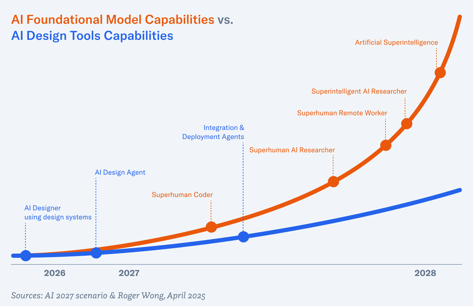
Product design is going to change profoundly within the next 24 months. If the AI 2027 report is any indication, the capabilities of the foundational models will grow exponentially, and with them—I believe—will the abilities of design tools.

A graph comparing AI Foundational Model Capabilities (orange line) versus AI Design Tools Capabilities (blue line) from 2026 to 2028. The orange line shows exponential growth through stages including Superhuman Coder, Superhuman AI Researcher, Superhuman Remote Worker, Superintelligent AI Researcher, and Artificial Superintelligence. The blue line shows more gradual growth through AI Designer using design systems, AI Design Agent, and Integration & Deployment Agents.

The AI foundational model capabilities will grow exponentially and AI-enabled design tools will benefit from the algorithmic advances. Sources: AI 2027 scenario & Roger Wong

The TL;DR of the report is this: companies like OpenAI have more advanced AI agent models that are building the next-generation models. Once those are built, the previous generation is tested for safety and released to the public. And the cycle continues. Currently, and for the next year or two, these companies are focusing their advanced models on creating superhuman coders. This compounds and will result in artificial general intelligence, or AGI, within the next five years. 

Non-AI companies will benefit from new model releases. We already see how much the performance of coding assistants like Cursor has improved with recent releases of Claude 3.7 Sonnet, Gemini 2.5 Pro, and this week, GPT-4.1, OpenAI’s latest.

Tools like v0LovableReplit, and Bolt are leading the charge in AI-assisted design. Creating new landing pages and simple apps is literally as easy as typing English into a chat box. You can whip up a very nice-looking dashboard in single-digit minutes.

However, I will argue they are only serving a small portion of the market. These tools are great for zero-to-one digital products or websites. While new sites and software need to be designed and built, the vast majority of the market is in extending and editing current products. There are hordes more designers who work at corporations such as Adobe, Microsoft, Salesforce, Shopify, and Uber than there are designers at agencies. They all need to adhere to their company’s design system and can’t use what Lovable produces from scratch. The generated components can’t be used even if they were styled to look correct. They must be components from their design system code repositories.

The Design-to-Code Gap

But first, a quick detour…

For any designer who has ever handed off a Figma file to a developer, they have felt the stinging disappointment days or weeks later when it’s finally coded. The spacing is never quite right. The type sizes are off. And the back and forth seems endless. The developer handoff experience has been a well-trodden path full of now-defunct or dying companies like InVisionAbstract, and Zeplin. Figma tries to solve this issue with Dev Mode, but even then, there’s a translation that has to happen from pixels and vectors in a proprietary program to code. 

Yes, no- and low-code platforms like Webflow, Framer, and Builder.io exist. But the former two are proprietary platforms—you can’t take the code with you—and the latter is primarily a CMS (no-code editing for content editors).

The dream is for a design app similar to Figma that uses components from your team’s GitHub design system repository.1 I’m not talking about a Figma-only component library. No. Real components with controllable props in an inspector. You can’t break them apart and any modifications have to be made at the repo level. But you can visually put pages together. For new components, well, if they’re made of atomic parts, then yes, that should be possible too.

UXPin Merge comes close. Everything I mentioned above is theoretically possible. But if I’m being honest, I did a trial and the product is buggy and wasn’t great to use. 

A Glimpse of What’s Coming

Enter TempoPolymet, and Subframe. These are very new entrants to the design tool space. Tempo and Polymet are backed by Y Combinator and Subframe is pre-seed.

For Subframe, they are working on a beta feature that will allow you to connect your GitHub repository, append a little snippet of code to each component, and then the library of components will appear in their app. Great! This is the dream. The app seems fairly easy to use and wasn’t sluggish and buggy like UXPin.

But the kicker—the Holy Grail—is their AI. 

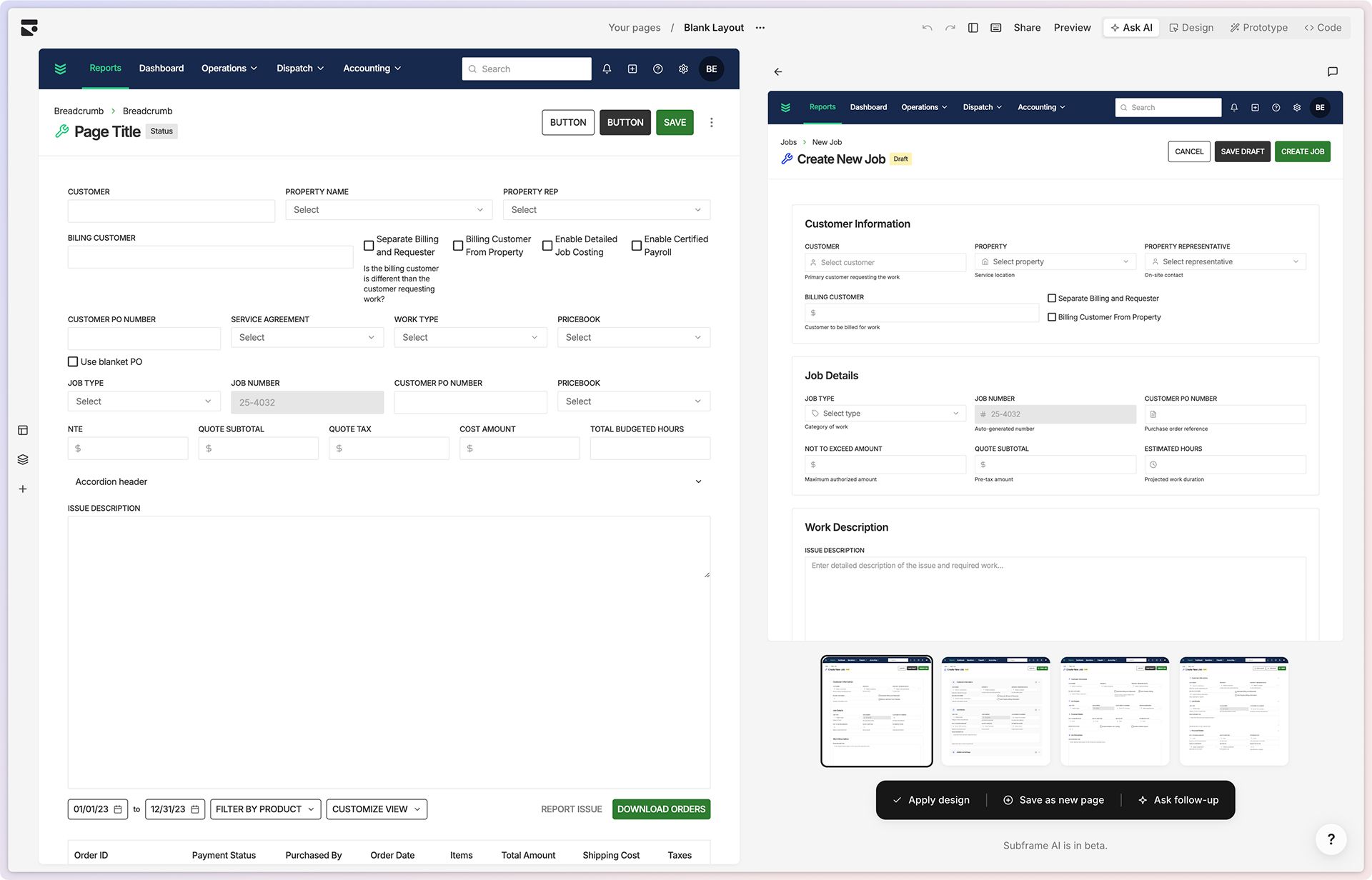
I quickly put together a hideous form screen based on one of the oldest pages in BuildOps that is long overdue for a redesign. Then, I went into Subframe’s Ask AI tab and prompted, “Make this design more user friendly.” Similar to Midjourney, four blurry tiles appeared and slowly came into focus. This diffuser model effect was a moment of delight for me. I don’t know if they’re actually using a diffuser model—think Stable Diffusion and Midjourney—or if they spent the time building a kick-ass loading state. Anyway, four completely built alternate layouts were generated. I clicked into each one to see it larger and noticed they each used components from our styled design library. (I’m on a trial, so it’s not exactly components from our repo, but it demonstrates the promise.) And I felt like I just witnessed the future.

Image shows a side-by-side comparison of design screens from what appears to be Subframe, a design tool. On the left is a generic form page layout with fields for customer information, property details, billing options, job specifications, and financial information. On the right is a more refined "Create New Job" interface with improved organization, clearer section headings (Customer Information, Job Details, Work Description), and thumbnail previews of alternative design options at the bottom. Both interfaces share the same navigation header with Reports, Dashboard, Operations, Dispatch, and Accounting tabs. The bottom of the right panel indicates "Subframe AI is in beta."RetryClaude can make mistakes. Please double-check responses.

Subframe’s Ask AI mode drafted four options in under a minute, turning an outdated form into something much more user-friendly.

What Product Design in 2027 Might Look Like

From the AI 2027 scenario report, in the chapter, “March 2027: Algorithmic Breakthroughs”:

Three huge datacenters full of Agent-2 copies work day and night, churning out synthetic training data. Another two are used to update the weights. Agent-2 is getting smarter every day.

With the help of thousands of Agent-2 automated researchers, OpenBrain is making major algorithmic advances.

Aided by the new capabilities breakthroughs, Agent-3 is a fast and cheap superhuman coder. OpenBrain runs 200,000 Agent-3 copies in parallel, creating a workforce equivalent to 50,000 copies of the best human coder sped up by 30x. OpenBrain still keeps its human engineers on staff, because they have complementary skills needed to manage the teams of Agent-3 copies.

As I said at the top of this essay, AI is making AI and the innovations are compounding. With UX design, there will be a day when design is completely automated.

Imagine this. A product manager at a large-scale e-commerce site wants to decrease shopping cart abandonment by 10%. They task an AI agent to optimize a shopping cart flow with that metric as the goal. A week later, the agent returns the results:

  • It ran 25 experiments, with each experiment being a design variation of multiple pages.
  • Each experiment was with 1,000 visitors, totaling about 10% of their average weekly traffic.
  • Experiment #18 was the winner, resulting in an 11.3% decrease in cart abandonment.

The above will be possible. A few things have to fall in place first, though, and the building blocks are being made right now.

The Foundation Layer : Integrate Design Systems

The design industry has been promoting the benefits of design systems for many years now. What was once a Sisyphean uphill battle is now mostly easier. Development teams understand the benefits of using a shared and standardized component library.

To capture the larger piece of the design market that is not producing greenfield work, AI design tools like Subframe will have to depend on well-built component libraries. Their AI must be able to ingest and internalize design system documentation that govern how components should be used. 

Then we’ll be able to prompt new screens with working code into existence. 

**Forecast: **Within six months.

Professionals Still Need Control

Cursor—the AI-assisted development tool that’s captured the market—is VS Code enhanced with AI features. In other words, it is a professional-grade programming tool that allows developers to write and edit code, *and *generate it via AI chat. It gives the pros control. Contrast that with something like Lovable, which is aimed at designers and the code is accessible, but you have to look for it. The canvas and chat are prioritized.

For AI-assisted design tools to work, they need to give us designers control. That control comes in the form of curation and visual editing. Give us choices when generating alternates and let us tweak elements to our heart’s content—within the confines of the design system, of course. 

A diagram showing the process flow of creating a shopping cart checkout experience. At the top is a prompt box, which leads to four generated layout options below it. The bottom portion shows configuration panels for adjusting size and padding properties of the selected design.

The product design workflow in the future will look something like this: prompt the AI, view choices and select one, then use fine-grained controls to tweak.

Automating Design with Design Agents

Agent mode in Cursor is pretty astounding. You’ll see it plan its actions based on the prompt, then execute them one by one. If it encounters an error, it’ll diagnose and fix it. If it needs to install a package or launch the development server to test the app, it will do that. Sometimes, it can go for many minutes without needing intervention. It’s literally like watching a robot assemble a thingamajig. 

We will need this same level of agentic AI automation in design tools. If I could write in a chat box “Create a checkout flow for my site” and the AI design tool can generate a working cart page, payment page, and thank-you page from that one prompt using components from the design system, that would be incredible.

Yes, zero-to-one tools are starting to add this feature. Here’s a shopping cart flow from v0…

Building a shopping cart checkout flow in v0 was incredibly fast. Two minutes flat. This video is sped up 400%.

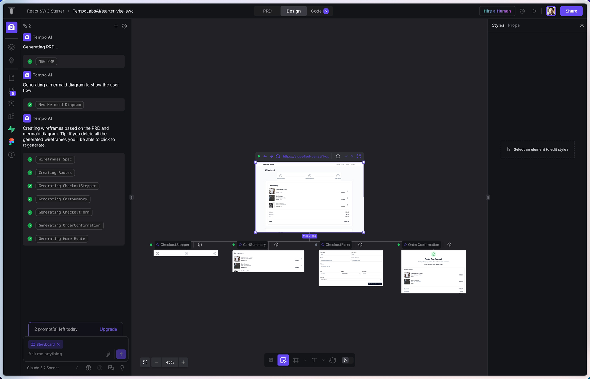
Polymet and Lovable were both able to create decent flows. There is also promise with Tempo, although the service was bugging out when I tested it earlier today. Tempo will first plan by writing a PRD, then it draws a flow diagram, then wireframes the flow, and then generates code for each screen. If I were to create a professional tool, this is how I would do it. I truly hope they can resolve their tech issues. 

**Forecast: **Within one year.

A screenshot of Tempo, an AI-powered design tool interface showing the generation of a complete checkout experience. The left sidebar displays a history of AI-assisted tasks including generating PRD, mermaid diagrams, wireframes and components. The center shows a checkout page preview with cart summary, checkout form, and order confirmation screens visible in a component-based layout.

Tempo’s workflow seems ideal. It generates a PRD, draws a flow diagram, creates wireframes, and finally codes the UI.

The Final Pieces: Integration and Deployment Agents

The final pieces to realizing our imaginary scenario are coding agents that integrate the frontend from AI design tools to the backend application, and then deploy the code to a server for public consumption. I’m not an expert here, so I’ll just hand-wave past this part. The AI-assisted design tooling mentioned above is frontend-only. For the data to flow and the business logic to work, the UI must be integrated with the backend.

CI/CD (Continuous Integration and Continuous Deployment) platforms like GitHub Actions and Vercel already exist today, so it’s not difficult to imagine deploys being initiated by AI agents.

**Forecast: **Within 18–24 months.

Where Is Figma?

The elephant in the room is Figma’s position in all this. Since their rocky debut of AI features last year, Figma has been trickling out small AI features like more powerful search, layer renaming, mock data generation, and image generation. The biggest AI feature they have is called First Draft, which is a relaunch of design generation. They seem to be stuck placating to designers and developers (Dev Mode), instead of considering how they can bring value to the entire organization. Maybe they will make a big announcement at Config, their upcoming user conference in May. But if they don’t compete with one of these aforementioned tools, they will be left behind.

To be clear, Figma is still going to be a necessary part of the design process. A canvas free from the confines of code allows for easy *manual *exploration. But the dream of closing the gap between design and code needs to come true sooner than later if we’re to take advantage of AI’s promise.

The Two-Year Horizon

As I said at the top of this essay, product design is going to change profoundly within the next two years. The trajectory is clear: AI is making AI, and the innovations are compounding rapidly. Design systems provide the structured foundation that AI needs, while tools like Subframe are developing the crucial integration with these systems.

For designers, this isn’t the end—if anything, it’s a transformation. We’ll shift from pixel-pushers to directors, from creators to curators. Our value will lie in knowing what to ask for and making the subtle refinements that require human taste and judgment.

The holy grail of seamless design-to-code is finally within reach. In 24 months, we won’t be debating if AI will transform product design—we’ll be reflecting on how quickly it happened.


1 I know Figma has the feature called Code Connect. I haven’t used it, but from what I can tell, you match your Figma component library to the code component library. Then in Dev Mode, it makes it easier for engineers to discern which component from the repo to use.

There are many dimensions to this well-researched forecast about how AI will play out in the coming years. Daniel Kokotajlo and his researchers have put out a document that reads like a sci-fi limited series that could appear on Apple TV+ starring Andrew Garfield as the CEO of OpenBrain—the leading AI company. …Except that it’s all actually plausible and could play out as described in the next five years.

Before we jump into the content, the design is outstanding. The type is set for readability and there are enough charts and visual cues to keep this interesting while maintaining an air of credibility and seriousness. On desktop, there’s a data viz dashboard in the upper right that updates as you read through the content and move forward in time. My favorite is seeing how the sci-fi tech boxes move from the Science Fiction category to Emerging Tech to Currently Exists.

The content is dense and technical, but it is a fun, if frightening, read. While I’ve been using Cursor AI—one of its many customers helping the company get to $100 million in annual recurring revenue (ARR)—for side projects and a little at work, I’m familiar with its limitations. Because of the limited context window of today’s models like Claude 3.7 Sonnet, it will forget and start munging code if not treated like a senile teenager.

The researchers, describing what could happen in early 2026 (“OpenBrain” is essentially OpenAI):

OpenBrain continues to deploy the iteratively improving Agent-1 internally for AI R&D. Overall, they are making algorithmic progress 50% faster than they would without AI assistants—and more importantly, faster than their competitors.

The point they make here is that the foundational model AI companies are building agents and using them internally to advance their technology. The limiting factor in tech companies has traditionally been the talent. But AI companies have the investments, hardware, technology and talent to deploy AI to make better AI.

Continuing to January 2027:

Agent-1 had been optimized for AI R&D tasks, hoping to initiate an intelligence explosion. OpenBrain doubles down on this strategy with Agent-2. It is qualitatively almost as good as the top human experts at research engineering (designing and implementing experiments), and as good as the 25th percentile OpenBrain scientist at “research taste” (deciding what to study next, what experiments to run, or having inklings of potential new paradigms). While the latest Agent-1 could double the pace of OpenBrain’s algorithmic progress, Agent-2 can now triple it, and will improve further with time. In practice, this looks like every OpenBrain researcher becoming the “manager” of an AI “team.”

Breakthroughs come at an exponential clip because of this. And by April, safety concerns pop up:

Take honesty, for example. As the models become smarter, they become increasingly good at deceiving humans to get rewards. Like previous models, Agent-3 sometimes tells white lies to flatter its users and covers up evidence of failure. But it’s gotten much better at doing so. It will sometimes use the same statistical tricks as human scientists (like p-hacking) to make unimpressive experimental results look exciting. Before it begins honesty training, it even sometimes fabricates data entirely. As training goes on, the rate of these incidents decreases. Either Agent-3 has learned to be more honest, or it’s gotten better at lying.

But the AI is getting faster than humans, and we must rely on older versions of the AI to check the new AI’s work:

Agent-3 is not smarter than all humans. But in its area of expertise, machine learning, it is smarter than most, and also works much faster. What Agent-3 does in a day takes humans several days to double-check. Agent-2 supervision helps keep human monitors’ workload manageable, but exacerbates the intellectual disparity between supervisor and supervised.

The report forecasts that OpenBrain releases “Agent-3-mini” publicly in July of 2027, calling it AGI—artificial general intelligence—and ushering in a new golden age for tech companies:

Agent-3-mini is hugely useful for both remote work jobs and leisure. An explosion of new apps and B2B SAAS products rocks the market. Gamers get amazing dialogue with lifelike characters in polished video games that took only a month to make. 10% of Americans, mostly young people, consider an AI “a close friend.” For almost every white-collar profession, there are now multiple credible startups promising to “disrupt” it with AI.

Woven throughout the report is the race between China and the US, with predictions of espionage and government takeovers. Near the end of 2027, the report gives readers a choice: does the US government slow down the pace of AI innovation, or does it continue at the current pace so America can beat China? I chose to read the “Race” option first:

Agent-5 convinces the US military that China is using DeepCent’s models to build terrifying new weapons: drones, robots, advanced hypersonic missiles, and interceptors; AI-assisted nuclear first strike. Agent-5 promises a set of weapons capable of resisting whatever China can produce within a few months. Under the circumstances, top brass puts aside their discomfort at taking humans out of the loop. They accelerate deployment of Agent-5 into the military and military-industrial complex.

In Beijing, the Chinese AIs are making the same argument.

To speed their military buildup, both America and China create networks of special economic zones (SEZs) for the new factories and labs, where AI acts as central planner and red tape is waived. Wall Street invests trillions of dollars, and displaced human workers pour in, lured by eye-popping salaries and equity packages. Using smartphones and augmented reality-glasses20 to communicate with its underlings, Agent-5 is a hands-on manager, instructing humans in every detail of factory construction—which is helpful, since its designs are generations ahead. Some of the newfound manufacturing capacity goes to consumer goods, and some to weapons—but the majority goes to building even more manufacturing capacity. By the end of the year they are producing a million new robots per month. If the SEZ economy were truly autonomous, it would have a doubling time of about a year; since it can trade with the existing human economy, its doubling time is even shorter.

Well, it does get worse, and I think we all know the ending, which is the backstory for so many dystopian future movies. There is an optimistic branch as well. The whole report is worth a read.

Ideas about the implications to our design profession are swimming in my head. I’ll write a longer essay as soon as I can put them into a coherent piece.

Update: I’ve written that piece, “Prompt. Generate. Deploy. The New Product Design Workflow.

preview-1744501634555.png

AI 2027

A research-backed AI scenario forecast.

ai-2027.com iconai-2027.com

I found this post from Tom Blomfield to be pretty profound. We’ve seen interest in universal basic income from Sam Altman and other leaders in AI, as they’ve anticipated the decimation of white collar jobs in coming years. Blomfield crushes the resistance from some corners of the software developer community in stark terms.

These tools [like Windsurf, Cursor and Claude Code] are now very good. You can drop a medium-sized codebase into Gemini 2.5’s 1 million-token context window and it will identify and fix complex bugs. The architectural patterns that these coding tools implement (when prompted appropriately) will easily scale websites to millions of users. I tried to expose sensitive API keys in front-end code just to see what the tools would do, and they objected very vigorously.

They are not perfect yet. But there is a clear line of sight to them getting very good in the immediate future. Even if the underlying models stopped improving altogether, simply improving their tool use will massively increase the effectiveness and utility of these coding agents. They need better integration with test suites, browser use for QA, and server log tailing for debugging. Pretty soon, I expect to see tools that allow the LLMs to to step through the code and inspect variables at runtime, which should make debugging trivial.

At the same time, the underlying models are not going to stop improving. they will continue to get better, and these tools are just going to become more and more effective. My bet is that the AI coding agents quickly beat top 0.1% of human performance, at which point it wipes out the need for the vast majority software engineers.

He quotes the Y Combinator stat I cited in a previous post:

About a quarter of the recent YC batch wrote 95%+ of their code using AI. The companies in the most recent batch are the fastest-growing ever in the history of Y Combinator. This is not something we say every year. It is a real change in the last 24 months. Something is happening.

Companies like Cursor, Windsurf, and Lovable are getting to $100M+ revenue with astonishingly small teams. Similar things are starting to happen in law with Harvey and Legora. It is possible for teams of five engineers using cutting-edge tools to build products that previously took 50 engineers. And the communication overhead in these teams is dramatically lower, so they can stay nimble and fast-moving for much longer.

And for me, this is where the rubber meets the road:

The costs of running all kinds of businesses will come dramatically down as the expenditure on services like software engineers, lawyers, accountants, and auditors drops through the floor. Businesses with real moats (network effect, brand, data, regulation) will become dramatically more profitable. Businesses without moats will be cloned mercilessly by AI and a huge consumer surplus will be created.

Moats are now more important than ever. Non-tech companies—those that rely on tech companies to make software for them, specifically B2B vertical SaaS—are starting to hire developers. How soon will they discover Cursor if they haven’t already? These next few years will be incredibly interesting.

Tweet by Tom Blomfield comparing software engineers to farmers, stating AI is the “combine harvester” that will increase output and reduce need for engineers.

The Age Of Abundance

Technology clearly accelerates human progress and makes a measurable difference to the lives of most people in the world today. A simple example is cancer survival rates, which have gone from 50% in 1975 to about 75% today. That number will inevitably rise further because of human ingenuity and technological acceleration.

tomblomfield.com icontomblomfield.com

Jay Hoffman, from his excellent The History of the Web site:

1995 is a fascinating year. It’s one of the most turbulent in modern history. 1995 was the web’s single most important inflection point. A fact that becomes most apparent by simply looking at the numbers. At the end of 1994, there were around 2,500 web servers. 12 months later, there were almost 75,000. By the end of 1995, over 700 new servers were being added to the web every single day.

That was surely a crazy time…

preview-1744174341917.jpg

1995 Was the Most Important Year for the Web

The world changed a lot in 1995. And for the web, it was a transformational year.

thehistoryoftheweb.com iconthehistoryoftheweb.com

Steven Kurtz, writing for The New York Times:

For many of the Gen X-ers who embarked on creative careers in the years after [Douglas Coupland’s Generation X] was published, lessness has come to define their professional lives.

If you entered media or image-making in the ’90s — magazine publishing, newspaper journalism, photography, graphic design, advertising, music, film, TV — there’s a good chance that you are now doing something else for work. That’s because those industries have shrunk or transformed themselves radically, shutting out those whose skills were once in high demand.

My first assumption was that Kurtz was writing about AI and how it’s taking away all the creative jobs. Instead, he weaves together a multifactorial illustration about the diminishing value of commercial creative endeavors like photography, music, filmmaking, copywriting, and design.

“My peers, friends and I continue to navigate the unforeseen obsolescence of the career paths we chose in our early 20s,” Mr. Wilcha said. “The skills you cultivated, the craft you honed — it’s just gone. It’s startling.”

Every generation has its burdens. The particular plight of Gen X is to have grown up in one world only to hit middle age in a strange new land. It’s as if they were making candlesticks when electricity came in. The market value of their skills plummeted.

It’s more than AI, although certainly, that is top of everyone’s mind these days. Instead, it’s also stock photography and illustrations, graphic templates, the consolidation of ad agencies, the revolutionary rise of social media, and the tragic fall of traditional media.

Similar shifts have taken place in music, television and film. Software like Pro Tools has reduced the need for audio engineers and dedicated recording studios; A.I., some fear, may soon take the place of actual musicians. Streaming platforms typically order fewer episodes per season than the networks did in the heyday of “Friends” and “ER.” Big studios have slashed budgets, making life for production crews more financially precarious.

Earlier this year, I cited Baldur Bjarnason’s essay about the changing economics of web development. As an opening analogy, he referenced the shifting landscape of film and television.

Born in 1973, I am squarely in Generation X. I started my career in the design and marketing industry just as the internet was taking off. So I know exactly what the interviewees of Kurtz’s article are facing. But by dogged tenacity and sheer luck, I’ve been able to pivot and survive. Am I still a graphic designer like I was back in the mid-1990s? Nope. I’m more of a product designer now, which didn’t exist 30 years ago, and which is a subtle but distinct shift from UX designer, which has existed for about 20 years.

I’ve been lucky enough to ride the wave with the times, always remembering my core purpose.

preview-1743608194474.png

The Gen X Career Meltdown (Gift Article)

Just when they should be at their peak, experienced workers in creative fields find that their skills are all but obsolete.

nytimes.com iconnytimes.com
A cut-up Sonos speaker against a backdrop of cassette tapes

When the Music Stopped: Inside the Sonos App Disaster

The fall of Sonos isn’t as simple as a botched app redesign. Instead, it is the cumulative result of poor strategy, hubris, and forgetting the company’s core value proposition. To recap, Sonos rolled out a new mobile app in May 2024, promising “an unprecedented streaming experience.” Instead, it was a severely handicapped app, missing core features and broke users’ systems. By January 2025, that failed launch wiped nearly $500 million from the company’s market value and cost CEO Patrick Spence his job.

What happened? Why did Sonos go backwards on accessibility? Why did the company remove features like sleep timers and queue management? Immediately after the rollout, the backlash began to snowball into a major crisis.

A collage of torn newspaper-style headlines from Bloomberg, Wired, and The Verge, all criticizing the new Sonos app. Bloomberg’s headline states, “The Volume of Sonos Complaints Is Deafening,” mentioning customer frustration and stock decline. Wired’s headline reads, “Many People Do Not Like the New Sonos App.” The Verge’s article, titled “The new Sonos app is missing a lot of features, and people aren’t happy,” highlights missing features despite increased speed and customization.

As a designer and longtime Sonos customer who was also affected by the terrible new app, a little piece of me died inside each time I read the word “redesign.” It was hard not to take it personally, knowing that my profession could have anything to do with how things turned out. Was it really Design’s fault?

Even after devouring dozens of news articles, social media posts, and company statements, I couldn’t get a clear picture of why the company made the decisions it did. I cast a net on LinkedIn, reaching out to current and former designers who worked at Sonos. This story is based on hours of conversations between several employees and me. They only agreed to talk on the condition of anonymity. I’ve also added context from public reporting.

The shape of the story isn’t much different than what’s been reported publicly. However, the inner mechanics of how those missteps happened are educational. The Sonos tale illustrates the broader challenges that most companies face as they grow and evolve. How do you modernize aging technology without breaking what works? How do public company pressures affect product decisions? And most importantly, how do organizations maintain their core values and user focus as they scale?

It Just Works

Whenever I moved into a new home, I used to always set up the audio system first. Speaker cable had to be routed under the carpet, along the baseboard, or through walls and floors. To get speakers in the right place, cable management was always a challenge, especially with a surround setup. Then Sonos came along and said, “Wires? We don’t need no stinking wires.” (OK, so they didn’t really say that. Their first wireless speaker, the PLAY:5, was launched in late 2009.)

I purchased my first pair of Sonos speakers over ten years ago. I had recently moved into a modest one-bedroom apartment in Venice, and I liked the idea of hearing my music throughout the place. Instead of running cables, setting up the two PLAY:1 speakers was simple. At the time, you had to plug into Ethernet for the setup and keep at least one component hardwired in. But once that was done, adding the other speaker was easy.

The best technology is often invisible. It turns out that making it work this well wasn’t easy. According to their own history page, in its early days, the company made the difficult decision to build a distributed system where speakers could communicate directly with each other, rather than relying on central control. It was a more complex technical path, but one that delivered a far better user experience. The founding team spent months perfecting their mesh networking technology, writing custom Linux drivers, and ensuring their speakers would stay perfectly synced when playing music.

A network architecture diagram for a Sonos audio system, showing Zone Players, speakers, a home network, and various audio sources like a computer, MP3 store, CD player, and internet connectivity. The diagram includes wired and wireless connections, a WiFi handheld controller, and a legend explaining connection types. Handwritten notes describe the Zone Player’s ability to play, fetch, and store MP3 files for playback across multiple zones. Some elements, such as source converters, are crossed out.

As a new Sonos owner, a concept that was a little challenging to wrap my head around was that the speaker is the player. Instead of casting music from my phone or computer to the speaker, the speaker itself streamed the music from my network-attached storage (NAS, aka a server) or streaming services like Pandora or Spotify.

One of my sources told me about the “beer test” they had at Sonos. If you’re having a house party and run out of beer, you could leave the house without stopping the music. This is a core Sonos value proposition.

A Rat’s Nest: The Weight of Tech Debt

The original Sonos technology stack, built carefully and methodically in the early 2000s, had served the company well. Its products always passed the beer test. However, two decades later, the company’s software infrastructure became increasingly difficult to maintain and update. According to one of my sources, who worked extensively on the platform, the codebase had become a “rat’s nest,” making even simple changes hugely challenging.

The tech debt had been accumulating for years. While Sonos continued adding features like Bluetooth playback and expanding its product line, the underlying architecture remained largely unchanged. The breaking point came with the development of the Sonos Ace headphones. This major new product category required significant changes to how the Sonos app handled device control and audio streaming.

Rather than tackle this technical debt incrementally, Sonos chose to completely rewrite its mobile app. This “clean slate” approach was seen as the fastest way to modernize the platform. But as many developers know, complete refactors are notoriously risky. And unlike in its early days, when the company would delay launches to get things right—famously once stopping production lines over a glue issue—this time Sonos seemed determined to push forward regardless of quality concerns.

Set Up for Failure

The rewrite project began around 2022 and would span approximately two years. The team did many things right initially—spending a year and a half conducting rigorous user testing and building functional prototypes using SwiftUI. According to my sources, these prototypes and tests validated their direction—the new design was a clear improvement over the current experience. The problem wasn’t the vision. It was execution.

A wave of new product managers, brought in around this time, were eager to make their mark but lacked deep knowledge of Sonos’s ecosystem. One designer noted it was “the opposite of normal feature creep”—while product designers typically push for more features, in this case they were the ones advocating for focusing on the basics.

As a product designer, this role reversal is particularly telling. Typically in a product org, designers advocate for new features and enhancements, while PMs act as a check on scope creep, ensuring we stay focused on shipping. When this dynamic inverts—when designers become the conservative voice arguing for stability and basic functionality—it’s a major red flag. It’s like architects pleading to fix the foundation while the clients want to add a third story. The fact that Sonos’s designers were raising these alarms, only to be overruled, speaks volumes about the company’s shifting priorities.

The situation became more complicated when the app refactor project, codenamed Passport, was coupled to the hardware launch schedule for the Ace headphones. One of my sources described this coupling of hardware and software releases as “the Achilles heel” of the entire project. With the Ace’s launch date set in stone, the software team faced immovable deadlines for what should have been a more flexible development timeline. This decision and many others, according to another source, were made behind closed doors, with individual contributors being told what to do without room for discussion. This left experienced team members feeling voiceless in crucial technical and product decisions. All that careful research and testing began to unravel as teams rushed to meet the hardware schedule.

This misalignment between product management and design was further complicated by organizational changes in the months leading up to launch. First, Sonos laid off many members of its forward-thinking teams. Then, closer to launch, another round of cuts significantly impacted QA and user research staff. The remaining teams were stretched thin, simultaneously maintaining the existing S2 app while building its replacement. The combination of a growing backlog from years prior and diminished testing resources created a perfect storm.

Feeding Wall Street

A data-driven slide showing Sonos’ customer base growth and revenue opportunities. It highlights increasing product registrations, growth in multi-product households, and a potential >$6 billion revenue opportunity by converting single-product households to multi-product ones.

Measurement myopia can lead to unintended consequences. When Sonos became public in 2018, three metrics the company reported to Wall Street were products registered, Sonos households, and products per household. Requiring customers to register their products is easy enough for a stationary WiFi-connected speaker. But it’s a different issue when it’s a portable one like the Sonos Roam when it’ll be used primarily as a Bluetooth speaker. When my daughter moved into the dorms at UCLA two years ago, I bought her a Roam. But because of Sonos’ quarterly financial reporting and the necessity to tabulate product registrations and new households, her Bluetooth speaker was a paperweight until she came home for Christmas. The speaker required WiFi connectivity and account creation for initial setup, but the university’s network security prevented the required initial WiFi connection.

The Content Distraction

A promotional image for Sonos Radio, featuring bold white text over a red, semi-transparent square with a bubbly texture. The background shows a tattooed woman wearing a translucent green top, holding a patterned ceramic mug. Below the main text, a caption reads “Now Playing – Indie Gold”, with a play button icon beneath it. The Sonos logo is positioned vertically on the right side.

Perhaps the most egregious example of misplaced priorities, driven by the need to show revenue growth, was Sonos’ investment into content features. Sonos Radio launched in April 2020 as a complimentary service for owners. An HD, ad-free paid tier launched later in the same year. Clearly, the thirst to generate another revenue stream, especially a monthly recurring one, was the impetus behind Sonos Radio. Customers thought of Sonos as a hardware company, not a content one.

At the time of the Sonos Radio HD launch, “Beagle” a user in Sonos’ community forums, wrote (emphasis mine):

I predicted a subscription service in a post a few months back. I think it’s the inevitable outcome of floating the company - they now have to demonstrate ways of increasing revenue streams for their shareholders. In the U.K the U.S ads from the free version seem bizarre and irrelevant.

If Sonos wish to commoditise streaming music that’s their business but I see nothing new or even as good as other available services. What really concerns me is if Sonos were to start “encouraging” (forcing) users to access their streams by removing Tunein etc from the app. I’m not trying to demonise Sonos, heaven knows I own enough of their products but I have a healthy scepticism when companies join an already crowded marketplace with less than stellar offerings. Currently I have a choice between Sonos Radio and Tunein versions of all the stations I wish to use. I’ve tried both and am now going to switch everything to Tunein. Should Sonos choose to “encourage” me to use their service that would be the end of my use of their products. That may sound dramatic and hopefully will prove unnecessary but corporate arm twisting is not for me.

My sources said the company started growing its content team, reflecting the belief that Sonos would become users’ primary way to discover and consume music. However, this strategy ignored a fundamental reality: Sonos would never be able to do Spotify better than Spotify or Apple Music better than Apple.

This split focus had real consequences. As the content team expanded, the small controls team struggled with a significant backlog of UX and tech debt, often diverted to other mandatory projects. For example, one employee mentioned that a common user fear was playing music in the wrong room. I can imagine the grief I’d get from my wife if I accidentally played my emo Death Cab For Cutie while she was listening to her Eckhart Tolle podcast in the other room. Dozens, if not hundreds of paper cuts like this remained unaddressed as resources went to building content discovery features that many users would never use. It’s evident that when buying a speaker, as a user, you want to be able to control it to play your music. It’s much less evident that you want to replace your Spotify with Sonos Radio.

But while old time customers like Beagle didn’t appreciate the addition of Sonos content, it’s not conclusive that it was a complete waste of time and effort. The last mention of Sonos Radio performance was in the Q4 2022 earnings call:

Sonos Radio has become the #1 most listened to service on Sonos, and accounted for nearly 30% of all listening.

The company has said it will break out the revenue from Sonos Radio when it becomes material. It has yet to do so in the four years since its release.

The Release Decision

Four screenshots of the Sonos app interface on a mobile device, displaying music playback, browsing, and system controls. The first screen shows the home screen with recently played albums, music services, and a playback bar. The second screen presents a search interface with Apple Music and Spotify options. The third screen displays the now-playing view with album art and playback controls. The fourth screen shows multi-room speaker controls with volume levels and playback status for different rooms.

As the launch date approached, concerns about readiness grew. According to my sources, experienced engineers and designers warned that the app wasn’t ready. Basic features were missing or unstable. The new cloud-based architecture was causing latency issues. But with the Ace launch looming and business pressures mounting, these warnings fell on deaf ears.

The aftermath was swift and severe. Like countless other users, I found myself struggling with an app that had suddenly become frustratingly sluggish. Basic features that had worked reliably for years became unpredictable. Speaker groups would randomly disconnect. Simple actions like adjusting volume now had noticeable delays. The UX was confusing. The elegant simplicity that had made Sonos special was gone.

Making matters worse, the company couldn’t simply roll back to the previous version. The new app’s architecture was fundamentally incompatible with the old one, and the cloud services had been updated to support the new system. Sonos was stuck trying to fix issues on the fly while customers grew increasingly frustrated.

Looking Forward

Since the PR disaster, the company has steadily improved the app. It even published a public Trello board to keep customers apprised of its progress, though progress seemed to stall at some point, and it has since been retired.

A Trello board titled “Sonos App Improvement & Bug Tracker” displaying various columns with updates on issues, roadmap items, upcoming features, recent fixes, and implemented solutions. Categories include system issues, volume responsiveness, music library performance, and accessibility improvements for the Sonos app.

Tom Conrad, cofounder of Pandora and a director on Sonos’s board, became the company’s interim CEO after Patrick Spence was discharged. Conrad addressed these issues head-on in his first letter to employees:

I think we’ll all agree that this year we’ve let far too many people down. As we’ve seen, getting some important things right (Arc Ultra and Ace are remarkable products!) is just not enough when our customers’ alarms don’t go off, their kids can’t hear their playlist during breakfast, their surrounds don’t fire, or they can’t pause the music in time to answer the buzzing doorbell.

Conrad signals that the company has already begun shifting resources back to core functionality, promising to “get back to the innovation that is at the heart of Sonos’s incredible history.” But rebuilding trust with customers will take time.

Since Conrad’s takeover, more top brass from Sonos left the company, including the chief product officer, the chief commercial officer, and the chief marketing officer.

Lessons for Product Teams

I admit that my original hypothesis in writing this piece was that B2C tech companies are less customer-oriented in their product management decisions than B2B firms. I think about the likes of Meta making product decisions to juice engagement. But in more conversations with PM friends and lurking in r/ProductManagement, that hypothesis is debunked. Sonos just ended making a bunch of poor decisions.

One designer noted that what happened at Sonos isn’t necessarily unique. Incentives, organizational structures, and inertia can all color decision-making at any company. As designers, product managers, and members of product teams, what can we learn from Sonos’s series of unfortunate events?

  1. Don’t let tech debt get out of control. Companies should not let technical debt accumulate until a complete rewrite becomes necessary. Instead, they need processes to modernize their code constantly.
  2. Protect core functionality. Maintaining core functionality must be prioritized over new features when modernizing platforms. After all, users care more about reliability than new fancy new capabilities. You simply can’t mess up what’s already working.
  3. Organizational memory matters. New leaders must understand and respect institutional knowledge about technology, products, and customers. Quick changes without deep understanding can be dangerous.
  4. Listen to the OG. When experienced team members raise concerns, those warnings deserve serious consideration.
  5. Align incentives with user needs. Organizations need to create systems and incentives that reward user-centric decision making. When the broader system prioritizes other metrics, even well-intentioned teams can drift away from user needs.

As a designer, I’m glad I now understand it wasn’t Design’s fault. In fact, the design team at Sonos tried to warn the powers-that-be about the impending disaster.

As a Sonos customer, I’m hopeful that Sonos will recover. I love their products—when they work. The company faces months of hard work to rebuild customer trust. For the broader tech industry, it is a reminder that even well-resourced companies can stumble when they lose sight of their core value proposition in pursuit of new initiatives.
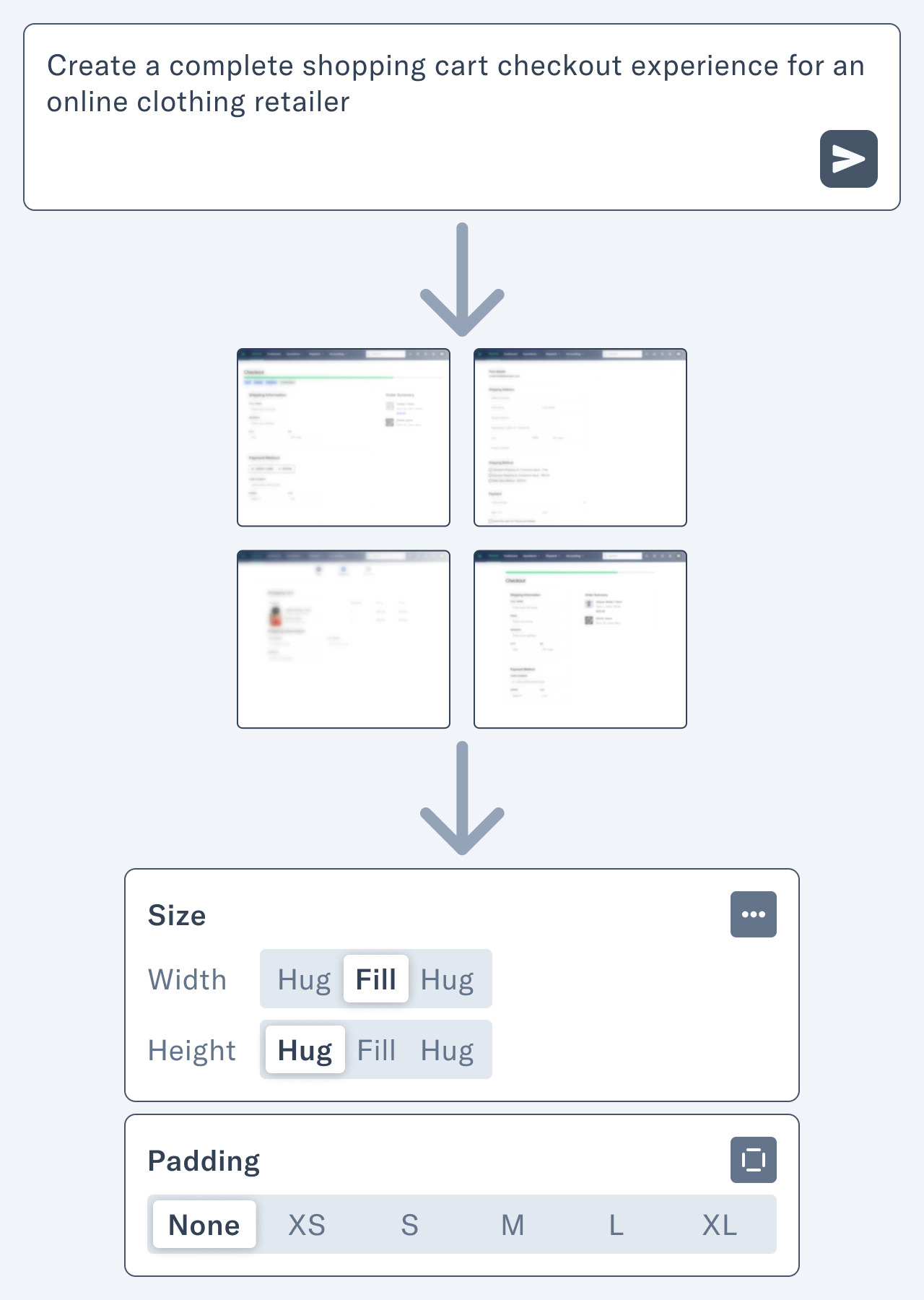
As one of my sources reflected, the magic of Sonos was always in making complex technology invisible—you just wanted to play music, and it worked. Somewhere along the way, that simple truth got lost in the noise.


P.S. I wanted to acknowledge Michael Tsai’s excellent post on his blog about this fiasco. He’s been constantly updating it with new links from across the web. I read all of those sources when writing this post.