
LukeW | Chat Interfaces & Declaring Intent
There's lots of debate within UI design circles about the explosion of chat interfaces driven by large-scale AI models. While there's certainly pros and cons to...

In the early 2000s to the mid-oughts, every designer I knew wanted to be featured on the FWA, a showcase for cutting-edge web design. While many of the earlier sites were Flash-based, it’s also where I discovered the first uses of parallax, Paper.js, and Three.js. Back then, websites were meant to be explored and their interfaces discovered.

A grid of winners from The FWA in 2009. Source: Rob Ford.
One of my favorite sites of that era was Burger King’s Subservient Chicken, where users could type free text into a chat box to command a man dressed in a chicken suit. In a full circle moment that perfectly captures where we are today, we now type commands into chat boxes to tell AI what to do.

The Wild West mentality of web design meant designers and creative technologists were free to make things look cool. Agencies like R/GA, Big Spaceship, AKQA, Razorfish, and CP+B all won numerous awards for clients like Nike, BMW, and Burger King. But as with all frontiers, civilization eventually arrives with its rules and constraints.
Last week, Sam Altman, the CEO of OpenAI, and a couple of others from the company demonstrated Operator, their AI agent. You’ll see them go through a happy path and have Operator book a reservation on OpenTable. The way it works is that the AI agent is reading a screenshot of the page and deciding how to interact with the UI. (Reminds me of the promise of the Rabbit R1.)
Let me repeat: the AI is interpreting UI by looking at it. Inputs need to look like inputs. Buttons need to look like buttons. Links need to look like links and be obvious.
In recent years, there’s been a push in the web dev community for accessibility. Complying with WCAG standards for building websites has become a positive trend. Now, we know the unforeseen secondary effect is to unlock AI browsing of sites. If links are underlined and form fields are self-evident, an agent like Operator can interpret where to click and where to enter data.
(To be honest, I’m surprised they’re using screenshots instead of interpreting the HTML as automated testing software would.)
Since Perplexity and Arc Search came onto the scene last year, the web’s economic foundation has started to shift. For the past 30 years, we’ve built a networked human knowledge store that’s always been designed for humans to consume. Sure, marketers and website owners got smart and figured out how to game the system to rank higher on Google. But ultimately, ranking higher led to more clicks and traffic to your website.
But the digerati are worried. Casey Newton of Platformer, writing about web journalism (emphasis mine):
The death of digital media has many causes, including the ineptitude of its funders and managers. But today I want to talk about another potential rifle on the firing squad: generative artificial intelligence, which in its capacity to strip-mine the web and repurpose it as an input for search engines threatens to remove one of the few pillars of revenue remaining for publishers.
Elizabeth Lopatto, writing for The Verge points out:
That means that Perplexity is basically a rent-seeking middleman on high-quality sources. The value proposition on search, originally, was that by scraping the work done by journalists and others, Google’s results sent traffic to those sources. But by providing an answer, rather than pointing people to click through to a primary source, these so-called “answer engines” starve the primary source of ad revenue — keeping that revenue for themselves.
Their point is that the fundamental symbiotic economic relationship between search engines and original content websites is changing. Instead of sending traffic to websites, search engines, and AI answer engines are scraping the content directly and providing them within their platforms.
Christopher Butler captures this broader shift in his essay “Who is the internet for?”:
Old-school SEO had a fairly balanced value proposition: Google was really good at giving people sources for the information they need and benefitted by running advertising on websites. Websites benefitted by getting attention delivered to them by Google. In a “clickless search” scenario, though, the scale tips considerably.
This isn’t just about news organizations—it’s about the fundamental relationship between websites, search engines, and users.
As the web is increasingly consumed not by humans but by AI robots, should we as designers continue to care what websites look like? Or, put another way, should we begin optimizing websites for the bots?
The art of search engine optimization, or SEO, was already pushing us in that direction. It turned personality-driven copywriting into “content” with keyword density and headings for the Google machine rather than for poetic organization. But with GPTbot slurping up our websites, should we be more straightforward in our visual designs? Should we add more copy?
It’s still early to know if AI optimization (AIO?) will become a real thing. Changes in consumer behavior happen over many single-digit years, not months. As of November 2024, ChatGPT is eighth on the list of the most visited websites globally, ranked by monthly traffic. Google is first with 291 times ChatGPT’s traffic.

Top global websites by monthly users as of November 2024. Source: SEMRush.
Interestingly, as Google rolled out its AI overview for many of its search results, the sites cited by Gemini do see a high clickthrough rate, essentially matching the number one organic spot. It turns out that nearly 40% of us want more details than what the answer engine tells us. That’s a good thing.

Clickthrough rates by entities on the Google search results page. Source: FirstPageSage, January 2025.
There’s a fear that AI answer engines and agentic AI will be the death of creative web design. But what if we’re looking at this all wrong? What if this evolution presents an interesting creative challenge instead?
Just as we once pushed the boundaries of Flash and JavaScript to create award-winning experiences for FWA, designers will need to find innovative ways to work within new constraints. The fact that AI agents like Operator need obvious buttons and clear navigation isn’t necessarily a death sentence for creativity—it’s just a new set of constraints to work with. After all, some of the most creative periods in web design came from working within technical limitations. (Remember when we did layouts using tables?!)
The accessibility movement has already pushed us to think about making websites more structured and navigable. The rise of AI agents is adding another dimension to this evolution, pushing us to find that sweet spot between machine efficiency and human delight.
From the Subservient Chicken to ChatGPT, from Flash microsites to AI-readable interfaces, web design continues to evolve. The challenge now isn’t just making sites that look cool or rank well—it’s creating experiences that serve both human visitors and their AI assistants effectively. Maybe that’s not such a bad thing after all.
I love this essay from Baldur Bjarnason, maybe because his stream of consciousness style is so similar to my own. He compares the rapidly changing economics of web and software development to the film, TV, and publishing industries.
Before we get to web dev, let’s look at the film industry, as disrupted by streaming.
Like, Crazy Rich Asians made a ton of money in 2018. Old Hollywood would have churned out at least two sequels by now and it would have inspired at least a couple of imitator films. But if they ever do a sequel it’s now going to be at least seven or even eight years after the fact. That means that, in terms of the cultural zeitgeist, they are effectively starting from scratch and the movie is unlikely to succeed.
He’s not wrong.
Every Predator movie after the first has underperformed, yet they keep making more of them. Completed movies are shelved for tax credits. Entire shows are disappeared [from] streamers and not made available anywhere to save money on residuals, which does not make any sense because the economics of Blu-Ray are still quite good even with lower overall sales and distribution than DVD. If you have a completed series or movie, with existing 4K masters, then you’re unlikely to lose money on a Blu-Ray.
I’ll quibble with him here. Shows and movies disappear from streamers because there’s a finite pot of money from subscriber revenue. So removing content will save them money. Blu-Ray is more sustainable because it’s an additional purchase.
OK, let’s get back to web dev.
He points out that similar to the film and other creative industries, developers fill their spare time with passion projects. But their day jobs are with tech companies and essentially subsidize their side projects.
And now, both the creative industries proper and tech companies have decided that, no, they probably don’t need that many of the “grunts” on the ground doing the actual work. They can use “AI” at a much lower cost because the output of the “AI” is not that much worse than the incredibly shitty degraded products they’ve been destroying their industries with over the past decade or so.
Bjarnason ends with seven suggestions for those in the industry. I’ll just quote one:
Don’t get tied to a single platform for distribution or promotion. Every use of a silo should push those interested to a venue you control such as a newsletter or website.
In other words, whatever you do, own your audience. Don’t farm that out to a platform like X/Twitter, Threads, or TikTok.
Of course, there are a lot of parallels to be drawn between what’s happening in the development and software engineering industries to what’s happening in design.

Web dev at the end of the world, from Hveragerði, Iceland

It’s 11 degrees Fahrenheit as I step off the plane at Toronto Pearson International. I’ve been up for nearly 24 hours and am about to trek through the gates toward Canadian immigration. Getting here from 73-degree San Diego was a significant challenge. What would be a quick five-hour direct flight turned into a five-hour delay, then cancelation, and then a rebook onto a red-eye through SFO. And I can’t sleep on planes. On top of that, I’ve been recovering from the flu, so my head was still very congested, and the descents from two flights were excruciating.
After going for a short secondary screening for who knows what reason—the second Canada Border Services Agency officer didn’t know either—I make my way to the UP Express train and head towards downtown Toronto. Before reaching Union Station, the train stops at the Weston and Bloor stations, picking up scarfed, ear-muffed, and shivering commuters. I disembark at Union Station, find my way to the PATH, and headed towards the CN Tower. I’m staying at the Marriott attached to the Blue Jays stadium.
Outside the station, the bitter cold slaps me across the face. Even though I am bundled with a hat, gloves, and big jacket, I still am unprepared for what feels like nine-degree weather. I roll my suitcase across the light green-salted concrete, evidence of snowfall just days earlier, with my exhaled breath puffing before me like the smoke from a coal-fired train engine.
I finally make it to the hotel, pass the zigzag vestibule—because vestibules are a thing in the Northeast, unlike Southern California—and my wife is there waiting to greet me with a cup of black coffee. (She had arrived the day before to meet up with a colleague.) I enter my room, take a hot shower, change, and I’m back out again into the freezing cold, walking the block-and-a-half to my company’s downtown Toronto office—though now with some caffeine in my system. It’s go time.
Like many companies, my company recently debuted a return to office or RTO policy. Employees who live close by need to come in three days per week, while others who live farther away need to go to the office once a month. This story is not about RTO mandates, at least not directly. I’m not going to debate the merits of the policy, though I will explore some nuances around it. Instead, I want to focus on the benefits of in-person collaboration.
The reason I made the cross-country trip to spend time with my team of product designers despite my illness and the travel snafus, is because we had to ship a big feature by a certain deadline, and this was the only way to get everyone aligned and pointed in the same direction quickly.
Two weeks prior, during the waning days of 2024, we realized that a particular feature was behind schedule and that we needed to ship within Q1. One of our product managers broke down the scope of work into discrete pieces of functionality, and I could see that it was way too much for just one of our designers to handle. So, I huddled with my team’s design manager and devised a plan. We divided the work among three designers. For me to guarantee to my stakeholders—the company’s leadership team and an important customer—I needed to feel good about where the feature was headed from a design perspective. Hence, this three-day design sprint (or swarm) in Toronto was planned.
I wanted to spend two to three hours with the team for three consecutive days. We needed to understand the problem together and keep track of the overall vision so that each designer’s discrete flow connected seamlessly to the overall feature. (Sorry to dance around what this feature is, but because it’s not yet public, I can’t be any more specific.)
The plan was:
But after Day 1, the plan went out the window. Going through all the flows in the initial session was overly ambitious. We needed half of the second day’s session to finish all the flows. However, we all left the room with a good understanding of the direction of the design solutions.
And I was OK with that. You see, my team is relatively green, and my job is to steer the ship in the right direction. I’m much less concerned about the UI than the overall experience.

Super low-fi whiteboard sketch of a screen. This is enough to go by.
On Day 3, the lead designer, the design manager, and I broke down one of the new features on the whiteboard, sketching what each major screen would look like—which form fields we’d need to display, how the tables would work, and the task flows. At some point, the designer doing most of the sketching—it was his feature, after all—said, “Y’know, it’d be easier if we just jumped into FigJam or Figma for the rest.” I said no. Let’s keep it on the whiteboard. Because honestly, I knew that we would fuss too much when using a digital tool. On the whiteboard, it allowed us to work out abstract concepts in a very low-fidelity and, therefore, facile way. This was better. Said designer learned a good lesson.
Just after two hours, we cracked the feature. We had sketched out all the primary screens and flows on the whiteboard. I was satisfied the designer knew how to execute. Because we did that together, there would be less stakeholder management he’d have to do with me. Now, I can be an advocate for this direction and help align with other stakeholders. (Which I did this past week, in fact.)
I purposely did not make these sessions all day long. I kept them to just a couple hours each to leave room for designers to have headphone time and design. I also set the first meeting for the morning to get everyone on the same page. The other meetings were booked for the afternoon, so the team had time to work on solutions and share those.
When the world was in lockdown, think about all the group chats and Zoom happy hours you had with your friends. Technology allowed us to stay connected but was no replacement for in-person time. Now think about how happy you felt when you could see them IRL, even if socially distanced. The power of that presence applies to work, too. There’s an ease to the conversation that is distinctly better than the start-stop of Zoom, where people raise hands or interrupt each other because of the latency of the connection.
I’ve attended virtual lunches and happy hours before on Zoom. They are universally awkward. But having lunch in person with someone is great. Conversation flows more naturally, and you’re building genuine rapport, not faking it.
Sketching super lo-fi screens is quick on a whiteboard. In FigJam, minutes are wasted as you’re battling with rectangles, the grid snap, and text size and color decisions. Additionally, standing at the whiteboard and explaining as you draw is immensely powerful. It helps the sketcher work out their thoughts, and the viewer understands the thinking. The physicality of it all is akin to performance art.
As I said, I don’t want to wade into the RTO debate directly. There have already been a lot of great think pieces on it. But I can add to the conversation as a designer and leader of a team of designers.
As I’ve illustrated in this essay, being together in person is wonderful and powerful. By our very nature, humans are social creatures, and we need to be with our compatriots. Collaboration is not only easier and more effective, but it also allows us to make genuine connections with our coworkers.
At the same time, designers need focus time to do our work. Much of our job is talking with users for research and validation, with fellow designers to receive critical feedback, and with PMs, engineers, and all others to collaborate. But when it comes to pushing pixels, we need uninterrupted headphone time. And that’s hard to come by in an open office plan, of which I’m sure 95% of all offices are these days.
In this article by David Brooks from 2022 in The New York Times, he lists study after study that adds to the growing evidence that open-plan offices are just plain bad.
We talk less with each other.
A much-cited study by Ethan Bernstein and Stephen Turban found that when companies made the move to more open plan offices, workers had about 70 percent fewer face-to-face interactions, while email and instant messaging use rose.
We’re more stressed.
In 2011 psychologist Matthew Davis and others reviewed over 100 studies about office environments. A few years later Maria Konnikova reported on what he found in The New Yorker — that the open space plans “were damaging to the workers’ attention spans, productivity, creative thinking and satisfaction. Compared with standard offices, employees experienced more uncontrolled interactions, higher levels of stress, and lower levels of concentration and motivation.”
And we are less productive.
A 2020 study by Helena Jahncke and David Hallman found that employees in quieter one-person cell offices performed 14 percent better than employees in open plan offices on a cognitive task.
I’m also pretty sure the earlier studies cited in the Brooks article analyzed offices with cubicles, not rows and rows of six-foot tables with two designers each.

Fantasy floor plan of Sterling Cooper by Brandi Roberts.
Many years ago, when I was at Rosetta, I shared a tiny, closed-door office with our head strategy guy, Tod Rathbone. Though cramped, it was a quiet space where Tod wrote briefs, and I worked on pitch decks and resourcing spreadsheets.
In the past, creatives often had private offices despite the popularity of open-layout bullpens. For instance, in the old Hal Riney building in Fisherman’s Wharf, every floor had single-person offices along the perimeter, some with stunning waterfront views. Even our bullpen teams had semi-private cubicles and plenty of breakout spaces to brainstorm. Advertising agencies understood how to design creative workspaces.
Steve Jobs also understood how to design spaces that fostered collaboration. He worked closely with the architectural firm Bohlin Cywinski Jackson to design the headquarters of Pixar Animation Studios in Emeryville. In Walter Isaacson’s biography, Jobs said…
If a building doesn’t encourage [chance encounters and unplanned collaborations], you’ll lose a lot of innovation and the magic that’s sparked by serendipity. So we designed the building to make people get out of their offices and mingle in the central atrium with people they might not otherwise see.

The atrium at Pixar headquarters.

**
I work at home and I’m lucky enough to have a lovely home office. It’s filled with design books, vinyl records, and Batman and Star Wars collectibles. All things that inspire me and make me happy.
My desk setup is pretty great as well. I have a clacky mechanical keyboard, an Apple Studio Display, a Wacom tablet, and a sweet audio setup.
When I go into my company’s offices in Los Angeles and Toronto, I just have my laptop. Our hoteling monitors aren’t great—just 1080p. There’s just no reason to plug in my MacBook Pro.
I’ve been at other companies where the hoteling situation is similar, so I don’t think this is unique to where I work now.
Pre-pandemic, the situation was reversed. Not many of us had perfect home office setups, if at all. We had to go into the office because that’s where we had all our nice equipment and the reference materials necessary to do our jobs. The pandemic flipped that dynamic.
Back to the RTO mandates, I think there could be compromises. Leadership likes to see their expensive real estate filled with workers. The life of a high-up leader is talking to people—employees, customers, partners, etc. But those on the ground performing work that demands focus, like software engineering and designing, need uninterrupted, long, contiguous chunks of time. We must get into the flow state and stay there to design and build stuff. That’s nearly impossible in the office, especially in an open-plan office layout.
So here are some ideas for companies to consider:
After being in freezing Toronto for four days, I arrive back home to sunny San Diego. It’s a perfect 68 degrees. I get out of the Uber with my suitcase and lug it into the house. I settle into my Steelcase chair and then log onto Zoom for a meeting with the feature stakeholders, feeling confident that my team of designers will get it done.
Appearing on Joe Rogan’s podcast, this week, Meta CEO Mark Zuckerberg said that Apple “[hasn’t] really invented anything great in a while. Steve Jobs invented the iPhone and now they’re just kind of sitting on it 20 years later.”
Let’s take a look at some hard metrics, shall we?
I did a search of the USPTO site for patents filed by Apple and Meta since 2007. In that time period, Apple filed for 44,699 patents. Meta, nee Facebook, filed for 4,839, or about 10% of Apple’s inventions.

You can argue that not all companies file for patents for everything, or that Zuck said Apple hasn’t “really invented anything great in a while.” Great being the keyword here.
He left out the following “great” Apple inventions since 2007:
The App Store, I’d argue, is on the same level as the iPhone because it opened up an entire new economy for developers, resulting in an astounding $935 billion market in 2025. Apple Watch might be a close second, kicking off a $38 billion market for smartwatches.
Let’s think about Meta’s since 2007, excluding acquisitions*:
*Yes, excluding acquisitions, as Zuckerberg is talking about inventions. That’s why WhatsApp, Instagram, and Quest are not included. Anything I’m missing on this list?
As you can see, other than Messenger and the Ray-Ban glasses, the rest of Meta’s inventions are aimed at developers, not consumers. I’m being a little generous.
I’ve added some products to the lists above based on some replies to my Threads post. I also added a sentence to clarify excluding acquisitions.

Apple finally launched its Vision Pro “spatial computing” device in early February. We immediately saw TikTok memes of influencers being ridiculous. I wrote about my hope for the Apple Vision Pro back in June 2023, when it was first announced. When preorders opened for Vision Pro in January, I told myself I wouldn’t buy it. I couldn’t justify the $3,500 price tag. Out of morbid curiosity, I would lurk in the AVP subreddits to live vicariously through those who did take the plunge.
After about a month of reading all the positives from users about the device, I impulsively bought an Apple Vision Pro. I placed my order online at noon and picked it up just two hours later at an Apple Store near me.
Many great articles and YouTube videos have already been produced, so this post won’t be a top-to-bottom review of the Apple Vision Pro. Instead, I’ll try to frame it from my standpoint as someone who has designed user experiences for VR.
Augmented reality, mixed reality, or spatial computing—as Apple calls it—on a “consumer” device is pretty new. You could argue that Microsoft HoloLens did it first, but that didn’t generate the same cultural currency as AVP has, and the HoloLens line has been relegated to industrial applications. The Meta Quest 3, launched last October, also has a passthrough camera, but they don’t market the feature; it’s still sold as a purely virtual reality headset.

Vision Pro Home Screen in my messy home office.
Putting on Vision Pro for the first time is pretty magical. I saw the world around me—though a slightly muted and grainy version of my reality—and I saw UI floating and pinned to reality. Unlike any other headset I’ve tried, there is no screen door effect. I couldn’t see the pixels. It’s genuinely a retina display just millimeters away from my actual retinas.
The UI is bright, vibrant, and crisp in the display. After launching a weather app from the home “screen” and positioning it on a wall, it stays exactly where it is in my living room. As I move closer to the app, everything about the app remains super sharp. It’s like diving into a UI.
The visionOS UI feels very much like an extension of macOS. There’s a lot of translucency, blurred backgrounds for a frosted glass effect, and rounded corners. The controls for moving, closing, and resizing a window feel very natural. There were times when I wished I could rotate a window on its Y-axis to face me better, but that wasn’t possible.
Admittedly, I didn’t turn on the accessibility feature. But as is, a significant issue that the UI presents is contrast. As someone with no accessibility issues, it was hard to tell half the time when something was highlighted. I would often have to look at another UI component and then back again to make sure a button was actually highlighted.
When you launch a Vision Pro app, it is placed right in front of you. For example, I would look at the Photos app, then click the Digital Crown (the dial for immersion) to bring up the Home Screen, which is then overlaid on top of the app. The background app does get fainter, and I can tell that the new screen is on top of Photos. Launching the Apple TV app from there would bring up the TV window on top of Photos, and I would run into issues where the handles for the windows are really close together, making it difficult to select the right one with my eyes so I can move it.
Window management, in general, is a mess. First of all, there is none. There’s no minimizing of windows; I would have to move them out of the way. There’s no collecting of windows. For instance, I couldn’t set up a workspace with the apps in the right place, collapse them all, and bring them with me to another room in my house. I would have to close them all, reopen them, and reposition them in the new room.
I was excited to try the Mac Virtual Display feature, where you can see your Mac’s screen inside Vision Pro. Turning this on is intuitive. A “Connect” button appeared just above my MacBook Pro when I looked at it.
The Mac’s screen blacks out, and a large screen inside Vision Pro appears. I could resize it, move it around, and position it exactly where I wanted it. Everything about this virtual screen was crisp, but I ran into issues.
First, I’m a pretty good typist but cannot touch-type. With the Mac Virtual Display, I need to look down at my keyboard every few seconds. The passthrough camera on the headset is great but not perfect. There is some warping of reality on the edges, and that was just enough to cause a little motion sickness.
Second, when I’m sitting at my desk, I’m used to working with dual monitors. I usually have email or comms software on the smaller laptop screen while I work in Figma, Illustrator, or Photoshop on my larger 5K Apple Studio Display. If I sit at my desk and turn on Mac Virtual Display, I also lose my Studio Display. Only one virtual display shows up in Vision Pro.
I tried to mitigate the lost space by opening Messages, Spark Email (the iPad version), and Fantastical in Vision Pro and placing those apps around me. But I found switching from my Mac to these other apps cumbersome. I’d have to stop using my mouse and use my fingers instead when I looked at Spark. I found that keyboard focus depended on where my eyes were looking. For example, if I were reading an email in Spark but needed to look at my keyboard to find the “E” key to archive that email, if I pressed the key before my eyes were back in the Spark window, that E would go to whatever app my eyes happened to cross. In other words, my eyes are my cursor, which takes a while to get used to.
It is only the first version of visionOS (currently 1.1). I expect many of these issues, like window management, eye tracking and input confusion, and contrast, to improve in the coming years.
In many ways, Apple has been telegraphing what they want to achieve with Vision Pro for years. Apple’s API for augmented reality, ARKit, was released way back in June 2017, a full six years before Vision Pro was unveiled. Some of the early AR apps for Vision Pro are cool tech demos.

There’s a jet engine in my living room!
The JigSpace app plunks real-world objects into your living room. I pulled up a working jet engine and was able to peel away the layers to see how it worked. There’s even a Formula 1 race car that you can load into your environment.
The Super Fruit Ninja game was fun. I turned my living room into a fruit-splattered dojo. I could even launch throwing stars from my hands that would get stuck on my walls.

That’s half a floor plan on top of a low-resolution 360° photo.
Some Vision Pro apps were rushed out the door and are just awful. The Zillow Immerse app is one of them. I found the app glitchy and all the immersive house tours very low-quality. The problem is that the environments that ship with Vision Pro are so high-resolution and detailed that anything short of that is jarringly inferior.
Apple Vision Pro can run iPad apps, at least the ones where the developer has enabled the capability. However, I found that many of the touch targets in iPad apps were not sufficient. Apple’s Human Interface Guidelines specify that hit targets should be at least 44x44 pts. But if opened in Vision Pro, that’s not enough. For visionOS, Apple recommends controls’ centers be at least 60 pts apart.
I would further recommend that controls for visionOS apps should have large targets. In Apple’s own Photos app, in the left sidebar, only the accordion arrow is a control. Looking at and selecting the accordion label like “Spatial” or “Selfies” does not work. I had to look to the right of the label, to the arrow in order to select the item. Not great.
Eye and hand tracking in Vision Pro are excellent, although not perfect. There were many times when I couldn’t get the device to register my pinch gesture or get my eyes to a point in a window to resize it.
Some apps take advantage of additional gestures like pinching with both hands and then pulling them apart to resize something. I do believe that more standard gestures need to be introduced in the future for visionOS.
Steve Jobs famously once said, “God gave us ten styluses. Let’s not invent another.” Apple eventually introduced the Pencil for iPad. I think for many applications and for users to be productive with them, Apple will have to introduce a controller.
The single most compelling use case for Apple Vision Pro right now is consuming video content, specifically movies and TV shows. The built-in speakers, which Apple calls audio pods, sound fantastic. Apple has been doing a lot of work in Spatial Audio over the years and I experienced really great surround sound in the Vision Pro. The three apps that currently stand out for video entertainment are IMAX, Disney Plus, and Apple TV.
Watching content in the IMAX —only a couple of trailers were free—reminded me of the best IMAX screen I’ve ever been to, which is the one in the Metreon in San Francisco. The screen is floor-to-ceiling high with a curved railing in front of it. On either side is a backlit IMAX logo, and I could choose from a few different positions in the theater!

Watching a Star Wars movie on Tatooine.
Disney leverages its IP very well by giving us various sets to watch their content. I could watch Avengers: End Game from Avengers Tower, Monsters, Inc. from the scare floor, or The Empire Strikes Back from Luke’s land speeder on Tatooine.
With Apple TV, I could watch Masters of the Air in a window in my space or go into an immersive environment. Whether it’s lakeside looking towards Mount Hood, on the surface of the moon, or in a discrete movie theater, the content was the star. My wife goes to sleep before me, and I usually put on my AirPods and watch something on my iPad. With Vision Pro, I could be much more engrossed in the show because the screen is as big as my room.

From the Apple commercial “First Timer”
I rewatched Dune from 2021 and was blown away by the audio quality of my AirPods Pro. The movie has incredible sound and uses bass and sub-bass frequencies a lot, so I was surprised at how well the AirPods performed. Of course, I didn’t feel the bass rumble in my chest, but I could certainly hear it in my ears.

The Vision Pro hardware is gorgeous.
As many others have pointed out, the hardware is incredible. It feels very premium and is a technological marvel. The cool-looking Solo Knit Band works pretty well for me, but everyone’s heads are so different that your mileage may vary. Everyone’s face is also very different, and Apple uses the Face ID scanner on the iPhone to scan your face when you order it. This determines the exact light seal they’ll include with your Vision Pro.
There are 28 different models of light seals. Finding the right light seal to fit my face wasn’t as easy as taking the recommendation from the scan. When I went to pick it up, I opted for a fitting, but the 21W that was suggested didn’t feel comfortable. I tried a couple of other light seal sizes and settled on the most comfortable one. But at home, the device was still very uncomfortable. I couldn’t wear it for more than 10 minutes without feeling a lot of pressure on my cheeks.
The next day, I returned to the Apple Store and tried three or four more light seal and headband combinations. But once dialed in, the headset was comfortable enough for me to watch an hour-long TV show.
I wonder why Apple didn’t try to develop a method that requires less variation. Wouldn’t some memory foam cushioned light seal work?
The Apple Vision Pro is an audacious device, and I can tell where they want to go, but they don’t yet have the technology to get there. They want to make AR glasses with crystal-clear, super-sharp graphics that can then be converted to immersive VR with the flick of a dial.
That’s why EyeSight, the screen on the front of the headset, allows people in the surrounding area to see the user’s eyes. The device also has a passthrough camera, allowing the user to see out. Together, these two features allow Vision Pro to act as a clear two-way lens.
But Apple seems to want both AR and VR in the same device. I would argue that it might be physically impossible. Imagine an Apple device more like the HoloLens, where they are truly glasses with imagery projected onto them. That eliminates the smaller-than-their-competitors’ field of vision, or FOV. That would eliminate the ridiculous fitting conundrum as the glasses could float in front of your eyes. And that would probably reduce the device’s weight, which has been discussed at length in many reviews.
And then, for VR, maybe there’s a conversion that could happen with the AR glasses. A dial could turn the glasses from transparent to opaque. Then, the user would snap on a light-blocking attachment (a light seal). I believe that would be a perfectly acceptable tradeoff.
In 1985, when I was 12 years old, I badgered my father daily to buy me a Macintosh computer. I had seen it at ComputerLand, a computer shop on Van Ness Avenue. I would go multiple times per week after school just to mess around with the display unit. I was enamored with MacPaint.

After I don’t know how many months, my dad relented and bought me a Macintosh 512K. The retail cost of the machine in 1985 was $2,795, equivalent to $8,000 in 2024 dollars. That’s a considerable investment for a working-class immigrant family. But my wise father knew then that computers were the future. And he was right.
With my Mac, I drew illustrations in MacPaint, wrote all my school essays in MacWrite, and made my first program in HyperCard. Eventually, I upgraded to other Macs and got exposed to and honed my skills in Photoshop and Illustrator, which would help my graphic design career. I designed my first application icon when I was a senior in high school.
Of course, computers are much cheaper today. The $999 entry model MacBook Air is able to do what my Mac 512K did and so much more. A kid today armed with a MacBook Air could learn so much!
Which brings us to the price tag of the Apple Vision Pro. It starts at $3,499. For a device where you can’t—at least for now—do much but consume. This was an argument against iPad for the longest time: it is primarily a consumption device. Apple went so far as to create a TV spot showing how a group of students use an iPad to complete a school project. With an iPad, there is a lot of creation that can happen. There are apps for drawing, 3D sculpting, video editing, writing, brainstorming, and more. It is more than a consumption device.
For Vision Pro, today, I’m not so sure. The obvious use case is 3D modeling and animation. Already, someone is figuring out how to visualize 3D models from Blender in AVP space. It’s tied to the instance of Blender running on his Mac, though, isn’t it? 3D modeling and animation software is notoriously complicated. The UI for Cinema 4D, the 3D software that I know best, has so many options and commands and so many keyboard shortcuts and combinations that it would be impossible to replicate in visionOS. Or take simpler apps like Final Cut Pro or Photoshop. Both have iPad apps, but a combination of the keyboard and mouse can make a user so much more productive. Imagine having to look at precisely the right UI element in Vision Pro, then pinch at exactly the right thing in a dense interface like Final Cut Pro. It would be a nightmare.

Being creative with djay in Apple Vision Pro
I do think that creative apps will eventually find their way to the platform. One of the launch apps is djay, the DJing app, of course. But it will take some time to figure out.
Beyond that, could a developer use Vision Pro to program in? If we look to the iPadOS ecosystem there are a handful of apps to write code. But there is no way to check your code, at least not natively. Erik Bledsoe from Coder writes, “The biggest hurdle to using an iPad for coding is its lack of a runtime environment for most languages, forcing you to move your files to a server for compiling and testing.” The workaround is to use a cloud-based IDE in the browser like Coder. I imagine that the same limitations will apply to Vision Pro.
For $3,500, you could buy a 16-inch MacBook Pro with an M3 Pro chip and an iPhone 15 Pro. Arguably, this would be a much more productive setup. With the Mac, you’d have access to tens of thousands of apps, many for professional applications. With the iPhone, there are nearly five million apps in the App Store.
In other words, I don’t believe buying an Apple Vision Pro today would open a new world up for a teenager. It might be cool and a little inspirational, but it won’t help the creator inside them. It won’t do what the Mac 512K did for me back in 1985.
Clearly, the Apple Vision Pro released in 2024 is a first generation product. Just like the first-gen Apple Watch, Apple and its customers will need to feel their collective way and figure out all the right use cases. We can look to the Meta Quest 3 and Microsoft HoloLens 2 to give us a glimpse.
As much as people were marveling at the AR vacuum cleaning game for Vision Pro, AR and VR apps have existed for a while. PianoVision for Meta Quest 3 combines your real piano or keyboard with a Guitar Hero-like game to teach you how to play. The industrial applications for HoloLens make a lot of sense.
Now that Apple is overtly out of the closet in the AR/VR game, developers will show great enthusiasm and investment in the space. At least on Reddit, there’s a lot of excitement from users and developers. We will have to see if the momentum lasts. The key for the developers will be the size of the market. Will there be enough Vision Pro users to sustain a thriving app ecosystem?
As for me, I decided to return my Vision Pro within the 14-day return window. The only real use case for me was the consumption of media, which I couldn’t justify spending $3,500 for a room-sized TV that only I could watch. Sign me up for version 2, though.

After years of rumors and speculation, Apple finally unveiled their virtual reality headset yesterday in a classic “One more thing…” segment in their keynote. Dubbed Apple Vision Pro, this mixed reality device is perfectly Apple: it’s human-first. It’s centered around extending human productivity, communication, and connection. It’s telling that one of the core problems they solved was the VR isolation problem. That’s the issue where users of VR are isolated from the real world; they don’t know what’s going on, and the world around them sees that. Insert meme of oblivious VR user here. Instead, with the Vision Pro, when someone else is nearby, they show through the interface. Additionally, an outward-facing display shows the user’s eyes. These two innovative features help maintain the basic human behavior of acknowledging each other’s presence in the same room.

I know a thing or two about VR and building practical apps for VR. A few years ago, in the mid-2010s, I cofounded a VR startup called Transported. My cofounders and I created a platform for touring real estate in VR. We wanted to help homebuyers and apartment hunters more efficiently shop for real estate. Instead of zigzagging across town running to multiple open houses on a Sunday afternoon, you could tour 20 homes in an hour on your living room couch. Of course, “virtual tours” existed already. There were cheap panoramas on real estate websites and “dollhouse” tours created using Matterport technology. Our tours were immersive; you felt like you were there. It was the future! There were several problems to solve, including 360° photography, stitching rooms together, building a player, and then most importantly, distribution. Back in 2015–2016, our theory was that Facebook, Google, Microsoft, Sony, and Apple would quickly make VR commonplace because they were pouring billions of R&D and marketing dollars into the space. But it turned out we were a little ahead of our time.
Consumers didn’t take to VR as all the technologists predicted. Headsets were still cumbersome. The best device in the market then was the Oculus Rift, which had to be tethered to a high-powered PC. When the Samsung Gear VR launched, it was a game changer for us because the financial barrier to entry was dramatically lowered. But despite the big push from all these tech companies, the consumer adoption curve still wasn’t great.
For our use case—home tours—consumers were fine with the 2D Matterport tours. They didn’t want to put on a headset. Transported withered as the gaze from the tech companies wandered elsewhere. Oculus continued to come out with new hardware, but the primary applications have all been entertainment. Practical uses for VR never took off. Despite Meta’s recent metaverse push, VR was still seen as a sideshow, a toy, and not the future of computing.
Until yesterday.
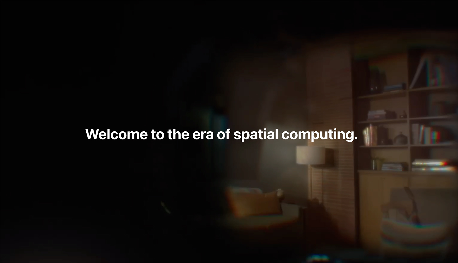
Apple didn’t coin the term “spatial computing.” The credit belongs to Simon Greenwold, who, in 2003, defined it as “human interaction with a machine in which the machine retains and manipulates referents to real objects and spaces.” But with the headline “Welcome to the era of spatial computing,” Apple brilliantly reminds us that VR has practical use cases. They take a position opposite of the all-encompassing metaverse playland that Meta has staked out. They’ve redefined the category and may have breathed life back into it.
Beyond marketing, Apple has solved many of the problems that have plagued VR devices.

While Apple Vision Pro looks to be a technological marvel that has been years in the making, I don’t think it’s without its faults.
Apple Vision Pro will ship in early 2024. I’m excited by the possibilities of this new platform. Virtual reality has captured the imagination of science-fiction writers, futurists, and technologists for decades. Being able to completely immerse yourself into stories, games, and simulations by just putting on a pair of goggles is very alluring. The technology has had fits and starts. And it’s starting again.

I recently came across Creative Selection: Inside Apple’s Design Process During the Golden Age of Steve Jobs by former software engineer Ken Kocienda. It was in one of my social media feeds, and since I’m interested in Apple, the creative process, and having been at Apple at that time, I was curious.
I began reading the book Saturday evening and finished it Tuesday morning. It was an easy read, as I was already familiar with many of the players mentioned and nearly all the technologies and concepts. But, I’d done something I hadn’t done in a long time—I devoured the book.
Ultimately this book gave more color and structure to what I’d already known, based on my time at Apple and my own interactions with him. Steve Jobs was the ultimate creative director who could inspire, choose, and direct work.
Kocienda describes a nondescript conference room called Diplomacy in Infinite Loop 1 (IL1), the first building at Apple’s then main campus. This was the setting for an hours-long meeting where Steve held court with his lieutenants. Their team members would wait nervously outside the room and get called in one by one to show their in-progress work. In Kocienda’s case, he describes a scene where he showed Steve the iPad software keyboard for the first time. He presented one solution that allowed the user to choose from two layouts: more keys but smaller keys or fewer keys but bigger. Steve asked which Kocienda liked better, and he said the bigger keys, and that was decided.
Before reading this book, I had known about these standing meetings. Not the one about software, but I knew about the MarCom meeting. Every Wednesday afternoon, Steve would hold a similar meeting—Phil Schiller would be there too, of course—to review in-progress work from the Marketing & Communications teams. This included stuff from the ad agency and work from the Graphic Design Group, where I was.
My department was in a plain single-story building on Valley Green Drive, a few blocks from the main campus and close to the Apple employee fitness center. The layout inside consisted of one large room where nearly everyone sat. Our workstations were set up on bench-style desks. Picture a six-foot table, with a workstation on the left facing north and another on the right facing south. There were three of these six-foot tables per row and maybe a dozen rows. Tall 48” x 96” Gatorfoam boards lined the perimeter of the open area. On these boards, we pinned printouts of all our work in progress. Packaging concepts, video storyboards, Keynote themes, and messaging headlines were all tacked up.
There was a handful of offices at one end and two large offices in the back. One was called the Lava Lounge and housed a group of highly-skilled Photoshop and 3D artists. They retouched photos and recreated screenshots and icons at incredibly-high resolutions for use on massive billboards in their dim room, lit only by lava lamps. The other office was for people who were working on super secret projects. Of course, that was badge access only.
My boss, Hiroki Asai, the executive creative director at the time, sat out in the open area with the rest of us. Every day around 4pm, he would walk around the perimeter of the room and review all the work. He’d offer his critique, which often ended up being, “I think this needs to be more…considered.” (He was always right!) A gaggle of designers, copywriters, and project managers would follow him around and offer their own opinions of the work as well. In other words, as someone who worked in the room, I had to pin up my work by 4pm every day and show some progress to get some feedback. Feedback from Hiroki was essential to moving work forward.
So every Wednesday afternoon, with a bundle of work tucked under his arms, he would exit the side door of the building and race over to IL1 to meet with Steve. I never went with him to those meetings. He usually brought project managers or creative directors. Some of the time, Hiroki would come back dejected after being yelled at by Steve, and some of the time, he’d come back triumphant, having got the seal of approval from him.
I like to tell one story about how our design team created five hundred quarter-scale mockups to get to an approval for the PowerMac G5 box. In the end, the final design was a black box with photos of the computer tower on each side of the box corresponding to the same side of the product. Steve didn’t want to be presented with only one option. He needed many. And then they were refined.
The same happened with the Monsters, Inc. logo when I was at USWeb/CKS. We presented Steve with a thick two-inch binder full of logo ideas. There must have been over a hundred in there.
Steve always expected us to do our due diligence, explore all options, and show our work. Show him that we did the explorations. He was the ultimate creative director.
That’s how Steve Jobs also approached software and hardware design, which is nicely recounted in Kocienda’s book.
In the book, Kocienda enumerates seven essential elements in Apple’s (product) design process: inspiration, collaboration, craft, diligence, decisiveness, taste, and empathy. I would expand upon that and say the act of exploration is also essential, as it leads to inspiration. In Steve’s youth, he experimented with LSD, became a vegetarian, took classes on calligraphy, and sought spiritual teachers in India. He was exploring to find his path. As with his own life, he used the act of exploration to design everything at Apple, to find the right solutions.
As designers, copywriters, and engineers, we explored all possibilities even when we knew where we would end up, just to see what was out there. Take the five hundred PowerMac G5 boxes to get to a simple black box with photos. Or my 14 rounds of MacBuddy. The concept of exploring and then refining is the definition of “creative selection,” Kocienda’s play on Darwin’s natural selection. But his essential element of diligence best illustrates the obsessive refinement things went through at Apple. Quality isn’t magic. It’s through a lot of perspiration.

This is the third article in a three-part series offering tips on how to get a job as a product or UX designer. Part 1 covers your resume and LinkedIn profile. Part 2 advises on your portfolio website.
If you have stood out enough from the hundreds of resumes and portfolios a hiring manager has looked at, you’ll start the interview process.
From my point of view, as a design hiring manager, it’s all about mitigating risk. How do I know if you will do great work with us? How do I know that you’ll fit in with the team and positively change our dynamic? How do I know that your contributions will help get us to where we need to be?
Ultimately the interview process is very much like dating: we’re figuring out if we’re right for each other, slowly engendering trust, and showing interest—without overdoing it.
The interview process will vary for each company, but in general, it’ll be:
The first step in the interview process will be the introductory call. From the hiring side, this is known as the screening call. Usually, it’s a recruiter, and their job is to screen out applicants who don’t have the right qualifications and then gather a few essential pieces of information.
After the call is scheduled, have a couple of things ready beforehand before getting on the phone. The most important thing to do ahead is to research the company. Use Google, LinkedIn, and all the modern tools at your disposal to learn the basics of the company: what they do, what they sell, who their target users are, who their clients are (if an agency).
Also, have your salary expectations in mind. Most employers will pay market rate salaries similar to other companies of their size. A seed-stage startup will not be able to compensate you as much as Google. Do your research on Glassdoor, Payscale, or other sites first. Shoot for maybe a little above average, but certainly, have a minimum in mind depending on your personal circumstance.
During the call, be prepared and be professional. A good recruiter will ask you about your salary expectations and your timeline (in case you’re interviewing elsewhere as well). If you pass the screen, you’ll probably talk to your future boss next.
Follow up with a thank-you email within an hour.
Hopefully, your recruiter prepped you well for your first interview with the hiring manager. These interviews can take many forms, but in general, you’ll introduce yourself, talk about your work, and then there will be more of a Q and A.
In these interviews, as a design hiring manager, I’m trying to understand the following:
The biggest mistake I’ve seen candidates make in interviews is not being specific enough. I will usually ask a question like, “Can you walk me through a recent project, focusing on your process and how you worked with others?” The answers I usually get are very high level. As an interviewer, I want to hear details because details demonstrate an excellent grasp of a subject. So if you rattle off the typical design process without going into details, it doesn’t give me confidence that you can do the job.
Be very, very familiar with your case studies. And lean on them as detailed examples. You might be asked to walk through a case study or two. Be able to do talk through each project in about five minutes. Tell stories!
Art Kilinski, Group Creative Director at NVIDIA, says, “Be ready to show your portfolio and be on camera if it’s a remote interview.”
The hiring manager may or may not have looked at your portfolio beforehand. Personally, I would, but sometimes we run out of time. So don’t assume.
After the interview, follow up with a thank-you email within an hour.
It’s rare these days that you’ll only speak to the hiring manager and get hired. However, if you pass the previous gauntlet of interviews, you will likely meet and be interviewed by your future teammates. The same advice from the section above applies here. Be kind and professional to everyone you meet. They could be your future colleagues, and how you treat them will reflect well or poorly on you.
Remember they are testing to see if you will be a great addition to the team. Do you have the skills to help? Or will you be a drag?
Follow up with thank-you emails within an hour. If you don’t have their emails, ask the recruiter for them.
I am opposed to speculative work. Even if you’re just out of school, you should not perform work for free. With that said, coding challenges are the norm in the tech industry, and, increasingly, so are design challenges.
A fair design challenge should not take an excessive amount of your time, nor should it be directly related to the company or product itself. In other words, if the company you’re interviewing for wants you to redesign their product’s dashboard over the weekend, that’s not kosher. Run the other way.
Employers will say that the amount of time you put into a take-home assignment like this signals how enthusiastic you are about the position. So, my advice here is to do enough where it’s a reasonable effort and demonstrates your skills. But don’t spend so much time that you are resentful if you aren’t hired.
I’m more of a fan of the live whiteboard challenge. This time-boxed exercise helps me experience what it’s like to collaborate with you. You can show off your strategic thinking skills in a limited time setting. You will need to prep for whiteboard challenges if you have never done them. Have a plan of attack before going in. Maybe even practice a couple of times with a friend first.
I will admit that the interviewing process is probably the most nerve-wracking. It isn’t easy talking to people you’ve never met and giving them a sense of who you are and how you would work with them as a colleague. It is scary to be vulnerable and put yourself out there to be judged. This process is an artificial construct.
Communicate clearly and genuinely. Be professional, yet yourself. If your work is good and you present yourself well, that should be enough to make a lasting impression with your interviewers so they can see a possible future with you on their team.
Good luck!

This is the second article in a three-part series offering tips on how to get a job as a product or UX designer. Part 1 covers your resume and LinkedIn profile. Part 3 is about the interviewing process.
As I mentioned in Part 1 of this series, portfolios used to be physical cases filled with your work, and you only had one of them. But now that portfolios are online, it’s much easier to get your work out there.
Much like resumes, many designers make the mistake of over-designing their portfolio website, trying to use it as a canvas to show their visual design or interaction chops. Don’t do it.
Remember your user, the design hiring manager, is trying to sift through hundreds of portfolios. Each time we open a portfolio site, we need to orient ourselves, find the work section, click into a project and view it. If your site has any friction at all, if it tries to be cute with something or tries to reinvent the wheel in any way, we can get frustrated quickly and move on to the next one. Your site should be about your work first and about you second.
A portfolio is not supposed to be an archive. So don’t dump everything you’ve ever designed into it. Instead, curate four to six best case studies you have. Yes, case studies. In the past, showing beautiful images of the final output was sufficient, but because websites can accommodate a lot of content, the case study format tells us hiring managers much more.
Think of a case study as the story of how you made something. Tell that story, and tell it to someone who’s not familiar with the client, product or service, and you. There are a few templates out there that are good starting points. I like this one by Calvin Pedzai:
While this format was originally intended for UX projects, I think this should also apply to non-product design. Michael Sequiera, as Global Creative Director at Visa, says, “I like to see 2-3 case studies on how they solved the design problem.”
As you write your case study, remember to write it like a story, a narrative, rather than plain and factually. Also, keep in mind the length. Strive to keep the case study short enough to be consumed in about three to five minutes of skimming and reading.
Sometimes designers do not show their work on their portfolio websites because of non-disclosure agreements, or NDAs, they’ve signed with companies and clients. First of all, we all have signed NDAs, and nearly everything we do for a company is work-for-hire, meaning the other companies own the work. But portfolios are how designers get hired. Design hiring managers will never hire a designer without evaluating past work first. So if you’ve signed an NDA and don’t think you can show these samples on your portfolio site, here are some things to consider:
I have also come across a handful of portfolio websites that do not show any work at all. When I interviewed one of these designers, she said her reason was that the work would be outdated as soon as she posted it. I bought her reasoning mainly because she had worked at a couple of big-name brands and had established herself enough to get away with that. Of course, I would still go through her work as part of the interview process.
(Disclaimer: I am not a lawyer and do not take what I wrote above as legal advice. I’m not advising you to break your non-disclosure agreements. If you have any legal doubts, please consult an actual lawyer.)
—
Having a well-crafted resume, robust LinkedIn profile, and compelling portfolio website are the bare minimum requirements before you start applying for jobs. But once you have those three basics, start applying for positions you qualify for.
In Part 3 of this series—I promise, it’s the last—I’ll provide some handy tips about the interviewing process.

This is the first article in a three-part series offering tips on how to get a job as a product or UX designer. Part 2 advises on your portfolio website. Part 3 covers the interviewing process.
(With apologies to Maxine Paetro, whose seminal 1979 book How to Put Your Book Together and Get a Job in Advertising was highly influential in my early job search process in the mid-1990s.)
I graduated from design school in the spring of 1995. Yahoo! was incorporated just a couple of months before. AOL was still the dominant way everyone connected to the Internet. Tim Berners-Lee’s World Wide Web was still a baby, with just a tiny fraction of websites available. In other words, my design education was about graphic design—layout, typography, logos, print. Neither digital design nor UX design was taught or barely practiced yet. (The closest thing would be human-computer interaction, more computer science than design.)
The San Francisco graphic design scene back in the early- to mid-1990s was pretty close-knit. Most of the established practitioners in The City taught at the California College of Arts & Crafts (CCAC, but now shortened to California College of the Arts (CCA)), fertile ground for finding interns and junior designers. Regardless, all of us graduating seniors needed to have portfolios. Physical portfolios. Some books—another name for portfolio—were basic: a leather folio with plastic slip pages filled with mocked-up posters, booklets, or photos of projects. Or some designers would custom bind books with special hardware and print their work on fine paper, spending hundreds of dollars. But you had one book. So when applying for jobs, you had to leave your book with the design studio for a few days to a week! Which meant that job hunting was very slow going.
If the creative director at the design studio liked your portfolio—which was very likely passed around the whole studio for the grubby hands of other designers to peruse—you’d go back in for an interview. In the interview, you’d walk through your work and get drilled on the choices you made. Back in my day, that’s how you could land a design job.
Fast-forward to today, and I’m on the hiring side of the table. Of course, I’ve hired designers and built teams before in other positions, but with my near-constant focus on recruiting at the moment—as Convex is scaling—I decided to put down some thoughts about what I think prospective designers should do when applying for jobs.
The basic building blocks are obvious. You will need:
In Part 1 of this three-part series, I’ll cover some foundational ideas, including the resume and LinkedIn profile. In Part 2, I’ll discuss the portfolio website. Finally, in Part 3, I will talk about the product design interview.
The mistake most people commit is foundational—they write and design their resume, LinkedIn, and portfolio for themselves. In other words, they’re not approaching these as designers because they’ve forgotten their primary user—the hiring manager.
First of all, design hiring managers are designers. We started as designers and have chosen the path of becoming creative directors, design managers, etc. But we are designers at our core. Which means we’ll look at everything you do through that lens. Do an applicant’s materials solve the core user need? Do those materials look good?
Hiring managers are busy people. As a design leader, I’m balancing brand and marketing projects, working on new product features, participating in 25 meetings per week, managing the people on my team, and looking for new designers to join our endeavor. So my time is valuable to me.
When there’s a job opening, I will need to sift through hundreds of resumes and portfolios. I will glance at a resume or LinkedIn profile for about 5 seconds and check out a portfolio for about 10 seconds before moving on. Unless something catches my attention.
As a hiring manager, I’m looking for a few key things first:
If the answers to those questions match the specific role I have open, I’ll spend more time with the candidate’s resume, profile, and portfolio.
If you’re on the job hunt, you’ll need a resume. Applications will ask you to upload them. Your resume is often a hiring manager’s first impression of your design work. Remember your user: they’re busy and need to sort through dozens, if not hundreds, of resumes. Hiring managers need to be able to scan the information quickly. Your resume is a chance to demonstrate your skills in layout, typography, and, most of all, restraint. Do not fall into the trap of designing a crazy, branded, “memorable” resume. It will have the opposite effect.
Peter Markatos, former Global Design Director at Uber and now Chief Design Officer at Quoori, says, “I think resumes for design jobs are critical. I’ve hired a lot of folks and I’ve NEVER seen a well-designed resume lead to a poor folio. I always see the opposite however. There’s nowhere to hide in a resume. Ground zero for design fluency.”
There are plenty of great resources out there on how to write your resume, so I won’t attempt to sum them up here. But for a design job, this is what matters.
Nearly all designers have freelanced at some point or another. There are two ways to show this on your resume. If you worked as a contractor at a company or studio, list that as a position in your Experience section, but indicate you were a contractor. Put freelance projects as bullets under a general freelance role in the Experience section.
Joe Stitzlein, who built design teams at Google and Nike and now is ECD at Stitzlein Studio, says, “No one wants your personal photo on a resume. No logos or monograms on a resume. Beautiful typesetting is a must. No typos. Keep it to one page.”
So here are some other quick tips:
Make sure your LinkedIn profile is up to date and matches your resume. When I’m reviewing applications, I skip the resume and go straight to the candidate’s LinkedIn profile about half the time. I find it more up-to-date, easier to scan, and just has richer information about the applicant.
Personally, I find recommendations to be powerful. Always be getting recommendations from your teachers, colleagues, and current and former bosses. This is the additional color hiring managers can get from reviewing your LinkedIn profile as opposed to your resume.
To borrow a culinary term, your resume and LinkedIn profile are the appetizers for the main course—the work. Your work experience, education, and list of skills is a brief introduction to who you are and the type of work you might do. These appetizers should lead into and set up the entree: your portfolio. We will tackle that in Part 2: Your Portfolio.
The design blog that connects the dots others miss. Written by Roger Wong.
If you’re new here, check out what others are reading in the Popular feed.


