Yennie Jun, writing for Art Fish Intelligence, asks which parts of thinking we surrender along with the task. Her example shows the difference between asking AI to answer a question and asking it to test thinking we’ve already begun:
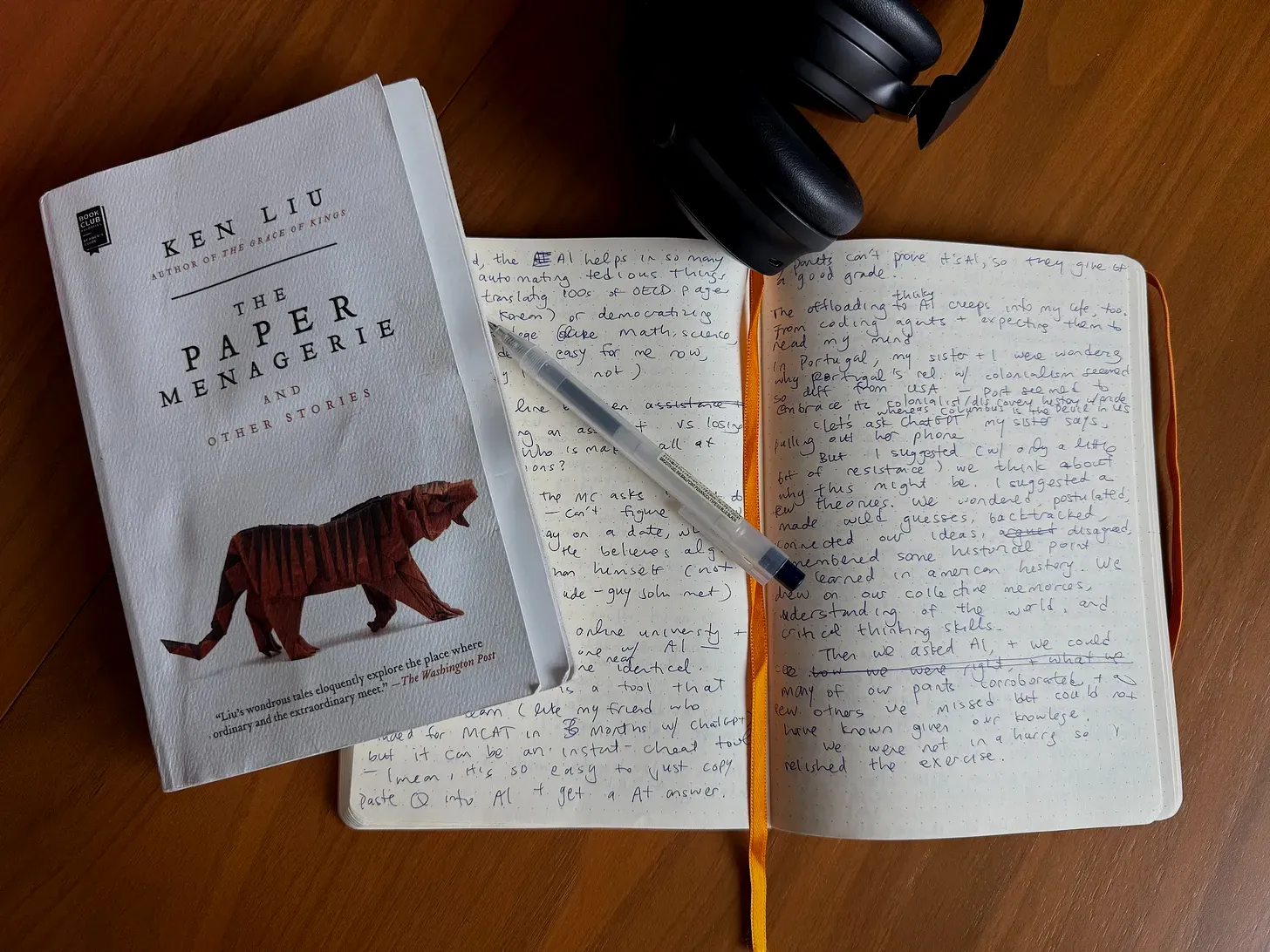
I suggested (with only a little bit of initial resistance) that we pause and think about why this might be. I suggested a few theories. Perhaps it was Portugal’s relative homogeneity and religiousness, compared to the US’s diversity of immigrants. Perhaps Portugal clung on to so-called “Age of Exploration” as one of the most prominent chapters in its national story. We wondered, postulated, made wild guesses, backtracked, connected our ideas, disagreed, and remembered historical details we learned in high school many years ago. We drew on our collective memories, knowledge, understanding of the world, and critical thinking skills. We knew we were speculating, and some of our theories were probably wrong; that was part of the exercise.
Eventually, we asked the same question to AI. Its response corroborated many of our theories and supplied several explanations we had missed. It also omitted a few possibilities we still found plausible. We had begun with a question, generated hypotheses, and only then used AI to test and extend our thinking. I relished the exercise.
The backtracking is the point. A finished answer can save time, but repeatedly skipping the work of forming and testing a hypothesis also skips the practice that builds judgment. For designers, that’s the work we should keep, even as it accelerates production.
We still need to use trial and error to learn what to ask or try next. Otherwise, faster production leaves us less able to tell whether what we made is any good.
Jun turns from productivity to autonomy:
Am I any different from the Microphone Man? Perhaps what differentiates me is that I still collected and curated the data, formulated the questions I wanted answered, and evaluated the end results? Or that the data was my own, instead of recording other people’s conversations? There will always have to be some balance between automating menial tasks to free up time for rewarding endeavors, and doing the work yourself as a learning experience.
Jenny, another character in Ken Liu’s story, aims to counterpoint the main character’s over-reliance on his AI assistant. She exclaims, “Tilly doesn’t just tell you what you want! She tells you what to think. Do you even know what you really want anymore?” Our autonomy depends, at least in part, on continuing to participate in forming our own desires. But when we offload thinking about what we want (What music should I listen to? What movies should I watch? What food should I eat? What shoes should I wear?), who do we become?
What are we automating? Human work or human agency? Human tasks or human thinking?
Designers still have to decide what deserves to exist before asking AI to make it.
Are we offloading too much of our thinking to AI?
AI can test and extend a line of thought, but using it before we form a hypothesis skips the practice that builds judgment and weakens our agency.
 artfish.ai