Skip to content

66 posts tagged with “history”

This is an amazing article and website by Marcin Wichary, the man behind the excellent Shift Happens book.

…I had a realization that the totemic 1984 Mac control panel, designed by Susan Kare, is still to this day perhaps the only settings screen ever brought up in casual conversation.

I kept wondering about that screen, and about what happened since then. Turns out, the Mac settings have lived a far more fascinating life than I imagined, have been redesigned many times, and can tell us a lot about the early history and the troubled upbringing of this interesting machine.

Indeed, Wichary goes through multiple versions of Mac operating systems and performs digital paleontology, uncovering long lost Settings minutiae. It’s also a great lesson in UI along the way. Be sure to click in the Mac screens.

preview-1752030135022.png

Frame of preference

A story of early Mac settings told by 10 emulators.

aresluna.org iconaresluna.org

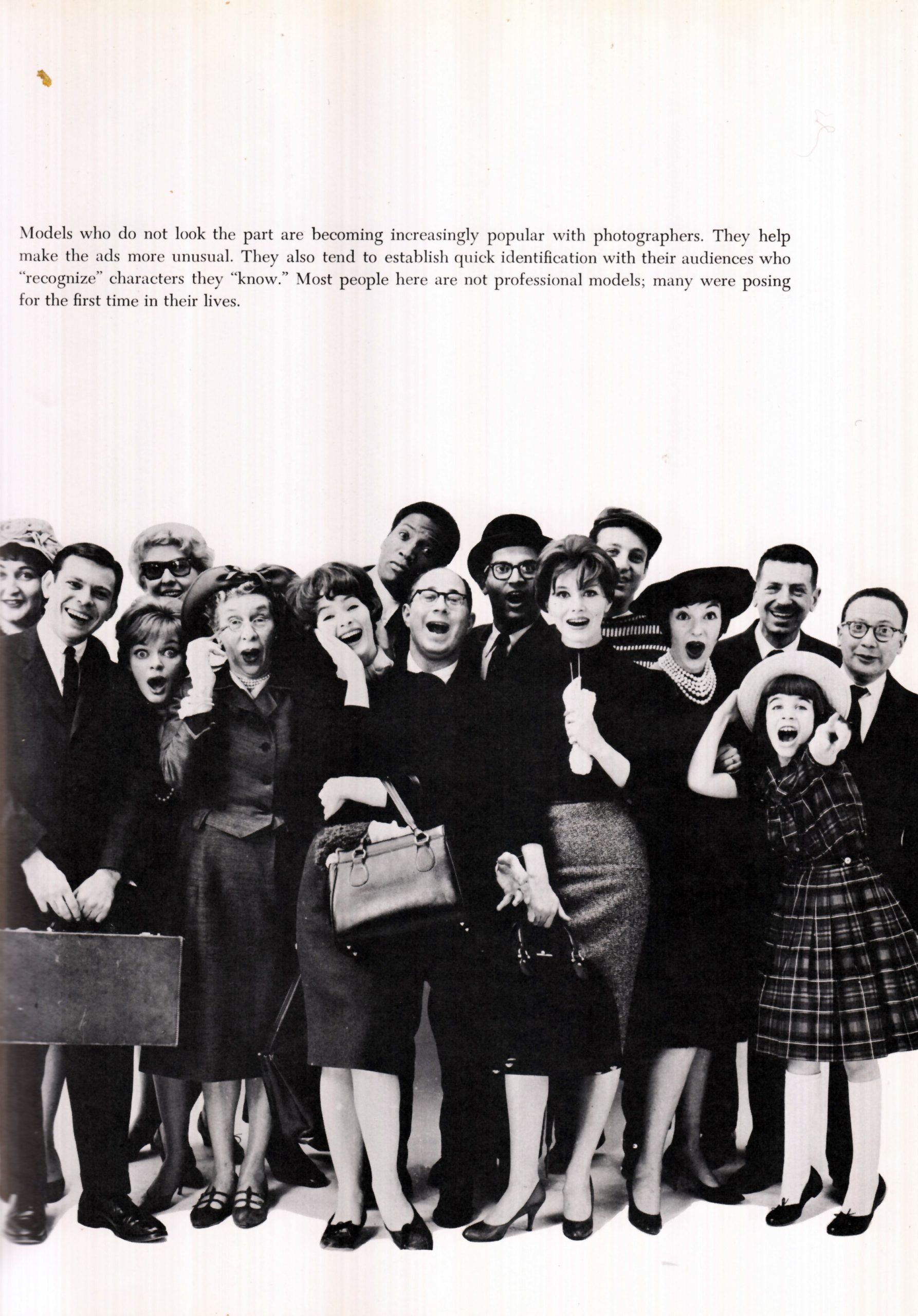
Stephen Heller, writing for PRINT magazine, revisits a long out-of-print book called *Visual Persuasion *by Stephen Baker, a creative director from the Mad Men era of advertising.

Although published in 1961, Visual Persuasion has as much relevance, vitality, insight, vision and spunk as any recently published book (including those that I’ve authored). The truth is this: I wish I had written it. Even though it is nearly 65 years out of print (and contains its share of outdated mores and stereotypes), it easily could still serve (with a minute refresh) to provide ideas to ward off what designers fear is the inevitable AI apocalypse—an end to original thinking and making, visual or otherwise.

One maxim, Heller notes:

Eye movements are based on conditioned reflexes. “Left-to-right habit makes our eyes travel clockwise in exploring a [layout],” Baker notes. The optical center of a page is slightly to the left. The tendency is to focus attention on a person’s eyes more than on any other part of their face. This mirrors one’s emotions with fair accuracy.

preview-1751949320516.jpeg

The Daily Heller: Visual Persuasion Hasn't Changed Since 1961

Steven Heller on the book he wishes he had written.

printmag.com iconprintmag.com
Close-up of bicentennial logo storyboard frames featuring red, white, and blue geometric patterns and star designs in rounded rectangles.

America at 200

When I was younger, I had a sheet of US Bicentennial stamps and I always loved the red, white, and blue star. Little did I know then that I would become a graphic designer.

Sheet of US postage stamps featuring the bicentennial star logo, each stamp showing

The symbol, designed by Bruce Blackburn at Chermayeff & Geismar is a multilayered stylized five-pointed star. It folds like bunting. Its rounded corners evoke both a flower and a pinwheel at the same time. And finally, the negative space reveals a classic, pointed star.

Jeff Beer, writing for Fast Company about a documentary on Ilon Specht, the copywriter who wrote the iconic line for L’Oreal, “Because I’m Worth It.”

In the film, she describes male colleagues who were always arguing with her and taking credit when something worked. She recalled how during pitch and idea meetings for L’Oreal Preference hair color, male colleagues had suggested an idea that cast the woman as an object, rather than the subject. “I was feeling angry. I’m not interested in writing anything about looking good for men. Fuck ‘em,” says an elderly, and terminally ill, Specht in the film, before looking straight down the camera to the male camera operator. “And fuck you, too.”

The film won the Grand Prix at the Cannes Lions a couple weeks ago as it was commissioned by L’Oreal.

The original ad for L’Oreal Preference hair color that first used the line, “Because I’m Worth It” is a single shot of a woman walking towards the camera, explaining why she likes it, and how it makes her feel.

In the doc, we find out that spot almost never happened. In fact, Specht went behind her bosses’ back to create the ad after her agency produced and the brand approved a spot with almost the exact same script, except it was a man speaking the words on behalf of his wife, walking silently beside him. It’s clear that 50 years later it still made Specht angry. Angry enough to not want to talk about advertising or that campaign ever again.

preview-1751428779020.jpg

The unsung author of L’Oreal’s iconic 'because I'm worth it' tagline finally gets her due

Back in the 1970s, Ilon Specht had to fight for the tagline “Because I’m Worth It.” A new Cannes Lions Grand Prix-winning short film tells the story.

fastcompany.com iconfastcompany.com

Before there was Jessica Hische, there was Jim Parkinson. You might not know his name, but you’ve seen his work. Most famously, he was known for the mastheads for Rolling Stone magazine and the LA Times. Stephen Coles has this remembrance.

preview-1751428433957.jpg

Jim Parkinson, 1941–2025

Jim Parkinson—lettering artist, type designer, and painter—died today at his home in Oakland, California, after a long struggle with Alzheimer’s.

typographica.org icontypographica.org

It’s been said that desktop publishing democratized graphic design. For those of you too young to know what the term means, it means the technology that enabled graphic design to go digital. It was an ecosystem, really: the Mac, PostScript, LaserWriter, and PageMaker. But before all that, designers depended on typesetters to set type.

David Langton writing for UX Collective:

A lot was lost when the Macintosh wiped out the traditional typesetting industry. From the art of typography to the craft of typesetting, many essential elements were lost. Typesetters were part of a tradition that stretched back more than 500 years to Gutenberg’s printing press. They understood the basics of type: kerning (spacing between the letters), leading (the space between lines of text), and line breaks (how to avoid widows — those solo words abandoned at the end of a paragraph). They knew about readability (like how to avoid setting type that was too wide to read). There were classic yet limited fonts, with standards for size and leading that assured that everyone working within common ranges maintained a threshold for quality. Yet it was in the craft or business side of typesetting that these services were most under appreciated. Typesetters provided overnight service. They worked overnight, so graphic designers did not have to. We would finish our days specifying the type, and the typesetters would keystroke the manuscripts, proofread, stylize the type, and set up columns following our instructions.

Designers would then pick up the galleys from the typesetters in the morning. The black type was photographically printed on white photo paper. You’d have to cut them up and paste them onto boards, assembling your layout.

Because this was such a physical process, we had to slow down. Langton says:

But since the Macintosh became an in-house tool, the process was reversed. Now, designers design first, then think about it. This shift in process has contributed to a trivialization of the role of graphic designer because anyone can noodle around with the Mac’s sophisticated type tools and make layouts. The design process has been trivialized while the thinking, the evaluation, and the strategic part of the process are often abandoned.

One small thing I’ll point out is that desktop publishing wasn’t popularized until 1985.

  • PostScript was released by Adobe in 1984.
  • The LaserWriter printer was released by Apple in 1985.
  • PageMaker was released by Aldus—later bought by Adobe—in 1985.
preview-1750050186871.jpeg

What the 1984 Macintosh revolution teaches designers about the 2025 AI revolution

Upheaval and disruption are nothing new for graphic designers.

uxdesign.cc iconuxdesign.cc

Christopher Butler writes a wonderful essay about the “best interfaces we never built,” exploring the UIs from sci-fi:

Science fiction, by the way, hasn’t just predicted our technological future. We all know the classic examples, particularly those from Star Trek: the communicator and tricorder anticipated the smartphone; the PADD anticipated the tablet; the ship’s computer anticipated Siri, Alexa, Google, and AI voice interfaces; the entire interior anticipated the Jony Ive glass filter on reality. It’s enough to make a case that Trek didn’t anticipate these things so much as those who watched it as young people matured in careers in design and engineering. But science fiction has also been a fertile ground for imagining very different ways for how humans and machines interact.

He goes on to namecheck 2001: A Space Odyssey, Quantum Leap, Inspector Gadget and others. I don’t know Butler personally, but I’d bet $1 he’s Gen X like me.

As UX designers, it’s very easy to get stuck thinking that UI is just pixels rendered on a screen. But in fact, an interface is anything that translates our intentions into outcomes that technology can deliver.

preview-1750007787508.jpg

The Best Interfaces We Never Built

Every piece of technology is an interface. Though the word has come to be a shorthand for what we see and use on a screen, an interface is anything

chrbutler.com iconchrbutler.com

The Steve Jobs archive sharing a little behind-the-scenes of Jobs’s famous Stanford commencement speech:

The talk generated no small measure of anxiety for Steve. He had attended Reed College for only a few months before dropping out; now he would be speaking to graduates of one of the world’s top research universities, a place that meant a great deal to him. An intensely private man, Steve was not in the habit of talking about his personal journey—but he knew the occasion required it.

Steve Jobs has always had an aura of invincibility around him—a creative genius who could convince those around him and the world of anything he wanted using his “reality distortion field.” But he was also human.

I’m sure you’ve seen it before. But whether you’re 22 years old or 50, his advice still resonates. I love the clarity in this scaled-up version.

Play
preview-1749791832757.jpg

Stay Hungry, Stay Foolish

Marking the 20th anniversary of Steve Jobs’ 2005 Stanford commencement speech with a digitally enhanced version of the video as well as a behind-the-scenes look at how it came to be: from firsthand accounts from people who were connected to the commencement to Steve’s personal drafts.

stevejobsarchive.com iconstevejobsarchive.com

I have relayed here before the story that I’ve been using Macs since 1985. It wasn’t the hardware that drew me in—it was MacPaint. I was always an artistic kid so being able to paint on a digital canvas seemed thrilling to me. And of course it was back then.

Behind MacPaint, was a man named Bill Atkinson. Atkinson died last Thursday, June 5 of pancreatic cancer. In a short remembrance, John Gruber said:

I say this with no hyperbole: Bill Atkinson may well have been the best computer programmer who ever lived. Without question, he’s on the short list. What a man, what a mind, what gifts to the world he left us.

I‘m happy that Figma also remembered Atkinson and that they are standing on his shoulders.

Every day at Figma, we wrestle with the same challenges Atkinson faced: How do you make powerful tools feel effortless? How do you hide complexity behind intuitive interactions? His fingerprints are on every pixel we push, every selection we make, every moment of creative flow our users experience.

preview-1749532457343.jpg

Bill Atkinson’s 10 Rules for Making Interfaces More Human

We commemorate the Apple pioneer whose QuickDraw and HyperCard programs made the Macintosh intuitive enough for nearly anyone to use.

figma.com iconfigma.com

Bell Labs was a famed research lab run by AT&T (aka “Ma Bell” before it was broken up). You can draw a straight line from Bell Labs to Xerox PARC where essential computing technologies like the graphical user interface, the mouse, Ethernet, and more were invented.

Aeroform, writing for 1517 Fund:

The reason why we don’t have Bell Labs is because we’re unwilling to do what it takes to create Bell Labs — giving smart people radical freedom and autonomy.

The freedom to waste time. The freedom to waste resources. And the autonomy to decide how.

preview-1749165348692.png

Why Bell Labs Worked.

Or, how MBA culture killed Bell Labs

1517.substack.com icon1517.substack.com

Apologies for linking to a lot of Christopher Butler recently, but I really love his thinking about design. This time, Butler reminds us about the importance of structure and how the proto-graphic designers we studied in art history, like Piet Mondrian, mastered it.

A well-composed photograph communicates something essential even before we register its subject. A thoughtfully designed page layout feels right before we read a single word. There’s something happening in that first moment of perception that transcends the individual elements being composed.

My favorite passage in his essay begins here:

Perhaps we “read” composition the way we read text — our brains processing visual structure as a kind of fundamental grammar that exists beneath conscious recognition. Just as we don’t typically think about parsing sentences into subjects and predicates while reading, we don’t consciously deconstruct the golden ratio or rule of thirds while looking at an image. Yet in both cases, our minds are translating structure into meaning.

The next eight short paragraphs build on this idea and crescendo with this banger:

In recognizing composition as this fundamental visual language, we begin to understand why good design works at such a deep level. It’s not just about making things look nice — it’s about speaking fluently in a language that predates words, tapping into patterns of perception that feel as natural as breathing.

Composition is a fundamental visual language. I had never thought of it that way and yet it feels right.

The whole thing is great. Please go read it.

preview-1749010527393.png

The Art Secret Behind All Great Design

When I was a young child, I would often pull books off of my father’s shelf and stare at their pages. In a clip from a 1987 home video that has

chrbutler.com iconchrbutler.com

John Gruber wrote a hilarious rant about the single-story a in the iOS Notes app:

I absolutely despise the alternate single-story a glyph that Apple Notes uses. I use Notes every single day and this a bothers me every single day. It hurts me. It’s a childish silly look, but Notes, for me, is one of the most serious, most important apps I use.

Since that sparked some conversation online, he followed up with a longer post about typography in early versions of the Mac system software:

…Apple actually shipped System 1.0 with a version of Geneva with a single-story a glyph — but only in the 9-point version of Geneva. At 12 points (and larger), Geneva’s a was double-story.

To me, it does make sense that 9-point Geneva would have a single-story a, since there are less pixels to draw the glyph well and to distinguish better from the lowercase e.

preview-1747273905636.png

Single-Story a’s in Very Early Versions of Macintosh System 1

A single-story “a” in Chicago feels more blasphemous than that AI image Trump tweeted of himself as the new pope.

daringfireball.net icondaringfireball.net

A lot of young designers love to look at what’s contemporary, what’s trending on Dribbble or Instagram. But I think to look forward, we must always study our past. I spent the week in New York City, on vacation. My wife and I attended a bunch of Broadway shows and went to the Museum of Broadway, where I became enamored with a lot of the poster art. (’Natch.) I may write about that soon.

Coincidentally, Matthew Strom wrote about the history of album art, featuring the first album cover ever, which uses a photo of the Broadway theater, the Imperial, where I saw Smash earlier this week.

preview-1746385689679.jpg

The history of album art

Album art didn’t always exist. In the early 1900s, recorded music was still a novelty, overshadowed by sales of sheet music. Early vinyl records were vastly different from what we think of today: discs were sold individually and could only hold up to four minutes of music per side. Sometimes, only one side of the record was used. One of the most popular records of 1910, for example, was “Come, Josephine, in My Flying Machine”: it clocked in at two minutes and 39 seconds.

matthewstrom.com iconmatthewstrom.com

You might not know his name—I sure didn’t—but you’ll surely recognize his illustration style that came to embody the style du jour of the 1960s and ’70s. Robert E. McGinnis has died at the age of 99. The New York Times has an obituary:

Robert E. McGinnis, an illustrator whose lusty, photorealistic artwork of curvaceous women adorned more than 1,200 pulp paperbacks, as well as classic movie posters for “Breakfast at Tiffany’s,” featuring Audrey Hepburn with a cigarette holder, and James Bond adventures including “Thunderball,” died on March 10 at his home in Greenwich, Conn. He was 99.

Mr. McGinnis’s female figures from the 1960s and ’70s flaunted a bold sexuality, often in a state of semi undress, whether on the covers of detective novels by John D. MacDonald or on posters for movies like “Barbarella” (1968), with a bikini-clad Jane Fonda, or Bond films starring Sean Connery and Roger Moore.

Illustrated movie poster for the James Bond film "The Man with the Golden Gun," featuring Roger Moore as Bond, surrounded by action scenes, women in bikinis, explosions, and a large golden gun in the foreground.

preview-1745266961383.jpg

Robert E. McGinnis, Whose Lusty Illustrations Defined an Era, Dies at 99

(Gift link) In the 1960s and ’70s, his leggy femmes fatales beckoned from paperback covers and posters for movies like “Breakfast at Tiffany’s” and “Thunderball.”

nytimes.com iconnytimes.com

Remember the Nineties?

In the 1980s and ’90s, Emigre was a prolific powerhouse. The company started out as a magazine in the mid-1980s, but quickly became a type foundry as the Mac enabled desktop publishing. As a young designer in San Francisco who started out in the ’90s, Zuzana Licko and Rudy VanderLans were local heroes (they were based across the Bay in Berkeley). From 1990–1999 they churned out 37 typefaces for a total of 157 fonts. And in that decade, they expanded their influence by getting into music, artists book publishing, and apparel. More than any other design brand, they celebrated art and artists.

Here is a page from a just-released booklet (with a free downloadable PDF) showcasing their fonts from the Nineties.

Two-page yellow spread featuring bold black typography samples. Left page shows “NINE INCH NAILS” in Platelet Heavy, “majorly” in Venus Dioxide Outlined, both dated 1993. Right page shows “Reality Bites” in Venus Dioxide, a black abstract shape below labeled Fellaparts, also from 1993.

Jay Hoffman, from his excellent The History of the Web site:

1995 is a fascinating year. It’s one of the most turbulent in modern history. 1995 was the web’s single most important inflection point. A fact that becomes most apparent by simply looking at the numbers. At the end of 1994, there were around 2,500 web servers. 12 months later, there were almost 75,000. By the end of 1995, over 700 new servers were being added to the web every single day.

That was surely a crazy time…

preview-1744174341917.jpg

1995 Was the Most Important Year for the Web

The world changed a lot in 1995. And for the web, it was a transformational year.

thehistoryoftheweb.com iconthehistoryoftheweb.com

Related to the NYT article about Gen X-ers in creative industries that I posted yesterday, graphic design historian Steven Heller explores what happened with advertising—specifically print—creative in the 2000s.

Advertising did not change when the Times Square ball fell at the stroke of midnight on Jan. 1, 2000, but the industry began its creative decline in the early 2000s. Here are several indicators to support this claim: For one, the traditional print outlets for advertisements, notably magazines and newspapers, sharply declined in numbers (some turning to digital-only) during the late 1990s and early 2000s. Major advertisers were cutting print budgets and earmarking creative talent for television work. TV had already plucked away many of the most imaginative ad-people during the preceding decades, and print slipped lower down on the hierarchical ladder.

He continues:

The work of 1960s and 1970s “mad men” smothered conventional establishment agencies at Art Directors Club award competitions, spawning the innovative Big Idea creative dynamic where exceptional art directors and copywriters made witty, ironic and suggestive slogans and visuals. But, by the early 2000s, these teams started to cede their dominance with, among the other social factors, the death of many national print magazines and the failure of television networks to retain large audiences in the face of cable.

In my first couple of years in design school, I was enamored with advertising. It seemed so glamorous to be making ads that appeared in glossy magazines and on TV. I remember visiting the offices of an agency in San Francisco—the name escapes me—and just loving the vibe and the potential. After graduation and into my career, I would brush up against ad agencies, collaborating with them on the pieces my design company was working on. Sometimes it was with FCB on Levi’s retail work, or BBDO for Mitsubishi Motors digital campaigns. I ended up working for a small ad agency in 2010, PJA Advertising & Marketing, doing B2B ads. It was fun and I learned a lot, but it wasn’t glamorous.

Anyway, back to Heller’s article…it’s reinforcing the idea that our—potentially Boomers, Gen Xers, and even Millennials—mental model of the creative and media world must change due to reality. And we must pivot our careers or be left behind.

preview-1743628868066.jpg

The Daily Heller: The Beginning of the End of Print Advertising? – PRINT Magazine

Taschen's All-American Ads series tells a distinct history of the United States from various vantage points.

printmag.com iconprintmag.com

Retro Safety

I was visiting a customer of ours in Denver this week. They're an HVAC contractor and we were camped out in one of their conference rooms where they teach their service technicians. On the walls, among posters of air conditioning diagrams were a couple of safety posters. At first glance they look like they're from the 1950s and ’60s, but upon closer inspection, they're from 2016! The only credit I can find on the internet is the copywriter, John Wrend.

Sadly, the original microsite where Grainger had these posters is gone, but I managed to track down the full set.

Illustration of a padlock shaped like a human eye with text that reads “give the lock… A SECOND LOOK,” promoting safety awareness from Grainger.