Skip to content

106 posts tagged with “graphic design”

1 min read

Fantastic Four: Retro Futurism

On 4/4, Marvel released a wonderful teaser poster for their upcoming movie, The Fantastic Four: First Steps. This will be the fourth iteration of the first family of comics on film. There was an unreleased Roger Corman-produced movie from 1994, with a fascinating history.

Blue and white graphic poster for the Fantastic Four movie. It shows the number 4 repeated in depth, with silhouettes of the main characters in the center.

Related to the NYT article about Gen X-ers in creative industries that I posted yesterday, graphic design historian Steven Heller explores what happened with advertising—specifically print—creative in the 2000s.

Advertising did not change when the Times Square ball fell at the stroke of midnight on Jan. 1, 2000, but the industry began its creative decline in the early 2000s. Here are several indicators to support this claim: For one, the traditional print outlets for advertisements, notably magazines and newspapers, sharply declined in numbers (some turning to digital-only) during the late 1990s and early 2000s. Major advertisers were cutting print budgets and earmarking creative talent for television work. TV had already plucked away many of the most imaginative ad-people during the preceding decades, and print slipped lower down on the hierarchical ladder.

He continues:

The work of 1960s and 1970s “mad men” smothered conventional establishment agencies at Art Directors Club award competitions, spawning the innovative Big Idea creative dynamic where exceptional art directors and copywriters made witty, ironic and suggestive slogans and visuals. But, by the early 2000s, these teams started to cede their dominance with, among the other social factors, the death of many national print magazines and the failure of television networks to retain large audiences in the face of cable.

In my first couple of years in design school, I was enamored with advertising. It seemed so glamorous to be making ads that appeared in glossy magazines and on TV. I remember visiting the offices of an agency in San Francisco—the name escapes me—and just loving the vibe and the potential. After graduation and into my career, I would brush up against ad agencies, collaborating with them on the pieces my design company was working on. Sometimes it was with FCB on Levi’s retail work, or BBDO for Mitsubishi Motors digital campaigns. I ended up working for a small ad agency in 2010, PJA Advertising & Marketing, doing B2B ads. It was fun and I learned a lot, but it wasn’t glamorous.

Anyway, back to Heller’s article…it’s reinforcing the idea that our—potentially Boomers, Gen Xers, and even Millennials—mental model of the creative and media world must change due to reality. And we must pivot our careers or be left behind.

preview-1743628868066.jpg

The Daily Heller: The Beginning of the End of Print Advertising? – PRINT Magazine

Taschen's All-American Ads series tells a distinct history of the United States from various vantage points.

printmag.com iconprintmag.com

Retro Safety

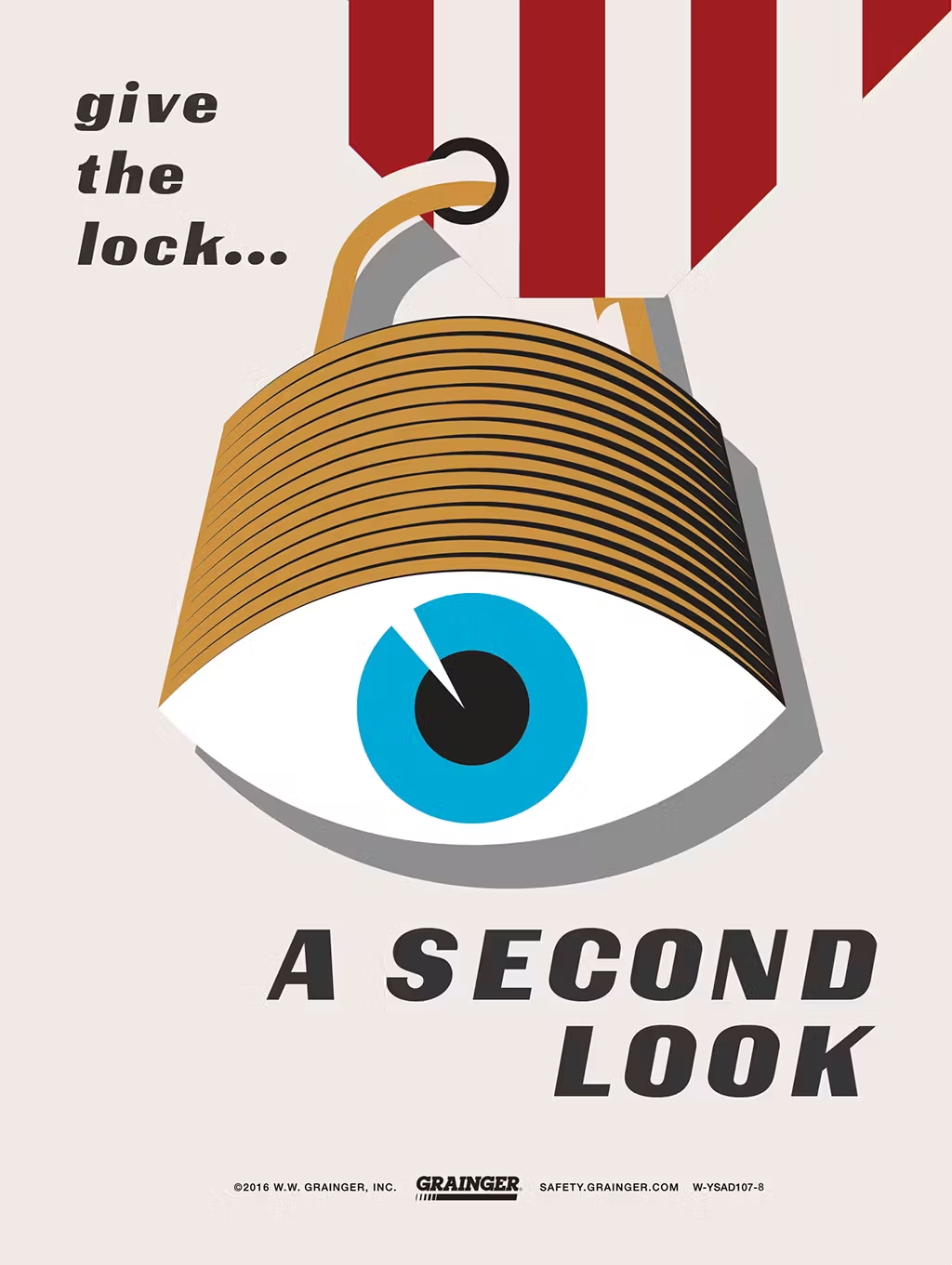
I was visiting a customer of ours in Denver this week. They’re an HVAC contractor and we were camped out in one of their conference rooms where they teach their service technicians. On the walls, among posters of air conditioning diagrams were a couple of safety posters. At first glance they look like they’re from the 1950s and ’60s, but upon closer inspection, they’re from 2016! The only credit I can find on the internet is the copywriter, John Wrend.

Sadly, the original microsite where Grainger had these posters is gone, but I managed to track down the full set.

Illustration of a padlock shaped like a human eye with text that reads “give the lock… A SECOND LOOK,” promoting safety awareness from Grainger.

The New FOX Sports Scorebug

I was sitting on a barstool next to my wife in a packed restaurant in Little Italy. We were the lone Kansas City Chiefs supporters in a nest full of hipster Philadelphia Eagles fans. After Jon Batiste finished his fantastic rendition of the national anthem, and the teams took the field for kickoff, I noticed something. The scorebug—the broadcast industry’s term for the lower-third or chyron graphic at the bottom of the screen—was different, and in a good way.

A Bluesky post praising the minimalistic Super Bowl lower-thirds, with a photo of a TV showing the Chiefs vs. Eagles game and sleek on-screen graphics.

posted about it seven minutes into the first quarter, saying I appreciated “the minimalistic lower-thirds for this Super Bowl broadcast.” It was indeed refreshing, a break from the over-the-top 3D-animated sparkling. I thought the graphics were clear and utilitarian while being exquisitely-designed. They weren’t distracting from the action. As with any good interface design, this new scorebug kept the focus on the players and the game, not itself. I also thought they were a long-delayed response to Apple’s Friday Night Baseball scorebug.

The Story Before the Story

James Poniewozik, writing for The New York Times:

Whether they work in sand or spores, heavy-handed metaphor is the true material of choice for all these opening titles. The series are different in genres and tone. But all of them seem to have collectively decided that the best way to convey the sense of epic event TV is with an overture of shape-shifting, literal-minded screen-saver art.

His point is that a recent trend in “prestige TV” main titles is to use particle effects. Particle effects—if you don’t know—are simulations in 3D software that produce, well, particles that can be affected by gravity, wind, and each other—essentially physics. Particles can be styled to look like snow, rain, smoke, fireworks, flower petals, water (yes, water is just particles; see this excellent video from Corridor Digital), or even Mordor’s orc hoards. This functionality has been in After Effects for decades in 2D but has been making its way into 3D packages like Cinema 4D and Blender. There’s a very popular program now called Houdini, which does particle systems and other simulations really well. My theory is that because particle effects are simpler to produce and workstations with GPUs are cheaper and easier to come by, these effects are simply more within reach. They certainly look expensive.

I’ve had Matthew Butterick’s Practical Typography website/ebook bookmarked since I discovered it over ten years ago. It’s making the rounds again, and I think it’s a good reminder that we are all “professional writers” as he describes:

When we think of “professional writers” we probably think of novelists, screenwriters, or journalists. But the programmer, the scientist, the lawyer—and you, if your work depends on presenting written ideas—all deserve to be called professional writers.

But as professional writers, we do more than write. We edit, we format, we print, we generate PDFs, we make web pages. More than ever, we’re responsible for delivering the written word to our readers. So we’re not just writers—we’re publishers.

Typography is the visual component of the written word. Thus, being a publisher of the written word necessarily means being a typographer.

He’s right. As much of our work is in producing documents and content, we are publishers. Here are a few of my favorite pages:

This book reminds me of a couple of seminal books from the early 1990s: The Mac Is Not a Typewriter by Robin Williams and Stop Stealing Sheep by Erik Spiekermann and E. M. Ginger. The former is how I learned all the basics, back when I was designing my high school’s newspaper. The latter is more comprehensive, going deeper into how type works conceptually. These three are all essential resources for any designer.

Butterick’s Practical Typography

Butterick’s Practical Typography

Typography is the visual component of the written word. Thus, being a publisher of the written word necessarily means being a typographer.

practicaltypography.com iconpracticaltypography.com
A stylized digital illustration of a person reclining in an Eames lounge chair and ottoman, rendered in a neon-noir style with deep blues and bright coral red accents. The person is shown in profile, wearing glasses and holding what appears to be a device or notebook. The scene includes abstract geometric lines cutting across the composition and a potted plant in the background. The lighting creates dramatic shadows and highlights, giving the illustration a modern, cyberpunk aesthetic.

Design’s Purpose Remains Constant

Fabricio Teixeira and Caio Braga, in their annual The State of UX report:

Despite all the transformations we’re seeing, one thing we know for sure: Design (the craft, the discipline, the science) is not going anywhere. While Design only became a more official profession in the 19th century, the study of how craft can be applied to improve business dates back to the early 1800s. Since then, only one thing has remained constant: how Design is done is completely different decade after decade. The change we’re discussing here is not a revolution, just an evolution. It’s simply a change in how many roles will be needed and what they will entail. “Digital systems, not people, will do much of the craft of (screen-level) interaction design.”

Scary words for the UX design profession as it stares down the coming onslaught of AI. Our industry isn’t the first one to face this—copywriters, illustrators, and stock photographers have already been facing the disruption of their respective crafts. All of these creatives have had to pivot quickly. And so will we.

Poster of Donald Trump as a false god with the phrase FALSE GOD

Trump: False God

Update: A 18” x 24” screenprinted version of this poster is now available at my Etsy shop.

Golden bust of Donald Trump

Michael C. Bender, writing for the Wall Street Journal in early September 2019:

[Trump rally regulars] describe, in different ways, a euphoric flow of emotions between themselves and the president, a sort of adrenaline-fueled, psychic cleansing that follows 90 minutes of chanting and cheering with 15,000 other like-minded Trump junkies.

“Once you start going, it’s kind of like an addiction, honestly,” said April Owens, a 49-year-old financial manager in Kingsport, Tenn., who has been to 11 rallies. “I love the energy. I wouldn’t stand in line for 26 hours to see any rock band. He’s the only person I would do this for, and I’ll be here as many times as I can.”

Sixteen months before the insurrection at the United States Capitol on January 6, 2021, Donald Trump was already in the midst of touring the southeastern US, holding rallies to support his 2020 re-election bid. During his initial run for the 2016 election, he held 323 rallies, creating a wake of fans who held onto every one of his words, whether by speech, interview, or tweet. Some diehards would even follow him across the country like deadheads following The Grateful Dead, attending dozens of rallies.