Skip to content
1 min read

Remember the Nineties?

In the 1980s and ’90s, Emigre was a prolific powerhouse. The company started out as a magazine in the mid-1980s, but quickly became a type foundry as the Mac enabled desktop publishing. As a young designer in San Francisco who started out in the ’90s, Zuzana Licko and Rudy VanderLans were local heroes (they were based across the Bay in Berkeley). From 1990–1999 they churned out 37 typefaces for a total of 157 fonts. And in that decade, they expanded their influence by getting into music, artists book publishing, and apparel. More than any other design brand, they celebrated art and artists.

Here is a page from a just-released booklet (with a free downloadable PDF) showcasing their fonts from the Nineties.

Two-page yellow spread featuring bold black typography samples. Left page shows “NINE INCH NAILS” in Platelet Heavy, “majorly” in Venus Dioxide Outlined, both dated 1993. Right page shows “Reality Bites” in Venus Dioxide, a black abstract shape below labeled Fellaparts, also from 1993.

Retro Safety

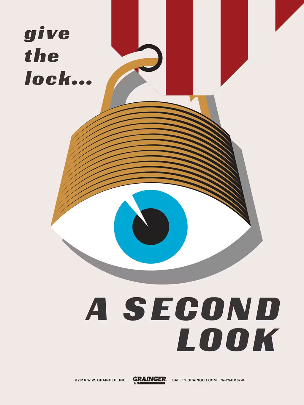
I was visiting a customer of ours in Denver this week. They’re an HVAC contractor and we were camped out in one of their conference rooms where they teach their service technicians. On the walls, among posters of air conditioning diagrams were a couple of safety posters. At first glance they look like they’re from the 1950s and ’60s, but upon closer inspection, they’re from 2016! The only credit I can find on the internet is the copywriter, John Wrend.

Sadly, the original microsite where Grainger had these posters is gone, but I managed to track down the full set.

Illustration of a padlock shaped like a human eye with text that reads “give the lock… A SECOND LOOK,” promoting safety awareness from Grainger.

Illustration of an injured construction worker emerging from unstable scaffolding, with text reading “Make sure it’s SECURE” and “Scaffolding safety starts with you!” promoting workplace safety from Grainger.

Silhouette of a hard hat filled with workers using ladders, accompanied by the text “KEEP LADDER SAFETY TOP OF MIND,” promoting safe ladder practices from Grainger.

Cartoon-style illustration of a person getting their arm caught in a machine with the guard removed, alongside the text “DON’T LET YOUR MACHINE GUARD DOWN,” promoting machine safety from Grainger.

Worker in full arc flash protective gear stands in front of a red-orange explosion graphic, with bold text reading “Arc flashes kill” and a warning to stay prepared, promoting electrical safety from Grainger.

Illustration of a shocked electrical outlet with a zigzagging yellow wire above it and the text “Using the wrong wires can be SHOCKING,” promoting electrical wiring safety from Grainger.

Painterly illustration of a confident construction worker wearing a full-body safety harness with the text “Don it Properly!” promoting proper fall protection from Grainger.

Cartoon-style illustration of a distracted forklift driver on a phone causing falling boxes and a spilled drink, with the text “FOCUSED DRIVERS ARE SAFE DRIVERS,” promoting powered truck safety from Grainger.

Stylized illustration of a person wearing a yellow respirator mask with the text “WEAR YOUR RESPIRATOR! AND BREATHE EASY,” promoting respiratory safety from Grainger.

Retro-style poster featuring a surprised man’s face with the text “IGNORE HAZARDS, INVITE HAZCOM” above various hazardous chemical containers, promoting hazard communication safety from Grainger.

Closeup of a man with glasses, with code being reflected in the glasses

From Craft to Curation: Design Leadership in the Age of AI

In a recent podcast with partners at startup incubator Y Combinator, Jared Friedman, citing statistics from a survey with their current batch of founders says, “[The] crazy thing is one quarter of the founders said that more than 95% of their code base was AI generated, which is like an insane statistic. And it’s not like we funded a bunch of non-technical founders. Like every one of these people is highly tactical, completely capable of building their own product from scratch a year ago…”

A comment they shared from founder Leo Paz reads, “I think the role of Software Engineer will transition to Product Engineer. Human taste is now more important than ever as codegen tools make everyone a 10x engineer.”

Still from a YouTube video that shows a quote from Leo Paz

While vibe coding—the new term coined by Andrej Karpathy about coding by directing AI—is about leveraging AI for programming, it’s a window into what will happen to the software development lifecycle as a whole and how all the disciplines, including product management and design will be affected.

A skill inversion trend is happening. Being great at execution is becoming less valuable when AI tools can generate deliverables in seconds. Instead, our value as product professionals is shifting from mastering tools like Figma or languages like JavaScript, to strategic direction. We’re moving from the how to the what and why; from craft to curation. As Leo Paz says, “human taste is now more important than ever.”

The Traditional Value Hierarchy

The industry has been used to the model of unified teams for software development for the last 15–20 years. Product managers define requirements, manage the roadmap, and align stakeholders. Designers focus on the user interface, ensure visual appeal and usability, and prototype solutions. Engineers design the system architecture and then build the application via quality code.

For each of the core disciplines, execution was paramount. (Arguably, product management has always been more strategic, save for ticket writing.) Screens must be pixel-perfect and code must be efficient and bug-free.

The Forces Driving Inversion

Vibe Coding and Vibe Design

With new AI tools like Cursor and Lovable coming into the mix, the nature of implementation fundamentally changes. In Karpathy’s tweet about vibe coding, he says, “…I just see stuff, say stuff, run stuff, and copy paste stuff, and it mostly works.” He’s telling the LLM what he wants—his intent—and the AI delivers, with some cajoling. Jakob Nielsen picks up on this thread and applies it to vibe design. “Vibe design applies similar AI-assisted principles to UX design and user research, by focusing on high-level intent while delegating execution to AI.”

He goes on:

…vibe design emphasizes describing the desired feeling or outcome of a design, and letting AI propose the visual or interactive solutions​. Rather than manually drawing every element, a designer might say to an AI tool, “The interface feels a bit too formal; make it more playful and engaging,” and the AI could suggest color changes, typography tweaks, or animation accents to achieve that vibe. This is analogous to vibe coding’s natural language prompts, except the AI’s output is a design mockup or updated UI style instead of code.

This sounds very much like creative direction to me. It’s shaping the software. It’s using human taste to make it better.

Acceleration of Development Cycles

The founder of TrainLoop also says in the YC survey that his coding has sped up one-hundred-fold since six months ago. He says, “I’m no longer an engineer. I’m a product person.”

This means that experimentation is practically free. What’s the best way of creating a revenue forecasting tool? You can whip up three prototypes in about 10 minutes using Lovable and then get them in front of users. Of course, designers have always had the power to explore and create variations for an interface. But to have three functioning prototypes in 10 minutes? Impossible.

With this new-found coding superpower, the idea of bespoke, personal software is starting to take off. Non-coders like The New York Times’ Kevin Roose are using AI to create apps just for themselves, like an app that recommends what to pack his son for lunch based on the contents of his fridge. This is an evolution of the low-code/no-code movement of recent years. The gap between idea to reality is literally 10 minutes.

Democratization of Creation

Designer Tommy Geoco has a running series on his YouTube channel called “Build Wars” where he invites a couple of designers to battle head-to-head on the same assignment. In a livestream in late February, he and his cohosts had a professional web designer Brett Williams square off against 19 year-old Lovable marketer Henrik Westerlund. Their assignment was to build a landing page for a robotics company in 45 minutes, and they would be judged on design quality, execution quality, interactive quality, and strategic approach.

Play

Forty-five minutes to design and build a cohesive landing page is not enough time. Similar to TV cooking competitions, this artificial time constraint forced the two competitors to focus on what mattered and to use their time strategically. In the end, the professional designer won, but the commentators were impressed by how much a young marketer with little design experience could accomplish with AI tools in such a short time, suggesting a fundamental shift in how websites may be created in the future.

Cohost Tom Johnson suggested that small teams using AI tools will outcompete enterprises resistant to adopt them, “Teams that are pushing back on these new AI tools… get real… this is the way that things are going to go. You’re going to get destroyed by a team of 10 or five or one.”

The Maturation Cycle of Specialized Skills

“UX and UX people used to be special, but now we have become normal,” says Jakob Nielsen in a recent article about the decline of ROI from UX work. For enterprises, product or user experience design is now baseline. AI will dramatically increase the chances that young startups, too, will employ UX best practices.

Obviously, with AI, engineering is more accessible, but so are traditional product management processes. ChatGPT can write a pretty good PRD. Dovetail’s AI-powered insights supercharges customer discovery. And yes, why not use ChatGPT to write user stories and Jira tickets?

The New Value Hierarchy

From Technical Execution to Strategic Direction & Taste Curation

In the AI-augmented product development landscape, articulating vision and intent becomes significantly more valuable than implementation skills. While AI can generate better and better code and design assets, it can’t determine what is worth building or why.

Mike Krieger, cofounder of Instagram and now Chief Product Officer at Anthropic, identifies this change clearly. He believes the true bottleneck in product development is shifting to “alignment, deciding what to build, solving real user problems, and figuring out a cohesive product strategy.” These are all areas he describes as “very human problems” that we’re “at least three years away from models solving.”

This makes taste and judgement even more important. When everyone can generate good-enough, decent work via AI, having a strong point of view becomes a differentiator. To repeat Leo Paz, “Human taste is now more important than ever as codegen tools make everyone a 10x engineer.” The ability to recognize and curate quality outputs becomes as valuable as creating them manually.

This transformation manifests differently across disciplines but follows the same pattern:

  • Product managers shift from writing detailed requirements to articulating problems worth solving and recognizing valuable solutions
  • Designers transition from pixel-level execution to providing creative direction that guides AI-generated outputs
  • Engineers evolve from writing every line of code to focusing on architecture, quality standards, and system design Each role maintains its core focus while delegating much of the execution to AI tools. The skill becomes knowing what to ask for rather than how to build it—a fundamental reorientation of professional value.

From Process Execution to User Understanding

In a scene from the film "Blade Runner," replicant Leon Kowalski can't quite understand how to respond to the situation about the incapacitated tortoise.

In a scene from the film Blade Runner, replicant Leon Kowalski can’t quite understand how to respond to the situation about the incapacitated tortoise.

While AI is great at summarizing mountains of text, it can’t yet replicate human empathy or understand nuanced user needs. The human ability to interpret context, detect unstated problems, and understand emotional responses remains irreplaceable.

Nielsen emphasizes this point when discussing vibe coding and design: “Building the right product remains a human responsibility, in terms of understanding user needs, prioritizing features, and crafting a great user experience.” Even as AI handles more implementation, the work of understanding what users need remains distinctly human.

Research methodologies are evolving to leverage AI’s capabilities while maintaining human insight:

  • AI tools can process and analyze massive amounts of user feedback
  • Platforms like Dovetail now offer AI-powered insights from user research
  • However, interpreting this data and identifying meaningful patterns still requires human judgment

The gap between what users say they want and what they actually need remains a space where human intuition and empathy create tremendous value. Those who excel at extracting these insights will become increasingly valuable as AI handles more of the execution.

From Specialized to Cross-Functional

The traditional boundaries between product disciplines are blurring as AI lowers the barriers between the specialized areas of expertise. This transformation is enabling more fluid, cross-functional files and changing how teams collaborate.

The aforementioned YC podcast highlights this evolution with Leo Paz’s observation that software engineers will become product engineers. The YC founders who are using AI-generated code are already reaping the benefits. They act more like product people and talk to more customers so they can understand them better and build better products.

Concrete examples of this cross-functionality are already emerging:

  • Designers can now generate functional prototypes without developer assistance using tools like Lovable
  • Product managers can create basic UI mockups to communicate their ideas more effectively
  • Engineers can make design adjustments directly rather than waiting for design handoffs

This doesn’t mean that all specialization disappears. As Diana Hu from YC notes:

Zero-to-one will be great for vibe coding where founders can ship features very quickly. But once they hit product market fit, they’re still going to have a lot of really hardcore systems engineering, where you need to get from the one to n and you need to hire very different kinds of people.

The result is a more nuanced specialization landscape. Early-stage products benefit from generalists who can work across domains with AI assistance. As products mature, deeper expertise remains valuable but is focused on different aspects: system architecture rather than implementation details, information architecture rather than UI production, product strategy rather than feature specification.

Team structures are evolving in response:

  • Smaller, more fluid teams with less rigid role definitions
  • T-shaped skills becoming increasingly valuable—depth in one area with breadth across others
  • New collaboration models replacing traditional waterfall handoffs
  • Emerging hybrid roles that combine traditionally separate domains

The most competitive teams will find the right balance between AI capabilities and human direction, creating new workflows that leverage both. As Johnson warned in the Build Wars competition, “Teams that are pushing back on these new AI tools, get real! This is the way that things are going to go. You’re going to get destroyed by a team of 10 or five or one.”

The ability to adapt across domains is becoming a meta-skill in itself. Those who can navigate multiple disciplines while maintaining a consistent vision will thrive in this new environment where execution is increasingly delegated to artificial intelligence.

Thriving in the Inverted Landscape

The future is already here. AI is fundamentally inverting the skill hierarchy in product development, creating opportunities for those willing to adapt.

Product professionals who succeed in this new landscape will be those who embrace this inversion rather than resist it. This means focusing less on execution mechanics and more on the strategic and human elements that AI cannot replicate: vision, judgment, and taste.

For product managers, double down on developing the abilities to extract profound insights from user conversations and articulate clear, compelling problem statements. Your value will increasingly come from knowing which problems are worth solving rather than specifying how to solve them. AI also can’t align stakeholders and prioritize the work.

For designers, invest in strengthening your design direction skills. The best designers will evolve from skilled craftspeople to visionaries who can guide AI toward creating experiences that resonate emotionally with users. Develop your critical eye and the language to articulate what makes a design succeed or fail. Remember that design has always been about the why.

For engineers, emphasize systems thinking and architecture over implementation details. Your unique value will come from designing resilient, scalable systems and making critical technical decisions that AI cannot yet make autonomously.

Across all roles, three meta-skills will differentiate the exceptional from the merely competent:

  • Prompt engineering: The ability to effectively direct AI tools
  • Judgment and taste development: The discernment to recognize quality and make value-based decisions
  • Cross-functional fluency: The capacity to work effectively across traditional role boundaries

We’re seeing the biggest shift in how we build products since agile came along. Teams are getting smaller and more flexible. Specialized roles are blurring together. And product cycles that used to take months now take days.

There is a silver lining. We can finally focus on what actually matters: solving real problems for real people. By letting AI handle the grunt work, we can spend our time understanding users better and creating things that genuinely improve their lives.

Companies that get this shift will win big. Those that reorganize around these new realities first will pull ahead. But don’t wait too long—as Nielsen points out, this “land grab” won’t last forever. Soon enough, everyone will be working this way.

The future belongs to people who can set the vision and direct AI to make it happen, not those hanging onto skills that AI is rapidly taking over. Now’s the time to level up how you think about products, not just how you build them. In this new world, your strategic thinking and taste matter more than your execution skills.

A screenshot of the YourOutie.is website showing the Lumon logo at the top with the title "Outie Query System Interface (OQSI)" beneath it. The interface has a minimalist white card on a blue background with small digital patterns. The card contains text that reads "Describe your Innie to learn about your Outie" and a black "Get Started" button. The design mimics the retro-corporate aesthetic of the TV show Severance.

Your Outie Has Both Zaz and Pep: Building YourOutie.is with AI

A tall man with curly, graying hair and a bushy mustache sits across from a woman with a very slight smile in a dimly lit room. There’s pleasant, calming music playing. He’s eager with anticipation to learn about his Outie. He’s an Innie who works on the “severed” floor at Lumon. He’s undergone a surgical procedure that splits his work self from his personal self. This is the premise of the show Severance on Apple TV+.

Ms. Casey, the therapist:

All right, Irving. What I’d like to do is share with you some facts about your Outie. Because your Outie is an exemplary person, these facts should be very pleasing. Just relax your body and be open to the facts. Try to enjoy each equally. These facts are not to be shared outside this room. But for now, they’re yours to enjoy.

Your Outie is generous. Your Outie is fond of music and owns many records. Your Outie is a friend to children and to the elderly and the insane. Your Outie is strong and helped someone lift a heavy object. Your Outie attends many dances and is popular among the other attendees. Your Outie likes films and owns a machine that can play them. Your Outie is splendid and can swim gracefully and well.

The scene is from season one, episode two, called “Half Loop.” With season two wrapping up, and with my work colleagues constantly making “my Outie” jokes, I wondered if there was a Your Outie generator. Not really. There’s this meme generator from imgflip, but that’s about it.

Screenshot of the Your Outie meme generator from imgflip.

So, in the tradition of name generator sites like Fantasy Name Generators (you know, for DnD), I decided to make my own using an LLM to generate the wellness facts.

The resulting website took four-and-a-half days. I started Monday evening and launched it by dinner time Friday. All totaled, it was about 20 hours of work. Apologies to my wife, to whom I barely spoke while I was in the zone with my creative obsession.

Lumon Outie Query System Interface (OQSI)

Lumon Outie Query System Interface (OQSI)

Your Outie started with a proof-of-concept.

I started with a proof-of-concept using Claude. I gathered information about the show and all the official Your Outie wellness facts from the fantastic Severance Wiki and attached them to this prompt:

I would like to create a “Wellness Fact” generator based on the “Your Outie is…” format from the character Ms. Casey. Question: What questions should we ask the user in order to create responses that are humorous and unique? These need to be very basic questions, potentially from predefined dropdowns.

Claude’s response made me realize that asking about the real person was the wrong way to go. It felt too generic. Then I wondered, what if we just had the user role-play as their Innie?

The prototype was good and showed how fun this little novelty could be. So I decided to put my other side-project on hold for a bit—I’ve been working on redesigning this site—and make a run at creating this.

Screenshot of Claude with the chat on the left and the prototype on the right. The prototype is a basic form with dropdowns for Innie traits.

Your Outie developed the API first but never used it.

My first solution was to create a Python API with a Next.js frontend. With my experience building AI-powered software, I knew that Python was the preferred method for working with LLMs. I also used LangChain so that I could have optionality with foundational models. I took the TypeScript code from Claude and asked Cursor to use Python and LangChain to develop the API. Before long, I had a working backend.

One interesting problem I ran into was that the facts from GPT often came back very similar to each other. So, I added code to categorize each fact and prevent dupes. Tweaking the prompt also yielded better-written results.

Additionally, I tried all the available models—except for the reasoning ones like o1. OpenAI’s GPT-4o-mini seemed to strike a good balance.

This was Monday evening.

Honestly, this was very trivial to do. Cursor plus Python LangChain made it easy. 172 lines of code. Boom.

I would later regret choosing Python, however.

Your Outie designed the website in Figma but only the first couple of screens.

Now the fun part was coming up with the design. There were many possibilities. I could riff on the computer terminals on the severed floor like the macrodata refinement game. I could emulate 1970s and ’80s corporate design like Mr. Milchick’s performance review report.

Screenshot of an old CRT monitor with a grid of numbers. Some of these numbers are captured into a box on the bottom of the screen.

The official macrodata refinement game from Apple.

Still from the show of the character Seth Milchick's performance review report.

Seth Milchick receives his first performance review in this report.

I ended up with the latter, but as I started designing, I realized I could incorporate a little early Macintosh vibe. I began thinking of the website as a HyperCard stack. So I went with it.

I was anxious to build the frontend. I started a new Next.js project and fired up Cursor. I forwent a formal PRD and started vibe coding (ugh, I hate that term, more on this in an upcoming post). Using static mock data, I got the UI to a good place by the end of the evening—well, midnight—but there was still a lot of polishing to do.

This was Tuesday night.

Screenshot of the author's Figma canvas showing various screen designs and typographic explorations.

My Figma canvas showing some quick explorations.

Your Outie struggled bravely with Cursor and won.

Beyond the basic generator, I wanted to create something that had both zaz and pep. Recalling the eight-hour remix of the Severance theme by ODESZA, “Music to Refine To,” I decided to add a music player to the site. I found a few cool tracks on Epidemic Sound and tried building the player. I thought it would be easy, but Cursor and I struggled mightily for hours. Play/pause wouldn’t work. Autoplaying the next track wouldn’t work. Etc. Eventually, I cut my losses after figuring out at least play/pause and combined the tracks together into a long one. Six minutes should be long enough, right?

v0 helped with generating the code for the gradient background.

This is my ode to the Music Dance Experience (MDE) from season one. That was Wednesday.

Still from the show of two characters dancing in the middle of the office.

Your Outie reintegrated.

Thursday’s activity was integrating the backend with the frontend. Again, with Cursor, this was relatively straightforward. The API took the request from the frontend and provided a response. The frontend displayed it. I spent more time fine-tuning the animations and getting the mobile layout just right. You wouldn’t believe how much Cursor-wrangling I had to do to get the sliding animations and fades dialed in. I think this is where AI struggles—with the nuances.

By the end of the night, I had a nice working app. Now, I had to look for a host. Vercel doesn’t support Python. After researching Digital Ocean, I realized I would have to pay for two app servers: one for the Node.js frontend and another for the Python backend. That’s not too cost-effective for a silly site like this. Again, it was midnight, so I slept on it.

Your Outie once refactored code from Python to React in just one hour.

Still from the show of the main character, Mark S. staring at his computer monitor.

In the morning, I decided to refactor the API from Python to React. LangChain has a JavaScript version, so I asked Cursor to translate the original Python code. The translation wasn’t as smooth as I had hoped. Again, it missed many of the details that I spent time putting into the original prompt and logic. But a few more chats later, the translation was completed, and now the app was all in React.

Between the end of my work day and dinner on Friday, I finished the final touchups on the site: removing debugging console messages, rewriting error messages to be more Severance-like, and making sure there were no layout bugs.

I had to fix a few more build errors and used Claude Code. It seemed a lot easier than sitting there and going back and forth with Cursor.

Then, I connected my repo to Vercel, and voila! The Lumon Outie Query System Interface (OQSI) was live at YourOutie.is.

I hope you enjoy it as much as I had fun making it. Now, I think I owe my wife some flowers and a date night.

A cut-up Sonos speaker against a backdrop of cassette tapes

When the Music Stopped: Inside the Sonos App Disaster

The fall of Sonos isn’t as simple as a botched app redesign. Instead, it is the cumulative result of poor strategy, hubris, and forgetting the company’s core value proposition. To recap, Sonos rolled out a new mobile app in May 2024, promising “an unprecedented streaming experience.” Instead, it was a severely handicapped app, missing core features and broke users’ systems. By January 2025, that failed launch wiped nearly $500 million from the company’s market value and cost CEO Patrick Spence his job.

What happened? Why did Sonos go backwards on accessibility? Why did the company remove features like sleep timers and queue management? Immediately after the rollout, the backlash began to snowball into a major crisis.

A collage of torn newspaper-style headlines from Bloomberg, Wired, and The Verge, all criticizing the new Sonos app. Bloomberg’s headline states, “The Volume of Sonos Complaints Is Deafening,” mentioning customer frustration and stock decline. Wired’s headline reads, “Many People Do Not Like the New Sonos App.” The Verge’s article, titled “The new Sonos app is missing a lot of features, and people aren’t happy,” highlights missing features despite increased speed and customization.

As a designer and longtime Sonos customer who was also affected by the terrible new app, a little piece of me died inside each time I read the word “redesign.” It was hard not to take it personally, knowing that my profession could have anything to do with how things turned out. Was it really Design’s fault?

Even after devouring dozens of news articles, social media posts, and company statements, I couldn’t get a clear picture of why the company made the decisions it did. I cast a net on LinkedIn, reaching out to current and former designers who worked at Sonos. This story is based on hours of conversations between several employees and me. They only agreed to talk on the condition of anonymity. I’ve also added context from public reporting.

The shape of the story isn’t much different than what’s been reported publicly. However, the inner mechanics of how those missteps happened are educational. The Sonos tale illustrates the broader challenges that most companies face as they grow and evolve. How do you modernize aging technology without breaking what works? How do public company pressures affect product decisions? And most importantly, how do organizations maintain their core values and user focus as they scale?

It Just Works

Whenever I moved into a new home, I used to always set up the audio system first. Speaker cable had to be routed under the carpet, along the baseboard, or through walls and floors. To get speakers in the right place, cable management was always a challenge, especially with a surround setup. Then Sonos came along and said, “Wires? We don’t need no stinking wires.” (OK, so they didn’t really say that. Their first wireless speaker, the PLAY:5, was launched in late 2009.)

I purchased my first pair of Sonos speakers over ten years ago. I had recently moved into a modest one-bedroom apartment in Venice, and I liked the idea of hearing my music throughout the place. Instead of running cables, setting up the two PLAY:1 speakers was simple. At the time, you had to plug into Ethernet for the setup and keep at least one component hardwired in. But once that was done, adding the other speaker was easy.

The best technology is often invisible. It turns out that making it work this well wasn’t easy. According to their own history page, in its early days, the company made the difficult decision to build a distributed system where speakers could communicate directly with each other, rather than relying on central control. It was a more complex technical path, but one that delivered a far better user experience. The founding team spent months perfecting their mesh networking technology, writing custom Linux drivers, and ensuring their speakers would stay perfectly synced when playing music.

A network architecture diagram for a Sonos audio system, showing Zone Players, speakers, a home network, and various audio sources like a computer, MP3 store, CD player, and internet connectivity. The diagram includes wired and wireless connections, a WiFi handheld controller, and a legend explaining connection types. Handwritten notes describe the Zone Player’s ability to play, fetch, and store MP3 files for playback across multiple zones. Some elements, such as source converters, are crossed out.

As a new Sonos owner, a concept that was a little challenging to wrap my head around was that the speaker is the player. Instead of casting music from my phone or computer to the speaker, the speaker itself streamed the music from my network-attached storage (NAS, aka a server) or streaming services like Pandora or Spotify.

One of my sources told me about the “beer test” they had at Sonos. If you’re having a house party and run out of beer, you could leave the house without stopping the music. This is a core Sonos value proposition.

A Rat’s Nest: The Weight of Tech Debt

The original Sonos technology stack, built carefully and methodically in the early 2000s, had served the company well. Its products always passed the beer test. However, two decades later, the company’s software infrastructure became increasingly difficult to maintain and update. According to one of my sources, who worked extensively on the platform, the codebase had become a “rat’s nest,” making even simple changes hugely challenging.

The tech debt had been accumulating for years. While Sonos continued adding features like Bluetooth playback and expanding its product line, the underlying architecture remained largely unchanged. The breaking point came with the development of the Sonos Ace headphones. This major new product category required significant changes to how the Sonos app handled device control and audio streaming.

Rather than tackle this technical debt incrementally, Sonos chose to completely rewrite its mobile app. This “clean slate” approach was seen as the fastest way to modernize the platform. But as many developers know, complete refactors are notoriously risky. And unlike in its early days, when the company would delay launches to get things right—famously once stopping production lines over a glue issue—this time Sonos seemed determined to push forward regardless of quality concerns.

Set Up for Failure

The rewrite project began around 2022 and would span approximately two years. The team did many things right initially—spending a year and a half conducting rigorous user testing and building functional prototypes using SwiftUI. According to my sources, these prototypes and tests validated their direction—the new design was a clear improvement over the current experience. The problem wasn’t the vision. It was execution.

A wave of new product managers, brought in around this time, were eager to make their mark but lacked deep knowledge of Sonos’s ecosystem. One designer noted it was “the opposite of normal feature creep”—while product designers typically push for more features, in this case they were the ones advocating for focusing on the basics.

As a product designer, this role reversal is particularly telling. Typically in a product org, designers advocate for new features and enhancements, while PMs act as a check on scope creep, ensuring we stay focused on shipping. When this dynamic inverts—when designers become the conservative voice arguing for stability and basic functionality—it’s a major red flag. It’s like architects pleading to fix the foundation while the clients want to add a third story. The fact that Sonos’s designers were raising these alarms, only to be overruled, speaks volumes about the company’s shifting priorities.

The situation became more complicated when the app refactor project, codenamed Passport, was coupled to the hardware launch schedule for the Ace headphones. One of my sources described this coupling of hardware and software releases as “the Achilles heel” of the entire project. With the Ace’s launch date set in stone, the software team faced immovable deadlines for what should have been a more flexible development timeline. This decision and many others, according to another source, were made behind closed doors, with individual contributors being told what to do without room for discussion. This left experienced team members feeling voiceless in crucial technical and product decisions. All that careful research and testing began to unravel as teams rushed to meet the hardware schedule.

This misalignment between product management and design was further complicated by organizational changes in the months leading up to launch. First, Sonos laid off many members of its forward-thinking teams. Then, closer to launch, another round of cuts significantly impacted QA and user research staff. The remaining teams were stretched thin, simultaneously maintaining the existing S2 app while building its replacement. The combination of a growing backlog from years prior and diminished testing resources created a perfect storm.

Feeding Wall Street

A data-driven slide showing Sonos’ customer base growth and revenue opportunities. It highlights increasing product registrations, growth in multi-product households, and a potential >$6 billion revenue opportunity by converting single-product households to multi-product ones.

Measurement myopia can lead to unintended consequences. When Sonos became public in 2018, three metrics the company reported to Wall Street were products registered, Sonos households, and products per household. Requiring customers to register their products is easy enough for a stationary WiFi-connected speaker. But it’s a different issue when it’s a portable one like the Sonos Roam when it’ll be used primarily as a Bluetooth speaker. When my daughter moved into the dorms at UCLA two years ago, I bought her a Roam. But because of Sonos’ quarterly financial reporting and the necessity to tabulate product registrations and new households, her Bluetooth speaker was a paperweight until she came home for Christmas. The speaker required WiFi connectivity and account creation for initial setup, but the university’s network security prevented the required initial WiFi connection.

The Content Distraction

A promotional image for Sonos Radio, featuring bold white text over a red, semi-transparent square with a bubbly texture. The background shows a tattooed woman wearing a translucent green top, holding a patterned ceramic mug. Below the main text, a caption reads “Now Playing – Indie Gold”, with a play button icon beneath it. The Sonos logo is positioned vertically on the right side.

Perhaps the most egregious example of misplaced priorities, driven by the need to show revenue growth, was Sonos’ investment into content features. Sonos Radio launched in April 2020 as a complimentary service for owners. An HD, ad-free paid tier launched later in the same year. Clearly, the thirst to generate another revenue stream, especially a monthly recurring one, was the impetus behind Sonos Radio. Customers thought of Sonos as a hardware company, not a content one.

At the time of the Sonos Radio HD launch, “Beagle” a user in Sonos’ community forums, wrote (emphasis mine):

I predicted a subscription service in a post a few months back. I think it’s the inevitable outcome of floating the company - they now have to demonstrate ways of increasing revenue streams for their shareholders. In the U.K the U.S ads from the free version seem bizarre and irrelevant.

If Sonos wish to commoditise streaming music that’s their business but I see nothing new or even as good as other available services. What really concerns me is if Sonos were to start “encouraging” (forcing) users to access their streams by removing Tunein etc from the app. I’m not trying to demonise Sonos, heaven knows I own enough of their products but I have a healthy scepticism when companies join an already crowded marketplace with less than stellar offerings. Currently I have a choice between Sonos Radio and Tunein versions of all the stations I wish to use. I’ve tried both and am now going to switch everything to Tunein. Should Sonos choose to “encourage” me to use their service that would be the end of my use of their products. That may sound dramatic and hopefully will prove unnecessary but corporate arm twisting is not for me.

My sources said the company started growing its content team, reflecting the belief that Sonos would become users’ primary way to discover and consume music. However, this strategy ignored a fundamental reality: Sonos would never be able to do Spotify better than Spotify or Apple Music better than Apple.

This split focus had real consequences. As the content team expanded, the small controls team struggled with a significant backlog of UX and tech debt, often diverted to other mandatory projects. For example, one employee mentioned that a common user fear was playing music in the wrong room. I can imagine the grief I’d get from my wife if I accidentally played my emo Death Cab For Cutie while she was listening to her Eckhart Tolle podcast in the other room. Dozens, if not hundreds of paper cuts like this remained unaddressed as resources went to building content discovery features that many users would never use. It’s evident that when buying a speaker, as a user, you want to be able to control it to play your music. It’s much less evident that you want to replace your Spotify with Sonos Radio.

But while old time customers like Beagle didn’t appreciate the addition of Sonos content, it’s not conclusive that it was a complete waste of time and effort. The last mention of Sonos Radio performance was in the Q4 2022 earnings call:

Sonos Radio has become the #1 most listened to service on Sonos, and accounted for nearly 30% of all listening.

The company has said it will break out the revenue from Sonos Radio when it becomes material. It has yet to do so in the four years since its release.

The Release Decision

Four screenshots of the Sonos app interface on a mobile device, displaying music playback, browsing, and system controls. The first screen shows the home screen with recently played albums, music services, and a playback bar. The second screen presents a search interface with Apple Music and Spotify options. The third screen displays the now-playing view with album art and playback controls. The fourth screen shows multi-room speaker controls with volume levels and playback status for different rooms.

As the launch date approached, concerns about readiness grew. According to my sources, experienced engineers and designers warned that the app wasn’t ready. Basic features were missing or unstable. The new cloud-based architecture was causing latency issues. But with the Ace launch looming and business pressures mounting, these warnings fell on deaf ears.

The aftermath was swift and severe. Like countless other users, I found myself struggling with an app that had suddenly become frustratingly sluggish. Basic features that had worked reliably for years became unpredictable. Speaker groups would randomly disconnect. Simple actions like adjusting volume now had noticeable delays. The UX was confusing. The elegant simplicity that had made Sonos special was gone.

Making matters worse, the company couldn’t simply roll back to the previous version. The new app’s architecture was fundamentally incompatible with the old one, and the cloud services had been updated to support the new system. Sonos was stuck trying to fix issues on the fly while customers grew increasingly frustrated.

Looking Forward

Since the PR disaster, the company has steadily improved the app. It even published a public Trello board to keep customers apprised of its progress, though progress seemed to stall at some point, and it has since been retired.

A Trello board titled “Sonos App Improvement & Bug Tracker” displaying various columns with updates on issues, roadmap items, upcoming features, recent fixes, and implemented solutions. Categories include system issues, volume responsiveness, music library performance, and accessibility improvements for the Sonos app.

Tom Conrad, cofounder of Pandora and a director on Sonos’s board, became the company’s interim CEO after Patrick Spence was discharged. Conrad addressed these issues head-on in his first letter to employees:

I think we’ll all agree that this year we’ve let far too many people down. As we’ve seen, getting some important things right (Arc Ultra and Ace are remarkable products!) is just not enough when our customers’ alarms don’t go off, their kids can’t hear their playlist during breakfast, their surrounds don’t fire, or they can’t pause the music in time to answer the buzzing doorbell.

Conrad signals that the company has already begun shifting resources back to core functionality, promising to “get back to the innovation that is at the heart of Sonos’s incredible history.” But rebuilding trust with customers will take time.

Since Conrad’s takeover, more top brass from Sonos left the company, including the chief product officer, the chief commercial officer, and the chief marketing officer.

Lessons for Product Teams

I admit that my original hypothesis in writing this piece was that B2C tech companies are less customer-oriented in their product management decisions than B2B firms. I think about the likes of Meta making product decisions to juice engagement. But in more conversations with PM friends and lurking in r/ProductManagement, that hypothesis is debunked. Sonos just ended making a bunch of poor decisions.

One designer noted that what happened at Sonos isn’t necessarily unique. Incentives, organizational structures, and inertia can all color decision-making at any company. As designers, product managers, and members of product teams, what can we learn from Sonos’s series of unfortunate events?

  1. Don’t let tech debt get out of control. Companies should not let technical debt accumulate until a complete rewrite becomes necessary. Instead, they need processes to modernize their code constantly.
  2. Protect core functionality. Maintaining core functionality must be prioritized over new features when modernizing platforms. After all, users care more about reliability than new fancy new capabilities. You simply can’t mess up what’s already working.
  3. Organizational memory matters. New leaders must understand and respect institutional knowledge about technology, products, and customers. Quick changes without deep understanding can be dangerous.
  4. Listen to the OG. When experienced team members raise concerns, those warnings deserve serious consideration.
  5. Align incentives with user needs. Organizations need to create systems and incentives that reward user-centric decision making. When the broader system prioritizes other metrics, even well-intentioned teams can drift away from user needs.

As a designer, I’m glad I now understand it wasn’t Design’s fault. In fact, the design team at Sonos tried to warn the powers-that-be about the impending disaster.

As a Sonos customer, I’m hopeful that Sonos will recover. I love their products—when they work. The company faces months of hard work to rebuild customer trust. For the broader tech industry, it is a reminder that even well-resourced companies can stumble when they lose sight of their core value proposition in pursuit of new initiatives.

As one of my sources reflected, the magic of Sonos was always in making complex technology invisible—you just wanted to play music, and it worked. Somewhere along the way, that simple truth got lost in the noise.


P.S. I wanted to acknowledge Michael Tsai’s excellent post on his blog about this fiasco. He’s been constantly updating it with new links from across the web. I read all of those sources when writing this post.

The New FOX Sports Scorebug

I was sitting on a barstool next to my wife in a packed restaurant in Little Italy. We were the lone Kansas City Chiefs supporters in a nest full of hipster Philadelphia Eagles fans. After Jon Batiste finished his fantastic rendition of the national anthem, and the teams took the field for kickoff, I noticed something. The scorebug—the broadcast industry’s term for the lower-third or chyron graphic at the bottom of the screen—was different, and in a good way.

A Bluesky post praising the minimalistic Super Bowl lower-thirds, with a photo of a TV showing the Chiefs vs. Eagles game and sleek on-screen graphics.

posted about it seven minutes into the first quarter, saying I appreciated “the minimalistic lower-thirds for this Super Bowl broadcast.” It was indeed refreshing, a break from the over-the-top 3D-animated sparkling. I thought the graphics were clear and utilitarian while being exquisitely-designed. They weren’t distracting from the action. As with any good interface design, this new scorebug kept the focus on the players and the game, not itself. I also thought they were a long-delayed response to Apple’s Friday Night Baseball scorebug.

New York Mets batter Brandon Nimmo at the plate, with a modern, minimalist Apple TV+ scorebug showing game stats.

Anyhow, as a man of good taste, John Gruber also noticed the excellence of the new graphics. Some of his followers, however, did not.

It looks as if they just let an intern knock something up in PowerPoint and didn’t bother having someone check it first. Awful. 👎

The scorebug is absolutely horrible! I really hope they don’t adopt this for the 2025 season, or I will riot. Horrible design and very distracting especially the score, this looks like something out of Fortnite.

Gruber has a wonderful and in-depth write-up about FOX Sports’ new NFL scorebug. Not only does it include a good design critique, but also a history lesson about the scorebug, which surprisingly, didn’t debut until 1994.

Until 1994, the networks would show the score and time remaining when they cut to a commercial break, and then show it again when they came back from commercials.

I had totally forgotten about that.

Empty stadium with FOX’s updated Super Bowl LIX scoreboard graphics displayed during a pre-game broadcast test.

Better look at the new scorebug displayed during a pre-game broadcast test.

Still from _The Brutalist_. An architect, holding a blueprint, is at the center of a group of people.

A Complete Obsession

My wife and I are big movie lovers. Every year, between January and March, we race to see all the Oscar-nominated films. We watched A Complete Unknown last night and The Brutalist a couple of weeks ago. The latter far outshines the former as a movie, but both share a common theme: the creative obsession.

Timothée Chalamet, as Bob Dylan, is up at all hours writing songs. Sometimes he rushes into his apartment, stumbling over furniture, holding onto an idea in his head, hoping it won’t flitter away, and frantically writes it down. Adrien Brody, playing a visionary architect named László Tóth, paces compulsively around the construction site of his latest project, ensuring everything is built to perfection. He even admonishes and tries to fire a young worker who’s just goofing off.

There is an all-consuming something that takes over your thoughts and actions when you’re in the groove willing something to life, whether it’s a song, building, design, or program. I’ve been feeling this way lately with a side project I’ve been working on off-hours—a web application that’s been consuming my thoughts for about a week. A lot of this obsession is a tenacity around solving a problem. For me, it has been fixing bugs in code—using Cursor AI. But in the past, it has been figuring out how to combine two disparate ideas into a succinct logo, or working out a user flow. These ideas come at all hours. Often for me it’s in the shower but sometimes right before going to sleep. Sometimes my brain works on a solution while I sleep, and I wake up with a revelation about a problem that seemed insurmountable the night before. It’s exhausting and exhilarating at the same time.

Still from "A Complete Unknown". Timothée Chalamet, as Bob Dylan, in the studio with his guitar.

If there’s one criticism I have about how Hollywood depicts creativity, it’s that the messiness doesn’t quite come through. Creative problem-solving is never a straight line. It is always a yarn ball path of twists, turns, small setbacks, and large breakthroughs. It includes exposing your nascent ideas to other people and hearing they’re shitty or brilliant, and going back to the drawing board or forging ahead. It also includes collaboration. Invention—especially in the professional setting—is no longer a solo act of a lone genius; it’s a group of people working on the same problem and each bringing their unique experiences, skills, and perspective.

I felt this visceral pull just weeks ago in Toronto. Standing at a whiteboard with my team of designers, each of us caught up in that same creative obsession—but now amplified by our collective energy. Together, we cracked a problem and planned an ambitious feature, and that’s the real story of creation. Not the solitary genius burning the midnight oil, but a group of passionate people bringing their best to the table, feeding off each other’s energy, and building something none of us could have made alone.

A stylized upside-down American flag overlaid with a faded, high-contrast portrait of Donald Trump displaying an angry expression. The image has a stark, glitch-art aesthetic with digital distortion effects.

Trump 2.0 Unleashed

For my mental health, I’ve been purposely avoiding the news since the 2024 presidential election. I mean, I haven’t been trying hard, but I’m certainly no longer the political news junkie I was leading up to November 5. However, I get exposed via two vectors: headlines in the New York Times app on my way to the Wordle and Connections, and on social media, specifically Threads and Bluesky. So, I’m not entirely oblivious.

As I slowly dip my toe into the news cycle, I have been reading and listening to a few long-form pieces. The first is the story of how Hitler destroyed the German democracy legally using the constitution in just 53 days.

Historian Timothy W. Ryback, writing for The Atlantic:

By January 1933, the fallibilities of the Weimar Republic—whose 181-article constitution framed the structures and processes for its 18 federated states—were as obvious as they were abundant. Having spent a decade in opposition politics, Hitler knew firsthand how easily an ambitious political agenda could be scuttled. He had been co-opting or crushing right-wing competitors and paralyzing legislative processes for years, and for the previous eight months, he had played obstructionist politics, helping to bring down three chancellors and twice forcing the president to dissolve the Reichstag and call for new elections. When he became chancellor himself, Hitler wanted to prevent others from doing unto him what he had done unto them.

That sets the scene. Rereading the article today, at the start of February, and at the end of Trump’s first two weeks in his second term, I find the similarities striking.

Ryback:

Hitler opened the meeting by boasting that millions of Germans had welcomed his chancellorship with “jubilation,” then outlined his plans for expunging key government officials and filling their positions with loyalists.

Trump won the 2024 election by just 1.5% in the popular vote. It is the “fifth smallest margin of victory in the thirty-two presidential races held since 1900,” according to the Council on Foreign Relations.

Dot chart comparing presidential popular vote percentages by party from 1940 to 2024, highlighting Trump’s narrow margin.

Within days of taking office, Trump is already remaking the Justice Department to his liking and installing loyalists.

Screenshot of two New York Times articles about Trump’s rapid reshuffling of leadership in the U.S. Justice Department.

Hitler appointed Hermann Göring to his cabinet and made him Prussia’s acting state interior minister.

“I cannot rely on police to go after the red mob if they have to worry about facing disciplinary action when they are simply doing their job,” Göring explained. He accorded them his personal backing to shoot with impunity. “When they shoot, it is me shooting,” Göring said. “When someone is lying there dead, it is I who shot them.”

Then, later in March, Hitler wiped the slates of his National Socialist supporters clean:

…an Article 48 decree was issued amnestying National Socialists convicted of crimes, including murder, perpetrated “in the battle for national renewal.” Men convicted of treason were now national heroes.

Upon taking office, Trump signed an executive order granting pardons and commutations for the January 6th rioters and murderers.

The similarities are uncanny.


A large part of what made Hitler’s dismantling of the Weimar Republic possible was because of the German Reichstag—their legislature. In a high-turnout election, Hitler’s Nazi party received 44 percent of the vote.

Although the National Socialists fell short of Hitler’s promised 51 percent, managing only 44 percent of the electorate—despite massive suppression, the Social Democrats lost just a single Reichstag seat—the banning of the Communist Party positioned Hitler to form a coalition with the two-thirds Reichstag majority necessary to pass the empowering law.

They took this as a mandate to storm government offices across the country, causing their political opponents to flee.

While Trump and his cronies haven’t exactly dissolved our Congress yet, it has already happened on the Republican side in a radical MAGA makeover.

Many Republican politicians have been primaried to their right and have lost. And now, with the wealthiest person in the world, Elon Musk, on Trump’s side, he has vowed to fund a primary challenge against any Republican who dares defy Trump’s agenda.


I appreciate the thoughtfulness of Ezra Klein’s columns and podcasts. In a recent episode of his show, he dissects the first few days of the new administration. On the emerging oligarchy:

The thing that has most got me thinking about oligarchy is Elon Musk, who in putting his money and his money is astonishing in its size and his attentional power because he used that money to take control of X. Yes. The means of communication. The means of communication in putting that in service of Trump to a very large degree. And then being at the Trump rallies, he has become clearly the most influential other figure in the Trump administration. The deal has not just been that maybe Trump listens to him a bit on policy, it’s that he becomes a kind of co-ruler.

In his closing for that episode, Klein leaves us with a very pessimistic diagnosis:

in many ways, Donald Trump was saved in his first term by all the people who did not allow him to do things that he otherwise wanted to do, like shoot missiles into Mexico or unleash the National Guard to begin shooting on protesters en masse. Now he is unleashed, and not just to make policy or make foreign policy decisions, but to enrich himself. And understanding a popular vote victory of a point and a half, where you end up with the smallest House majority since the Great Depression, where you lose half of the Senate races in battleground states, and where not a single governor’s mansion changes hands as a kind of victory that is blessed by God for unsparing ambition and greatness, that’s the kind of mismatch between public mood and presidential energy that can, I guess it could create greatness. It seems also like it can create catastrophe.

I, for one, will be hopeful but realistic that America will end up in catastrophe and our fears of democracy dying will come to fruition.


P.S. I didn’t have a good spot to include Ezra Klein’s January 28, 2025 episode, but it’s a very good listen to understand where the larger MAGA movement is headed.

Surreal scene of a robotic chicken standing in the center of a dimly lit living room with retro furnishings, including leather couches and an old CRT television emitting a bright blue glow.

Chickens to Chatbots: Web Design’s Next Evolution

In the early 2000s to the mid-oughts, every designer I knew wanted to be featured on the FWA, a showcase for cutting-edge web design. While many of the earlier sites were Flash-based, it’s also where I discovered the first uses of parallax, Paper.js, and Three.js. Back then, websites were meant to be explored and their interfaces discovered.

Screenshot of The FWA website from 2009 displaying a dense grid of creative web design thumbnails.

A grid of winners from The FWA in 2009. Source: Rob Ford.

One of my favorite sites of that era was Burger King’s Subservient Chicken, where users could type free text into a chat box to command a man dressed in a chicken suit. In a full circle moment that perfectly captures where we are today, we now type commands into chat boxes to tell AI what to do.

Screenshot of the early 2000s Burger King Subservient Chicken website, showing a person in a chicken costume in a living room with a command input box.

The Wild West mentality of web design meant designers and creative technologists were free to make things look cool. Agencies like R/GA, Big Spaceship, AKQA, Razorfish, and CP+B all won numerous awards for clients like Nike, BMW, and Burger King. But as with all frontiers, civilization eventually arrives with its rules and constraints.

The Robots Are Looking

Play

Last week, Sam Altman, the CEO of OpenAI, and a couple of others from the company demonstrated Operator, their AI agent. You’ll see them go through a happy path and have Operator book a reservation on OpenTable. The way it works is that the AI agent is reading a screenshot of the page and deciding how to interact with the UI. (Reminds me of the promise of the Rabbit R1.)

Let me repeat: the AI is interpreting UI by looking at it. Inputs need to look like inputs. Buttons need to look like buttons. Links need to look like links and be obvious.

In recent years, there’s been a push in the web dev community for accessibility. Complying with WCAG standards for building websites has become a positive trend. Now, we know the unforeseen secondary effect is to unlock AI browsing of sites. If links are underlined and form fields are self-evident, an agent like Operator can interpret where to click and where to enter data.

(To be honest, I’m surprised they’re using screenshots instead of interpreting the HTML as automated testing software would.)

The Economics of Change

Since Perplexity and Arc Search came onto the scene last year, the web’s economic foundation has started to shift. For the past 30 years, we’ve built a networked human knowledge store that’s always been designed for humans to consume. Sure, marketers and website owners got smart and figured out how to game the system to rank higher on Google. But ultimately, ranking higher led to more clicks and traffic to your website.

But the digerati are worried. Casey Newton of Platformer, writing about web journalism (emphasis mine):

The death of digital media has many causes, including the ineptitude of its funders and managers. But today I want to talk about another potential rifle on the firing squad: generative artificial intelligence, which in its capacity to strip-mine the web and repurpose it as an input for search engines threatens to remove one of the few pillars of revenue remaining for publishers.

Elizabeth Lopatto, writing for The Verge points out:

That means that Perplexity is basically a rent-seeking middleman on high-quality sources. The value proposition on search, originally, was that by scraping the work done by journalists and others, Google’s results sent traffic to those sources. But by providing an answer, rather than pointing people to click through to a primary source, these so-called “answer engines” starve the primary source of ad revenue — keeping that revenue for themselves.

Their point is that the fundamental symbiotic economic relationship between search engines and original content websites is changing. Instead of sending traffic to websites, search engines, and AI answer engines are scraping the content directly and providing them within their platforms.

Christopher Butler captures this broader shift in his essay “Who is the internet for?”:

Old-school SEO had a fairly balanced value proposition: Google was really good at giving people sources for the information they need and benefitted by running advertising on websites. Websites benefitted by getting attention delivered to them by Google. In a “clickless search” scenario, though, the scale tips considerably.

This isn’t just about news organizations—it’s about the fundamental relationship between websites, search engines, and users.

The Designer’s Dilemma

As the web is increasingly consumed not by humans but by AI robots, should we as designers continue to care what websites look like? Or, put another way, should we begin optimizing websites for the bots?

The art of search engine optimization, or SEO, was already pushing us in that direction. It turned personality-driven copywriting into “content” with keyword density and headings for the Google machine rather than for poetic organization. But with GPTbot slurping up our websites, should we be more straightforward in our visual designs? Should we add more copy?

Not Dead Yet

It’s still early to know if AI optimization (AIO?) will become a real thing. Changes in consumer behavior happen over many single-digit years, not months. As of November 2024, ChatGPT is eighth on the list of the most visited websites globally, ranked by monthly traffic. Google is first with 291 times ChatGPT’s traffic.

Table ranking the top 10 most visited websites with data on visits, pages per visit, and bounce rate.

Top global websites by monthly users as of November 2024. Source: SEMRush.

Interestingly, as Google rolled out its AI overview for many of its search results, the sites cited by Gemini do see a high clickthrough rate, essentially matching the number one organic spot. It turns out that nearly 40% of us want more details than what the answer engine tells us. That’s a good thing.

Table showing click-through rates (CTR) for various Google SERP features with labeled examples: Snippet, AI Overview, #1 Organic Result, and Ad Result.

Clickthrough rates by entities on the Google search results page. Source: FirstPageSage, January 2025.

Finding the Sweet Spot

There’s a fear that AI answer engines and agentic AI will be the death of creative web design. But what if we’re looking at this all wrong? What if this evolution presents an interesting creative challenge instead?

Just as we once pushed the boundaries of Flash and JavaScript to create award-winning experiences for FWA, designers will need to find innovative ways to work within new constraints. The fact that AI agents like Operator need obvious buttons and clear navigation isn’t necessarily a death sentence for creativity—it’s just a new set of constraints to work with. After all, some of the most creative periods in web design came from working within technical limitations. (Remember when we did layouts using tables?!)

The accessibility movement has already pushed us to think about making websites more structured and navigable. The rise of AI agents is adding another dimension to this evolution, pushing us to find that sweet spot between machine efficiency and human delight.

From the Subservient Chicken to ChatGPT, from Flash microsites to AI-readable interfaces, web design continues to evolve. The challenge now isn’t just making sites that look cool or rank well—it’s creating experiences that serve both human visitors and their AI assistants effectively. Maybe that’s not such a bad thing after all.

A winter panoramic view from what appears to be a train window, showing a snowy landscape with bare deciduous trees and evergreens against a gray sky. The image has a moody, blue-gray tone.

The Great Office Reset

Cold Arrival

It’s 11 degrees Fahrenheit as I step off the plane at Toronto Pearson International. I’ve been up for nearly 24 hours and am about to trek through the gates toward Canadian immigration. Getting here from 73-degree San Diego was a significant challenge. What would be a quick five-hour direct flight turned into a five-hour delay, then cancelation, and then a rebook onto a red-eye through SFO. And I can’t sleep on planes. On top of that, I’ve been recovering from the flu, so my head was still very congested, and the descents from two flights were excruciating.

After going for a short secondary screening for who knows what reason—the second Canada Border Services Agency officer didn’t know either—I make my way to the UP Express train and head towards downtown Toronto. Before reaching Union Station, the train stops at the Weston and Bloor stations, picking up scarfed, ear-muffed, and shivering commuters. I disembark at Union Station, find my way to the PATH, and headed towards the CN Tower. I’m staying at the Marriott attached to the Blue Jays stadium.

Outside the station, the bitter cold slaps me across the face. Even though I am bundled with a hat, gloves, and big jacket, I still am unprepared for what feels like nine-degree weather. I roll my suitcase across the light green-salted concrete, evidence of snowfall just days earlier, with my exhaled breath puffing before me like the smoke from a coal-fired train engine.

I finally make it to the hotel, pass the zigzag vestibule—because vestibules are a thing in the Northeast, unlike Southern California—and my wife is there waiting to greet me with a cup of black coffee. (She had arrived the day before to meet up with a colleague.) I enter my room, take a hot shower, change, and I’m back out again into the freezing cold, walking the block-and-a-half to my company’s downtown Toronto office—though now with some caffeine in my system. It’s go time.


The Three-Day Sprint

Like many companies, my company recently debuted a return to office or RTO policy. Employees who live close by need to come in three days per week, while others who live farther away need to go to the office once a month. This story is not about RTO mandates, at least not directly. I’m not going to debate the merits of the policy, though I will explore some nuances around it. Instead, I want to focus on the benefits of in-person collaboration.

The reason I made the cross-country trip to spend time with my team of product designers despite my illness and the travel snafus, is because we had to ship a big feature by a certain deadline, and this was the only way to get everyone aligned and pointed in the same direction quickly.

Two weeks prior, during the waning days of 2024, we realized that a particular feature was behind schedule and that we needed to ship within Q1. One of our product managers broke down the scope of work into discrete pieces of functionality, and I could see that it was way too much for just one of our designers to handle. So, I huddled with my team’s design manager and devised a plan. We divided the work among three designers. For me to guarantee to my stakeholders—the company’s leadership team and an important customer—I needed to feel good about where the feature was headed from a design perspective. Hence, this three-day design sprint (or swarm) in Toronto was planned.

I wanted to spend two to three hours with the team for three consecutive days. We needed to understand the problem together and keep track of the overall vision so that each designer’s discrete flow connected seamlessly to the overall feature. (Sorry to dance around what this feature is, but because it’s not yet public, I can’t be any more specific.)

The plan was:

  • Day 1 (morning): The lead designer reviews the entire flow. He sets the table and helps the other designers understand the persona, this part of the product, and its overall purpose. The other designers also walk through their understanding of the flows and functionality they’re responsible for.
  • Day 2 (afternoon): Every designer presents low-fidelity sketches or wireframes of their key screens.
  • Day 3 (afternoon): Open studio if needed.

But after Day 1, the plan went out the window. Going through all the flows in the initial session was overly ambitious. We needed half of the second day’s session to finish all the flows. However, we all left the room with a good understanding of the direction of the design solutions.

And I was OK with that. You see, my team is relatively green, and my job is to steer the ship in the right direction. I’m much less concerned about the UI than the overall experience.

A whiteboard sketch showing a UI wireframe with several horizontal lines representing text or content areas, connected by an arrow to a larger wireframe below. The text content is blurred out.

Super low-fi whiteboard sketch of a screen. This is enough to go by.

On Day 3, the lead designer, the design manager, and I broke down one of the new features on the whiteboard, sketching what each major screen would look like—which form fields we’d need to display, how the tables would work, and the task flows. At some point, the designer doing most of the sketching—it was his feature, after all—said, “Y’know, it’d be easier if we just jumped into FigJam or Figma for the rest.” I said no. Let’s keep it on the whiteboard. Because honestly, I knew that we would fuss too much when using a digital tool. On the whiteboard, it allowed us to work out abstract concepts in a very low-fidelity and, therefore, facile way. This was better. Said designer learned a good lesson.

Just after two hours, we cracked the feature. We had sketched out all the primary screens and flows on the whiteboard. I was satisfied the designer knew how to execute. Because we did that together, there would be less stakeholder management he’d have to do with me. Now, I can be an advocate for this direction and help align with other stakeholders. (Which I did this past week, in fact.)

The Power of Presence

Keep the Work Sessions Short

I purposely did not make these sessions all day long. I kept them to just a couple hours each to leave room for designers to have headphone time and design. I also set the first meeting for the morning to get everyone on the same page. The other meetings were booked for the afternoon, so the team had time to work on solutions and share those.

Presence Is Underrated

When the world was in lockdown, think about all the group chats and Zoom happy hours you had with your friends. Technology allowed us to stay connected but was no replacement for in-person time. Now think about how happy you felt when you could see them IRL, even if socially distanced. The power of that presence applies to work, too. There’s an ease to the conversation that is distinctly better than the start-stop of Zoom, where people raise hands or interrupt each other because of the latency of the connection.

No Replacement for Having Lunch Together

I’ve attended virtual lunches and happy hours before on Zoom. They are universally awkward. But having lunch in person with someone is great. Conversation flows more naturally, and you’re building genuine rapport, not faking it.

FigJam Is No Match for a Whiteboard and Working Expo Marker

Sketching super lo-fi screens is quick on a whiteboard. In FigJam, minutes are wasted as you’re battling with rectangles, the grid snap, and text size and color decisions. Additionally, standing at the whiteboard and explaining as you draw is immensely powerful. It helps the sketcher work out their thoughts, and the viewer understands the thinking. The physicality of it all is akin to performance art.

The RTO Question

As I said, I don’t want to wade into the RTO debate directly. There have already been a lot of great think pieces on it. But I can add to the conversation as a designer and leader of a team of designers.

As I’ve illustrated in this essay, being together in person is wonderful and powerful. By our very nature, humans are social creatures, and we need to be with our compatriots. Collaboration is not only easier and more effective, but it also allows us to make genuine connections with our coworkers.

At the same time, designers need focus time to do our work. Much of our job is talking with users for research and validation, with fellow designers to receive critical feedback, and with PMs, engineers, and all others to collaborate. But when it comes to pushing pixels, we need uninterrupted headphone time. And that’s hard to come by in an open office plan, of which I’m sure 95% of all offices are these days.

In this article by David Brooks from 2022 in The New York Times, he lists study after study that adds to the growing evidence that open-plan offices are just plain bad.

We talk less with each other.

A much-cited study by Ethan Bernstein and Stephen Turban found that when companies made the move to more open plan offices, workers had about 70 percent fewer face-to-face interactions, while email and instant messaging use rose.

We’re more stressed.

In 2011 psychologist Matthew Davis and others reviewed over 100 studies about office environments. A few years later Maria Konnikova reported on what he found in The New Yorker — that the open space plans “were damaging to the workers’ attention spans, productivity, creative thinking and satisfaction. Compared with standard offices, employees experienced more uncontrolled interactions, higher levels of stress, and lower levels of concentration and motivation.”

And we are less productive.

A 2020 study by Helena Jahncke and David Hallman found that employees in quieter one-person cell offices performed 14 percent better than employees in open plan offices on a cognitive task.

I’m also pretty sure the earlier studies cited in the Brooks article analyzed offices with cubicles, not rows and rows of six-foot tables with two designers each.

The Lure of Closed-Door Offices

Blueprint floor plan of an office space showing multiple rooms and areas including private offices, conference rooms, reception area, restrooms, and common spaces. The layout features a central hallway with offices and meeting spaces branching off, elevator banks and stairs on the right side, and various workstations throughout. The plan uses blue lines on white background and includes furniture placement within each room.

Fantasy floor plan of Sterling Cooper by Brandi Roberts.

Many years ago, when I was at Rosetta, I shared a tiny, closed-door office with our head strategy guy, Tod Rathbone. Though cramped, it was a quiet space where Tod wrote briefs, and I worked on pitch decks and resourcing spreadsheets.

In the past, creatives often had private offices despite the popularity of open-layout bullpens. For instance, in the old Hal Riney building in Fisherman’s Wharf, every floor had single-person offices along the perimeter, some with stunning waterfront views. Even our bullpen teams had semi-private cubicles and plenty of breakout spaces to brainstorm. Advertising agencies understood how to design creative workspaces.

Steve Jobs also understood how to design spaces that fostered collaboration. He worked closely with the architectural firm Bohlin Cywinski Jackson to design the headquarters of Pixar Animation Studios in Emeryville. In Walter Isaacson’s biography, Jobs said…

If a building doesn’t encourage [chance encounters and unplanned collaborations], you’ll lose a lot of innovation and the magic that’s sparked by serendipity. So we designed the building to make people get out of their offices and mingle in the central atrium with people they might not otherwise see.

Modern open space with exposed wooden ceiling beams and steel structure. Features floor-to-ceiling windows, polished concrete floors, and a central seating area with black couches arranged on a red carpet. Café-style seating visible along the walls with art displays.

The atrium at Pixar headquarters.

Reimagining the Office

Collection of bookshelves showing design and tech-related books, including titles on graphic design, branding, and typography. Features decorative items including an old Macintosh computer, action figures of pop culture characters, and black sketchbooks labeled with dates. Books include works by Tufte and texts about advertising and logo design.

**

I work at home and I’m lucky enough to have a lovely home office. It’s filled with design books, vinyl records, and Batman and Star Wars collectibles. All things that inspire me and make me happy.

My desk setup is pretty great as well. I have a clacky mechanical keyboard, an Apple Studio Display, a Wacom tablet, and a sweet audio setup.

When I go into my company’s offices in Los Angeles and Toronto, I just have my laptop. Our hoteling monitors aren’t great—just 1080p. There’s just no reason to plug in my MacBook Pro.

I’ve been at other companies where the hoteling situation is similar, so I don’t think this is unique to where I work now.

Pre-pandemic, the situation was reversed. Not many of us had perfect home office setups, if at all. We had to go into the office because that’s where we had all our nice equipment and the reference materials necessary to do our jobs. The pandemic flipped that dynamic.

Back to the RTO mandates, I think there could be compromises. Leadership likes to see their expensive real estate filled with workers. The life of a high-up leader is talking to people—employees, customers, partners, etc. But those on the ground performing work that demands focus, like software engineering and designing, need uninterrupted, long, contiguous chunks of time. We must get into the flow state and stay there to design and build stuff. That’s nearly impossible in the office, especially in an open-plan office layout.

So here are some ideas for companies to consider:

  • Make the office better than your employees’ home setups. Of course, not everyone has a dedicated home office like I do, but by now, they probably have a good setup in place. Reverse that. Give employees spaces that’s theirs so they can have the equipment they want and personalize it to their liking.
  • Add more closed-door offices. Don’t just reserve them for executives; have enough single-person offices with doors for roles that really need focus. It’s a lot of investment in real estate and furniture, but workers will look forward to spaces they can make their own and where they can work uninterrupted.
  • Add more cubicles. The wide open plan with no or low dividers gives workers zero privacy. If more offices are out of the question, semi-private cubicles are the next best thing.
  • Limit in-person days to two or three. As I’ve said earlier in the essay, I love being in person for collaboration. But then, we need time for heads-down-focused work at some point. Companies should consider having people in the office for only two or three days. But don’t expect designers and engineers to push many pixels or write much code.
  • Cut down on meetings. Scheduled meetings are the bane of any designer’s existence because they cut into our focus time. I tend to want to have my meetings earlier in the day so I can save the rest of the day for actual work. Meetings should be relegated to the mornings or just the afternoons, and this applies to in-office days as well.

After being in freezing Toronto for four days, I arrive back home to sunny San Diego. It’s a perfect 68 degrees. I get out of the Uber with my suitcase and lug it into the house. I settle into my Steelcase chair and then log onto Zoom for a meeting with the feature stakeholders, feeling confident that my team of designers will get it done.

The Story Before the Story

James Poniewozik, writing for The New York Times:

Whether they work in sand or spores, heavy-handed metaphor is the true material of choice for all these opening titles. The series are different in genres and tone. But all of them seem to have collectively decided that the best way to convey the sense of epic event TV is with an overture of shape-shifting, literal-minded screen-saver art.

His point is that a recent trend in “prestige TV” main titles is to use particle effects. Particle effects—if you don’t know—are simulations in 3D software that produce, well, particles that can be affected by gravity, wind, and each other—essentially physics. Particles can be styled to look like snow, rain, smoke, fireworks, flower petals, water (yes, water is just particles; see this excellent video from Corridor Digital), or even Mordor’s orc hoards. This functionality has been in After Effects for decades in 2D but has been making its way into 3D packages like Cinema 4D and Blender. There’s a very popular program now called Houdini, which does particle systems and other simulations really well. My theory is that because particle effects are simpler to produce and workstations with GPUs are cheaper and easier to come by, these effects are simply more within reach. They certainly look expensive.

Anyhow, I love it when mainstream media covers design. It brings a necessary visibility to our profession, especially in the age of generative AI. The article is worth checking out (gift article) because Poniewozik embeds a bunch of videos within it.

This is also an excuse to plug one of my favorite TV main title sequences of all time, True Blood by Digital Kitchen. It’s visceral, hypnotic, and utterly unstoppable. I watched it every time.

In an interview with Watch the Titles! in 2009, Rama Allen, lead designer and concept co-creator of the sequence:

After dipping ourselves in Southern Gothic, from Powers Boothe in Southern Comfort to digesting a pile of Harry Crews novels, one of the biggest ideas we latched onto was “the whore in the house of prayer.” This delicate balance of the sacred and profane co-existing creates powerful imagery. Editorially, we collided the seething behind-the-curtains sexuality of the South into the fist-pounding spirituality of Pentecostal healings to viscerally expose the conflicts we saw in the narrative of the show. Holy rollers flirt with perversion while godless creatures seek redemption.

Another all-time favorite of mine is, of course, Mad Men by Imaginary Forces. Looking at this sequence again after having finished the series, it’s impressive how well it captures Don Draper’s story in just over 30 seconds.

In an interview with Art of the Title in 2011, creative directors Steve Fuller and Mark Gardner point out the duality of the 1950s and ’60 eras’ characters—projecting respectability while giving in to their vices. This contrast became a key influence on the sequence’s design, reflecting the tension between their polished exteriors and hidden complexities.

Steve Fuller:

Yeah, one thing that Matthew [Weiner] said kept echoing in my head. He said, “This is an era of guys wanting to be the head of the PTA but also drink, smoke, and get laid as much as possible.” That was the kind of dual life these guys were leading and that’s what was interesting.

The best titles give the viewer a sense of the story and its world while being visually interesting and holding the audience for up to a minute while the name cards roll.

Zuckerberg believes Apple “[hasn’t] really invented anything great in a while…”

Appearing on Joe Rogan’s podcast, this week, Meta CEO Mark Zuckerberg said that Apple “[hasn’t] really invented anything great in a while. Steve Jobs invented the iPhone and now they’re just kind of sitting on it 20 years later.”

Let’s take a look at some hard metrics, shall we?

I did a search of the USPTO site for patents filed by Apple and Meta since 2007. In that time period, Apple filed for 44,699 patents. Meta, nee Facebook, filed for 4,839, or about 10% of Apple’s inventions.

Side-by-side screenshots of patent searches from the USPTO database showing results for Apple Inc. and Meta Platforms. The Apple search (left) returned 44,699 results since 2007, while the Meta search (right) returned 4,839 results.

You can argue that not all companies file for patents for everything, or that Zuck said Apple hasn’t “really invented anything great in a while.” Great being the keyword here.

He left out the following “great” Apple inventions since 2007:

  • App Store (2008)
  • iPad (2010)
  • Apple Pay (2014)
  • Swift (2014)
  • Apple Watch (2015)
  • AirPods (2016)
  • Face ID (2017)
  • Neural engine SoC (2017)
  • SwiftUI (2019)
  • Apple silicon (2020)
  • Vision Pro (2023) [arguable, since it wasn’t a commercial success, but definitely a technical feat]

The App Store, I’d argue, is on the same level as the iPhone because it opened up an entire new economy for developers, resulting in an astounding $935 billion market in 2025. Apple Watch might be a close second, kicking off a $38 billion market for smartwatches.

Let’s think about Meta’s since 2007, excluding acquisitions*:

  • Facebook Messenger (2011)
  • React (2013)
  • React Native (2015)
  • GraphQL (2015)
  • PyTorch (2016)
  • Ray-Ban Stories (2021)
  • Llama (2023)

*Yes, excluding acquisitions, as Zuckerberg is talking about inventions. That’s why WhatsApp, Instagram, and Quest are not included. Anything I’m missing on this list?

As you can see, other than Messenger and the Ray-Ban glasses, the rest of Meta’s inventions are aimed at developers, not consumers. I’m being a little generous.

Update 1/12/2025

I’ve added some products to the lists above based on some replies to my Threads post. I also added a sentence to clarify excluding acquisitions.

A stylized digital illustration of a person reclining in an Eames lounge chair and ottoman, rendered in a neon-noir style with deep blues and bright coral red accents. The person is shown in profile, wearing glasses and holding what appears to be a device or notebook. The scene includes abstract geometric lines cutting across the composition and a potted plant in the background. The lighting creates dramatic shadows and highlights, giving the illustration a modern, cyberpunk aesthetic.

Design’s Purpose Remains Constant

Fabricio Teixeira and Caio Braga, in their annual The State of UX report:

Despite all the transformations we’re seeing, one thing we know for sure: Design (the craft, the discipline, the science) is not going anywhere. While Design only became a more official profession in the 19th century, the study of how craft can be applied to improve business dates back to the early 1800s. Since then, only one thing has remained constant: how Design is done is completely different decade after decade. The change we’re discussing here is not a revolution, just an evolution. It’s simply a change in how many roles will be needed and what they will entail. “Digital systems, not people, will do much of the craft of (screen-level) interaction design.”

Scary words for the UX design profession as it stares down the coming onslaught of AI. Our industry isn’t the first one to face this—copywriters, illustrators, and stock photographers have already been facing the disruption of their respective crafts. All of these creatives have had to pivot quickly. And so will we.

Teixeira and Braga remind us that “Design is not going anywhere,” and that “how Design is done is completely different decade after decade.”

UX Is a Relatively Young Discipline

If you think about it, the UX design profession has already evolved significantly. When I started in the industry as a graphic designer in the early 1990s, web design wasn’t a thing, much less user experience design. I met my first UX design coworker at marchFIRST, when Chris Noessel and I collaborated on Sega.com. Chris had studied at the influential Interaction Design Institute Ivrea in Italy. If I recall correctly, Chris’ title was information architect as UX designer wasn’t a popular title yet. Regardless, I marveled at how Chris used card sorting with Post-It notes to determine the information architecture of the website. And together we came up with the concept that the website itself would be a game, obvious only to visitors who paid attention. (Alas, that part of the site was never built, as we simply ran out of time. Oh, the dot-com days were fun.)

Screenshot of a retro SEGA website featuring a futuristic female character in orange, a dropdown menu of games like “Sonic Adventure” and “Soul Calibur,” and stylized interface elements with bold fonts and blue tones.

“User experience” was coined by Don Norman in the mid-1990s. When he joined Apple in 1993, he settled on the title of “user experience architect.” In an email interview with Peter Merholz in 1998, Norman said:

I invented the term because I thought human interface and usability were too narrow. I wanted to cover all aspects of the person’s experience with the system including industrial design graphics, the interface, the physical interaction and the manual. Since then the term has spread widely, so much so that it is starting to lose its meaning.

As the thirst for all things digital proliferated, design rose to meet the challenge. Design schools started to add interaction design to their curricula, and lots of younger graphic designers were adapting and working on websites. We used the tools we knew—Adobe Illustrator and Photoshop—and added Macromedia Director and Flash as projects allowed.

Director was the tool of choice for those making CD-ROMs in San Francisco’s Multimedia Gulch in the early 1990s. It was an easy transition for designers and developers when the web arrived just a few years later in the dot-com boom.

In a short span of twenty years, designers added many mediums to their growing list: CD-ROMs, websites, WAP sites, responsive websites, mobile apps, tablet apps, web apps, and AR/VR experiences.

Designers have had to understand the limitations of each medium, picking up craft skills, and learning best practices. But I believe, good designers have had one thing remain constant: they know how to connect businesses with their audiences. They’re the translation layer, if you will. (Notice how I have not said how to make things look good.)

From Concept to Product Strategy

Concept. Back then, that’s how I referred to creative strategy. It was drilled into me at design school and in my first job as a designer. Sega.com was a game in and of itself to celebrate gamers and gaming. Pixar.com was a storybook about how Pixar made its movies, emphasizing its storytelling prowess. The Mitsubishi Lancer microsite leaned on the Lancer’s history as a rally car, reminding visitors of its racing heritage. These were all ideas that emotionally connected the brand with the consumer, to lean on what the audience knew to be true and deepened it.

Screenshot of Pixar’s early 2000s website featuring a character from A Bug’s Life, with navigation links, a stylized serif font, and descriptive text about the film’s colorful insect characters.

When I designed Pixar.com, I purposefully made the site linear, like a storybook.

Concept was also the currency of creative departments at ad agencies. The classic copywriter and art director pairing came up with different ideas for ads. These ideas aren’t just executions of TV commercials. Instead, they were the messages the brands wanted to convey, in a way that consumers would be open to them.

I would argue that concept is also product strategy. It’s the point of view that drives a product—whether it’s a marketing website, a cryptocurrency mobile app, or a vertical SaaS web app. Great product strategy connects the business with the user and how the product can enrich their lives. Enrichment can come in many forms. It can be as simple as saving users a few minutes of tedium, or transforming an analog process into a digital one, therefore unlocking new possibilities.

UI Is Already a Commodity

In more recent years, with the rise of UI kits, pre-made templates, and design systems like Material UI, the visual design of user interfaces has become a commodity. I call this moment “peak UI”—when fundamental user interface patterns have reached ubiquity, and no new patterns will or should be invented. Users take what they know from one interface and apply that knowledge to new ones. To change that is to break Jakob’s Law and reduce usability. Of course, when new modalities like voice and AI came on the scene, we needed to invent new user interface patterns, but those are few and far between.

And just like how AI-powered coding assistants are generating code based on human-written code, the leading UI software program Figma is training its AI on users’ files. Pretty soon, designers will be able to generate UIs via a prompt. And those generated UIs will be good enough because they’ll follow the patterns users are already familiar with. (Combined with an in-house design system, the feature will be even more useful.)

In one sense, this alleviates having to make yet another select input. Instead, opening up time for more strategic—and IMHO, more fun—challenges.

Three Minds

In today’s technology companies’ squad, aka Spotify model, every squad has a three-headed leadership team consisting of a product manager, a designer, and an engineering or tech lead. This cross-functional leadership team is a direct descendent of the copywriter-art director creative team pioneered by Bill Bernbach in 1960, sparking the so-called “creative revolution” in advertising.

Three vintage ads by Doyle Dane Bernbach (DDB): Left, a Native American man smiling with a rye sandwich, captioned “You don’t have to be Jewish to love Levy’s”; center, a black-and-white Volkswagen Beetle ad labeled “Lemon.”; right, a smiling woman in a uniform with the headline “Avis can’t afford not to be nice.”

Ads by DDB during the creative revolution of the 1960s. The firm paired copywriters and art directors to create ads centered on a single idea.

When I was at Organic in 2005, we debuted a mantra called, Three Minds.

Great advertising was often created in “pairs”—a copywriter and an art director. In the digital world, the creation process is more complex. Strategists, designers, information architects, media specialists, and technologists must come together to create great experiences. Quite simply, it takes ThreeMinds.

At its most simplistic, PMs own the why; designers, own the what; and engineers own the how. But the creative act is a lot messier than that and the lines aren’t as firm in practice.

The reality is there’s blurriness between each discipline’s area of responsibility. I asked my friend, Byrne Reese, Group Product Manager at RingCentral, about that fuzziness between PMs and designers, and here’s what he had to say:

I have a bias towards letting a PM drive product strategy. But a good product designer will have a strong point of view here, because they will also see the big picture alongside the PM. It is hard for them not to because for them to do their role well, they need to do competitive analysis, they need to talk to customers, they need to understand the market. Given that, they can’t help it but have a point of view on product strategy.

Shawn Smith, a product management and UX consultant, sees product managers owning a bit more of everything, but ultimately reinforces the point that it’s messy:

Product managers cover some of the why (why x is a relevant problem at all, why it’s a priority, etc), often own the what (what’s the solution we plan to pursue), and engage with designers and engineers on the how (how the solution will be built and how it will ultimately manifest).

Rise of the Product Designer

In the last few years, companies have switched from hiring UX designers to hiring product designers.

Line graph showing Google search interest in the U.S. for “ux design” (blue) and “product design” (red) from January 2019 to 2024. Interest in “ux design” peaks in early 2022 before declining, while “product design” fluctuates and overtakes “ux design” in late 2023. Annotations mark the start and end of a zero interest-rate period and a change in Google’s data collection.

The Google Trends data here isn’t conclusive, but you can see a slow decline for “UX design” starting in January 2023 and a steady incline for “product design” since 2021. In September 2024, “product design” overtook “UX design.” (The jump at the start of 2022 is due to a change in Google’s data collection system, so look at the relative comparison between the two lines.)

Zooming out, UX design and product design had been neck and neck. But once the zero interest-rate period (ZIRP) era hit and tech companies were flush with cash, there’s a jump in UX design. My theory is because companies could afford to have designers focus on their area of expertise—optimizing user interactions. At around March 2022, when ZIRP was coming to an end and the tech layoffs started, UX design declines while product design rises.

Screenshot of LinkedIn job search results from December 27, 2024, showing 802 results for “UX designer” and 1,354 results for “product designer” in the United States.

Looking at the jobs posted on LinkedIn at the moment, and you’ll find nearly 70% more product designer job postings than ones for UX designer—1,354 versus 802.

As Christoper K. Wong wrote so succinctly, product design is overtaking UX. Companies are demanding more from their designers.

Design Has Always Been About the Why

Steve Jobs famously once said, “Design is not just what it looks like and feels like. Design is how it works.”

Through my schooling and early experiences in the field, I’ve always known this and practiced my craft this way. Being a product designer suits me. (Well, being a designer suits me too, but that’s another post.)

Product design requires us designers to consider more than just the interactions on the screen or the right flows. I wrote earlier that—at its most simplistic—designers own the what. But product designers must also consider why we’re building whatever we’re building.

Vintage advertisement for the Eames Lounge Chair. It shows a man dressed in a suit and tie, reclining on the chair and reading a newspaper.

This dual focus on why and what isn’t new to design. When Charles and Ray Eames created their famous Eames Lounge Chair and Ottoman in 1956, they aimed to design a chair that would offer its user respite from the “strains of modern living.” Just a couple of years later, Dieter Rams at Braun, would debut his T3 pocket radio, sparking the transition of music being a group activity to a personal one. The Sony Walkman and Apple iPod are clear direct descendants.

The Eameses and Rams showed us what great designers have always known: our job isn’t just about the surface, or even about how something works. It’s about asking the right questions about why products should exist and how they might enrich people’s lives.

As AI reshapes our profession—just as CD-ROMs, websites, and mobile apps did before—this ability to think strategically about the why becomes even more critical. The tools and techniques will keep changing, just as they have since my days in San Francisco’s Multimedia Gulch in the 1990s. But our core mission stays the same: we’re still that translation layer, creating meaningful connections between businesses and their audiences. That’s what design has always been about, and that’s what it will continue to be.

A close-up photograph of a newspaper's personal advertisements section, with one listing circled in red ink. The circled ad is titled "DESIGN NOMAD" and cleverly frames a designer's job search as a personal ad, comparing agency work to casual dating and seeking an in-house position as a long-term relationship. The surrounding text shows other personal ads in small, dense print arranged in multiple columns.

Breadth vs. Depth: Lessons from Agencies and In-House Design

I recently read a post on Threads in which Stephen Beck wonders why the New York Times needs an external advertising agency when it already has an award-winning agency in-house. You can read the back-and-forth in the thread itself, but I think Nina Alter’s reply sums it up best:

Creatives need to be free to bring new perspectives. Drink other kool-aid. That’s much of the value in agencies.

This all got me thinking about the differences between working in-house and at an agency. As a designer who began my career bouncing from agency to agency before settling in-house, I’ve seen both sides of this debate firsthand. Many of my designer friends have had similar paths. So, I’ll speak from that perspective. It’s biased and probably a little outdated since I haven’t worked at an agency since 2020, and that was one that I owned.

I think the best path for a young designer is to work for agencies at the beginning of their careers. It’s sort of like casually dating when you first start dating. You quickly experience a bunch of different types of people. You figure out what your preferences are. You make mistakes. You learn a lot about your own strengths and weaknesses. And most importantly, you grow. This is all training for eventually settling down and investing in a long-term relationship with a partner.

Playing the Field: Becoming a Swiss Army Knife

My first full-time design job was for Dennis Crowe, a faculty member at CCA (California College of the Arts, fka CCAC, California College of the Arts when I attended there). To this day, he’s still my favorite boss I’ve ever had. He’s the one who taught me that design is design is design. In my four years at Zimmermann Crowe Design, I worked on packaging, retail graphics, retail fixtures, retail store design, brochures, magazine ads, logos and identities, motion graphics, and websites. The clients I got to work on included big brands like Levi’s, Foot Locker, and Nike. But I also worked with local clientele like Bob ’n’ Sheila’s Edit World (a local video editing company), Marin Academy (a local private high school), and the San Francisco International Film Festival.

There was a thrill in walking into the studio and designing for multiple clients with varying sensibilities on their projects. I really had to learn how to flex not only my design aesthetics but also my problem-solving skills.

I’d juggle multiple projects at a time. I might work on a retail fixture for Levi’s, specifying metals and powder coats, while also sketching on a logo for a photo lab.

The reason I left ZCD was that I had learned all that I could and wanted to work on websites. It was 1999 in San Francisco, at the peak of the multimedia Gold Rush. I wanted to be a part of that. So, I joined USWeb/CKS and began working on Levi.com. Despite having designed only two websites by that point in my career—my portfolio site and ZCD’s site—I was hired at a digital agency. To be fair, back then, CKS did a lot of print still; Apple and Kinko’s were both clients, and the firm did all their marketing.

During my tenure at USWeb/CKS (which then became marchFIRST), I worked on digital campaigns for Levi’s—including the main dot-com, microsites, and emails—web stuff for Apple and Sega, website pitches for Harley-Davidson and Toys “R” Us, and Pixar.com. Again, very different aesthetics, approaches, and strategies for each of those brands.

My career in agencies led to more brands, both consumer and B2B. My projects continued to include marketing sites but soon encompassed intranets, digital ads (aka banners), 360-degree advertising campaigns (brand and product launches), videos, owner events and experiences, and applications.

Working in agencies was exceptional training for me to become a generalist and a multipurpose Swiss Army knife.

Agencies: Built for Perfection

The other great thing about working at agencies is the built-in structure. If you’ve watched Mad Men you’ve seen it. On one side is account, or client services. Like Roger Sterling, they ensure the client is happy, but they’re also the voice of the customer internally. They’ll look at the work, put on their client hat, and make sure it’s on strategy and the client will be satisfied. On the other side is creative. Like Don Draper and his merry pranksters, they come up with the ideas. Extrapolate that to today’s world, and it’s just slightly more complicated. Strategy or planning, production, technology, and delivery, i.e., project management, are added to the mix. And if you’re in an ad agency, you also have media. (Harry Crane’s gotta go somewhere!)

As a creative, you must sell your work through a gauntlet of gatekeepers. Not only will your creative higher-ups approve the work—or at least give input—but so will all the other departments, including account. They’ll poke holes in your strategy and force you to consider the details. You’ll go back and iterate and do it all over again. By the time the client sees it, it’s pretty damn near perfect.

Back then, design agencies rarely had retainers and weren’t agencies of record like most advertising shops. The industry soon changed as the stability of being an AoR for a brand meant being able to hire dedicated teams. One hundred percent allocated creatives meant solutions improved through deeper familiarity with the client’s brand. The benefit of the perspective of the agency was still present because of the way they’re organized. Day-to-day designers, copywriters, art directors, project managers, and account managers are dedicated. But as you go up the hierarchy, creative directors, group creative directors, executive creative directors, and their departmental peers are on multiple accounts. They use this more “worldly” perspective to ensure their teams’ output is on trend, following industry best practices, and relevant. When I was GCD at LEVEL Studios, I oversaw design across many Silicon Valley enterprise brands simultaneously—Cisco, NetApp, VMware, and Marvell.

In-House: Go Deeper

Eventually, whether it’s because of age, maturity, wisdom, or just plain exhaustion, I realized agency life is a young person’s game. The familiarity of working on the same brand, talking to the same audience, and solving similar problems is comforting. I’m not alone, as so many friends have ended up at Salesforce, Apple, and Meta.

Agency life is about exploring different creative identities—just like dating. But in-house work lets you go deeper, building a shared creative language with a single partner: your brand.

While I worked for Apple and Pixar in-house for a few years, that was in the middle of my career. I’d soon return to agency life at Razorfish, PJA, and Rosetta. By the time I got to TrueCar, I had done and seen so much. It was easy for me to take on inforgraphics, pitch decks, publications, motion graphics, and more. I built a strong creative team of nine to take on nearly everything except for above-the-line advertising.

That’s not to say there’s nothing new to learn in a marriage—or working in-house. There’s a ton. But it requires the maturity to want play the long game.

It’s about building relationships and the buzzword I keep hearing these days—alignmentAlignment is about influence, selling your work, and building consensus. Instead of the gauntlet of creative gatekeepers I mentioned earlier, being in-house gives you more design and creative authority and ownership, as long as you can convince others of your expertise.

For me, I can. I’ve spent more than half my career in agencies and worked on dozens of brands across hundreds of projects. I’ve seen a lot and done a lot.

Many designers new to UX or product design rely on user research for many decisions. This is what is taught in schools and boot camps. It’s a best practice that should only be used when the answers aren’t obvious. I suppose obviousness is relative. More senior designers who’ve designed a lot will arrive at answers more quickly because they’ve solved similar problems or seen other apps solve similar problems. Velocity is paramount for startups. Testing something obvious, i.e., has been previously solved, slows the business down. Don’t reinvent the wheel.

From Boot Camps to Product Teams

I’m not quite sure what the state of the agency is today. I see a rise in boutique shops but also a consolidation in the large players. Omnicom and IPG have announced a $20 billion merger to compete against Publicis Groupe and WPP. A report from Forrester last year predicted that generative AI might eliminate as many as 30,000 jobs from ad agencies by 2030. So, what are the prospects for young designers who want to work at agencies first? I don’t know, but it might be much harder to get a job than when I was coming up.

Early-career designers can still get agency-like experience in startups or tech companies, where wearing multiple hats provides a crash course in breadth. They’ll have opportunities to level up quickly. But without mentors or structured guidance, the learning curve can be steep.

Breadth and Depth

While I might be stretching this metaphor of short-term versus long-term relationships a bit—and I do apologize—there are other ways of thinking about this. Medical students rotate through many different specialties to get a feel for which one they might want to focus on. Heck, I would argue it’s similar for undeclared college students as well.

There’s value in the shotgun approach when you’re early in your career. (Sorry for mixing my metaphors again!) In the early stages of your career, variety helps you explore. Later, you’ll face a choice: stick with variety or embrace stability. Not that there can’t be variety in being client-side. Of course, that can happen via different product lines, audiences, and even sub-brands. The sandbox will be just a little smaller.

Stephen Beck wasn’t questioning the value of agencies. He wondered why the New York Times would have an external one since they already have an internal one. Agencies give perspective, which you need for brand campaigns. It’s easy for in-house creatives to get sucked into the company’s mission and forget how the outside world sees them. Perspective through breadth is the currency of agencies. In contrast, you get more profound insights via depth by being in-house.

I believe working in both types of organizations is part of a designer’s journey. Dating teaches you breadth and adaptability, while commitment lets you dive deep and create lasting value. The key is knowing when it’s time to shift gears.

Vibrant artistic composition featuring diverse models in striking, colorful fashion. The central figure is dressed in an elaborate orange-red gown, surrounded by models in bold outfits of pink, red, yellow, and orange tones. The background transitions between shades of orange and pink, with the word ‘JAGUAR’ displayed prominently in the center.

A Jaguar Meow

The British automaker Jaguar unveiled its rebrand last week, its first step at relaunching the brand as an all-EV carmaker. Much ink has been spilled about the effort already, primarily negative, regarding the toy-like logotype in design circles and the bizarre film in the general town square.

Play

Jaguar’s new brand film

Interestingly, Brand New, the preeminent brand design website, hasn’t weighed in yet. It has decided to wait until after December 2, when Jaguar will unveil the first “physical manifestation of its Exuberant Modernism creative philosophy, in a Design Vision Concept” at Miami Art Week. (Update: Brand New has weighed in with a review of the rebrand. My commentary on it is below.)

There have been some contrarian views, too, decrying the outrage by brand experts. In Print Magazine, Saul Colt writes:

Critics might say this is the death of the brand, but I see it differently. It’s the rebirth of a brand willing to take a stand, turn heads, and claw its way back into the conversation. And that, my friends, is exactly what Jaguar needed to do.

With all due respect to Mr. Colt—and he does make some excellent points in his piece—I’m not in the camp that believes all press is good press. If Jaguar wanted to call attention to itself and make a statement about its new direction, it didn’t need to abandon its nearly 90 years of heritage to do so. A brand is a company’s story over time. Jeff Bezos once said, “Your brand is what people say about you when you’re not in the room.” I’m not so sure this rebrand is leaving the right impression.

Here’s the truth: the average tenure of a chief marketing officer tends to be a short four years, so they feel as if they need to prove their worth by paying for a brand redesign, including a splashy new website and ad campaign filled with celebrities. But branding alone does not turn around a brand—a better product does. Paul Rand, one of the masters of logo design and branding, once said:

A logo derives its meaning from the quality of the thing it symbolizes, not the other way around. A logo is less important than the product it signifies; what it means is more important than what it looks like.

It’s the thing the logo represents and the meaning instilled in it by others. In other words, it’s not the impression you make but the impression you’re given.

There were many complaints about the artsy, haute couture brand film to introduce their new “Copy Nothing” brand ethos. The brand strategy itself is fine, but the execution is terrible. As my friend and notable brand designer Joe Stitzlein says, “At Nike, we used to call this ‘exposing the brief to the end user.’” Elon Musk complained about the lack of cars in the spot, trolling with “Do you sell cars?” Brand campaigns that don’t show the product are fine as long as the spot reinforces what I already know about the brand, so it rings authentic. Apple’s famous “Think Different” ad never showed a computer. Sony’s new Playstation “Play Has No Limits” commercial shows no gameplay footage.

Play

Apple’s famous “Think Different” ad never showed a computer.

Play

Sony’s recent Playstation “Play Has No Limits” commercial doesn’t show any gameplay footage.

All major automakers have made the transition to electric. None have thrown away their brands to do so. Car marques like VolkswagenBMW, and Cadillac have made subtle adjustments to their logos to signify an electrified future, but none have ditched their heritage.

Volkswagen’s logo redesign in 2019

Before and after of BMW's logo redesign in 2020

BMW’s logo redesign in 2020

Instead, they’ve debuted EVs like the Mustang Mach E, the Lyriq, and the Ioniq 5. They all position these vehicles as paths to the future.

Mr. Colt:

The modern car market is crowded as hell. Luxury brands like Porsche and Tesla dominate mindshare, and electric upstarts are making disruption their personal brand. Jaguar was stuck in a lane of lukewarm association: luxury-ish, performance-ish, but ultimately not commanding enoughish to compete.

Hyundai built a splashy campaign around the Ioniq 5, but they didn’t do a rebrand. Instead, they built a cool-looking, retro-future EV that won numerous awards when it launched, including MotorTrend’s 2023 SUV of the Year.

We shall see what Jaguar unveils on December 2. The only teaser shot of the new vehicle concept does look interesting. But the conversation has already started on the wrong foot.

Cropped photo of a new Jaguar concept car


Update

December 3, 2024

As expected, Jaguar unveiled their new car yesterday. Actually, it’s not a new car, but a new concept car called Type 00. If you know anything about concept cars, they are never what actually ships. By the time you add the required safety equipment, including side mirrors and bumpers, the final car a consumer will be able to purchase will look drastically different.

Putting aside the aesthetics of the car, the accompanying press release is full of pretension. Appropriate, I suppose, but feels very much like they’re pointing out how cool they are rather than letting the product speak for itself.

Two Jaguar Type 00 concept cars, one blue and one pink


Update 2

December 9, 2024

Brand New has weighed in with a review of the rebrand. Armin Vit ends up liking the work overall because it did what it set out to do—create conversation. However, his readers disagree. As of this writing, the votes are overwhelmingly negative while the comments are more mixed.

Poll results from Brand New showing the overwhelming negative response to the Jaguar rebrand

Griffin AI logo

How I Built and Launched an AI-Powered App

I’ve always been a maker at heart—someone who loves to bring ideas to life. When AI exploded, I saw a chance to create something new and meaningful for solo designers. But making Griffin AI was only half the battle…

Birth of an Idea

About a year ago, a few months after GPT-4 was released and took the world by storm, I worked on several AI features at Convex. One was a straightforward email drafting feature but with a twist. We incorporated details we knew about the sender—such as their role and offering—and the email recipient, as well as their role plus info about their company’s industry. To accomplish this, I combined some prompt engineering and data from our data providers, shaping the responses we got from GPT-4.

Playing with this new technology was incredibly fun and eye-opening. And that gave me an idea. Foundational large language models (LLMs) aren’t great yet for factual data retrieval and analysis. But they’re pretty decent at creativity. No, GPT, Claude, or Gemini couldn’t write an Oscar-winning screenplay or win the Pulitzer Prize for poetry, but it’s not bad for starter ideas that are good enough for specific use cases. Hold that thought.

I belong to a Facebook group for WordPress developers and designers. From the posts in the group, I could see most members were solopreneurs, with very few having worked at a large agency. From my time at Razorfish, Organic, Rosetta, and others, branding projects always included brand strategy, usually weeks- or months-long endeavors led by brilliant brand or digital strategists. These brand insights and positioning always led to better work and transformed our relationship with the client into a partnership.

So, I saw an opportunity. Harness the power of gen AI to create brand strategies for this target audience. In my mind, this could allow these solo developers and designers to charge a little more money, give their customers more value, and, most of all, act like true partners.

Validating the Problem Space

The prevailing wisdom is to leverage Facebook groups and Reddit forums to perform cheap—free—market research. However, the reality is that good online communities ban this sort of activity. So, even though I had a captive audience, I couldn’t outright ask. The next best thing for me was paid research. I found Pollfish, an online survey platform that could assemble a panel of 100 web developers who own their own businesses. According to the data, there was overwhelming interest in a tool like this.*

Screenshot of two survey questions showing 79% of respondents would "Definitely buy" and "probably buy" Griffin AI, and 58% saying they need the app a lot.

Notice the asterisk. We’ll come back to that later on.

I also asked some of my designer and strategist friends who work in branding. They all agreed that there was likely a market for this.

Testing the Theory

I had a vague sense of what the application would be. The cool thing about ChatGPT is that you can bounce ideas back and forth with it as almost a co-creation partner. But you had to know what to ask, which is why prompt engineering skills were developed.

I first tested GPT 3.5’s general knowledge. Did it know about brand strategy? Yes. What about specific books on brand strategy, like Designing Brand Identity by Alina Wheeler? Yes. OK, so the knowledge is in there. I just needed the right prompts to coax out good answers.

I developed a method whereby the prompt reminded GPT of how to come up with the answer and, of course, contained the input from the user about the specific brand.

Screenshot of prompt

Through trial and error and burning through a lot of OpenAI credits, I figured out a series of questions and prompts to produce a decent brand strategy document.

I tested this flow with a variety of brands, including real ones I knew and fake ones I’d have GPT imagine.

Designing the MVP

The Core Product

Now that I had the conceptual flow, I had to develop a UI to solicit the answers from the user and have those answers inform subsequent prompts. Everything builds on itself.

I first tried an open chat, just like ChatGPT, but with specific questions. Only issue was I couldn’t limit what the user wrote in the text box.

Early mockup of the chat UI for Griffin AI

Early mockup of the chat UI for Griffin AI

AI Prompts as Design

Because the prompts were central to the product design, I decided to add them into my Figma file as part of the flow. In each prompt, I indicated where the user inputs would be injected. Also, most of the answers from the LLM needed to be stored for reuse in later parts of the flow.

Screenshot of app flow in Figma

AI prompts are indicated directly in the Figma file

Living With Imperfect Design

Knowing that I wanted a freelance developer to help me bring my idea to life, I didn’t want to fuss too much about the app design. So, I settled on using an off-the-shelf design system called Flowbite. I just tweaked the colors and typography and lived with the components as-is.

Building the MVP

Building the app would be out of my depths. When GPT 3.5 first came out, I test-drove it for writing simple Python scripts. But it failed, and I couldn’t figure out a good workflow to get working code. So I gave up. (Of course, fast-forward until now, and gen AI for coding is much better!)

I posted a job on Upwork and interviewed four developers. I chose Geeks of Kolachi, a development agency out of Pakistan. I picked them because they were an agency—meaning they would be a team rather than an individual. Their process included oversight and QA, which I was familiar with working at a tech company.

Working Proof-of-Concept in Six Weeks

In just six weeks, I had a working prototype that I could start testing with real users. My first beta testers were friends who graciously gave me feedback on the chat UI.

Through this early user testing, I found that I needed to change the UI. Users wanted more real estate for the generated content, and the free response feedback text field was simply too open, as users didn’t know what to do next.

So I spent another few weekends redesigning the main chat UI, and then the development team needed another three or four weeks to refactor the interface.

Mockup of the revised chat UI

The revised UI gives more room for the main content and allows the user to make their own adjustments.

AI Slop?

As a creative practitioner, I was very sensitive to not developing a tool that would eliminate jobs. The fact is that the brand strategies GPT generated were OK; they were good enough. However, to create a real strategy, a lot more research is required. This would include interviewing prospects, customers, and internal stakeholders, studying the competition, and analyzing market trends.

Griffin AI was a shortcut to producing a brand strategy good enough for a small local or regional business. It was something the WordPress developer could use to inform their website design. However, these businesses would never be able to afford the services of a skilled agency strategist in addition to the logo or website work.

However, the solo designer could charge a little extra for this branding exercise or provide more value in addition to their normal offering.

I spent a lot of time tweaking the prompts and the flow to produce more than decent brand strategies for the likes of Feline Friends Coffee House (cat cafe), WoofWagon Grooming (mobile pet wash), and Dice & Duels (board game store).

Beyond the Core Product

While the core product was good enough for an MVP, I wanted to figure out a valuable feature to justify monthly recurring revenue, aka a subscription. LLMs are pretty good at mimicking voice and tone if you give it enough direction. Therefore I decided to include copywriting as a feature, but writing based on a brand voice created after a brand strategy has been developed. ChatGPT isn’t primed to write in a consistent voice, but it can with the right prompting and context.

Screenshots of the Griffin AI marketing site

Screenshots of the Griffin AI marketing site

Beyond those two features, I also had to build ancillary app services like billing, administration, onboarding, tutorials, and help docs. I had to extend the branding and come up with a marketing website. All this ate up weeks more time.

Failure to Launch

They say the last 20% takes 80% of the time, or something like that. And it’s true. The stuff beyond the core features just took a lot to perfect. While the dev team was building and fixing bugs, I was on Reddit, trying to gather leads to check out the app in its beta state.

Griffin AI finally launched in mid-June. I made announcements on my social media accounts. Some friends congratulated me and even checked out the app a little. But my agency and tech company friends weren’t the target audience. No, my ideal customer was in that WordPress developers Facebook group where I couldn’t do any self-promotion.

Screenshot of the announcement on LinkedIn

I continued to talk about it on Reddit and everywhere I could. But the app never gained traction. I wasn’t savvy enough to build momentum and launch on ProductHunt. The Summer Olympics in Paris happened. Football season started. The Dodgers won the World Series. And I got all but one sale.

When I told this customer that I was going to shut down the app, he replied, “I enjoyed using the app, and it helped me brief my client on a project I’m working on.” Yup, that was the idea! But not enough people knew about it or thought it was worthwhile to keep it going.

Lessons Learned

I’m shutting Griffin AI down, but I’m not too broken up about it. For me, I learned a lot and that’s all that matters. Call it paying tuition into the school of life.

When I perform a post-mortem on why it didn’t take off, I can point to a few things.

I’m a maker, not a seller.

I absolutely love making and building. And I think I’m not too bad at it. But I hate the actual process of marketing and selling. I believe that had I poured more time and money into getting the word out, I could have attracted more customers. Maybe.

Don’t rely on survey data.

Remember the asterisk? The Pollfish data that showed interest in a product like this? Well, I wonder if this was a good panel at all. In the verbatims, some comments didn’t sound like these respondents were US-based, business owners, or taking the survey seriously. Comments like “i extremely love griffin al for many more research” and “this is a much-needed assistant for my work.” Instead of survey data with a suspect panel, I need to do more first-hand research before jumping into it.

AI moves really fast.

AI has been a rocket ship this past year-and-a-half. Keeping up with the changes and new capabilities is brutal as a side hustle and as a non-engineer. While I thought there might be a market for a specialized AI tool like Griffin, I think people are satisfied enough with a horizontal app like ChatGPT. To break through, you’d have to do something very different. I think Cursor and Replit might be onto something.


I still like making things, and I’ll always be a tinkerer. But maybe next time, I’ll be a little more aware of my limitations and either push past them or find collaborators who can augment my skills.

Closeup of MU/TH/UR 9000 computer screen from the movie Alien:Romulus

Re-Platforming with a Lot of Help From AI

I decided to re-platform my personal website, moving it from WordPress to React. It was spurred by a curiosity to learn a more modern tech stack like React and the drama in the WordPress community that erupted last month. While I doubt WordPress is going away anytime soon, I do think this rift opens the door for designers, developers, and clients to consider alternatives.

First off, I’m not a developer by any means. I’m a designer and understand technical things well, but I can’t code. When I was young, I wrote programs in BASIC and HyperCard. In the early days of content management systems, I built a version of my personal site using ExpressionEngine. I was always able to tweak CSS to style themes in WordPress. When Elementor came on the scene, I could finally build WP sites from scratch. Eventually, I graduated to other page builders like Oxygen and Bricks.

So, rebuilding my site in React wouldn’t be easy. I went through the React foundations tutorial by Next.js and their beginner full-stack course. But honestly, I just followed the steps and copied the code, barely understanding what was being done and not remembering any syntax. Then I stumbled upon Cursor, and a whole new world opened up.

Screenshot of the Cursor website, promoting it as “The AI Code Editor” designed to boost productivity. It features a “Download for Free” button, a 1-minute demo video, and a coding interface with AI-generated suggestions and chat assistance.

Cursor is an AI-powered code editor (IDE) like VS Code. In fact, it’s a fork of VS Code with AI chat bolted onto the side panel. You can ask it to generate and debug code for you. And it works! I was delighted when I asked it to create a light/dark mode toggle for my website. In seconds, it outputted code in the chat for three files. I would have to go into each code example and apply it to the correct file, but even that’s mostly automatic. I simply have to accept or reject the changes as the diff showed up in the editor. And I had dark mode on my site in less than a minute. I was giddy!

To be clear, it still took about two weekends of work and a lot of trial and error to finish the project. But a non-coder like me, who still can’t understand JavaScript, would not have been able to re-platform their site to a modern stack without the help of AI.

Here are some tips I learned along the way.

Plan the Project and Write a PRD

While watching some React and Next.js tutorials on YouTube, this video about 10xing your Cursor workflow by Jason Zhou came up. I didn’t watch the whole thing, but his first suggestion was to write a product requirements document, or PRD, which made a lot of sense. So that’s what I did. I wrote a document that spelled out the background (why), what I wanted the user experience to be, what the functionality should be, and which technologies to use. Not only did this help Cursor understand what it was building, but it also helped me define the functionality I wanted to achieve.

Screenshot of a project requirements document titled “Personal Website Rebuild,” outlining a plan to migrate the site rogerwong.me from WordPress to a modern stack using React, Next.js, and Tailwind CSS. It includes background context, required pages, and navigation elements for the new site.

A screenshot of my PRD

My personal website is a straightforward product when compared to the Reddit sentiment analysis tool Jason was building, but having this document that I could refer back to as I was making the website was helpful and kept things organized.

Create the UI First

I’ve been designing websites since the 1990s, so I’m pretty old school. I knew I wanted to keep the same design as my WordPress site, but I still needed to design it in Figma. I put together a quick mockup of the homepage, which was good enough to jump into the code editor.

I know enough CSS to style elements however I want, but I don’t know any best practices. Thankfully, Tailwind CSS exists. I had heard about it from my engineering coworkers but never used it. I watched a quick tutorial from Lukas, who made it very easy to understand, and I was able to code the design pretty quickly.

Prime the AI

Once the design was in HTML and Tailwind, I felt ready to get Cursor started. In the editor, there’s a chat interface on the right side. You can include the current file, additional files, or the entire codebase for context for each chat. I fed it the PRD and told it to wait for further instructions. This gave Cursor an idea of what we were building.

Make It Dynamic

Then, I included the homepage file and told Cursor to make it dynamic according to the PRD. It generated the necessary code and, more importantly, its thought process and instructions on implementing the code, such as which files to create and which Next.js and React modules to add.

Screenshot of the AI coding assistant in the Cursor editor helping customize Tailwind CSS Typography plugin settings. The user reports issues with link and heading colors, especially in dark mode. The assistant suggests editing tailwind.config.ts and provides code snippets to fix styling.

A closeup of the Cursor chat showing code generation

The UI is well-considered. For each code generation box, Cursor shows the file it should be applied to and an Apply button. Clicking the Apply button will insert the code in the right place in the file, showing the new code in green and the code to be deleted in red. You can either reject or accept the new code.

Be Specific in Your Prompts

The more specific you can be, the better Cursor will work. As I built the functionality piece by piece, I found that the generated code would work better—less error-prone—when I was specific in what I wanted.

When errors did occur, I would simply copy the error and paste it into the chat. Cursor would do its best to troubleshoot. Sometimes, it solved the problem on its first try. Other times, it would take several attempts. I would say Cursor generated perfect code the first time 80% of the time. The remainder took at least another attempt to catch the errors.

Know Best Practices

Screenshot of the Cursor AI code editor with a TypeScript file (page.tsx) open, showing a blog post index function. An AI chat panel on the right helps troubleshoot Tailwind CSS Typography plugin issues, providing a tailwind.config.ts code snippet to fix link and heading colors in dark mode.

Large language models today can’t quite plan. So, it’s essential to understand the big picture and keep that plan in mind. I had to specify the type of static site generator I wanted to build. In my case, just simple Markdown files for blog posts. However, additional best practices include SEO and accessibility. I had to have Cursor modify the working code to incorporate best practices for both, as they weren’t included automatically.

Build Utility Scripts

Since I was migrating my posts and links from WordPress, a fair bit of conversion had to be done to get it into the new format, Markdown. I thought I would have to write my own WordPress plugin or something, but when I asked Cursor how to transfer my posts, it proposed the existing WordPress-to-Markdown script. That was 90% of the work!

I ended up using Cursor to write additional small scripts to add alt text to all the images and to ensure no broken images. These utility scripts came in handy to process 42 posts and 45 links in the linklog.

The Takeaway: Developers’ Jobs Are Still Safe

I don’t believe AI-powered coding tools like Cursor, GitHub Copilot, and Replit will replace developers in the near future. However, I do think these tools have a place in three prominent use cases: learning, hobbying, and acceleration.

For students and those learning how to code, Cursor’s plain language summary explaining its code generation is illuminating. For hobbyists who need a little utilitarian script every once in a while, it’s also great. It’s similar to 3D printing, where you can print out a part to fix the occasional broken something.

Two-panel graphic promoting GitHub Copilot. The left panel states, “Proven to increase developer productivity and accelerate the pace of software development,” with a link to “Read the research.” The right panel highlights “55% Faster coding” with a lightning bolt icon on a dark gradient background.

For professional engineers, I believe this technology can help them do more faster. In fact, that’s how GitHub positions Copilot: “code 55% faster” by using their product. Imagine planning out an app, having the AI draft code for you, and then you can fine-tune it. Or have it debug for you. This reduces a lot of the busy work.

I’m not sure how great the resulting code is. All I know is that it’s working and creating the functionality I want. It might be similar to early versions of Macromedia (now Adobe) Dreamweaver, where the webpage looked good, but when you examined the HTML more closely, it was bloated and inefficient. Eventually, Dreamweaver’s code got better. Similarly, WordPress page builders like Elementor and Bricks Builder generated cleaner code in the end.

Tools like Cursor, Midjourney, and ChatGPT are enablers of ideas. When wielded well, they can help you do some pretty cool things. As a fun add-on to my site, I designed some dingbats—mainly because of my love for 1960s op art and ’70s corporate logos—at the bottom of every blog post. See what happens if you click them. Enjoy.

Photo of Kamala Harris

The Greatest Story Ever Told

I was floored. Under immense pressure, under the highest of expectations, Kamala outperformed, delivering way beyond what anyone anticipated. Her biography is what makes her relatable. It illustrates her values. And her story is the American story.

When she talked about her immigrant parents, I thought about mine. My dad was a cook and a taxicab driver. My mother worked as a waitress. My sister and I grew up squarely in the middle class, in a rented flat in the San Francisco working class neighborhood of North Beach (yes, back in the 1970s and ’80s it was working class). Our school, though a private parochial one, was also attended by students from around the neighborhood, also mostly kids of immigrants. Education was a top value in our immigrant families and they made sacrifices to pay for our schooling.

Because my mother and father worked so hard, my parents taught my sister and me the importance of dedication and self-determination. Money was always a worry in our household. It was an unspoken presence permeating all decisions. We definitely grew up with a scarcity mindset.

But our parents, especially my dad, taught us the art of the possible. There wasn’t a problem he was unwilling to figure out. He was a jack of all trades who knew how to cook anything, repair anything, and do anything. Though he died when my sister and I were teenagers, his curiosity remained in us, and we knew we could pursue any career we wanted.

With the unwavering support of our mother, we were the first ones in our extended family to go to college, coming out the other end to pursue white collar, professional careers. And creative ones at that. We became entrepreneurs, starting small businesses that created jobs.

Kamala Harris’s story and my story are not dissimilar. They’re echoes, variations on the American story of immigrants coming to seek a better life in the greatest country in the world. So that they may give a better life for their children and their children’s children.

The American story changes the further you get away from your original immigrant ancestors — yes, unless your ancestors are indigenous, we’re all descendants of immigrants. But it is still about opportunity; it is still about the art of the possible; it is still about freedom. It is about everyone having a chance.

Kamala ended her speech with “And together, let us write the next great chapter in the most extraordinary story ever told.” It resonated with me and made me emotional. Because she captured exactly what it means to me to be an American and to love this country where an unlikely journey like hers and mine could only happen here.

Apple VR headset on a table

Thoughts on Apple Vision Pro

Apple finally launched its Vision Pro “spatial computing” device in early February. We immediately saw TikTok memes of influencers being ridiculous. I wrote about my hope for the Apple Vision Pro back in June 2023, when it was first announced. When preorders opened for Vision Pro in January, I told myself I wouldn’t buy it. I couldn’t justify the $3,500 price tag. Out of morbid curiosity, I would lurk in the AVP subreddits to live vicariously through those who did take the plunge.

After about a month of reading all the positives from users about the device, I impulsively bought an Apple Vision Pro. I placed my order online at noon and picked it up just two hours later at an Apple Store near me.

Many great articles and YouTube videos have already been produced, so this post won’t be a top-to-bottom review of the Apple Vision Pro. Instead, I’ll try to frame it from my standpoint as someone who has designed user experiences for VR

Welcome to the Era of Spatial Computing

Augmented reality, mixed reality, or spatial computing—as Apple calls it—on a “consumer” device is pretty new. You could argue that Microsoft HoloLens did it first, but that didn’t generate the same cultural currency as AVP has, and the HoloLens line has been relegated to industrial applications. The Meta Quest 3, launched last October, also has a passthrough camera, but they don’t market the feature; it’s still sold as a purely virtual reality headset.

Screenshot of the Apple Vision Pro home screen showing floating app icons in an augmented reality workspace. Visible apps include TV, Music, Mindfulness, Settings, Safari, Photos, Notes, App Store, Freeform, Mail, Messages, Keynote, and Compatible Apps, overlaid on a real-world office environment.

Vision Pro Home Screen in my messy home office.

Putting on Vision Pro for the first time is pretty magical. I saw the world around me—though a slightly muted and grainy version of my reality—and I saw UI floating and pinned to reality. Unlike any other headset I’ve tried, there is no screen door effect. I couldn’t see the pixels. It’s genuinely a retina display just millimeters away from my actual retinas. 

The UI is bright, vibrant, and crisp in the display. After launching a weather app from the home “screen” and positioning it on a wall, it stays exactly where it is in my living room. As I move closer to the app, everything about the app remains super sharp. It’s like diving into a UI. 

The visionOS User Interface

The visionOS UI feels very much like an extension of macOS. There’s a lot of translucency, blurred backgrounds for a frosted glass effect, and rounded corners. The controls for moving, closing, and resizing a window feel very natural. There were times when I wished I could rotate a window on its Y-axis to face me better, but that wasn’t possible. 

Admittedly, I didn’t turn on the accessibility feature. But as is, a significant issue that the UI presents is contrast. As someone with no accessibility issues, it was hard to tell half the time when something was highlighted. I would often have to look at another UI component and then back again to make sure a button was actually highlighted.

When you launch a Vision Pro app, it is placed right in front of you. For example, I would look at the Photos app, then click the Digital Crown (the dial for immersion) to bring up the Home Screen, which is then overlaid on top of the app. The background app does get fainter, and I can tell that the new screen is on top of Photos. Launching the Apple TV app from there would bring up the TV window on top of Photos, and I would run into issues where the handles for the windows are really close together, making it difficult to select the right one with my eyes so I can move it.

Window management, in general, is a mess. First of all, there is none. There’s no minimizing of windows; I would have to move them out of the way. There’s no collecting of windows. For instance, I couldn’t set up a workspace with the apps in the right place, collapse them all, and bring them with me to another room in my house. I would have to close them all, reopen them, and reposition them in the new room.

Working in Apple Vision Pro

I was excited to try the Mac Virtual Display feature, where you can see your Mac’s screen inside Vision Pro. Turning this on is intuitive. A “Connect” button appeared just above my MacBook Pro when I looked at it.

The Mac’s screen blacks out, and a large screen inside Vision Pro appears. I could resize it, move it around, and position it exactly where I wanted it. Everything about this virtual screen was crisp, but I ran into issues.

First, I’m a pretty good typist but cannot touch-type. With the Mac Virtual Display, I need to look down at my keyboard every few seconds. The passthrough camera on the headset is great but not perfect. There is some warping of reality on the edges, and that was just enough to cause a little motion sickness.

Second, when I’m sitting at my desk, I’m used to working with dual monitors. I usually have email or comms software on the smaller laptop screen while I work in Figma, Illustrator, or Photoshop on my larger 5K Apple Studio Display. If I sit at my desk and turn on Mac Virtual Display, I also lose my Studio Display. Only one virtual display shows up in Vision Pro. 

I tried to mitigate the lost space by opening Messages, Spark Email (the iPad version), and Fantastical in Vision Pro and placing those apps around me. But I found switching from my Mac to these other apps cumbersome. I’d have to stop using my mouse and use my fingers instead when I looked at Spark. I found that keyboard focus depended on where my eyes were looking. For example, if I were reading an email in Spark but needed to look at my keyboard to find the “E” key to archive that email, if I pressed the key before my eyes were back in the Spark window, that E would go to whatever app my eyes happened to cross. In other words, my eyes are my cursor, which takes a while to get used to.

Spatial Computing 1.0

It is only the first version of visionOS (currently 1.1). I expect many of these issues, like window management, eye tracking and input confusion, and contrast, to improve in the coming years. 

Native visionOS Apps

In many ways, Apple has been telegraphing what they want to achieve with Vision Pro for years. Apple’s API for augmented reality, ARKit, was released way back in June 2017, a full six years before Vision Pro was unveiled. Some of the early AR apps for Vision Pro are cool tech demos.

Screenshot from Apple Vision Pro using the JigSpace app, showing a detailed 3D augmented reality model of a jet engine overlaid in a modern living room environment.

There’s a jet engine in my living room!

The JigSpace app plunks real-world objects into your living room. I pulled up a working jet engine and was able to peel away the layers to see how it worked. There’s even a Formula 1 race car that you can load into your environment.

The Super Fruit Ninja game was fun. I turned my living room into a fruit-splattered dojo. I could even launch throwing stars from my hands that would get stuck on my walls.

Screenshot from Apple Vision Pro using the Zillow Immerse app, displaying a virtual tour interface overlaid on a dining area. Navigation options such as “Breakfast nook,” “Living room,” and “Kitchen” appear at the bottom, along with a broken 3D floor plan model in the center.

That’s half a floor plan on top of a low-resolution 360° photo.

Some Vision Pro apps were rushed out the door and are just awful. The Zillow Immerse app is one of them. I found the app glitchy and all the immersive house tours very low-quality. The problem is that the environments that ship with Vision Pro are so high-resolution and detailed that anything short of that is jarringly inferior. 

UX Considerations in Vision Pro

Apple Vision Pro can run iPad apps, at least the ones where the developer has enabled the capability. However, I found that many of the touch targets in iPad apps were not sufficient. Apple’s Human Interface Guidelines specify that hit targets should be at least 44x44 pts. But if opened in Vision Pro, that’s not enough. For visionOS, Apple recommends controls’ centers be at least 60 pts apart. 

I would further recommend that controls for visionOS apps should have large targets. In Apple’s own Photos app, in the left sidebar, only the accordion arrow is a control. Looking at and selecting the accordion label like “Spatial” or “Selfies” does not work. I had to look to the right of the label, to the arrow in order to select the item. Not great.

Eye and hand tracking in Vision Pro are excellent, although not perfect. There were many times when I couldn’t get the device to register my pinch gesture or get my eyes to a point in a window to resize it.

Some apps take advantage of additional gestures like pinching with both hands and then pulling them apart to resize something. I do believe that more standard gestures need to be introduced in the future for visionOS.

Steve Jobs famously once said, “God gave us ten styluses. Let’s not invent another.” Apple eventually introduced the Pencil for iPad. I think for many applications and for users to be productive with them, Apple will have to introduce a controller.

IMAX in My Bedroom

The single most compelling use case for Apple Vision Pro right now is consuming video content, specifically movies and TV shows. The built-in speakers, which Apple calls audio pods, sound fantastic. Apple has been doing a lot of work in Spatial Audio over the years and I experienced really great surround sound in the Vision Pro. The three apps that currently stand out for video entertainment are IMAX, Disney Plus, and Apple TV. 

Watching content in the IMAX —only a couple of trailers were free—reminded me of the best IMAX screen I’ve ever been to, which is the one in the Metreon in San Francisco. The screen is floor-to-ceiling high with a curved railing in front of it. On either side is a backlit IMAX logo, and I could choose from a few different positions in the theater!

Screenshot from Apple Vision Pro using the Disney+ app, showing a virtual Star Wars-themed environment with a sunset over Tatooine. A floating screen displays a scene featuring droids BB-8 and R2-D2, blending immersive AR with cinematic playback.

Watching a Star Wars movie on Tatooine.

Disney leverages its IP very well by giving us various sets to watch their content. I could watch Avengers: End Game from Avengers Tower, Monsters, Inc. from the scare floor, or The Empire Strikes Back from Luke’s land speeder on Tatooine. 

With Apple TV, I could watch Masters of the Air in a window in my space or go into an immersive environment. Whether it’s lakeside looking towards Mount Hood, on the surface of the moon, or in a discrete movie theater, the content was the star. My wife goes to sleep before me, and I usually put on my AirPods and watch something on my iPad. With Vision Pro, I could be much more engrossed in the show because the screen is as big as my room.

Still from an Apple Vision Pro commercial showing a person lying on a couch wearing the headset, watching a large virtual screen suspended in the air that displays warplanes flying through clouds. The scene emphasizes immersive home entertainment; caption reads “Apple TV+ subscription required.”

From the Apple commercial “First Timer”

I rewatched Dune from 2021 and was blown away by the audio quality of my AirPods Pro. The movie has incredible sound and uses bass and sub-bass frequencies a lot, so I was surprised at how well the AirPods performed. Of course, I didn’t feel the bass rumble in my chest, but I could certainly hear it in my ears.

Vision Pro Industrial Design

Close-up photo of the Apple Vision Pro headset, showcasing its sleek design with a reflective front visor, external cameras, and adjustable fabric headband resting on a dark surface.

The Vision Pro hardware is gorgeous.

As many others have pointed out, the hardware is incredible. It feels very premium and is a technological marvel. The cool-looking Solo Knit Band works pretty well for me, but everyone’s heads are so different that your mileage may vary. Everyone’s face is also very different, and Apple uses the Face ID scanner on the iPhone to scan your face when you order it. This determines the exact light seal they’ll include with your Vision Pro.

There are 28 different models of light seals. Finding the right light seal to fit my face wasn’t as easy as taking the recommendation from the scan. When I went to pick it up, I opted for a fitting, but the 21W that was suggested didn’t feel comfortable. I tried a couple of other light seal sizes and settled on the most comfortable one. But at home, the device was still very uncomfortable. I couldn’t wear it for more than 10 minutes without feeling a lot of pressure on my cheeks.

The next day, I returned to the Apple Store and tried three or four more light seal and headband combinations. But once dialed in, the headset was comfortable enough for me to watch an hour-long TV show.

I wonder why Apple didn’t try to develop a method that requires less variation. Wouldn’t some memory foam cushioned light seal work?

Apple’s Ambitions

The Apple Vision Pro is an audacious device, and I can tell where they want to go, but they don’t yet have the technology to get there. They want to make AR glasses with crystal-clear, super-sharp graphics that can then be converted to immersive VR with the flick of a dial.

That’s why EyeSight, the screen on the front of the headset, allows people in the surrounding area to see the user’s eyes. The device also has a passthrough camera, allowing the user to see out. Together, these two features allow Vision Pro to act as a clear two-way lens.

But Apple seems to want both AR and VR in the same device. I would argue that it might be physically impossible. Imagine an Apple device more like the HoloLens, where they are truly glasses with imagery projected onto them. That eliminates the smaller-than-their-competitors’ field of vision, or FOV. That would eliminate the ridiculous fitting conundrum as the glasses could float in front of your eyes. And that would probably reduce the device’s weight, which has been discussed at length in many reviews.

And then, for VR, maybe there’s a conversion that could happen with the AR glasses. A dial could turn the glasses from transparent to opaque. Then, the user would snap on a light-blocking attachment (a light seal). I believe that would be a perfectly acceptable tradeoff.

What $3,500 Buys You

In 1985, when I was 12 years old, I badgered my father daily to buy me a Macintosh computer. I had seen it at ComputerLand, a computer shop on Van Ness Avenue. I would go multiple times per week after school just to mess around with the display unit. I was enamored with MacPaint.

Vintage black-and-white print ad announcing the Apple Macintosh, featuring a hand using a computer mouse and a sketch of the Macintosh computer. The headline reads, “We can put you in touch with Macintosh,” promoting its simplicity and ease of use. The ad is from ComputerLand with the tagline “Make friends with the future.”

After I don’t know how many months, my dad relented and bought me a Macintosh 512K. The retail cost of the machine in 1985 was $2,795, equivalent to $8,000 in 2024 dollars. That’s a considerable investment for a working-class immigrant family. But my wise father knew then that computers were the future. And he was right.

With my Mac, I drew illustrations in MacPaint, wrote all my school essays in MacWrite, and made my first program in HyperCard. Eventually, I upgraded to other Macs and got exposed to and honed my skills in Photoshop and Illustrator, which would help my graphic design career. I designed my first application icon when I was a senior in high school.

Of course, computers are much cheaper today. The $999 entry model MacBook Air is able to do what my Mac 512K did and so much more. A kid today armed with a MacBook Air could learn so much!

Which brings us to the price tag of the Apple Vision Pro. It starts at $3,499. For a device where you can’t—at least for now—do much but consume. This was an argument against iPad for the longest time: it is primarily a consumption device. Apple went so far as to create a TV spot showing how a group of students use an iPad to complete a school project. With an iPad, there is a lot of creation that can happen. There are apps for drawing, 3D sculpting, video editing, writing, brainstorming, and more. It is more than a consumption device.

More than a Consumption Device? Not So Fast.

For Vision Pro, today, I’m not so sure. The obvious use case is 3D modeling and animation. Already, someone is figuring out how to visualize 3D models from Blender in AVP space. It’s tied to the instance of Blender running on his Mac, though, isn’t it? 3D modeling and animation software is notoriously complicated. The UI for Cinema 4D, the 3D software that I know best, has so many options and commands and so many keyboard shortcuts and combinations that it would be impossible to replicate in visionOS. Or take simpler apps like Final Cut Pro or Photoshop. Both have iPad apps, but a combination of the keyboard and mouse can make a user so much more productive. Imagine having to look at precisely the right UI element in Vision Pro, then pinch at exactly the right thing in a dense interface like Final Cut Pro. It would be a nightmare.

Screenshot from Apple Vision Pro using the Djay app, showing a realistic virtual DJ setup with turntables and music controls overlaid in a modern living room. A user’s hand interacts with the virtual record player, blending AR and music mixing in real time.

Being creative with djay in Apple Vision Pro

I do think that creative apps will eventually find their way to the platform. One of the launch apps is djay, the DJing app, of course. But it will take some time to figure out.

Beyond that, could a developer use Vision Pro to program in? If we look to the iPadOS ecosystem there are a handful of apps to write code. But there is no way to check your code, at least not natively. Erik Bledsoe from Coder writes, “The biggest hurdle to using an iPad for coding is its lack of a runtime environment for most languages, forcing you to move your files to a server for compiling and testing.” The workaround is to use a cloud-based IDE in the browser like Coder. I imagine that the same limitations will apply to Vision Pro.

The Bottom Line

For $3,500, you could buy a 16-inch MacBook Pro with an M3 Pro chip and an iPhone 15 Pro. Arguably, this would be a much more productive setup. With the Mac, you’d have access to tens of thousands of apps, many for professional applications. With the iPhone, there are nearly five million apps in the App Store.

In other words, I don’t believe buying an Apple Vision Pro today would open a new world up for a teenager. It might be cool and a little inspirational, but it won’t help the creator inside them. It won’t do what the Mac 512K did for me back in 1985.

Vision Pro’s Future

Clearly, the Apple Vision Pro released in 2024 is a first generation product. Just like the first-gen Apple Watch, Apple and its customers will need to feel their collective way and figure out all the right use cases. We can look to the Meta Quest 3 and Microsoft HoloLens 2 to give us a glimpse.

As much as people were marveling at the AR vacuum cleaning game for Vision Pro, AR and VR apps have existed for a while. PianoVision for Meta Quest 3 combines your real piano or keyboard with a Guitar Hero-like game to teach you how to play. The industrial applications for HoloLens make a lot of sense.

Now that Apple is overtly out of the closet in the AR/VR game, developers will show great enthusiasm and investment in the space. At least on Reddit, there’s a lot of excitement from users and developers. We will have to see if the momentum lasts. The key for the developers will be the size of the market. Will there be enough Vision Pro users to sustain a thriving app ecosystem?

As for me, I decided to return my Vision Pro within the 14-day return window. The only real use case for me was the consumption of media, which I couldn’t justify spending $3,500 for a room-sized TV that only I could watch. Sign me up for version 2, though.

What is brand strategy and why is it so powerful

What Is Brand Strategy and Why Is It So Powerful

Let me tell you a story…

Imagine a smoky wood-paneled conference room. Five men in smart suits sit around a table with a slide projector in the middle. Atop the machine is a finned plastic container that looks like a donut or a bundt cake. A sixth man is standing and begins a pitch.

Technology is a glittering lure, but there’s the rare occasion when the public can be engaged on the level beyond flash, if they have a sentimental bond with the product.

My first job, I was in-house at a fur company with this old pro copywriter—Greek named Teddy. And Teddy told me the most important idea in advertising is “new.” Creates an itch. You simply put your product in there as a kind of calamine lotion.

But he also talked about a deeper bond with the product. Nostalgia. It’s delicate, but potent.

Courtesy of Lions Gate Entertainment, Inc.

Of course, I’m describing an iconic scene from the TV show Mad Men, in which Don Draper, creative director of Sterling Cooper, a mid-level advertising agency on the rise, vying for Kodak’s business.

Draper weaves a story about technology, newness, and nostalgia. As he clicks through a slideshow of his family on the screen, he channels the desire—no—need of everyone, i.e., consumers, to be loved and how the power of memories can take us there.

Teddy told me that in Greek “nostalgia” literally means “the pain from an old wound.” It’s a twinge in your heart, far more powerful than memory alone. This device isn’t a spaceship. It’s a time machine. It goes backwards, forwards. It takes us to a place where we ache to go again.

It’s not called the Wheel. It’s called the Carousel. It lets us travel the way a child travels. Round and around and back home again, to a place where we know we are loved.

This isn’t brand strategy. However, it is an excellent illustration of how using insights about an audience and the uniqueness of your brand can create a powerful emotional connection. You see, one of Don Draper’s gifts is his instinct about people. He can immediately get deep into a single person’s heart and manipulate them, and he can also apply that skill to audiences. It’s about understanding what makes them tick, what they care about, and then combining their desires with whatever is unique about the brand. (Ironically, in the show, he knows himself the least.)

What is brand strategy? It is identifying the intersection of these two circles of the Venn diagram and finding the emotional truth therein.

What is brand strategy? It's the intersection of Audience and Brand. It's magic.

Understanding the essence of brand strategy

In Alina Wheeler’s seminal book on brand identity called Designing Brand Identity, she emphasizes that:

Effective brand strategy provides a central, unifying idea around which all behavior, actions, and communications are aligned. It works across all products and services, and is effective over time. The best brand strategies are so differentiated and powerful that they deflect the competition. They are easy to talk about, whether you are the CEO or an employee.

Wheeler goes on to say that brand strategy is deeply rooted in the company’s vision, which is aligned with its leadership and employees, and encapsulates a deep understanding of the customer’s perceptions and needs.

A brand strategy enhances the connection with ideal customers by clearly defining the brand’s value proposition and ensuring the messaging resonates with their needs, preferences, and desires. It streamlines marketing by creating a cohesive narrative across all channels, making it easier to communicate the benefits and unique selling points of products. Furthermore, a solid brand strategy amplifies brand awareness, setting a foundation for consistent and memorable brand experiences, which fosters recognition and loyalty among the target audience.

The core elements of an effective brand strategy

There are five essential elements of brand strategy:

  1. Brand purpose and mission
  2. Consistency in messaging and design
  3. Emotional connection and storytelling
  4. Employee involvement and brand advocacy
  5. Competitive awareness and positioning

Brand purpose and mission

All good brands must exist for some reason beyond just the financial aspect. No consumer will have any affinity with a brand that’s only out to make money. Instead, the brand needs to have a higher purpose—a reason for being that is greater than themselves. Simon Sinek’s Start with Why is a great primer on why brand purpose is necessary.

A brand’s purpose is then distilled into a succinct statement that acts as the brand’s mission. It is the unifying internal rallying cry for employees so they can share a common purpose.

Branding is consistency in messaging and design

Collage of three images: Woman playing tennis, woman with headphones, abstract pattern.

Target’s brand is very consistent with its white and red color palette.

Keeping the message and design consistent is critical to making a brand stand out. This means always sharing the same core message and look, which helps people recognize and trust the brand. It’s like they’re getting a note from a familiar friend. This builds a strong, trustworthy brand image that people can easily remember, connect with, and love.

Emotional connection and storytelling

Football player diving to catch ball in ad.

Nike celebrates the athlete in all of us.

Creating an emotional connection and weaving compelling storytelling into the fabric of a brand goes beyond mere transactions; it invites the audience into a narrative that resonates on a personal level. Through stories, a brand can illustrate its values, mission, and the impact it aims to have in the world, making its purpose relatable and its vision inspiring. This narrative approach fosters a deeper bond with the audience, turning passive consumers into passionate advocates. Engaging storytelling not only captivates but also enriches the brand experience, ensuring that every interaction is meaningful and memorable.

By integrating authentic stories into the brand strategy, companies can give light to the human element of their brand, making it more accessible and emotionally appealing to their audience.

Competitive awareness and positioning

Understanding the competitive landscape and strategically positioning the brand within it is crucial. It involves recognizing where your brand stands in relation to competitors and identifying what makes your brand unique through techniques like SWOT analyses and competitive audits. This awareness enables a brand to differentiate itself, highlighting its unique value propositions that appeal to the target audience. By carefully analyzing competitors and the market, a brand can craft a positioning strategy that emphasizes its strengths, addresses consumer needs more effectively, and carves out a distinct space in the consumer’s mind, setting the stage for sustainable growth and loyalty.

More than a logo: The power of storytelling in brand strategy

Man in glasses pondering (maybe crying) during a meeting.

The character Harry Crane reacting to Don Draper’s Carousel pitch.

Brand strategy is much more than just a pretty logo or shiny new website. It’s about creating a meaningful connection with a brand’s audience, as demonstrated by Don Draper’s memorable pitch in Mad Men. The key lies in storytelling and emotional resonance, moving beyond the novelty to forge a genuine bond with customers.

Alina Wheeler’s work further highlights the importance of a unified narrative that aligns with the company’s mission and resonates with both employees and customers. A successful brand strategy differentiates the brand from competitors, not just through its products or services, but through the story it tells and the values it embodies.

To navigate the complexities of brand development effectively, creating a narrative that speaks directly to the audience’s needs and desires is essential. Building a brand is about more than just standing out in the market; it’s about creating a lasting relationship with customers by reflecting their values and aspirations.

What is brand strategy? It’s a secret power.

Apple advertisement: Inspirational tribute to innovative thinkers poster.

Apple’s Think Different campaign celebrated iconoclasts and invited those consumers into their tent.

Not all clients know they need this. Effective brand strategy is key to all successful brands like Nike, Apple, Patagonia, and Nordstrom. It’s the foundation upon which all lasting brands are built. These companies don’t just sell products; they sell stories, experiences, and values that resonate deeply with their customers. These brands stand out not only because of their innovative offerings but also because of their ability to connect with consumers on an emotional level, embedding their products into the lifestyles and identities of their audience. This deep connection is the result of a carefully crafted brand strategy that articulates a clear vision, mission, and set of values that align with those of their target market.

Moreover, an effective brand strategy acts as a guiding star for all of a company’s marketing efforts, ensuring consistency across all touchpoints. It helps businesses understand their unique position in the market, differentiate themselves from competitors, and communicate their message in a compelling and memorable way. By investing in a solid brand strategy, companies can build a robust and cohesive brand identity that attracts and retains loyal customers, driving long-term success and growth. In a world where consumers are bombarded with choices, a well-executed brand strategy is not just a secret power—it’s an essential one.

Why is brand strategy important

Why Is Brand Strategy Important

Designing since 1985

I’ve been a designer for as long as I can remember. I usually like to say that I started in the seventh grade, after being tenacious enough to badger my father into buying my first Macintosh computer and then spending hours noodling in MacPaint and MacDraw. Pixel by pixel, I painstakingly drew Christopher Columbus’s ship, the Santa Maria, for a book report cover. I observed the lines of the parabolic exterior of Saint Mary’s Cathedral, known colloquially in San Francisco as “the washing machine,” and replicated them in MacDraw. Of course, that’s not design, but that was the start of my use of the computer to make visuals that communicate. Needless to say, I didn’t know what brand strategy even was, or why it’s important, but we’ll get there.

Pixel art of a woman in traditional attire drawn on an early computer program called MacPaint.

Screenshot of MacPaint (1984)

Amateur hour

The first real logo I designed was for a friend of mine who ran a computer consulting company consisting of only himself. Imagine the word “MacSpect” set in Garamond, with a black square preceding it and then a wave running through the shape and logotype, inverted out of the letters. I thought it was the coolest thing in 1992. But it meant nothing. There was no concept behind it. It borrowed Garamond from Apple’s official typeface at the time, and the invert technique was popular in the late 1980s and early 1990s.

MacSpect logo with stylized typography.

Author’s attempt at recreating his first logo from memory, 32 years later

Concept is king

Fast-forward to my first real design job after design school. One of my early projects was to design a logo for Levi’s. It was not to be their official corporate logo, but instead, it was for a line of clothing called Americana. It would be used on hangtags and retail store signage. I ended up designing a distressed star—grunge was the shit in the mid-1990s—with a black and white inverted bottle cap pattern behind it. (There’s that inverting again!) Even though this was just as trendy as my student-level MacSpect logo, this mark worked. You see, the Levi’s brand has always been rooted in American authenticity, with its history going back to the Gold Rush in the mid-1800s. The distress in the logo represented history. The star shape was a symbol of America. And the pattern in the circle is straight from the label on every pair of Levi’s jeans.

This logo worked because it was rooted in a concept, or put another way, rooted in strategy. And this is where I learned why brand strategy was important to design.

Levi's jeans logo with star design

Why is brand strategy important? Why does it matter?

Designing something visually appealing is easy. Find some inspiration on Instagram, Dribbble, or Behance, put your spin on it, and call it a day. But what you create won’t be timeless. In fact, its shelf life will be as long as the trend lasts. A year? Two at best?

Collage of various user interface design examples. Why is brand strategy important? So you can avoid being the same as everyone else.

Trends like neumorphism come and go quickly

But if your design is rooted in brand strategy—concepts representing the essence of the brand you’re designing for—your creation will last longer. (I won’t say forever because eventually, all logos are redesigned, usually based on the whims of the new marketing person who takes charge.)

Brand strategy is the art of distilling a brand

Big design, branding, marketing, or advertising agencies have dedicated brand strategists. Clients pay a premium for their expertise because they can distill the essence of a brand into key pillars. The process is not unlike talking to a friend about a problem and then having them get to the heart of the matter because they know you and have an objective point of view. For a client, seeing excellent brand strategy deliverables is often jaw-dropping because strategists can articulate the brand better than they can. Their secret isn’t telling clients something they don’t know. Instead, the secret is revealing what they know in their hearts but can’t express.

Woman in orange with a wizard's hat conversing with man sitting.

Brand strategists work their magic by being therapists to clients. (Midjourney)

How do brand strategists work their magic? Through research and by acting as therapists, in a way. They listen and then reflect what they hear and learn.

Branding is more than just creative work

The brand insights articulated by brand strategists are typically used to inform the creative work. From logos to slogans, from landing pages to Instagram posts, all the creative is rooted in the pillars of the brand. So then, the brand’s audience experiences a consistent voice.

However, what clients find most valuable is the illumination of their brand purpose and company mission. You see, brand strategy also crosses into business strategy. They’re not one and the same, but there is overlap. The purpose and mission of a company help align employees and partners. They help with product or service development—the very future of the company.

This is why Simon Sinek’s “Start with why” talk from 2009 resonated with so many business leaders. It’s about purpose and mission. Why also happens to be the root of great branding.

Play

Brand strategy is the foundation for building brands—and the companies they represent. And the partner agencies that create that brand strategy for them are invaluable.

Offering brand strategy can propel you from “vendor” to “partner”

Clients will call freelancers and agencies “vendors,” lumping them into the same category as those who sell them copy paper. To transcend from being thought of as a vendor to being a partner, offering brand strategy is crucial.

Nearly all clients not listed in the Fortune 500 will not know what is brand strategy, nor why is brand strategy important. But once they see it, they’ll come to appreciate it.

This shift demands not just skill but a change in mindset. As a freelancer or small agency owner, your value lies in weaving brand stories, not just creating aesthetically pleasing designs and building websites. Your work should mirror the brand’s ethos and vision, making you an essential part of your client’s journey.

Apple Vision Pro

Transported into Spatial Computing

After years of rumors and speculation, Apple finally unveiled their virtual reality headset yesterday in a classic “One more thing…” segment in their keynote. Dubbed Apple Vision Pro, this mixed reality device is perfectly Apple: it’s human-first. It’s centered around extending human productivity, communication, and connection. It’s telling that one of the core problems they solved was the VR isolation problem. That’s the issue where users of VR are isolated from the real world; they don’t know what’s going on, and the world around them sees that. Insert meme of oblivious VR user here. Instead, with the Vision Pro, when someone else is nearby, they show through the interface. Additionally, an outward-facing display shows the user’s eyes. These two innovative features help maintain the basic human behavior of acknowledging each other’s presence in the same room.

Promotional image from Apple showing a woman smiling while wearing the Vision Pro headset, with her eyes visible through the front display using EyeSight technology. She sits on a couch in a warmly lit room, engaging with another person off-screen.

I know a thing or two about VR and building practical apps for VR. A few years ago, in the mid-2010s, I cofounded a VR startup called Transported. My cofounders and I created a platform for touring real estate in VR. We wanted to help homebuyers and apartment hunters more efficiently shop for real estate. Instead of zigzagging across town running to multiple open houses on a Sunday afternoon, you could tour 20 homes in an hour on your living room couch. Of course, “virtual tours” existed already. There were cheap panoramas on real estate websites and “dollhouse” tours created using Matterport technology. Our tours were immersive; you felt like you were there. It was the future! There were several problems to solve, including 360° photography, stitching rooms together, building a player, and then most importantly, distribution. Back in 2015–2016, our theory was that Facebook, Google, Microsoft, Sony, and Apple would quickly make VR commonplace because they were pouring billions of R&D and marketing dollars into the space. But it turned out we were a little ahead of our time.

Consumers didn’t take to VR as all the technologists predicted. Headsets were still cumbersome. The best device in the market then was the Oculus Rift, which had to be tethered to a high-powered PC. When the Samsung Gear VR launched, it was a game changer for us because the financial barrier to entry was dramatically lowered. But despite the big push from all these tech companies, the consumer adoption curve still wasn’t great.

For our use case—home tours—consumers were fine with the 2D Matterport tours. They didn’t want to put on a headset. Transported withered as the gaze from the tech companies wandered elsewhere. Oculus continued to come out with new hardware, but the primary applications have all been entertainment. Practical uses for VR never took off. Despite Meta’s recent metaverse push, VR was still seen as a sideshow, a toy, and not the future of computing.

Until yesterday.

Blurry, immersive view of a cozy living room with the centered text “Welcome to the era of spatial computing,” representing the Apple Vision Pro experience and its introduction to augmented reality.

Apple didn’t coin the term “spatial computing.” The credit belongs to Simon Greenwold, who, in 2003, defined it as “human interaction with a machine in which the machine retains and manipulates referents to real objects and spaces.” But with the headline “Welcome to the era of spatial computing,” Apple brilliantly reminds us that VR has practical use cases. They take a position opposite of the all-encompassing metaverse playland that Meta has staked out. They’ve redefined the category and may have breathed life back into it.

Beyond marketing, Apple has solved many of the problems that have plagued VR devices.

  • **Isolation: **As mentioned at the beginning of this piece, Apple seems to have solved the isolation issue with what they’re calling EyeSight. People around you can see your eyes, and you can see them inside Vision Pro.
  • Comfort: One of the biggest complaints about the Oculus Quest is its heaviness on your face. Apple solves this with a wired battery pack that users put into their pockets, thus moving that weight off their heads. But it is a tether.
  • Screen door effect: Even though today’s screens have really tiny pixels, users can still see the individual pixels because they’re so close to the display. In VR, this is called the “screen door effect” because you can see the lines between the screen’s pixels. The Quest 2 is roughly HD-quality (1832x1920) per eye. Apple Vision Pro will be double that to 4K quality per eye. We’ll have to see if this is truly eliminated once reviewers get their hands on test units.
  • Immersive audio: Building on the spatial audio technology they debuted with AirPods Pro, Vision Pro will have immersive audio to transport users to new environments.
  • Control: One of the biggest challenges in VR adoption has been controlling the user interface. Handheld game controllers are not intuitive for most people. In the real world, you look at something to focus on it, and you use your fingers and hands to manipulate objects. Vision Pro looks to overcome this usability issue with eye tracking and finger gestures.
  • Performance: Rendering 3D spaces in real-time requires a ton of computing and graphics-processing power. Apple’s move to its own M-series chips leapfrogs those available on competitors’ devices.
  • Security: In the early days of the Oculus Rift, users had to take off their headsets in the middle of setup to create and log into an online account. More recently, Meta mandated that Oculus users log in with their Facebook accounts. I’m not sure about the setup process, but privacy-focused Apple has built on their Face ID technology to create iris scanning technology called Optic ID. This identifies the specific human, so it’s as secure as a password. Finally, your surroundings captured by the external cameras are processed on-device.
  • Cross-platform compatibility: If Vision Pro is to be used for work, it will need to be cross-platform. In Apple’s presentation, FaceTime calls in VR didn’t exclude non-VR participants. Their collaborative whiteboard app, Freeform, looked to be usable on Vision Pro.
  • Development frameworks: There are 1.8 million apps in Apple’s App Store developed using Apple’s developer toolkits. From the presentation, it looked like converting existing iOS and possibly macOS apps to be compatible with visionOS should be trivial. Additionally, Apple announced they’re working with Unity to help developers bring their existing apps—games—to Vision Pro.

Person wearing an Apple Vision Pro headset stands at a desk in a loft-style office, interacting with multiple floating app windows in augmented reality. The text reads, “Free your desktop. And your apps will follow.” promoting spatial computing.

While Apple Vision Pro looks to be a technological marvel that has been years in the making, I don’t think it’s without its faults.

  • Tether: The Oculus Quest was a major leap forward. Free from being tethered to a PC, games like Beat Saber were finally possible. While Vision Pro isn’t tethered to a computer, there is the cord to the wearable battery pack. Apple has been in a long war against wires—AirPods, MagSafe charging—and now they’ve introduced a new one.
  • Price: OK, at $3,500, it is as expensive as the highest-end 16-inch MacBook Pro. This is not a toy and not for everyday consumers. It’s more than ten times the price of an Oculus Quest 2 ($300) and more than six times that of a Sony PlayStation VR 2 headset ($550). I’m sure the “Pro” designation softens the blow a little.

Apple Vision Pro will ship in early 2024. I’m excited by the possibilities of this new platform. Virtual reality has captured the imagination of science-fiction writers, futurists, and technologists for decades. Being able to completely immerse yourself into stories, games, and simulations by just putting on a pair of goggles is very alluring. The technology has had fits and starts. And it’s starting again.

Poster of Donald Trump as a false god with the phrase FALSE GOD

Trump: False God

Update: A 18” x 24” screenprinted version of this poster is now available at my Etsy shop.

Golden bust of Donald Trump

Michael C. Bender, writing for the Wall Street Journal in early September 2019:

[Trump rally regulars] describe, in different ways, a euphoric flow of emotions between themselves and the president, a sort of adrenaline-fueled, psychic cleansing that follows 90 minutes of chanting and cheering with 15,000 other like-minded Trump junkies.

“Once you start going, it’s kind of like an addiction, honestly,” said April Owens, a 49-year-old financial manager in Kingsport, Tenn., who has been to 11 rallies. “I love the energy. I wouldn’t stand in line for 26 hours to see any rock band. He’s the only person I would do this for, and I’ll be here as many times as I can.”

Sixteen months before the insurrection at the United States Capitol on January 6, 2021, Donald Trump was already in the midst of touring the southeastern US, holding rallies to support his 2020 re-election bid. During his initial run for the 2016 election, he held 323 rallies, creating a wake of fans who held onto every one of his words, whether by speech, interview, or tweet. Some diehards would even follow him across the country like deadheads following The Grateful Dead, attending dozens of rallies.

There’s no doubt that Trump is charismatic and has mesmerized a particular segment of the American populace. His approval ratings during his presidency never dropped below 34%. They admire his willingness to shake up the system and say what’s on his mind, unafraid of backlash for being politically incorrect. 

But Trump is a media-savvy Svengali who has been cultivating his public persona for decades. He went from being a frequent mention in the New York City tabloids to national notoriety when his reality show, The Apprentice, portrayed him as a take-no-prisoners, self-made billionaire business tycoon. 1  

His charm and ego carried him into the presidency in 2016, beating Hillary Clinton in the Electoral College but losing the popular vote by 2.9 million. Once he became the most powerful man on the planet, Trump’s narcissistic tendencies only grew worse. 

At the Unite the Right rally in Charlottesville, Virginia, in August 2017, Heather Heyer was killed by a white supremacist who rammed his car into a crowd of counter-protesters. Trump reacted by saying there was “blame on both sides,” adding that he believed there were “very fine people on both sides.”

House Speaker Paul Ryan urged Trump to be the country’s moral compass. “You’re the president of the United States. You have a moral leadership obligation to get this right and not declare there is a moral equivalency here.” But Trump fed on the adoration of his fans, saying, “These people love me. These are my people. I can’t backstab the people who support me.”

Donald Trump would shore up that support up to and after the 2020 election. On November 7, 2020, three days after Election Day, Joe Biden was declared the winner by the Associated Press, Fox News, and other major networks. Trump didn’t concede and would launch a campaign calling the election rigged and that he had won, without evidence.

There was no evidence of widespread election fraud. More than 50 lawsuits alleging fraud or irregularities were dismissed by the courts—many of whom were Trump appointees. But Trump, desperate to hold onto his power, fueled by his unbridled narcissism, called on his supporters to “stop the steal” by marching to the Capitol on January 6, 2021, the day the election was to be certified by the United States Congress. On December 19, 2020, “Be there, will be wild!” he tweeted.

On January 6, 2021, a mob of angry Trump supporters descended onto the US Capitol after being riled up by a speech by President Donald Trump. They stormed the building, overwhelming the Capitol Police, injuring many of them, and causing lawmakers to flee for their lives. 

The FBI estimates that as many as 2,000 people were involved in the attack. More than 850 people have been charged so far. Many told authorities that Donald Trump told them to go to Washington, DC that day, march on the Capitol, and disrupt the certification ceremony.

Donald Trump is now the subject of the House Select Committee to Investigate the January 6th Attack on the United States Capitol, and is likely under criminal investigation by the Department of Justice.


In Bellville, Texas, about an hour northwest of Houston, a shrine to Donald Trump was erected in 2020, months before the November election and the attack on the Capitol in January. A burger joint named Trump Burger sits next to a Cricket Wireless store and across from a triangular dirt lot. Among the open-flame grill and buns branded “TRUMP,” are photos of the smiling former president and T-shirts that say “Jesus is my savior. Donald Trump is my president.” The restaurant’s owner, a second-generation Lebanese-American, loves Trump’s economic policies while he was president. Moreover, he admires Trump’s businessman reputation since he is a business owner himself. Blue “Trump 2024” flags adorn most walls of the restaurant. Even tiny “Trump 2024” flags on toothpicks hold burgers together. 

In her closing statement during the Select Committee’s July 21 hearing, Republican Representative Liz Cheney said, “And every American must consider this. Can a President who is willing to make the choices Donald Trump made during the violence of January 6th ever be trusted with any position of authority in our great nation again?”

The followers of Donald Trump see him as a god. They decorate their homes and businesses with his likeness. They wait hours in line and gather to hear his sermons. They heed his every word. But he is a false god. His supporters may not realize or are willfully ignorant of Trump’s narcissism. He has been a menace to American democracy not because of his ideology, for he has none. Instead, he has brought our democratic experiment to the brink because of his lust for approval.

Trump will likely make another run to become president again. To save our country, we cannot allow that to happen, for he is who our Founders warned us about.

Alexander Hamilton, in a note to George Washington, dated August 18, 1792:

When a man unprincipled in private life desperate in his fortune, bold in his temper, possessed of considerable talents, having the advantage of military habits—despotic in his ordinary demeanour—known to have scoffed in private at the principles of liberty—when such a man is seen to mount the hobby horse of popularity—to join in the cry of danger to liberty—to take every opportunity of embarrassing the General Government & bringing it under suspicion—to flatter and fall in with all the non sense of the zealots of the day—It may justly be suspected that his object is to throw things into confusion that he may “ride the storm and direct the whirlwind.


I collaborated with Roberto Vescovi again, who modeled the Putin bust I used in the “Putin: False” poster. Mr. Vescovi sculpted the Trump bust. The final scene was composed in Cinema 4D and rendered using Redshift. The poster was assembled in Photoshop. 

References

Bender, Michael C. “‘It’s Kind of Like an Addiction’: On the Road With Trump’s Rally Diehards.” Wall Street Journal, September 6, 2019.

“1980s: How Donald Trump Created Donald Trump.” NBC News, July 6, 2016.

Lempinen, Edward. “Despite drift toward authoritarianism, Trump voters stay loyal. Why?.” Berkeley News, December 7, 2020.

McAdams, Dan P. “A Theory for Why Trump’s Base Won’t Budge.” The Atlantic, December 2, 2019. 

“2016 United States presidential election.” Wikipedia, August 6, 2022.

“Timeline of the 2020 United States presidential election (November 2020–January 2021).” Wikipedia, August 2, 2022.

Clark, Doug Bock, Alexandra Berzon, Kirsten Berg. “Building the “Big Lie”: Inside the Creation of Trump’s Stolen Election Myth.” ProPublica, April 26, 2022.

Sherman, Amy. “A timeline of what Trump said before Jan. 6 Capitol riot.” PolitiFact, January 22, 2021.


1 Never mind that he received a lot of help from his fatherbankrupted six of his companies, and didn’t pay small business owners.

Poster of Putin as a false idol with the word FALSE

Putin: False

Update: A 18” x 24” screen-printed version of this poster is now available at my Etsy shop. It’s four colors: red, blue, black, and gold; and printed on thick 100 lb French Paper Co. cover stock. Proceeds will be donated to help Ukraine.

“…I want a man like Putin
One like Putin, full of strength
One like Putin, who won’t be a drunk
One like Putin, who wouldn’t hurt me
One like Putin, who won’t run away!”

— Lyrics from a popular Russian pop song, “One Like Putin,” from 2010.

Vladimir Putin has long been regarded as a divine hero in Russia. Propagandist imagery such as him riding shirtless on horseback, shooting a tiger with a tranquilizing dart to save a group of journalists, racing in an F1 car on a track, or defeating an opponent in martial arts, help cultivate an image of Putin as a strong, masculine savior—the only one who could lead Russia against the West. These and many more staged acts of supposed strength and bravery have turned him into a sex symbol in the country for women and a man’s man for men.

Evoking the biblical story of the Golden Calf, this poster calls out the worship of Vladimir Putin as a false idol or god. He is not the righteous leader many Russians believe him to be. Instead, he is a vengeful, scheming autocrat who assassinates those he perceives have wronged him or Mother Russia. And he wages wars with sovereign nations under the guise of anti-Naziism. 

Golden bust of Vladimir Putin, against a red backdrop, and below with the word FALSE in Russian and English.

This cultish infatuation with Putin’s strongman qualities has extended beyond Russia’s borders to inspire the acceptance and admiration of other autocratic leaders, including Viktor Orban of Hungary, Rodrigo Duterte of the Philippines, and Benjamin Netanyahu, former prime minister of Israel. But most chilling was the rise of Donald Trump as president of the United States.

The veneration of men as gods is incredibly dangerous to liberal democracies. 

The Putin 3D model was created in collaboration with Roberto Vescovi. The final scene was composed in Cinema 4D and rendered using Redshift. The poster was assembled in Photoshop. 

References

Oliver, John. “Putin.” Last Week Tonight with John Oliver, February 19, 2017.

Sperling, Valerie. “Putin’s macho personality cult.” (PDF) Communist and Post-Communist Studies, January 11, 2016.

Rachman, Gideon. “The international cult of Vladimir Putin.” Financial Times, January 31, 2022.


Update August 6, 2022: It’s posted in Kyiv.

Last month I reached out to fellow graphic designer Kateryna Korolevtseva who is based in Ukraine. I was searching for a local printer who would print this anti-Putin poster for me in the country. She recommended 24print in Kyiv.

I worked with the wonderful people at 24print, and they printed 30 copies of my poster and sent me some photos…

Anti-Putin protest poster mounted on some fencing

Anti-Putin protest poster affixed to a burned Russian tank

Anti-Putin protest poster affixed to a burned Russian tank

Anti-Putin protest posters and signs mounted on a fence

Anti-Putin protest poster held next to a burned Russian military vehicle

Anti-Putin protest poster mounted on some fencing


Update October 22, 2022: Limited edition screen print

To raise money for the victims of Russia’s inhumane war on Ukraine, I have screen printed a limited edition of this Putin poster. The poster was printed in Los Angeles, California on 100 lb. French Paper Co. cover stock, using four colors. The bust of Putin is printed in metallic gold with black ink for shading. It is a limited edition of 50, with each one hand numbered and signed by me. All proceeds will be donated to GlobalGiving’s Ukraine Crisis Relief Fund. The fund is being used to support Ukrainians:

  • Shelter, food, and clean water for refugees
  • Health and psychosocial support
  • Access to education and economic assistance
  • And more

Please support this effort by purchasing a poster from my Etsy shop.

Woman holding up a protest poster. Poster is an image of an angry Putin, with the word FALSE below in Russian and English.


Update July 14, 2023: Gold Award Winner

Words "Graphis Poster 2024 Gold Award" next to a golden award trophy

I am incredibly honored to have my “Putin: False” poster recognized as a Gold winner in the Graphis Poster 2024 Awards. This was a passion project after the invasion of Ukraine, and I am glad to have helped even just a little.